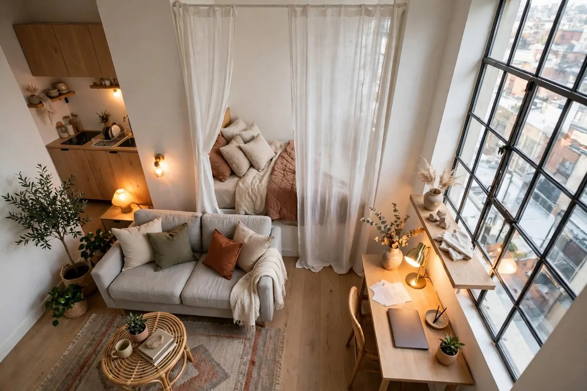
20 Design Studios That Prove Workspaces Can Be Beautiful

Most workspaces are built to be ignored. Gray carpet, a gray desk, and a chair that squeaks every time you lean back.
A design studio is built to be looked at. Color lives on the walls. Paper, wood, fabric, and plants all have a job. Nothing in the room is an accident.
The first real design studio I ever stepped into had paint on the floor and a bicycle leaning against a brick wall. It was the prettiest workspace I had ever seen, and nobody there seemed surprised by that.
That visit changed how I think about work rooms. A beautiful workspace is not a luxury. It changes how your brain feels when you sit down. It makes hard work feel a little lighter, and long days feel a little shorter.
You do not need a big budget or a builder to steal these looks. Most of them are small moves. A wall of color. A lamp in the right spot. A table that faces the light instead of the wall.
Here are 20 design studios that prove a workspace can be beautiful. Each one is a real look you can copy, in a rented room or a spare corner, with the furniture you already own. Pick the ones that make you want to sit down and start.
1. The Sunlit Loft Studio
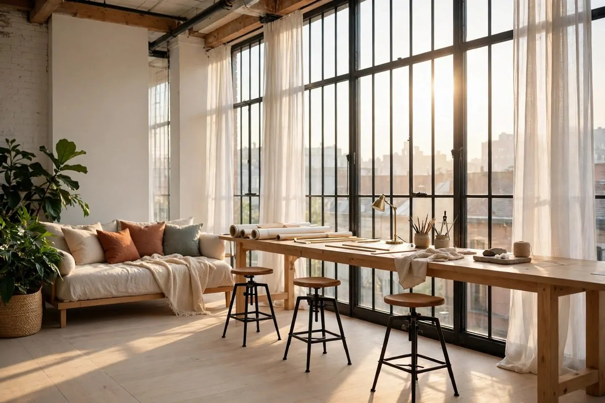
A loft studio starts with light. Big windows, high ceilings, and a long table where everybody can spread out. The room does half the decorating all by itself.
Put the long table near the windows, not against the back wall. Daylight is the best lamp you will ever own, and it is free. Your eyes get less tired, and your work looks true in color.
Keep the table clear at the end of every day. A long table collects stuff fast. Papers, cups, chargers, and offcuts all creep to the middle. A two minute clear each evening keeps the loft feeling open.
Use stools that tuck fully under the table. Stools save floor space, and they keep the room feeling airy. Pick ones with a footrest, because a stool with nowhere for your feet gets old fast.
A rug under the table softens the sound. Loft floors are hard, and sound bounces everywhere. One big flat rug under the work zone makes talking and typing sound calmer.
Here is how window light changes through the day, and what each direction is best for:
| Window direction | Light through the day | Best for |
|---|---|---|
| North | Soft and even, almost no glare | Color work, drawing, long screen days |
| East | Bright mornings, calm afternoons | Early starts, morning meetings |
| South | Strong light most of the day | Plants, photo work, winter warmth |
| West | Soft mornings, golden evenings | Late work, golden hour photos |
Plants love a loft. One tall plant in the corner and one trailing plant on a high shelf frame the windows like living curtains. They cost very little, and they forgive a lot of neglect.
Hang one big thing on the wall. A mood board, a large print, or a row of color swatches. In a tall room, small frames get lost. One big piece gives the eye a place to land.
A loft studio is not about size. It is about light, one long table, and room to breathe. Give your work the window, and the window will give you the look.
2. The White-Wall Gallery Studio
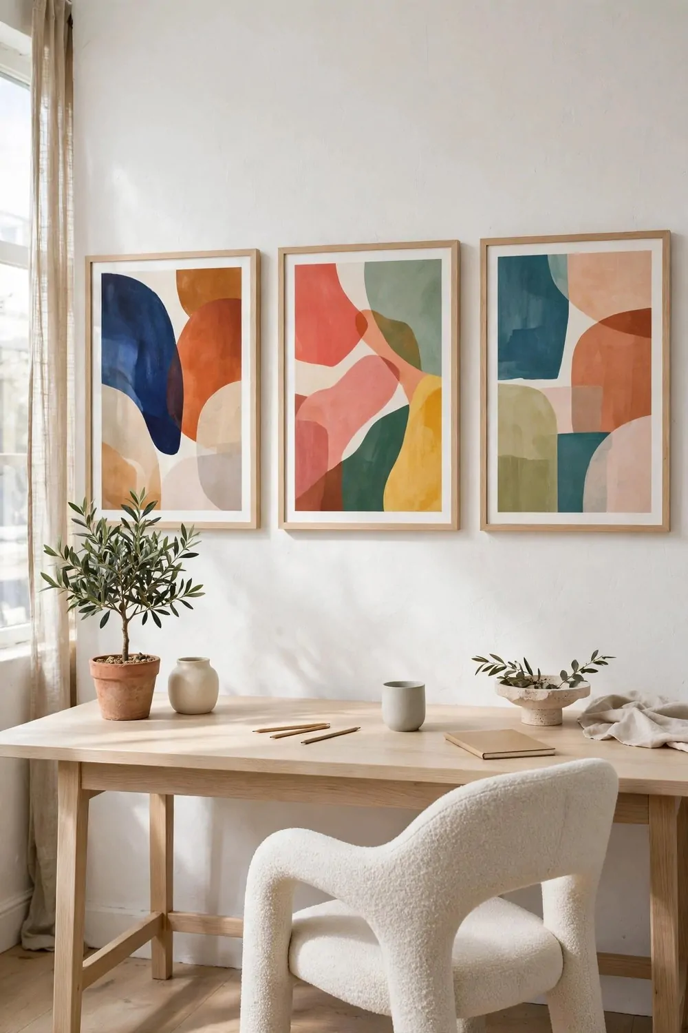
White walls can feel cold in an office. In a design studio, white walls are the gallery. They make every color you pin up look brighter and every object look chosen.
The trick is to treat the walls like an exhibition. Hang work at eye level, with space around each piece. A wall packed edge to edge reads as clutter. A wall with air reads as a gallery.
Use big frames with wide white mats. A wide mat makes a small print look important. It also gives the eye a rest between the art and the frame. Cheap prints look expensive in a good mat.
Change the wall often. A gallery studio is never finished. Swap prints when a project ends, or when the seasons change. The wall becomes a record of what you have been working on, and that is a lovely thing to look at.
Keep the furniture quiet so the walls can talk. A pale desk, a simple chair, and one sculptural object. When the furniture shouts, the wall goes quiet. Let the wall win.
One plant is enough in a white room. A small olive tree or a single tall stem in a vase adds life without breaking the calm. Green against white is a combination that never fails.
Light the wall, not just the desk. A picture light or a track of small spotlights makes the art glow in the evening. The room turns into a private gallery after dark, and working late feels like an event.
Dust the frames once a week. White walls show dust fast, and dusty frames dull the whole effect. A quick wipe keeps the gallery feeling fresh.
A white-wall studio proves that empty is not boring. Empty is the frame. Your work is the picture.
3. The Moody Charcoal Studio
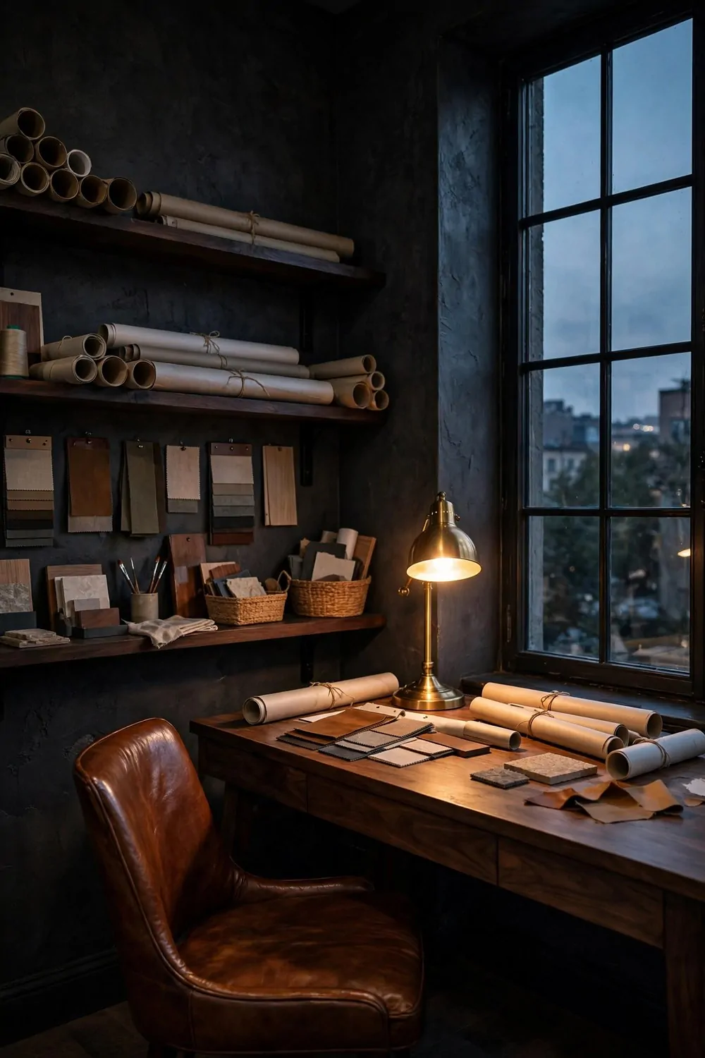
Not every beautiful workspace is bright and white. Some of the best studios I know are dark, rich, and glowing like evening. Charcoal walls, warm wood, and one lamp that makes everything look expensive.
Dark walls scare people in small rooms. They think dark means smaller. It does not have to. Dark walls blur the corners, and blurred corners make the edges hard to find. The room feels deeper, like a forest at dusk.
The secret is light. A dark studio needs more lamps, not fewer. Warm pools of light on the desk, by the chair, and on the shelves. The contrast between dark walls and warm light is what makes the room feel rich instead of gloomy.
Pick one deep color and commit to it. Charcoal, inky blue, or deep green. Paint all the walls, not just one. A single dark accent wall can look like you ran out of paint. All four walls look deliberate.
Keep the desk lamp warm, around 2700K on the box. Cool white light on dark walls looks cold and flat. Warm light makes the dark feel like evening, and evening is when a moody studio does its best work.
Use materials that glow in lamplight. Brass, leather, walnut, and glass all catch warm light beautifully. A brass lamp base against a charcoal wall is a small luxury that costs very little.
Keep the clutter down. Dark rooms hide mess better than white ones, which is a trap. The mess is still there, and it still tires your brain. Closed storage keeps the moody look honest.
One large artwork pops on a dark wall in a way it never does on white. Hang one big piece and let it shine. It becomes the moon of the room.
Dark, warm, and glowing. If bright rooms leave you cold, this studio was built for you.
4. The Plant-Filled Studio
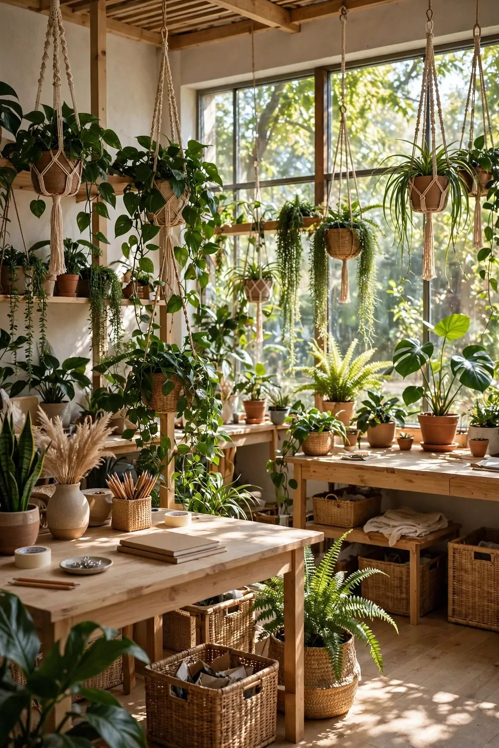
Some studios are divided by walls. This one is divided by leaves. Plants mark the zones, soften the hard edges, and clean the air while they do it. It is the greenest way to split a room.
Start with tall plants. A fiddle leaf fig, a palm, or a bamboo in a big pot. Height is what makes a plant read as a divider. Small plants on the floor just look like decoration that wandered off.
Use three pots in a loose row, not one. One pot is a plant. Three pots is a boundary. Vary the heights a little so the line feels natural, like a little indoor hedgerow.
Put the row where two zones meet. Between the desk and the meeting spot, or between the work table and the reading chair. The plants mark the border your brain already wanted.
Choose matching pots. Same color, same material, three of them. Matching pots turn three separate plants into one deliberate move. Mismatched pots turn the divider into a plant sale.
Water on the same day each week. Plants that divide a room get looked at a lot, and a drooping divider is sadder than a drooping plant in a corner. A weekly watering habit keeps the boundary green.
Add trailing plants on high shelves too. They soften the top of the room and pull the eye upward. A studio with green at every height feels alive in a way no poster can match.
Keep the floor clear under the plants. Drip trays save the wood, and a quick wipe after watering stops stains. Green should feel fresh, not damp.
A row of green, a line of pots, and your studio grows a soft wall that never needs a builder.
5. The Color-Blocked Studio
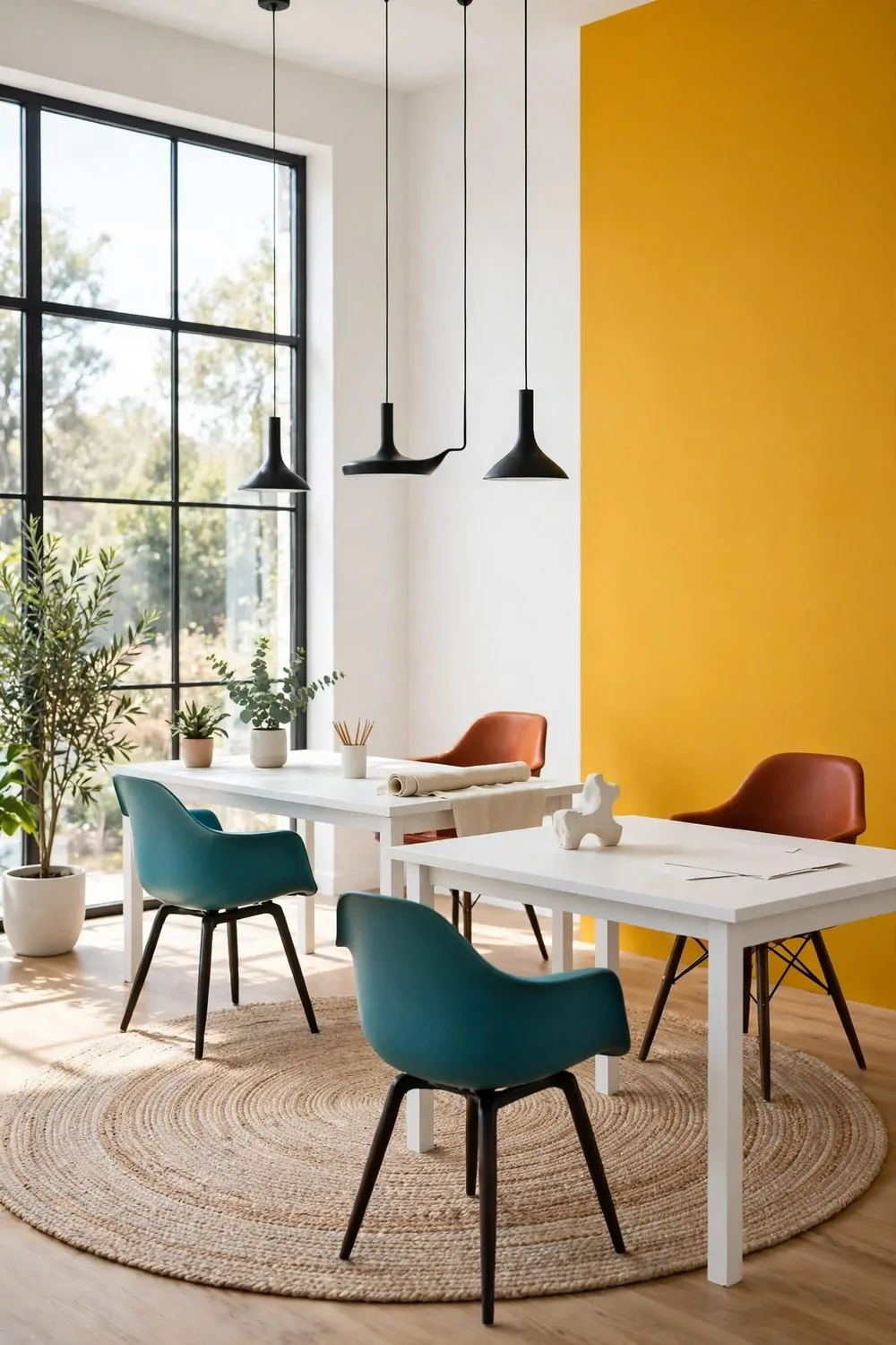
One bold wall. That is the whole idea, and it is one of the bravest looks on this list. A single wall of mustard yellow, deep teal, or burnt orange turns a plain workspace into a studio with a personality.
Pick the wall you face when you work. You should see the color all day, not just when you walk in. A bold wall behind you is wasted. A bold wall in front of you works for its living.
Keep everything else quiet. White desks, pale floors, simple chairs. The bold wall needs a calm room around it, or the whole space starts shouting. One loud wall and a quiet room is the balance.
Repeat the wall color twice more, in very small doses. A cushion, a vase, a notebook. Three repeats is the sweet spot. One repeat looks like an accident. Five repeats looks like a theme, and themes get tiring fast.
Test the color with a big painted board first. Paint a large piece of cardboard and lean it against the wall for a week. Light changes color through the day, and a week of looking tells you the truth. Paint is cheap. Regret is not.
If you rent and cannot paint, use a giant fabric panel or a removable wall mural. A floor-to-ceiling fabric drop in one bold color gives you the same block without losing your deposit. Hang it straight, and it reads as a design choice, not a cover-up.
Color-blocked studios photograph beautifully. The bold wall makes every photo of your work look intentional. If you share your work online, the wall becomes your backdrop for free.
One wall, one bold color, and the room stops being an office. It starts being a studio.
6. The Minimal Japanese Studio
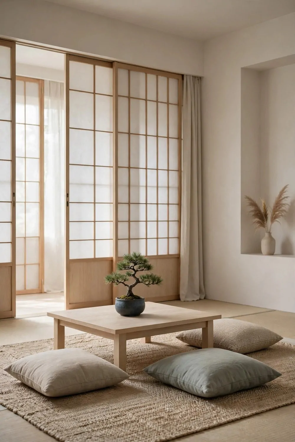
This studio is built on empty space. Low furniture, pale wood, and surfaces so clear you could eat off them. It is calm in a way that makes your shoulders drop the second you walk in.
The first rule is low. A low table, low shelves, and a floor cushion or two. Low furniture makes the ceiling feel higher, and the room feels bigger than it is. Your eye travels further when nothing blocks it.
The second rule is natural. Wood, paper, cotton, and stone. Materials that age well and feel good to touch. Plastic and chrome have no place here. Every surface should feel warm under your hand.
Keep only what you use every day on the table. A laptop, a notebook, and one pen. Everything else lives behind a closed door or in a single beautiful box. Empty surfaces are the whole look, and clutter breaks it in one afternoon.
Light should be soft and diffused. A paper lantern or a lamp behind a screen glows instead of shining. Harsh light makes a minimal room feel cold. Soft light makes it feel like morning, all day long.
One living thing is enough. A small bonsai, a single branch in a vase, or one perfect stone on the desk. In a minimal room, one object carries more meaning than ten. Choose it with care.
Sit on the floor sometimes. A floor cushion and a low table change how your body feels during long work. Your back stretches, your legs move, and the work feels less like sitting in a chair all day.
Minimal does not mean empty of feeling. It means every single thing in the room earned its place. That is a beautiful way to work.
7. The Industrial Brick Studio
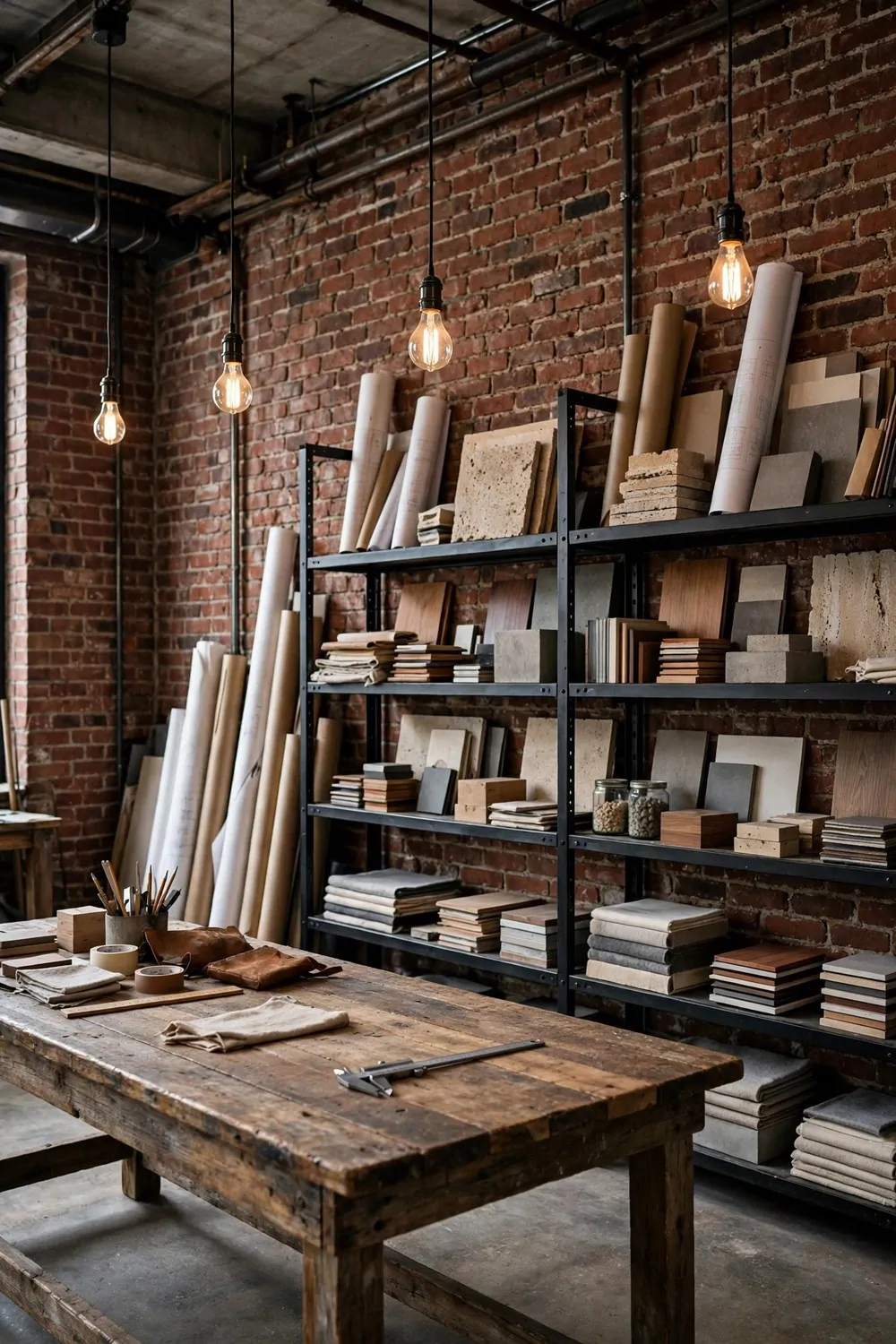
Exposed brick, black steel, and a long reclaimed wood bench. The industrial studio looks like it grew out of an old factory, because the best ones did. It is honest, tough, and surprisingly warm.
Brick is the star here, so let it show. Do not cover a brick wall with posters edge to edge. Leave most of it bare. The texture of old brick is decoration enough, and it gets better with age.
The workbench should be big and solid. Reclaimed wood, thick and heavy, on steel legs. A bench that wobbles ruins the whole industrial feeling. Test it before you buy. Lean on it hard. It should not move.
Steel shelving holds the supplies. Open shelves, black metal frames, wood boards. Everything visible, everything in reach. Industrial storage is honest storage. Nothing hides behind a door.
Here are the materials that make an industrial studio feel real:
- Raw brick or concrete, left bare and a little rough
- Black steel for shelves, legs, and light fittings
- Reclaimed wood with visible grain and old nail marks
- Leather and canvas for chairs and tool rolls
- Edison bulbs with warm, bare filaments
Keep the cables tidy. Industrial rooms have a lot of metal, and tangled cables against steel look messy fast. Run cables along the bench legs with clips, and keep the power strip in one box.
Light with bare bulbs on long cords. Hang them at different heights over the bench. The warm filaments glow against the brick, and the room feels like evening even at noon.
One soft thing saves the room from feeling cold. A wool throw over a chair, a big rug under the bench, or a canvas curtain. Hard rooms need one soft note, or nobody wants to sit in them for long.
Brick, steel, wood, and warm light. The industrial studio is tough on the outside and warm on the inside, just like good work.
8. The Cozy Attic Studio
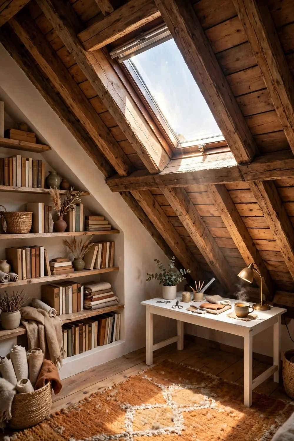
Every attic smells the same. Dust, old wood, and quiet. Climb the little ladder and the whole house goes silent below you. That quiet is exactly why an attic makes such a good studio.
The sloped ceiling is a gift, not a problem. It makes the room feel like a den, and dens help you focus. Put the desk where the ceiling is highest, and the low corners become storage.
A skylight is worth more than a big window here. Sun comes through the roof in the morning and rolls across the sloped ceiling. No one walks past and looks in. The light is private, and private light is a luxury.
Build storage into the low walls. Short cupboards under the eaves hold paper, fabric, and tools without eating floor space. The awkward corners become the most useful part of the room.
Keep the palette warm. Cream walls, honey wood, and a wool rug under the desk. Attics can feel cold, so warm colors and soft textures do the heating before the heater does.
Mind your head. Mark the low spots with a beam, a shelf, or a hanging plant, so you learn where to duck. A studio that bumps your head every morning is a studio you will stop using.
A small lamp on the desk matters more here than in any other room. Attic corners go dark early, and a warm pool of light keeps the work going after the skylight fades.
Quiet, warm, and tucked away. An attic studio is the room the rest of the house forgot, turned into the best seat in the home.
9. The Scandinavian Light Studio
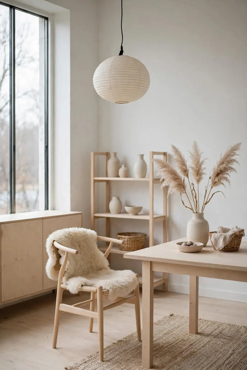
Scandinavian style was built for small, dark winters. Pale wood, white walls, soft textiles, and light everywhere. It is the look that makes a small studio feel bright even in February.
Start with the lightest wood you can find. Pale birch, ash, or whitewashed pine. Dark wood eats light. Pale wood bounces it. In a small room, that bounce is worth real money.
Keep the walls white and the floors pale. The whole room becomes a light box. Sunlight comes in the window and bounces off every surface. Even a gray day feels brighter in a white and pale wood room.
Add softness with textiles. A sheepskin over a chair, a wool throw on the sofa, linen curtains that move in the breeze. Scandinavian rooms are soft to the touch. Hard and cold is the opposite of the look.
Keep the furniture low and leggy. Low desks, slim-legged tables, chairs you can see the floor under. Visible floor is visible room, and the eye travels further in a room where the floor keeps going.
Plants are part of the look, not an extra. One tall plant in the corner, one trailing plant on a shelf. Green against white and pale wood is the fresh note that keeps the room from feeling sterile.
Clutter is the enemy of this style. Everything has a home, and the home is behind a closed door. A Scandinavian studio is tidy not because the people are tidy, but because the storage is good.
One paper pendant lamp finishes the room. It glows softly in the evening and looks like a little moon in the daytime. Hang it low over the work table, and the whole studio gathers around it.
Pale, soft, bright, and calm. If your winters are long or your windows are small, this look was designed for you.
10. The Vintage Print Shop Studio
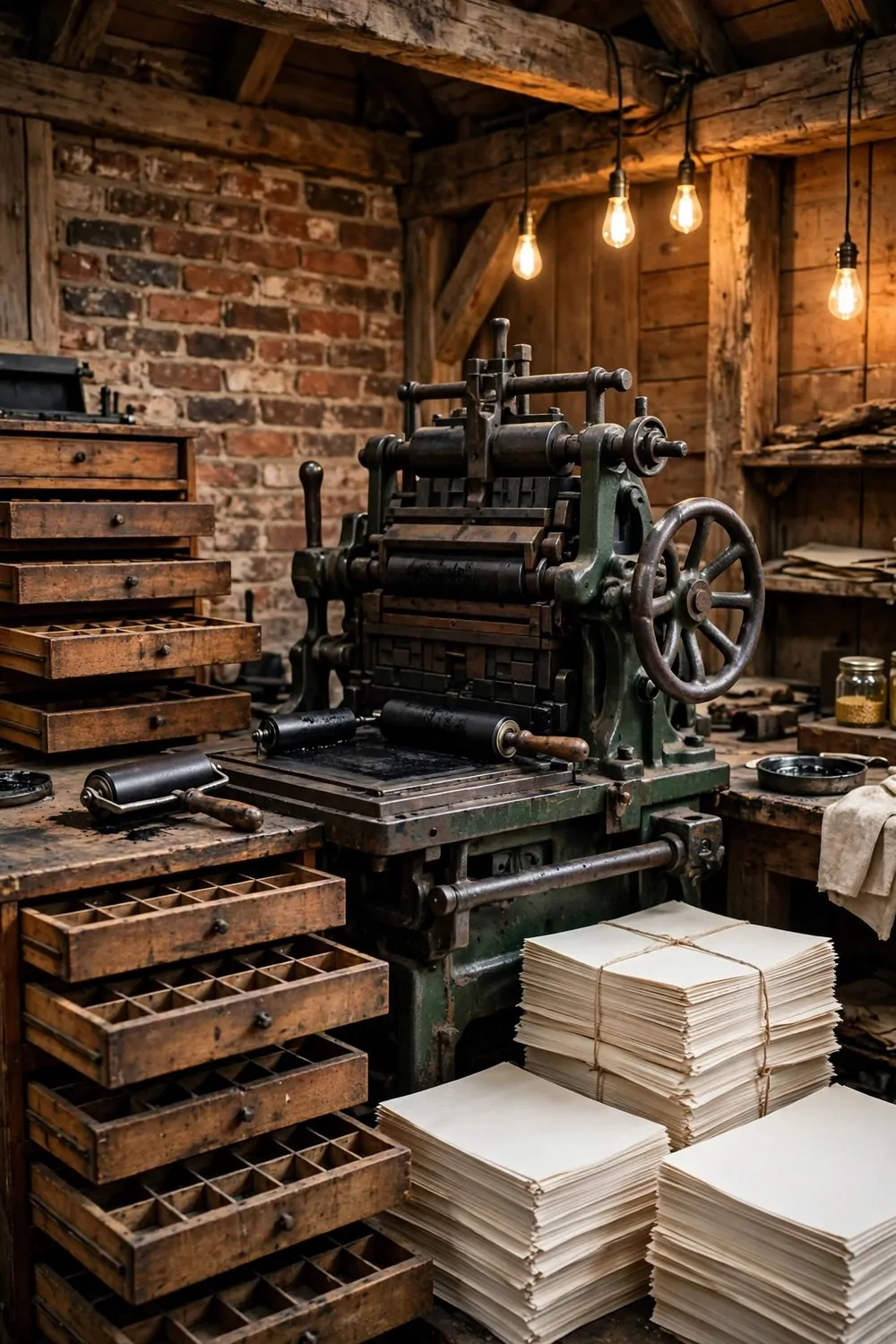
Ink, paper, and old iron. A vintage print shop studio smells like work in the best way. It is the studio for people who love making things with their hands and keeping the old ways alive.
The letterpress is the heart of the room. Even if it never prints a thing, it anchors the whole space. Put it where the light falls on it, and keep the floor around it clear. Old machines deserve room to breathe.
Wooden type drawers are the prettiest storage ever made. Small compartments, worn wood, brass pulls. Use them for ink, tools, paper clips, and all the little things that usually end up in a junk drawer.
Stacks of blank paper are decoration here. Tied with string, stacked on a bench, they look like a promise. Keep the stacks neat and out of damp corners. Paper hates damp more than anything.
Warm workshop lighting does the rest. Bare bulbs on cords, a bench lamp with a green shade, and one window with the blinds half open. The room should glow like a workshop at dusk, even at noon.
Keep the surfaces wiped. Ink gets everywhere in a print room, and ink on a chair seat is a bad surprise. A damp cloth at the end of every session keeps the romance without the stains.
Hang one framed print you made yourself. Not a perfect one. The one with the smudge, or the slightly crooked edge. It tells visitors this is a working studio, not a museum.
Old iron, warm wood, and fresh paper. A print shop studio is proof that the oldest tools can make the prettiest rooms.
11. The Material Library Studio
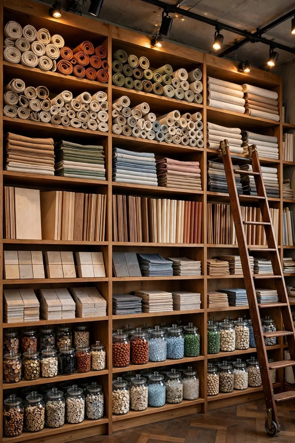
Every designer needs a library of stuff. Fabric, wood, stone, paper, and color, all where you can touch them. A material library studio puts all of it on the wall, and the wall becomes the most useful thing in the room.
Open shelves are the whole system. Floor to ceiling, one full wall. No doors. You need to see the materials to use them, and hidden materials get forgotten for years.
Sort by type, not by color. All the fabrics together, all the woods together, all the stones together. When a project starts, you go to one shelf and compare. Sorting by color looks pretty and works terribly.
Use clear jars for the small things. Buttons, beads, thread, and screws all live in glass, where you can see them. A jar you can see into gets used. A box you cannot see into gets ignored.
Here are the shelves every material library needs:
- Fabric swatches, folded and standing like books
- Wood veneers and offcuts, sorted by tone
- Stone and tile samples, heavy ones low down
- Paper stacks in every weight and finish
- Glass jars for buttons, beads, and small findings
- One empty shelf, kept empty on purpose
Label the shelves with simple tags. Wood, fabric, stone, paper. Labels stop the guessing and stop the whole wall coming down when you need one thing. A strip of tape and a pen is enough.
Keep the heavy things low. Stone samples on a high shelf are a bad idea and a sore foot waiting to happen. Heavy low, light high, and the wall stays safe.
Leave one shelf empty. It gives the eye a resting place, and it gives you room to grow. A library packed to the brim looks like it is about to burst. One breathing shelf keeps it calm.
Touch everything. A material library is not for looking. It is for picking up, comparing, and holding against the light. The studio that lets you touch is the studio that gets used.
12. The Dark Academia Studio
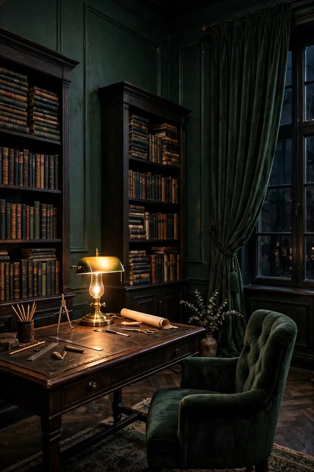
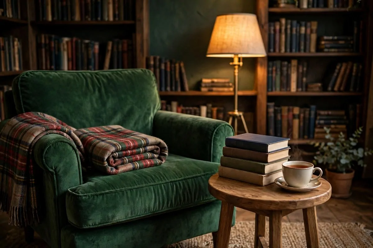
Deep green walls, tall bookcases, and a brass lamp glowing over a leather desk. The dark academia studio feels like a library after closing time, and it makes deep work feel like a pleasure instead of a chore.
Paint the walls deep green, not black. Green keeps the room feeling alive. Black can go flat and cold. Green holds the lamplight and gives it back warmer.
Bookcases should run tall and full. Books stacked sideways, books standing upright, a few laid flat on top. A bookcase with air gaps looks like it is waiting for a delivery. A full one looks like a life.
The desk lamp is the star. A brass banker’s lamp with a green glass shade, glowing over the work. It lights the desk and nothing else, and that pool of light is what makes the room feel private.
Keep the desk leather-topped if you can. Leather ages beautifully, it feels good under your forearms, and a scratch on leather is a story, not a flaw. A glass desk top in a dark room just shows fingerprints.
Heavy curtains finish the look. Velvet or thick linen, floor length, in the same deep green as the walls. They block the glare, hush the sound, and make the room feel like a separate world.
Work in the evening on purpose. This studio does its best work after sunset, when the lamp is the only light. Save your hardest thinking for the dark hours, and the room will pay you back.
One rolled drawing or map on the desk keeps it feeling like a working studio, not a set. The room should look used, in the best way. A perfect desk is a desk nobody works at.
Dark, green, and glowing. If you do your best thinking after dark, this is your room.
13. The Pastel Soft Studio
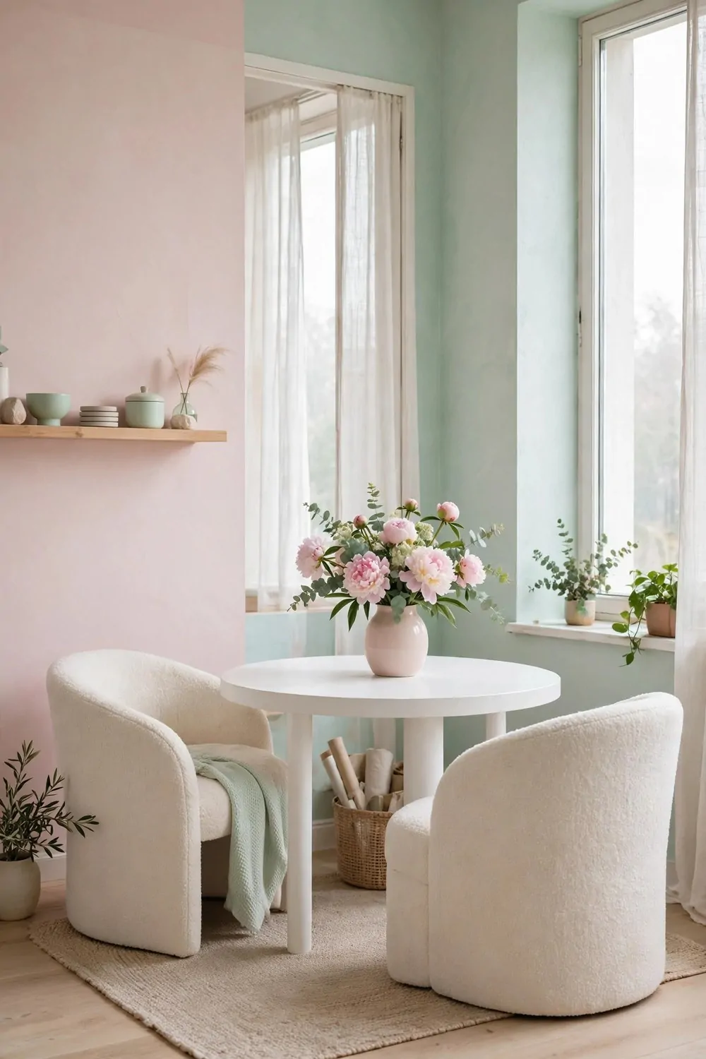
Blush pink, mint green, and soft daylight. The pastel studio is the gentlest room on this list, and it is a serious workspace underneath the softness. Calm colors help calm minds, and calm minds do good work.
Pick two pastels, not five. Blush and mint, or lilac and butter yellow. Two soft colors play nicely together. Five pastels in one room turn into a candy shop, and candy shops are hard to concentrate in.
Keep the big furniture white. A white desk, white shelves, and pale floors let the pastel walls do all the talking. When the furniture competes with the walls, the room gets noisy.
Curves soften everything. A round desk, curved chairs, and a vase with a round belly. Sharp corners in a pastel room feel like a mistake. Curves feel like the room is hugging you a little.
Fresh flowers are part of the look, not an extra. One vase of peonies or sweet peas on the desk, changed weekly. Flowers in a pastel room look like they grew there. A fake plant would break the spell.
Light should be diffused and soft. Sheer curtains, a paper shade, and no bare bulbs. Pastel walls glow in soft light and go washed out in harsh light. The curtain is doing real work here.
Keep the desk almost empty. One notebook, one pen, and the vase. A pastel studio with a cluttered desk looks like a messy bedroom. The same room with a clear desk looks like a dream.
Work here feels slower in a good way. The colors ask you to breathe before you start. If your work is frantic, a pastel room is the deep breath at the start of the day.
Soft, calm, and kind. A pastel studio is proof that gentle rooms can hold serious work.
14. The Crit Wall Studio
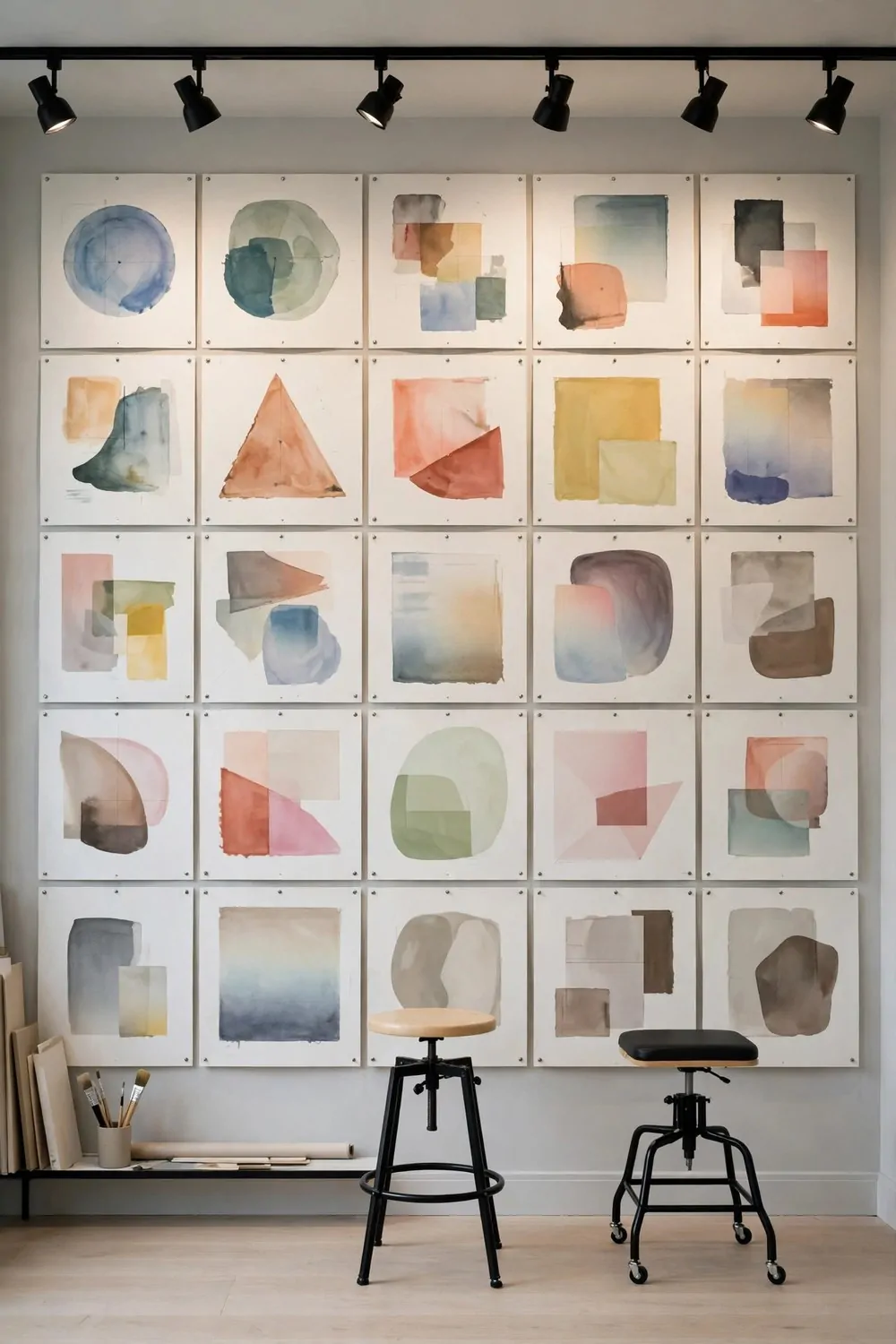
Every design studio needs a wall for showing work. Not a framed gallery. A working wall, where sketches get pinned up, stared at, moved around, and argued over. The crit wall is where good work gets better.
The wall should be big and blank. One full wall, painted white or pale gray, with nothing permanent on it. A crit wall that already holds furniture or shelves is not a crit wall. It is a wall with stuff on it.
Pin work in a neat grid. Rows and columns, with even gaps. A tidy grid makes it easy to compare pieces side by side. Random pinning looks busy and hides the weak piece you most need to see.
Use the same paper size for everything on the wall. Same size boards, same pins, same spacing. Uniform boards make the differences in the work stand out. Mixed sizes make the wall look like a notice board.
Track lighting from above is the right light for a crit wall. A row of small spotlights aimed at the boards, so the work glows evenly. Overhead room light leaves shadows at the edges, and shadows hide problems.
Stools, not chairs, belong under a crit wall. You stand, you point, you step back, you sit for a minute. A stool lets you move. A big chair anchors you in one spot, and crits need movement.
Change the wall every week. Old work comes down, new work goes up. A crit wall that never changes becomes wallpaper. A wall that changes stays honest.
Stand back further than you think you need to. Walk to the far side of the room and look. Work that holds up from a distance is work that is really finished. Work that only works up close is not done yet.
One wall, one grid, and the courage to look. The crit wall is the studio’s conscience.
15. The Dual-Zone Studio
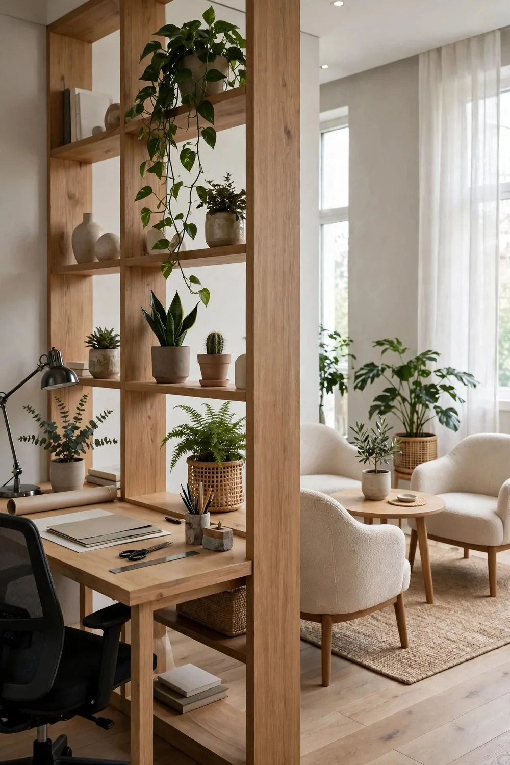
A studio has two jobs that fight each other. Quiet making, and loud meeting. One room has to hold both, and the answer is a divider that splits the room without closing it off.
An open bookshelf is the best divider for this job. It splits the room, stores your stuff, and still lets light through. Three jobs, one piece of furniture. A solid bookcase blocks light and makes the far side feel dark.
Put the making zone by the window. Daylight belongs to the work. Put the meeting zone on the other side, with two armchairs and a small table. Visitors sit in the soft zone, and the work stays undisturbed.
Fill the lower shelves with heavy things. Books, baskets, storage boxes. Heavy low and light high keeps the shelf steady and stops it feeling top heavy. Leave some shelves a little empty, because air is part of the design.
Style both sides of the shelf. You will see the back of it from the other zone, so make the back pretty too. A plant trailing down one side and a photo frame on the other does the job.
Here is how the main divider options compare:
| Divider type | Light kept | Best for |
|---|---|---|
| Open bookshelf | Most of it | Studios that need storage too |
| Folding screen | Some, through gaps | Renters, rooms that change daily |
| Row of tall plants | Almost all of it | Bright rooms, soft separations |
| Curtain on a rail | Very little when closed | Video calls, total privacy |
Keep meeting things on the meeting side only. Cups, notebooks, and the spare charger never cross the shelf. Work things stay on the work side. The divider only works if the stuff respects it.
Set a rule for the boundary. When a visitor sits down, the work side pauses. When the visitor leaves, the meeting side tidies in two minutes. Boundaries that everyone knows are boundaries that hold.
One shelf, two zones, and a room that does two jobs without either one suffering.
16. The Tiny Corner Studio
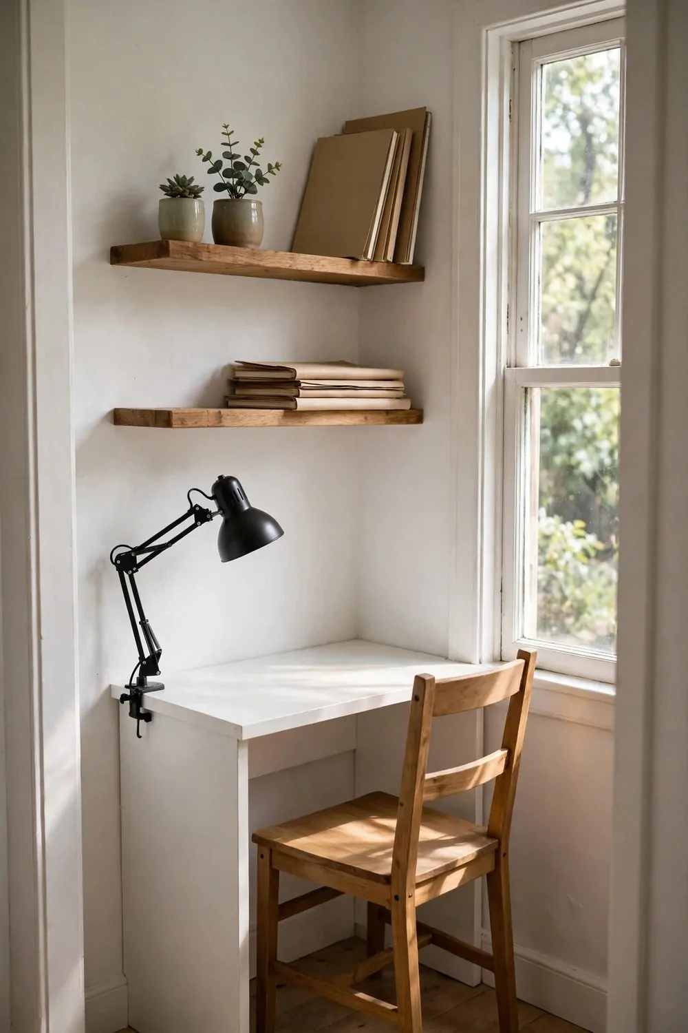
Not every studio gets a whole room. Some studios get a corner, and a corner done right can hold a whole creative life. The tiny corner studio is proof that small is not the same as cramped.
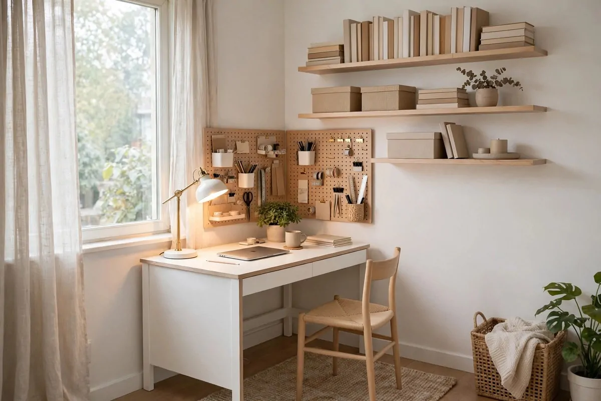
The desk should fit the corner exactly. Wall to wall, no gaps. A desk that touches both walls reads as built-in, even when it is just a board on brackets. Gaps collect dust and lost pens.
Go up, not out. Floating shelves above the desk hold everything, and the floor stays clear. Three shelves, evenly spaced, with the everyday things at arm height and the rarely used things up top.
One chair, and it should be a good one. In a tiny studio the chair is the whole seating plan. Pick one that supports your back and slides fully under the desk. A chair that blocks the walkway will drive you mad by Tuesday.
A clip-on task lamp beats a desk lamp here. It clamps to the shelf, aims exactly where you need it, and leaves the desk surface free. Desk space in a corner studio is precious. Do not spend it on a lamp base.
Keep the corner light in color. White desk, pale walls, and one bright note. Dark colors in a tiny corner close the walls in. Pale colors push them back out again.
Use the window if there is one beside the corner. Even a small window makes a corner studio feel connected to the world. Angle the desk so the light comes from the side, not straight into the screen.
One corner, one desk, one good chair. Small studios do not need more. They need everything in exactly the right spot.
17. The Courtyard Garden Studio
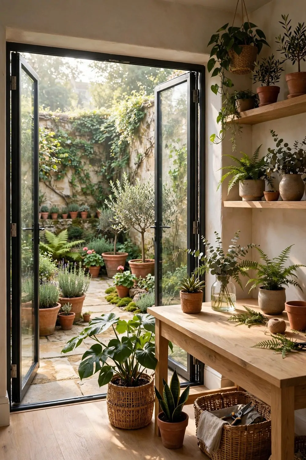
A studio with a garden door is a studio with two rooms. Inside for making, outside for thinking. The glass between them is the best wall a workspace can have.
Put the desk near the glass, facing the garden. Your eyes get distance to rest on, and green is the color eyes rest on best. A desk facing a wall all day is a desk that tires you out by lunch.
Open the doors whenever the weather allows it. Fresh air changes how a room feels faster than any furniture can. The studio becomes bigger the second the doors open, and the garden becomes part of the workday.
Use materials that live happily in both worlds. Oak, terracotta, linen, and stone all belong inside and out. When the inside and the garden share materials, the boundary disappears, and the room feels twice as big.
Keep the threshold clear. No boxes, no shoes, no stack of paper by the door. The walk from desk to garden should take three seconds and zero sidesteps. If the path is blocked, the garden stops getting used.
Shade the glass in summer. A simple linen curtain or an outdoor blind stops the glare without closing the view. Glare on a screen is the one thing that can ruin a garden studio, and shade fixes it in one move.
Water the garden plants on the same day each week, and keep one plant inside by the glass too. The inside plant and the outside garden talk to each other across the glass, and the room feels like it grows out of the ground.
A garden studio is a workspace with fresh air on tap. Open the door, and the work gets easier.
18. The Bold Pattern Studio
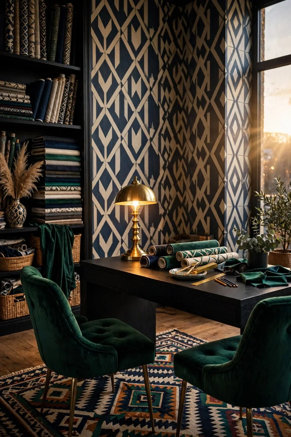
Stripes, geometry, and a rug that refuses to be quiet. The bold pattern studio is for people who think plain walls are a wasted opportunity. Pattern is the decoration, and it does not apologize.
One patterned wall is enough. Geometric wallpaper in navy and cream, or a bold mural behind the desk. One wall of pattern gives the room its energy. Four walls of pattern give you a headache by Thursday.
Mix patterns by scale, not by color. One big pattern, one medium pattern, one small pattern. A big geometric wallpaper, a medium striped cushion, and a small dotted rug. Different scales play nicely together. Same scale patterns fight.
Keep the desk itself plain. A black desk with a brass lamp lets the pattern shine around it. A patterned desk in a patterned room is pattern overload, and overload is the one mistake this look cannot survive.
Here is a simple way to mix patterns without the room falling apart:
- One big pattern on the wall, and let it lead
- One medium pattern on soft things, like cushions or a throw
- One small pattern underfoot, on the rug
- One plain color repeated everywhere, to hold it all together
- Nothing else patterned, no matter how tempting the sale looks
Velvet is the right fabric for this room. Emerald, navy, or rust velvet chairs catch the light and hold their color. Velvet and pattern together look rich. Shiny fabrics and pattern together look noisy.
Hang the art simply. One framed print in a plain black frame, hung straight. The pattern is already doing the talking. The art just needs to sit quietly and look good.
Bold pattern is not for everyone. If it makes your eyes tired, skip this one and pick a calmer look. If it makes your heart beat faster, this is your studio. Pattern people know who they are.
19. The Warm Wood Workshop Studio
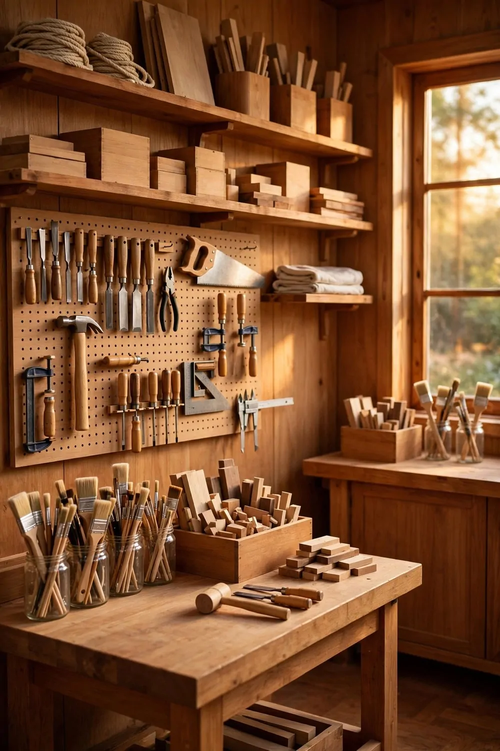
Sawdust in the air, tools on the wall, and benches worn smooth by years of work. The warm wood workshop is the studio for makers, and it smells like the best kind of work.
Benches should be big, heavy, and at the right height. A bench you stand at for cutting and a bench you sit at for detail work. Two heights, two jobs. One bench trying to do both does neither well.
A pegboard on the wall is the workshop’s best friend. Tools, saws, brushes, and tape all hang where you can see them. The bench stays clear for work, and the wall becomes a working display.
Store wood by tone, standing upright in a rack. Offcuts sorted by size, biggest at the back. When you can see the wood, you use it. Wood hidden in a pile gets forgotten and warped.
Golden light suits a wood workshop. Warm bulbs, a window with afternoon sun, and one task lamp over each bench. Wood glows in warm light in a way no other material does. Cool light makes it look gray and tired.
Keep the floor swept. Sawdust builds up fast, and a dusty floor is slippery and sad. A five minute sweep at the end of every session keeps the workshop safe and the wood clean.
Sharpen the tools on a schedule. Sharp tools are safe tools, and they do better work. A dull chisel slips. A sharp one sings. The workshop rewards the people who look after it.
One finished piece on display keeps the room honest. A chair, a box, or a board you made with your own hands, sitting where visitors see it. The workshop is not just for making. It is for showing what making can do.
Wood, tools, and golden light. A workshop studio is proof that the oldest way of working is still the most beautiful.
20. The Studio That Glows at Night
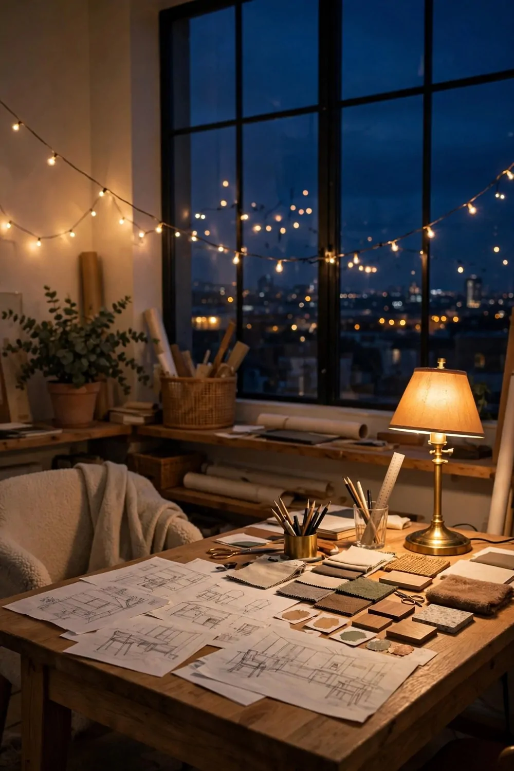
By day this studio is plain and practical. By night it turns into the prettiest room in the house. Warm lamps, string lights, and a window full of evening sky. Night is when this studio does its best work.
The big ceiling light is the enemy here. It flattens everything and kills the mood. Turn it off at sunset and live by lamp light alone. The room will feel smaller in the best way. Cozy, not cramped.
Layer three kinds of light, and the room changes its mood with one click:
- A floor lamp by the work chair, for reading and drawing
- A small table lamp on the desk, for warm close light
- A string of warm lights along a shelf, for pure magic
Warm bulbs, always. Around 2700K on the box. Warm light makes skin look good, sketches look good, and rooms feel like evening. Cool white light at night feels like an office that forgot to close.
Put one lamp on a timer. A lamp that switches itself on at dusk means you come home to a glowing room, not a dark box. It is a small luxury that costs almost nothing and feels wonderful every single day.
Dim the screens at night. A glowing laptop fights the lamps and wins. Lower the brightness, and the room keeps its glow. Your eyes will rest better, and sleep will come easier.
Keep the window uncovered after dark. The evening sky, the distant lights, and the dark blue glass are part of the look. A curtain drawn at dusk hides the best view the studio owns.
A glowing studio is a studio that welcomes you home. Turn the big light off tonight and see what the lamps can do.
That is all twenty. Twenty studios, twenty different ways to prove the same thing. A workspace does not have to be gray to be serious. It does not have to be plain to be productive. The prettiest rooms I know are the ones where people do their best work.
You do not need to copy a whole studio. Steal one idea. The lamp. The plant divider. The wall of color. One small change this weekend, and your work corner will feel different on Monday morning.
Then steal one more next weekend. Slow design beats fast design every time, because slow design stays. Fast design ends up in a box in the garage by winter.
Save the looks you love. Start with the one that made you stop scrolling. Your dream workspace is not a different building. It is the room you already have, with a little more beauty in it.