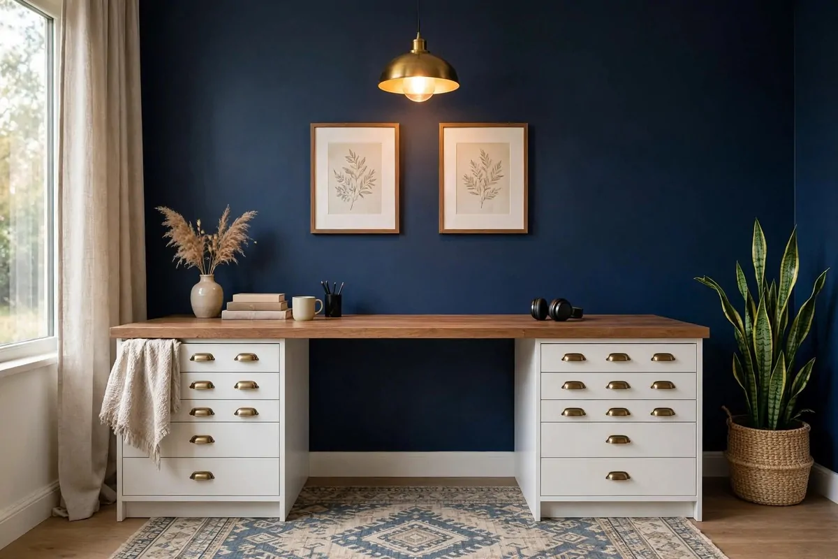
28 Studio Inspiration Looks to Save for Your Dream Space

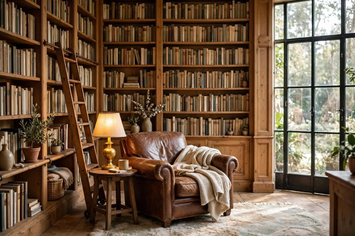
The photos in the rental listing showed sunlight across a wood floor, a reading chair by the window, and a plant leaning toward the light like it owned the place.
Then I opened the front door. The real room had one bare bulb, a scuffed floor, and an echo.
I stood there with my boxes and felt a little cheated. The listing had sold me a dream, and the room had handed me a box.
Here is what I learned in the months that followed. The gap between the listing photo and the dream space is not money.
It is a short list of looks. Small choices, copied one at a time, that turn one plain room into a place you love coming home to.
I saved 28 of them for you. Each one is a real look you can copy in a rented studio, with the furniture you already own and a budget that stays small.
Save the ones that make your heart jump. Your dream space is closer than that empty echo makes it feel.
1. The Window-First Studio
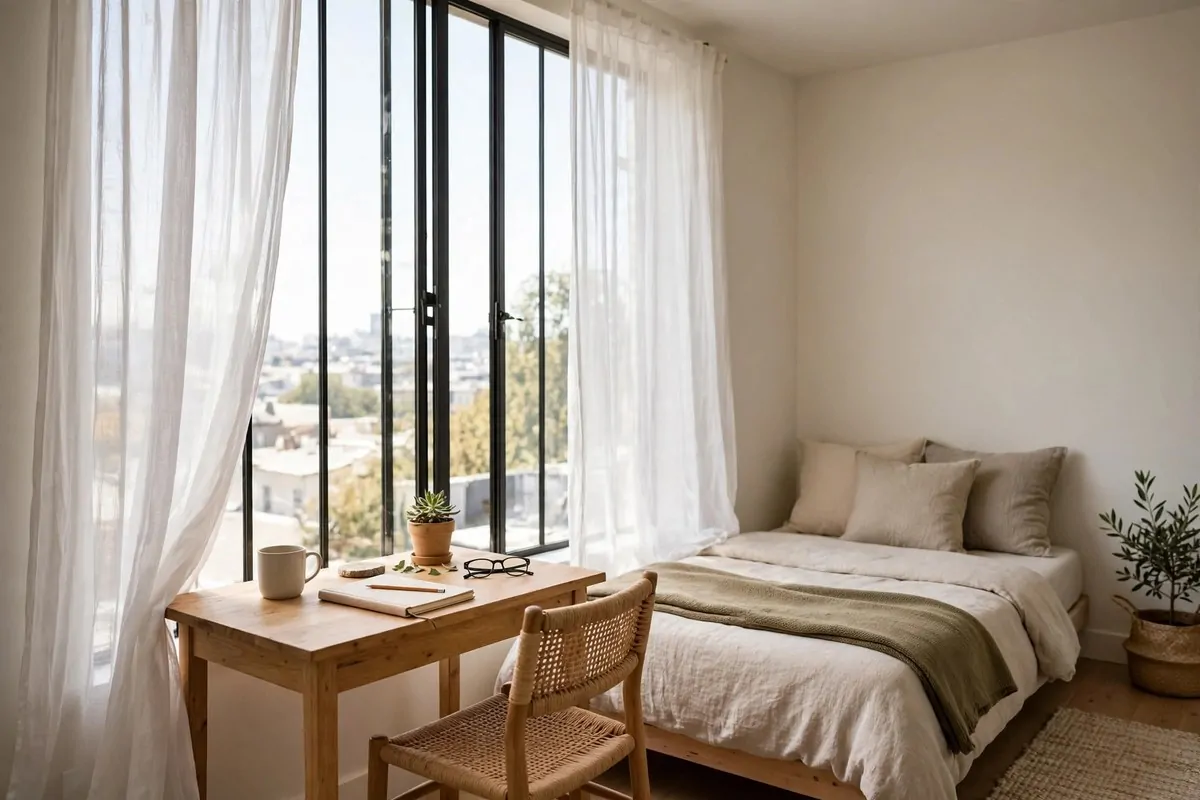
Every studio has one good spot. It is almost always the window. Yet most of us push the bed there, or the storage boxes, and waste the best light in the whole home.
Put the life of the room by the window instead. A small desk, a daybed, or two chairs. The place where you sit most should get the light most.
I moved my desk to the window wall in my first studio. My whole day changed. Morning light woke me up better than coffee did. Video calls looked good without any extra lamps.
Keep the window clear. No tall shelf in front of it. No heavy curtain that stays shut. A sheer curtain softens the light and keeps your privacy, and it still lets the sun do its work.
A daybed by the window is a lovely trick. It is a sofa by day and a guest bed by night. Add a folded throw and two cushions, and it looks planned, not like a spare bed shoved in a corner.
Watch what the light does at different times of day before you decide. Sit in the spot at nine in the morning, then again at four. The light tells you where the desk goes and where the reading chair goes.
If your window faces a brick wall, do not give up on it. A mirror on the wall beside the window catches the sky and throws it back in. Even a little sky makes a room feel bigger.
Plants love the window spot too. One trailing plant on the sill and one tall plant on the floor frame the window like curtains made of leaves. They cost very little and they forgive a lot.
Start with the window. Everything else in the room can orbit around it. When the best spot holds the best part of your day, the whole studio starts to feel like it was designed for you.
2. A Sofa That Faces the View
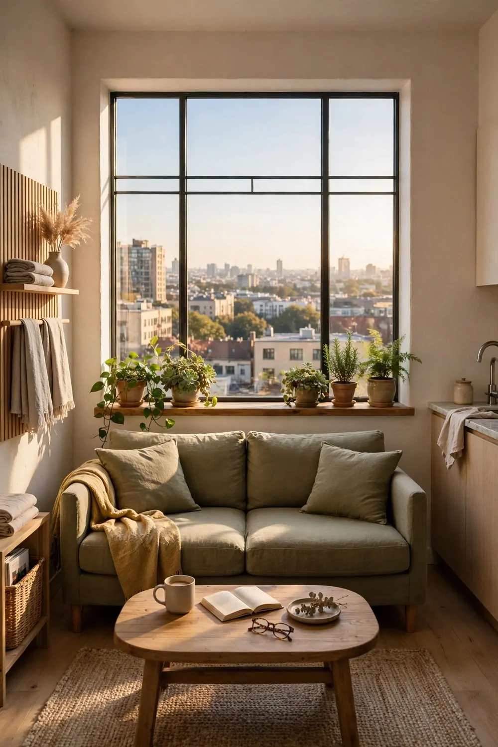
Most sofas face the television. In a studio, that often means the sofa faces a wall, with its back to the window. The best view in the room goes unseen all day.
Turn the sofa around. Face the window, the plants, or the prettiest corner you own. The television can sit to one side. Your eyes will thank you every single evening.
I did this on a rainy Saturday and sat down expecting to hate it. Instead I watched the sky change for an hour and forgot to turn the television on at all. That had never happened before.
A sofa facing the view makes the room feel calm. Your brain reads the open light as space. A sofa facing a wall reads as a dead end, even when the room is the same size.
Put a low table in front of the sofa, not a tall one. A low table keeps the view open. Your coffee, your book, and your feet all fit, and the window stays the star.
Add one plant on the windowsill in the sightline. It gives your eyes a resting place. Green in the middle distance is the oldest relaxation trick there is, and it works in a studio just as well as in a garden.
If you share the studio, talk it through first. One person may love the television spot. A small swivel chair can be the compromise. It turns toward the screen for films and toward the window for quiet mornings.
Keep the back of the sofa tidy, because you will see it from the door now. A folded throw over the back hides a multitude of sins and adds a soft line to the room.
Face the good stuff. Put your back to the rest. It is a small turn with a big payoff, and it costs nothing at all.
3. The Gallery Wall Studio
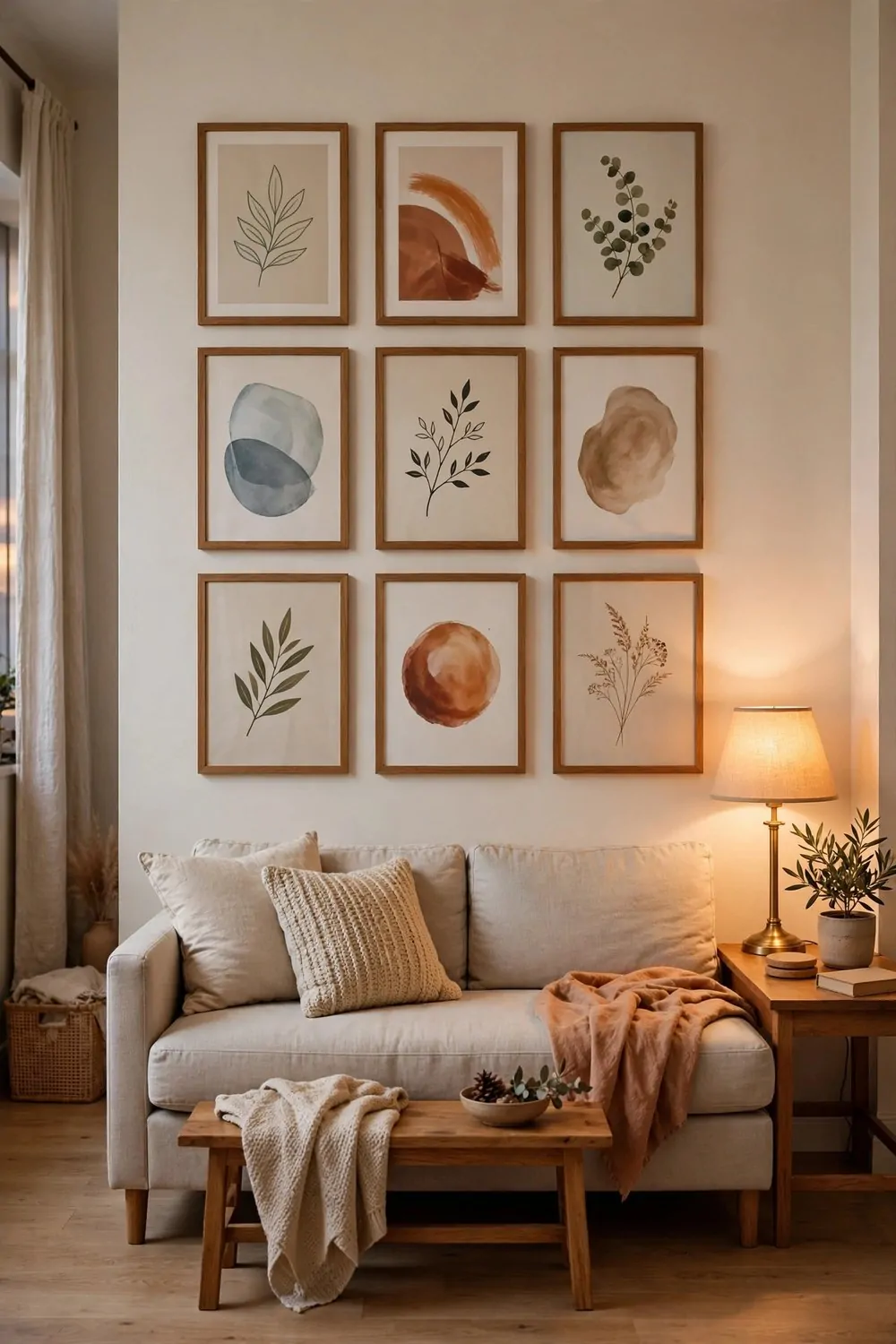
A bare wall in a studio feels like a waiting room. One big wall, painted plain, with nothing on it. Guests notice it even when they say nothing. You notice it every day.
A gallery wall fixes it in one afternoon. Frames of different sizes, hung close together, turn a blank wall into the personality of the whole room.
Start with what you already own. Photos you printed, postcards from trips, a child’s drawing, a page torn from a magazine you loved. A gallery wall made of real memories beats a shop-bought set every time.
Keep one thing consistent across the frames. All black frames, or all wood frames, or all white mats. One steady element holds the mix together. Without it the wall looks random. With it, the wall looks collected.
Lay the frames on the floor first. Move them around until the group feels balanced. Take a photo of the layout with your phone. That photo is your map when the hammer comes out, and it saves a wall full of extra nail holes.
Hang the middle of the group at eye level. About 57 inches from the floor to the center. In a studio you walk past the wall all day, so eye level is where the art belongs. Art hung too high gets ignored.
Leave two or three inches between frames. Tight spacing reads as one big piece. Wide spacing reads as pictures that lost each other. Two inches is the sweet spot for most walls.
Mix in one object that is not a picture. A small woven basket, a wooden letter, a tiny shelf with a plant. One object breaks the flatness and makes the wall feel alive.
One wall, one afternoon, and the plainest room in your home finally has something to say.
4. Warm Wood and White Walls
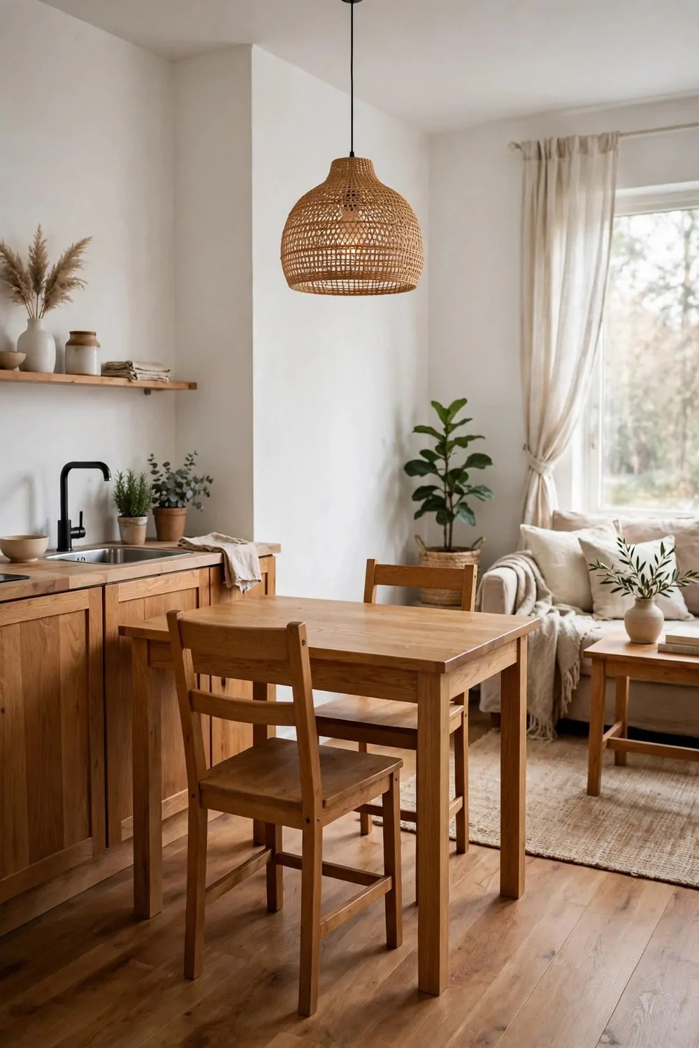
White walls can feel cold. Wood can feel heavy. Put them together and something lovely happens. The white keeps the room bright, and the wood keeps it warm.
This look is the backbone of a hundred dream studios. It is simple, it is cheap to copy, and it never really goes out of style. White paint, oak furniture, and soft daylight.
Start with the biggest wood piece you own. A dining table, a bookshelf, or a bed frame. Let that one piece set the wood tone for the room. Then match the smaller pieces to it, roughly, not perfectly.
Perfect matching looks like a furniture showroom. Close matching looks like a home. A honey oak table beside a slightly darker walnut shelf is fine. Your eye reads them as family, not twins.
Keep the walls truly white, not cream and not gray. Cream walls with warm wood can turn yellow in lamplight. A clean white bounces the light around and lets the wood do all the warming.
Add texture where the color stays quiet. A woven pendant light, a linen cushion, a jute rug. Texture is what stops a white and wood room from feeling plain. It gives your hands something to notice.
Wipe wood furniture with a damp cloth once a week and it will glow. Dust sits on wood fast in a small room, and dusty wood looks tired. A quick wipe is the cheapest polish there is.
Plants are the third member of this look. Green leaves against white walls and warm wood is a combination that never fails. One big plant in the corner and one small one on the table is plenty.
White walls, warm wood, one plant. That is the whole recipe, and it works in every studio I have ever seen it in.
5. The Reading Corner Studio
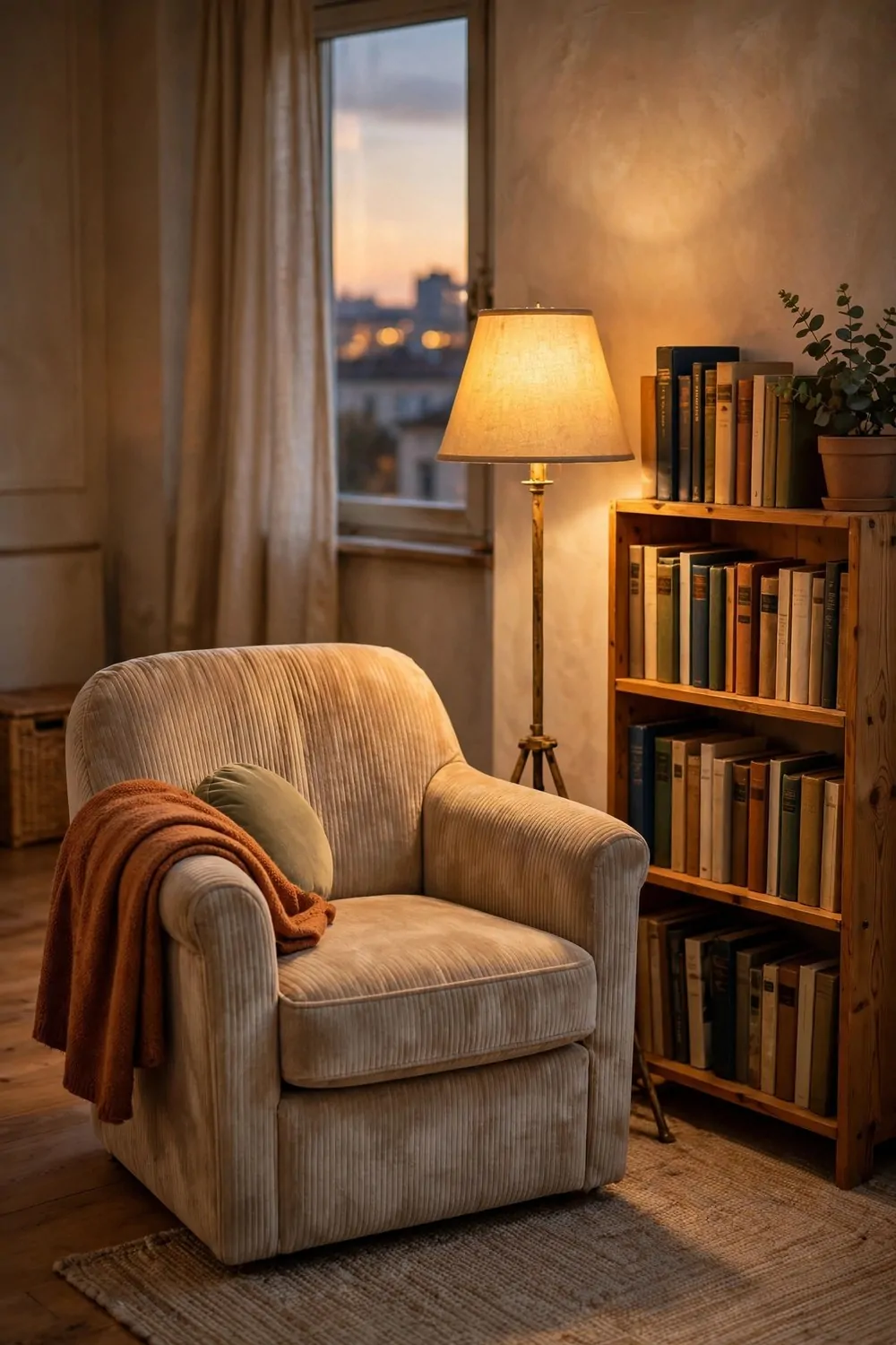
Every studio needs one spot that is only for sitting still. Not working, not eating, not scrolling. Just sitting with a book and a warm drink. That spot is the reading corner.
You do not need much room for it. A corner, a chair, a lamp, and a little table. The magic is in how the pieces sit together, not in how much space they take.
The chair matters most. It should be one you can sit in for an hour without fidgeting. Deep enough to curl up in, firm enough to hold you up. A beautiful chair that hurts your back is not a reading chair. It is a sculpture.
The lamp should come over your shoulder. A floor lamp behind and beside the chair lights the page without shining in your eyes. A lamp in front of you lights your face and leaves the book in shadow. Shoulder light is reading light.
The table should be just big enough for a mug and the book you are not reading. A tiny side table is perfect. A big table invites clutter, and clutter beside a reading chair becomes a dumping ground within a week.
Add a soft throw over one arm of the chair. It invites you to sit down, and it keeps you warm on cool evenings. A throw that lives on the chair is part of the corner, not decoration for guests.
Keep the corner away from the television if you can. A reading corner facing a screen is a television corner that happens to hold a book. Face the window, the plants, or a quiet wall. The book deserves the view.
One chair, one lamp, one table. Build the triangle and the corner will hold the best hour of your day.
6. Plants as Room Dividers
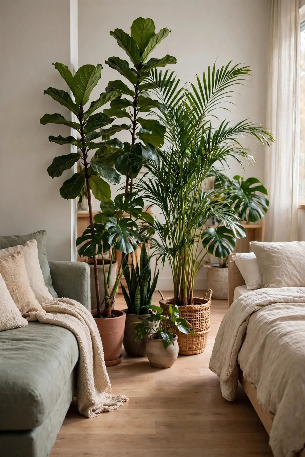
A studio needs dividing, but walls block the light. Shelves block the view. Plants do neither. A row of tall plants splits the room and keeps it breathing.
This is the softest divider there is. Green leaves mark the edge of a zone without ever making the room feel smaller. Your eye passes through the leaves and the light passes with it.
Pick tall plants for this job. A fiddle leaf fig, a palm, or a bamboo in a big pot. Height is what makes the divider read as a divider. Small plants on the floor just look like decoration that wandered off.
Use three pots, not one. One pot is a plant. Three pots in a loose row is a boundary. Vary the heights a little so the line feels natural, like a little indoor hedgerow.
Put the row where two zones meet. Between the bed and the sofa, or between the desk and the dining spot. The plants mark the border your brain already wanted. You will feel the zones separate the first day.
Water them on the same day each week. Plants that divide a room get looked at a lot, and a drooping divider is sadder than a drooping plant in a corner. A weekly watering habit keeps the boundary green.
Choose pots that match. Same color, same material, three of them. Matching pots turn three separate plants into one deliberate move. Mismatched pots turn the divider into a plant sale.
Light still reaches both zones through the leaves. That is the whole point. The room stays one bright space, and your brain still reads two rooms. Plants are the only divider that gives you both.
A row of green, a line of pots, and your studio grows a soft wall that never needs a builder.
7. The Loft Bed Studio
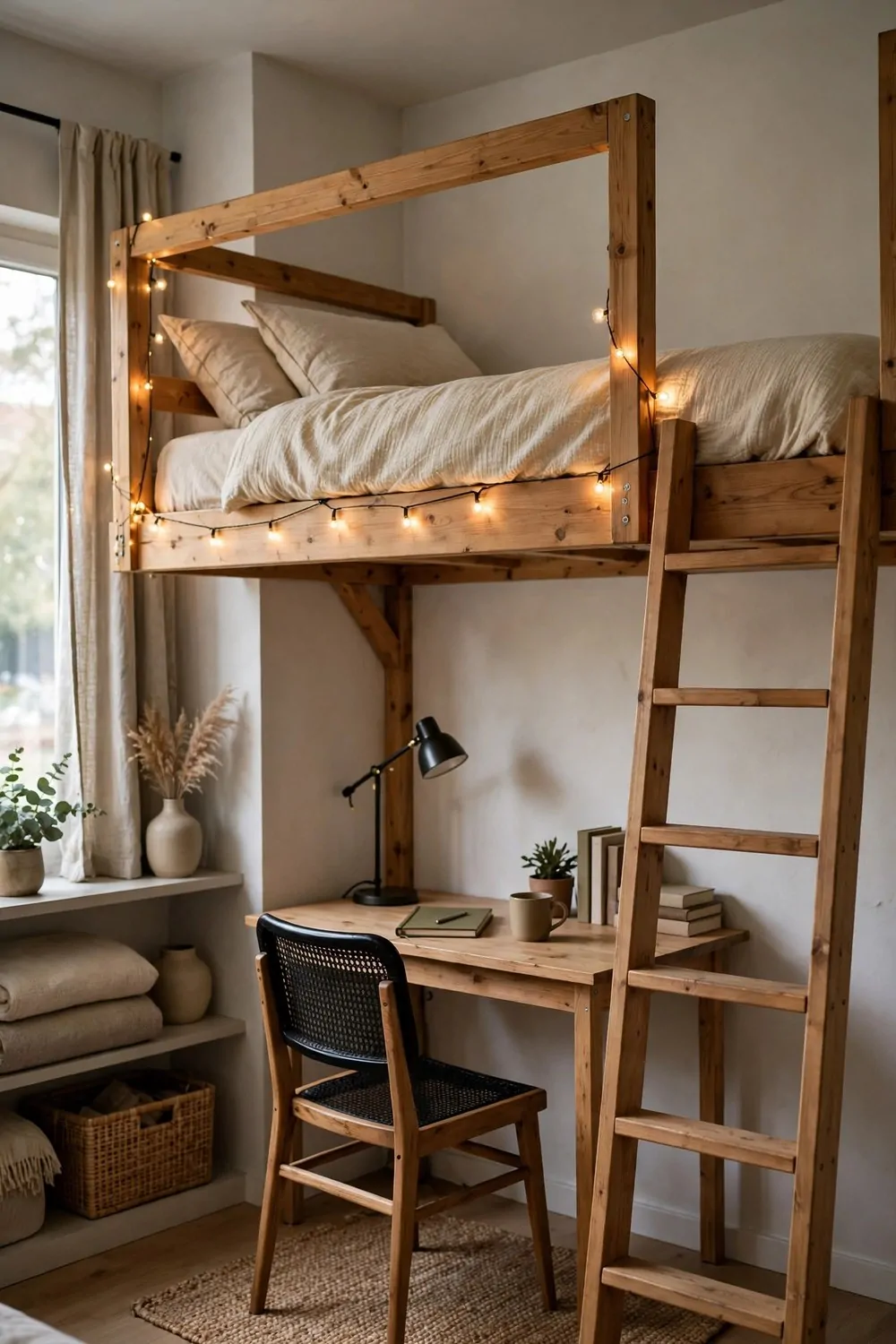
When the ceiling is high enough, the loft bed is the greatest trick a studio owns. The bed goes up top. A whole second room opens up underneath. One patch of floor does two jobs.
Check your ceiling height first. You need to sit up in bed without bumping your head, and stand under it without ducking. If you cannot do both, a lower platform bed with drawers is the safer pick, and it still wins you storage.
Make the space underneath a real zone. A desk, a rug, and a lamp turn it into an office. A small sofa and a shelf turn it into a lounge. An empty gap under a loft bed becomes a cave for boxes, and caves do not get used.
A solid ladder matters more than a clever one. You will climb it half asleep every single night. Wide steps and a good handhold beat a skinny ship ladder every time. Test the ladder in the shop if you can. Your feet will tell you the truth.
Guard rails are not optional. Even adults roll in their sleep. A rail on the open side is the difference between a loft bed and a bad night. Do not skip it to save money. This is the one place to spend properly.
Here is a quick check before you buy any loft bed:
| What to check | Why it matters | Good answer |
|---|---|---|
| Sitting height up top | You sit up every morning | Head clears the ceiling easily |
| Standing height below | The zone below must feel open | No ducking to walk under it |
| Guard rail | Safety while you sleep | Rail on every open side |
| Ladder feel | You climb it half asleep | Wide steps, solid handhold |
Keep the bedding simple up top. Fewer pillows means less stuff tumbling off the edge. A fitted sheet, a duvet, and one good pillow is plenty when the bed is up high.
String lights along the frame make the underneath feel cozy instead of shadowy. Light is what turns a gap into a room. One warm string of lights costs very little and changes the whole feeling.
Measure twice, climb once. And enjoy your brand new downstairs.
8. A Studio in All Cream
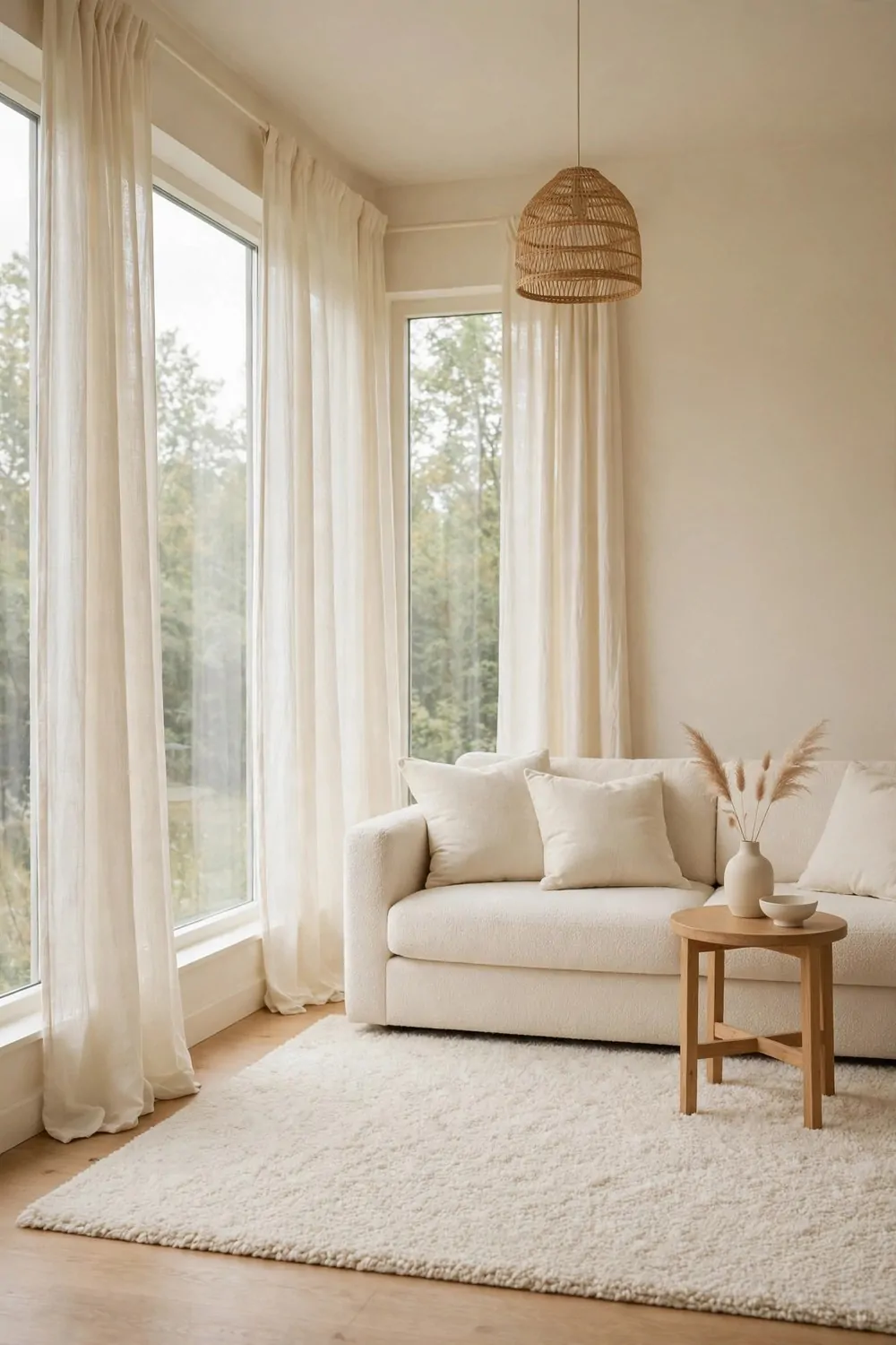
Cream on cream on cream. It sounds boring on paper. In real life it is one of the calmest looks a studio can wear. Soft, warm, and endlessly easy to live with.
The trick is shades, not one flat color. Cream walls, an oatmeal sofa, a pale rug, ivory curtains. Each piece is a slightly different cream, and the differences are what make the room interesting.
If everything matches exactly, the room goes flat. Your eye finds no edges and gets bored. Five close shades of cream give the eye gentle places to rest without any jolt.
Texture does the heavy lifting here. A nubby wool throw, a linen cushion, a woven basket, a soft sheepskin. In a one-color room, texture is the pattern. Your hands notice what your eyes glide past.
Keep one darker note in the room. A walnut side table, a black lamp base, or a deep green plant. One dark note anchors all that cream and stops the room from floating away. Without it the room can feel like a cloud you cannot sit on.
Light is your best friend in a cream studio. Cream bounces daylight beautifully. Keep the windows clear and the curtains sheer, and the room will glow from morning to evening without any effort from you.
This look forgives mess better than white does. Cream hides a little dust and a few crumbs. A cream sofa shows less wear than a white one, and that matters in a room where the sofa is also the dining chair and the office chair.
Wash the soft things often. Cream throws and cushion covers go in the wash every couple of weeks. Fresh cream looks luxurious. Dingy cream just looks tired.
Soft, warm, and calm. A cream studio is a deep breath you get to live inside.
9. The Dark and Moody Studio
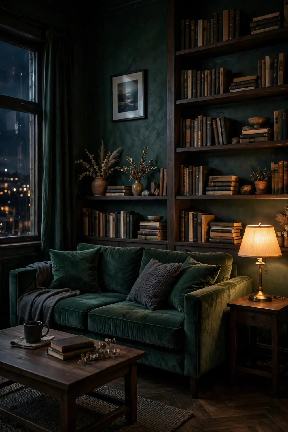
Not every dream space is bright and white. Some of the best studios I know are dark, rich, and glowing like evening. Deep green walls, warm lamps, and a sofa you sink into.
Dark walls scare people in small rooms. They think dark means smaller. It does not have to. Dark walls blur the corners of a room, and blurred corners make the edges hard to find. The room feels deeper, like a forest at dusk.
The secret is light. A dark studio needs more lamps, not fewer. Warm pools of light on the sofa, by the bed, and on the shelves. The contrast between dark walls and warm light is what makes the room feel rich instead of gloomy.
Pick one deep color and commit to it. Deep green, inky blue, or warm charcoal. Paint all the walls, not just one. A single dark accent wall in a studio can look like you ran out of paint. All four walls look deliberate.
Keep the big furniture soft and deep in tone too. A velvet sofa in a jewel tone, dark wood shelves, brass lamp bases. Shiny brass against dark green is a combination that always looks expensive, even when the lamp came from a discount shop.
Art pops on dark walls in a way it never does on white. A bright print, a pale photograph, or a gilt frame glows against the dark. Hang one large piece and let it shine. It becomes the moon of the room.
Use warm bulbs everywhere, around 2700K on the box. Cool white light on dark walls looks cold and flat. Warm light makes the dark feel like evening, and evening is when a moody studio does its best work.
Dark, warm, and glowing. If bright rooms leave you cold, this is your dream space. Paint one wall this weekend and see how the room changes after sunset.
10. The Tiny Kitchen That Works Hard
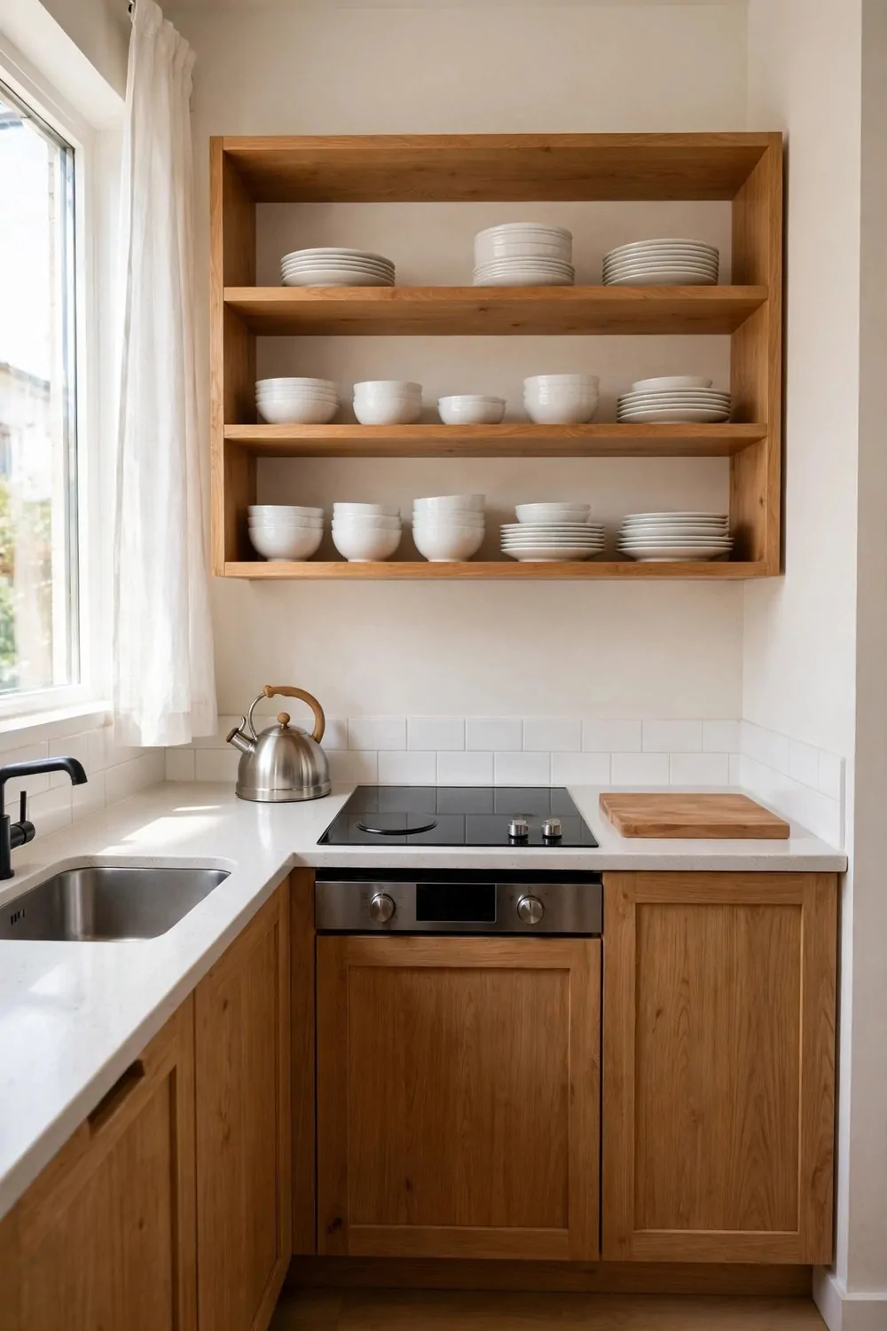
The kitchen in a studio is small. That is a fact, not a problem. A small kitchen that works hard beats a big kitchen that wastes space every single day.
The rule is simple. Only the things you use every day earn a spot on the counter. A kettle, a cutting board, and maybe a knife block. Everything else lives in a cupboard and comes out when it is needed.
Open shelves suit a tiny kitchen beautifully. They replace heavy upper cabinets and keep the room feeling open. Your eye keeps moving, and the whole kitchen breathes.
Keep the shelves honest. Everyday white dishes, stacked neatly. Bowls nested together, glasses in a straight row. The shelf should look like a shop display, not like a cupboard that lost its door.
Here is the short list for a hard working tiny kitchen:
- One good knife, kept sharp, instead of a block full of dull ones
- A cutting board big enough for real cooking, stored upright by the wall
- A kettle or coffee maker you use every single morning
- One pan that goes from stove to table
- A small tray that gathers the bottles and jars into one tidy group
Wipe the counters every night after dinner. Not a deep clean, just a clear and a wipe. An empty counter in the morning makes the whole kitchen feel bigger and the day feel easier.
Light the kitchen wall brightly. Under-cabinet lights or one strong strip light makes cooking easy and makes the kitchen wall feel like its own little room. Good light is the cheapest kitchen upgrade there is.
A tiny kitchen asks you to own less and cook more simply. That is not a loss. It is the reason studio cooks get so good at one-pan dinners.
Small kitchen, clear counters, sharp knife. The room will work as hard as you do.
11. A Table That Seats Two Tonight and Six on Sunday
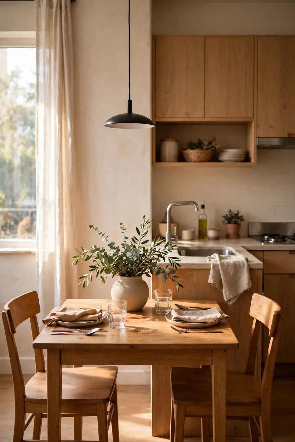
A studio dining table has two jobs that fight each other. On weeknights it seats one or two people. On Sundays it needs to hold six, plus the food, plus the elbows.
The answer is a table that grows. A drop-leaf table, an extendable table, or a small table with a bench that slides underneath. Small on Tuesday, generous on Sunday.
A drop-leaf table is the classic studio answer. Leaves down, it is a console against the wall. Leaves up, it is a proper dining table. It has been solving small rooms for a hundred years, and it still works.
Chairs should stack or fold. Four folding chairs on wall hooks take up almost no room, and they come down when friends arrive. A bench on one side seats three people in the space of two chairs, and it slides under the table when dinner is done.
Keep the centerpiece low. Nothing on the table taller than a water glass. A shallow bowl of fruit, a row of small candles, or a low vase with short stems. Faces stay visible, and conversation stays easy.
Set the table the night before a big meal. Plates, glasses, and the low centerpiece. Waking up to a set table makes a Sunday feel like an occasion, even in a one-room home.
After dinner, the table shrinks back down. Leaves fold, chairs go back on their hooks, and the studio gets its floor back. That shrinking is the whole trick. The room is generous when you need it and tidy when you do not.
Two tonight, six on Sunday, and the floor back by Monday. That is a table earning its place in a studio.
12. The Fold-Away Office
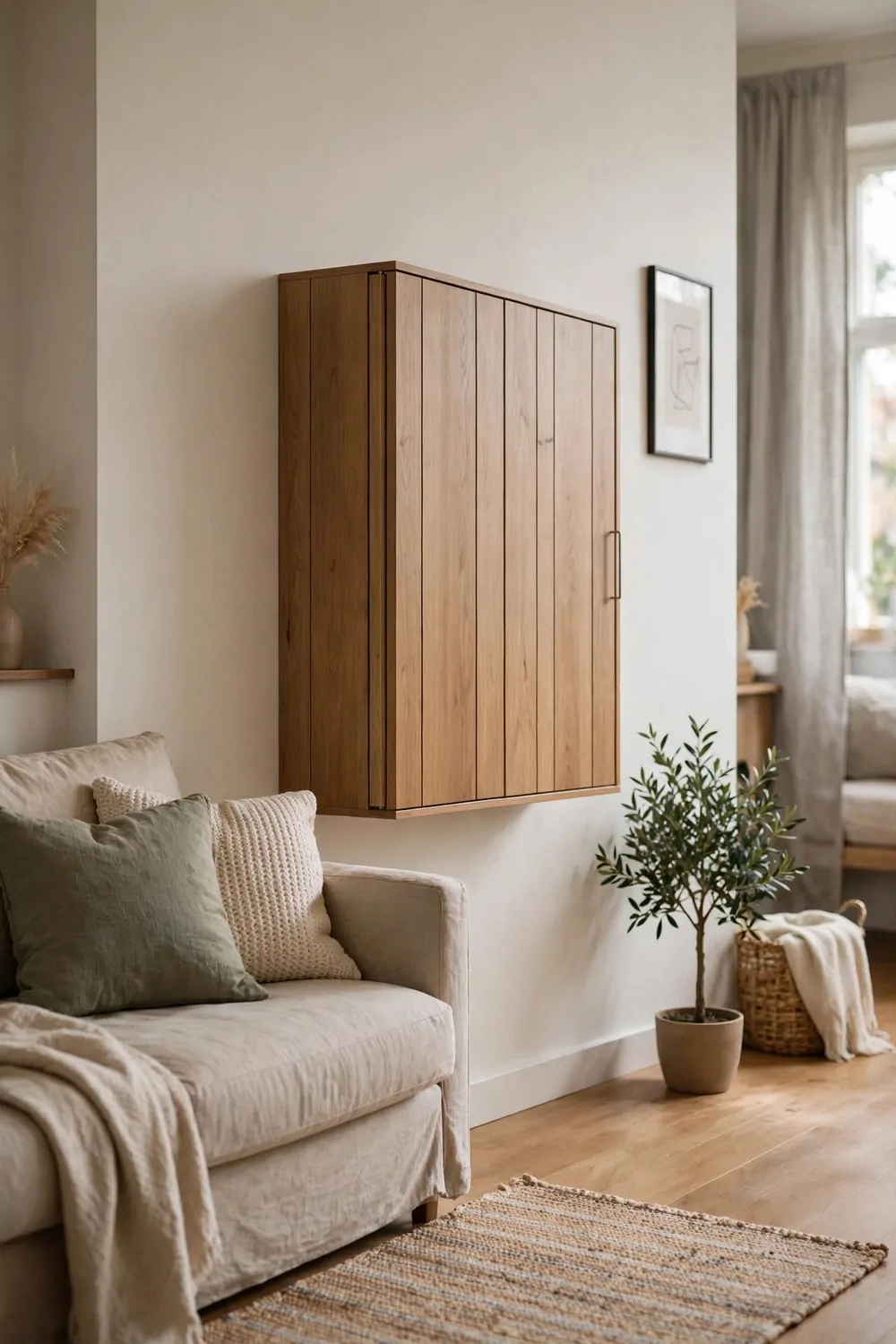
Working from home in a studio means the office shares a room with your whole life. The desk stares at you all evening. Your brain keeps working when the work is done.
A fold-away desk fixes that. Work happens, then the desk folds up, and the room becomes a living room again. Out of sight really does mean out of mind.
The simplest version is a wall-mounted drop-down desk. A wooden panel hinged to the wall, held by chains or brackets. Down for work, up for life. It costs little and fits in an afternoon.
A secretary desk is the furniture version. The front drops down to make a writing surface, and the little cubbies inside hold pens, papers, and chargers. Close the front and the office disappears behind a handsome cabinet door.
Keep the work supplies in one box that lives on the desk. Laptop, notebook, charger, and one pen. When the desk folds away, the box goes with it into a cupboard. Nothing work-shaped stays out to nag you at dinner.
Light the fold-away spot properly. A clip lamp on the shelf above, or a small plug-in wall light. Fold-away desks often sit in corners where the room light does not reach, and squinting at a laptop in a dark corner is miserable.
Make folding the desk part of your end-of-day routine. Save the file, close the laptop, fold the desk up. Ten seconds, and the studio is a living room again. The routine is what makes the trick stick.
Here is how the main fold-away options compare:
| Fold-away option | Floor space used | Best for |
|---|---|---|
| Wall drop-down desk | None when folded | Tiny studios, tight budgets |
| Secretary desk | One cabinet footprint | People who love real furniture |
| Folding table + hooks | None, hangs on the wall | Renters, very small rooms |
| Rolling cart desk | One cart in a closet | Moving between rooms |
Fold it up tonight. Your evening will feel longer, and your mornings will start cleaner.
13. Mirrors That Double the Room
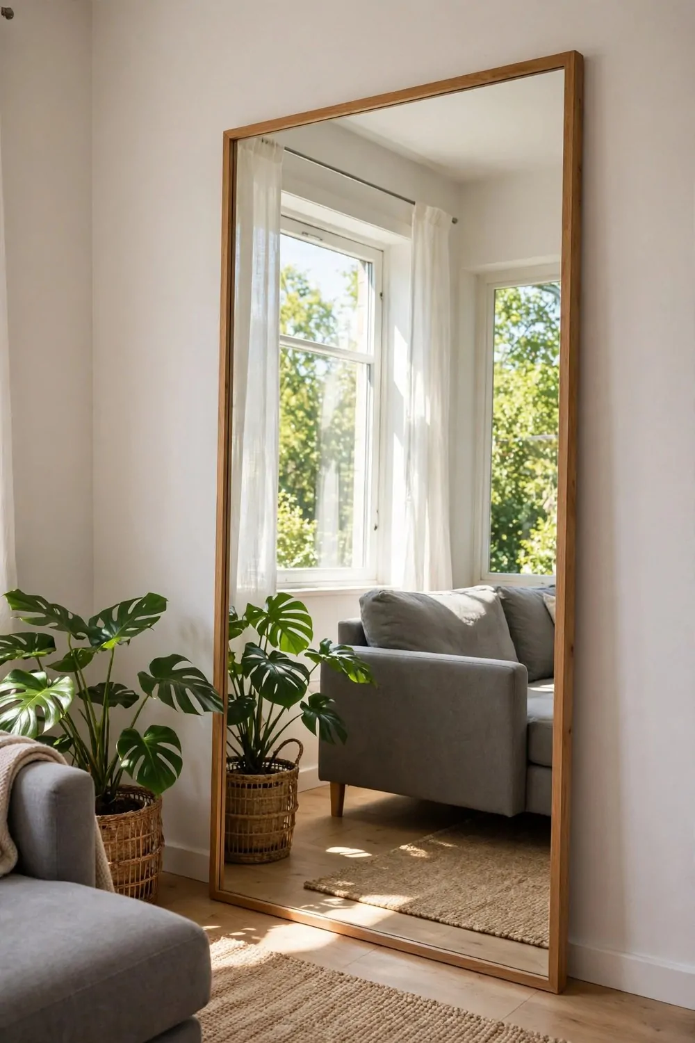
A mirror is the cheapest extra square footage you will ever buy. It does not add real space, but your eyes cannot tell the difference. The room looks twice as big, and the light doubles too.
Placement is everything. A mirror across from the window catches the sky and throws it back across the room. A mirror on the same wall as the window just shows you the opposite wall. Same mirror, completely different result.
Go as big as you can manage. One large mirror beats three small ones. Small mirrors chop the reflection into pieces and the room reads as busy. One big mirror opens the whole wall up at once.
Lean it if you cannot hang it. A large leaning mirror on the floor is renter friendly and looks relaxed and intentional. Just make sure the bottom sits flat and steady against the wall, and that it cannot slide on a smooth floor.
Angle it slightly if the window view is mostly brick wall. Tilt the top a touch toward the room and the mirror catches more sky. A tiny tilt makes a big difference to what the mirror shows you.
Do not point a mirror at clutter. It doubles the mess too. Point it at the window, the plants, or the prettiest corner you own. The mirror shows what you aim it at, so aim it at the good stuff.
Keep the mirror clean. A dusty mirror in a small room reads as a gray wall. A quick wipe once a week keeps the light bouncing the way it should, and the room keeps its borrowed space.
One mirror, facing the light, and the darkest corner of your studio gets brighter for free.
14. The Cozy Textile Studio
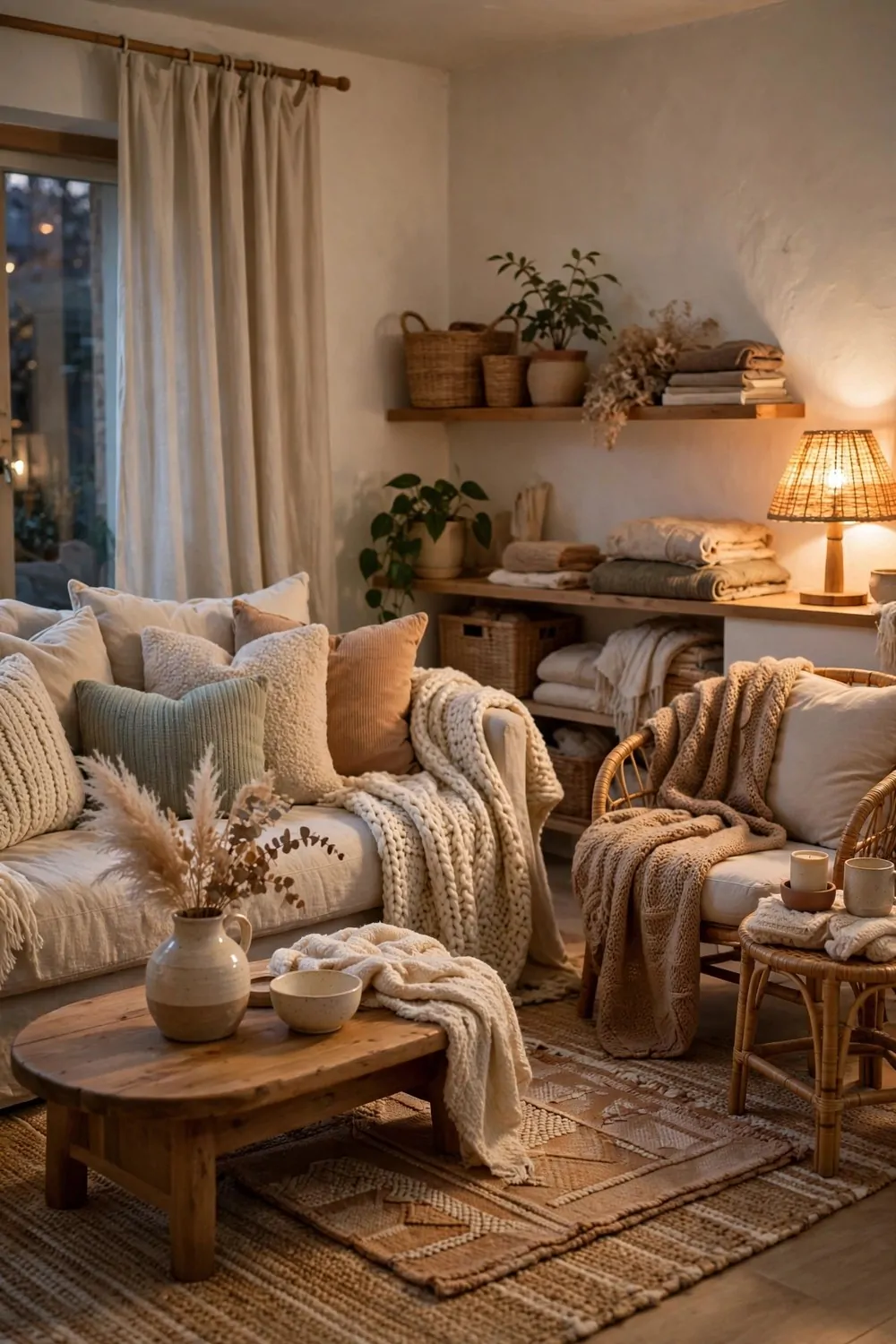
Some studios look good in photos and feel cold in real life. Hard floors, bare walls, one thin sofa. The cozy textile studio is the opposite. It wraps you the second you walk in.
Textiles are the warmth. Throws, cushions, rugs, curtains. Soft layers on every surface that can hold them. A room full of fabric feels like a hug, and hugs do not need a big budget.
Start from the floor up. A large rug under the seating area is the foundation. Then a throw on the sofa, cushions in two sizes, and a curtain that actually reaches the floor. Each layer adds a little more softness.
Mix the fabrics. Knitted wool, soft linen, woven cotton, a little velvet. Different fabrics catch the light differently, and that mix is what makes the room feel rich. One fabric everywhere goes flat, like a hotel room with no personality.
Keep the colors close together. Warm neutrals, soft creams, one dusty rose or sage note. Cozy comes from closeness, not from contrast. Loud clashing colors wake a room up. Soft close colors settle it down.
Wash the soft things on a schedule. Throws every two weeks, cushion covers monthly, curtains twice a year. Fresh textiles smell clean and feel soft. Neglected textiles go limp and gray, and the whole cozy trick falls apart.
Layer the bed the same way. A fitted sheet, a flat sheet folded back, a light duvet, and a throw across the foot. A layered bed looks inviting from the door, and it is the biggest soft surface in the room.
A cozy studio is a studio that asks you to sit down and stay. Pile on the soft layers, and the room will do the rest.
15. A Folding Screen That Makes a Bedroom
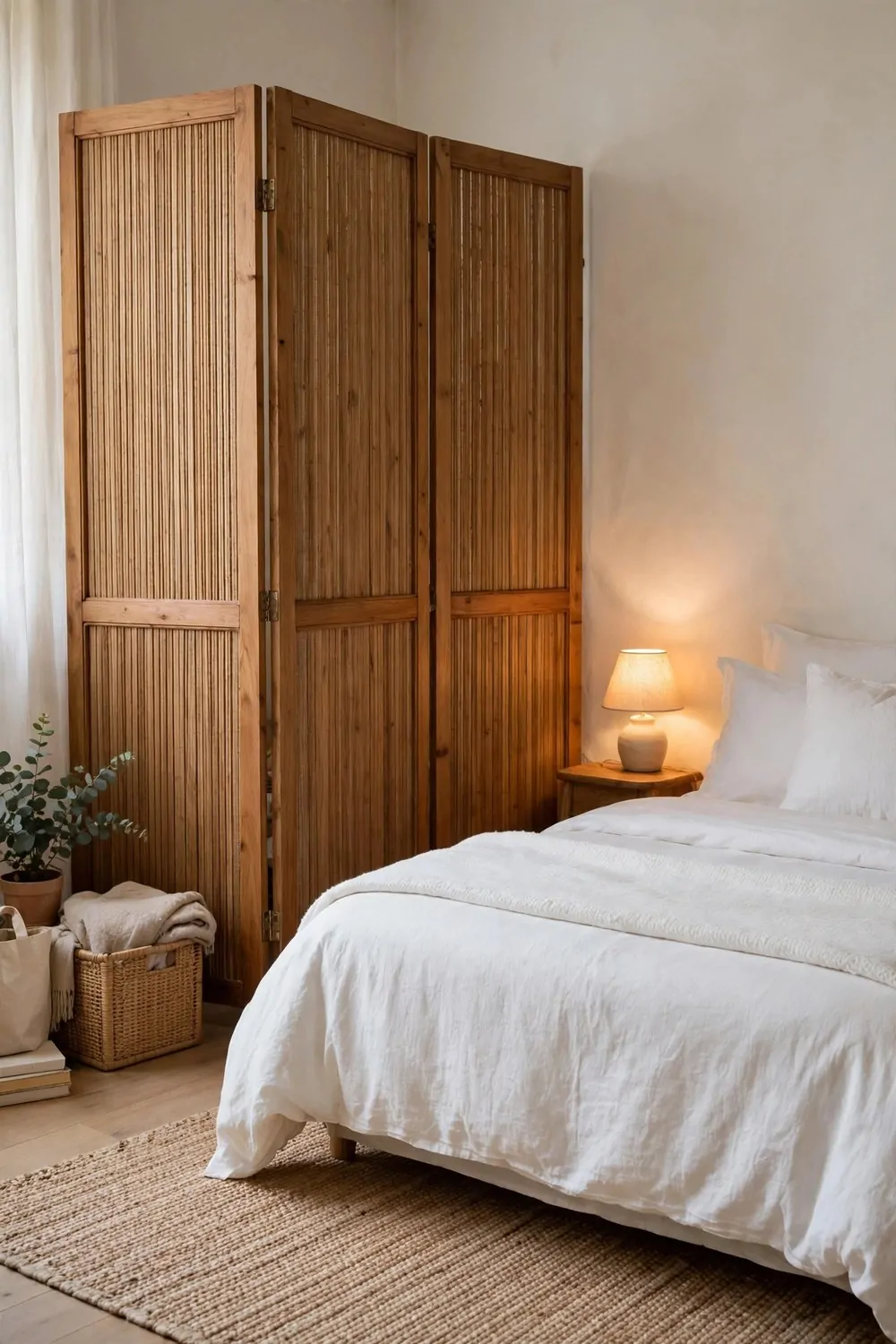
A studio bedroom with no walls is a bed in the middle of everything. You see it from the sofa, from the desk, and from the front door. It never quite feels like a bedroom.
A folding screen changes that without building anything. Three panels of wood and fabric, standing in a loose zigzag, and suddenly the bed has a room of its own.
Pick a screen that is taller than the bed but shorter than the ceiling. It should hide the bed from the living area when you sit down, without blocking the light from above. About five or six feet tall is right for most studios.
Place the screen at an angle, not in a straight line. A slight zigzag looks natural and stands steady. A straight line of panels wobbles and looks like a wall that gave up halfway. The zigzag is the whole trick.
Choose a screen with panels you can see a little through. Cane webbing, slatted wood, or linen stretched over a frame. A solid screen blocks light and makes the bed corner feel like a closet. A screen with a little see-through keeps the air moving.
Behind the screen, keep the bedroom simple. A made bed, one lamp, and a small stool for a book and a glass of water. The screen hides the mess from the living room, and the simple corner stays calm.
Screens move. That is their superpower. Slide it aside when friends come over and the studio opens up again. Pull it back out at night and the bedroom returns. No other divider is this flexible.
Fold it flat when you move house. A folding screen packs down to almost nothing and fits in a car. It is the most portable bedroom wall ever made.
One screen, one zigzag, and your bed finally gets a room to call its own.
16. The Art Corner Studio
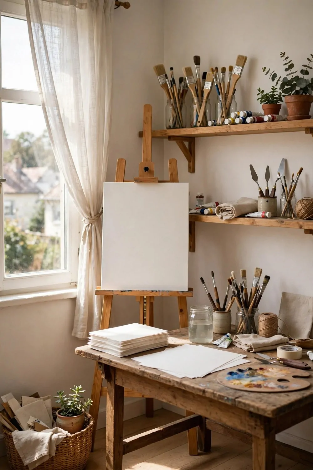
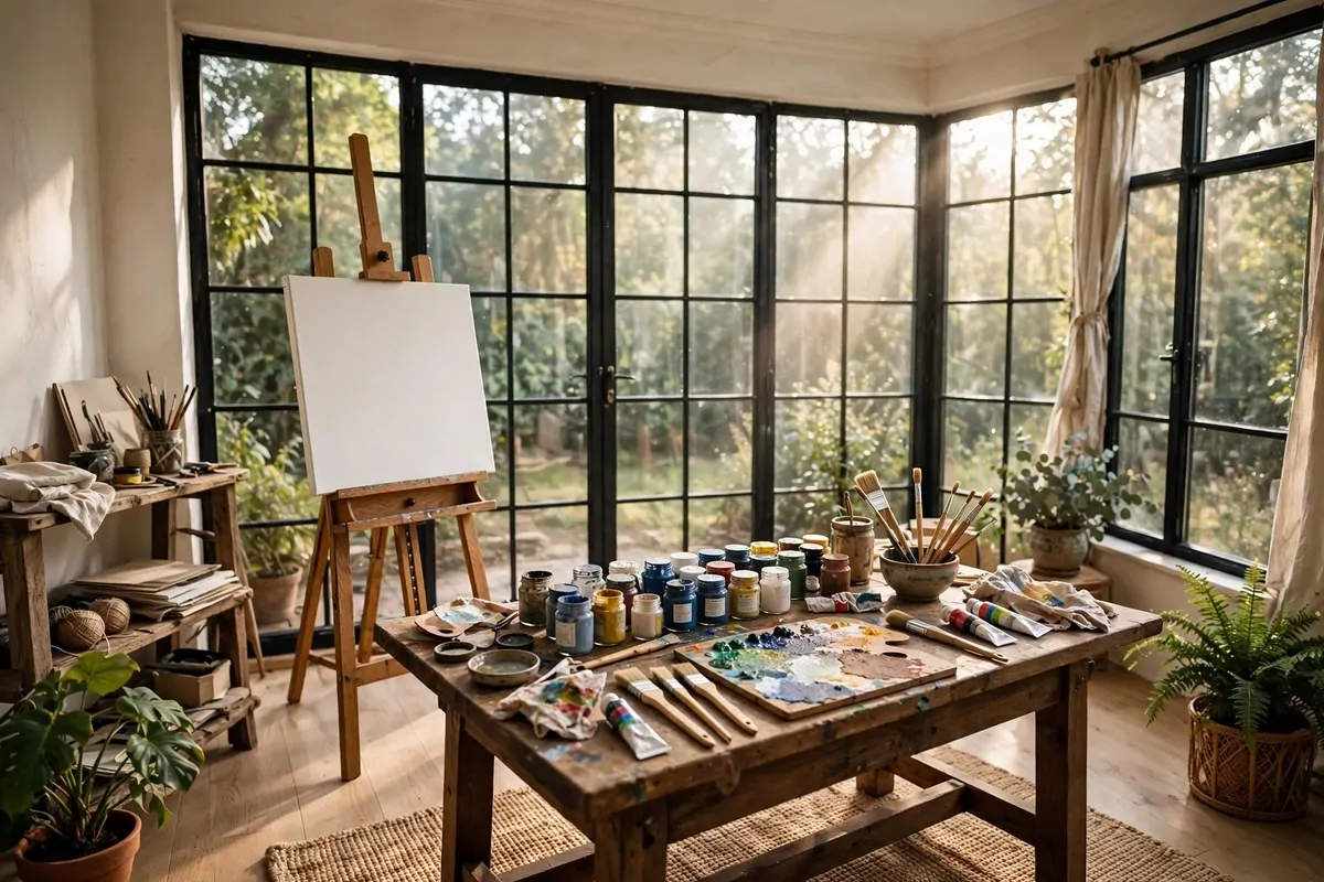
Every creative person needs one spot that is allowed to stay messy. Not the whole studio. Just one corner where the paint, the paper, and the half-finished ideas can live without apology.
The art corner is that spot. An easel by the window, a worktable, and shelves for supplies. It is small, it is working, and it is yours.
Put the art corner where the light is best. Near a window, ideally with north light that stays even all day. Good light matters more than good supplies. A cheap brush in good light beats an expensive brush in a dark corner.
Keep the supplies visible and close. Jars of brushes, tubes of paint, rolls of paper on a shelf at arm height. When the supplies are easy to reach, you start creating in spare minutes. When they are packed in boxes, you never start at all.
Protect the floor. A canvas drop cloth or a cheap flat rug under the easel catches the drips. Paint on a wood floor is a landlord conversation nobody wants. The drop cloth is the cheapest insurance in the studio.
A pegboard on the wall holds tools, scissors, tape, and reference photos. Everything hangs where you can see it, and the table stays clear for actual work. A clear table invites making. A cluttered table invites tidying instead.
Set a closing ritual for the art corner. Five minutes at the end of a session. Brushes washed, lids on, paper stacked. The corner can stay messy during the work, but a quick reset keeps it from swallowing the whole studio.
One corner, kept working, and your creativity gets a home address. The rest of the studio stays tidy, and the art corner stays gloriously alive.
17. Smart Storage Walls
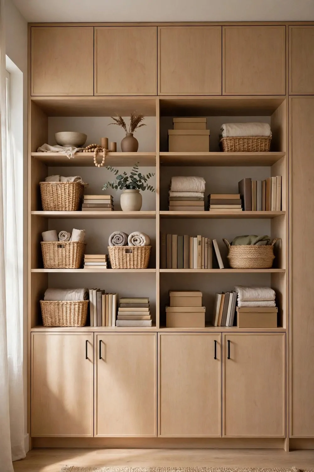
A studio has no spare rooms for storage. No attic, no garage, no second closet. The storage has to live on the walls, or it lives on the floor. Floor storage is how studios turn into obstacle courses.
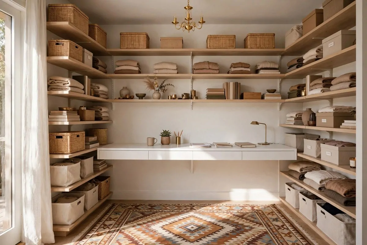
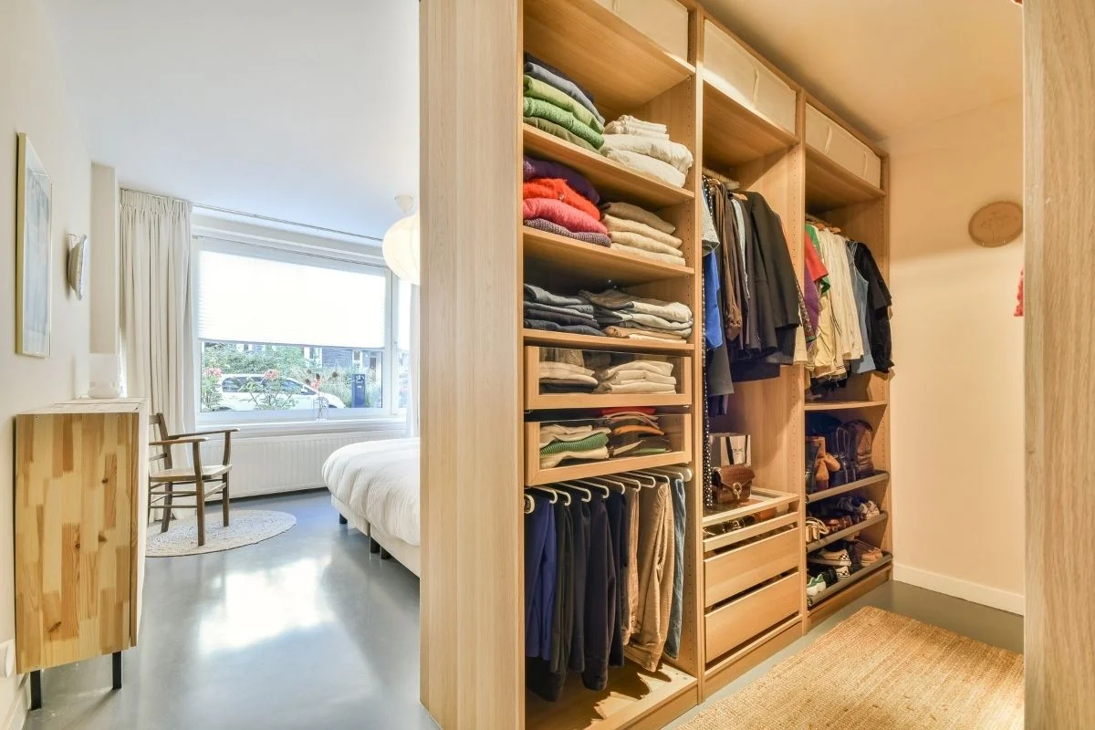
A storage wall fixes that. One full wall of cabinets and shelves, floor to ceiling, holding everything the studio owns. One wall works hard so the other three can breathe.
Build it in layers. Closed cabinets at the bottom for the ugly stuff. Open shelves in the middle for books and beautiful things. Closed boxes at the very top for the seasonal stuff you touch twice a year.
Keep the wall one color. All white, all pale wood, or all one paint color. A storage wall in one color reads as architecture, not furniture. Mixed colors read as a pile of boxes that grew into a wall.
Here is a simple plan for what lives where on a storage wall:
- Bottom cabinets: shoes, tools, cleaning supplies, heavy things
- Middle shelves: books, plants, framed photos, everyday dishes
- Top boxes: winter blankets, holiday decorations, luggage, keepsakes
- One open shelf at arm height: the things you grab every single day
Label the top boxes. A strip of tape and a pen is enough. Winter clothes, camping gear, old photos. Labels stop the guessing and stop the whole wall coming down when you need one thing.
Leave one shelf mostly empty. It gives the eye a resting place and gives you room to grow. A storage wall packed to the brim looks like it is about to burst. One breathing shelf keeps it calm.
One wall, working hard, and the rest of your studio gets its floor back.
18. The Balcony Extension
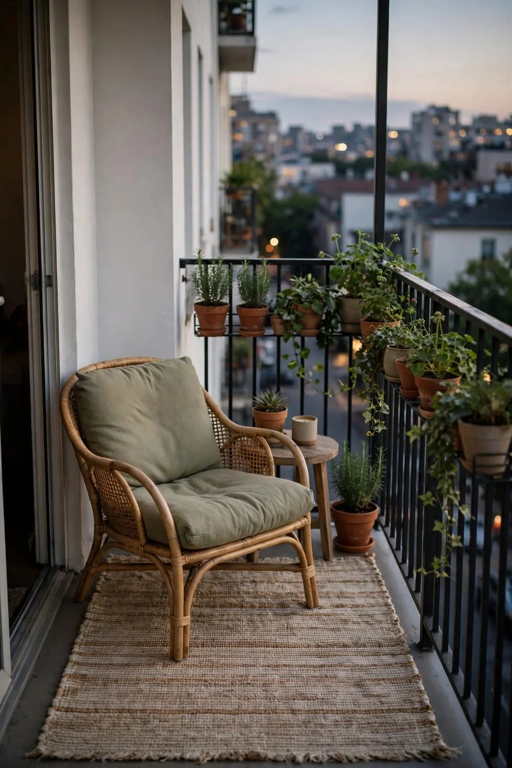
A balcony is a room without walls. Most of us treat it like a storage shelf for a dead plant and a broken chair. It deserves better. It is the cheapest extra room your studio owns.
Start with the floor. One outdoor rug, made for weather, turns concrete into a room. A flat weave rug in a pattern you love defines the space and makes bare feet happy. Indoor rugs on a balcony soak up rain and smell by the second week.
Add one comfortable chair and one small table. That is all a small balcony needs. A chair you love, a table for coffee, and the rug tying them together. More furniture crowds a balcony fast, and crowded balconies do not get used.
A potted plant at the edge softens the railing and gives you privacy. A tall grass or a leafy shrub in a heavy pot blocks the neighbor’s view without blocking the sky. Heavy pots matter, because wind on a balcony is stronger than you think.
String lights change a balcony after dark. One warm string along the railing turns the space into a little evening room. Solar ones charge all day and switch themselves on. No plugs, no fuss.
Keep a small outdoor box for cushions and throws. A waterproof deck box holds the soft things when it rains and doubles as an extra seat. Soft things left out in the rain go moldy fast, and moldy cushions ruin the whole idea.
Leave the rug out all season and shake it weekly. A quick shake and a sweep keeps it fresh. At the end of the season, roll it up and store it dry. A good outdoor rug lasts years if it spends winter indoors.
One rug, one chair, one plant. The balcony stops being a ledge and starts being the favorite room of the house.
19. The Almost-Empty Studio
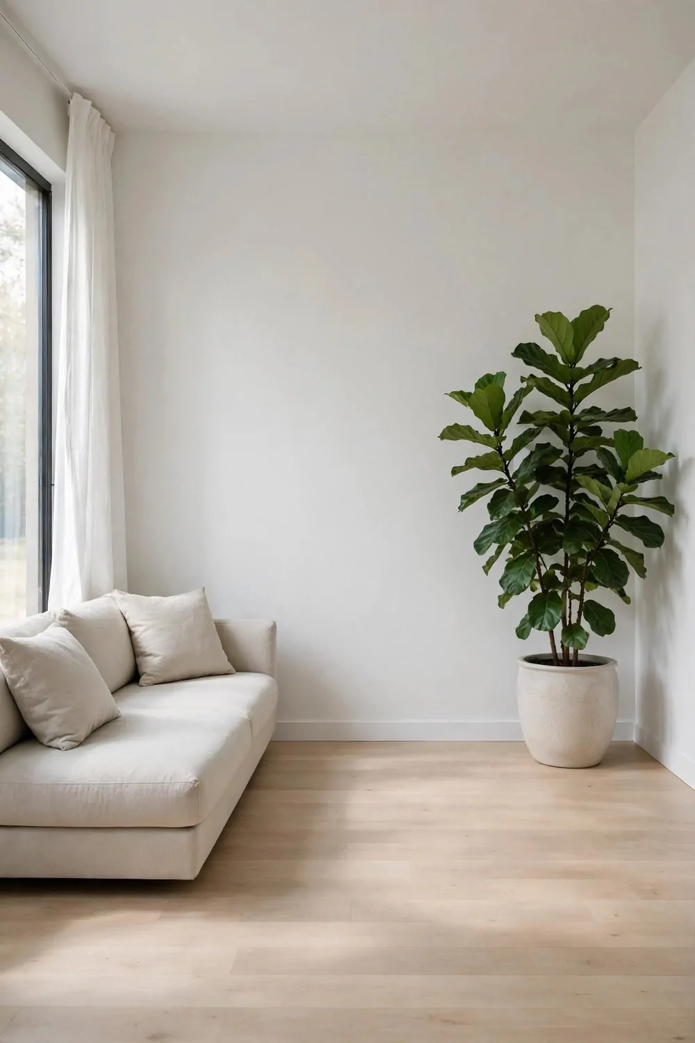
This look is the bravest one on the list. Almost nothing in the room. One sofa, one plant, one lamp. White walls, pale floor, and a whole lot of breathing space.
It sounds stark. In real life it feels like a deep breath. Your eyes rest everywhere. Your brain stops scanning for clutter. The room is quiet, and quiet rooms calm busy minds.
The almost-empty studio only works if every piece earns its place. The sofa must be comfortable, because it is the only seat. The plant must be healthy, because it is the only decoration. One weak piece ruins the whole effect.
Quality beats quantity here, completely. One good sofa beats three cheap chairs. One beautiful rug beats a pile of small mats. Buy fewer things, buy them once, and buy them well.
Storage must be invisible. Everything lives behind closed doors or in one tidy closet. The almost-empty look is not about owning nothing. It is about owning things that have a hidden home.
Clean lines matter. Furniture with slim legs, no fussy details, no busy patterns. The eye travels in straight calm lines, and the room feels bigger than its square footage.
This look is not for everyone. If you love objects, collections, and color, it will feel bare and cold to you. That is fine. The almost-empty studio is for people who feel calmer with less around them.
One sofa, one plant, one lamp, and a lot of air. If that sentence makes you exhale, this is your look.
20. Vintage Finds, New Life
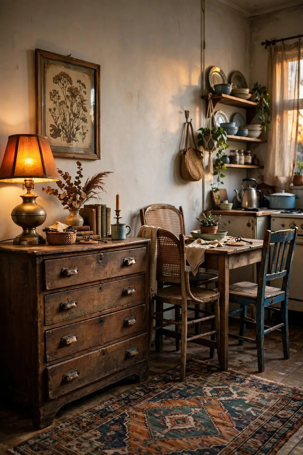
A studio full of brand new furniture can feel like a showroom. Nothing has a story. A studio with vintage finds feels like a life. Every piece has a past, and the past gives the room its soul.
Start with one big vintage piece. A wooden dresser, an old dining table, or a retro armchair. One strong old piece anchors the room, and the newer pieces gather around it naturally.
Thrift shops, flea markets, and online secondhand listings are treasure hunts. Go with measurements, not hopes. A beautiful dresser that does not fit through the door is just a beautiful problem.
Mix the eras. A 1960s lamp beside a 1990s wooden chair beside a brand new sofa. Mixed eras look collected over time. One era everywhere looks like a movie set, and movie sets are hard to live in.
Check vintage furniture before you buy. Open every drawer. Sit in every chair. Smell the inside of cupboards. A little wear is character. A wobbly leg or a musty smell is a project, and projects cost weekends.
Here are the vintage finds that give the most charm for the least money:
- A solid wood side table, sanded and oiled in one afternoon
- A retro table lamp with a new shade in a plain color
- A woven basket for blankets, books, or firewood
- A framed vintage print, hung a little lower than you think
- A patterned rug, cleaned properly, that warms the whole floor
Let the dents and scratches stay. A scratch on an old table is a story, not a flaw. Perfect furniture is boring anyway. The marks are what make the piece yours.
One old piece, loved well, and your studio stops looking like a catalog and starts looking like a home.
21. The One Color Pop Studio
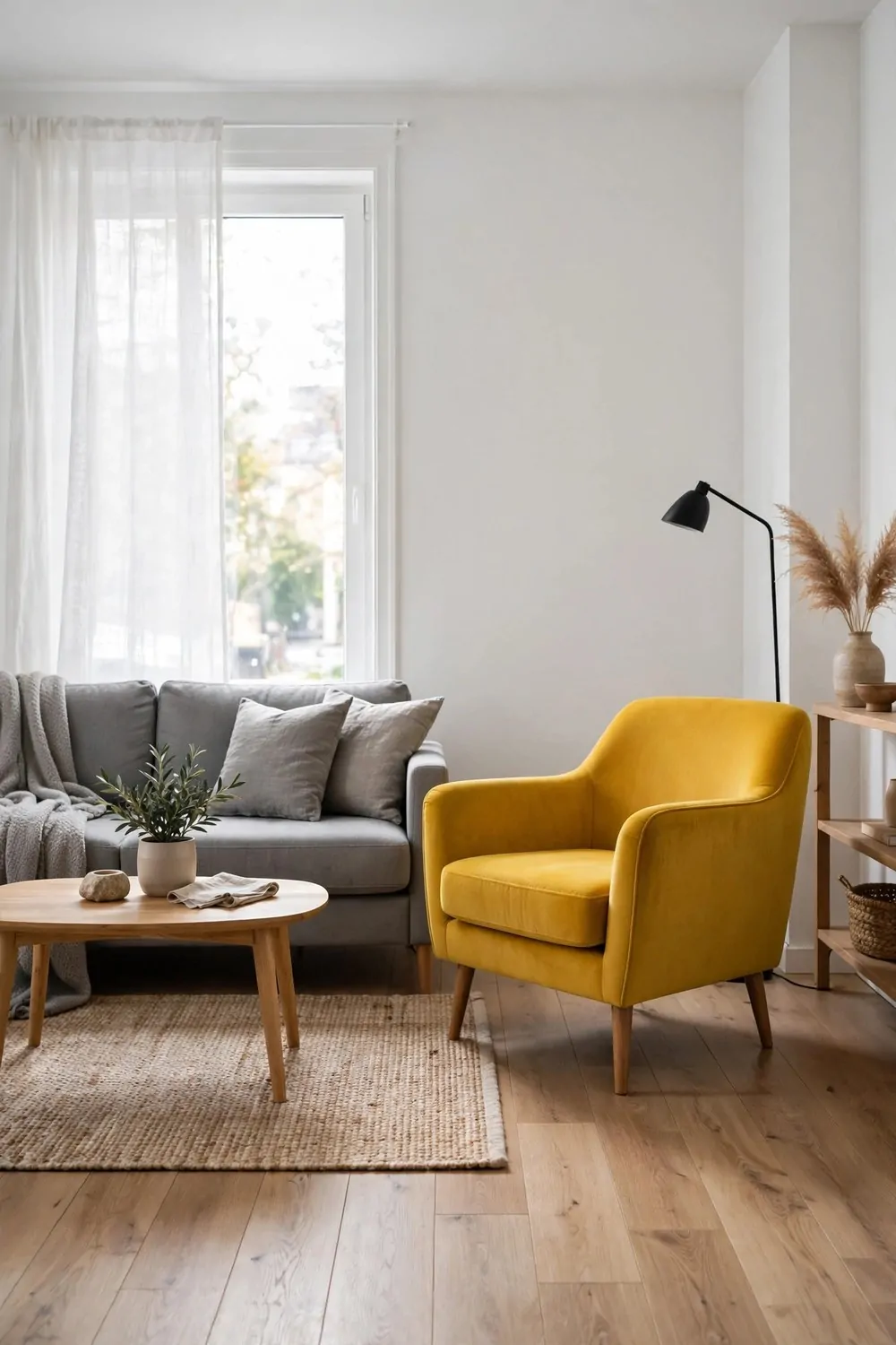
A neutral room with one loud thing in it. That is the whole idea, and it is one of the easiest looks to copy. Gray sofa, white walls, wood floor, and one mustard yellow armchair that steals every glance.
The pop works because everything else stays quiet. The quiet room makes the loud piece look deliberate. A loud piece in a loud room just looks like noise.
Pick your pop color with your heart, then commit to it. Mustard yellow, deep teal, burnt orange, or cherry red. The color should be one that makes you smile every time you see it. If it does not make you smile, it is the wrong color.
Repeat the pop color twice more, in very small doses. A vase, a book spine, a candle. Three repeats is the sweet spot. One repeat looks like an accident. Five repeats looks like a theme, and themes get tiring fast.
Keep the pop piece big and useful. An armchair, a rug, or a large artwork. A tiny pop disappears in a studio. A big pop holds the room together and gives your eye one place to land.
This look is easy to change with the seasons. Swap the cushion covers and the vase, and the whole room gets a new mood. The neutral base stays the same. The pop does all the changing.
If you rent, the pop is your best friend. You cannot paint the walls, but you can own a yellow chair. Color that moves with you is color that never costs a deposit.
One loud chair, two tiny echoes, and a quiet room that suddenly has a personality.
22. A Studio That Glows at Night
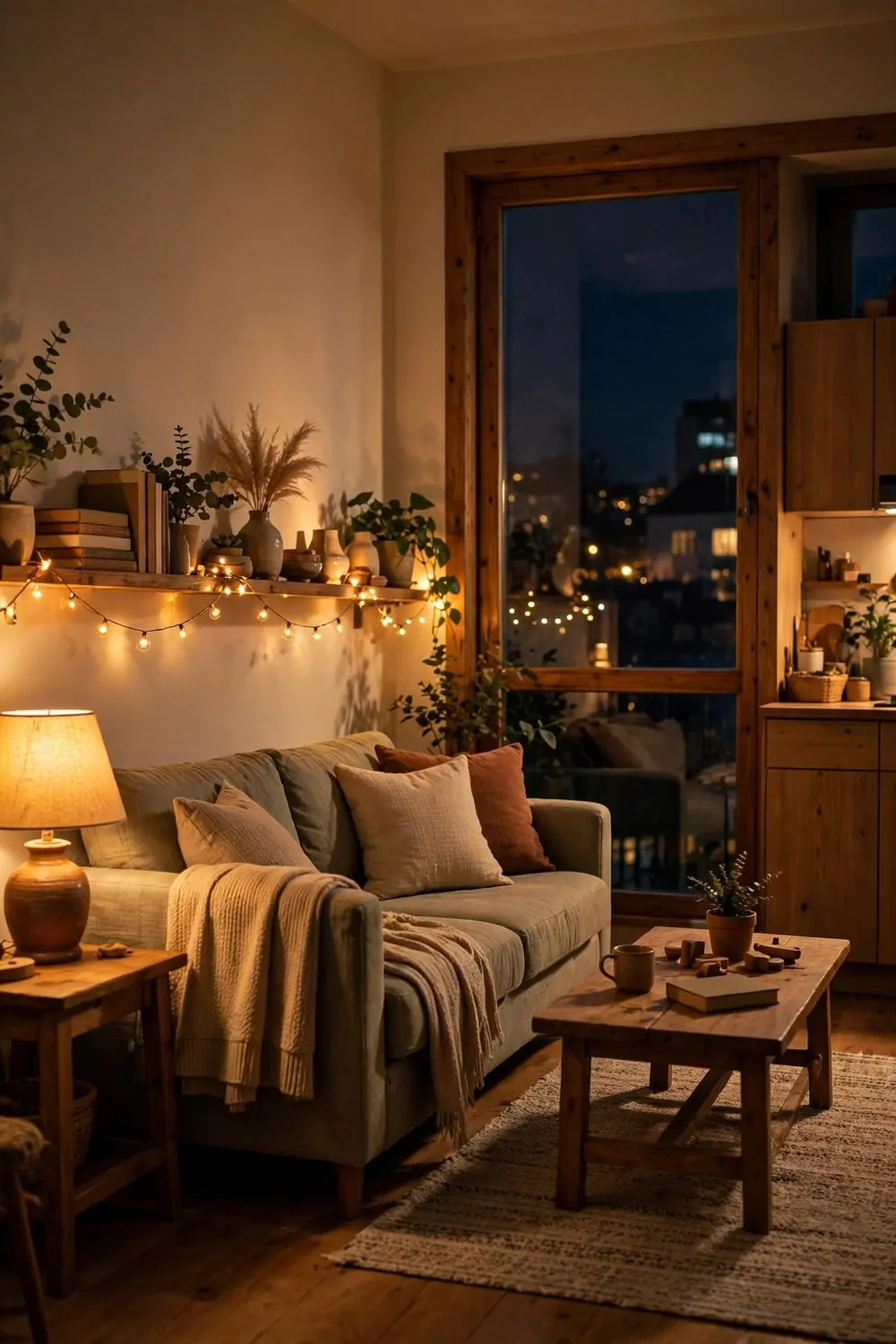
Studios look one way by day and another way by night. By day the window does the work. By night the lamps do. A studio that glows at night is a studio designed for evenings, and evenings are when you actually live in it.
The big ceiling light is the enemy here. It flattens everything and kills the mood. Turn it off at sunset and live by lamp light alone. The room will feel smaller in the best way. Cozy, not cramped.
Layer three kinds of light. A floor lamp by the sofa for reading. A small table lamp for glow. A string of warm lights along a shelf for magic. Three layers, three switches, and the room changes its mood with one click.
Warm bulbs, always. Around 2700K on the box. Warm light makes skin look good, food look good, and rooms feel like evening. Cool white light at night feels like an office that forgot to close.
Put one lamp on a timer. A lamp that switches itself on at dusk means you come home to a glowing room, not a dark box. It is a small luxury that costs almost nothing and feels wonderful every single day.
Candles count too, used safely. Three small candles on a tray down the middle of the table give warm light and a little ceremony. Keep them away from curtains and plants, and never leave them burning in an empty room.
Dim the screens at night. A glowing television or laptop fights the lamps and wins. Lower the brightness, and the room keeps its glow. Your eyes will rest better, and sleep will come easier.
A glowing studio is a studio that welcomes you home. Turn the big light off tonight and see what the lamps can do.
23. The Work-and-Sleep Split
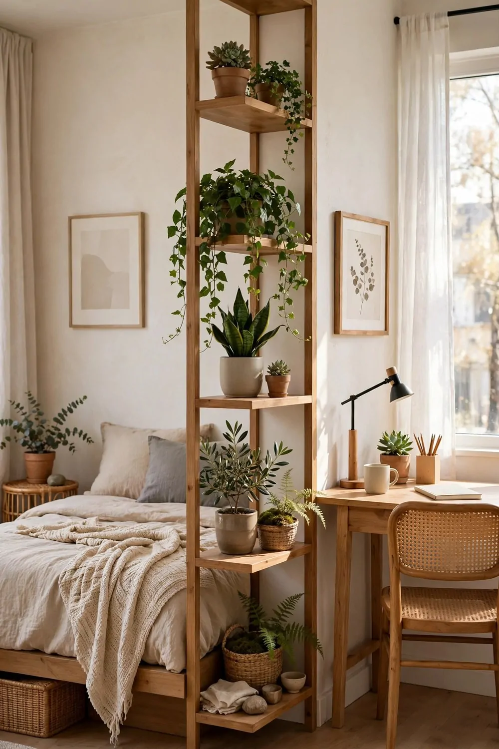
The hardest problem in a studio is the work-and-sleep split. Your desk and your bed share one room, and your brain cannot tell when the workday ends. Sleep gets lighter. Evenings feel shorter.
The fix is a divider that means something. Not a wall. A bookshelf, standing perpendicular to the wall, splitting the room into a sleep side and a work side. Both sides stay bright, and both sides get a job.
An open-back bookshelf is the best divider for this. It splits the room, stores your stuff, and still lets light through. Three jobs, one piece of furniture. A solid bookcase blocks light and makes the far side feel dark.
Fill the lower shelves with heavy things. Books, baskets, storage boxes. Heavy low and light high keeps the shelf steady and stops it feeling top heavy. Leave some shelves a little empty, because air is part of the design.
Style both sides of the shelf. You will see the back of it from the other zone, so make the back pretty too. A plant trailing down one side and a photo frame on the other does the job.
Set a shutdown ritual at the edge of the divider. At the end of the workday, close the laptop, walk around the shelf to the sleep side, and do not go back. The walk around the shelf is the commute. Your brain learns the boundary fast.
Keep work things on the work side only. Papers, chargers, and notebooks never cross the shelf. Sleep things stay on the sleep side. The divider only works if the stuff respects it.
One shelf, one ritual, and your brain finally learns when the workday is over.
24. The Craft and Create Studio
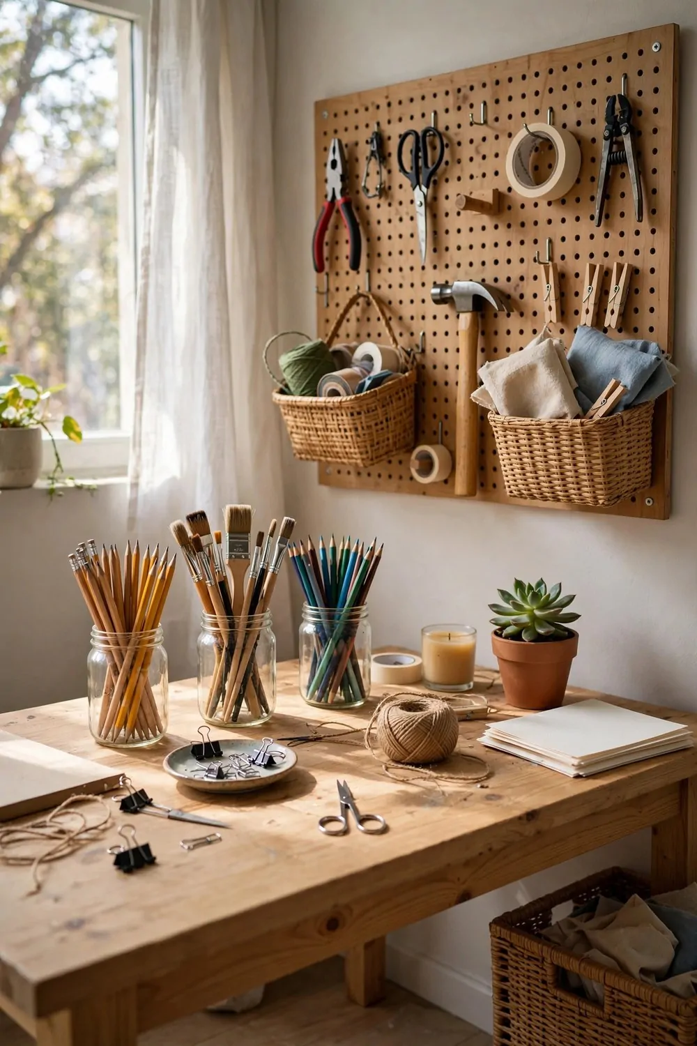
A studio that makes things needs a making spot. Not a corner that borrows the dining table. A real worktable, with supplies in reach and space to spread out.
The worktable should be bigger than you think you need. Craft projects spread. Fabric, paper, beads, and tools all want elbow room. A table that fits the project with room to spare gets used. A cramped table gets avoided.
A pegboard on the wall is the craft studio’s best friend. Tools, scissors, tape, ribbons, and reference photos all hang where you can see them. The table stays clear for work, and the wall becomes a working display.
Store supplies in clear jars and open baskets. Glass jars for buttons, beads, and thread. Baskets for fabric and yarn. When you can see the supplies, you use them. Hidden supplies get forgotten in a cupboard for years.
Here is the short list for a craft spot that actually gets used:
- A worktable at a height you can stand at, for cutting and gluing
- A comfortable chair for the slow stitching and painting hours
- A bright task lamp, because craft details need real light
- One shelf for finished pieces, so you can see your progress
- A small bin beside the table for scraps, emptied every week
Protect the table. A cutting mat or a sheet of thick cardboard saves the surface from knives, glue, and paint. A protected table is a table you are not afraid to make a mess on.
Tidy the table at the end of every session, just for five minutes. Tools back on the pegboard, scraps in the bin, project covered with a cloth. Five minutes keeps the craft corner from eating the whole studio.
One table, one pegboard, and your making gets a home. The dining table goes back to being a dining table, and everyone is happier.
25. The Fireplace Focal Point
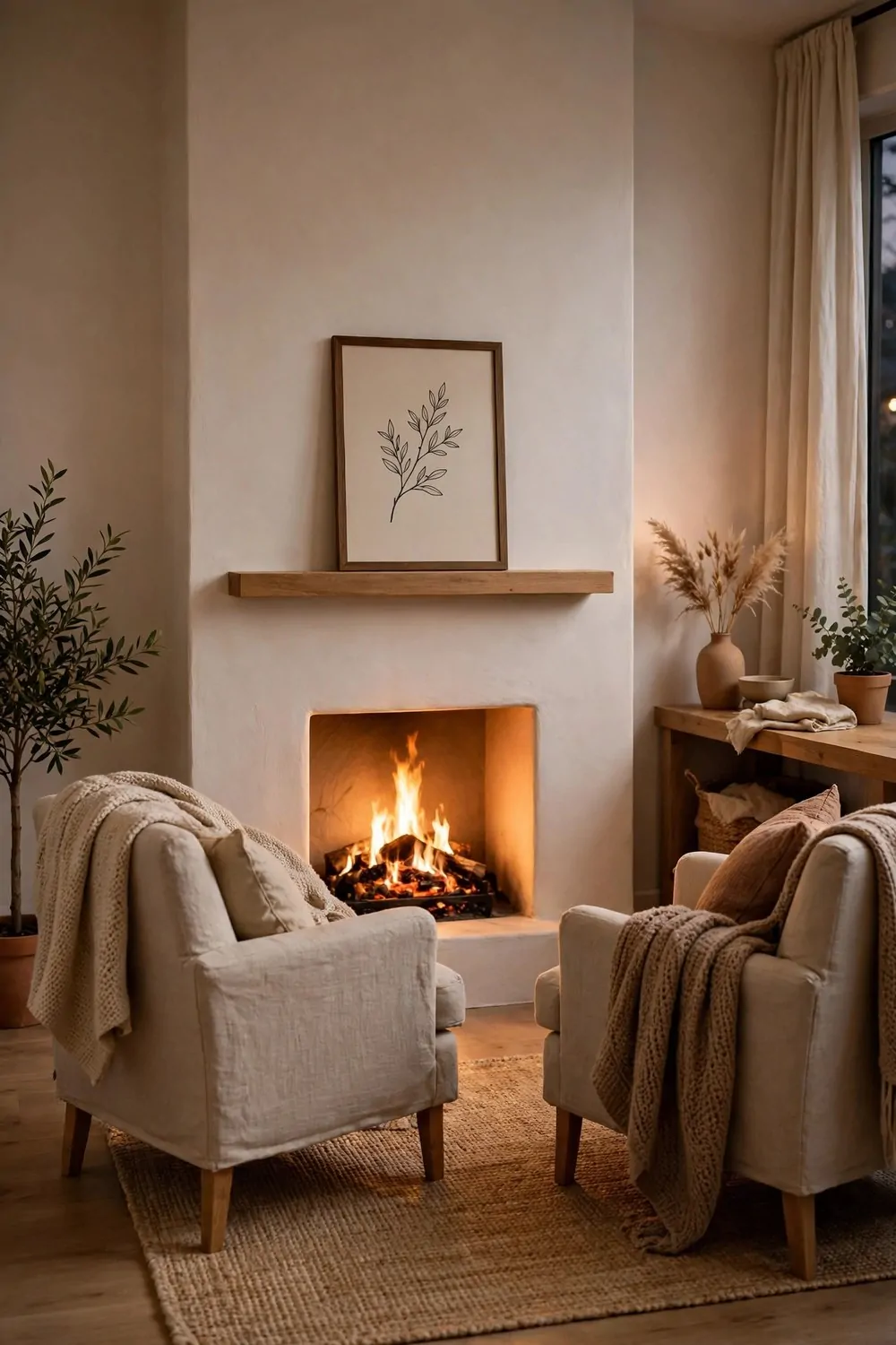
Every room needs one thing that draws the eye. In a studio, that one thing is often missing, and the eye wanders without landing. A fireplace, real or fake, gives the room its star.
If your studio has a real fireplace, you have already won. Arrange the furniture to face it. Two chairs, a small sofa, and a rug. The fireplace is the heart, and everything else orbits around it.
If you do not have one, fake it beautifully. An electric fireplace insert in a simple mantel surround gives the glow and the focal point without any chimney. It heats the room too, which is a bonus on cold evenings.
Keep the mantel simple. One framed print, one candle, one small plant. A crowded mantel fights the fire for attention. The fire should win. It is the star, and stars need a little space around them.
A mirror or a large artwork above the mantel finishes the look. It pulls the eye up and makes the wall feel tall. Hang it centered, with the middle at eye level, and the whole arrangement reads as one deliberate piece.
Arrange the seating in a loose half circle facing the fire. Not a straight row. A half circle feels like conversation. A straight row feels like a waiting room, and nobody wants to wait in their own home.
Light the rest of the room low in the evening. Let the fire glow do the work. Lamps stay on, but dim. The flicker is the show, and everything else is the audience.
One focal point, and the whole studio knows where to look. The eye lands, rests, and the room feels finished.
26. The Scandi Light Studio
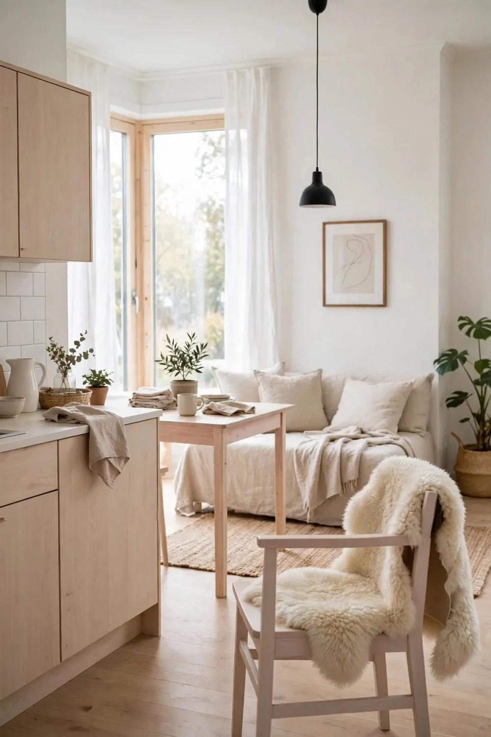
Scandinavian style is built for small, dark winters. Pale wood, white walls, soft textiles, and light everywhere. It is the look that makes a small studio feel bright even in February.
Start with the lightest wood you can find. Pale birch, ash, or whitewashed pine. Dark wood eats light. Pale wood bounces it. In a small room, that bounce is worth real money.
Keep the walls white and the floors pale. The whole room becomes a light box. Sunlight comes in the window and bounces off every surface. Even a gray day feels brighter in a white and pale wood room.
Add softness with textiles. A sheepskin over a chair, a wool throw on the sofa, linen curtains that move in the breeze. Scandinavian rooms are soft to the touch. Hard and cold is the opposite of the look.
Keep the furniture low and leggy. Low sofas, slim-legged tables, chairs you can see the floor under. Visible floor is visible room, and the eye travels further in a room where the floor keeps going.
Plants are part of the look, not an extra. One tall plant in the corner, one trailing plant on a shelf. Green against white and pale wood is the fresh note that keeps the room from feeling sterile.
Clutter is the enemy of this style. Everything has a home, and the home is behind a closed door. A Scandi studio is tidy not because the people are tidy, but because the storage is good.
Pale, soft, bright, and calm. If your studio faces north or your winters are long, this look was designed for you.
27. The Eclectic Collector Studio
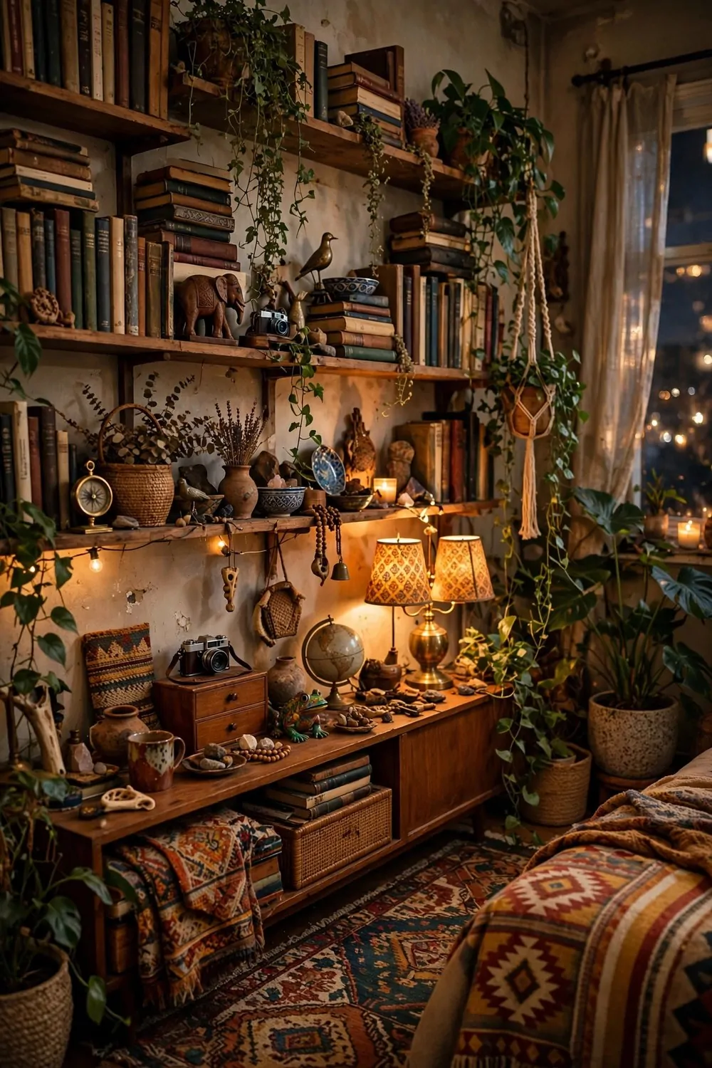
Some studios look designed. This one looks lived. Mixed patterns, souvenirs from trips, books stacked sideways, plants everywhere, and not a single matching set in sight. It is the collector’s studio, and it has more personality than any showroom.
The rule here is love, not matching. Every object in the room is there because you love it, not because it matches the sofa. A rug from one trip, a lamp from a flea market, a chair your grandmother gave you. The mix is the style.
Keep one steady note running through the chaos. One wood tone, one metal finish, or one repeated color. That single steady thread holds the whole collection together. Without it the room tips from eclectic into messy.
Layer the patterns. Stripes with florals, checks with geometrics. The trick is scale. One big pattern, one medium pattern, one small pattern. Different scales play nicely together. Same scale patterns fight.
Books are the backbone of this look. Stack them sideways, stand them upright, pile them on the floor beside the chair. Books add color, height, and life. A collector’s studio without books is like a kitchen without a stove.
Rotate the objects. Every few months, swap a few pieces between rooms, or bring a stored treasure out and retire another. Rotation keeps the room feeling fresh without buying anything new. The collection stays alive.
Dust the shelves weekly. A collector’s studio gathers dust faster than a minimal one, because there are more surfaces. A quick dust keeps the treasures looking loved instead of neglected.
Collected, loved, and a little bit wild. If your home tells your story, this is your dream space.
28. Your Dream Space, One Change at a Time
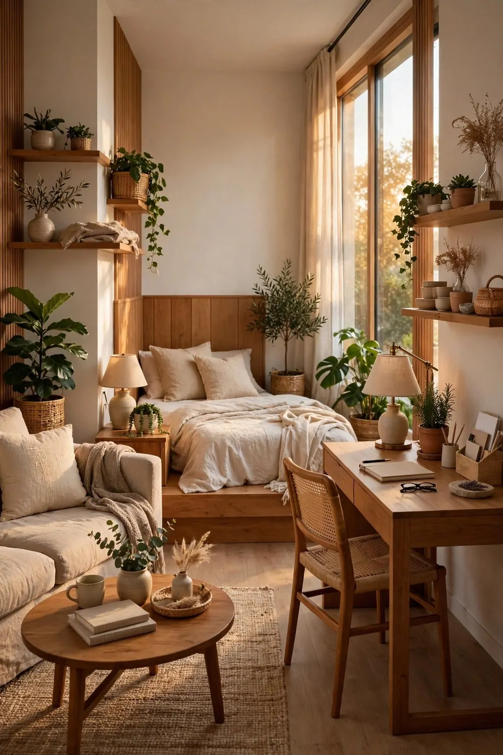
Here we are at the end of the list. Twenty eight looks, and your studio is still the same room it was this morning. That is fine. Dream spaces are not built in a day. They are built one change at a time.
Pick one look from this list. Just one. The one that made you stop scrolling and picture it in your own room. Start there, and start this weekend.
Maybe it is the window-first desk. Maybe it is the gallery wall. Maybe it is simply turning the sofa to face the view. Small moves, made with care, change a room more than a shopping spree ever will.
Do the change properly. Move the furniture, hang the frames, plug in the lamps. Live with it for a week before you judge it. New arrangements feel strange for the first two days. Then they feel like they were always there.
Then pick the next look. And the next. Slow design beats fast design every time, because slow design stays. Fast design ends up in a box in the garage by winter.
Keep a photo of your studio on your phone. Take a new one after every change. The photos show you progress you cannot see day to day. On a tired evening, scroll back to the first photo and see how far the room has come.
Your dream space is not a different apartment. It is this apartment, with a few looks stolen and made your own. The listing photo promised you a dream. These 28 looks are how you build it for real.
Save this list. Pin the looks you love. Start with one change this weekend, and tell me which look you picked first. I am still torn between the reading corner and the gallery wall. You tell me yours.