22 Small Studio Design Layouts That Use Every Inch

The rug in my studio sat in the same spot for three years. One Saturday I dragged it six inches to the left, and the whole room changed its mind about what it was for.
That sounds too small to matter. It mattered a lot. The rug moved, so the sofa moved. The sofa moved, so the walkway moved. And once the walkway moved, my little one-room home finally had a bedroom side and a living side, instead of one big blurry middle.
That is what Small Studio Design really is. It is not about buying clever furniture. It is about deciding where things go, and letting the floor plan do the work that walls usually do.
A studio is one room. You sleep in it, you eat in it, you work in it, and you watch films in it. When every job happens everywhere, the whole place feels messy even when it is clean. A good layout gives every job its own patch of floor.
These 22 Small Studio Design layouts do exactly that. Each one is a different way to arrange the same small rectangle. Rugs, sofas, shelves, beds and light do the dividing. No builder needed. Most of them cost nothing at all.
You do not need all 22. You need one that fits your room. Read through them, picture your own floor, and steal the layout that makes you say, oh, that would work here.
1. The L-Shaped Split
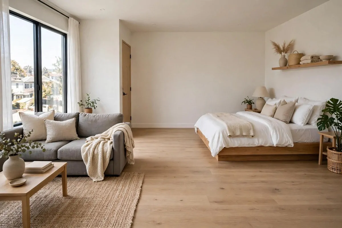
The L-shaped split is the simplest layout in this whole list. You push your living furniture into one corner and your sleeping furniture into the other, and the room bends into an L.
Put the sofa and the coffee table in the corner farthest from the door. That becomes the living room. Put the bed in the opposite corner, near the quietest wall. That becomes the bedroom.
The empty middle is the hallway. It connects the two arms of the L. Do not fill it with stuff. The empty middle is what makes the split read as two rooms instead of one crowded one.
A rug under the sofa locks the living arm in place. A smaller rug, or even just a soft throw by the bed, marks the sleeping arm. Your feet learn the two zones fast.
This layout works best in a square-ish studio. If your room is long and thin, the L still works, but you bend it less. Think of it as a soft turn, not a hard corner.
I like this layout because it needs no new furniture. You just slide what you already own into two corners and leave the middle alone. Ten minutes of pushing furniture, and the room feels twice as thoughtful.
Keep the walkway wide enough to carry a laundry basket through. If you have to turn sideways to get past the sofa, the L is too tight. Pull the sofa six inches back and try again.
One lamp in each arm finishes the trick. A floor lamp by the sofa, a small warm lamp by the bed. Two pools of light, two rooms. That is the whole magic of the L-shaped split.
2. The Alcove Bed Nook
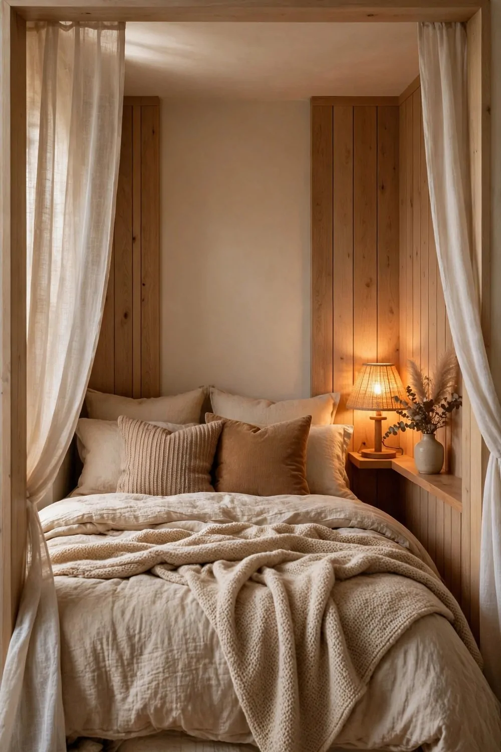
Some studios have a little alcove. A shallow nook off the main room, just big enough for a bed and not much else. If you have one, you have already won half the layout game.
Put the bed in the alcove and nowhere else. That nook becomes the bedroom, full stop. The main room stays free for living, eating and working, and your bed never stares at you during dinner.
A curtain across the alcove opening adds privacy without a wall. Sheer fabric keeps the light moving. Heavier fabric gives you real darkness for sleep. Pick the one your sleep needs.
If the alcove is very shallow, use a bed with no headboard, or a low platform bed. Tall headboards eat the little depth you have. Low and simple wins in a nook.
Storage goes under the bed here. Flat boxes, drawers, or a lift-up base. The alcove has no room for a dresser, so the bed has to hold the clothes too.
I once lived in a studio where the alcove fit the bed with about eight inches to spare on each side. It felt like sleeping in a little cave, in the best way. Cozy, dark, quiet.
Keep the nook tidy, because you see it from the main room all day. A made bed reads as a calm corner. An unmade bed reads as a mess you cannot hide.
No alcove in your studio? You can fake one. A tall open shelf or a curtain rod across one corner makes a pretend nook. It is not as good as the real thing, but it gets you most of the feeling.
3. The Galley Kitchen Wall
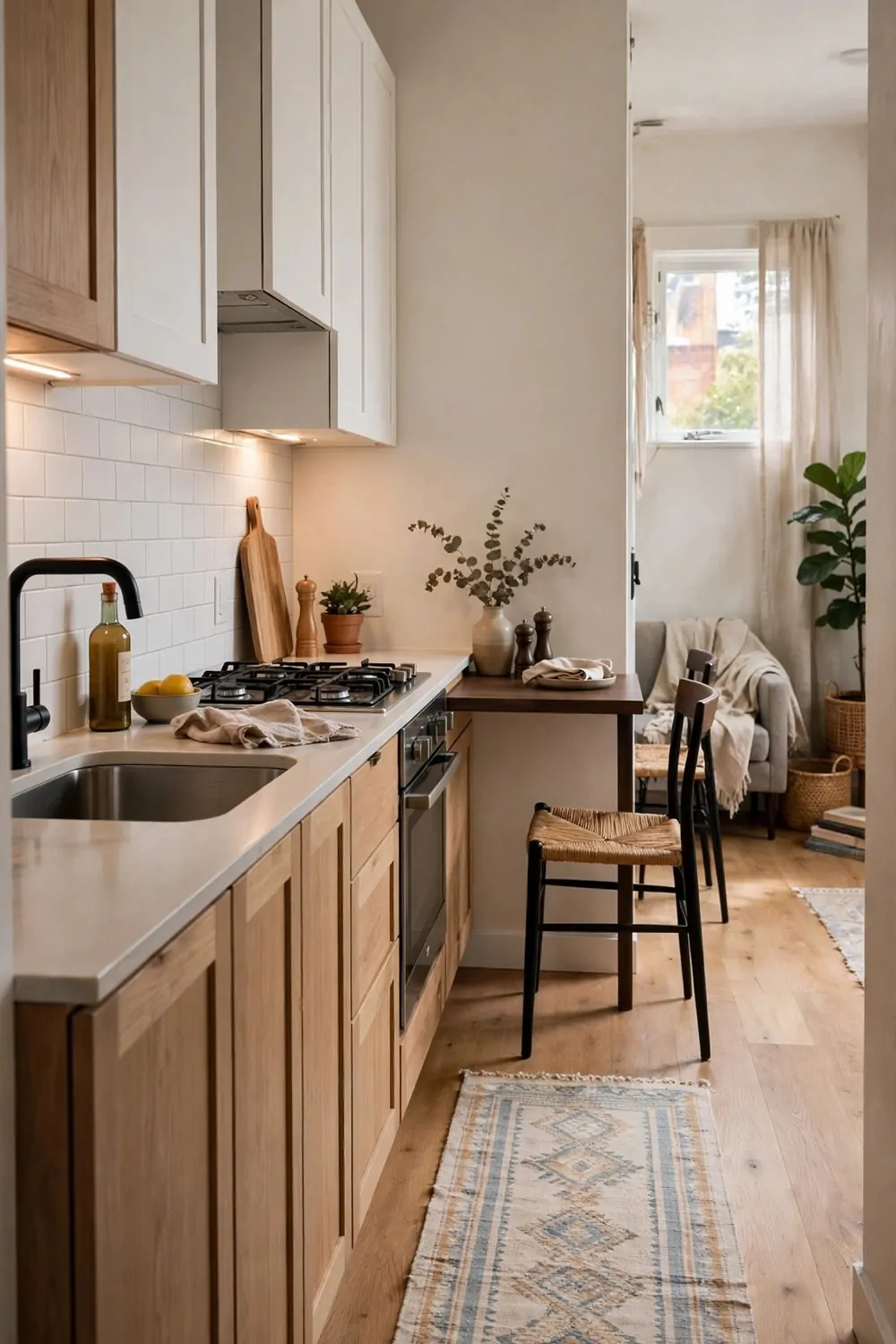
In a galley studio, the kitchen runs along one wall like a little train station. The trick is to keep everything else off that wall, so the kitchen stays a kitchen and does not leak into the whole room.
Line the kitchen wall with your cooking zone only. Counters, stove, sink, and the things you use every day. Nothing else lives on that wall. No desk, no bookshelf, no shoe pile.
Put a narrow table or a small island parallel to the kitchen wall, a few feet out. That table is the border. On one side is cooking. On the other side is living. Your body feels the border every time you walk around it.
A runner rug along the kitchen floor marks the work lane. It also saves your feet, because kitchen floors are hard and you stand there a lot.
Keep the counters clear. In a galley kitchen, the counter is your only work surface, so a pile of mail on it is a real problem. Give the mail its own little tray somewhere else.
I learned this layout the hard way. My first studio had the kitchen on one wall and I put my desk right beside the stove. Every work call smelled like lunch. Moving the desk to the far wall fixed my whole day.
Light the kitchen wall brightly. Under-cabinet lights or one strong strip light makes cooking easy and makes the kitchen wall feel like its own room.
This layout is honest. It does not pretend the kitchen is anything else. It just gives it one wall and keeps the rest of the room free.
4. The Floating Sofa Layout
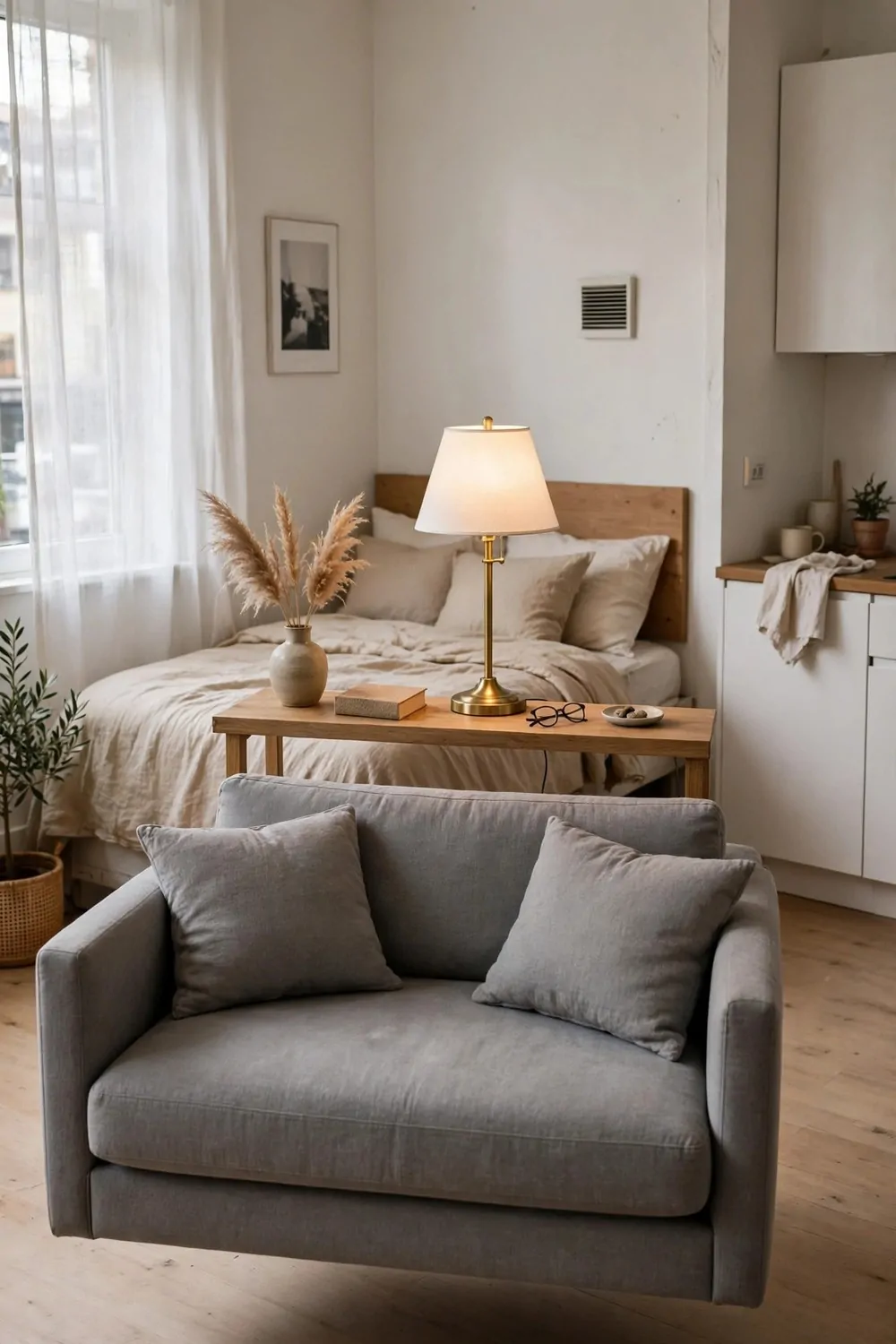
Most people push the sofa against the wall. In a studio, that wastes your best dividing tool. Pull the sofa away from the wall and let it float in the middle of the room.
A floating sofa splits the room into two sides without blocking light. Behind it is the sleeping zone. In front of it is the living zone. The back of the sofa is the wall.
Leave about two feet behind the sofa for a walkway. That gap is the hallway between the zones. It feels narrow on paper, but in real life it is plenty.
Put a slim console table behind the sofa. It gives you a spot for a lamp and a book, and it stops the back of the sofa from looking bare. It also keeps the sofa from drifting when you flop onto it.
A rug under the front legs of the sofa anchors the living side. The rug plus the sofa back is a boundary your brain accepts right away, even though no wall exists.
This layout needs a sofa with a decent-looking back. If the back of your sofa is ugly, throw a folded blanket over it or push the console table tight against it. Problem solved.
I did this in a studio with one big window. The sofa faced the window, the bed hid behind it, and from the sofa I never saw the bed at all. It felt like a real living room.
Turn the sofa so it faces the best view you have. The window, the bookshelf, the television. The floating sofa layout is about facing the good stuff and putting your back to the rest.
5. The Corner Anchor Layout
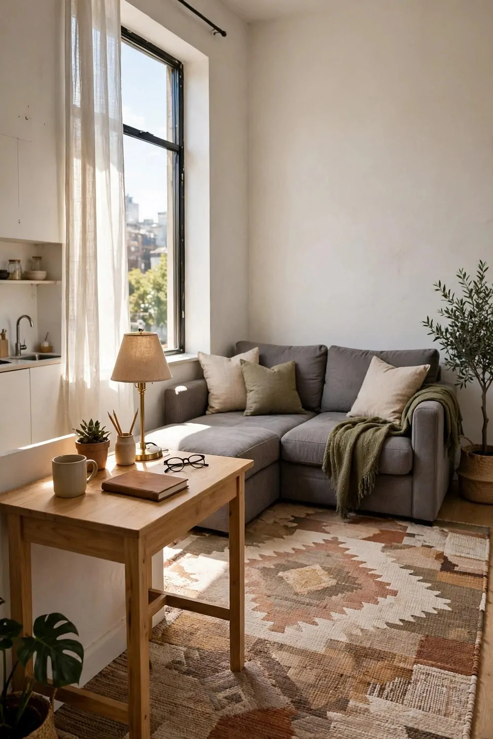
Every studio has one corner that feels solid. Maybe it has the best light, or the longest wall, or the least foot traffic. That corner is your anchor. Build the whole layout around it.
Put your biggest piece of furniture in the anchor corner. Usually that is the sofa, or the bed. One big piece, placed with care, sets the tone for everything else in the room.
Arrange the rest of the furniture in a loose arc around the anchor. The desk goes near the window. The dining spot goes near the kitchen. The anchor holds the middle together.
This layout works because it gives the eye one place to land. Without an anchor, a studio feels like furniture floating in space. With one, the room feels planned, even when the plan is simple.
Pick the corner farthest from the front door for the anchor. The door corner is traffic. The far corner is calm. Calm corners hold big furniture better.
A large rug under the anchor piece makes it feel even more settled. The rug says, this is the heart of the room. Everything else orbits around it.
I have used this layout in two different studios. In the first, the anchor was the bed in the far corner. In the second, it was the sofa. Both times, the room felt bigger once one corner took charge.
Do not put two big pieces in two different corners and hope they balance. That just splits the room into two camps. One anchor, one heart. The rest follows.
6. The Murphy Bed Wall
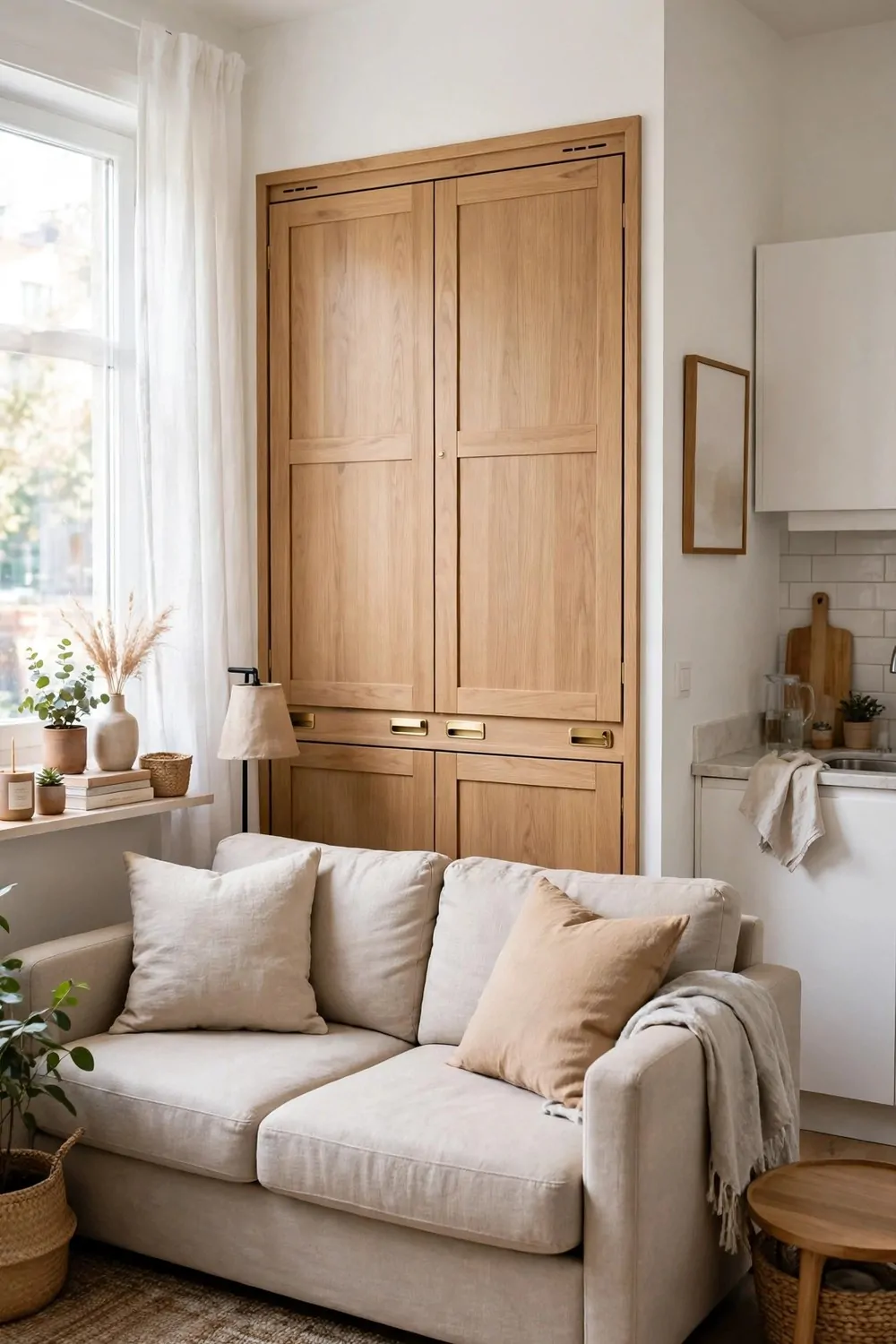
A Murphy bed folds up into the wall, and the whole room changes jobs with it. Daytime, the wall holds a cabinet and the floor is a living room. Nighttime, the bed comes down and the room is a bedroom.
This is the layout for people who want a real bed and a real living room in the same patch of floor. No sofa bed. No cushions that never lie flat. A proper bed that disappears.
Put a sofa in front of the closed Murphy bed. During the day, the room reads as a normal living room. At night, the sofa slides aside and the bed folds down. Two rooms, same floor, ten seconds apart.
Keep the bedding on the bed when you fold it up. Good Murphy beds have straps that hold the pillows and duvet in place. That is the whole point. No remaking the bed every night.
You need a solid wall for this layout. A Murphy bed pulls on its fixings every time it folds. Brick or stud walls work well. A thin partition wall does not, so check before you buy.
Here is how the costs and effort compare for the main bed options in a studio:
| Bed option | Floor space freed each day | Effort to set up |
|---|---|---|
| Murphy bed | A whole living room | One pull, ten seconds |
| Sofa bed | Very little, it stays put | Fold out cushions nightly |
| Loft bed | The space underneath | None, but you climb nightly |
| Daybed | None, it doubles as a sofa | Move cushions each night |
It costs more than a rug or a curtain. I will not pretend otherwise. But for some studios it buys back the most floor space of any layout on this list, and that is worth a lot.
Make folding the bed part of your morning routine. Bed up, curtains open, kettle on. Ten seconds, and the studio is a living room again. The routine is what makes the layout stick.
7. The Loft Bed Over the Desk
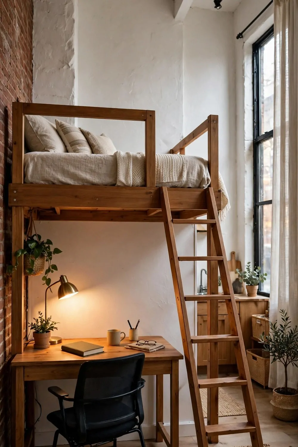
When the ceiling is high enough, the loft bed layout stacks your life vertically. The bed goes up top. The desk goes underneath. One patch of floor does two jobs.
Check your ceiling height first. You need to sit up in bed without hitting your head, and sit at the desk without ducking. If you cannot do both, pick a lower platform bed instead.
Make the space under the loft a real work zone. A desk, a lamp, a small shelf. Not a storage cave. If the underneath feels like a cave, you will never want to work there.
A solid ladder matters more than a clever one. You climb it half asleep every night. Wide steps and a good handhold beat a skinny ladder every single time.
Guard rails are not optional. Even adults roll in their sleep. A rail on the open side is the difference between a loft bed and a bad night.
Keep the bedding simple up top. Fewer pillows means less stuff tumbling off the edge. A fitted sheet, a duvet, one good pillow. That is plenty when the bed is up high.
String lights or a small clip lamp under the loft make the desk zone feel cozy instead of shadowy. Light is what turns the underneath from a gap into a room.
I love this layout for students and anyone who works from home. Your office is always set up, your bed is always made, and they never fight over the same floor.
If a full loft feels too high, try a mid sleeper. The bed sits lower, the space underneath holds a desk or drawers, and the climb is much friendlier. You still win the floor back.
8. The Diagonal Layout
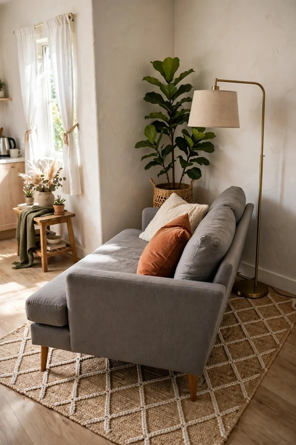
Most people push every piece of furniture flat against a wall. The diagonal layout breaks that habit. You angle one key piece, usually the sofa or the bed, and the whole room loosens up.
Angle the sofa at about forty-five degrees in a corner. Suddenly the corner behind it becomes useful. A plant fits there. A floor lamp fits there. A little reading spot appears out of nowhere.
The diagonal line also makes the walkway feel wider. Straight lines of furniture make a room feel like a corridor. One angled piece breaks the corridor feeling and gives the eye somewhere interesting to go.
This layout works best in a square studio. In a long thin room, diagonals eat floor space you cannot spare. Squares can afford one bold angle. Rectangles usually cannot.
Do not angle everything. One angled piece is a design choice. Five angled pieces is chaos. Pick the sofa or the bed, angle it, and keep everything else straight.
A rug under the angled piece is almost required. The rug shows the angle was on purpose. Without the rug, an angled sofa just looks like it drifted.
I tried this layout with my desk once. Angled toward the window, it caught the light beautifully, and working felt less like sitting in a box. Small angle, big mood change.
Measure the corners before you commit. An angled sofa needs a little extra room at the sides. If the angle blocks the door swing or the closet, straighten it back out.
9. The Entryway-First Layout
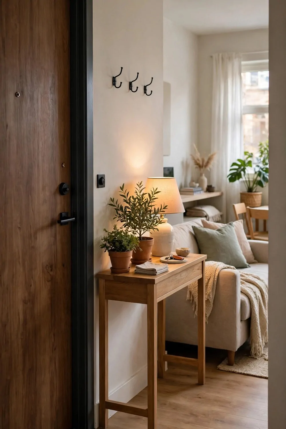
The first thing you see when you open the front door sets the tone for the whole studio. The entryway-first layout plans that first view on purpose, instead of letting it happen by accident.
Put something calm right in the sightline from the door. A tidy bookshelf. A plant on a small table. A neat console with a lamp. Not the bed. Not the drying laundry. The first view should say, this home is calm.
Keep the entry zone clear and narrow. A small mat, hooks for coats and keys, and nothing else. The entry is a passage, not a storage room. If it fills up, the whole studio feels cluttered the second you walk in.
Place the living zone just past the entry, so you walk into the nicest part of the room first. The sleeping zone goes farthest from the door. Guests see the living room. You keep the bedroom private.
A folding screen just inside the door can hide the bed from the entry view. Open it when friends visit. Fold it away when it is just you. Flexible privacy, no building work.
I once lived in a studio where the front door opened straight onto the bed. Every visitor saw my unmade duvet first. A simple screen fixed it in one afternoon, and I wished I had done it a year earlier.
Keep shoes by the door, not in the middle of the room. A small tray or a slim shoe rack in the entry stops shoes from migrating across the whole floor.
This layout is about manners. Your home greets you at the door. Make the greeting a good one, and the rest of the room follows.
10. The Window Work Zone

The window is the best desk spot in any studio. Daylight is free, the view rests your eyes, and work feels less like sitting in a box. The window work zone layout builds the whole room around that one fact.
Put the desk right against the window wall, facing out or sideways to the glass. Facing the window gives you the view. Sideways gives you light without screen glare. Try both for a day and keep the one your eyes prefer.
Keep the desk small and the surface clear. A window desk that collects clutter blocks the light, which defeats the whole point. Laptop, lamp, notebook, mug. Everything else lives on a shelf nearby.
A sheer curtain softens harsh sun without killing the light. If the afternoon sun hits your screen, the sheer curtain is the cheapest fix there is. It also makes the window look finished.
Put the bed as far from the window desk as the room allows. Work and sleep need distance, even in one room. If the bed is right beside the desk, your brain never quite clocks off.
I worked from a window desk for two years. On hard days I would look up at the sky for ten seconds, and it genuinely helped. A window is the cheapest wellness upgrade a studio can have.
At the end of the workday, close the laptop and clear the desk. That little closing ritual tells your brain work is done. The window desk becomes just a window again.
If your studio has two windows, lucky you. Put the desk at one and the reading chair at the other. Two window zones, two moods, one small room.
11. The Island Divider Layout
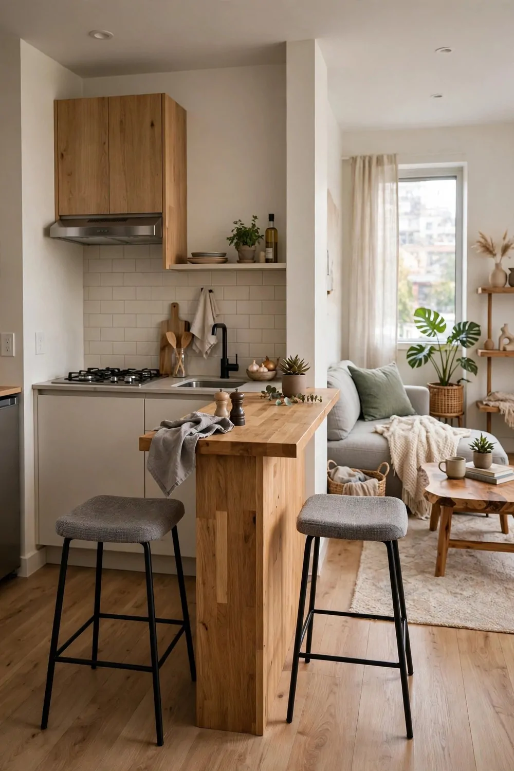
A kitchen island, or even a narrow table used as one, is the hardest working divider in a studio. It separates cooking from living, adds counter space, and gives you a place to eat. Three jobs, one piece of furniture.
Place the island parallel to the kitchen wall, a few feet out into the room. That gap between the counter and the island is the kitchen lane. The far side of the island is the living room.
Use the island as your dining table. Two stools on the living side, and breakfast happens right there. No separate dining table eating floor space. The island is the table.
Storage goes inside the island. Shelves or baskets on the kitchen side hold pots and pantry stuff. The living side stays clean and pretty, with maybe one plant and nothing else.
Keep the island slim. A deep island in a small studio becomes an obstacle you walk around all day. Narrow and long beats wide and short every time.
Here is a quick guide to divider options and what each one gives you:
| Divider | What it adds | Best for |
|---|---|---|
| Kitchen island | Counter space and dining | Studios with a kitchen wall |
| Open bookshelf | Storage and light flow | Splitting bed from sofa |
| Folding screen | Flexible privacy | Renters, guest visits |
| Curtain on a track | Soft, full separation | Hiding the sleeping zone |
A rolling island is even better for renters. It moves where you need it and parks against the wall when you want the floor back. Lock the wheels when you cook, or it will wander.
I cooked in a studio with an island for a year, and I miss it every day. Chopping vegetables while facing the room, instead of facing a wall, made cooking feel social instead of lonely.
This layout turns the kitchen from a corner into a room. That is a big upgrade for a small space.
12. The Two-Rug Split
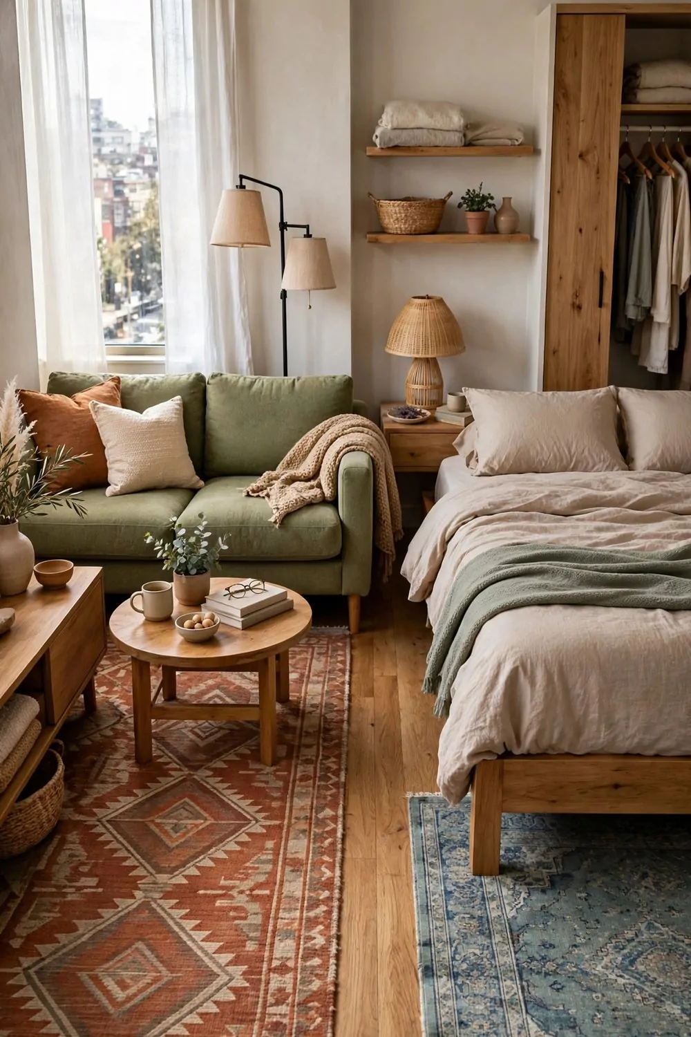
Two rugs can do the work of a wall. One rug marks the living zone. A different rug marks the sleeping zone. Your eye reads two rooms, even though the floor never changed.
The trick is contrast. The rugs should feel different. A soft thick rug says relax. A flat woven rug says quiet corner. If the two rugs look identical, the split disappears and the room goes blurry again.
Size matters more than pattern. Each rug should sit under at least the front legs of the furniture in its zone. A tiny rug floating in the middle of a zone makes the area look smaller, not more defined.
Leave a strip of bare floor between the two rugs. That strip is the hallway. It sounds silly, but a little walkway between zones makes the room feel planned instead of crammed.
Washable rugs are your friend here. Everything in a studio is close together, so spills travel fast. A rug you can wash saves a lot of worry and a lot of money.
I started with one rug and added the second a month later. The change was instant. My sofa area finally felt like a living room, even though my bed was only ten steps away.
Keep the colors calm and related. Two loud rugs fight each other. Two quiet rugs in the same family make the zones feel like siblings, not strangers.
Measure before you buy. Walk each zone with your feet and count the steps. Buy the rug that fits the steps, not the one that looks pretty in the shop photo.
This layout costs two rugs and nothing else. It is one of the cheapest ways to make a studio feel like it has rooms.
13. The Hallway Kitchen Layout
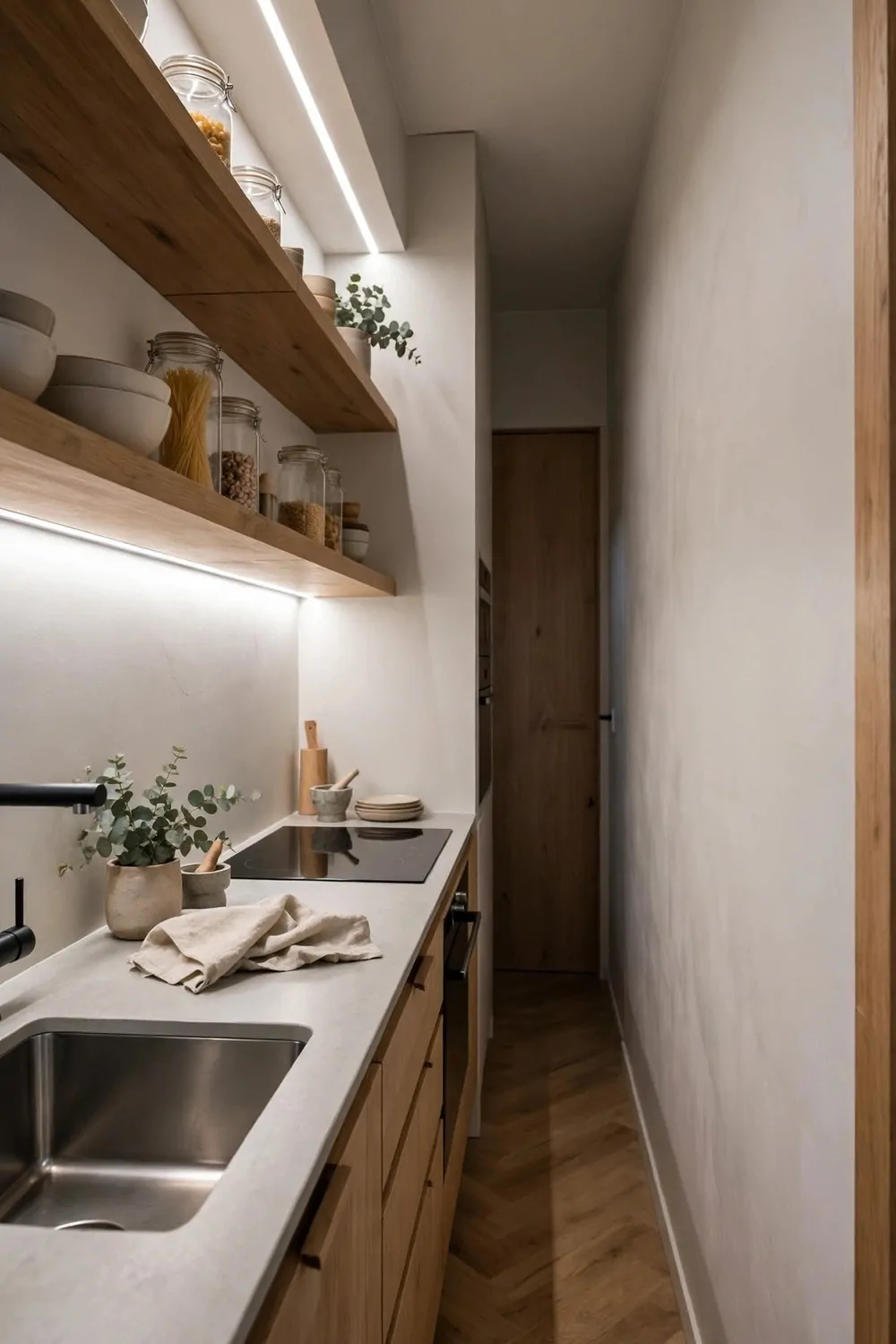
Some studios have the kitchen in a little hallway or passage between the door and the main room. Most people treat that passage as wasted space. The hallway kitchen layout treats it as the kitchen, properly.
Keep everything kitchen in the passage. Cooking, pantry storage, the kettle, the bins. The main room stays free for living and sleeping, and cooking smells stay near the door and the vent.
A slim counter along one side of the passage is usually all you need. The other side stays clear for walking. If both sides fill up, the passage becomes a tunnel and nobody enjoys cooking there.
Use the vertical space in the passage. Shelves above the counter hold the pantry. Hooks hold the pans. The walls do the storage work so the floor stays walkable.
Light the passage brightly. Hallway kitchens are often dark, and a dark kitchen is a kitchen you avoid. One strong strip light changes the whole feeling.
I once rented a studio where the kitchen was a glorified hallway. At first I hated it. Then I put a shelf up, a bright light in, and a little speaker on the counter, and it became my favorite cooking spot. Small and focused.
Keep the passage tidy, because you walk through it every time you come home. A tidy passage says welcome. A cluttered one says obstacle course.
This layout is honest about what the space is. It does not pretend the hallway is a gourmet kitchen. It just makes it a good small one, and keeps the main room for living.
14. The Bedroom Behind Glass
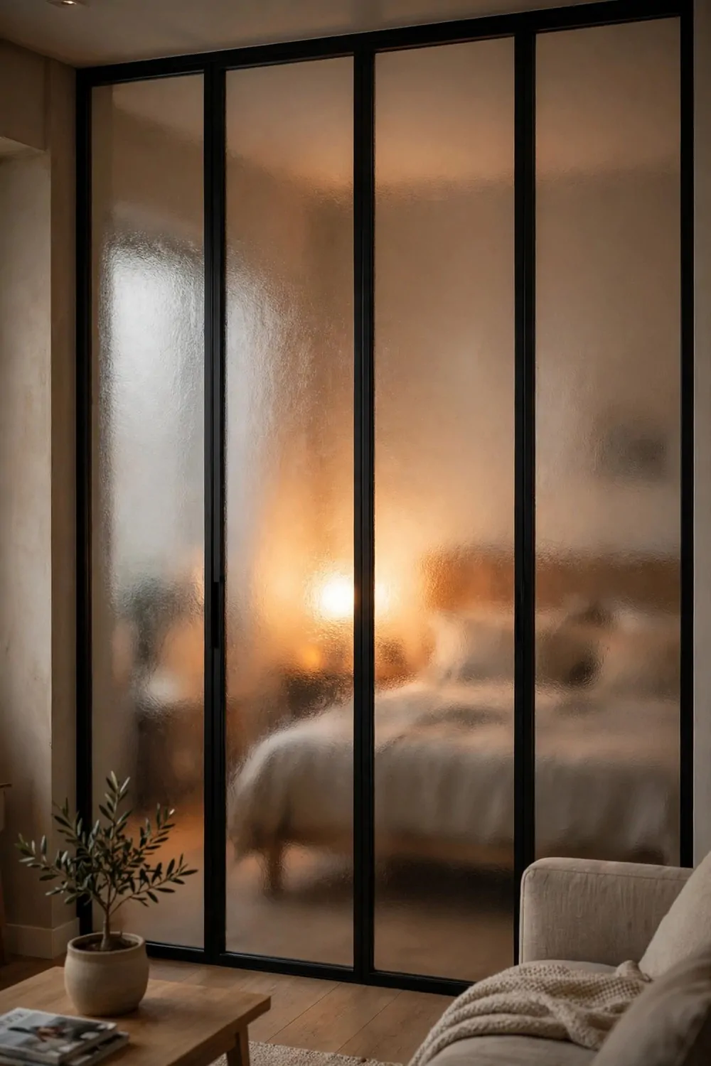
Glass partitions are the fancy cousin of the folding screen. A glass wall or a glass door separates the bedroom from the living room, keeps the light flowing, and still gives you a door you can close.
Use reeded or frosted glass if you want privacy. Clear glass keeps the view but shows the bed. Frosted glass hides the bed and still lets the daylight through. Pick the one your sleep and your modesty need.
A sliding glass door saves floor space. A swinging door needs a clear arc, and in a studio that arc is floor you cannot spare. Sliding wins in small rooms almost every time.
This layout usually needs a landlord’s okay or a proper build, so it is not for every renter. But if you own the place, or your landlord agrees, it is one of the most grown-up studio layouts there is.
Keep the glass clean. Smudged glass in a small room reads as a gray wall. A quick wipe once a week keeps the light moving the way it should.
A curtain on the bedroom side of the glass adds a second layer. Glass by day, curtain by night. The bedroom disappears at bedtime and reappears in the morning.
I stayed in a studio with a glass bedroom wall once, on a trip. Waking up behind frosted glass, with the morning light glowing through it, felt like waking up inside a lantern. I came home and wanted one immediately.
If a full glass wall is too much, try a glass door on the alcove or a glass panel beside the bed. Even a little glass goes a long way toward keeping the light.
15. The Platform Bed Layout
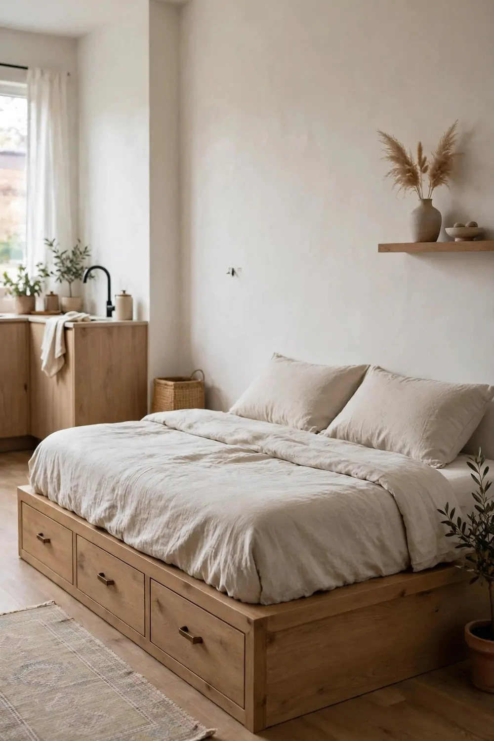
A platform bed sits low and solid, and it turns the sleeping zone into a calm, grounded corner. No tall headboard, no wobble, just a low rectangle that says, this is where rest happens.
The platform itself is the storage. Drawers built into the base hold clothes, bedding and out-of-season stuff. The bed becomes a dresser, and the dresser disappears from the room.
Keep the bedding simple. A fitted sheet, a duvet, one or two pillows. A platform bed with a mountain of pillows looks fussy and eats the clean lines that make the layout work.
Put the platform bed against the longest quiet wall you have. It reads as a calm block, not a bed shoved in a corner. The wall anchors it and keeps the floor open.
A low bed makes the ceiling feel higher. That is a real visual trick. When the bed sits low, the room gains air above it, and the whole studio feels taller than it is.
I slept on a platform bed in a studio for three years. Making the bed took thirty seconds, because there was nothing to tuck and fluff. Low and simple is a gift on tired mornings.
Add one soft thing beside the platform. A small rug, a sheepskin, a warm lamp on a low stool. One soft touch stops the low bed from feeling cold or bare.
This layout suits people who like calm rooms. If your style is cozy chaos, a platform bed might feel too plain. But if you like clean lines, it is hard to beat.
16. The Circular Flow Layout
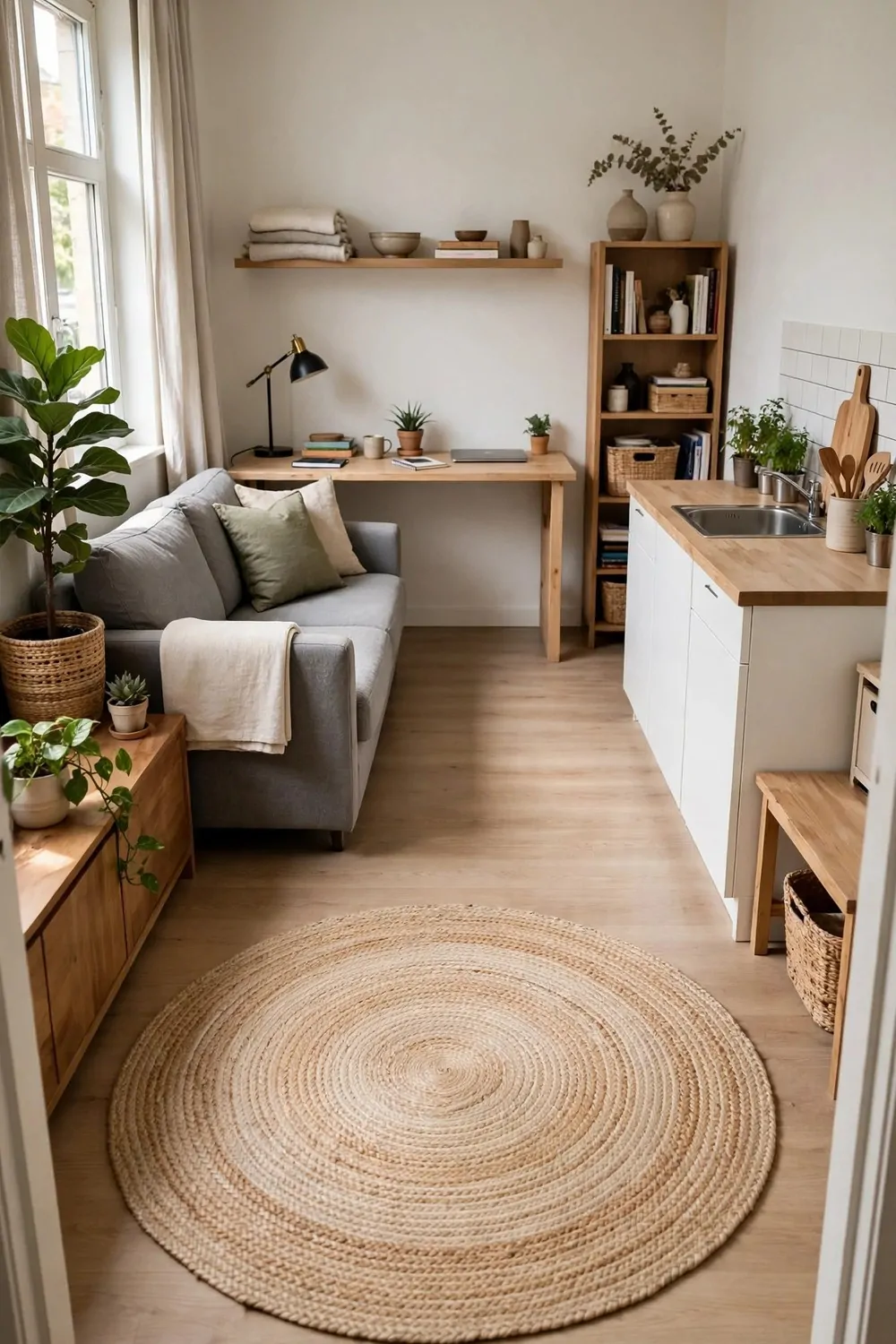
The circular flow layout is about how you move, not how things look. You arrange the furniture so you can walk a loop around the room, and the studio feels bigger because your body never hits a dead end.
Push furniture to the edges and leave the middle open. The loop runs around the center. Sofa on one wall, desk on another, bed on a third. You walk the circle without ever squeezing past anything.
Dead ends make a studio feel small. When you walk into a corner and have to back out, your brain registers the room as cramped. A loop never makes you back up, so the room feels generous.
Keep the loop wide enough for two people to pass. If the loop is a tight squeeze, it becomes a corridor, not a circle. About three feet of walking space is the sweet spot.
A round rug in the middle of the loop helps. It marks the center without blocking it. The eye sees the circle, the feet follow it, and the room feels designed.
I first noticed this layout in a friend’s studio. I walked in, put my bag down, and realized I had circled the whole room without thinking about it. Everything was reachable. Nothing was in the way. It felt twice its size.
Test the loop before you commit. Walk it with a laundry basket. Walk it in the dark. If you bump into the same chair twice, move the chair.
This layout is invisible when it works. Nobody says, what a lovely circular flow. They just say, your place feels big. That is the compliment that counts.
17. The Banquette Dining Nook
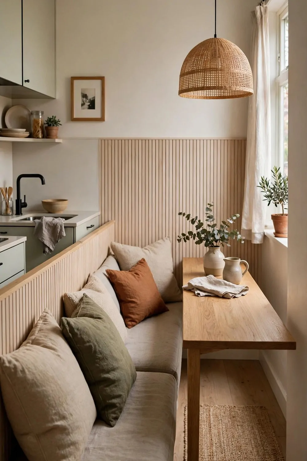
A banquette is a bench built along a wall, with a table in front of it. It seats more people than chairs, takes less floor, and turns a dead wall into the dining room.
Build the bench along the wall nearest the kitchen. Short trips with hot food matter. A dining nook on the far side of the room turns every meal into a hike.
A bench tucks right under the table when dinner is done. Chairs need pulling out and pushing in. A bench just slides. That little difference saves floor space every single day.
Storage hides inside the bench. Lift the seat and there is room for table linens, board games, or the things you only use when guests come. The nook stores its own party supplies.
Cushions make the bench comfortable. A long cushion along the back and a couple of throw pillows turn a hard bench into the coziest seat in the house. People will fight over it.
I ate at a banquette in a tiny studio once, and four of us fit where two chairs would have felt crowded. The wall did the work that chair legs usually do.
Keep the table narrow. A wide table in a banquette nook pushes you against the bench and makes eating awkward. Narrow table, happy elbows, easy conversation.
This layout is a treat for people who love hosting in a small space. The nook says, sit down, stay a while, even when the room is small.
18. The Closet Office Layout
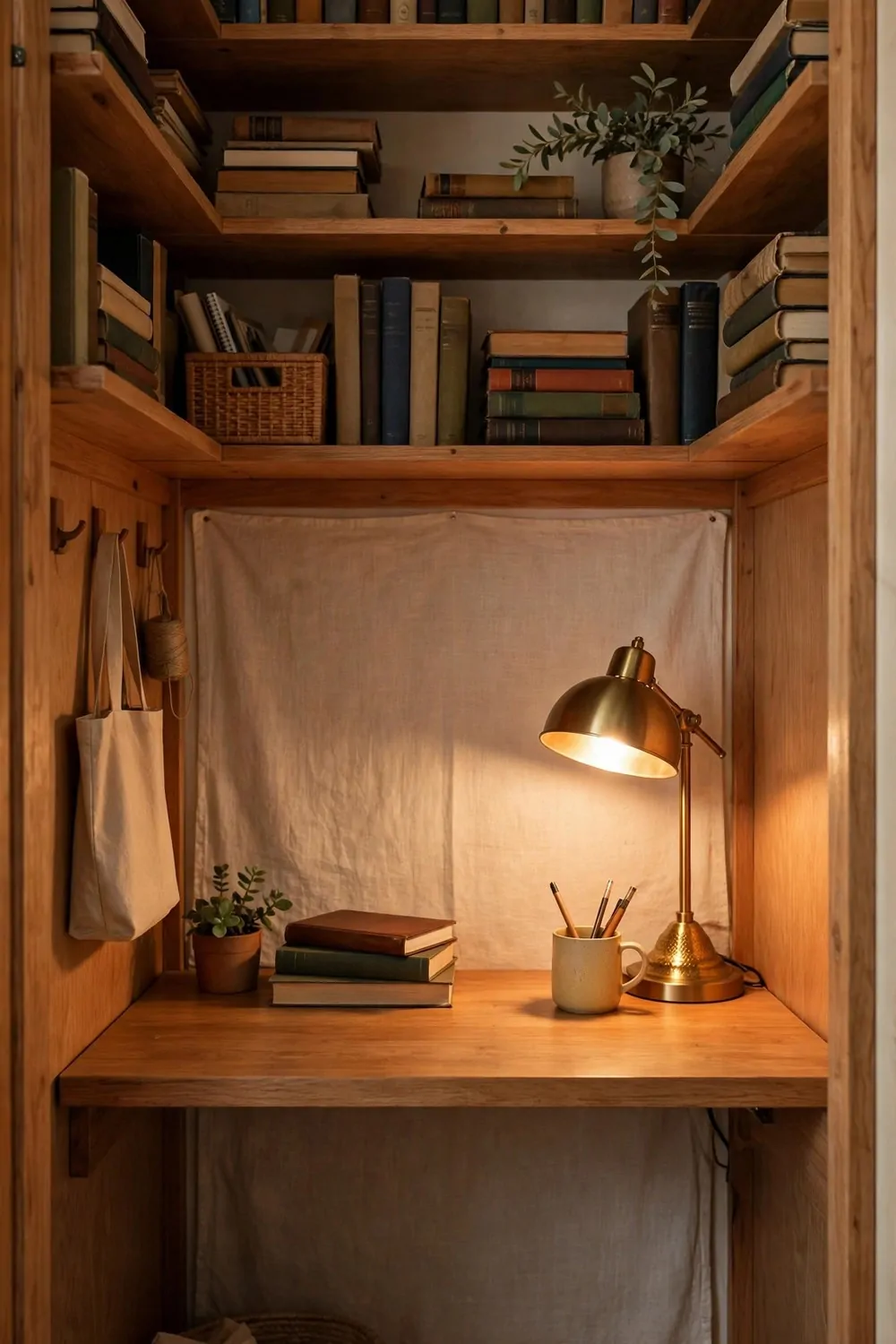
Every studio has a closet that is doing a bad job. It holds stuff you have not touched in a year, behind a door you barely open. The closet office layout gives that closet a job.
Clear the closet completely. Every single thing out. Then put a desk surface across the closet at sitting height. A board, a shelf, or a small desk that fits the width. That is your office.
Shelves above the desk hold the work things. Books, files, the printer if it fits. The closet walls become office walls, and everything work-related lives behind one door.
A small lamp inside the closet is essential. Closet lights are usually dead or scary. A warm desk lamp makes the little office feel intentional instead of hidden away.
When work ends, close the closet doors. The office disappears. Your studio becomes a home again, and your brain gets the message that the workday is done.
I have a friend who works from a closet office, and she calls it her cloffice. She says closing the doors at six in the evening is the best part of her whole workday. I believe her.
Ventilation matters in a closet. Leave the doors open while you work, or the little space gets stuffy fast. Fresh air is not optional, even in a closet.
This layout is perfect for renters. A board, a lamp, and a few shelves, all removable. When you move out, the closet goes back to being a closet in one afternoon.
19. The Open Shelf Wall
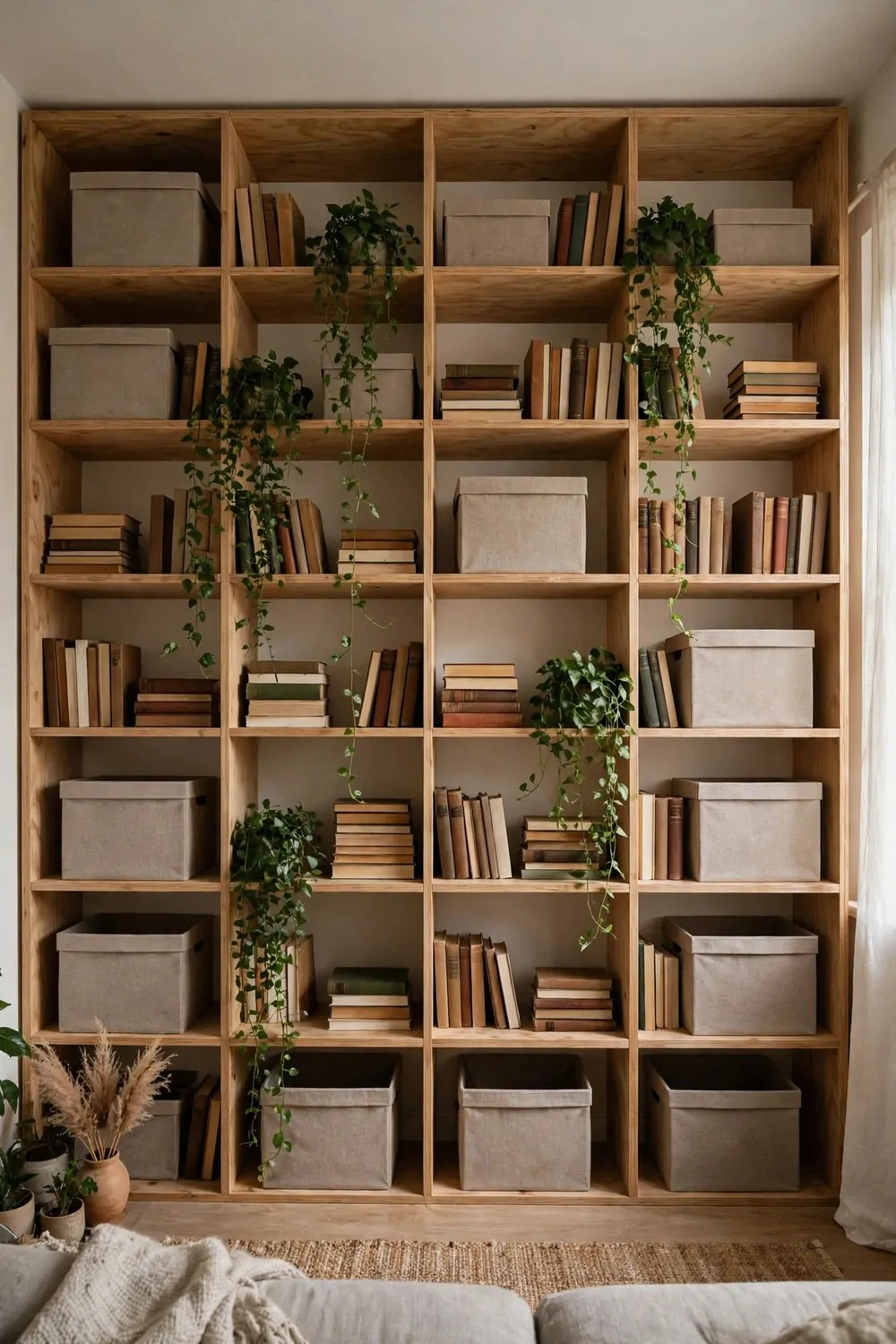
One full wall of open shelves can hold almost everything a studio needs to store. Books, boxes, plants, dishes, clothes in baskets. The wall becomes the closet, the bookcase and the pantry all at once.
Build the shelves from floor to ceiling. Shelves that stop halfway look unfinished. Shelves that reach the ceiling look like they were built for the room, and they pull the eye upward, which makes the room feel taller.
Use matching boxes and baskets on the shelves. Uniform containers read as tidy even when the stuff inside is not. Mixed bags and open piles read as clutter from across the room.
Keep daily things at arm height. The coffee, the plates, the books you are reading now. Seasonal things live up top. The things you touch once a season belong at the top of the wall.
Leave some shelves a little empty. A wall packed to the brim reads as a warehouse. A wall with breathing room reads as a library. Air is part of the design.
Anchor the whole wall to the studs. A tall shelf wall in a small room needs to be steady. A bracket or two at the top is cheap insurance and keeps everything safe.
I built an open shelf wall in my last studio, and it swallowed an entire closet worth of stuff. The room felt bigger, not smaller, because the floor finally had nothing left on it.
Style the shelves like you mean it. A plant trailing down one end, a photo frame, a stack of books lying flat. Pretty and practical can share the same shelf.
20. The Daybed Living Room
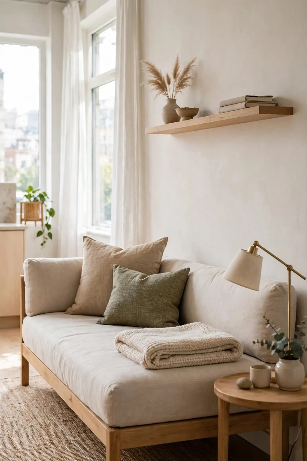
A daybed is a sofa by day and a bed by night, and it never pretends to be anything else. It does both jobs honestly, which is why it works so well in a studio.
Style it like a sofa during the day. Cushions along the back, a folded throw over one arm, a small side table beside it. Guests will sit on it and never guess it is your bed.
At night, move the cushions and pull the bedding out of its drawer or basket. The changeover takes two minutes once you have the routine down. Keep the bedding close by, or the routine falls apart.
A daybed with storage underneath is the best version of this layout. Drawers or a trundle hold the bedding, the spare pillows and the winter blankets. Everything for both jobs lives inside the one piece of furniture.
Pick a firm mattress. A soft one sags when people sit on it all day and feels lumpy at night. Firm works for sitting and sleeping both.
Put the daybed against the longest wall you have. It reads as a sofa against a wall, not a bed in the middle of the room. The wall anchors it and keeps the floor open.
Add a reading lamp and a little shelf at one end. Now the daybed corner is a reading nook by day and a sleep nook by night. Same corner, two lives.
One piece of furniture, two jobs, zero compromise. That is studio furniture done right, and the whole layout follows from it.
21. The Night-and-Day Flip
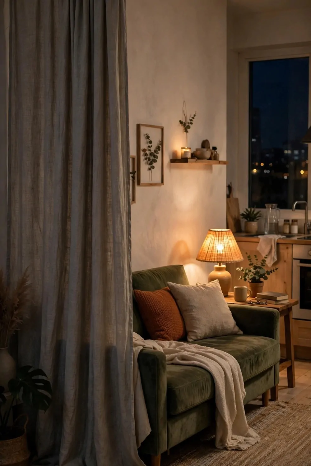
The night-and-day flip layout runs on a routine. In the morning, the room flips to living mode. At night, it flips to sleeping mode. The furniture stays put. The accessories do the flipping.
Morning flip: fold the bedding away, open the curtains wide, turn off the bed lamp, turn on the living lamp. Two minutes, and the room is a living room.
Evening flip: pull the bedding out, draw the bed curtain closed, dim the living lamp, turn on the warm bed lamp. Two minutes, and the room is a bedroom.
Keep the flip supplies in one basket near the bed. Bedding, sleep mask, the book you read at night. One basket, one routine, no hunting around the room every evening.
A fold-down desk helps this layout a lot. Desk down for work, desk up for the evening. The wall does the work and the floor stays open for both modes.
This layout needs almost no new furniture. It needs a routine and a basket. That is the cheapest layout on this list, and for some people it is the most life-changing.
I used a version of this flip in my smallest studio. The room was too small for zones, so I gave it times instead. Living room by day, bedroom by night, office in between. Time became the wall.
Write the flip steps on a little card and stick it inside a cupboard door until the routine sticks. After two weeks you will not need the card. Your hands will know the flip by heart.
22. The One-Zone Minimal Layout
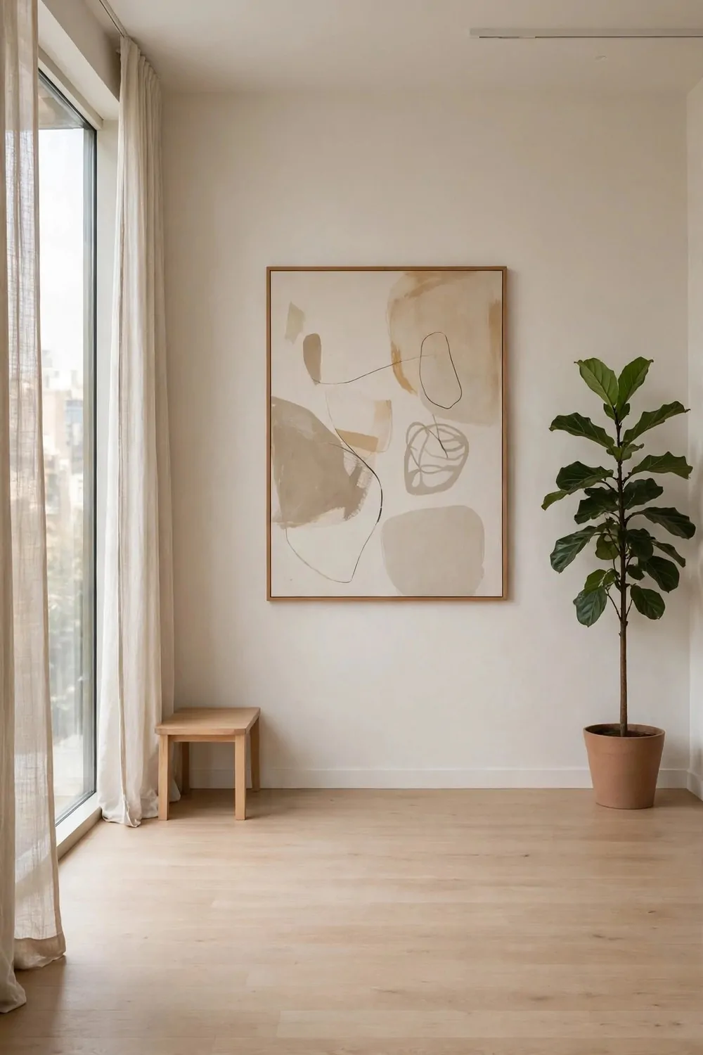
The last layout is the bravest one. No zones at all. One calm room, very little furniture, and everything in it earns its place every single day.
Keep only what you use in a normal week. One sofa, one table, one bed, one shelf. If a piece of furniture does not get used daily, it goes. The room stays almost empty, and the emptiness is the design.
This layout works because a studio with almost nothing in it feels big. The eye travels across open floor, the light reaches every corner, and the room breathes. Clutter is what makes small rooms feel small, not size.
Choose furniture that is beautiful from every side. In a one-zone room, there is no back of the sofa to hide. Every piece is on display from every angle, so pick pieces you love looking at.
One big piece of art or one tall plant gives the room a focal point. Without a focal point, an empty room feels unfinished. With one, it feels curated and calm.
Cleaning takes ten minutes in a one-zone room. There is nowhere for mess to hide. That is a real gift on busy weeks, when a cluttered studio can start to feel like a second job.
I am not a true minimalist. I own too many books and too many mugs. But I tried this layout for a month once, and the calm it gave me was real. I kept the open floor and brought back only the things I truly missed.
Own less, live bigger. In a studio, that is not a slogan. It is the floor plan.
Your studio does not need to be bigger. It needs a plan. One rectangle, a few smart moves, and a layout that fits the way you actually live.
Start with the rug trick or the floating sofa. Those two cost nothing and you can try them before lunch. Then add the layout that fits your room shape. A square room loves the L-shaped split. A long room loves the galley wall. A tall room loves the loft.
Layer the layouts slowly. One change a week. Let the room teach you what it needs next, and do not be afraid to move the sofa twice. The rug moved six inches in my studio, and the whole room changed its mind.
One room can hold a whole life. You just have to give every job a home. Start tonight, with a pencil and an open mind. Your studio is waiting to feel bigger than it is.