25 Tiny Spaces That Look Like a Million Bucks

True or false. A small room always looks cheaper than a big one.
False. And this list is my proof. Walk into the right tiny room and you forget to ask how big it is. You notice the warm light first. Then the one big piece of art. Then the way the curtains fall from the ceiling to the floor like they own the place. Small does not mean cheap. It just means every choice shows, so the good choices show more.
I have gathered the 25 moves I keep seeing in the loveliest tiny spaces. None of them ask you to knock down a wall. Most of them cost less than a weekend takeaway budget. They are about light, scale, texture and a little bit of trickery. Honestly, half of them take under an hour. Pick the ones that fit your room and your wallet, and watch guests guess the price of the place completely wrong.
1. Layer Your Lighting Until the Room Glows
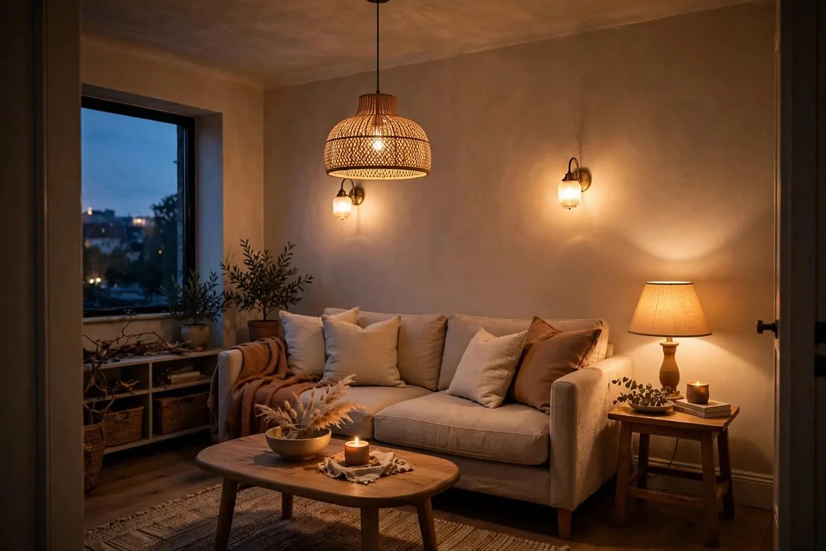
One ceiling bulb is the fastest way to make a tiny room feel flat. It washes everything out and leaves corners dark. Hotels never do this, and that is why hotel rooms feel rich.
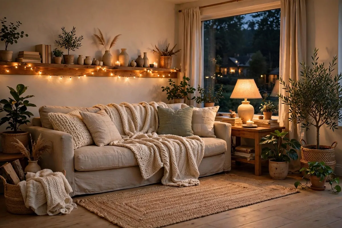
Try three layers instead. An overhead light for general glow. A lamp near your reading spot for tasks. And a small light aimed at art or a shelf for drama.
The trick is warmth. Cool white bulbs feel like an office. Warm bulbs feel like candlelight and good company.
Start with what you have. A cheap lamp with a warm bulb beats a fancy ceiling light that blinds you.
And here is the bit people miss. Light from different heights makes a small room feel deeper. The eye follows the layers and the walls seem to move back.
Dimmers help a lot. A dimmer on one lamp gives you ten different moods for the price of one bulb.
I put a tiny LED strip behind a bookshelf once. It took ten minutes. The shelf looked like it was floating. My friend asked which designer did it.
Do not light everything evenly. Leave a soft shadow in one corner. Contrast is what makes light feel expensive.
Also, match your bulb colours. Mixed bulbs fight each other and the room feels messy. Pick warm everywhere and the room calms down instantly.
- Overhead light for the base glow
- One lamp by your seat for reading and warmth
- One accent light aimed at art, a shelf or a plant
- Warm bulbs everywhere, no mixing with cool white
- A dimmer on at least one lamp for evening mood
2. Hang Curtains From the Ceiling, Not the Window
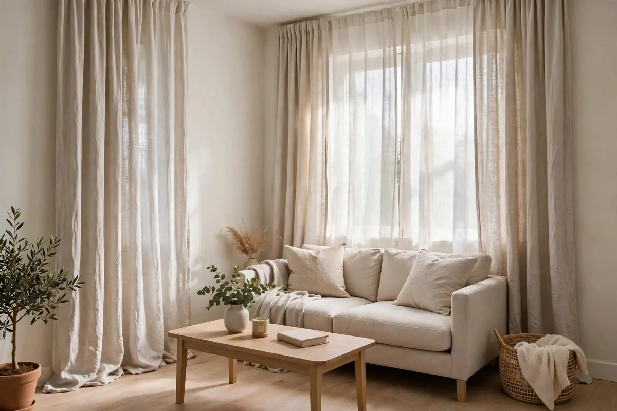
Most people hang their curtains right at the top of the window. That chops the wall in half. It makes the ceiling feel low and the room feel small.
Mount the rod close to the ceiling instead. Let the fabric fall all the way to the floor. The eye follows the long line up and the ceiling feels taller.
This trick works in any tiny room. Bedrooms, living rooms, even little home offices. It costs almost nothing.
Choose fabric that is light and soft. Linen looks rich and lets light filter through in a pretty way.
Keep the colour close to your wall colour. Matching tones make the window feel like part of the architecture, not a hole in it.
And let the curtains sit wide. Pull them past the window edges. More glass shows, more light comes in, and the window looks bigger than it is.
I did this in a bedroom with a tiny window. It looked twice as wide. Guests kept saying the room felt airy, and nobody could say why.
The rod matters too. A simple slim rod in brass or black looks neat. Skip the bulky chunky ones in a small space.
Iron or steam the curtains once. Wrinkled fabric ruins the whole effect. Smooth long lines are the point.
3. Choose One Oversized Piece of Art
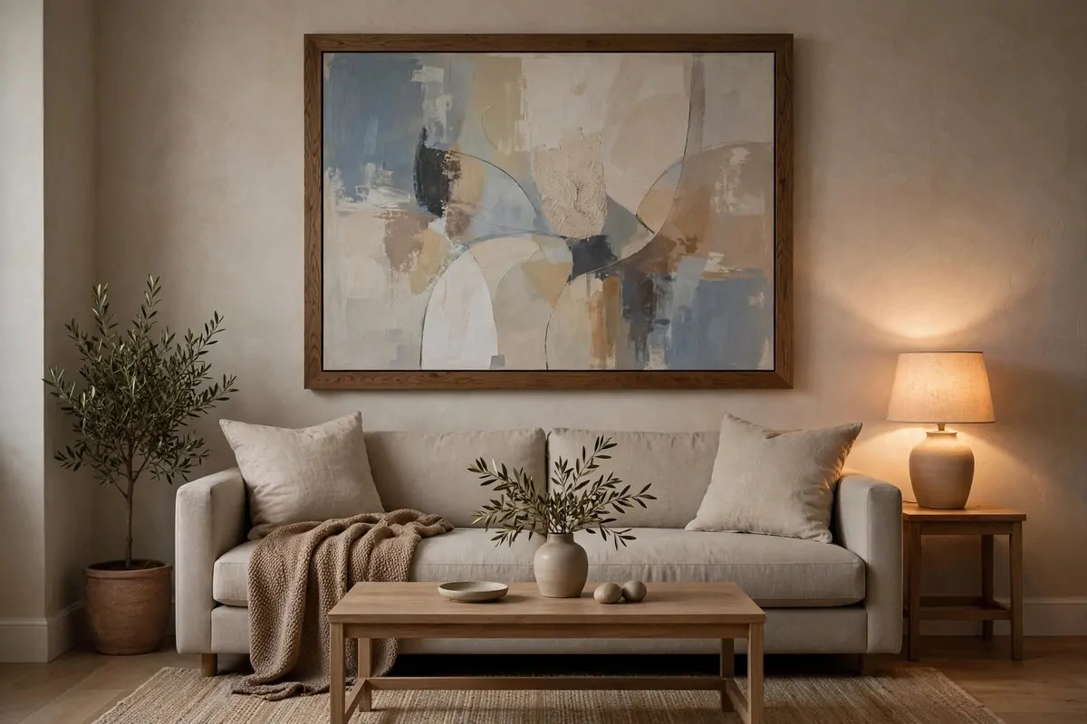
A tiny wall covered in ten little frames feels busy. It is like the room is shouting in ten small voices. One big piece of art speaks calmly and clearly.
Scale is the secret. Big art on a small wall looks brave and confident. Small art on a small wall looks timid.
You do not need an expensive original. A large print in a simple frame does the same job. Even fabric stretched over a frame works.
Pick colours that talk to your room. Pull one shade from your rug or cushions and let the art echo it.
Hang it with its centre at eye level. That is the height galleries use, and it instantly makes a room feel considered.
Keep the wall around it clean. Negative space is part of the luxury. Let the art breathe and it looks far more valuable.
I once framed a big piece of patterned wrapping paper for a hallway. People assumed it was from a gallery. Honestly, the frame cost more than the art.
One large piece also hides flaws. A cracked bit of plaster or an uneven wall disappears behind it. Small frames would just point at the problem.
4. Match Your Bedside Lamps Like a Hotel
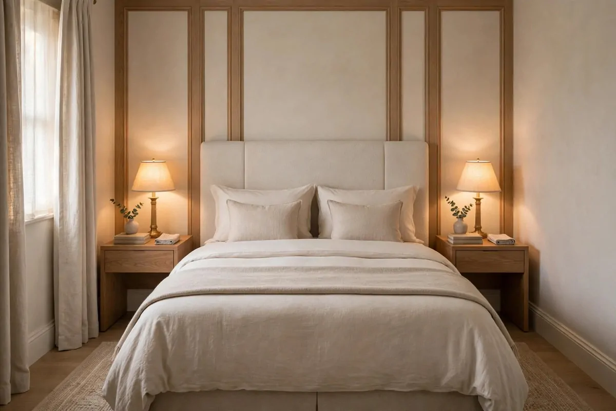
Walk into any fancy hotel room and the first thing you notice is balance. Two lamps. Two tables. Everything in pairs. Your brain reads that symmetry as calm and rich.
You can copy it at home for very little money. Two matching lamps on two matching tables. That is the whole trick.
The lamps do not need to be identical twins. Same shape, same shade colour, close enough height. Your eye smooths over the rest.
Warm light matters here too. Matching lamps with warm bulbs make the bed look like the centre of a quiet, cosy scene.
If your room is too narrow for two tables, use wall sconces. They give you the same symmetry without eating floor space.
Keep the tops tidy. A lamp, a small book, maybe one little object. Cluttered bedside tables break the hotel spell.
This is one of the cheapest ways to make a bedroom feel designed. Two lamps, ten minutes of arranging, and the room feels finished.
And it photographs beautifully. If you ever rent the room out or sell, those two matching lamps will do half the work.
5. Add Warm Wood Where Everything Looks Cold
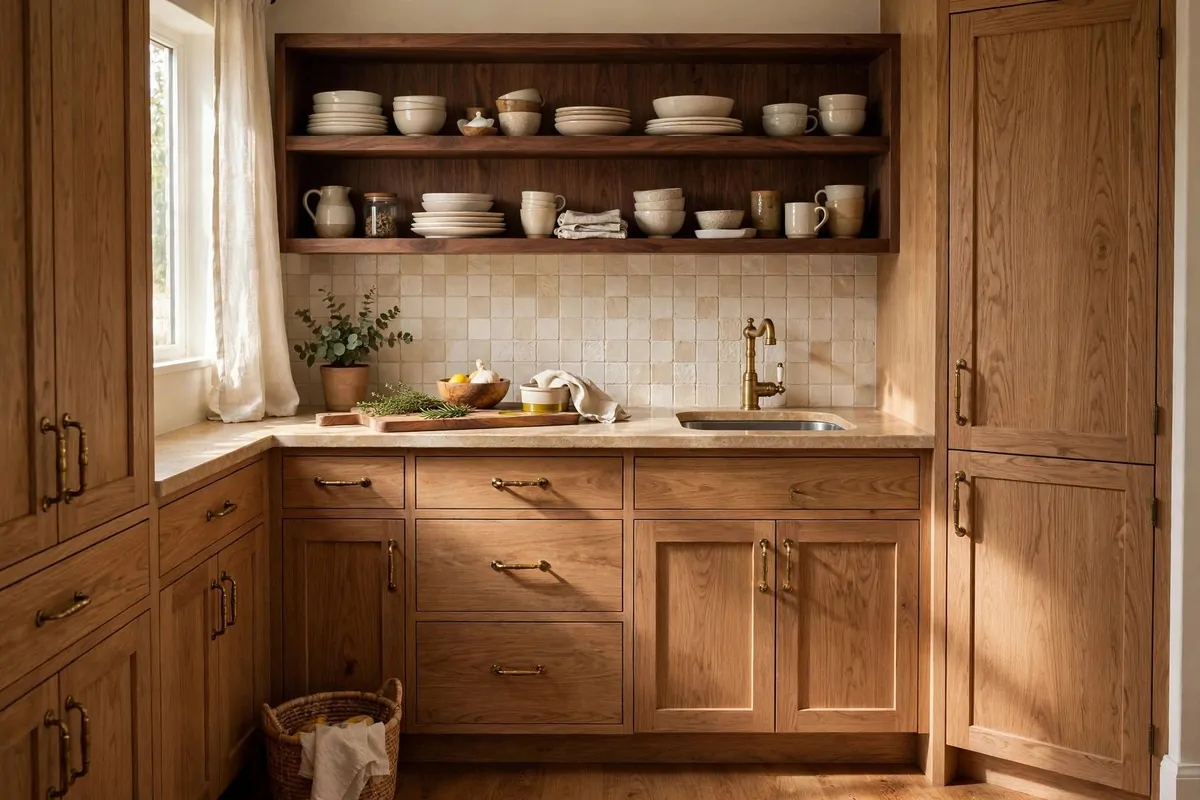
Too many white and grey surfaces can make a tiny room feel cold. It starts to look like a clinic, not a home. Warm wood fixes that in minutes.
Try a walnut shelf. An oak picture frame. A small wooden stool. You do not need matching furniture, just a few warm notes.
The grain does the work. Wood has natural pattern and texture that flat painted surfaces lack. Your eye reads it as quality without thinking.
Mix tones if you like. Oak and walnut can live together happily. Just keep the undertones in the same family so it feels collected, not random.
Start with what you touch most. A wooden tray on a coffee table. A wooden handle on a drawer. Small warm touches where your hands go.
I swapped a metal bedside table for a small wooden one once. Same size, same room. It instantly felt warmer, like the room had exhaled.
Wood also photographs warm. If your tiny space looks washed out in photos, a wooden element will bring the colour back.
Keep it simple. Three wooden accents in a small room is plenty. More than that and the room starts to feel like a cabin.
6. Float Furniture Off the Floor
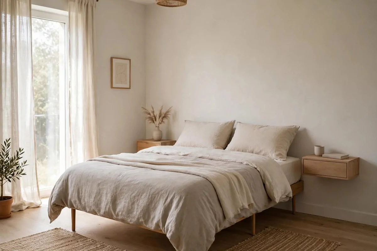
Furniture does not have to be small in a tiny room. It has to look light. Pieces with legs, or pieces mounted on the wall, let the floor show through.
When you can see floor under the furniture, your brain thinks the room is bigger. It is a simple visual trick and it always works.
Try a bed with slim legs instead of a solid base. Floating nightstands screwed to the wall. A wall-hung desk instead of a chunky one.
Glass and slim profiles help too. A glass side table almost disappears. A slim-armed chair takes up less visual space than a bulky one.
This is not about buying tiny furniture. Tiny furniture can actually make a room feel awkward, like dollhouse pieces lost in a real room.
Go for normal sizes with air underneath. One proper sofa with legs looks richer than three small chairs crammed together.
Cleaning gets easier too. You can reach under everything. Dust has nowhere to hide and the room stays looking sharp.
I replaced a solid bookcase with wall-mounted shelves once. The floor suddenly looked twice as big. The room felt like it could breathe.
- Legs on the sofa and bed so floor shows underneath
- Floating shelves and wall-mounted nightstands
- Slim profiles over chunky shapes
- Glass or open bases where possible
7. Put a Big Mirror Where It Catches the Light
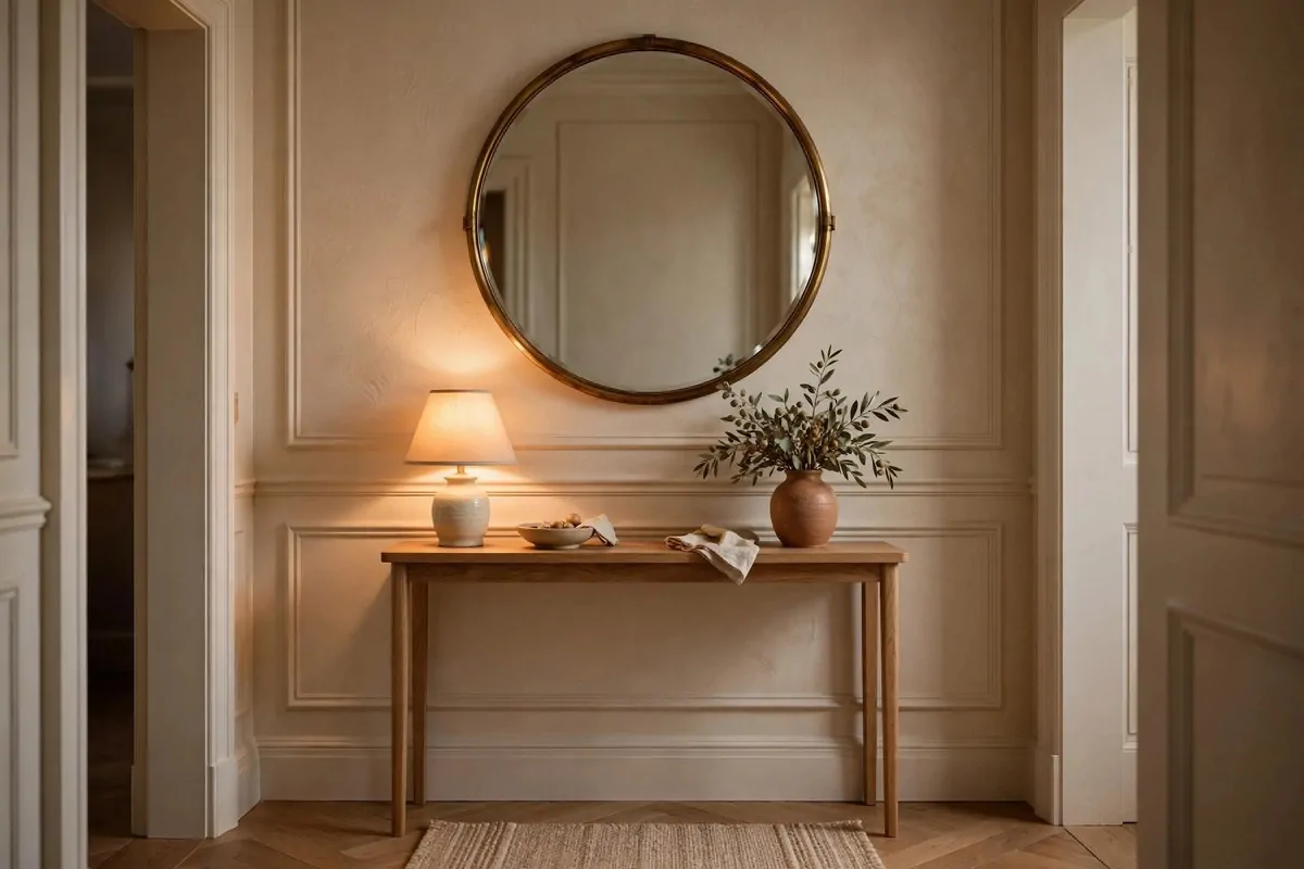
A big mirror is the cheapest square footage you will ever buy. It bounces light around and doubles what the eye sees. Small rooms feel twice as big.
Placement is everything. Hang it opposite a window. It will catch the daylight and throw it deep into the room.
Or place it to reflect something pretty. Art, a plant, a lamp. Never aim it at clutter or a doorway. It will just multiply the mess.
A round mirror softens a tiny room. The curve breaks up all the straight lines and feels friendly. Brass or thin black frames look smart.
One large mirror beats three small ones. Small mirrors chopped across a wall look busy. One confident mirror looks like a design choice.
Leaning a full-length mirror against a wall works too. It feels relaxed and grand at the same time, like a dressing room.
I put a tall mirror at the end of a dark hallway once. The hallway gained a window that was never there. Light travelled right down it.
Keep the glass clean. Smudges show fast on a big mirror and cheapen the effect. A quick wipe every week keeps the magic.
8. Choose a Statement Pendant Over the Table
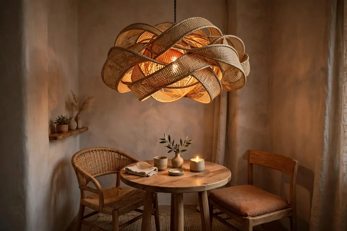
A tiny dining corner can look like an afterthought. Or it can look like the best seat in the house. The difference is often one good pendant light.
Hang a sculptural pendant low over the table. It draws the eye down to the food and the people, and up to the shape. The corner becomes a destination.
Shape matters more than price. A woven shade, a glass globe, a paper lantern. Interesting silhouettes look expensive at any budget.
Hang it lower than you think. About arm's reach above the table surface feels intimate. Too high and the light floats away uselessly.
This works over a coffee table too. Or a reading chair. One pendant turns a forgotten corner into a styled moment.
Match the finish to something else in the room. Brass pendant, brass picture frame. Black pendant, black lamp base. Repeats make it look planned.
I found a rattan pendant at a flea market for the price of a pizza. It hangs over my little table and guests always ask where it is from.
And put it on a dimmer if you can. Bright pendant for work, low glow for dinner. Two moods, one light.
9. Style a Velvet Chair as the Star
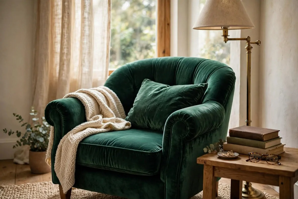
Every tiny room needs one star piece. Something with texture and colour that the eye lands on. A velvet armchair does this job beautifully.
Velvet catches light in a way flat fabrics cannot. It glows in some spots and goes deep in others. That play of light reads as luxury.
Pick a rich colour. Emerald, sapphire, deep mustard. In a small neutral room, one jewel tone feels like a piece of jewellery.
You only need one. Two velvet chairs in a tiny room can feel heavy. One chair is a statement. Two is a pattern.
Place it where it gets good light. Near a window or under a lamp. Velvet needs light to show off its texture.
Add a small side table and a lamp. Now you have a reading corner that looks like it belongs in a boutique hotel.
Second-hand velvet chairs are everywhere. Velvet hides wear well and a good steam brings it back to life. Check charity shops first.
Keep the rest of the corner simple. Let the chair be the diva. Everything around it should be quiet so it can shine.
10. Use Small Doses of Marble and Brass
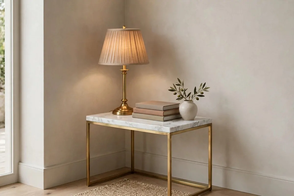
Marble, brass and velvet are the classic rich materials. In a tiny room you do not need much. A little goes a long way when every surface is close.
Try a marble-topped side table. Brass lamp bases. A small brass tray. These are the touches the eye reads as expensive.
Mix them with plain affordable basics. A simple sofa plus one marble table looks curated. All expensive pieces together would feel stiff.
Keep the metals to two finishes at most. Brushed brass and matte black work well together. More than two and the room starts to look confused.
Real stone in a small piece is worth it. A tiny marble tray costs little and you touch it every day. That is where quality matters most.
Faux marble can work in a pinch, but keep it small and far from hands. Up close, the print gives itself away. Real stone feels cold and solid.
I have a brass letter opener on my desk that cost almost nothing. It sits there like a little piece of jewellery. Guests pick it up and smile.
Repeat the material once more somewhere. A brass lamp and a brass frame. The repeat makes it look like a plan, not an accident.
11. Dress the Bed Like a Hotel Bed
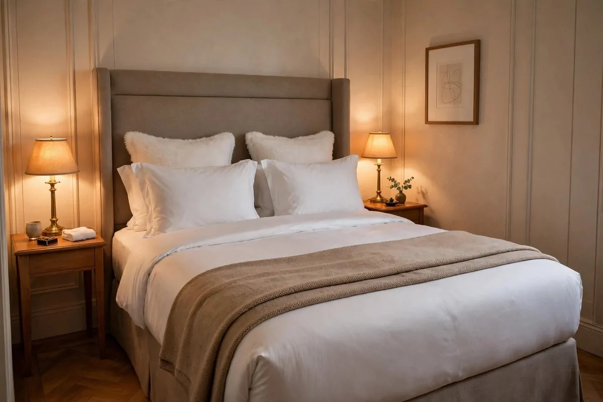
Hotels make beds an art form. Tall, layered, crisp. You can copy the look in a tiny bedroom and it changes the whole room.
Start with white or cream bedding. It looks fresh and clean, and it makes a small room feel brighter. Colour comes from cushions and throws.
Layer it up. Sheet, duvet, a folded throw across the foot. Two sleeping pillows plus two slightly fancier ones in front. Height reads as luxury.
Iron the pillowcases if you can stand it. Or just smooth them well. Crisp bedding is half the hotel look.
A bed runner or a folded throw adds colour without fuss. It is also practical. You can sit on it without messing the duvet.
Make the bed every morning. I know, boring advice. But an unmade bed ruins every other trick in this list. A made bed is free luxury.
In a tiny room the bed is the biggest thing in it. Dress it well and the whole room looks rich. Dress it badly and nothing else saves it.
You do not need expensive sheets. Mid-range cotton in white, washed soft, looks just as good as the fancy stuff once it is layered and smoothed.
12. Upgrade the Bathroom With Gold Touches
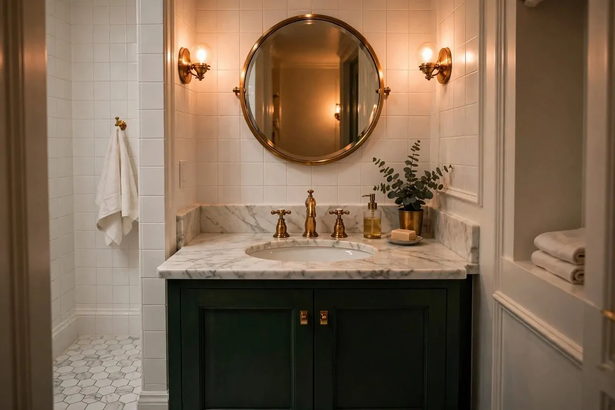
Small bathrooms are where gold and brass shine hardest. A few warm metal touches turn a plain white box into a jewel box.
Start with the taps. Brass or gold-toned taps against white porcelain look instantly rich. It is the first thing the eye finds.
Add a matching mirror frame. A round brass mirror over the sink ties the whole look together. It reflects light and makes the room feel bigger.
Swap the little things. A brass soap dispenser. A small tray for the toothbrush. These tiny swaps cost little but the effect is big.
Keep the walls simple. White or soft neutral tiles let the warm metals be the star. Busy patterns fight with gold.
Good lighting helps. A warm bulb in the bathroom changes everything. Cool white light in a small bathroom feels like a hospital.
I changed only the taps and the mirror in a tiny rented bathroom. The landlord did not mind. Visitors assumed the whole room was new.
And keep counters clear. One soap dispenser, one small plant, done. Clear surfaces in a small bathroom feel five-star. Cluttered ones feel like a drawer exploded.
13. Bring In One Big Statement Plant
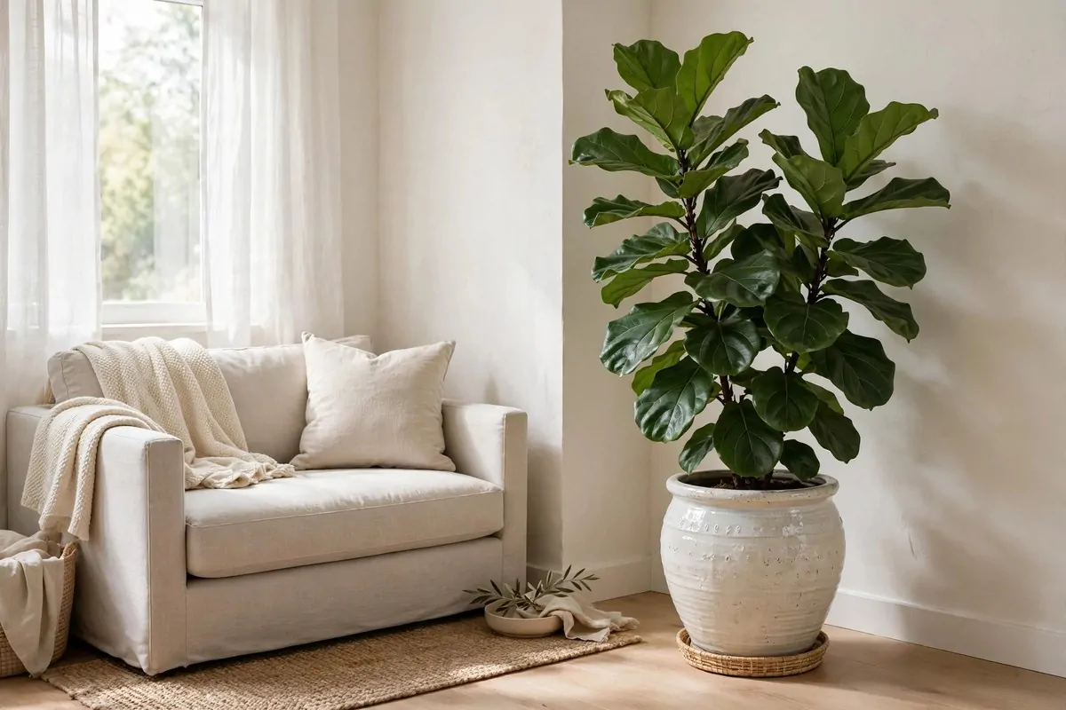
One large plant beats ten tiny ones. A big leafy plant fills a corner with life and height. It is nature's sculpture, and it costs less than a cushion.
Pick something with big leaves. A fiddle-leaf fig, a monstera, a bird of paradise. Bold shapes read as deliberate. Wispy little plants get lost.
Put it in a proper pot. A simple ceramic or clay pot in a nice colour lifts a plant from afterthought to feature. The pot matters as much as the plant.
Place it where it fills an awkward gap. That dead corner between the sofa and the wall. The empty spot by the window. Plants love those jobs.
One plant is easier to keep alive than twelve. You water one thing. You notice when it needs help. It thrives and so does the room.
The green also softens everything. Wood, metal, fabric, they all look warmer next to a living green leaf. It is the cheapest colour in design.
I bought a big monstera from a market stall years ago. It is still going. It has been in four homes and it makes every one of them look better.
And if you kill plants, be honest about it. A good fake in a great pot fools most people from across the room. Just dust it now and then.
14. Add a Wood Slat Accent Wall
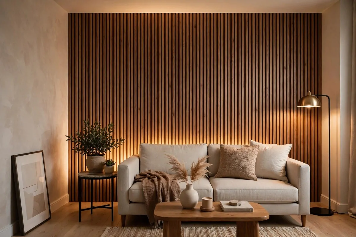
One textured wall can carry a whole tiny room. Vertical wood slats add warmth, rhythm and depth. They turn a flat box into a designed space.
The vertical lines pull the eye upward. The ceiling feels taller. The room feels more architectural, like someone planned it.
You do not need real timber. Slat panels come ready-made and fix to the wall easily. A weekend job at most, and renter-friendly versions exist.
Put the slats behind the sofa or the TV. One feature wall is enough. Two would feel busy in a small space.
Wood tones warm up grey rooms beautifully. If your tiny space feels cold and flat, this is the fix. The texture catches light and shadow.
Keep the other walls plain. Let the slat wall be the star. Plain walls around it make the texture stand out even more.
I have seen this in the tiniest flats and it always works. The wall looks custom and expensive, even though the panels are not.
Finish the edges neatly. A clean top and bottom edge is what separates a classy job from a craft project gone wrong. Take your time there.
15. Try a Glass Console That Almost Disappears
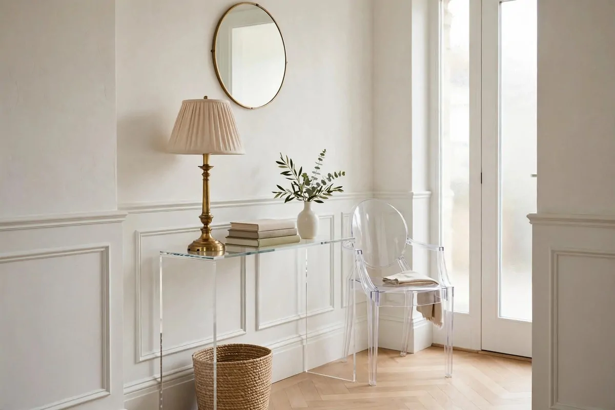
A glass console is a magic trick for tiny entryways and hallways. You get the surface you need, but the eye sees straight through it. The room stays open.
Style the top simply. A lamp, a small stack of books, one little vase. Three things is the sweet spot. More than that and the transparency is wasted.
The see-through base means the floor shows underneath. Like furniture with legs, this makes the space feel bigger than it is.
Glass pairs well with warm metals. A glass top with brass legs is a classic rich combination. It looks light but feels expensive.
Keep it clean. Fingerprints show on glass fast. A quick wipe keeps it invisible, which is the whole point.
This also works as a small desk. A glass desk in a corner feels like it takes up no space at all. Your room keeps its airiness.
I used a glass console behind a small sofa once. It held a lamp and books without blocking any light. The room felt twice as deep.
Choose glass with soft edges if you can. Rounded corners feel safer and softer in a tight space. Sharp corners in small rooms are asking for bruised hips.
16. Anchor the Room With a Plush Rug
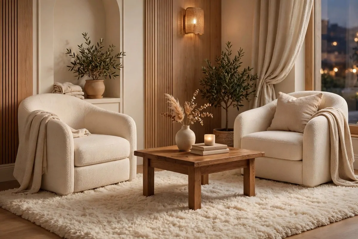
A rug tells the room where to sit. In a tiny space, one plush rug under the main seating turns scattered furniture into a proper arrangement.
Go as big as the room allows. A rug that fits under the front legs of every seat looks generous. A tiny floating rug looks like a postage stamp.
Texture matters more than pattern. A thick, soft pile underfoot feels rich the moment you step on it. Your feet notice quality before your eyes do.
Keep the colour calm. Cream, soft grey, warm beige. A quiet rug lets your furniture and art do the talking. A loud rug in a small room shouts over everything.
Layer a small patterned rug over a big plain one if you want interest. The layers add depth and look very styled, like something from a magazine.
A rug also softens sound. Tiny rooms echo. A plush rug absorbs the bounce and the room feels calmer and more private.
I once laid a big rug in a small flat with hard floors. The whole place felt warmer and quieter. My neighbour downstairs thanked me too.
Vacuum it well and rotate it now and then. A flat, dirty rug does the opposite of luxury. A cared-for rug keeps its plush promise.
- Big enough for front legs of all seating
- Thick pile for softness underfoot
- Calm colour, quiet pattern
- Layered over a larger plain rug for extra depth
17. Keep the Palette Calm and Tonal
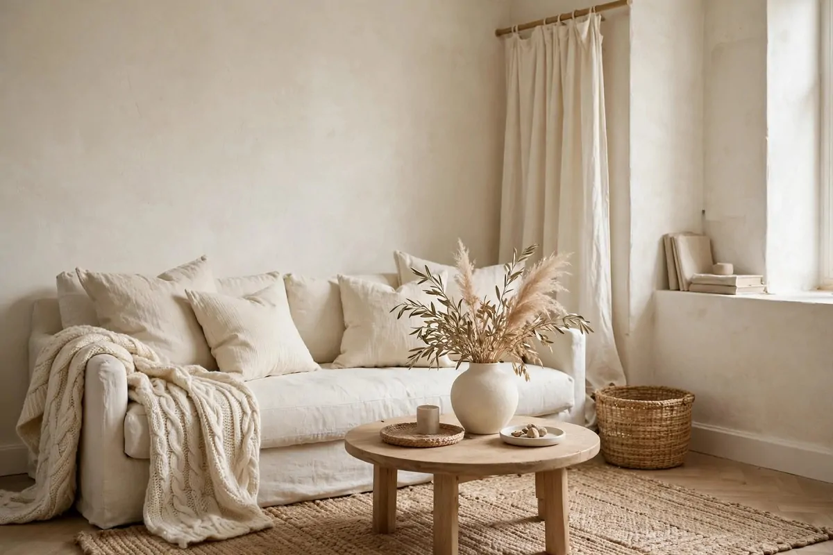
A room in shades of one colour looks expensive. Cream on cream on beige. The eye relaxes. Nothing fights. The whole space feels calm and intentional.
Pick one base colour you love. Then gather its cousins. If you choose beige, add cream, tan, soft brown. Layers of the same family.
Texture does the talking here. Linen cushions, a wool throw, a jute rug, a ceramic vase. Same colours, different feels. That is what makes it rich.
This trick hides a multitude of sins. Mismatched furniture in one tonal family looks collected. In clashing colours it looks like a jumble sale.
It also makes tiny rooms feel bigger. The eye flows across the space without stopping. Boundaries blur and the room feels open.
Add one dark note for depth. A dark wood frame, a black lamp base. One dark accent stops the room feeling washed out.
White walls help, but warm white, not blue white. Warm white glows. Cool white glares. The undertone changes everything.
I painted a tiny room warm white and dressed it all in creams. Visitors called it serene. It was the same furniture, just a calmer palette.
| Tonal palette | Shades to mix | Textures to add |
|---|---|---|
| Warm cream | Ivory, oat, soft caramel | Linen, wool, rattan |
| Soft grey | Pebble, stone, charcoal accent | Velvet, brushed metal, glass |
| Warm beige | Sand, taupe, deep brown accent | Jute, oak, boucle |
18. Style Shelves in Little Groups of Three
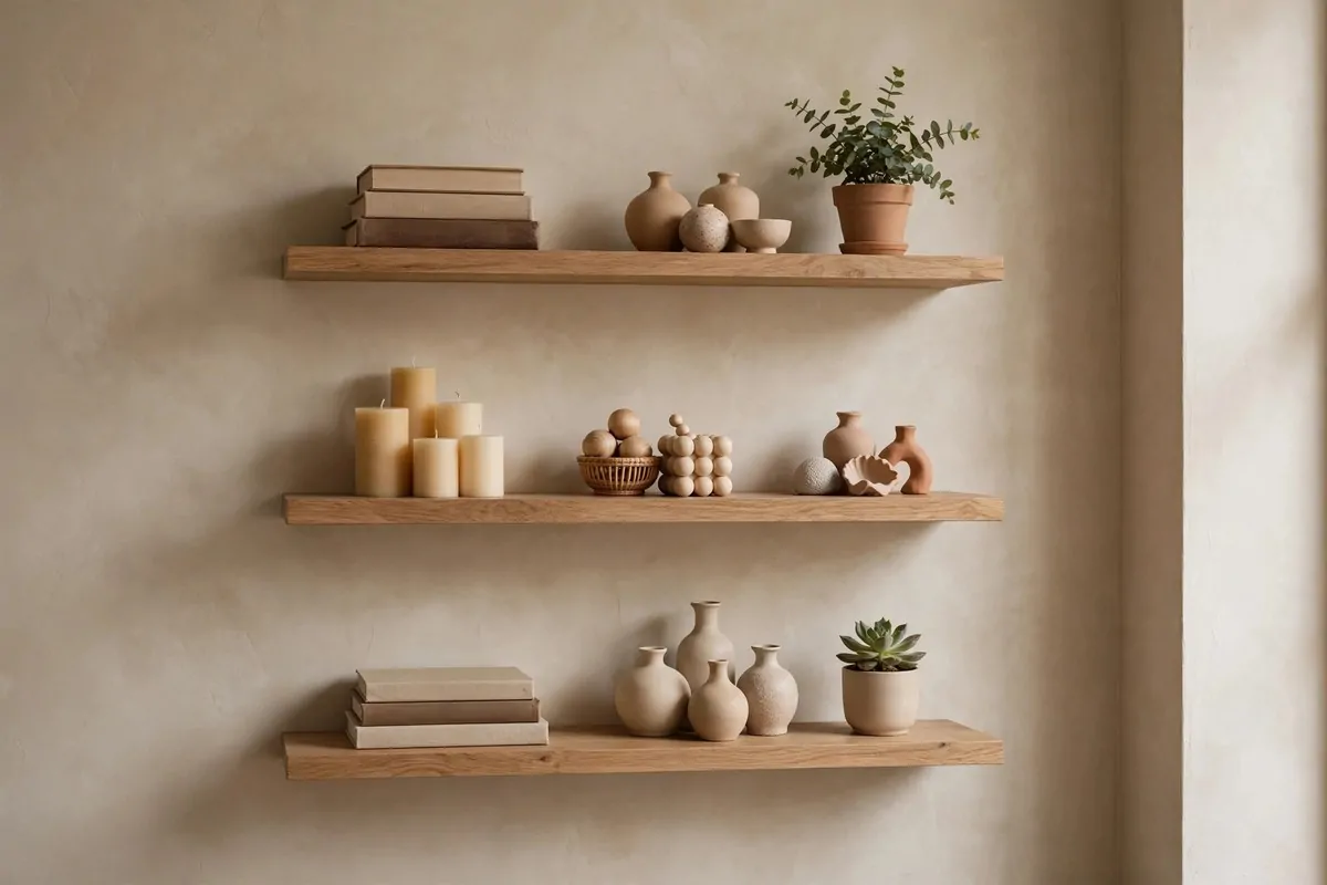
Shelves full of random bits look like storage. Shelves styled in little groups look like a shop display. The rule of three is the easiest styling trick there is.
Group things in threes. Three books standing, one lying down. Three small vases of different heights. Odd numbers please the eye.
Vary the heights. Tall, medium, small. The little staircase of shapes keeps the shelf interesting without looking messy.
Leave empty space. Half-empty shelves look curated. Crammed shelves look like a charity shop. Air between groups is part of the design.
Repeat a colour or material across the groups. Three wooden items, three white ceramics. The repeats tie the shelf together.
Mix books with objects. A stack of books with a small plant on top. A framed photo leaning behind a candle. Books give shelves weight and brains.
I restyled one shelf in my living room in twenty minutes. Grouped things in threes, removed half the stuff. It looked like a different room.
Step back and squint. If the shelf looks balanced when blurry, it is balanced. That is the oldest stylist trick and it never fails.
- Group items in threes or fives
- Vary heights: tall, medium, small
- Leave breathing room between groups
- Repeat one colour or material
- Mix books, plants and pretty objects
19. Give a Tiny Kitchen a Statement Backsplash
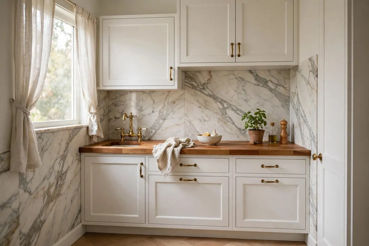
A tiny kitchen has one big visible surface: the backsplash. Make it beautiful and the whole kitchen feels upgraded. One slab of veined stone does more than new cabinets would.
Veined marble or a good porcelain lookalike adds drama. The natural lines draw the eye and give the small space a focal point. It looks custom and rich.
Keep the cabinets quiet. Plain white or soft grey lets the backsplash be the star. Busy cabinets plus busy stone would fight.
Carry the stone up a little higher than usual. A taller backsplash feels more generous and more designed. It is a small area so the extra cost stays small.
Match the handles to the stone's warmth. Brass handles with warm veining. Black with cool grey. Little repeats make it look like a plan.
Shiny surfaces help here. A polished backsplash reflects light around a small kitchen. The room feels brighter and a touch bigger.
Peel-and-stick options exist for renters. A good quality one, applied carefully, fools most eyes. Just line it up straight and take your time.
I have seen tiny galley kitchens with one marble wall that looked like boutique hotel kitchens. Same old cabinets. Totally different feeling.
20. Take Storage Right Up to the Ceiling
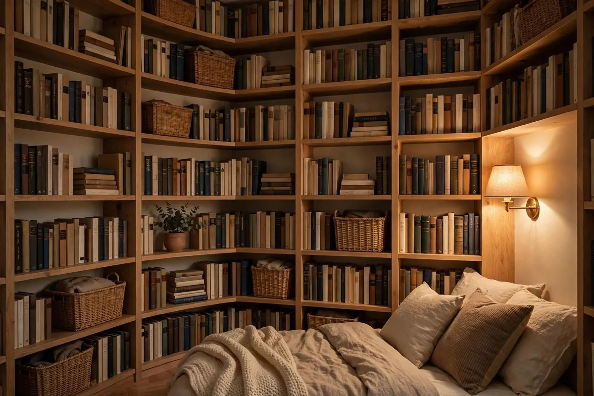
Dead space above your furniture is wasted luxury. Shelves or cabinets that run floor to ceiling make a tiny room feel custom-built and grand.
The vertical lines draw the eye up. The ceiling feels higher. The storage looks intentional, like it was designed for the room.
Use the top shelves for pretty things. Baskets, boxes, books you love. The high spots are for display, not for daily digging.
Keep the bottom practical. Daily items at arm height. Seasonal stuff up top. A small step stool makes the high shelves usable.
Paint built-ins the same colour as the walls. They blend in and the room feels bigger. Contrasting colours chop the wall into pieces.
One full wall of storage beats three small bookcases. It looks calm and architectural. Small scattered pieces look fussy.
I added tall shelves either side of a tiny bedroom window. The room gained a library feel. Guests always comment on it first.
Dust the tops now and then. High shelves collect dust fast. A quick wipe keeps them looking sharp instead of forgotten.
21. Turn a Tiny Balcony Into a Cafe Corner
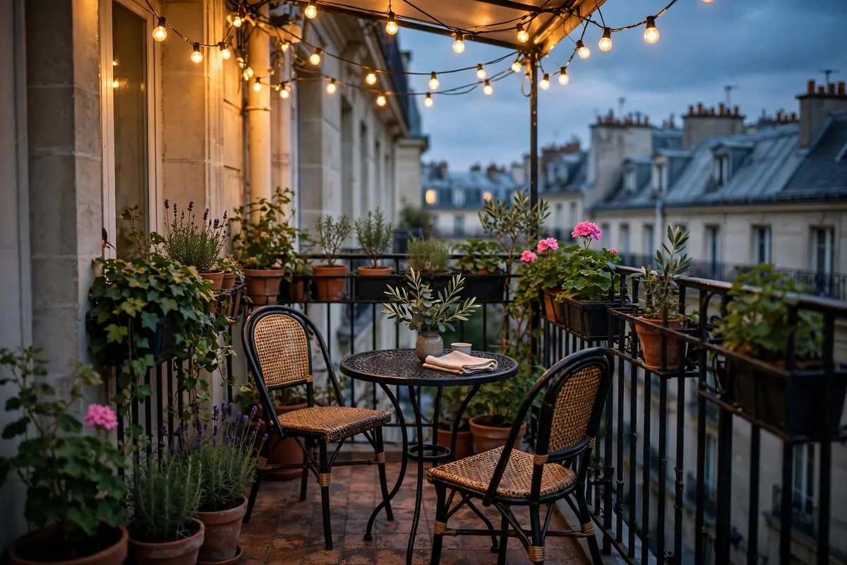
A tiny balcony is a room without a roof. Treat it like one and it becomes the most charming seat in the house. A bistro table, two chairs, and you have a Paris cafe.
Keep the furniture small and foldable. A round bistro table tucks into corners. Folding chairs can hang on the wall when not in use.
Add plants in a row. Pots along the railing make a green wall. It feels private and lush, even on a busy street.
String lights change everything. Warm little bulbs overhead turn a plain balcony into an evening spot. It glows like a restaurant terrace.
An outdoor rug grounds it. Yes, even outside. A small rug says this is a room, not a ledge. It makes the space feel finished.
Weatherproof cushions add comfort. A cushion on a metal chair turns twenty minutes into two hours. Choose colours that match your indoor palette.
I had coffee on a friend's tiny balcony strung with lights. It felt like a holiday. The balcony was barely bigger than a door mat.
Sweep it and keep it tidy. A small outdoor space shows mess fast. Five minutes of tidying keeps the cafe feeling alive.
22. Go Dark and Moody in the Powder Room
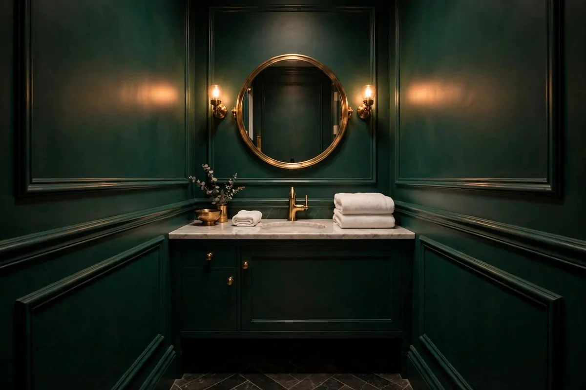
A tiny powder room is the one place where dark walls work magic. Deep green, navy or charcoal make the small space feel like a jewel box, not a cupboard.
Dark walls blur the corners. You cannot quite see where the room ends. It feels deeper and more mysterious than white walls would.
Add brass or gold against the dark. A brass mirror, gold taps. Warm metal glows against dark paint like candlelight. It is a classic rich pairing.
Keep the lighting warm and low. A small sconce or a pretty pendant. Bright overhead light kills the mood. You want glow, not glare.
One piece of art or a pretty mirror is enough. Dark walls need little decoration. The colour is the decoration.
White towels pop beautifully against dark walls. Crisp white on deep green looks five-star. It is the easiest styling trick in this room.
I painted a tiny downstairs loo deep green once. Guests walked in and gasped. It became the most talked-about room in the house.
Ventilate well and use proper bathroom paint. Dark paint shows moisture marks fast. The right paint keeps it looking rich for years.
23. Build a Window Seat Worth Sitting In
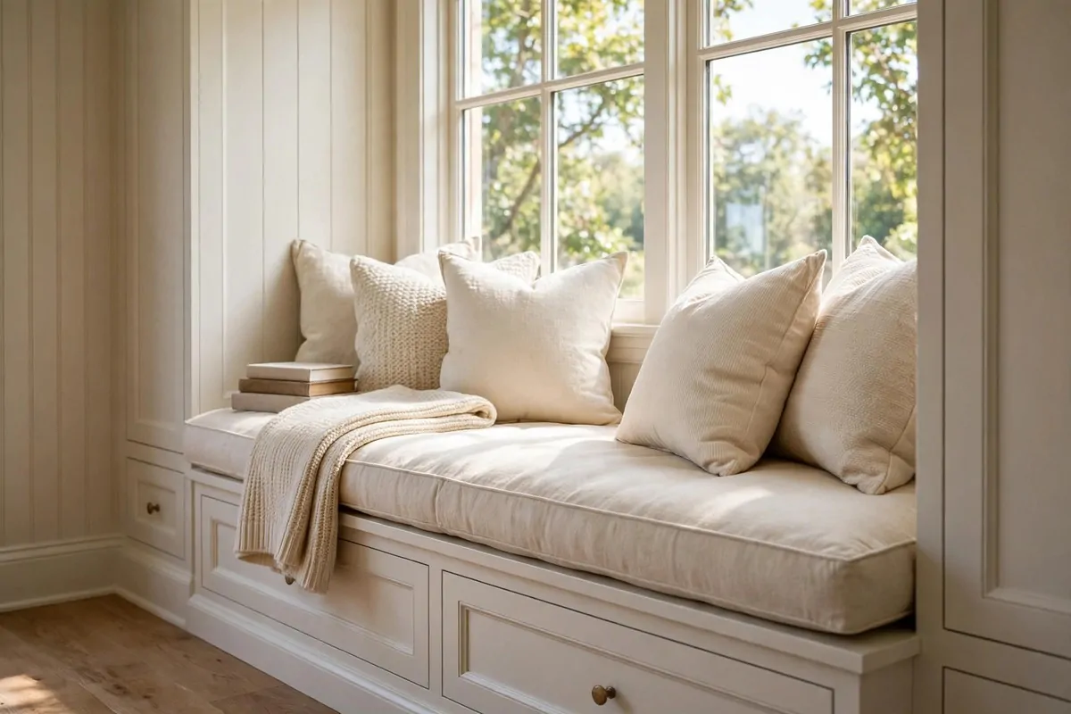
A window seat turns dead space into the best spot in the house. A deep cushion, some pillows, a throw, and suddenly everyone fights over it.
The cushion must be thick. A thin pad feels like a bench. A deep, firm cushion feels like a sofa. Comfort is what makes it look inviting.
Layer pillows along the back. Different sizes, one colour family. They make the seat look plush and styled, and they are genuinely comfy.
Add storage underneath. Drawers or baskets under the seat hide clutter. A window seat that stores things is a tiny-room hero.
A throw draped over one end says someone loves this spot. It adds texture and colour. It makes the seat look lived-in, not staged.
Good light is built in. Windows give the best reading light there is. A small side table for tea completes it.
I made one from a low bookcase, a cushion and pillows. Total cost was small. It became the spot where everyone ended up with a book.
Keep the window clean and the view clear. The window is the art here. A dirty window ruins the whole dream. Wipe it and let the light in.
- Deep, firm cushion for real comfort
- Pillows in one colour family, varied sizes
- Storage baskets or drawers underneath
- A throw for texture and warmth
- Small side table for a cup of tea
24. Keep Floors Flowing From Room to Room
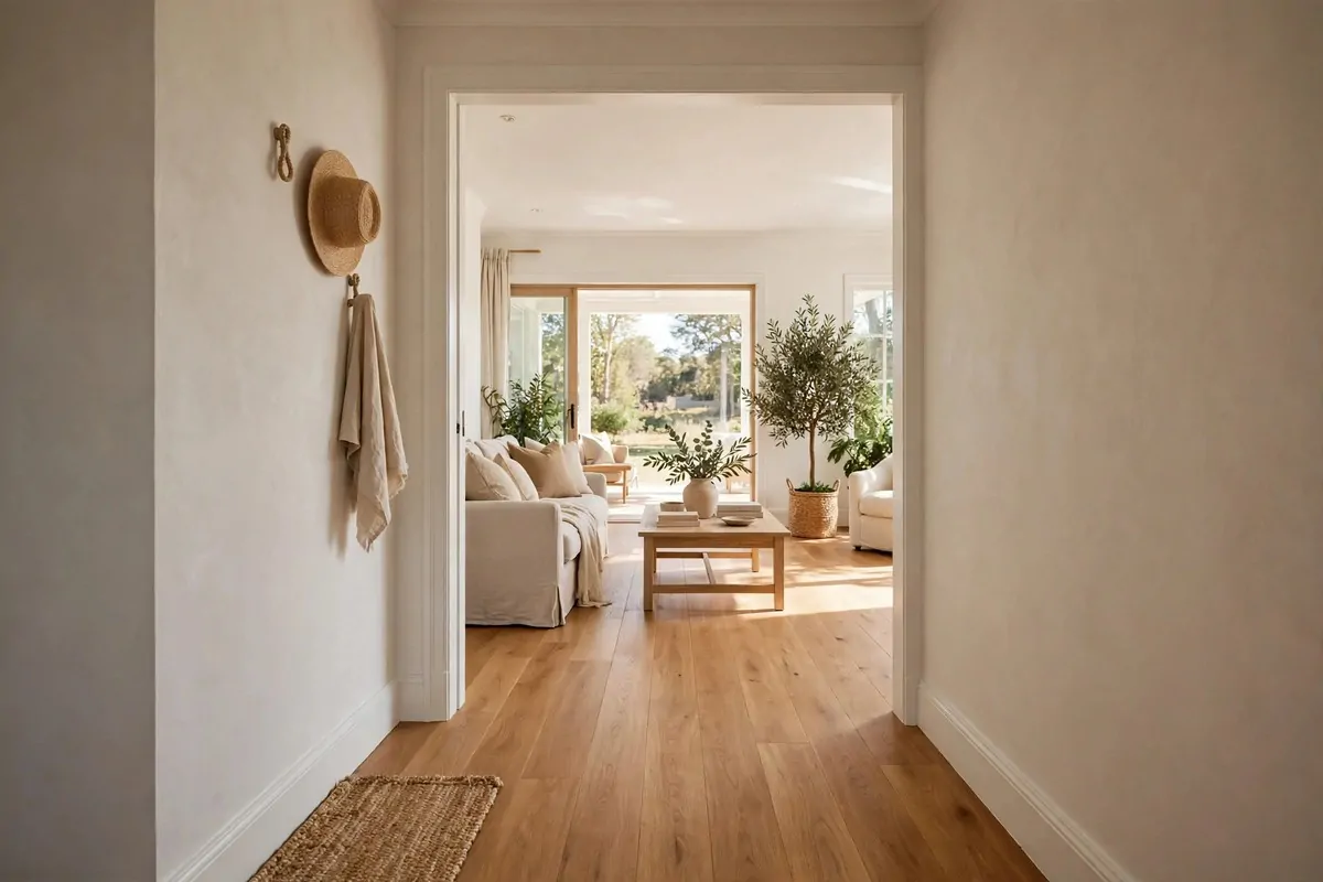
Chopped-up flooring makes a tiny home feel smaller. Different floors in every room stop the eye at each doorway. One flowing floor makes it all feel bigger.
Use the same flooring through as many rooms as you can. Wood or wood-look running from hall to living room to bedroom. The eye glides straight through.
The eye reads it as one big space. Doorways become details, not dividers. The home feels open even when the rooms are small.
Keep the tone consistent. If you cannot replace floors, use rugs in similar tones to link rooms. Visual flow matters more than actual material.
Remove fussy thresholds where you can. A smooth transition between rooms feels modern and calm. Little strips and steps break the flow.
This works in open-plan spaces too. One floor under kitchen and living area zones them as one generous room. Rugs then mark the zones.
I have seen tiny flats where the wood ran wall to wall. They felt twice their size. The floor did all the work.
And keep it clean. A flowing floor shows dust across the whole home. A quick regular sweep keeps the big-space illusion alive.
25. Style a Desk Corner That Means Business
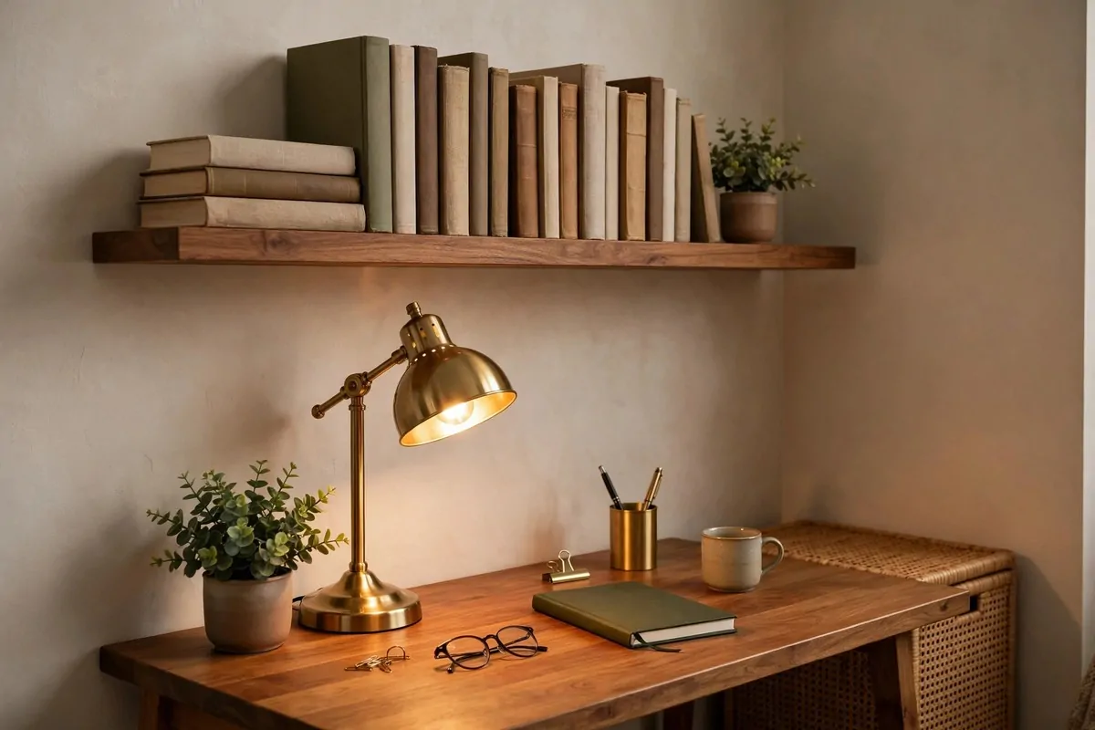
A tiny home office can look like a cluttered afterthought. Or it can look like a proper study. The difference is styling, not size.
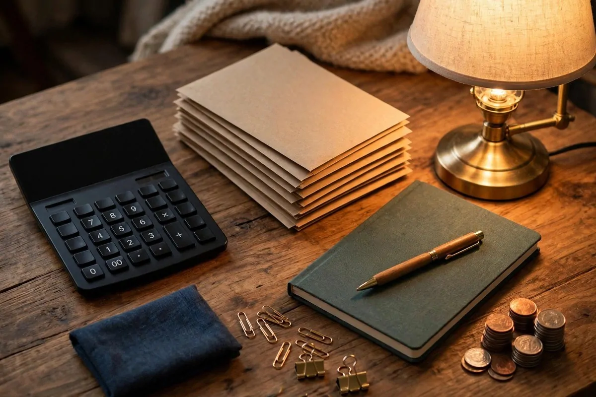
Start with a real desk lamp. A brass or black desk lamp says this is a workplace. Overhead room light alone makes a desk feel temporary.
Keep the surface clear. Laptop, lamp, one notebook, one small plant. A clear desk looks calm and capable. A buried desk looks stressed.
Use the wall above. A small shelf, a pinboard, one framed print. Vertical styling makes the corner feel designed, not squeezed in.
Hide the cables. A cable tray or a simple box under the desk removes the messiest visual. Tidy cables are invisible luxury.
A good chair matters. You do not need an expensive one, just one that looks intentional. A wooden chair with a cushion beats a sad office cast-off.
I set up a desk in a hallway nook once. Lamp, shelf, plant, done. It became my favourite spot. Small, but it felt like a real office.
And face the desk toward the room if you can. Facing a wall all day feels like punishment. Facing out feels like you run the place.