30 Design Ideas to Steal for Every Room in Your Home

The first home I ever decorated had eleven paint colors in it, and not one of them matched anything else. The kitchen was bright yellow. The bedroom was dark purple. The hallway was a green I still cannot explain.
I thought more color meant more style. It did not. It meant my eyes never knew where to rest. Every room shouted, and none of them talked to each other.
Years later I learned the truth about good Design Ideas. They are almost never big or expensive. They are small moves, repeated with care. A rug that is actually big enough. A lamp where you actually sit. A color that shows up three times instead of once.
This list is my whole collection of those small moves. Thirty ideas, one for every room and every corner of your home. Steal the ones that fit your house. Skip the rest. You do not need a designer or a big budget. You need a free afternoon and a willingness to move the sofa.
1. Float the Sofa Off the Wall
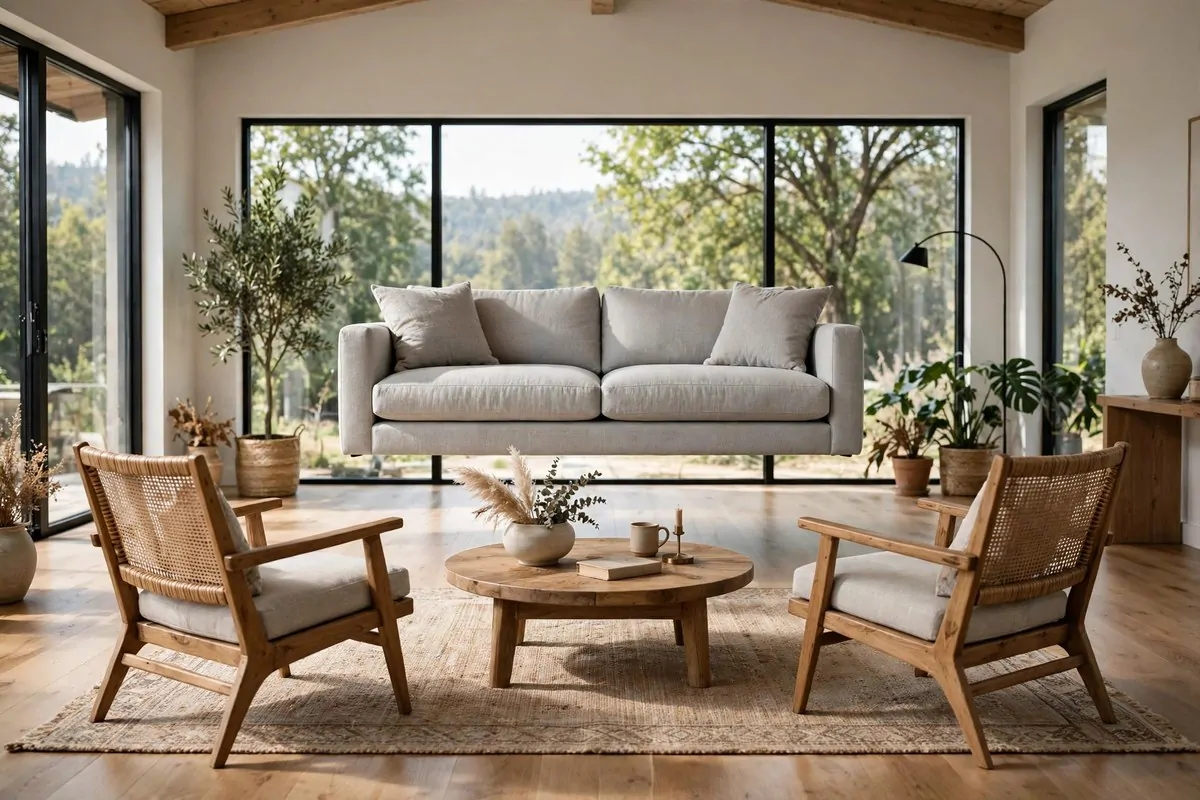
Most of us push the sofa flat against the wall and call it done. It feels safe. It feels like we are saving space. But a sofa stuck to the wall can make a room feel like a waiting room.
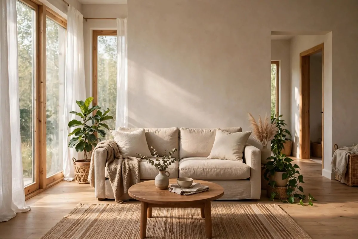
Pull it out, even a little. Six inches of air behind the sofa changes the whole feeling. The room gets depth. The sofa gets a shape. You can walk behind it, and suddenly the room feels designed instead of just filled.
If your living room is big enough, float the sofa fully. Put it in the middle of the room, facing two chairs, with a rug underneath all of it. The back of the sofa becomes a divider, and the room gets two zones instead of one long hallway.
A slim console table behind a floated sofa is a lovely trick. It holds a lamp, a book, and a drink. It also hides the back of the sofa, which is never the prettiest view in the house.
Try it for a week before you decide. Living with a floated sofa feels strange for the first two days. Then you sit down in your new conversation corner and you wonder why you ever lined the walls with furniture.
Keep the walkway behind the sofa clear. If you have to squeeze past, the float is too far out. A comfortable gap is about the width of your hips. Enough to walk through without turning sideways.
This works in small rooms too. A sofa pulled six inches off the wall with a narrow shelf behind it gives you storage and breathing room. Small does not have to mean stuck.
One pull, six inches, and your living room starts to feel like it was planned.
2. Buy the Bigger Rug
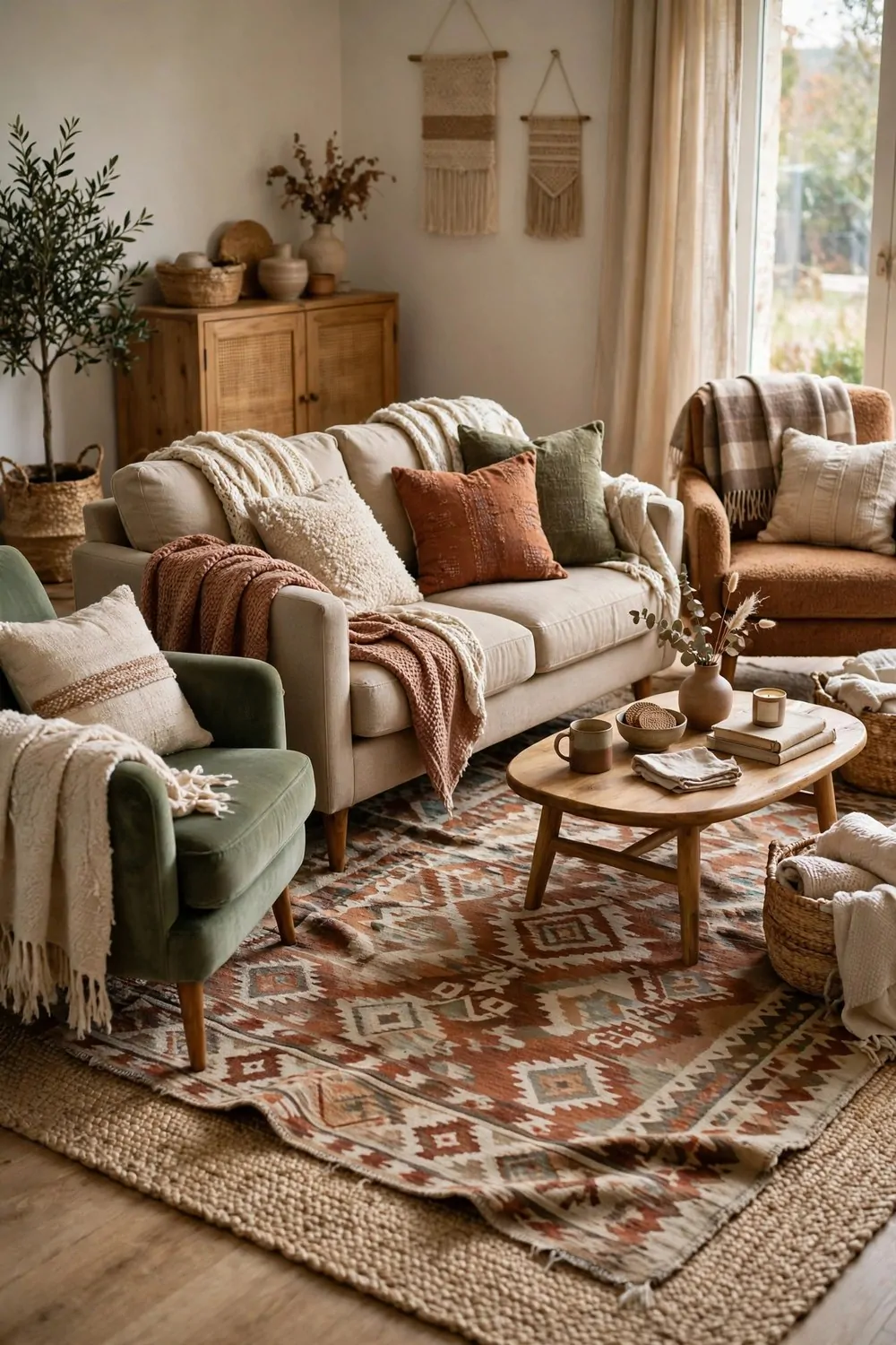
Almost every rug I see in real homes is too small. It floats in the middle of the floor like a little island, and the furniture stands around it looking awkward and separate.
The rule is simple. The rug should be big enough for the front legs of every seat in the group. Even better, all four legs of the sofa and the chairs sit on the rug. That is when a seating area starts to feel like one place.
Here is a quick guide to rug sizes for common rooms:
| Room size | Rug size to try first | What should sit on it |
|---|---|---|
| Small living room | 5 by 8 feet | Front legs of sofa and chairs |
| Medium living room | 8 by 10 feet | All legs of sofa and chairs |
| Large living room | 9 by 12 feet | Whole seating group, plus the coffee table |
| Bedroom | 8 by 10 feet under a queen bed | Bed plus two feet of rug on each side |
Measure your seating group before you shop. Lay tape on the floor in the rug size you are thinking about. Live with the tape outline for a day. Your feet will tell you if it is right.
A rug that is too big is rare. A rug that is too small is everywhere. When you are torn between two sizes, pick the bigger one. Your room will thank you.
Flat, low pile rugs work best in busy homes. They are easy to clean, chairs slide on them, and the door can still open over them. Thick shag looks cozy in photos and fights you every day in real life.
One rug, the right size, and your furniture finally looks like it belongs together.
3. Lamps, Not Just the Big Light
The big ceiling light is the worst light in most homes. It shines down from above, makes shadows under your eyes, and turns every evening into an interrogation. Yet it is the light most of us use.
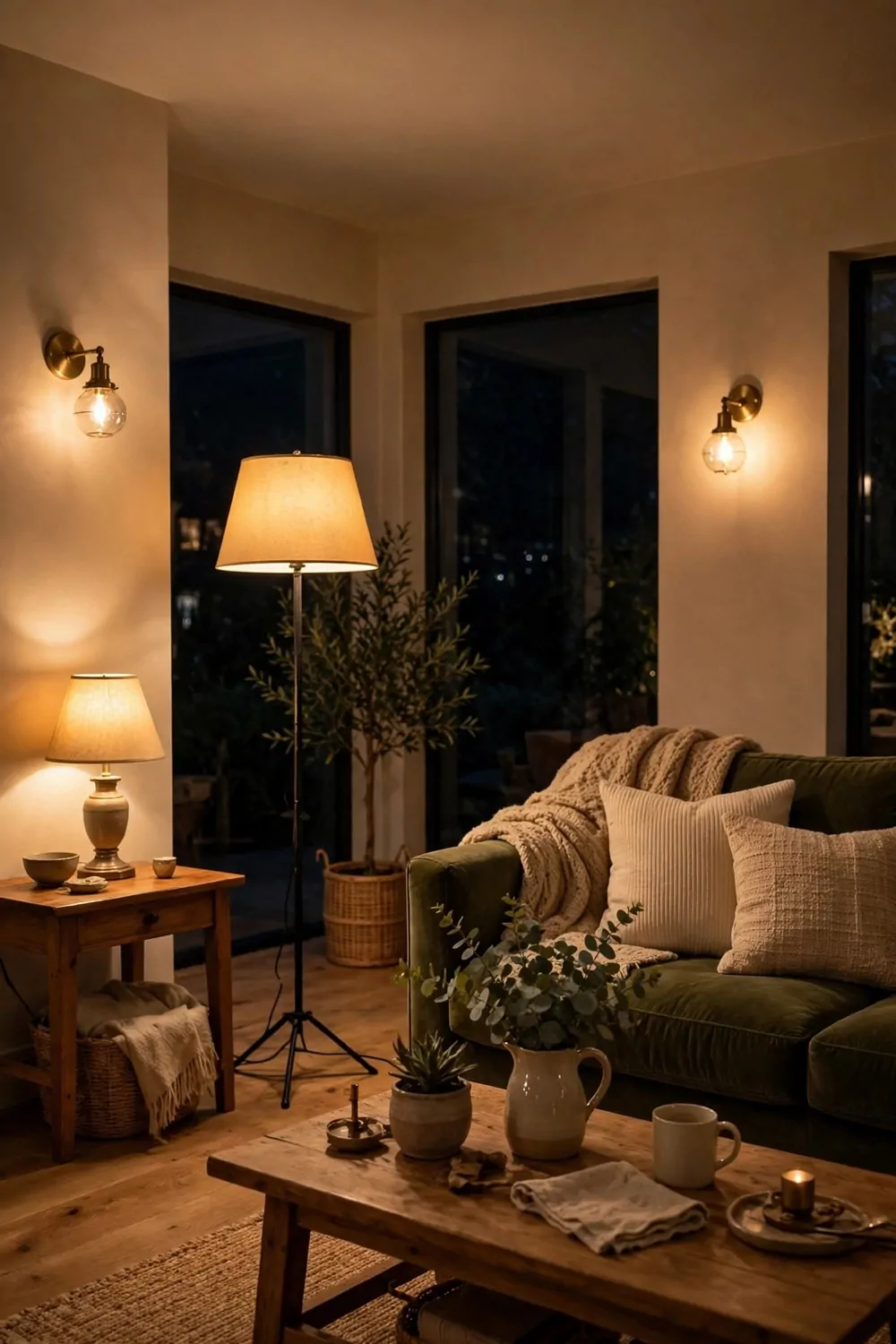
Good rooms use three kinds of light. A general light for seeing. A task light for reading or working. And a soft glow light for mood. Lamps give you all three without any rewiring.
Put a floor lamp beside the sofa for reading. Put a small table lamp on the console for glow. Put a warm light in the corner for evenings. Three lamps, three switches, and the room changes its mood with one click.
Warm bulbs matter more than fancy lamps. Look for bulbs around 2700K on the box. That warm number is the color of candlelight and late sun. Cool white bulbs make a living room feel like an office, and nobody relaxes in an office.
Keep the lamps at different heights. A tall floor lamp, a medium table lamp, and one low glow near the floor. Different heights make the light feel layered, like sunlight coming through trees.
I stopped using my ceiling light almost entirely. My living room is lit by two lamps and one small wall light. Guests always say the room feels warm. It is the lamps doing it, not the furniture.
If you rent and cannot add wall lights, use plug-in wall lamps or a lamp on a stack of books. The height trick works no matter how you get the lamp up there.
Turn the big light off tonight. Turn on the lamps. Sit down and see how the room feels. That feeling is the whole idea.
4. Make the Bed Like a Hotel
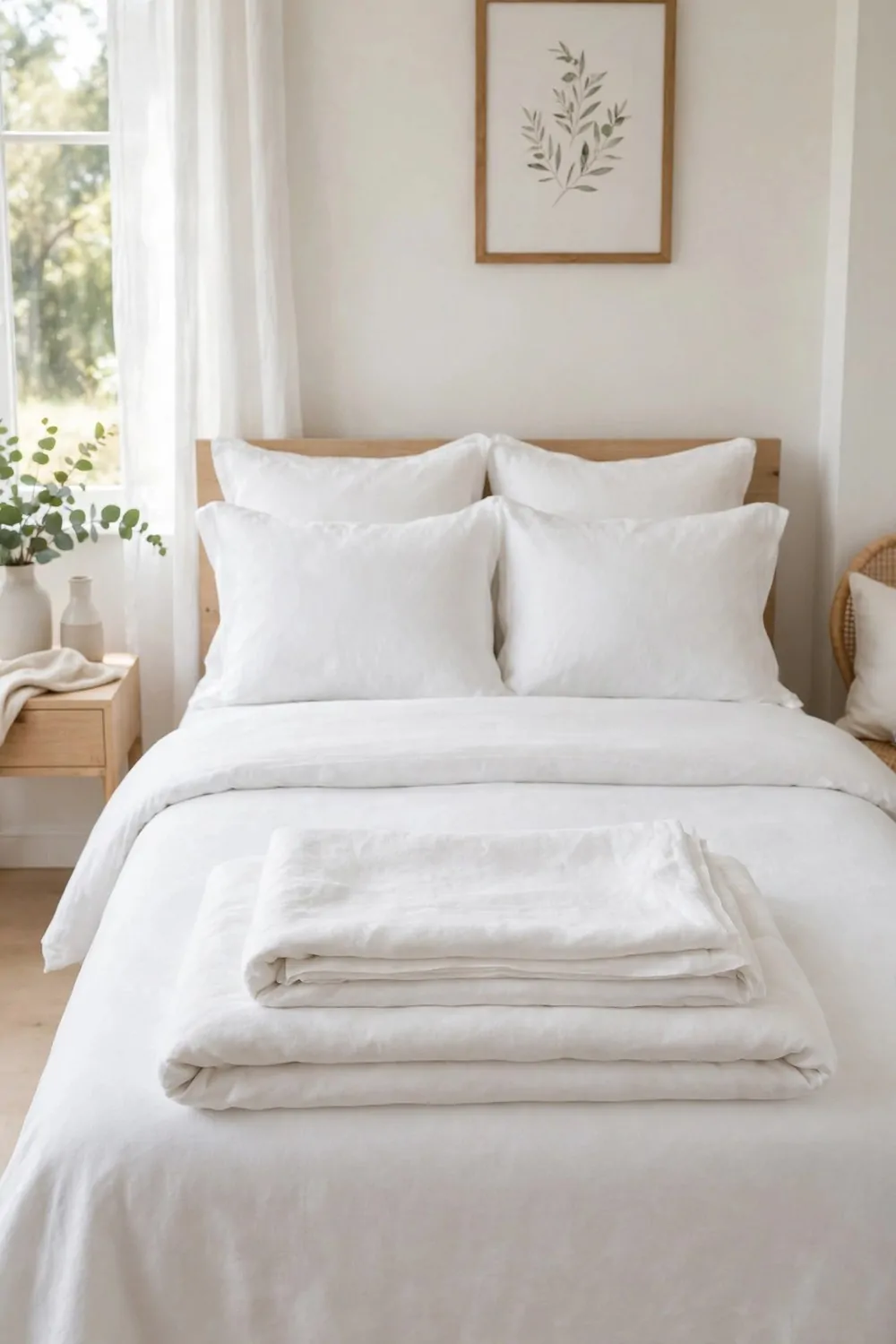
A made bed changes a bedroom more than any new furniture can. It is the biggest thing in the room, and your eyes land on it first. An unmade bed makes the whole room feel messy, even when everything else is tidy.
Hotel beds look good because of layers. A fitted sheet, a flat sheet folded back, a light duvet, and two or three pillows. Each layer is smooth and straight. Nothing fancy, just care.
Use white or very pale bedding. Pale bedding looks clean and calm, and it makes the room feel bigger. Dark bedding can look rich, but in a small bedroom it sits there like a big dark block and pulls all the light toward it.
Pull the duvet tight and fold the top third back. That fold is the hotel trick. It shows the sheet underneath, adds a clean line, and makes the bed look finished in ten seconds.
Add two sleeping pillows and two softer cushions in front. Not a mountain. Just enough to lean against when you read. Too many pillows end up on the floor every night, and a pile of pillows on the floor is not design.
Tuck the sides in or let them hang straight. Either way, keep both sides even. A bed that is neat on one side and messy on the other looks like you gave up halfway.
Make the bed every morning. It takes three minutes. Those three minutes buy you a calm bedroom all day long, and a room that feels designed even when the rest of the house is chaos.
Your bed is the star of the bedroom. Dress it like one.
5. Hang Art at Eye Level
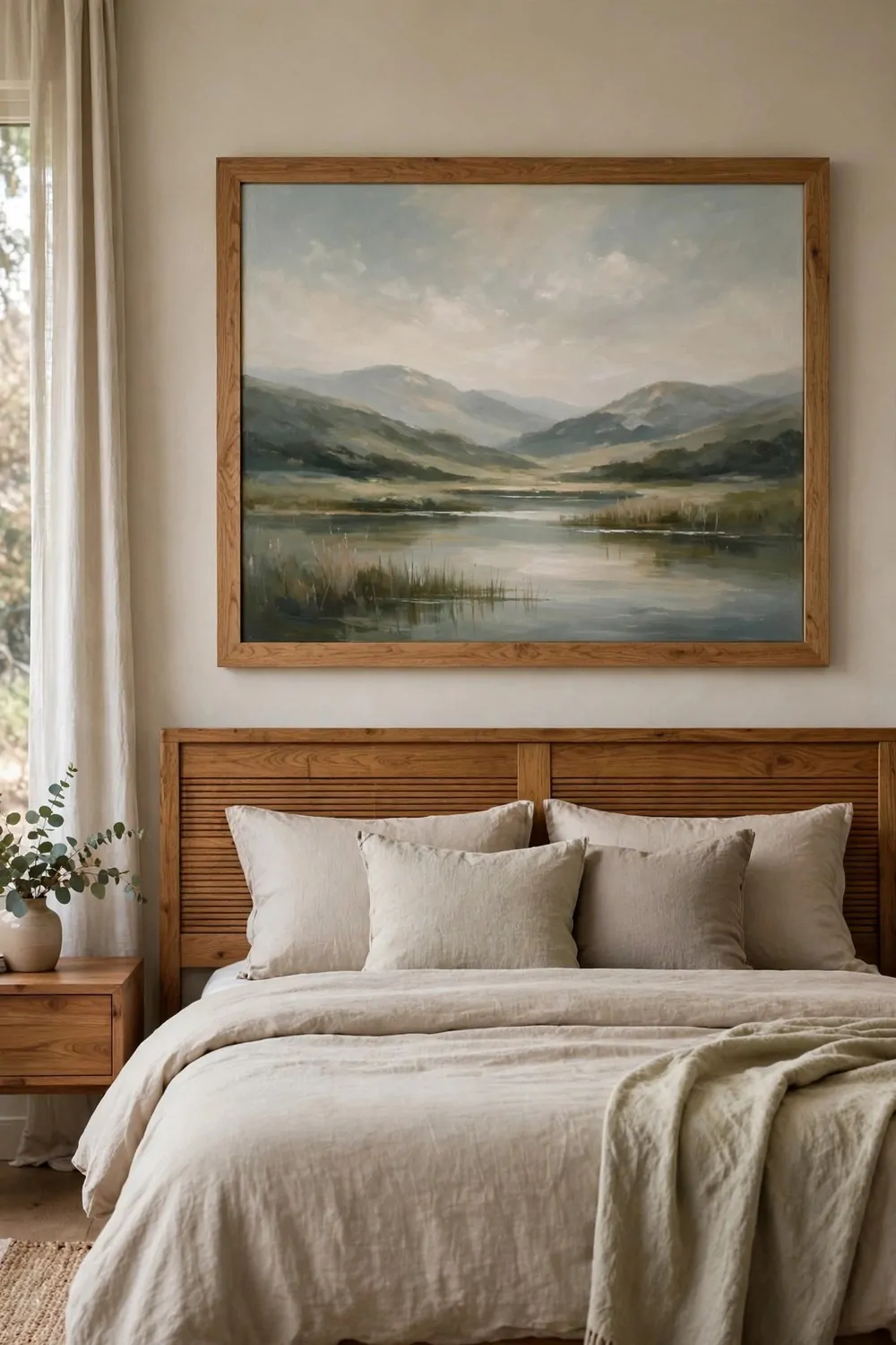
Art hung too high is the most common mistake in bedrooms. People hang a picture above the bed and push it up toward the ceiling, as if height makes it grand. It does not. It makes it float away from the room.
The center of a picture should sit at about eye level, roughly 57 inches from the floor. That is the height galleries use. It is the height your eyes naturally rest at when you stand in a room.
Above a bed, hang the art closer to the headboard than to the ceiling. A gap of about six to eight inches between the headboard and the bottom of the frame looks right. More than that, and the art and the bed stop talking to each other.
Go big over a bed. One large piece beats five small ones. A large piece fills the wall, anchors the bed, and gives the room one calm thing to look at. Small frames scattered above a bed look fussy and lost.
If you love a gallery wall, keep it in the hallway or the living room. Over a bed, one strong piece wins. Your eyes need one place to land when you wake up, not ten.
Check the art from the doorway, not from two inches away. Stand where you enter the room. If the art looks right from there, it is hung right. If you have to tilt your head back, it is too high.
A frame with a simple thin border keeps the focus on the art. Thick ornate frames fight the picture and add noise. Let the art do the work.
One picture, one nail, hung at eye level. It is the cheapest upgrade a bedroom can get.
6. The Three-Thing Nightstand
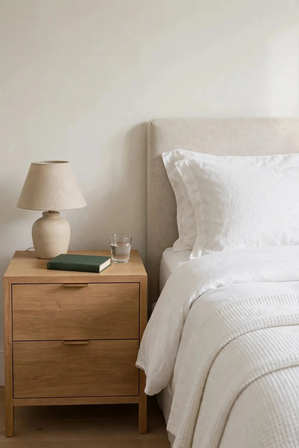
A nightstand collects clutter faster than any surface in the house. Glasses, chargers, books, bottles, old receipts, a cup from three days ago. It becomes a little junk drawer with a lamp on top.
The rule is three things. A lamp. A book. A glass of water. That is all a nightstand needs to hold. Everything else lives in the drawer or somewhere else entirely.
A lamp that works for reading and for sleep is worth the money. Warm light, a shade that points down, and a switch you can reach without sitting up. One good lamp beats a pile of gadgets.
Keep the book you are actually reading, not the five you plan to read. One book on the nightstand is a promise. Five books is a pile of guilt that stares at you every night.
The drawer holds the rest. Chargers, medicine, a notebook, spare reading glasses. Close the drawer and the surface stays calm. Open surfaces stay calm only when the hidden storage does the real work.
Clear the nightstand every Sunday. It takes two minutes. Old water glasses go to the kitchen. Finished books go to the shelf. The three things stay, and the nightstand resets itself.
A calm nightstand helps you sleep. Your brain reads the tidy surface as a tidy day ending. A messy nightstand reads as unfinished business, and unfinished business keeps you awake.
Lamp, book, water. Three things, every night, and the bedroom breathes easier.
7. Open Shelves With the Dishes You Use
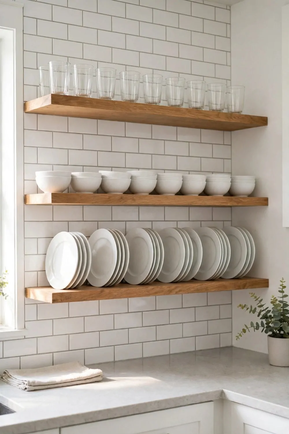
Open kitchen shelves look beautiful in photos, and they can work in real kitchens too, if you follow one rule. Only the dishes you actually use every day go on the open shelves. Everything else stays behind a door.
Everyday white dishes are the best choice for open shelves. They stack neatly, they match everything, and they look calm from across the room. A jumble of patterns and colors on an open shelf reads as clutter, even when it is tidy.
Keep the stacks short and even. Four or five plates per stack, bowls nested together, glasses in a straight row. The shelf should look like a shop display, not like a cupboard that lost its door.
Leave space between groups. A shelf packed edge to edge feels heavy. A shelf with a little air between the plates and the glasses feels light and easy. Air is part of the design, even in a kitchen.
Put the shelves near the dishwasher or the sink. Dishes travel from shelf to table to sink and back. Short trips mean the shelves stay used and the dishes stay clean. Long trips mean the shelves become decoration and the dishes gather dust.
Wash the shelf dishes often. Open shelves collect a thin film of kitchen grease over time. A quick wipe of the shelf and a rinse of the dishes once a week keeps everything fresh and ready.
If open shelves feel scary, start with one. One shelf, one set of dishes, one week. You will know fast if the open look suits your kitchen or if you prefer doors. Both answers are fine.
One shelf, everyday dishes, kept neat. The kitchen gets a display and you get your plates in one easy reach.
8. Clear Counters, Happy Kitchen
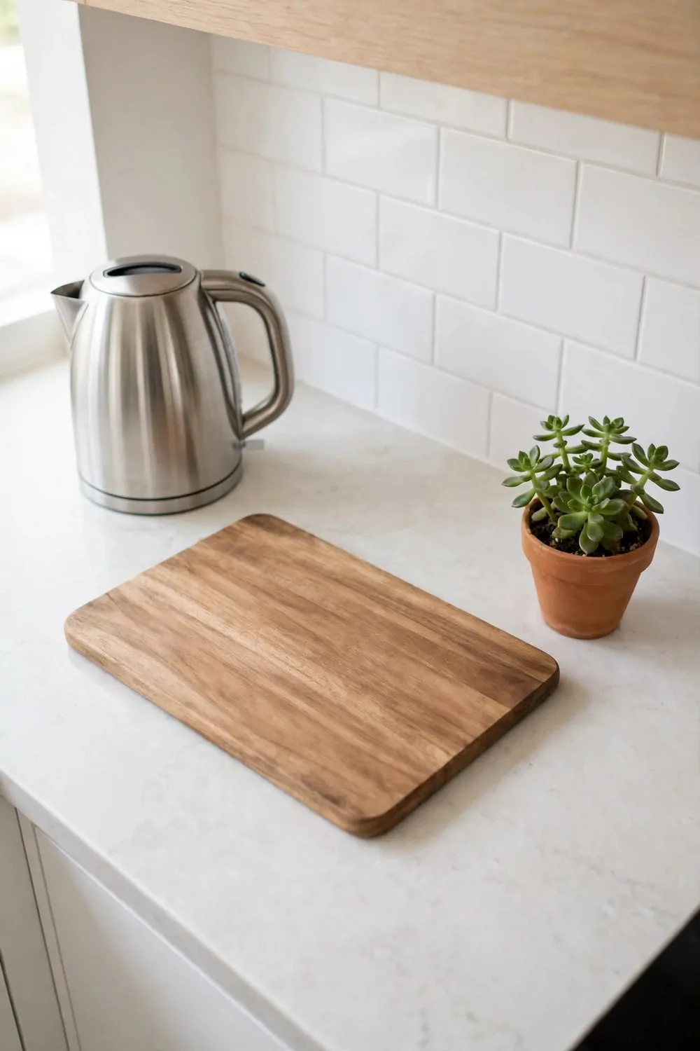
A kitchen counter covered in stuff feels stressful, even when the stuff is useful. The toaster, the blender, the knife block, the fruit bowl, the mail pile, the vitamins. Each item is small. Together they eat the whole kitchen.
Keep only what you use every single day on the counter. For most homes that is a kettle or a coffee maker, a cutting board, and maybe a knife block. Everything else lives in a cupboard and comes out when it is needed.
The fruit bowl is allowed. One bowl of fruit adds color and life. Three bowls, a bread box, and a stack of cookbooks is a display, not a working counter. Pick the one bowl and let the counter breathe.
Wipe the counters every night after dinner. Not a deep clean, just a clear and a wipe. An empty counter in the morning makes the whole kitchen feel bigger and the day feel easier. It is a small habit with a big payoff.
Use the inside of cupboard doors. Hooks for measuring cups, a small rack for spices, a board for notes. The door space is free storage that keeps the counters clear without any new furniture.
Group the few things that stay out on one tray. A tray turns three loose items into one tidy group. It also makes wiping the counter easy, because you lift one tray instead of ten small things.
A clear counter is not about being strict. It is about giving yourself room to cook. Cooking needs space, and space is the one thing a crowded counter never gives you.
Clear it tonight. Cook in it tomorrow. You will feel the difference with the first chopped onion.
9. A Backsplash With a Little Courage
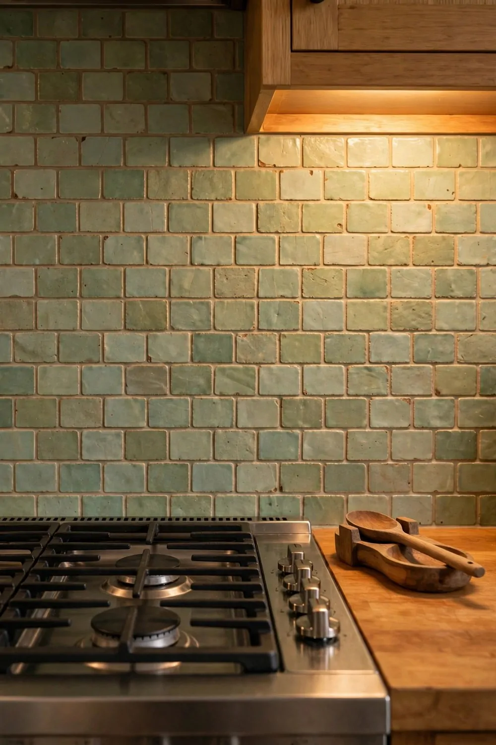
The backsplash is the smallest wall in the kitchen and the best place to be brave. A bold tile there costs very little, because the area is small, but it changes the whole room.
Handmade-look tiles in a soft color are a lovely place to start. Sage green, warm cream, or dusty blue. The slight unevenness of handmade tiles catches the light and makes the kitchen feel crafted instead of flat.
Keep the rest of the kitchen calm when the backsplash is bold. Plain counters, simple cupboard fronts, quiet floors. One brave wall is a statement. Two brave walls is a fight.
Run the tile all the way to the ceiling behind the stove if you can. A short strip of tile stops the eye. A tall run pulls the eye up and makes the kitchen feel taller and more finished.
Grout color matters more than people think. White grout with pale tiles looks fresh and clean. Gray grout with pale tiles looks calm and hides splashes. Pick the grout with the same care as the tile.
If new tile is too much right now, peel and stick tiles do a fine job. They cost little, go up in an afternoon, and come down clean when you move. The brave backsplash is not about the budget. It is about the choice.
Wipe the backsplash down after cooking. Grease settles on tile fast, and a greasy backsplash dulls the color. A quick wipe keeps the brave wall looking brave.
One small wall, one brave choice, and the kitchen gets a personality all its own.
10. Spa Towels, Rolled Not Folded
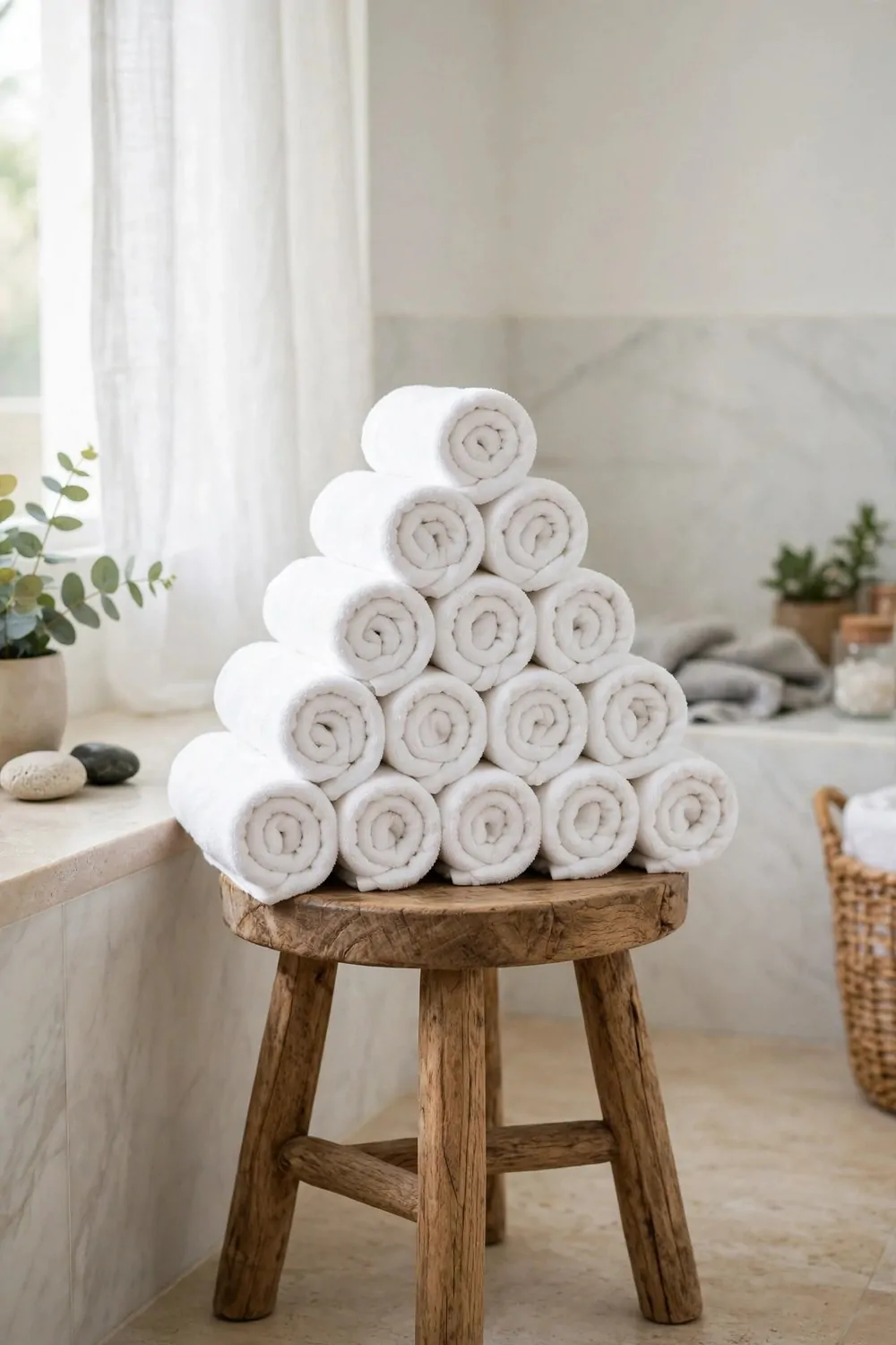
Hotels roll their towels, and there is a reason. Rolled towels look plush, take up less shelf space, and make an ordinary bathroom feel like a spa. Folded towels in a stack look like a linen cupboard. Rolled towels look like a treat.
Roll each towel tightly, starting from one short end. Tuck the loose end under the roll. Stack the rolls in a pyramid on a stool, or line them in a basket by the tub. The shape does half the work for you.
Use white towels for the spa look. White reads as clean and fresh, and it matches every bathroom color. Colored towels are fine too, but one color only. A rainbow of towels on display reads as busy, not relaxing.
Keep two rolled towels out and the rest in the cupboard. Display is for show. The working towels live behind a door, where they stay dry and fresh. Swap the display towels for clean ones once a week.
Add one small thing beside the towels. A candle, a little plant, or a bottle of nice soap. One thing, not five. The spa feeling comes from calm and space, not from a crowd of products.
Wash towels with no fabric softener if you can. Softener coats the fibers and makes towels less absorbent over time. A splash of vinegar in the rinse keeps them soft and thirsty, which is what a towel is for.
Roll the towels tonight. Put them where you can see them. Tomorrow morning your bathroom will feel like a small hotel, and your shower will feel like a small holiday.
11. A Plant in the Bathroom
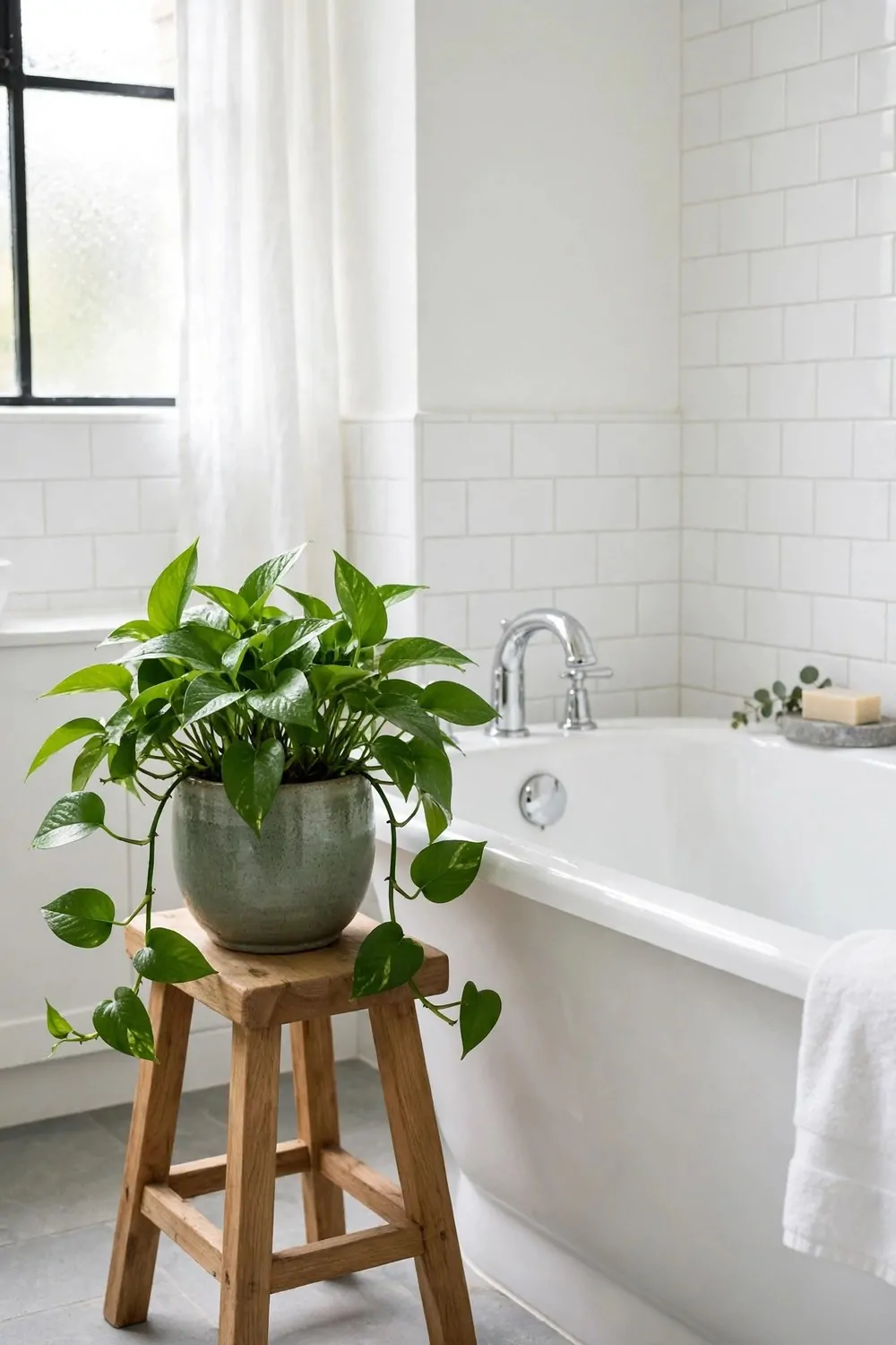
Bathrooms are hard, wet, steamy rooms, and most of them have no life in them at all. Tile, glass, chrome, and nothing green. A plant changes that in one move. It softens every hard surface it sits near.
Pick a plant that loves humidity. Pothos, ferns, and peace lilies all enjoy steamy air and low light. They are the plants that forgive a bathroom, and they grow happily with very little care.
Put the plant where it gets some light but not direct harsh sun. A stool by the tub, a shelf near the window, or a hanging pot from the ceiling. The plant should be seen from the door, so it greets you when you walk in.
Use a pot that matches the bathroom. White ceramic, natural stone, or woven baskets all suit a bathroom. A plastic nursery pot with a label still on it ruins the spa feeling fast. Repot it once and the plant looks like it belongs.
Water less than you think. Bathroom air is damp, and the soil stays wet longer. Check the soil with your finger before you water. If it feels damp an inch down, wait. Overwatering kills more bathroom plants than neglect does.
One plant is enough for a small bathroom. Two is plenty for a big one. A jungle in a bathroom feels damp and crowded. One healthy green plant feels fresh and calm.
A living thing in the hardest room of the house. That is the whole trick, and it costs less than a new shower curtain.
12. The Key Tray by the Door
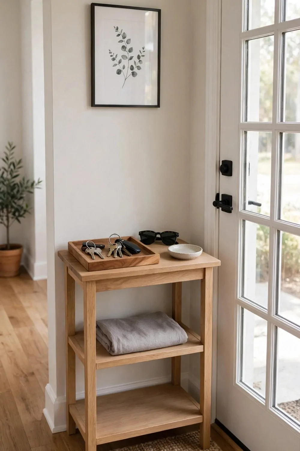
Lost keys steal more time than almost anything in a home. We all know the feeling. You are ready to leave, shoes on, bag in hand, and the keys are nowhere. The whole morning unravels over a small piece of metal.
The fix is a tray by the door. One tray, always in the same spot, holding keys, sunglasses, and loose change. Everything that leaves the house with you lives in the tray. Everything else lives somewhere else.
Put the tray on the first surface you pass when you walk in. A console table, a shelf, or a hook rail by the door. It must be the easy spot, or nobody will use it. Convenience beats beauty here, every time.
Empty the tray once a week. Receipts, old tickets, and coins creep in fast. A tray that overflows stops being a landing spot and becomes a junk pile. A quick weekly clear keeps it working.
Give everyone in the house a spot in the tray. One small dish per person, or one tray with clear zones. Shared trays work when the zones are clear. Shared trays fail when everything lands in one heap.
A small dish for keys also catches the little things. The spare house key, the garage remote, the dog lead clip. Small things with a home do not get lost. Small things without a home vanish weekly.
One tray, one spot, every day. The keys live there, and the mornings get calmer.
13. A Mirror You Pass on the Way Out
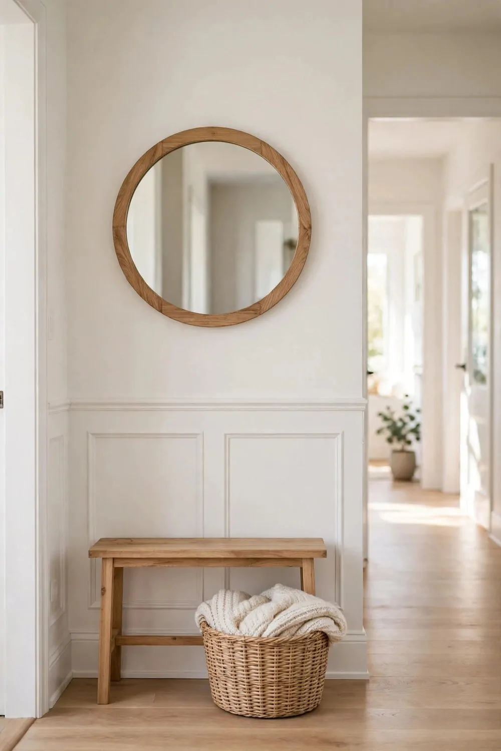
A mirror by the front door does two jobs at once. It bounces light into the entryway, which is often the darkest spot in the house, and it gives you one last look before you leave.
Hang it at face height, where you naturally glance as you walk past. Not so high you see the ceiling, not so low you see the floor. Your face should be centered when you stand a step away from the door.
A round mirror suits most entryways. It softens the hard lines of the door frame and the console table. A rectangular mirror suits a narrow hallway better, where it can run tall and make the space feel longer.
Keep the wall around the mirror simple. One mirror, one small bench or console, one basket underneath. An entryway crowded with frames and hooks feels busy the moment you walk in. Calm entryways make calm departures.
Put a small bench under the mirror if you have room. It holds shoes, bags, and a place to sit while you tie laces. A bench with a basket underneath hides the shoe pile and keeps the floor clear.
Wipe the mirror once a week. Entryway mirrors collect dust and fingerprints fast, because everyone touches the door and the light switch nearby. A clean mirror bounces twice as much light as a dusty one.
One mirror, one glance, one deep breath. You leave the house looking right and feeling ready.
14. Dining Chairs That Do Not Match
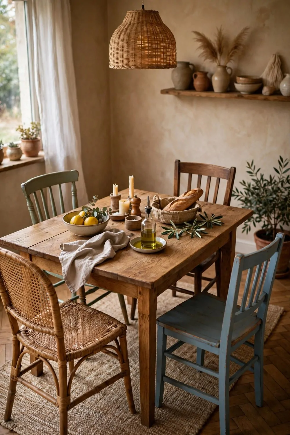
A matching dining set looks tidy in a shop and a little stiff at home. Six identical chairs in a row feel like a restaurant, not a family table. Mixed chairs feel collected, warm, and personal.
The trick is to mix with a plan. Pick one thing that stays the same. The same wood tone, the same seat height, or the same simple shape. Then let everything else vary. Same height, different styles. Or same style, different finishes.
Two chairs at the ends can be different from the side chairs. A pair of armchairs at the heads of the table anchors the set, and simpler side chairs fill the rest. The table reads as designed, not as a random sale haul.
Keep the seat heights within an inch of each other. Chairs that sit at different heights make dinner awkward. Measure before you buy, especially with old or secondhand chairs. Height matters more than looks here.
Rattan, wood, and painted chairs mix beautifully. A rattan chair beside a wooden one adds texture. A painted chair adds a pop of color. The mix feels collected over time, like the table grew with the family.
Add one bench on one side if the table is long. A bench slides under the table when not in use, seats three kids easily, and softens the formal feel. Benches also make a dining room feel casual and welcoming.
Mixed chairs tell a story. Matching chairs tell a receipt. Pick the story.
15. A Centerpiece That Stays Low
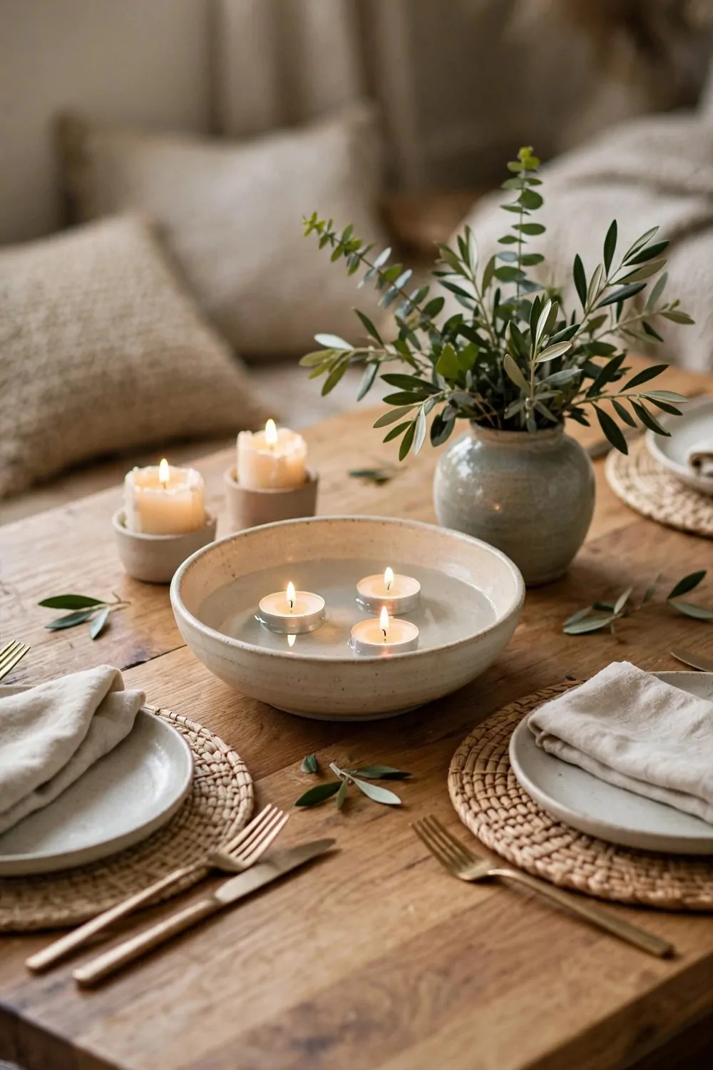
A tall centerpiece blocks the view across a dining table. You cannot see the person opposite you, so conversation dies. A low centerpiece keeps the view open and the table feeling generous.
The rule is simple. Nothing on the dining table should be taller than a water glass. A shallow bowl, a low vase with short stems, or a row of small candles. The table stays open, and faces stay visible.
A shallow wooden bowl with fruit is the easiest centerpiece there is. It adds color, it changes with the seasons, and it is useful. Fruit gets eaten, the bowl gets refilled, and the table never looks stale.
Candles work beautifully at dinner. Three small candles in a row down the middle of the table give warm light and a little ceremony. Keep them unscented, so the food smells like food and not like a candle shop.
Change the centerpiece with the seasons, but keep it low every time. Spring greenery in a low vase. Summer fruit in a bowl. Autumn leaves on a tray. Winter pine branches laid flat. The table stays fresh without ever blocking a face.
Keep the centerpiece to one third of the table length. A centerpiece that runs the whole table crowds the plates and the elbows. One calm group in the middle, and the rest of the table belongs to dinner.
Low, simple, and changed often. That is a centerpiece that serves the meal instead of stealing it.
16. A Desk That Faces the Room
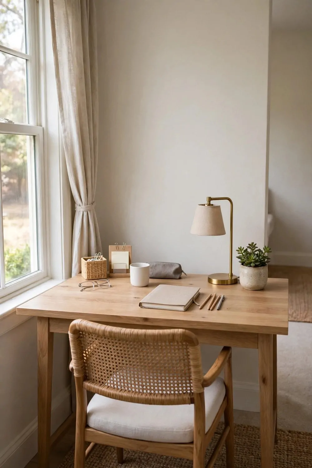
Most home office desks face the wall. It feels logical. The desk goes against the wall, the chair goes in front, and you stare at paint all day. It is also the most tiring way to work.
Turn the desk around. Face the room, the door, or the window. Your eyes get distance to rest on, your brain gets a view, and the room feels bigger because you can see all of it from your chair.
A desk facing the room needs a tidy back. The cables, the monitor back, and the clutter all show from the door. A cable box and one tidy shelf behind the desk fix that. The room side stays calm.
If the desk faces a window, angle it slightly sideways. Straight-on window light glares on the screen by mid-morning. Sideways gives you daylight without the glare, and a view to rest your eyes on between tasks.
Put a lamp on the desk even if the room is bright. Task light at desk level stops eye strain in the afternoon, when daylight fades but work goes on. A small warm lamp is kinder than the ceiling light for late work.
Keep the desk surface to one job at a time. Laptop, notebook, mug, lamp. Papers that belong to tomorrow live in a tray, not spread across the desk. A clear desk at the end of the day makes the next morning start clean.
Facing the room changes how work feels. You are part of the house, not facing away from it. Try it for a week. Most people never turn the desk back.
17. Hide the Cables in One Box
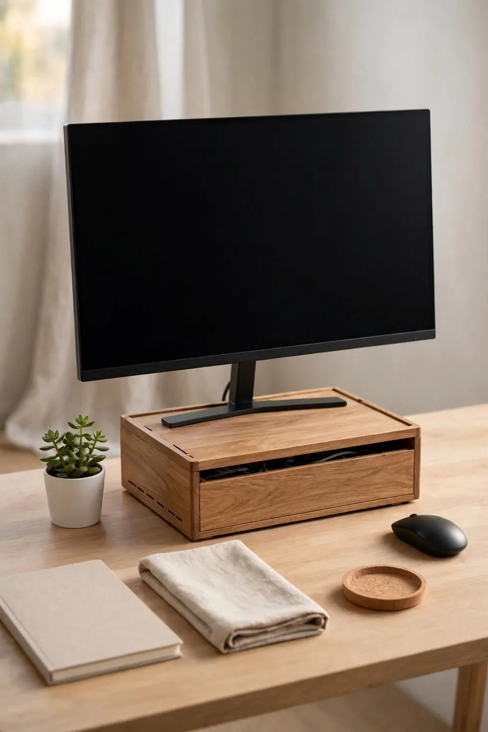
Cables are the visual noise of a modern home. Chargers, monitor leads, lamp cords, speaker wires. They tangle, they gather dust, and they make even a tidy desk look messy.
One cable box fixes most of it. A lidded box with slots at each end holds the power strip and the spare cable length. The cables go in, the lid goes on, and only the short ends you need come out.
Run cables along the back edge of the desk with small clips. Clips cost almost nothing and stick to the desk edge. Each cable gets its own clip, so they stop tangling and stop sliding off the back of the desk.
Label the chargers. A strip of tape on each plug says what it charges. Phone, laptop, tablet, headphones. Labels sound fussy until you are crawling under a desk trying to find the one plug that matters.
Charge everything in one spot. A charging station on one shelf or in one drawer keeps cables in one place. The rest of the room stays cable free, and you always know where the charger lives.
Vacuum behind the desk once a month. Cable corners collect dust fast, and dusty cables look worse than tidy ones. A quick pass with the vacuum keeps the hidden cables honestly hidden.
One box, a few clips, and the desk stops looking like a server room. The room feels calmer, and you stop tripping over the same charger every morning.
18. Hooks Low Enough for Kids
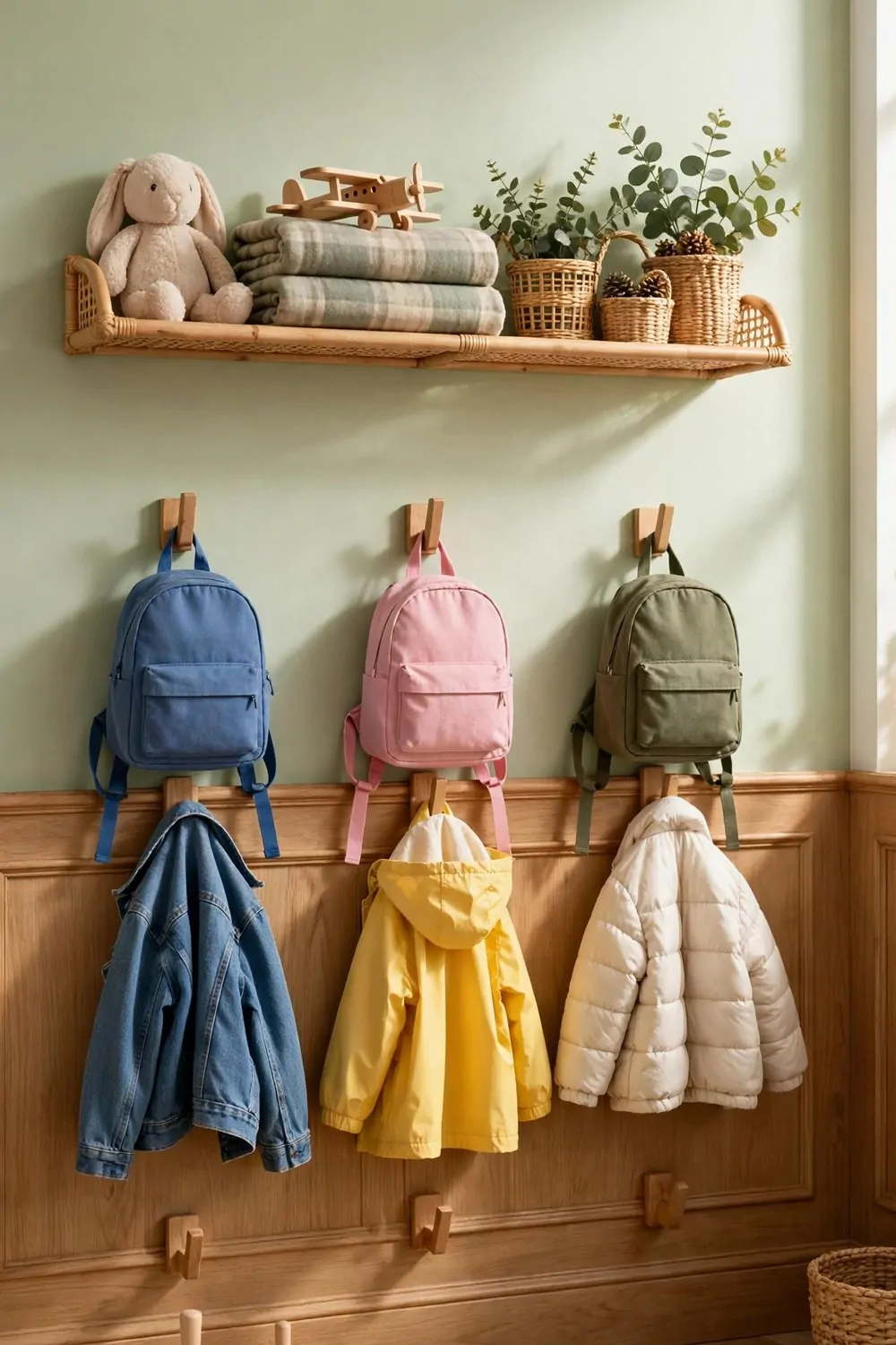
Kids cannot use hooks they cannot reach. A row of beautiful hooks at adult height is decoration to a child. Their coats end up on the floor, and nobody is happy, least of all the parent picking them up.
Put a row of hooks at child height. For small kids, that is about three feet from the floor. For bigger kids, about four feet. Measure your child with their arm raised, and put the hook where their hand naturally lands.
Give each child their own hook, marked with their name or a picture. A hook that belongs to one child gets used. A shared row of hooks becomes a pile, and piles end up on the floor anyway.
Use sturdy hooks that can hold a school bag. A bag full of books is heavy. A flimsy adhesive hook will peel off the wall by Tuesday. Screw the hooks into a stud or use strong anchors. The wall can take it.
Keep the adult hooks higher on the same wall. Two rows, one for grown ups, one for kids. The wall looks intentional, and everyone hangs their own coat. That is the dream, and it actually works.
Add a small basket under the hooks for shoes and hats. One basket per child keeps the floor clear. Shoes go in the basket, not in a trail to the bedroom. The hallway stays walkable.
Low hooks teach independence. A child who can hang their own coat feels grown up. And a grown up child who hangs their own coat is a gift to every parent.
19. Toy Bins With Picture Labels
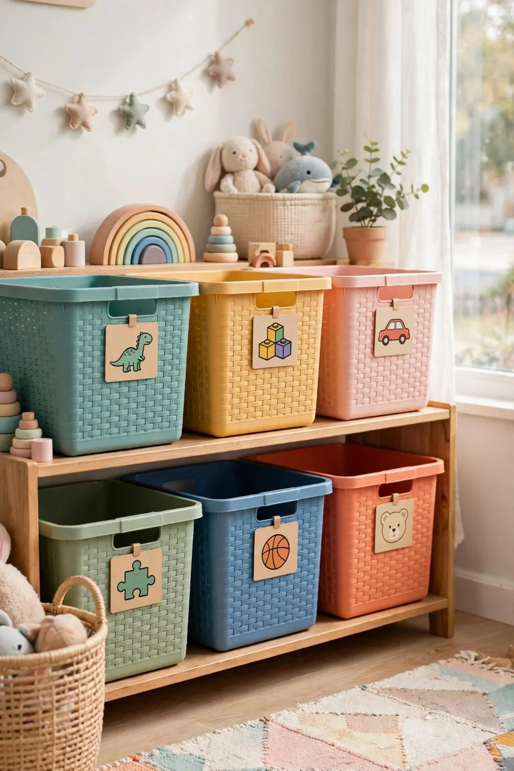
Toy storage fails when kids cannot tell where things go. A bin with a written label means nothing to a child who cannot read yet. A bin with a picture label means everything.
Stick a photo or a simple drawing on each bin. A photo of the blocks on the block bin. A drawing of a doll on the doll bin. Kids match the picture to the toy, and tidying becomes a matching game instead of a chore.
Keep the bins low and open. Low shelves with open bins beat tall cupboards with doors. A child can see the toys, reach the toys, and put the toys back without help. Independence starts with reachable storage.
Limit the bins to five or six. More bins mean more sorting and more mess. Five clear categories cover most toy collections. Blocks, cars, dolls, art stuff, and dress up. Rotate the rest out of sight and swap them monthly.
Use bins that are all the same size and color. Matching bins look calm even when the toys inside are wild. Mixed bins in every color and size look chaotic before a single toy is added.
Tidy together for five minutes at the end of the day. Make it a game. Who can match the most toys to their picture labels? Five minutes of shared tidying beats an hour of weekend sorting every time.
Picture labels turn clean up into a puzzle kids can solve. And a puzzle kids can solve is a puzzle that actually gets done.
20. A Mirror Across From the Window
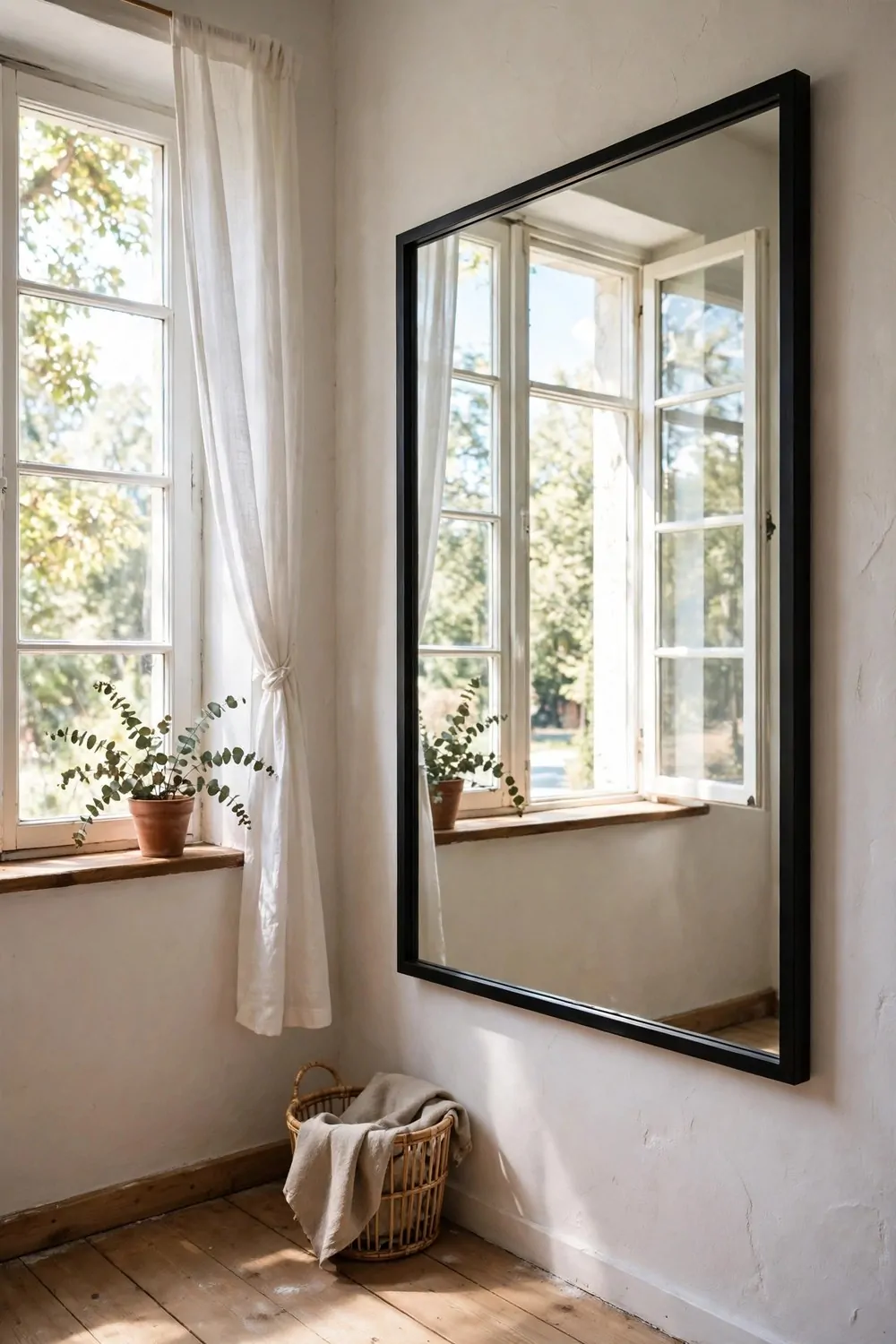
A mirror doubles light, but only if it faces the light. A mirror hung on the same wall as the window reflects the wall beside it. A mirror hung across from the window reflects the whole bright sky.
Hang the mirror on the wall opposite the window, or on the wall beside it at an angle. Stand where the mirror will go and check what it reflects. If it reflects the window, it is right. If it reflects a blank wall, move it.
A large mirror works best for this trick. The bigger the mirror, the more light it catches and the bigger the room feels. One big mirror beats three small ones, which chop the reflection into pieces.
Keep the mirror clean. A dusty mirror reflects gray light, and gray light makes a room feel dull. A weekly wipe keeps the reflection bright and the light bouncing properly.
Do not hang a mirror directly opposite a window in a bedroom if the morning sun hits it. Reflected sun can be blinding at dawn. Angle it slightly, or hang it on the side wall, so the light bounces softly instead of glaring.
A mirror across from the window also gives you a view. The garden, the sky, the street trees, all doubled. A small room gains a second window, and a second window is a gift.
One mirror, facing the light, and the darkest room in the house gets brighter for free.
21. Furniture With Legs You Can See Under
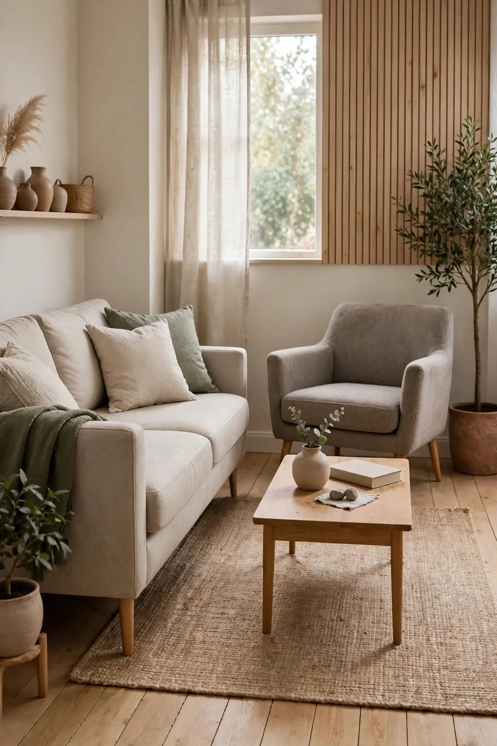
Furniture that sits flat on the floor eats the floor visually. A sofa with no legs reads as a big block. Your eye stops at it, and the room shrinks around it. Furniture on legs is a different story.
When you can see the floor running under the sofa, the table, and the bed, your eye travels further. The room feels deeper than it is. The floor keeps going, and your brain reads that as more space.
Look for slim legs you can see through. Tapered wood legs, thin metal legs, anything that lifts the piece a few inches. The more floor you can see, the bigger the room feels, even when the furniture is exactly the same size.
This works for almost everything. Sofas, beds, dressers, side tables. Lift it up a little and the floor comes back. A bed on legs also gives you storage underneath, which is a bonus in a small bedroom.
Keep the space under the furniture clean. Dust gathers there fast, and a dusty gap under the sofa ruins the airy feeling. A quick sweep once a week keeps the trick working.
Avoid skirts and valances on furniture in small rooms. They hide the legs and put the floor back in hiding. Let the legs show. They are doing real work for the room.
I swapped a blocky sofa for one on slim legs and the same room suddenly had space I had never noticed. Nothing else changed. The floor was just visible again, and visible floor is visible room.
22. One Color, Three Times
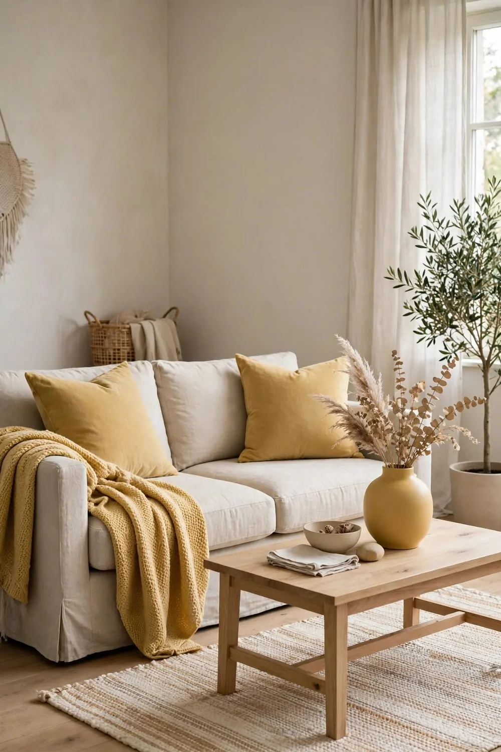
Too many colors in a room chop it into pieces. Red cushions here, blue curtains there, a green rug in the middle. Each color is a border, and your eye stops at every single one.
Pick one accent color and repeat it three times in the room. Cushions, a throw, a vase. Three repeats is the sweet spot. Fewer and the eye misses the pattern. More than five and it starts to feel like a theme park.
Here is a simple plan for repeating a color through a room:
| Where it shows up | What to use | Why it works |
|---|---|---|
| Large and soft | Cushions or a throw | Sets the color for the whole room |
| Medium and useful | A lamp base or a plant pot | Carries the color to a new corner |
| Small and sharp | A vase, a book spine, a candle | Finishes the pattern for the eye |
Keep the big things neutral. Walls, sofa, rug, bed frame. The accent color lives in things you can swap cheaply. Cushion covers, throws, a plant pot. Seasons change and moods change, and a small swap refreshes the whole room.
This trick also makes shopping easier. When you see something in your color, you know it belongs. When it is not in your color, you walk past it. Fewer random buys, calmer room, happier wallet.
Let the color flow between rooms too. The same accent in the living room and the hallway ties the home together. Each room keeps its own personality, but the house reads as one home.
One color, three repeats, in every room. That is the thread that sews a home together.
23. Tall, Medium, Low
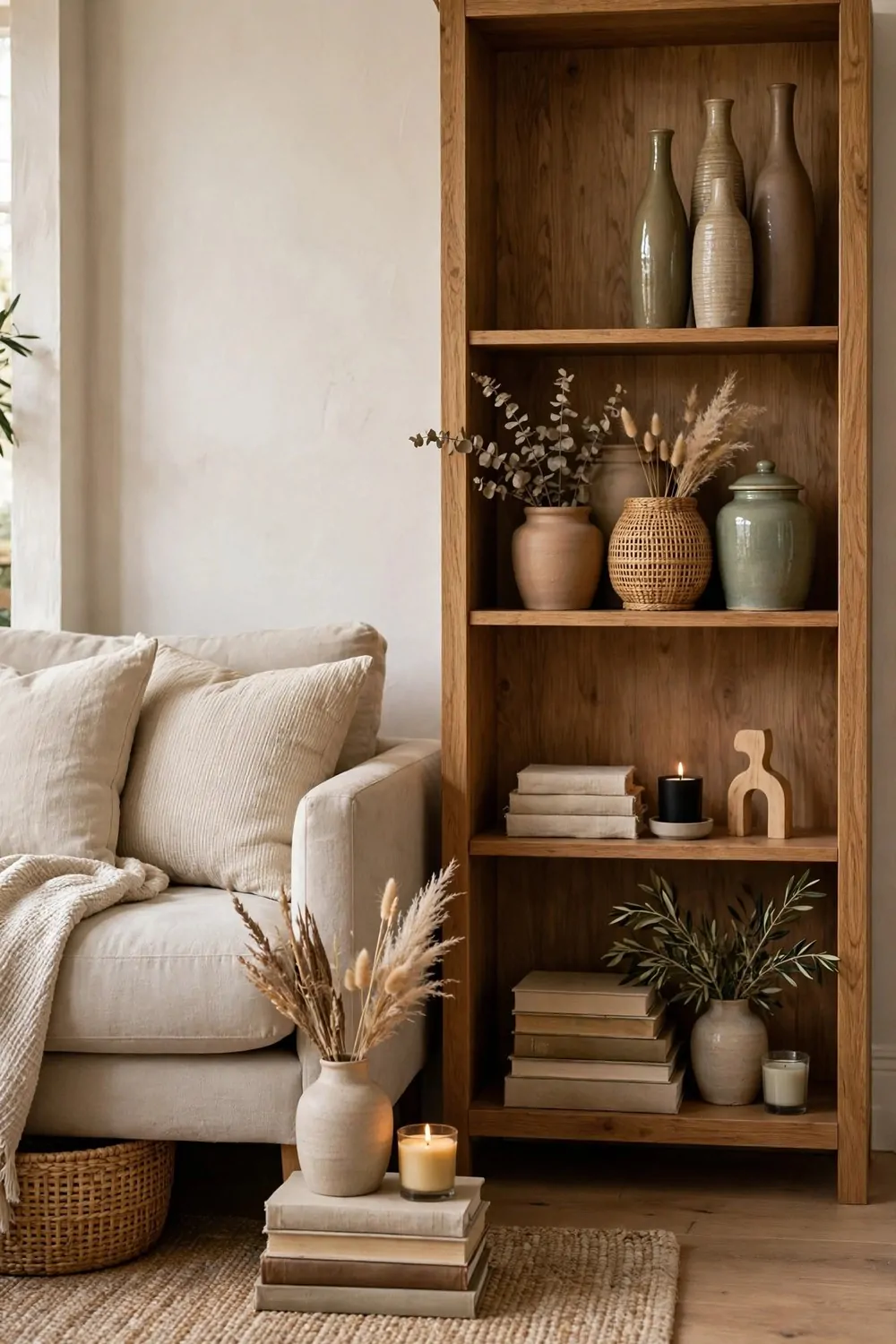
A shelf with everything at the same height looks flat and boring. A mantel with five objects in a straight row looks like a police lineup. The fix is height. Tall, medium, and low, grouped together, makes any surface look designed.
Group objects in threes. One tall thing, one medium thing, one low thing. A tall vase, a medium stack of books, a low candle. The eye moves up and down, and the group feels alive.
Vary the heights on every surface. Bookshelves, mantels, console tables, nightstands. The same rule works everywhere, because eyes love movement and get bored with straight lines.
Use books to cheat height. A short object on a stack of two books becomes a medium object. A medium object on a stack becomes tall. Books are the designer’s secret step stool, and every home has some.
Leave space between groups. Three groups with air between them look better than nine objects crammed together. Air is what lets each group shine. Crowded shelves look like storage. Spaced shelves look like styling.
Step back and squint. If the surface looks like a flat line, add height somewhere. If it looks like a mountain range, take something away. The squint test never lies.
Tall, medium, low. Three heights, one group, and every surface in your home gets interesting.
24. Every Room Gets One Star
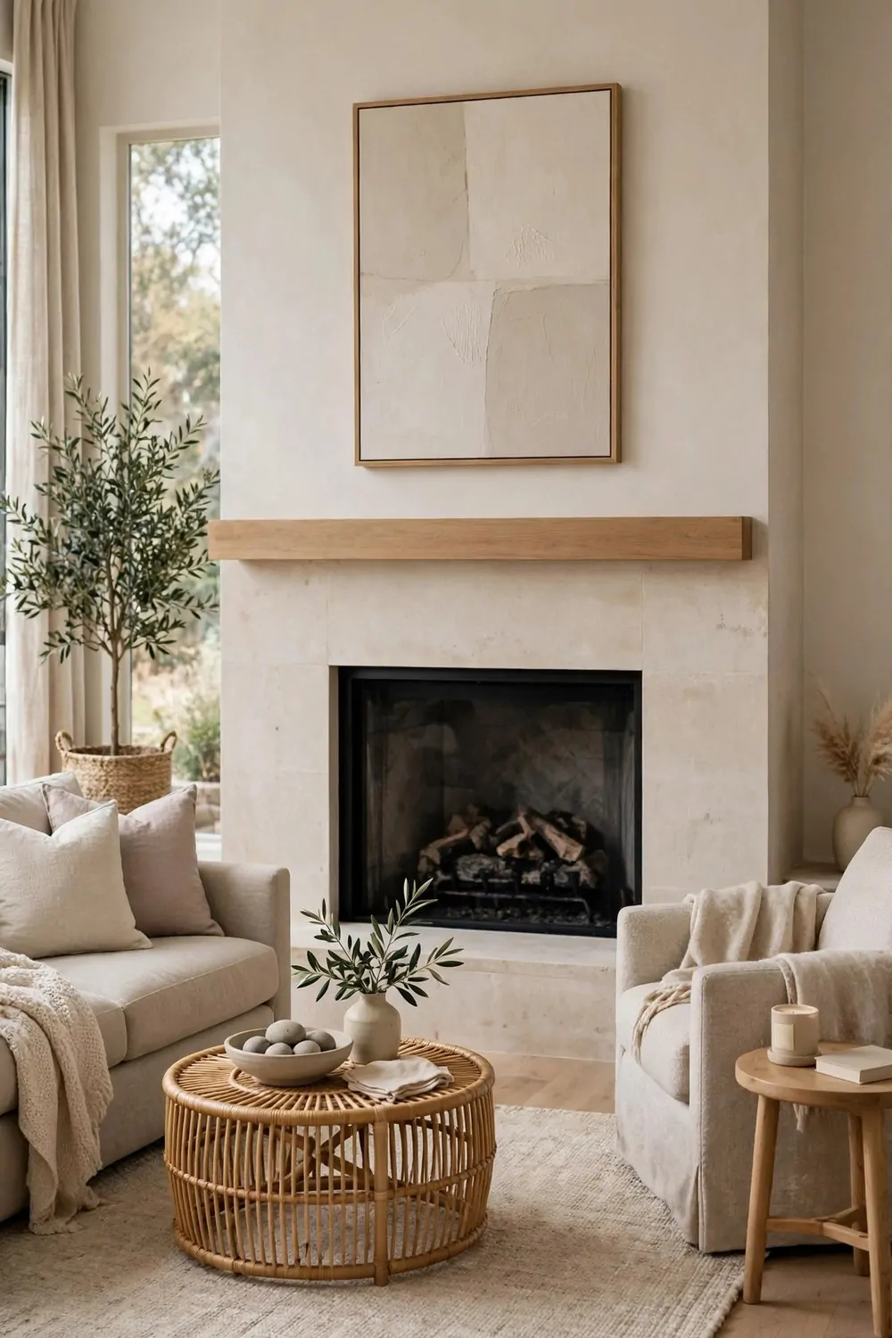
Every room needs one thing that draws the eye. A fireplace, a big piece of art, a beautiful window, a bold sofa. That one thing is the star. Everything else in the room supports it.
When a room has two stars, they fight. A bold sofa and a bold gallery wall compete, and the eye does not know where to land. The room feels busy and restless, even when it is tidy.
Pick the star when you plan the room. In the living room it might be the fireplace. In the bedroom it might be the bed wall. In the dining room it might be a pendant light. One star, chosen on purpose.
Make the star bigger or bolder than everything else. A large artwork, a dramatic light, a rich color on one wall. The star earns its place by being clearly the most interesting thing in the room.
Keep the supporting pieces quiet. Neutral sofa, plain rug, simple curtains. Quiet pieces do not compete. They frame the star and let it shine. A room full of stars is a room full of noise.
If your room already has a natural star, like a big window or a fireplace, work with it. Do not add a rival. Arrange the furniture to face the star, and let the architecture do the heavy lifting.
One star per room. The eye lands, rests, and the room feels calm and finished.
25. Take One Thing Away
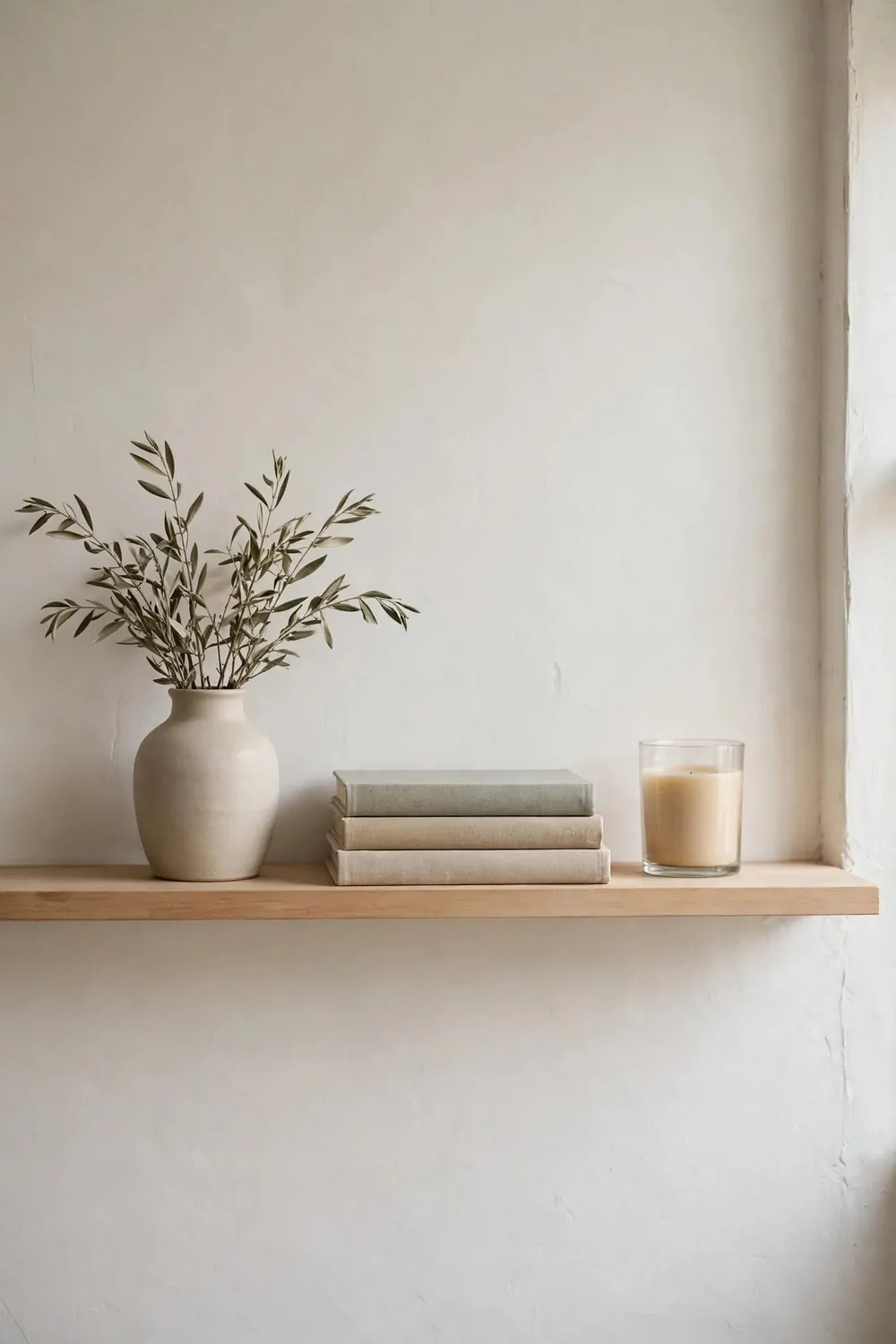
The easiest design idea on this whole list costs nothing and takes one minute. Walk into a room, look around, and take one thing away. Just one. A cushion, a vase, a frame, a basket. Remove it and live with the room for a day.
Most rooms have too much in them. We add and add, and we never subtract. Each new thing felt right at the time, but together they crowd the room and tire the eye. Subtraction is the design move nobody teaches.
Designers call this editing. They style a shelf, then they remove one object before they call it done. That last removal is what makes the shelf look intentional instead of stuffed.
Try it on one shelf first. Remove the least loved object. The shelf breathes. The remaining objects get space and attention. You will be surprised how much better the shelf looks with less on it.
Do the same with cushions. A sofa with six cushions is a cushion shop. A sofa with three cushions is a place to sit. Remove two, keep the best three, and the sofa gets comfortable again.
Keep a box for removed things. Not the bin, a box. Live without the object for a month. If you miss it, bring it back. If you forget it, give it away. Most things in the box get forgotten, and that tells you everything.
One thing away, one room at a time. Your home gets calmer, and you never spent a cent.
26. A Hallway Gallery Wall
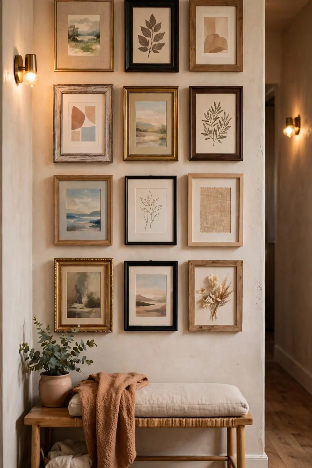
Hallways are the most ignored rooms in a home. We walk through them a hundred times a day and never look at them. A gallery wall turns a hallway from a passage into a place.
Mix frame sizes and styles, but keep one thing consistent. All black frames, all wood frames, or all white mats. One consistent element holds the mix together. Without it, the wall looks random. With it, the wall looks collected.
Lay the frames on the floor first. Arrange them until the group feels balanced, then take a photo of the layout. The photo is your map when you hang them. Floor planning saves a wall full of extra nail holes.
Hang the center of the group at eye level, about 57 inches from the floor. Hallways are walked through standing up, so eye level is where the art belongs. Art hung too high in a hallway gets ignored, because nobody looks up while walking.
Leave two to three inches between frames. Tight spacing reads as one big piece. Wide spacing reads as scattered pictures that lost each other. Two inches is the sweet spot for most walls.
Mix photos, prints, and kids art. A hallway gallery is the family story told in frames. The best ones mix a wedding photo, a holiday print, and a child’s drawing, all in matching frames. That mix is what makes a house feel like a home.
One hallway, one afternoon, and the most walked-through room in the house finally gets a job.
27. Pretty Jars in the Laundry Room
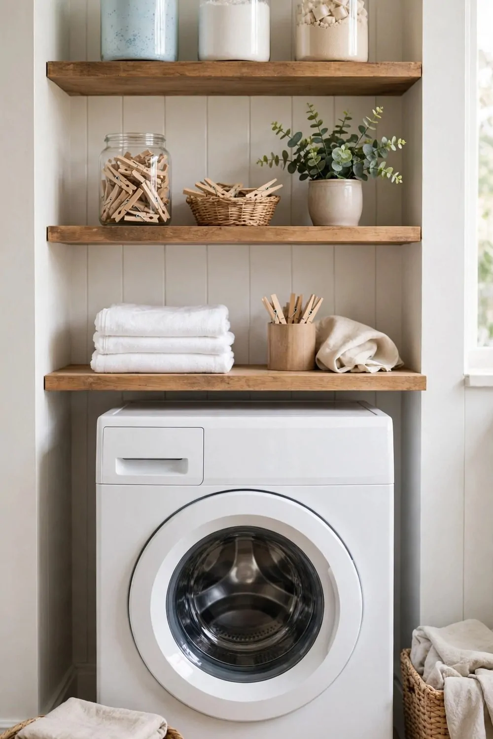
The laundry room is where design goes to die. Detergent bottles, stain sprays, a pile of unmatched socks. Nobody decorates the room where the dirty clothes live. But you visit it every day, so it deserves a little care.
Decant the detergents into matching glass jars. Powder in one, liquid in a pump bottle, clothespins in another. Matching jars turn a shelf of plastic bottles into a tidy display. The room looks calmer instantly.
Label the jars with simple tags. Powder, softener, pins. Labels stop the guessing and stop the wrong scoop going in the wrong wash. A label maker or a piece of tape and a pen both do the job.
Put the jars on an open shelf at arm height. The things you reach for every wash should be easy to grab. Heavy detergent boxes stay low, where lifting them is safe. Light jars go high, where they look pretty.
Add one plant if the room has light. A pothos on a high shelf trails down and softens all the hard machines. Laundry rooms are full of metal and plastic. One green thing makes the whole room feel less like a workshop.
Fold on a clear surface. A counter over the machines, or a wall-mounted fold-down table, gives you a folding spot. Folding on top of the dryer is how clean clothes end up wrinkled and dusty.
Keep a small basket for lost socks. One basket, always in the same spot. Single socks go in the basket. Once a month, match them up. The sock basket is a small system, and small systems keep a house running.
Pretty jars, one plant, one basket. The laundry room stops being a chore room and starts being a room you do not mind walking into.
28. The Reading Triangle
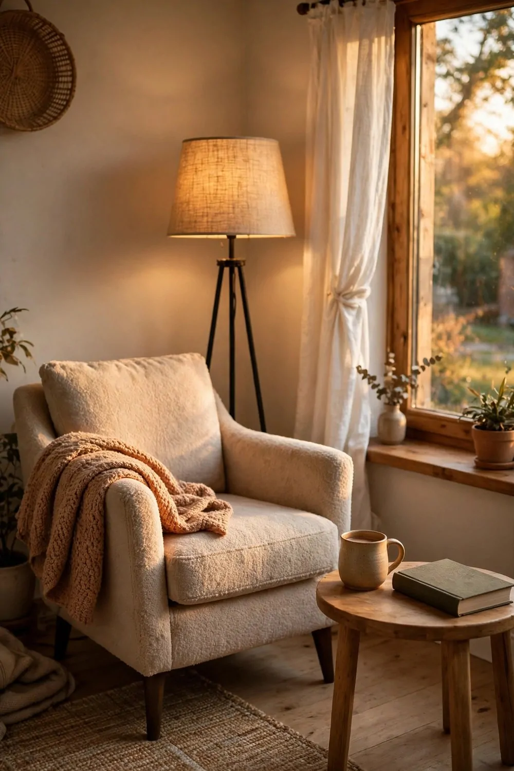
A reading corner needs three things, arranged in a triangle. A comfortable chair. A good light. A small table for a mug and a book. Miss one corner of the triangle and the corner does not work.
The chair should be one you can sit in for an hour without fidgeting. Deep enough to curl up in, firm enough to hold you up. A chair that looks beautiful and feels awful is not a reading chair. It is a sculpture.
The light should come over your shoulder, not from in front. A floor lamp behind and beside the chair lights the page without glaring in your eyes. A lamp in front of you lights your face and leaves the book in shadow. Shoulder light is reading light.
The table should be just big enough for a mug and the book you are not reading. A tiny side table is perfect. A big table invites clutter, and clutter beside a reading chair becomes a dumping ground within a week.
Add a soft throw over one arm of the chair. It invites sitting down, and it keeps you warm on cool evenings. A throw that lives on the chair is part of the corner, not decoration for guests.
Keep the corner away from the television if you can. A reading corner facing a TV is a TV corner that happens to have a book in it. Face the window, the garden, or a quiet wall. The book deserves the view.
One chair, one lamp, one table. The triangle is small, but it holds the best hour of your day.
29. One Outdoor Rug Changes the Balcony
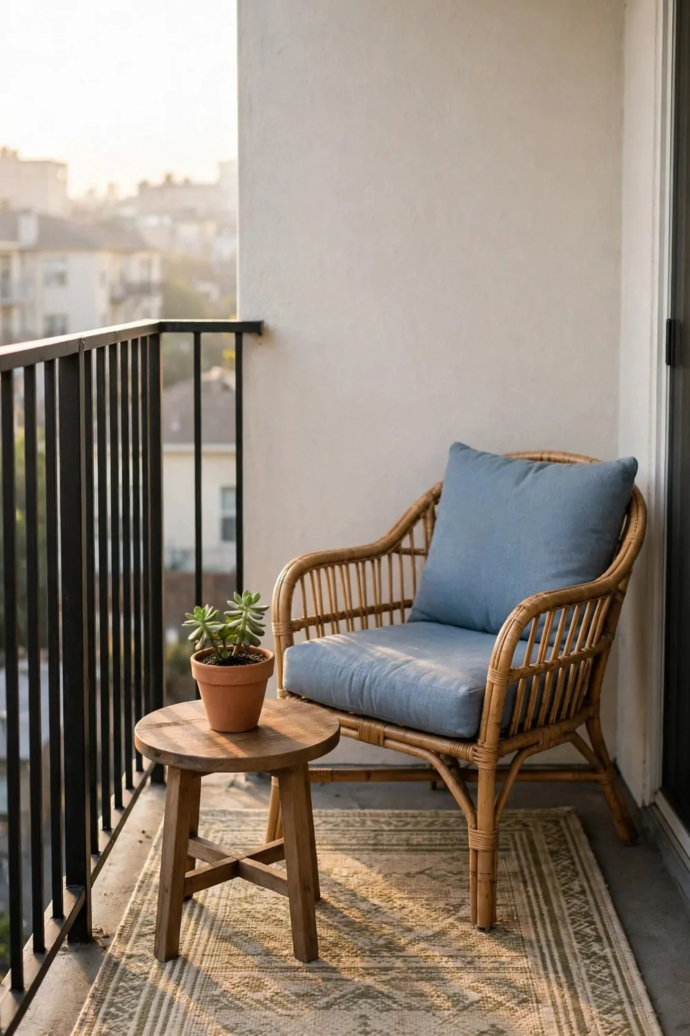
A bare balcony floor feels unfinished, no matter how nice the chairs are. Concrete or tile underfoot reads as outdoors and exposed. One outdoor rug turns the balcony into a room, and rooms get used.
Pick a rug made for outdoors. Flat weave, weather proof, and easy to shake clean. Indoor rugs on a balcony soak up rain, grow mold, and smell by the second week. Outdoor rugs are built for weather and they dry fast.
Size it like an indoor rug. Big enough for the chair legs and a little extra. A rug too small for the furniture floats like a mat and does nothing for the space. A rug that holds the chairs defines the whole balcony as one place.
Add one comfortable chair and one small table. That is all a small balcony needs. A chair you love, a table for coffee, and the rug tying them together. More furniture crowds a balcony fast, and crowded balconies do not get used.
A potted plant at the edge softens the railing and gives privacy. A tall grass or a leafy shrub in a heavy pot blocks the neighbor’s view without blocking the sky. Heavy pots matter, because wind on a balcony is stronger than you think.
Leave the rug out all season and shake it weekly. A quick shake and a sweep keeps it fresh. At the end of the season, roll it up and store it dry. A good outdoor rug lasts years if it spends winter indoors.
One rug, one chair, one plant. The balcony stops being a ledge and starts being the favorite room of the house.
30. Pick One Word for Your Whole Home
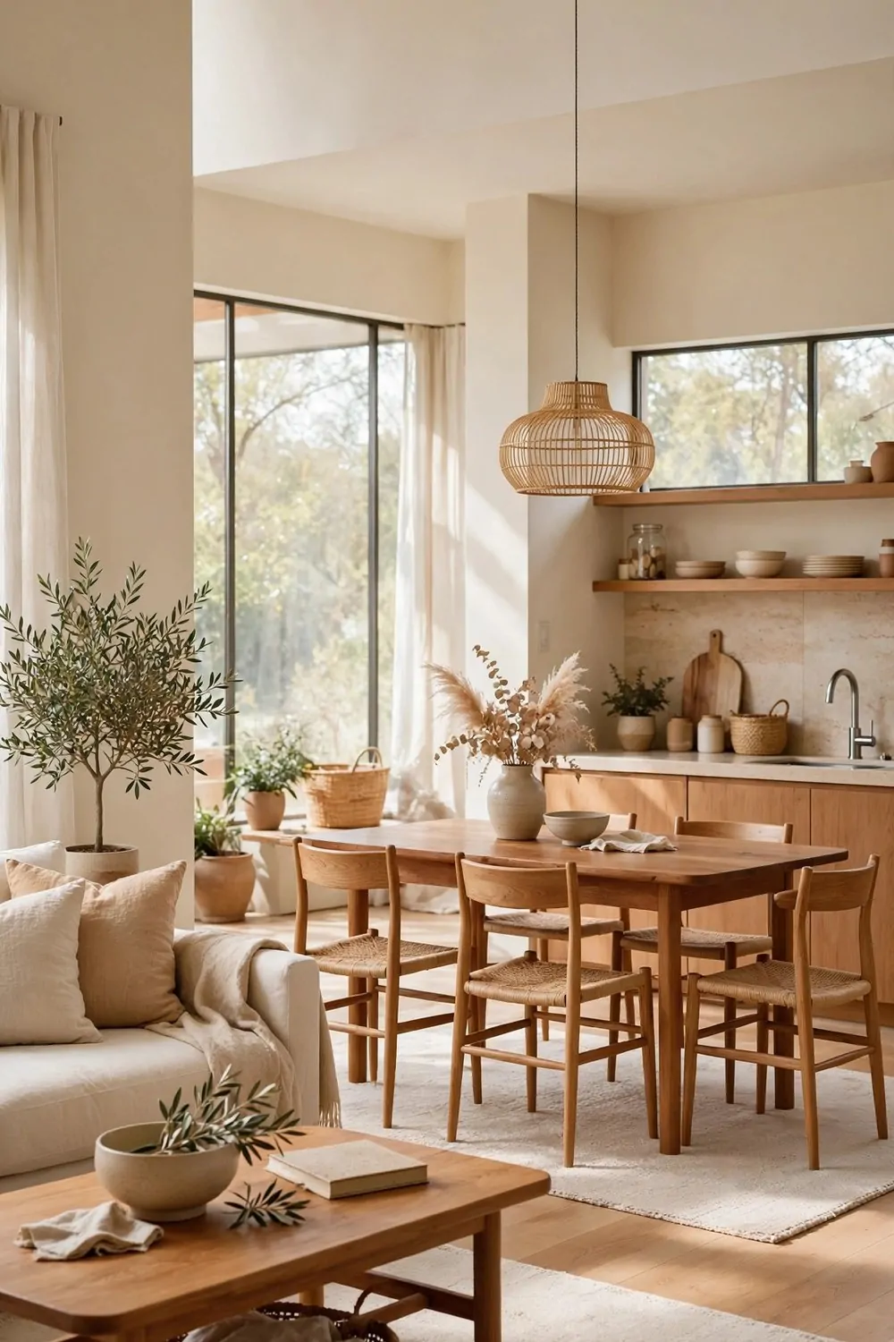
The last idea is the one that holds all the others together. Pick one word for your whole home. Calm. Warm. Bright. Fresh. Coastal. Rustic. One word, and let it guide every choice you make.
When you shop, ask the word. Does this cushion feel calm? Does this lamp feel warm? If the answer is no, put it back. The word is a filter, and filters stop the random buys that make homes feel jumbled.
Write the word somewhere you will see it. Inside a cupboard door, on a note in your phone, on the first page of a notebook. It is not a poster. It is a quiet rule for the house.
Let each room express the word differently. A calm bedroom is soft and pale. A calm kitchen is clear and simple. A calm living room is uncluttered and warm. Same word, different rooms, one home.
Share the word with the people you live with. When everyone knows the word, decorating stops being an argument. It becomes a shared game. Does this feel like our word? Yes or no, and the decision is easy.
My word is warm. Warm wood, warm light, warm colors, warm welcomes. Every choice in my home gets measured against it. The house feels like one place now, not thirty separate decisions.
Pick your word tonight. Write it down. Then steal the ideas from this list that match it, and let the rest go. Your home is waiting to feel like itself.
You do not need a new house. You need a few small moves, made with care, in the rooms you already have.
Start with the rug. Or the lamps. Or the one thing you take away. Pick the easiest idea on this list and do it this weekend. One small change will show you how much a room can shift.
Then do one more next weekend. And one more after that. Slow design beats fast design every time, because slow design stays. Fast design ends up in a box in the garage by winter.
Thirty ideas, one home, and a word to hold them together. Steal them all. Your rooms are ready.