15 Business and Advertising Studio Ideas That Grab Attention

A few seconds. That is all a shop window gets before a person walking past decides to keep going.
Most windows lose those seconds. They are plain, or messy, or so full of stuff that the eye finds nothing to land on. The person walks on, and never knows what they missed.
A business studio is different. It is a workspace built to grab attention on purpose. Every wall, every shelf, every light is there to make someone stop, look, and come closer.
I learned this the slow way. My first little studio corner was tidy and quiet and completely invisible. Nobody stopped. Nobody asked questions. It looked fine, and fine is the most forgettable look there is.
So I started watching the rooms that did stop people. The bright window on my street. The little shop with the glowing wall. The market stall everyone crowded around. They all used the same small tricks, and none of them cost much money.
Here are 15 business and advertising studio ideas that grab attention. Each one is a real look you can copy in a spare room, a corner, or a rented space. Pick the ones that fit your work, and watch people start to stop.
1. The Window That Stops the Street
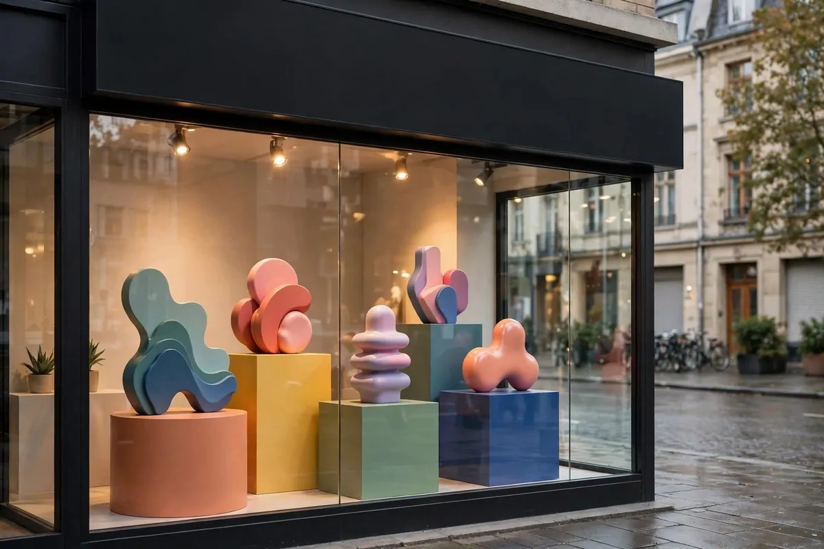
Your window is the only ad you never have to pay for twice. You set it up once, and it works every day, all day, for everyone who walks past.
The mistake most people make is filling the window. They push everything they sell right up against the glass. From the street it reads as clutter, and clutter is easy to walk past.
Pick one hero. One product, one display, one big shape. The eye needs a single thing to land on first. Everything else in the window is there to support that one thing, not compete with it.
Put the hero at eye level. That is the band between about chest height and just above head height for a person standing on the pavement. Things placed low get stepped past. Things placed high get missed.
Light the window from inside, even in the daytime. A small spotlight aimed at the hero makes it pop against the daylight outside. It costs very little to run, and it works in gray weather too.
Change the window often. A window that never changes becomes part of the street, and people stop seeing it. Swap the hero every two weeks, or with every new season. Regulars will notice, and noticing is the first step to stopping.
Keep the glass clean. It sounds small, and it is small. Dirty glass dulls every color behind it. A quick wipe every morning keeps the whole display honest.
Leave some empty space. Empty glass is not wasted glass. It is the frame around your hero, and frames make things look important. A window with breathing room looks confident. A stuffed window looks desperate.
Here is how I plan the three zones of a window, top to bottom:
| Zone | Height | Put here |
|---|---|---|
| Top zone | Above head height | Hanging sign or garland, nothing heavy |
| Eye zone | Chest to head height | The hero, lit and clear |
| Base zone | Below chest height | Low props, crates, plants, kept tidy |
A good window does not shout. It points. One clear thing, well lit, with room around it. That is what makes a person stop mid-step and turn their head.
2. The Neon Glow Studio
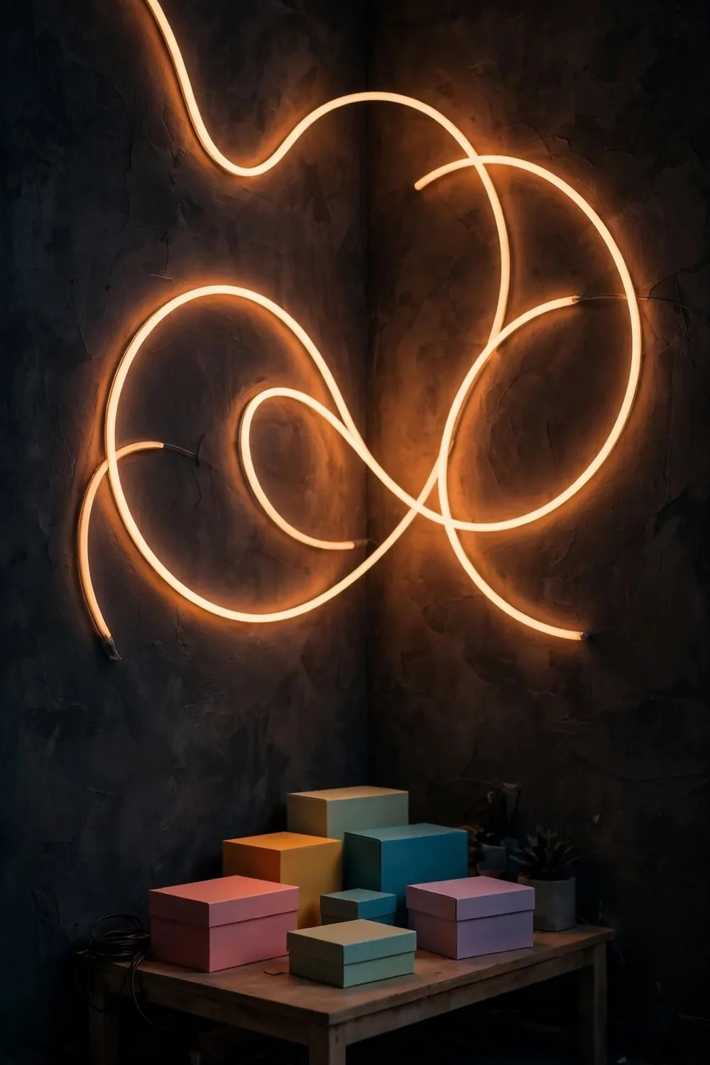
Neon is the oldest attention trick on the street, and it still works. A warm glow in a dark window pulls the eye from half a block away.
You do not need real glass neon. Modern LED tubes bend into the same shapes, use far less power, and will not burn your fingers. They come in warm white, pink, amber, and ice blue.
Pick one shape. A simple curve, a star, a wave. One shape reads clearly from the street. Five shapes tangled together read as a mess of light.
Mount the glow on a dark wall. Light needs dark behind it to shine. A neon tube on a white wall looks washed out. The same tube on a charcoal wall looks like evening magic.
Keep the rest of the room calm. The glow is the star, so the furniture stays quiet. A plain table, a few blank boxes, nothing shiny competing for attention.
Put the glow on a timer. It should switch itself on at dusk, every day, without you thinking about it. A studio that glows on time looks alive. A studio that glows only when someone remembers looks closed.
Watch the reflections. A glowing tube reflects in glass and polished floors, and that double glow is part of the charm. Check it from the street at night, not just from inside. The street view is the one that matters.
Warm colors feel friendly. Cool colors feel modern. Pick the feeling that matches what you sell, and stick to one color family. Mixed colors fight, and fighting light tires the eye.
A little glow goes a long way. One tube, one wall, one dark room. That is the whole trick, and it is enough to make people slow down as they pass.
3. The Bold Color Wall Studio
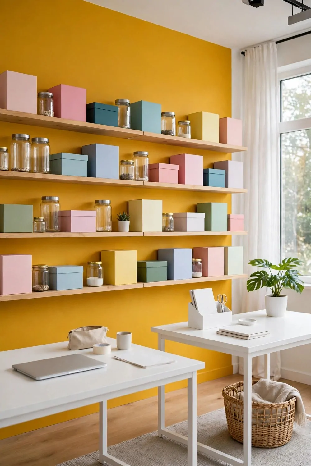
One wall of bold color is the cheapest transformation in this whole list. A tin of paint, one afternoon, and the room has a personality.
Pick the wall you face when you work, or the wall behind your display. Color you cannot see is color wasted. The bold wall should be in your eyeline all day.
Mustard, teal, and deep green all photograph well. They make blank product boxes look designed and plain shelves look deliberate. Pale colors do not do that job. Pale walls are a background. Bold walls are a statement.
Keep the rest of the room pale and quiet. White desks, light floors, simple chairs. The bold wall needs calm around it, or the whole room starts shouting and nobody can think in it.
Repeat the color twice in small doses. A cushion. A vase. A notebook on the desk. Two small repeats tie the room together. Ten repeats turn the room into a theme, and themes get old fast.
Test with a painted board first. Paint a big piece of cardboard and lean it on the wall for a week. Light changes the color through the day, and a week of looking tells you the truth before you commit.
Renters can fake it. A floor-to-ceiling fabric drop in one bold color gives you the same block without losing your deposit. Hang it straight and weight the bottom, and it reads as a design choice.
Bold walls make great photo backdrops. Every photo of your work gets a free background that looks intentional. If you share your work online, the wall pays for itself in every single post.
One wall. One bold color. That is all it takes to turn a plain room into a studio people remember.
4. The Gallery Wall Studio
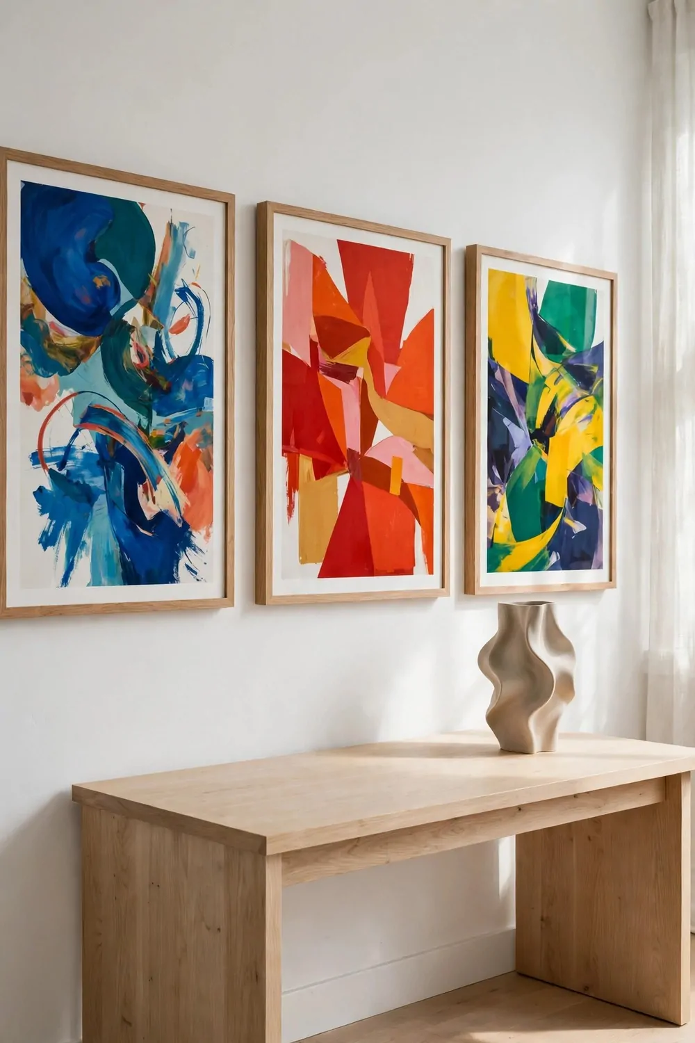
A gallery wall treats your work like art, and people treat art differently. They slow down. They step closer. They look twice.
Hang work at eye level, with space around each piece. A wall packed edge to edge reads as a notice board. A wall with air reads as a gallery, and galleries get respect.
Use big frames with wide white mats. A wide mat makes a small print look important. Cheap prints look expensive in a good mat, and the mat costs less than the frame.
Keep the frames matching. Same color, same thickness, all in a row. Matching frames turn a mixed set of prints into one deliberate collection. Mixed frames turn it into a jumble sale.
Change the wall with every campaign. When a project ends, the wall changes. The studio becomes a record of your work, and visitors can see at a glance what you have been making.
Light the wall, not just the desk. A row of small spotlights or one picture light makes the art glow after dark. The room turns into a private gallery in the evening, and late work feels like an event.
One plant is enough in a gallery room. A small olive tree or one tall stem in a vase. Green against white is a combination that never fails, and it keeps the room feeling alive.
Dust the frames once a week. White walls and glass show dust fast, and dusty frames dull the whole effect. A quick wipe keeps the gallery feeling fresh.
A gallery wall says your work matters before you say a word. That is the kind of first impression money cannot buy.
5. The Lightbox Studio
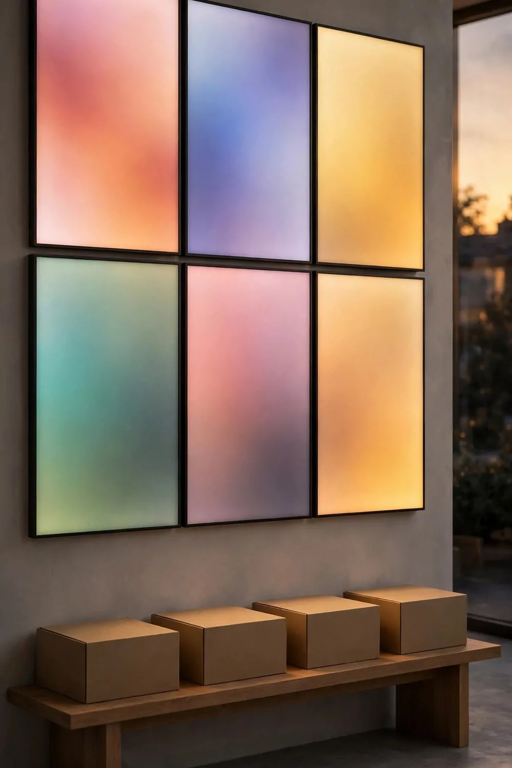
A lightbox wall glows softly, like a row of windows at dusk. It is calm, modern, and almost impossible to walk past without a second look.
Backlit panels are simple boxes with a light inside and a printed or plain front. You can buy them ready-made, or build one from a shallow frame and an LED strip. Both work.
Keep the glow even. Hot spots and dark corners make a lightbox look broken. Diffused LED strips spread the light flat, and a frosted front panel hides the bulbs completely.
Use soft abstract color on the panels. Gentle gradients, big color blocks, simple shapes. Busy pictures on a glowing wall tire the eye. Simple color calms it and holds it.
Put a low bench under the lightbox wall. People sit, and sitting people stay longer. A bench turns a glowing wall into a place, not just a picture.
Dim the room lights a little. The lightboxes should be the brightest thing in the room. When the ceiling light wins, the glow dies. When the glow wins, the room feels like evening.
Here is how the main panel options compare:
| Panel type | Cost | Best for |
|---|---|---|
| Ready-made lightbox | Higher | Fast setup, clean finish |
| DIY frame and LED strip | Lower | Custom sizes, tight budgets |
| Fabric lightbox | Middle | Big walls, soft even glow |
Check the glow at night from outside. The lightbox wall should read clearly through the window. If it washes out in daylight, that is fine. Lightboxes do their best work after sunset.
A glowing wall is quiet advertising. It does not shout. It shines. And shining is what makes people stop.
6. The Chalkboard Studio
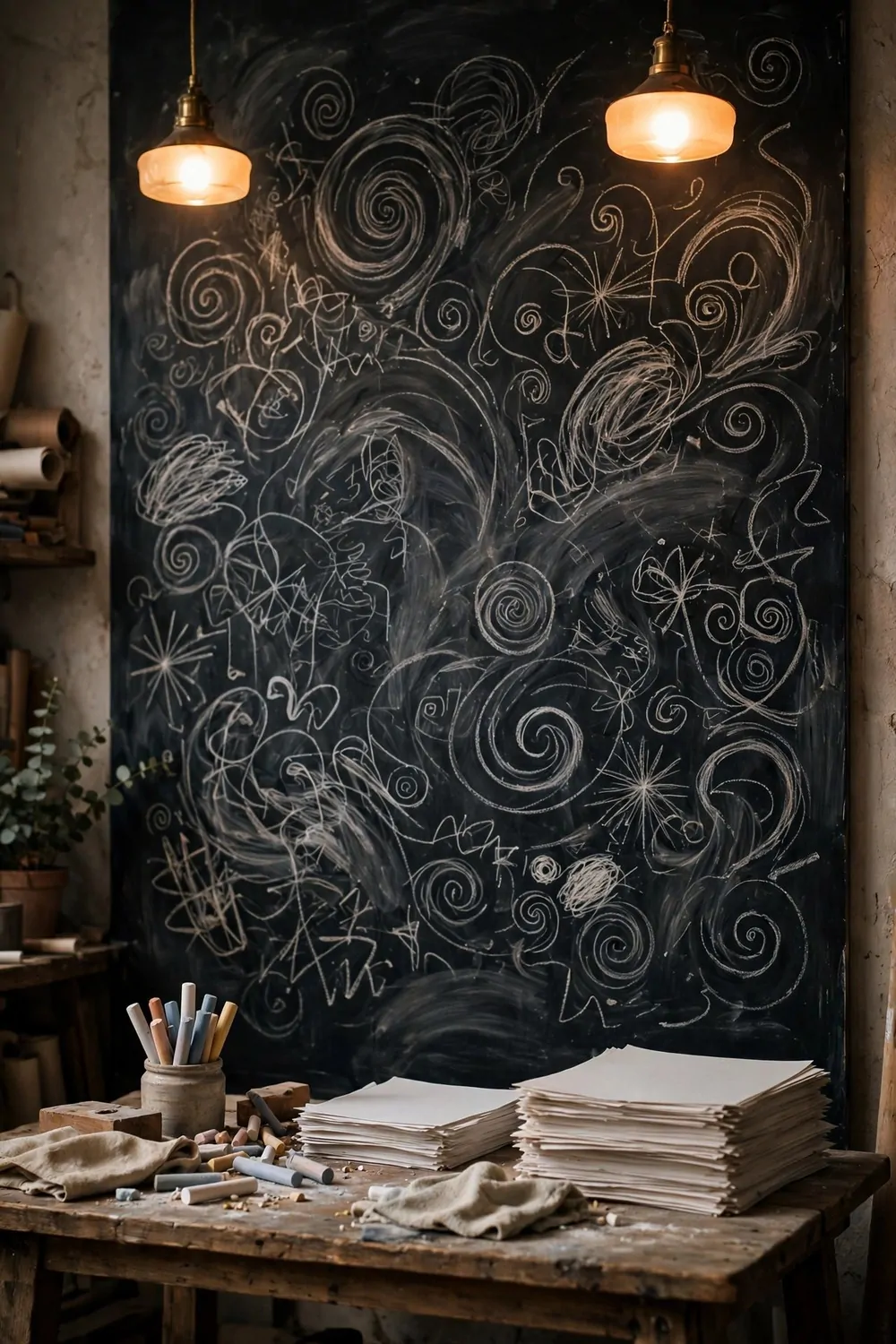
A chalkboard wall is a working wall. You can draw on it, wipe it, and draw again. It tells visitors this studio makes things, and it makes them today.
Paint one full wall with chalkboard paint. Two coats, left to dry properly. A half wall looks like you ran out of paint. A full wall looks deliberate.
Draw big. Big arrows, big circles, big simple shapes. Small writing on a chalkboard reads as a school lesson. Big shapes read as a studio at work.
Keep the drawings abstract or simple. Swirls, grids, stars, rough sketches of your next idea. The wall is a sketchbook, not a poster. Rough is honest. Perfect is suspicious.
Chalk dust is part of the deal. Wipe the ledge daily and keep a damp cloth nearby. Dusty floors under a chalk wall look neglected. A clean floor under a chalk wall looks like a working studio.
Change the drawing every week. A chalk wall that never changes becomes wallpaper. A wall that changes stays honest, and regular visitors will check what is new.
Use the wall in meetings. Sketch the idea while you talk about it. Clients remember what they watched you draw far longer than what they heard you say.
Keep chalk and cloths in one tray on the table. Tools with a home get used. Tools scattered across the room get lost, and a chalk wall with no chalk is just a black wall.
A chalkboard wall says your studio is alive. Ideas go up, ideas come down, and the room changes with the work. That is a look no printed poster can fake.
7. The Product Shelf Studio
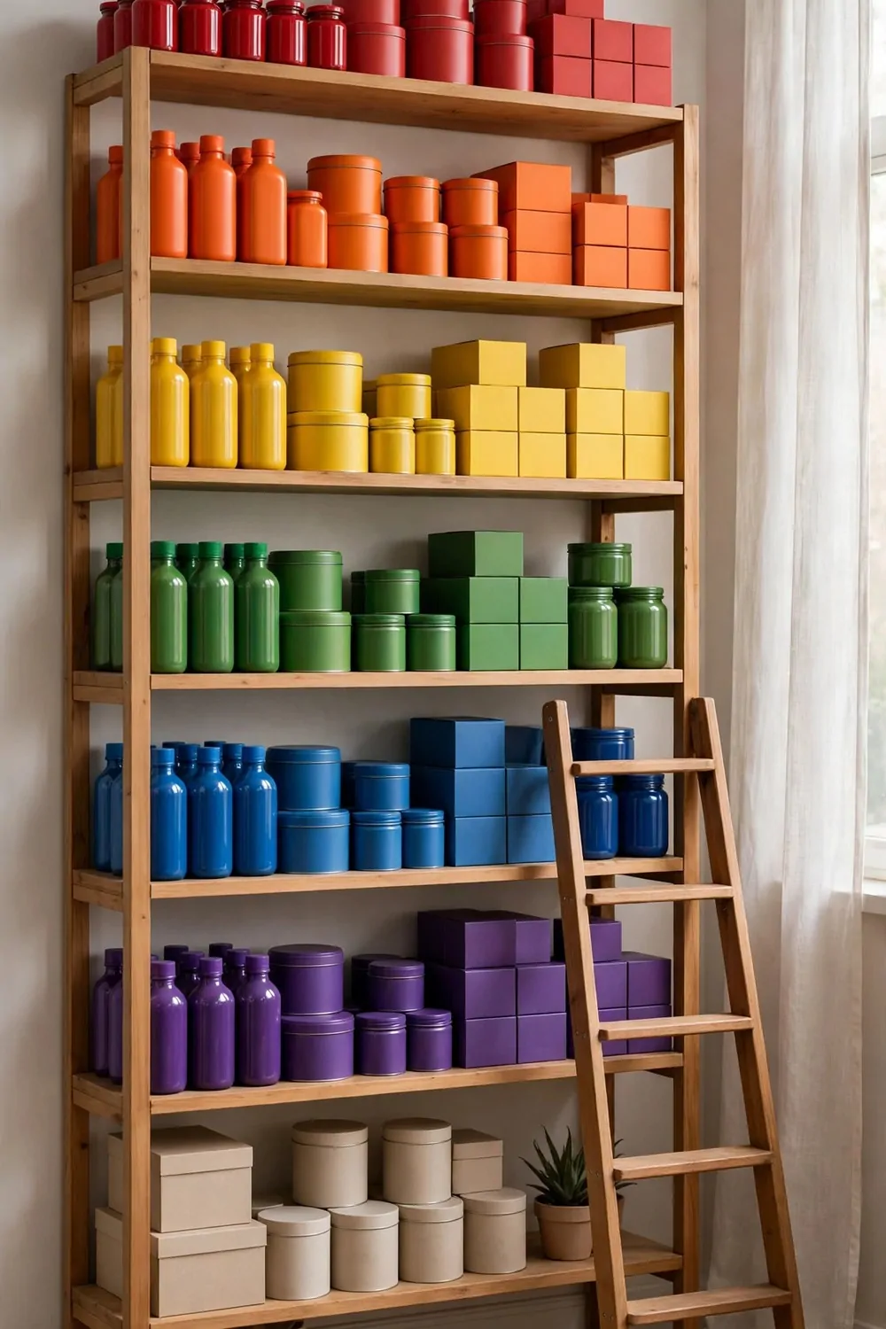
Shelves full of your products are the most honest display there is. No tricks, no hiding. Here is what we make, all of it, where you can see it.
Open shelves only. Doors hide products, and hidden products get forgotten. If you need to see it to sell it, it lives on an open shelf.
Sort by type, not by color. All the jars together, all the boxes together, all the bottles together. When a visitor wants to compare, they go to one shelf. Sorting by color looks pretty and works terribly.
Keep the shelves full but not packed. A shelf with breathing room looks like a shop. A shelf stuffed to the brim looks like a stockroom. Leave a little air at the end of every row.
Use clear jars for small things. Buttons, beads, samples, and findings all live in glass. A jar you can see into gets opened. A box you cannot see into gets ignored.
Label with simple tags. One word, big and plain. Jars, boxes, samples. Labels stop the guessing and stop the whole shelf coming down when someone needs one thing.
Here are the shelf rules I never break:
- Heavy things low, light things high
- Everyday items at arm height
- One empty shelf, kept empty on purpose
- Wipe the shelves weekly, dust shows fast
- Step back and check the whole wall reads as one display
A small ladder says the shelves go high on purpose. It also tells visitors the top rows matter. Keep the ladder steady and the top shelves tidy, because people do look up.
A product shelf wall is your studio’s resume. It shows range, care, and pride without a single word of sales talk.
8. The Photo Backdrop Studio
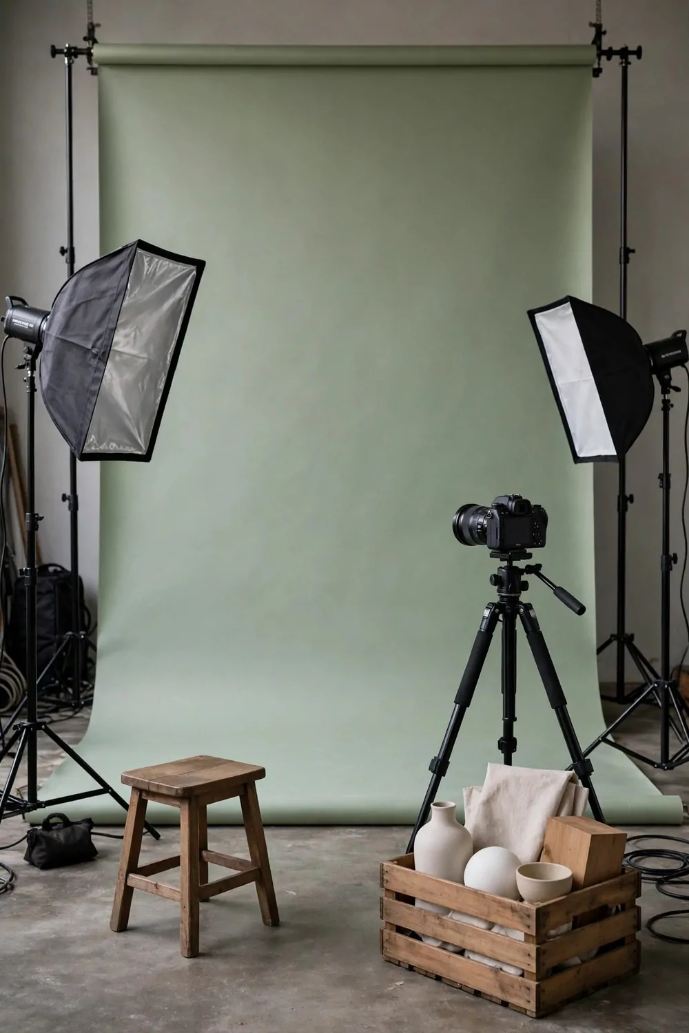
Every business needs photos, and good photos need a good backdrop. A studio corner built for photos pays for itself in every post, listing, and ad you ever make.
A paper backdrop is one long roll of paper that curves from wall to floor. No corner line, no seam, nothing to distract. The product floats in clean color.
Pick three backdrop colors. Soft sage, warm cream, and one bold color like deep blue. Three rolls cover almost every product you will ever shoot, and they store standing in a corner.
Light from the sides, not from the front. Side light shapes the product and shows its texture. Front light flattens everything and makes even lovely things look dull.
Keep the floor of the backdrop clean. The camera sees every footprint and speck. Sweep before every shoot, and keep a spare strip of paper to roll down when the old one gets marked.
A tripod is not optional. Handheld photos wobble, and wobble shows at full size. A tripod keeps every shot straight and lets you step back and really look at the setup.
Keep props in one crate beside the backdrop. Blank boxes, a small stool, a piece of cloth, a plant. Props with a home get used well. Props scattered across the studio get forgotten.
Shoot in daylight when you can. Window light is free and kind to colors. On gray days, two soft studio lights do the same job. The backdrop does not mind which light you use, as long as it is even.
A photo corner turns your studio into a content machine. One corner, one backdrop, one tripod, and every product you make gets a photo worth stopping for.
9. The Market Stall Studio
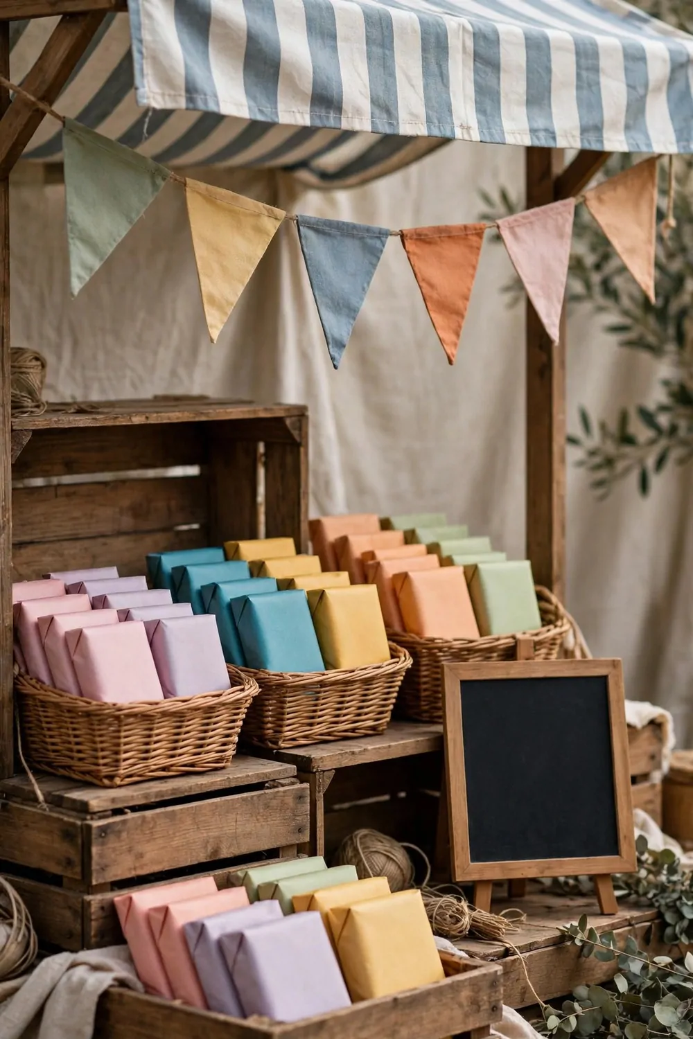
Market stalls grab attention because they look alive. Crates, awnings, baskets, things piled with care. A studio corner dressed like a stall borrows all of that energy.
Wooden crates are the whole trick. Stack them two high, three high, some on their sides. Crates at different heights make the eye travel, and a traveling eye stays longer.
A striped awning over the corner says shop before a single word is read. Canvas, hung straight, weighted at the corners. A sagging awning says closing down. A straight awning says open for business.
Bunting helps more than you would think. A string of small flags overhead adds color and movement. It makes the corner feel like an event, and events draw crowds.
Pile products in baskets, not in rows. A basket full of colorful packages looks generous. A row of the same packages looks like a shelf. Generous sells. Neat just sits there.
Keep a blank chalk board on the stall front. In real life it holds the day’s offer. Change it daily, and regulars will check it the way they check a menu.
Here is how the display styles compare:
| Display style | Feeling | Best for |
|---|---|---|
| Market stall | Lively, generous | Events, launches, weekends |
| Plain shelves | Calm, tidy | Everyday browsing |
| Window display | Curious, distant | Passersby, street traffic |
Keep the stall corner tidy behind the scenes. Crates hide storage beautifully, but a mess behind the crates shows. Tidy the back, and the front stays magic.
A market stall corner is a party in one corner of your studio. It makes people smile before they even know what you sell, and smiling people stop.
10. The Dark Moody Studio
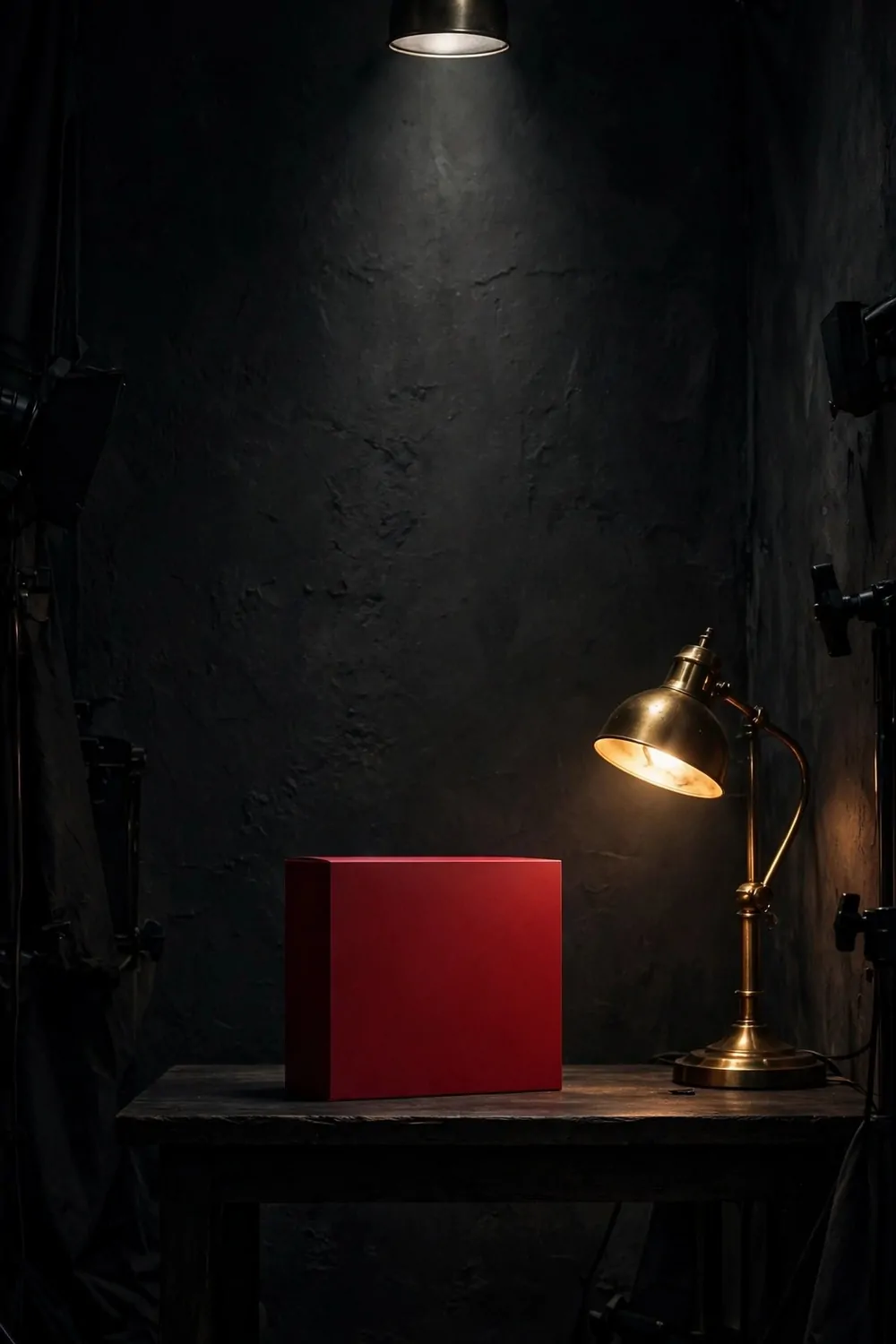
Not every studio should be bright. A dark studio with one spotlight makes a single product look like the most important thing in the world.
Paint the walls charcoal or deep green. Dark walls blur the corners, and blurred corners make the room feel deeper. The eye goes straight to the one lit thing.
One spotlight, aimed down at the display table. Not two, not three. One pool of light, one hero. Two spotlights make two heroes, and two heroes argue.
The hero sits alone on the table. One product, one plain box, one bold color. Everything else lives in shadow on purpose. Shadow is doing a job here. It is framing the star.
Warm light only. Around 2700K on the box. Cool white light on dark walls looks cold and flat. Warm light makes the dark feel like evening, and evening is when a moody studio shines.
Materials that glow help. Brass, glass, leather, and polished wood all catch warm light beautifully. A brass lamp base against a charcoal wall is a small luxury that costs very little.
Keep the floor dark too, or cover it with a dark rug. A pale floor in a dark room bounces light everywhere and breaks the spell. Dark floor, dark walls, one pool of light. That is the formula.
Work the room in the evening on purpose. This studio does its best after sunset, when the spotlight is the only light. Save your launches and photo shoots for the dark hours.
Dark, warm, and focused. If bright rooms leave you cold, this studio was built for you, and your hero product will never have looked better.
11. The Bright White Studio
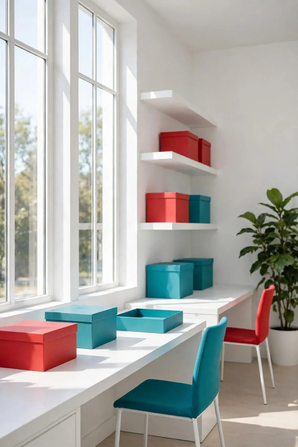
An all-white studio is a blank page, and blank pages make colors shout. One red box, one teal chair, and the whole room wakes up.
White walls, white desks, white shelves, pale floors. The room becomes a light box, and sunlight bounces off every surface. Even a gray day feels brighter in here.
Add color in three places only. A chair, a stack of boxes, one plant pot. Three pops of color is the sweet spot. One pop looks like an accident. Ten pops look like a toy shop.
Keep the furniture low and leggy. Slim legs, visible floor, nothing bulky. Visible floor is visible room, and the eye travels further in a room where the floor keeps going.
White shows dust and marks fast. That is the price of the look. Wipe the desks daily and touch up scuffs weekly. A white studio that is not clean is not bright. It is just tired.
One big plant keeps the room from feeling sterile. A tall green plant in the corner is the fresh note that makes white feel alive instead of empty.
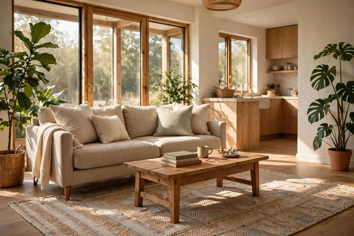
Light the room with daylight first. Tall windows, sheer curtains, nothing blocking the glass. Electric light is the backup, not the plan. White rooms run on sun.
Clutter is the enemy here. Everything has a home behind a closed door or in one tidy box. A white studio is tidy not because the people are tidy, but because the storage is good.
Pale, bright, and bold in three places. A white studio makes your products the color in the room, and that is exactly where the attention should go.
12. The Vintage Sign Studio
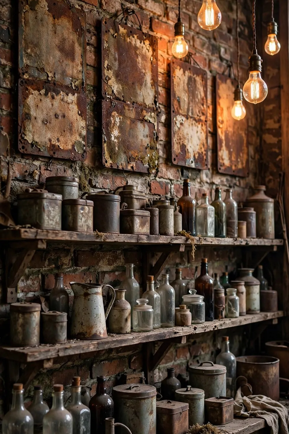
Old signs tell stories, even blank ones. A rusted metal panel, a worn wooden board, an old enamel shape. They make a studio feel like it has been there for years, and years mean trust.
Hunt for vintage-style signs with no writing, or with shapes only. Real old signs with words can fight your own message. Blank and weathered signs give you the feeling without the noise.
Hang them at different heights, like they grew there over time. One high, one low, one leaning on a shelf. A perfect grid of old signs looks new. A loose arrangement looks collected.
Brick is the best friend of a vintage sign. The rough texture and the rusted metal belong together. If you have no brick, a single wood-paneled wall does the same job.
Warm Edison bulbs finish the look. Bare filaments, hung on long cords at different heights. The warm glow against brick and rusted metal feels like evening in an old workshop.
Wooden shelves hold the small things. Old tins, glass bottles, worn tools. Group them in threes, and leave air between the groups. Threes look collected. Rows look like a shop shelf.
Keep the dust under control. Vintage rooms collect dust fast, and dusty bottles look abandoned. A weekly wipe keeps the room feeling loved instead of left behind.
One modern thing saves the room from feeling like a museum. A new lamp, a clean laptop, a fresh plant. The mix of old and new is what makes a vintage studio feel alive and working.
Old signs, warm light, worn wood. A vintage studio borrows the past to make the present feel solid, and solid is what makes people trust a business.
13. The Pop-Up Shop Studio
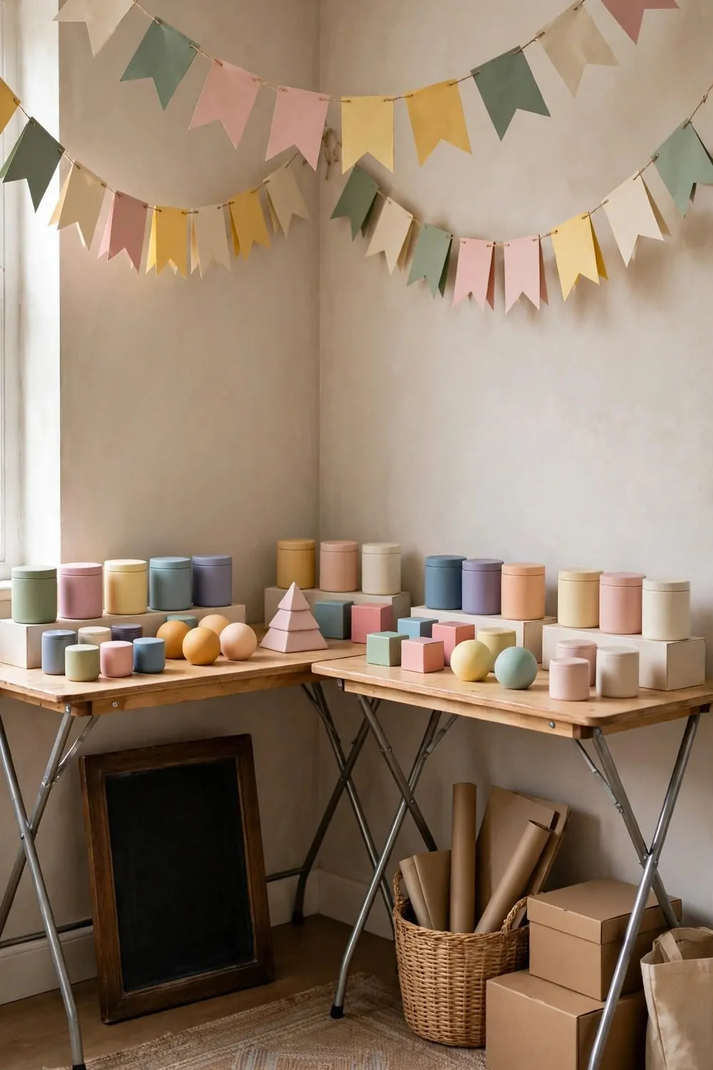
A pop-up corner is a shop that can appear in an afternoon and vanish by Monday. Folding tables, display stands, and a string of garlands. It is the most flexible studio idea on this list.
Folding tables are the base. Two of them, dressed with plain cloths to the floor. Cloths hide the folding legs and make cheap tables look like real counters. Weight the cloths so they hang straight.
Display stands at different heights do the selling. A tall stand at the back, a low stand at the front. Height differences make the eye travel, and the products get seen in layers.
Paper garlands overhead mark the corner as special. A string of simple paper shapes, hung straight and high. Garlands say celebration, and celebration draws a crowd.
Keep the products grouped by story, not by type. A morning group, a gift group, a treat yourself group. Stories sell. Types just sit there.
Here is the whole pop-up kit in one list:
- Two folding tables and two plain cloths
- Three display stands, mixed heights
- One string of garlands and spare hooks
- A blank chalkboard for the day’s offer
- One rug to mark the corner floor
The rug matters more than it sounds. It marks the corner as a place, and people step onto a rug differently. They slow down. They browse. A bare floor says walkway. A rug says shop.
Pack it all into one corner when the pop-up ends. Tables fold, stands stack, garlands roll into a box. The studio goes back to normal in twenty minutes, and the pop-up can return next weekend.
A pop-up corner is a shop with no lease and no risk. Try it for a weekend, watch what people stop for, and let the crowd teach you what your studio should sell.
14. The Corner Showcase Studio
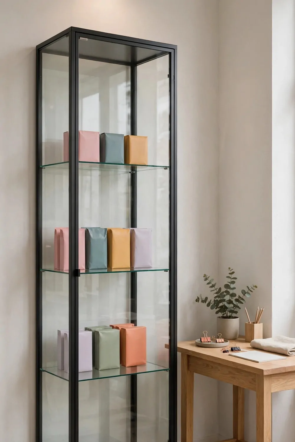
A glass display cabinet is a little museum for your best work. It says these pieces are special, and special is worth a closer look.
Put the cabinet in a corner where the light falls on it. Glass needs light to shine, and a cabinet in a dark corner looks like a cupboard. A cabinet in the light looks like a showcase.
One spotlight above the cabinet does the heavy lifting. Aim it down through the glass. The light catches the products and the glass almost disappears. Check the angle from the doorway, not just from inside.
Keep the cabinet tidy inside. Three shelves, a few pieces per shelf, air around each one. A stuffed cabinet reads as storage. A cabinet with air reads as a collection.
Rotate the display monthly. The cabinet should hold the newest work, the seasonal work, or the pieces you are proudest of. A cabinet that never changes becomes furniture. A cabinet that changes stays a showcase.
A small oak desk beside the cabinet gives the corner a job. It is where you wrap, write, and talk to visitors. The cabinet shows, the desk serves. Together they make a complete corner.
Keep the glass clean. Fingerprints show on glass faster than anywhere else. A quick wipe every morning keeps the showcase honest. Dirty glass makes even lovely products look dull.
Lock the cabinet if the pieces matter. A small lock is not about trust. It is about saying these pieces are valued. Visitors read that signal, and they handle the rest of the room with more care.
Glass, light, and air. A showcase corner turns your best work into an exhibit, and exhibits get the kind of attention shelves never do.
15. The Studio That Glows at Night
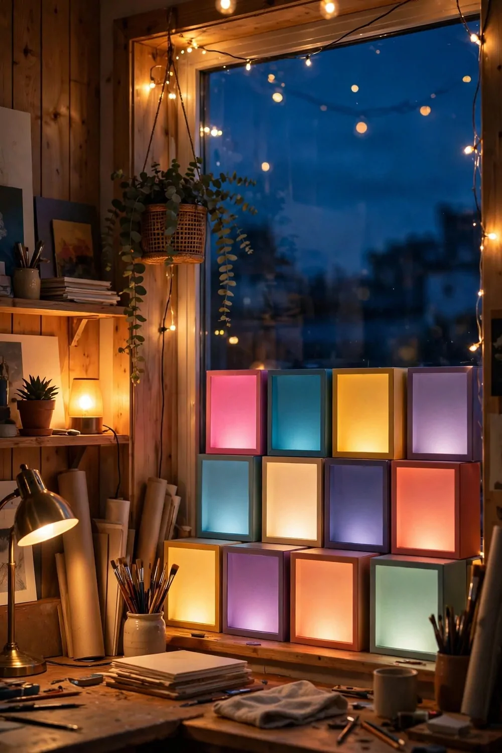
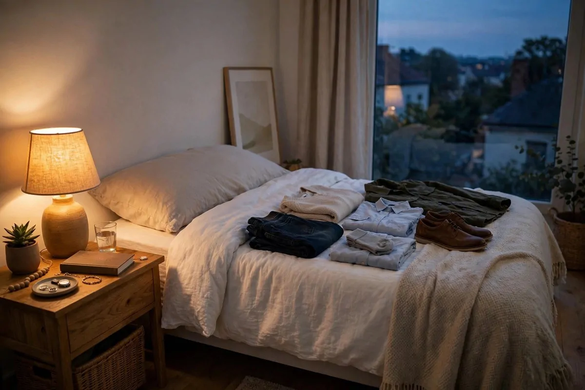
By day this studio is plain and practical. By night it turns into the prettiest room on the street. Warm lamps, string lights, and a window full of evening glow.
The big ceiling light is the enemy here. It flattens everything and kills the mood. Turn it off at sunset and live by lamp light alone. The room feels smaller in the best way. Cozy, not cramped.
Layer three kinds of light, and the room changes its mood with one click:
- A floor lamp by the work chair, for reading and drawing
- A small table lamp on the desk, for warm close light
- A string of warm lights along a shelf, for pure magic
Warm bulbs, always. Around 2700K on the box. Warm light makes products look good, sketches look good, and rooms feel like evening. Cool white light at night feels like an office that forgot to close.
The window display glows from within. A small light inside the display, aimed at the products, turns the window into a lantern. People walking past at night see a glowing box of color, and glowing boxes stop people.
Put one lamp on a timer. A lamp that switches itself on at dusk means you come back to a glowing room, not a dark box. It is a small luxury that costs almost nothing and feels wonderful every day.
Dim the screens at night. A glowing laptop fights the lamps and wins. Lower the brightness, and the room keeps its glow. Your eyes rest better too.
Keep the window uncovered after dark. The evening sky, the distant lights, and the dark blue glass are part of the look. A curtain drawn at dusk hides the best view the studio owns.
A glowing studio welcomes people home. Turn the big light off tonight, let the lamps do their work, and watch the street slow down outside your window.
That is all fifteen. Fifteen studios, fifteen ways to prove the same thing. Attention is not about shouting the loudest. It is about giving the eye one clear thing to land on.
You do not need to copy a whole studio. Steal one idea. The window hero. The glow. The bold wall. One small change this weekend, and your studio will feel different on Monday morning.
Then steal one more next weekend. Slow design beats fast design every time, because slow design stays. Fast design ends up in a box in the storage room by winter.
Save the looks you love. Start with the one that made you stop scrolling. Your studio does not need a bigger room. It needs a brighter idea, and now you have fifteen of them.