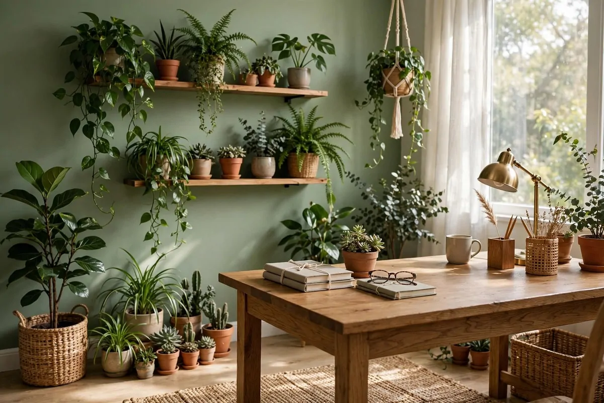
15 Ralph Lauren Office Inspiration Looks With Classic Charm

Deep navy is the color that tells your brain to slow down and do good work. I first felt that in a small reading room with dark blue walls, warm wood shelves, and one brass lamp glowing in the corner, and I did not want to leave.
That room had nothing fancy in it. It had books, a worn leather chair, and a desk that looked like it had been used for years. It felt calm and steady. It felt like a place where you could think clearly and finish your work without rushing.
I gathered 15 Ralph Lauren Office Inspiration looks for you, all built around that same classic charm. Think navy and cream, dark wood, brass, leather, plaid, and shelves full of books you actually love.
One quick note before we start. These are rooms inspired by that classic preppy and equestrian look, not the brand’s own rooms. Nothing here is connected to the brand, and you do not need any special labels or fancy pieces to get the feeling right.
You do not need to copy a whole room at once. Pick one look that fits your space and your budget. Start with the wall, the chair, or the lamp. One good change can shift the whole mood of your office.
Read through the list slowly. Notice which room makes you want to sit down and stay a while. That is the one to try first.
The Navy and White Striped Wall
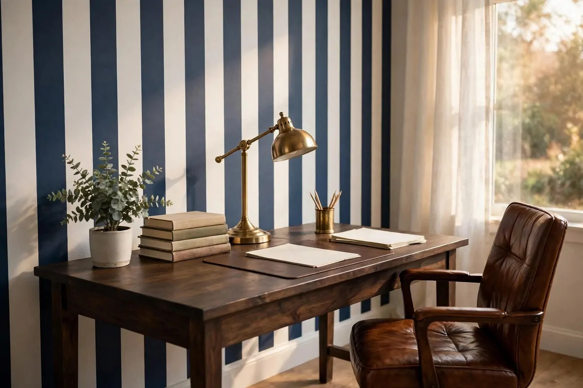
A striped wall can set the tone for your whole office in one afternoon. Navy and white stripes feel crisp and classic. They make the room look smart without making it feel cold.
Keep the stripes on one wall if your room is small. That one wall becomes the star. The other walls stay plain and calm, so your eyes have a place to rest.
Thin stripes feel soft and quiet. Wide stripes feel bold and strong. I like a medium stripe for an office, because it reads well on video calls and it does not fight with your desk and shelves.
Put your desk against the striped wall if you can. Your chair and your lamp will stand out against the pattern. Your work spot will look planned, even if the rest of the room is still a work in progress.
Keep the art simple on a striped wall. One or two frames are enough. A plain wood frame or a thin gold frame works best. Too many pictures will make the wall feel busy.
If paint feels like too much work, try removable striped wallpaper. It peels off clean when you move. Test a small piece first and live with it for a few days.
Match the navy in your stripes to one other thing in the room. A cushion, a rug edge, or a storage box will do. That small repeat makes the whole room feel tied together.
Light stripes with warm light in the evening. A brass lamp or a soft white bulb keeps the navy from looking too dark. Cool white light can make the wall feel a bit harsh.
Start with this look if you want a big change for little money. One wall, one color pair, and your office will feel like it has a real style.
The Leather Desk With Brass Details
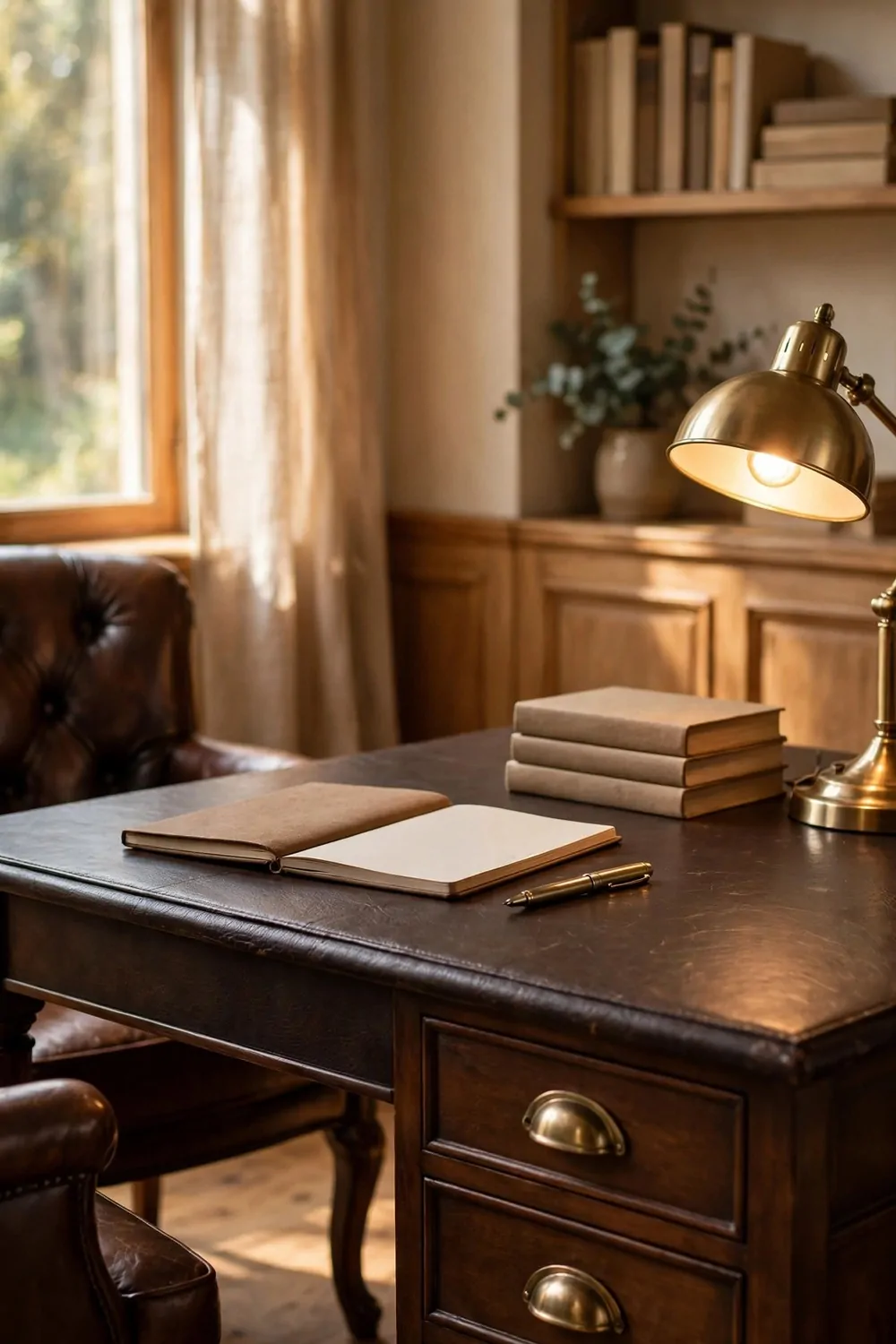
A leather desk top changes how work feels. Your arms rest soft on it. Your papers sit still. Your coffee mug does not slide around like it does on a slick wood top.
Brass details do the quiet work on this desk. Think brass drawer pulls, a brass pen cup, and a small brass lamp base. The warm gold tone looks rich next to dark leather.
Keep the brass warm, not shiny like a mirror. A soft brushed finish looks older and calmer. Shiny brass can glare in your screen light and pull your eyes away from your work.
Your chair matters just as much as your desk. A good chair should look right with leather and feel right after a long day. Use this quick guide to pick one.
| Chair type | Look | Comfort | Care |
|---|---|---|---|
| Leather chair | Classic and rich, matches a leather desk | Soft seat, warms up as you sit | Wipe clean, keep out of harsh sun |
| Fabric chair | Soft and cozy, adds texture | Breathes well on warm days | Vacuum often, spot clean marks |
| Wood chair with cushion | Simple and timeless | Firm seat, best with a thick cushion | Dust the wood, wash the cushion cover |
Leather care is simple if you keep it easy. Wipe the desk top with a soft dry cloth most days. Keep water rings away with a coaster. That is really all it needs.
Give your desk one clear work zone. Keep your laptop or notebook in the middle. Keep pens and papers to one side. A clear middle helps your brain feel clear too.
Dark wood legs ground a leather desk and keep it from floating in the room. If your desk is light wood, add a dark leather chair or a dark rug under it. The contrast makes both pieces look better.
One lamp is enough on most leather desks. Pick a brass lamp with a plain shade. Place it on the side away from your writing hand, so your hand does not cast a shadow on your page.
This look works best when you keep the desk tidy. Leather and brass already look rich. You do not need clutter to prove the point.
The Equestrian Touches That Feel Classic
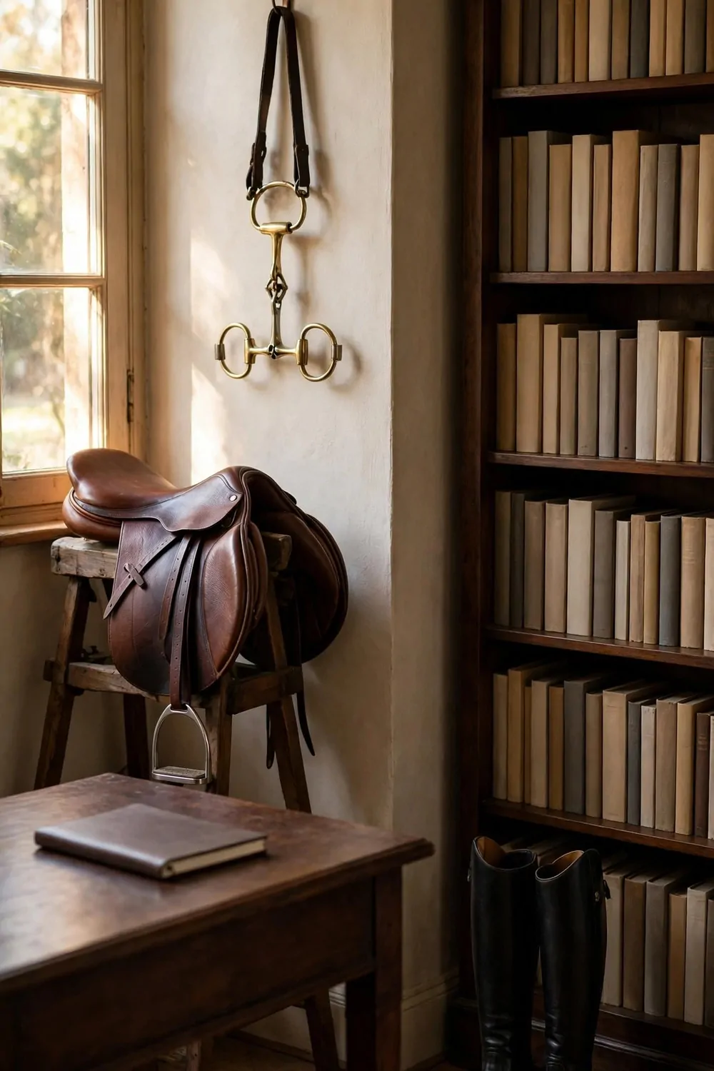
Equestrian style in an office is not about a theme room. It is about a few small touches that feel calm, neat, and well made. Think leather, dark wood, and simple shapes.
Start with one framed print of a horse. A simple sketch or a quiet photo works best. Hang it where you can see it from your chair. It should feel like art, not like a poster.
Leather straps and stitching give you the same feeling without any big pieces. A leather desk pad with stitched edges is a good start. A leather box for pens adds the same touch in a smaller way.
Keep your equestrian touches to two or three in the whole room. One print, one leather piece, and one wood piece are plenty. More than that can start to feel like a costume.
Books help this look feel real. Stack a few hardcover books on your desk or shelf. Choose plain covers in brown, green, or navy. They add weight and calm to the room.
Stick to a simple color set. Brown leather, dark green, cream, and brass are enough. When the colors stay quiet, the textures get to do the talking.
Stirrup shaped bookends are a sweet touch if you find a plain pair. Keep them small and simple. Let them hold your books up, and let the books be the main event.
Avoid anything loud or shiny here. No big prints on every wall. No bright colors fighting for attention. Classic style wins by staying calm.
Try one touch this week and see how it feels. If it makes your office feel steadier, add a second one. If it feels like too much, one is enough.
The Plaid Throw and Tartan Accents
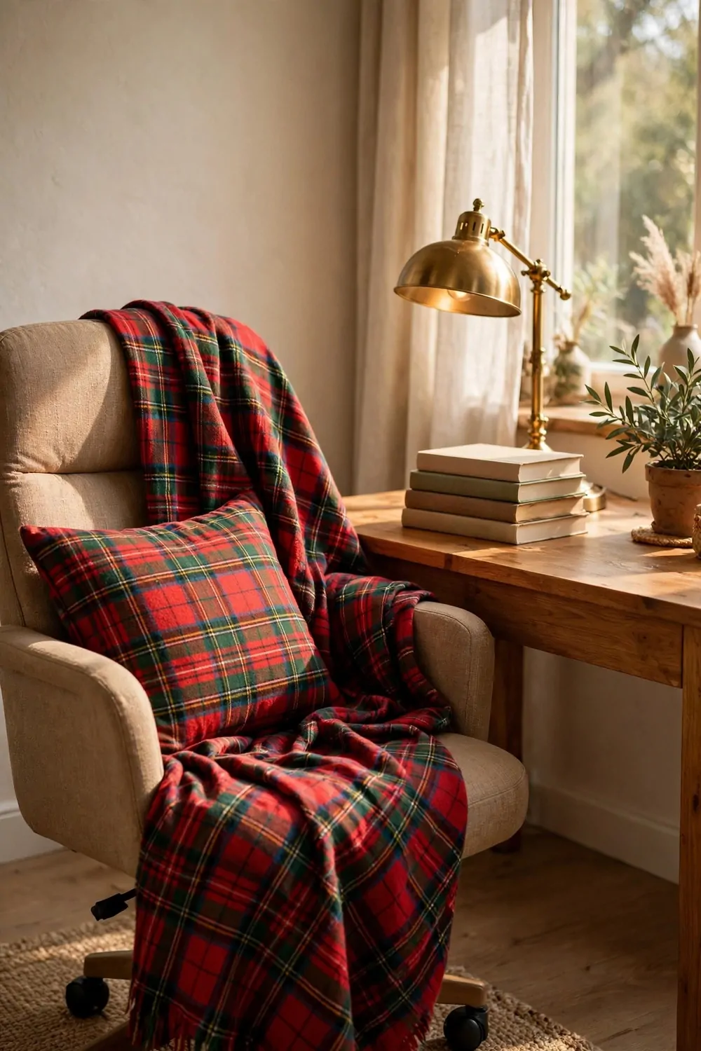
A plaid throw can warm up an office in seconds. Drape it over your chair back or fold it on your reading chair. It adds color and softness without any work at all.
Tartan cushions work the same way on a small scale. One cushion on your chair is enough to bring in the pattern. Two cushions can work if they share one color, like navy or green.
Mix plaid sizes with care. A big bold plaid throw looks best next to a small quiet plaid cushion. Two big plaids in one small room can feel loud and busy.
Keep your plaid colors in the classic family. Navy, forest green, deep red, and cream all play well together. One strong plaid is better than three plaids that do not match.
These small plaid pieces are the easiest way to try the look before you spend more.
- A plaid throw folded over your desk chair
- One tartan cushion on your reading chair
- A plaid fabric box on a shelf for small supplies
- A thin plaid runner under your desk lamp or tray
Put plaid where you touch it most. Your chair, your lap, and your reading corner are the best spots. Plaid on a high shelf looks nice, but you will not feel it the way you feel it on your chair.
In cold months a wool throw earns its place every day. In warm months swap it for a light cotton plaid. You dont need to store the whole look away, just change the fabric weight.
If plaid feels like too much for you, try a tiny touch instead. A plaid notebook cover or a small plaid pencil case gives you the pattern in a quiet way.
Plaid is a friendly pattern. It says cozy and classic at the same time. Let it soften your office, and keep the rest of the room simple around it.
The Dark Wood Bookcase Wall
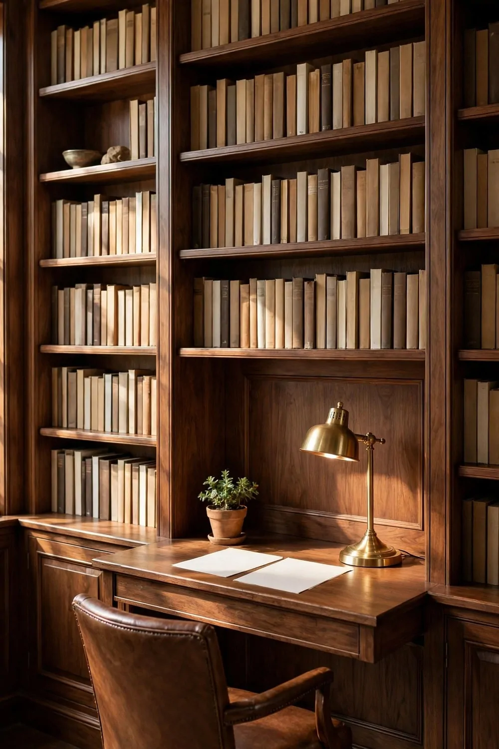
A wall of dark wood bookcases makes an office feel serious in the best way. It gives the room weight. It tells you this is a place for reading, thinking, and real work.
Dark wood does not have to mean dark and gloomy. Warm brown wood with a soft shine looks rich. Keep the shelves lit and the books neat, and the wall will feel warm, not heavy.
Fill the shelves with books you actually like. Mix tall books with short books. Stand some up and lay some down in small stacks. That mix keeps the wall from looking like a shop display.
Leave some empty space on purpose. A shelf that is packed edge to edge feels stressed. One empty spot here and there lets your eyes rest and makes the books stand out more.
Add a few plain boxes or baskets to the lower shelves. They hide cables, chargers, and papers you do not want to see. Choose boxes in leather, wood, or plain canvas for a calm look.
Small lights on the shelves make a big difference. A tiny clip light or a small brass lamp on one shelf warms the wood at night. It also helps you find the book you want.
Place your desk in front of the bookcase wall if you have room. You will work with books behind you, like a small library. On video calls, the shelves look smart and tidy behind you.
Keep the top of the bookcase simple. One plant, one clock, or one framed photo is enough. A crowded top makes the whole wall feel top heavy.
Build this wall slowly if you need to. One bookcase this month, one more later. A bookcase wall that grows with your book collection feels more honest than one bought all at once.
The White Wainscoting and Green Walls
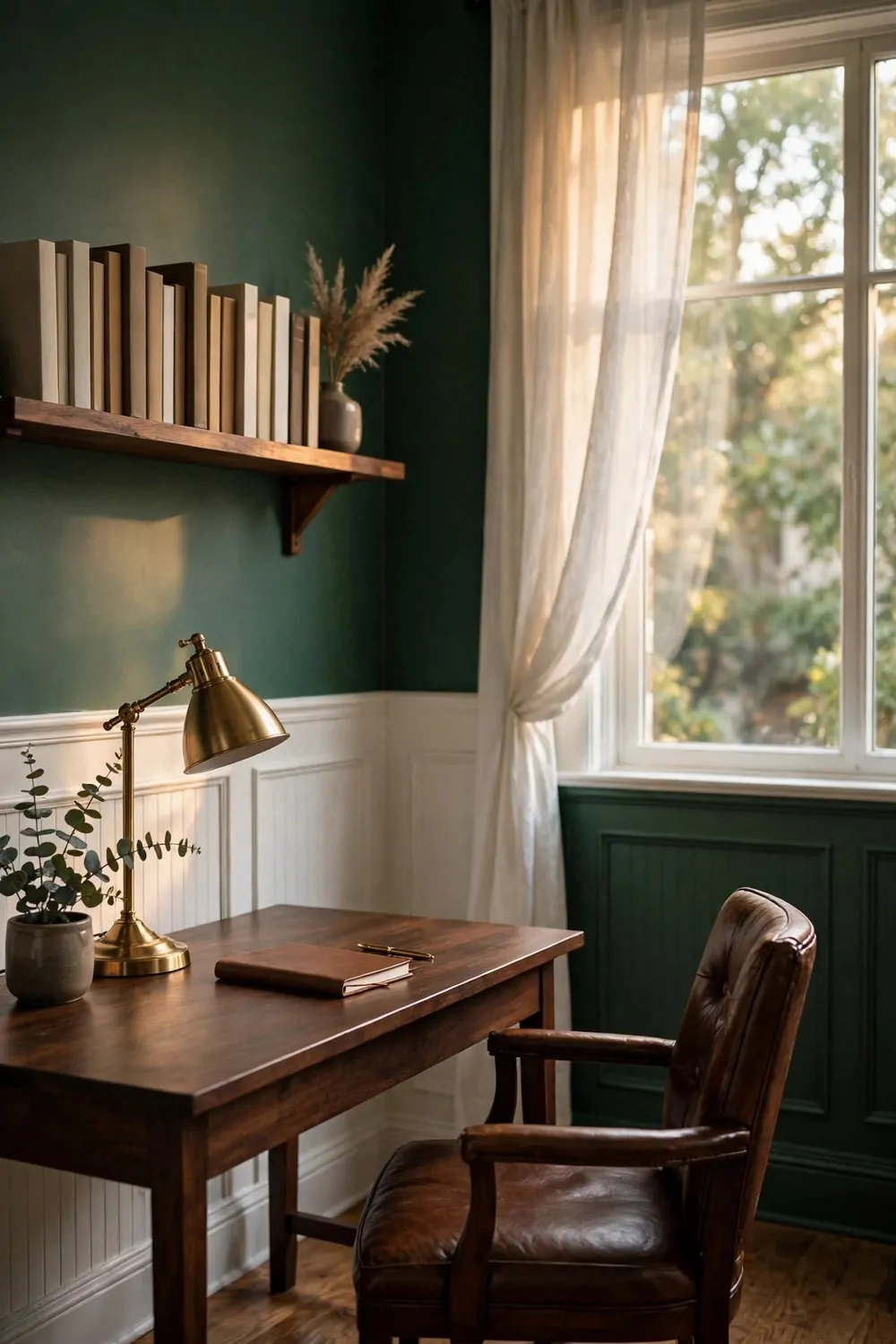
White wainscoting with green walls above it is a classic pair. The white trim keeps the room bright at the bottom. The green above it adds depth and calm.
Green is a kind friend to tired eyes. It feels like leaves and quiet gardens. In an office, it helps the room feel steady during a long day of screen work.
The white panels also protect your walls. Chairs bump them, bags lean on them, and the trim takes the hit. Wipe the white paint clean and it looks new again.
Keep the trim crisp and white. A warm white works best with green walls. A stark cold white can clash with a warm green, so test them side by side first.
| Green shade | Feel | Works best with |
|---|---|---|
| Deep forest green | Rich and library like | Dark wood, brass, leather |
| Soft sage green | Light and calm | White trim, light wood, cream fabric |
| Muted olive green | Warm and earthy | Brown leather, gold frames, woven baskets |
Always test a paint swatch on your own wall first. Green changes a lot in morning light and evening light. Paint a small patch and watch it for two days before you paint the whole wall.
Furniture in dark wood looks wonderful against green walls. A leather chair, a wood desk, and brass lamps all glow a little warmer with green behind them.
Brass is the best metal friend for green walls. Gold frames, brass lamps, and brass drawer pulls pop against the green without shouting. Silver can look cold here, so use it sparingly.
In a small room, keep the wainscoting to about one third of the wall height. That keeps the green from taking over. In a tall room, you can go a little higher with the white panels.
This look is worth the paint effort. White and green together feel timeless. They will still look right years from now, long after trend colors fade.
The Gold Frame Gallery Wall
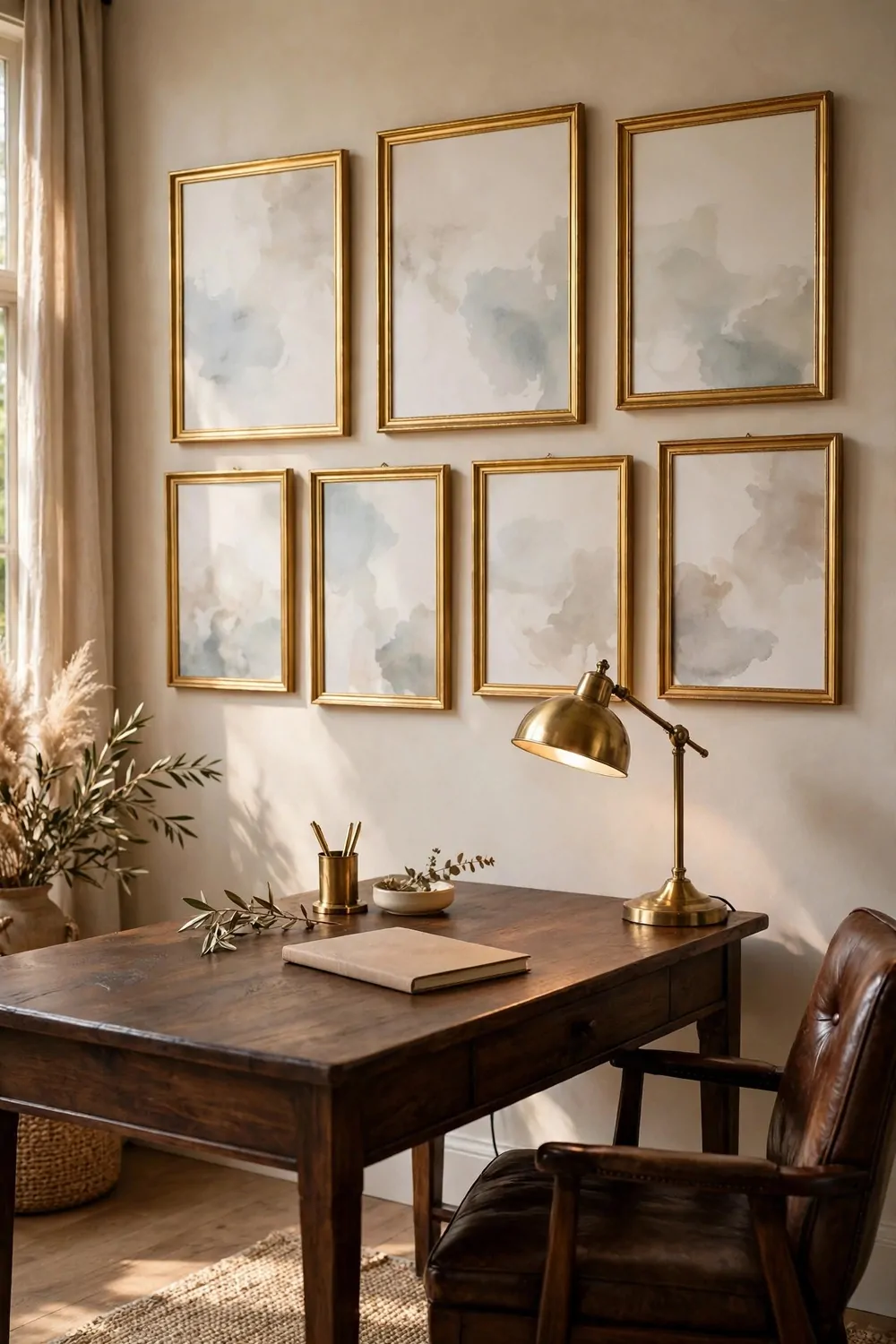
Gold frames can pull a whole wall together. Even if your art is all different, the same gold frames make it look like one planned collection. That is the magic of this look.
Mix art sizes on your gallery wall. One large piece in the middle anchors the wall. Smaller pieces around it add charm. Keep the gaps between frames about the same width.
Choose simple art for gold frames. Botanical prints, old maps, quiet landscapes, and plain photos all work well. Busy art in a busy gold frame can feel like too much at once.
Hang your gallery at eye level. The middle of the group should sit where your eyes rest when you stand in the room. Art hung too high feels distant, like it belongs to someone else.
Lay the frames on the floor first and play with the layout. Move them around until the shape feels balanced. Take a photo of the floor layout before you start hanging.
One big frame can anchor a whole desk wall. Hang it above your desk and keep the desk surface simple below it. Your eyes will go to the art first, then settle on your work.
Keep the wall color calm behind gold frames. Cream, soft green, and navy all let gold shine. A loud wall color will fight the frames for attention.
Do not crowd the gallery with shelves and clocks. Let the frames have air around them. A gallery wall needs breathing room to look classy instead of cluttered.
Start with three frames if a full wall feels scary. Three gold frames in a row above your desk already give you the classic feeling. You can add more later.
The Herringbone Wood Floor Office
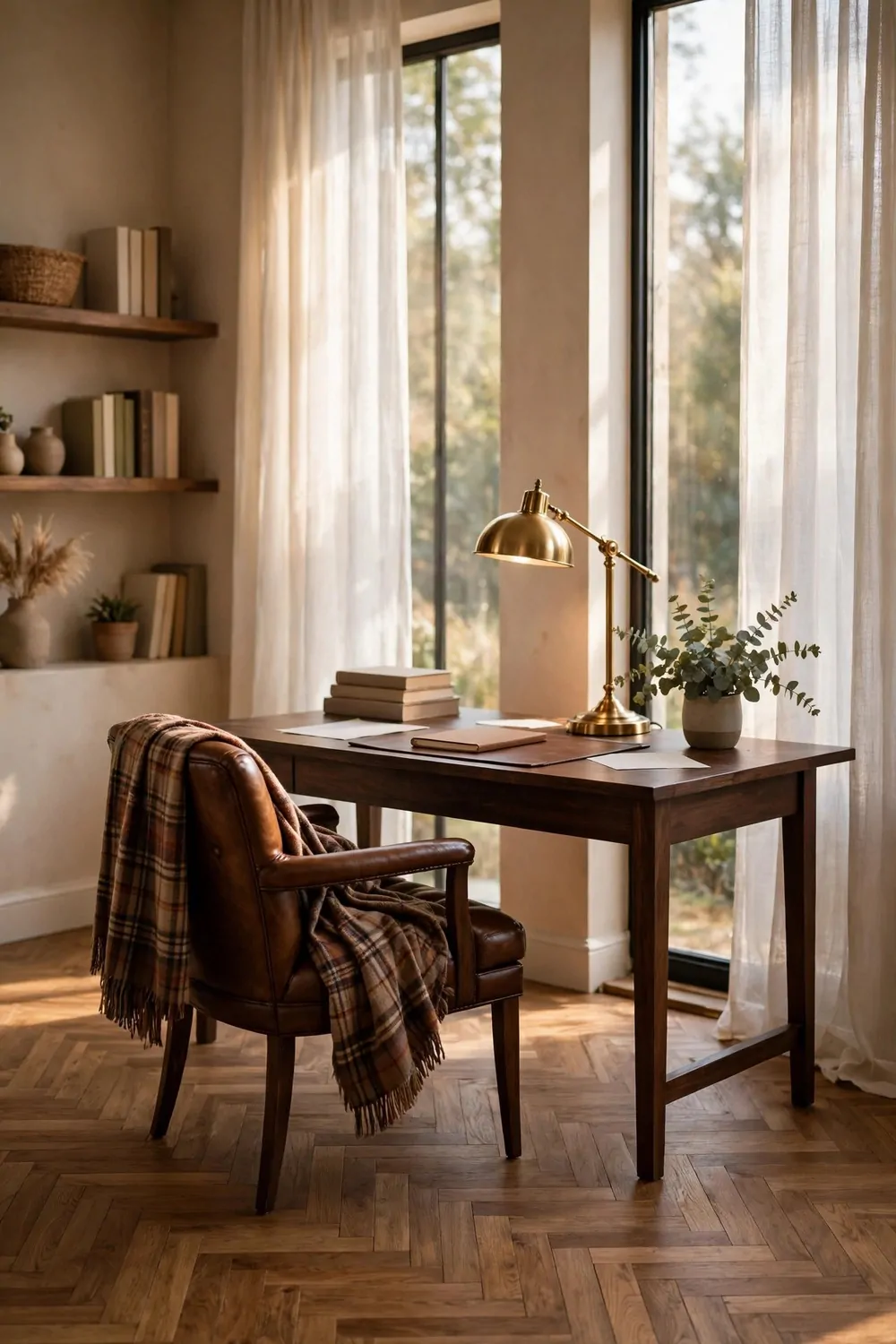
A herringbone wood floor is a pattern of small wood pieces laid in a zigzag. It looks old and smart at the same time. Your office floor becomes part of the design, not just a surface to walk on.
Warm wood tones suit this pattern best. Honey brown, walnut, and warm oak all glow in daylight. The zigzag catches the light in a soft way that flat floors do not.
A rug on top softens the pattern and marks your work zone. Choose a plain rug in cream or navy. A busy rug on a busy floor will fight the herringbone for your eyes.
If your chair rolls, use a clear chair mat or a flat rug pad. Wheels can wear down wood over time. A mat protects the floor and still lets the pattern show around the edges.
Keep part of the floor visible. Do not cover every inch with rugs and boxes. The herringbone pattern needs some open space to show its shape.
Dark floors pair well with a light desk and light walls. The contrast keeps the room from feeling too dark. Light floors pair well with dark wood furniture for the same reason.
Cleaning is simple. Sweep often, mop with a damp cloth, and wipe spills fast. Wood floors reward small daily care more than big deep cleans once in a while.
In a small office, choose lighter wood for the herringbone. Light wood bounces light around and makes the floor feel wider. Dark wood in a tiny room can feel a bit closed in.
You do not need to redo your whole floor to try this look. Herringbone peel and stick tiles and wood look planks can give you the pattern without a full rebuild. Try it in one room first.
The Classic Wingback Reading Chair
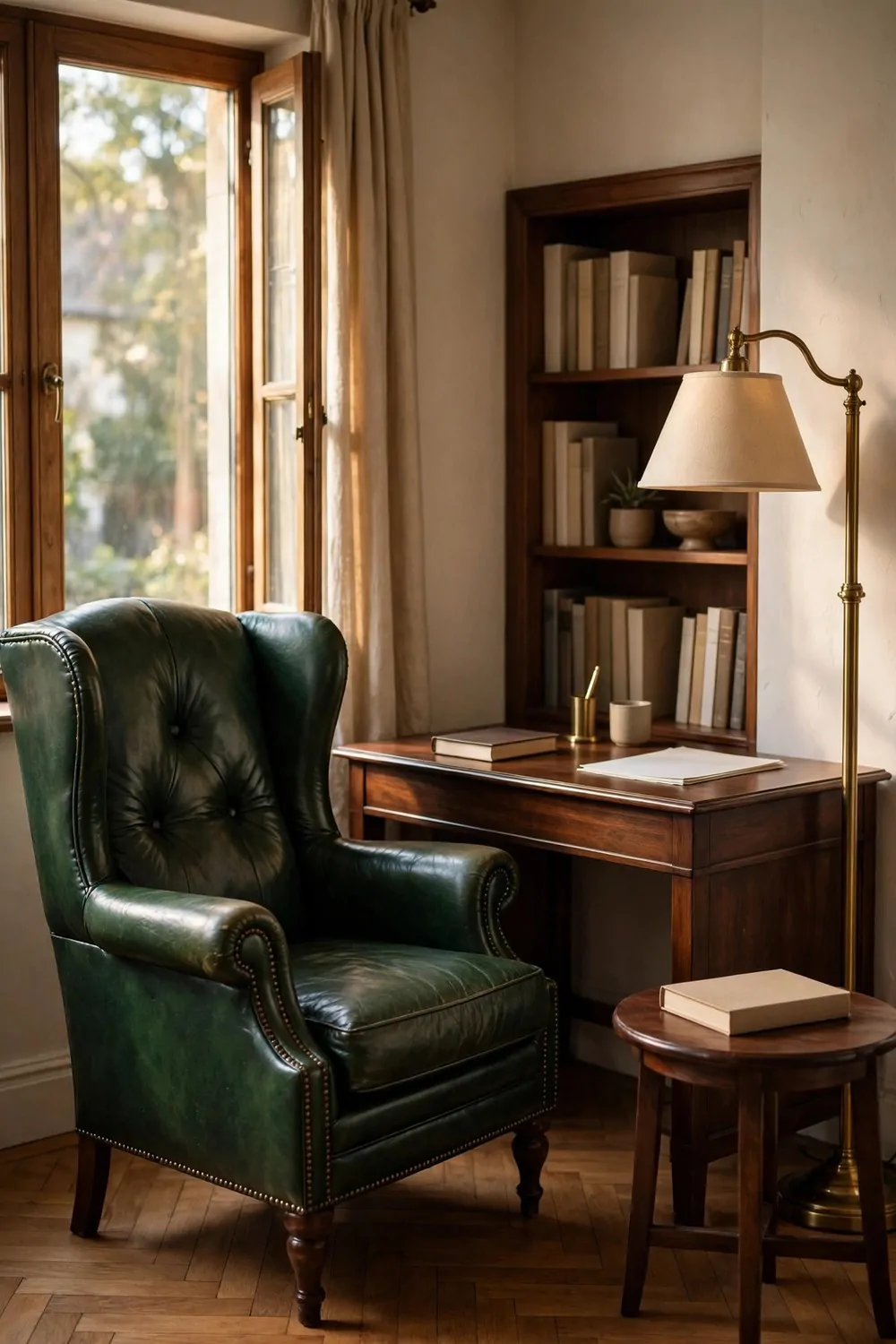
A wingback chair makes a reading corner feel like its own small room. The high sides wrap around you a little. They block drafts and noise, and they help you focus on your book.
This chair is made for slow moments. A chapter before work, a quiet break at lunch, or ten minutes with tea at the end of the day. It is not a work chair, and that is the point.
Leather wingbacks look rich and age well. Fabric wingbacks feel soft and cozy right away. Pick the one that fits how you will use the chair, not just how it looks in a photo.
Place the chair near a window or a lamp. Good light is the whole secret of a reading chair. A chair in a dark corner, no matter how pretty, will sit empty.
Set up the corner right with a few small pieces, and the chair will get used every day.
- A small side table for tea and a book
- A warm lamp at shoulder height
- A soft throw folded over one arm
- A small basket for the book you are reading now
Drape a throw over one arm of the chair, not over the whole back. That keeps the chair shape visible. It also makes the throw easy to grab when you sit down.
Keep your current book within arm’s reach. A small stack on the side table is better than a tall shelf across the room. If the book is close, you will pick it up more often.
Use the chair as a work break spot. Step away from your desk, sit in the wingback, and rest your eyes for a few minutes. You will go back to work fresher than if you just kept scrolling.
A wingback chair is a promise to yourself. It says slow reading matters here. Give it a good corner, and it will pay you back every week.
The Marble and Brass Lamp Lighting
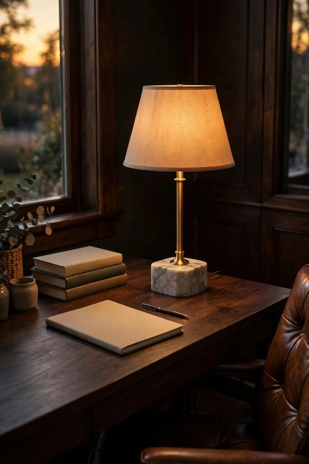
A lamp with a marble base and brass details looks solid and calm on a desk. The marble feels cool and heavy. The brass warms it up. Together they look timeless.
Warm light is the key to this look. Choose a warm white bulb, not a cold blue one. Warm light makes wood glow, makes leather look rich, and makes your face look kind on video calls.
Two lamps are often better than one big overhead light. A desk lamp for work and a floor lamp in the corner spread the light around. The room feels layered instead of flat.
Place your desk lamp on the opposite side from your writing hand. If you write with your right hand, put the lamp on the left. That stops shadows from falling on your page.
Match your brass finishes if you can. A brass desk lamp and a brass floor lamp in the same warm tone look planned. Mixed brass tones can still work, but keep them close in color.
Pick a plain lamp shade. White, cream, or soft linen shades spread light gently. A dark shade can look moody, but it throws less light on your work.
Keep lamp cords tidy with a small clip or a cord cover. A cord trailing across your desk ruins the calm look fast. Run it down the back leg of the desk where you cannot see it.
In the evening, turn off the overhead light and let the lamps do the work. The room will feel smaller and cozier. That soft glow is perfect for reading and winding down.
Good lighting is not a luxury in an office. It is a tool. A marble and brass lamp gives you that tool in a form you will love looking at every day.
The Saddle Leather and Canvas Storage
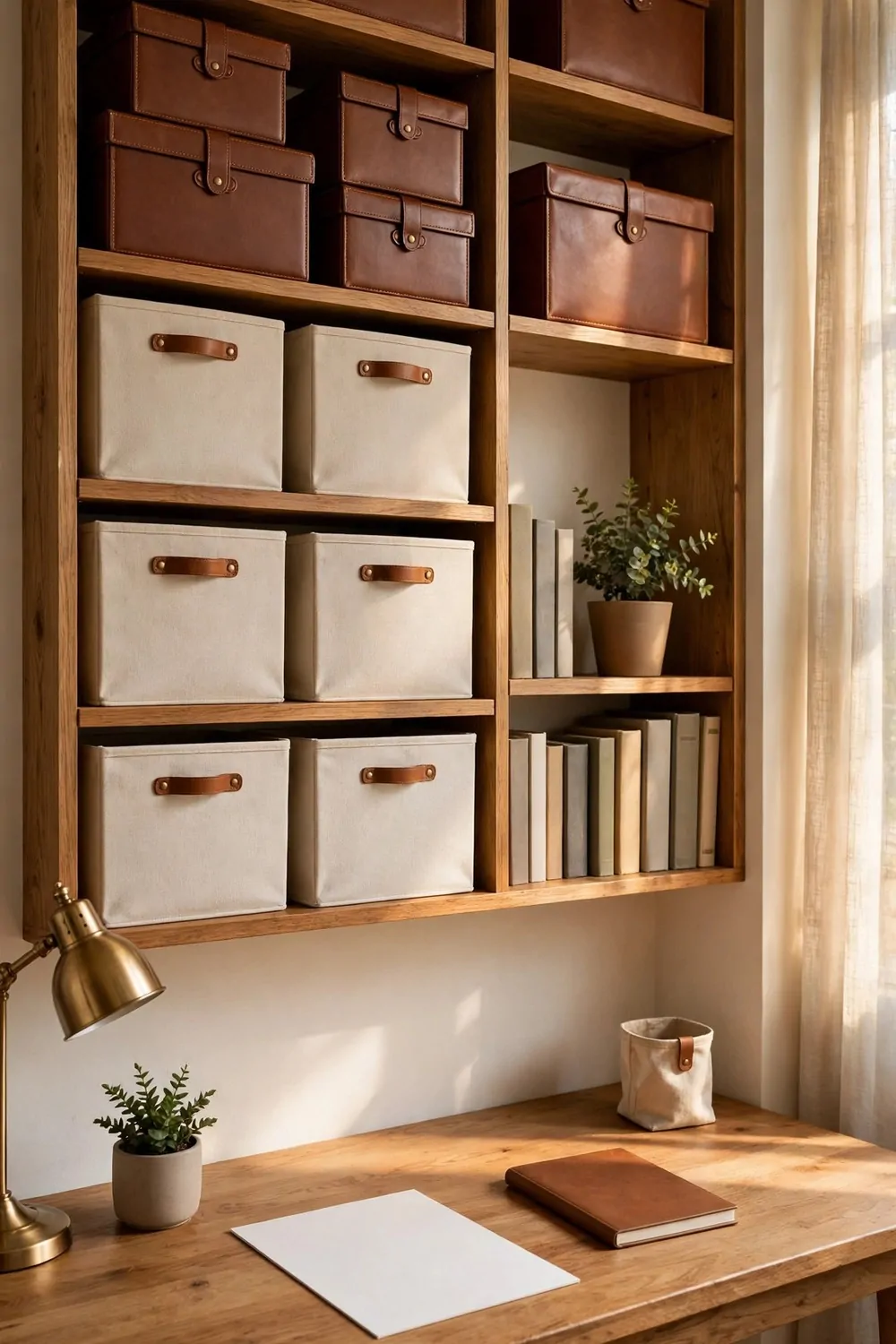
Saddle leather and canvas are a perfect pair for office storage. Leather looks rich and strong. Canvas looks soft and honest. Together they feel like good travel gear for your desk.
Canvas bins on open shelves hide the messy stuff. Use them for cables, chargers, notebooks, and spare supplies. Label each bin with a plain tag so you can find things fast.
Leather handles on boxes and baskets add the classic touch. A canvas bin with leather pull tabs looks made to last. It also feels nice in your hand when you pull it off the shelf.
Keep labels simple. One word is enough. Write “cables” or “papers” in plain handwriting. Fancy labels take time and they often peel off anyway.
Store daily items close to your desk and rare items higher up. Your pens, notebooks, and chargers should live within arm’s reach. Old files can go on the top shelf.
Hide your cables in a canvas or leather box with a small hole for the cord. The box sits on your desk or floor and swallows the tangle. Your desk will look calmer at once.
Mix brown leather with cream canvas for a soft classic look. Dark brown leather with white canvas can look a bit harsh. Warm tones together feel more welcoming.
A small leather tray on your desk holds keys, coins, and clips in one spot. Empty your pockets into the tray when you sit down. At the end of the day, everything is in one place.
Storage should help you work, not become a project of its own. A few good boxes in leather and canvas will do more than a whole wall of fancy organizers.
The Window Seat With Cushions
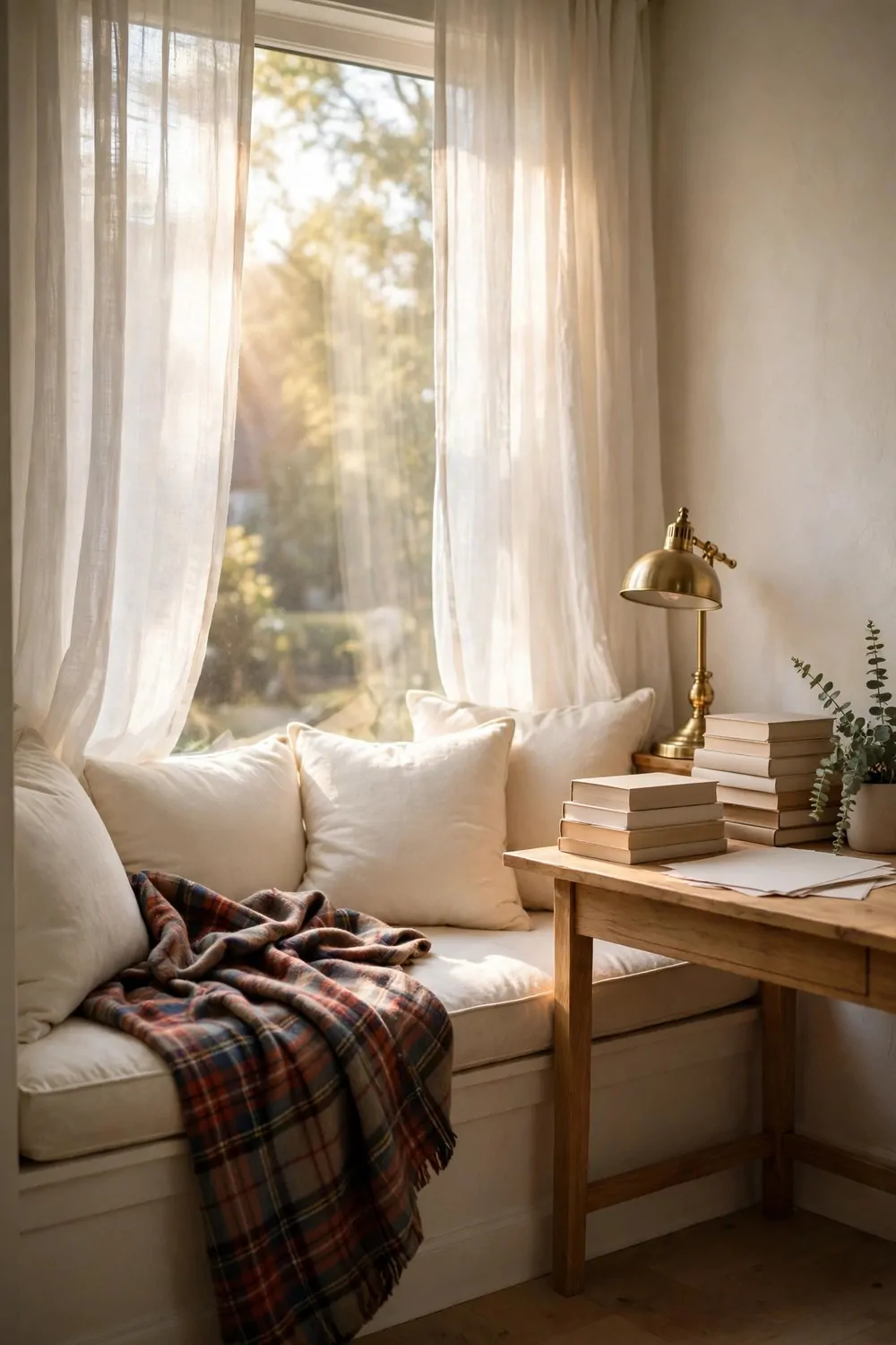
A window seat turns a plain window into your favorite spot in the office. It gives you a place to read, think, and watch the light change. It also adds extra seating without a big chair.
A thick cushion is the heart of a window seat. It should be firm enough to sit on for an hour. A thin cushion looks pretty but feels hard fast, and you will stop using the seat.
Mix plaid cushions with plain ones. One plaid pillow and two plain pillows in cream or navy look balanced. All plaid can feel loud in such a small space.
Good light makes a window seat work. You get daylight for reading most of the day. Add a small lamp nearby for cloudy afternoons and winter evenings.
| Storage option | What it holds | Best for |
|---|---|---|
| Lift up seat lid | Blankets, books, spare cushions | Small rooms with no extra closet |
| Drawers under the seat | Papers, notebooks, office supplies | Daily work items you reach for often |
| Open cubbies below | Books, baskets, pretty boxes | Display storage you want to see |
| Baskets beside the seat | Throws, magazines, chargers | Renters and seats with no built in storage |
Keep a basket for blankets right beside the window seat. A folded throw in the basket is easy to grab on a cold morning. It also keeps the seat itself clear and tidy.
You can work from a window seat for short tasks. Answer a few emails with a lap desk, or read a report in the daylight. For long typing sessions, your desk chair will still be kinder to your back.
A small plant on the windowsill suits a window seat well. Choose a plant that likes bright light. Keep it small so it does not block your view or crowd your cushions.
Keep the windowsill mostly clear. One plant and one small book stack are enough. A crowded sill makes the seat feel cramped before you even sit down.
A window seat is a gift in any office. Give it a thick cushion, a few good pillows, and a clear view, and it will become the spot you go to think.
The Timeless Black and Cream Palette
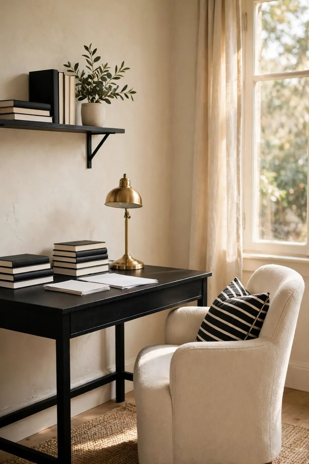
Black and cream never go out of style. Cream walls feel warm and bright. Black furniture and frames add shape and weight. Together they look clean and classic.
Start with cream as your main color. Cream walls, a cream rug, and cream curtains give the room a soft base. Black should be the accent, not the main event.
A black desk against a cream wall looks sharp and smart. Add a black frame or two on the wall above it. The desk will stand out without any extra decoration.
Warm wood keeps black and cream from feeling too stark. A wood desk top, wood shelves, or a wood floor adds warmth between the two strong colors.
Add one soft accent color if the room feels too plain. Navy and forest green both work well with black and cream. Pick one accent and use it in small doses.
Keep patterns small in a black and cream room. Thin stripes, small checks, and plain textures work best. A huge bold pattern can overpower the calm palette.
Use black in small, clear shapes. A black lamp base, black drawer pulls, and black picture frames are enough. Too much black at once can make the room feel heavy.
Black frames on cream walls make art pop. The the rug below can stay cream with a thin black border to tie the floor to the walls.
This palette is a safe base for any classic office. You can change cushions and art over the years, and the black and cream bones will still look right.
The Vintage Map and Travel Objects
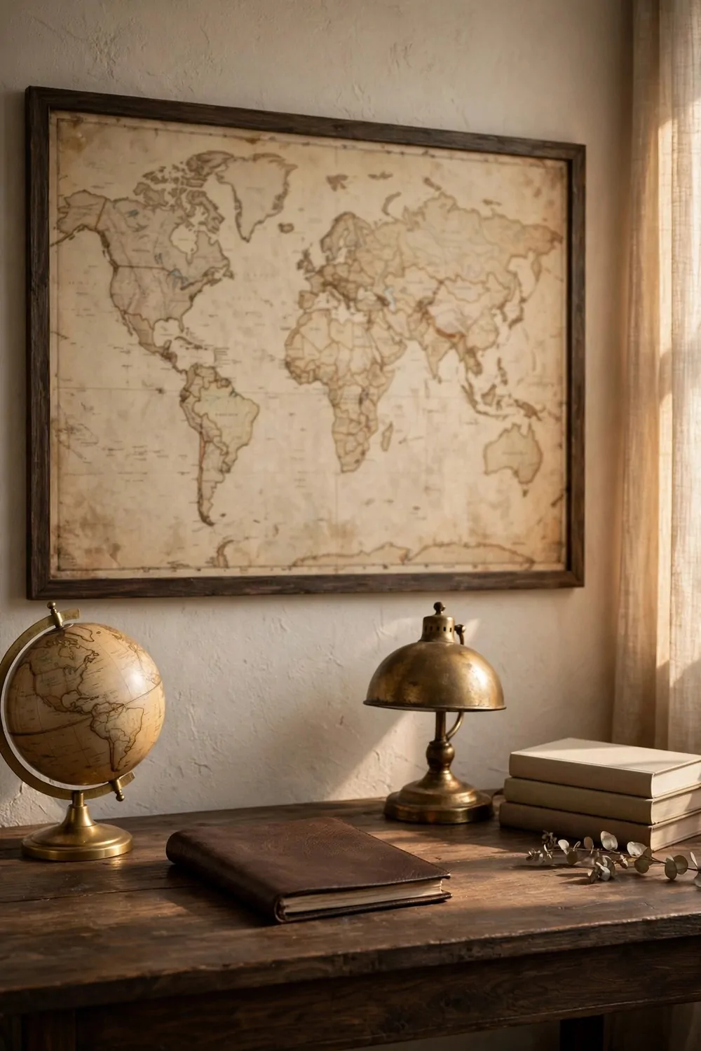
An old map on the wall gives an office a sense of story. It makes you think of trips, books, and faraway places. It also fills a large wall without any fuss.
A small globe on a shelf adds the same feeling in three dimensions. Spin it when you need a break. Let it remind you that work is one part of a bigger world.
Old travel boxes and trunks make good storage with a story. A small trunk under a window can hold blankets or books. A stack of old suitcases can hold papers and look charming.
Keep travel objects few and real looking. One map, one globe, and one trunk are plenty. A room full of travel props starts to feel like a shop window.
These pieces work best when they feel collected over time, not bought all at once.
- A framed vintage map above your desk
- A small globe on a bookshelf
- A leather trunk used as a side table
- A brass compass or spyglass on a shelf
- Old postcards pinned in a plain frame
Hang your map above your desk where you see it all day. A map at eye level becomes part of your thinking space. A map hung too high becomes wallpaper you forget.
Let each object hold a small story if you can. A map of a place you visited means more than a random map. A postcard from a friend means more than a shop print.
Mix travel objects with books on the same shelf. A globe next to travel books looks natural. A compass next to a stack of journals looks like it belongs there.
Travel objects should spark daydreams, not clutter. Keep them dusted, keep them few, and let the map and the globe do the quiet storytelling for your office.
The Polished Silver and Crystal Details
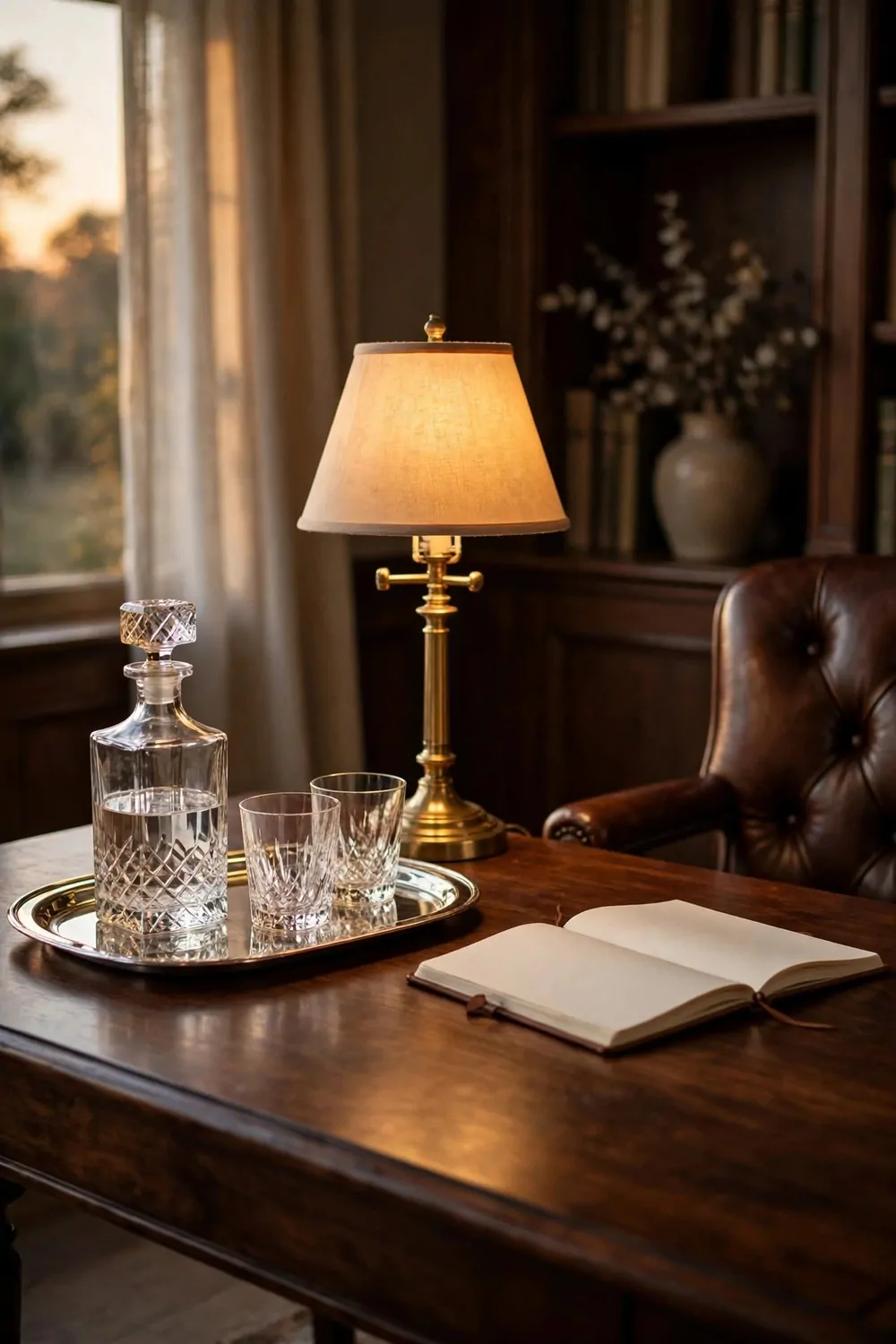
Polished silver adds a cool shine to a warm classic office. A silver tray on your desk catches the light. It also keeps small items together in one neat spot.
Crystal brings the same shine in a softer way. A crystal paperweight holds your papers down and looks pretty doing it. A small crystal vase with one stem softens a desk corner.
Keep silver and crystal in small doses. One tray, one paperweight, and one frame are enough. Too much shine in one room can feel cold and a bit showy.
A silver photo frame on your desk or shelf adds a personal touch. Choose a plain frame with clean lines. Let the photo inside be the star, not the frame.
Use a silver tray as your desk landing spot. Keys, clips, and a pen all sit on the tray. When you need to clear your desk fast, you lift one tray instead of ten small things.
Mix silver and brass with care. They can live in the same room, but give each one its own zone. Brass lamps on the desk, silver tray on the shelf, for example. That keeps the metals from clashing.
Polishing is easy if you do a little often. Wipe silver with a soft cloth once a week. Dust crystal with a dry cloth. A quick wipe keeps the shine without a big cleaning day.
Place crystal where light hits it. Near a window or under a lamp, crystal throws tiny rainbows on the wall. In a dark corner, it just looks like plain glass.
Silver and crystal are the final polish on a classic office. They say you care about small details. Add one piece, step back, and enjoy the quiet shine.