29 Living Room Inspiration Layouts You’ll Want to Recreate

—
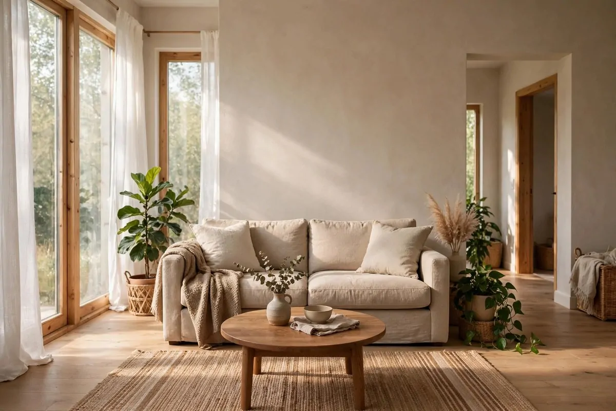
Flip through any home magazine and you will see the same kind of room. Perfect cushions. A coffee table with nothing on it. A sofa that looks like nobody has ever sat on it.
Now look at your own living room. There is a blanket sliding off the couch. Shoes by the door. A remote hiding somewhere between the cushions. The rooms we save photos of and the rooms we actually live in feel like two different worlds.
But here is what I learned after looking at hundreds of real homes. The difference is almost never money. It is the layout. A good layout decides where people sit, where your eyes go, and how the room feels the second you walk in.
If you are hunting for Living Room Inspiration that fits real life and real budgets, you are in the right place. I organized these 29 layouts by room shape and by how you actually use your space. Small rooms, big rooms, TV lovers, book lovers, party people. Everyone finds their match below.
The Conversation Circle Layout
This is the oldest layout in the book. And it still works better than almost anything else.
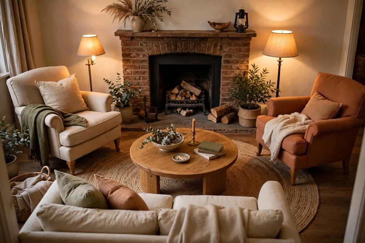
The idea is simple. Put the seats in a circle so people face each other instead of facing a screen. A round coffee table goes in the middle. The whole setup says one thing: talk to me.
I love this layout for homes where friends come over alot. You can fit four or five people and everyone feels included. Nobody ends up craning their neck to see someone.
Start with a round rug. It defines the circle without any walls. Place two armchairs and a small sofa around it. Keep the gaps between seats small enough that you can talk without raising your voice.
The coffee table should be low and round. Sharp corners in a circle layout feel wrong. Wood, rattan, or stone all look great. Leave enough room on top for cups, but do not clutter it.
Add a floor lamp behind one chair. It gives the corner a warm pool of light at night. A small side table next to each chair is a nice touch too. People need a place for their tea.
What about the TV? If you need one in the same room, put it on a side wall. Let the circle be the star. The TV becomes the backup singer.
One mistake I see often: pushing all the furniture against the walls. That kills the circle. Pull the chairs in a little. The middle of the room is not wasted space. It is the heart of the layout.
Try this layout if your living room is where talks happen. Long chats. Board games. Sunday coffee with your sister. It makes all of that feel natural.
The Classic TV Wall Setup
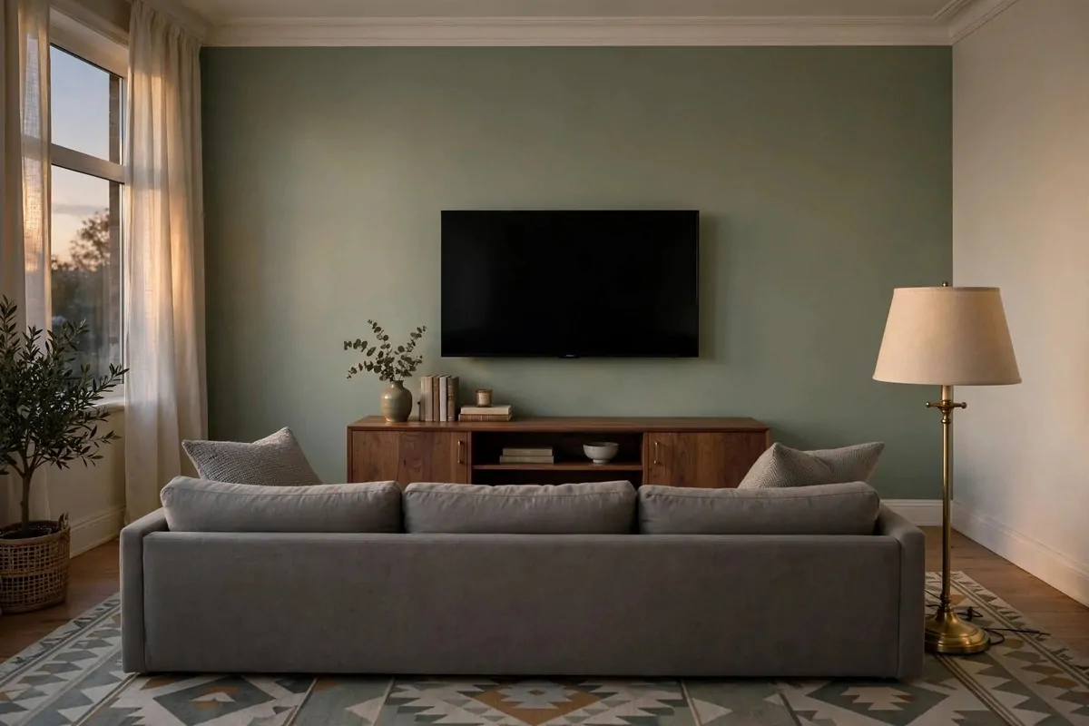
Let us be real. Most of us watch TV in the living room. And there is nothing wrong with that.
The classic TV wall setup just does it right. The TV goes on one main wall, mounted or on a console. The sofa faces it straight on. Everything else supports that view.
Mount the TV at eye level when you sit down. That one detail changes everything. A TV hung too high gives everyone a stiff neck by the end of a movie.
The media console under the TV hides the mess. Cables, remotes, game controllers. Pick one with closed doors if you hate clutter. Open shelves work if you keep them tidy.
Your sofa should sit straight across from the screen. Add a rug under the coffee table to mark the zone. The rug makes the whole thing feel like a proper little theater.
Lighting matters more than people think. A floor lamp on one side of the sofa softens the glow of the screen. It is easier on your eyes too.
Do not block the walkway to get a better view. Leave a clear path behind the sofa or on one side. Nothing ruins movie night like climbing over furniture.
This layout fits almost any room shape. Square, rectangle, even an awkward corner can work. The TV wall becomes the anchor and everything else follows.
If movie nights are your thing, start here. It is popular for a reason. It just works.
The Sectional Sweet Spot
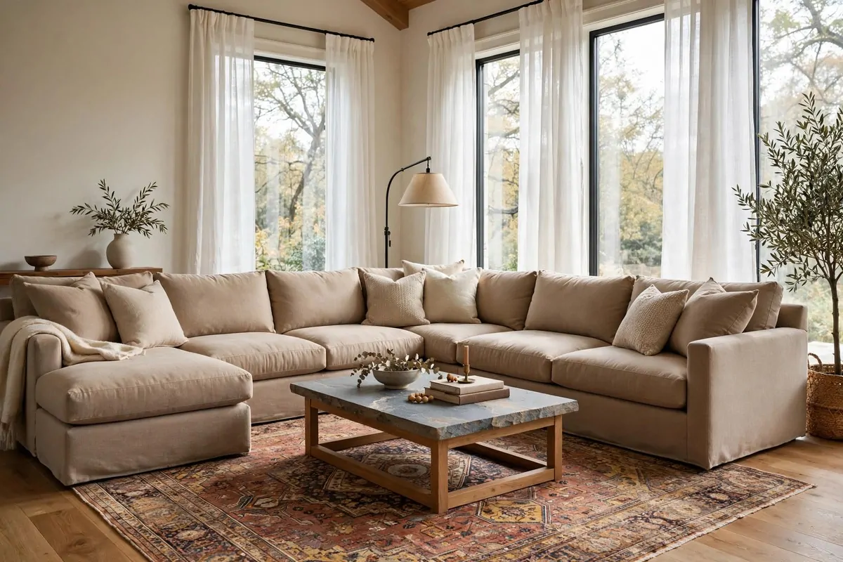
A sectional is the hardest working sofa you can buy. It seats four or five people and it takes up one corner.
The sweet spot is simple. Push the L into a corner of the room. The long side faces the TV or the fireplace. The short side faces into the room.
This one piece does the job of a sofa plus two chairs. It also gives everyone a corner to sink into. Corner seats are the best seats. Everyone fights for them.
Place a big coffee table in front of the long side. A rug under the whole sectional ties it together. The rug should be big enough that the front legs of the sectional sit on it.
Do not be afraid of a large sectional in a medium room. One big piece often looks calmer than three small pieces. Fewer legs, fewer gaps, less visual noise.
Add one armchair opposite the short side if you have space. It balances the L shape. If space is tight, skip it. The sectional alone is enough.
Throw pillows are the fun part here. Mix two or three colors. Keep the biggest pillows at the corners. It looks styled without trying too hard.
One thing to watch: sectionals are heavy to move. Be sure of your layout before you buy. Measure the corner twice. I learned that the hard way.
If your room has a clear corner and you want max seating with min fuss, this is your layout.
The Small Square Room Plan
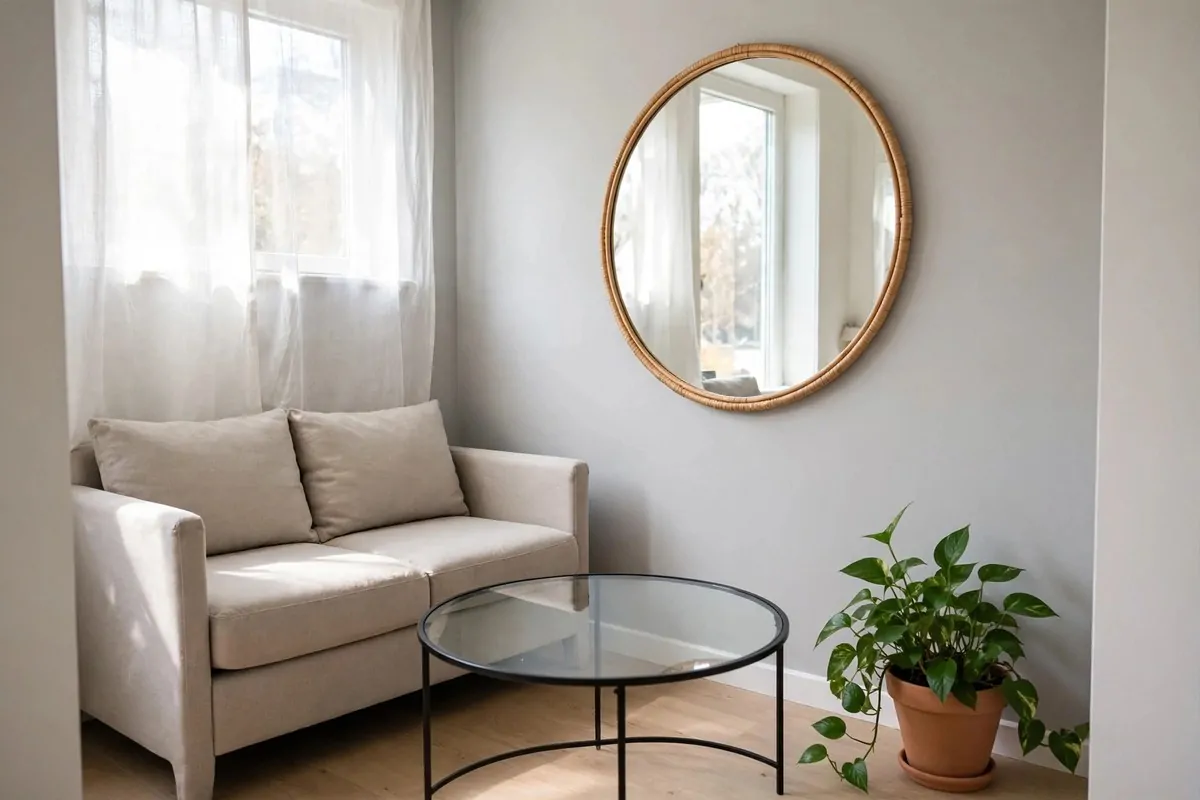
Small square rooms scare people. They should not. A square is actually the easiest shape to furnish.
The plan: one loveseat, one small table, one big mirror. That is the whole recipe. Keep every piece light and leggy.
A loveseat seats two without eating the room. Look for one with thin arms or no arms at all. Every inch counts here.
The coffee table should be round and small. Round tables have no corners to bump into. Glass tops make the room feel bigger because you can see through them.
Hang a large mirror on the wall opposite the window. It bounces light around and doubles the view. This is the oldest small room trick there is.
Keep the walls light. White, cream, or pale gray. Dark colors in a tiny room can feel cozy, but they need good lighting to work. Light colors are the safe win.
One plant adds life without taking space. A tall thin plant in a corner draws the eye up. That makes the ceiling feel higher.
Skip the bulky armchair. Use a pouf or a floor cushion instead. You can tuck it under the table when guests leave.
Storage is the secret weapon. A coffee table with a shelf. A loveseat with drawers under the seat. Small rooms need furniture that does two jobs.
I rember my first apartment had a room this size. Once I got the big mirror up and ditched the oversized chair, it felt twice as big. Layout beats square footage every time.
The Open-Plan Zone Split
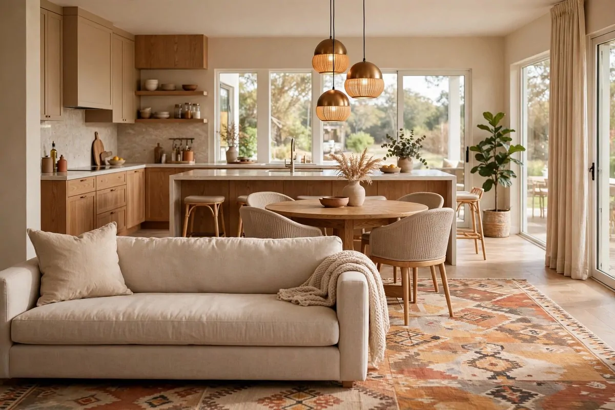
Open-plan rooms are wonderful and tricky at the same time. All that space, and no idea where the living room ends.
The fix is zoning. You divide the big space into smaller areas without building walls. The living room becomes one zone. The dining area becomes another.
A large rug is your best tool. Put the sofa and coffee table on it. The rug says: this is the living room. Everything on the rug belongs together.
Turn the sofa so its back faces the dining area. The back of the sofa works like a soft wall. It is a friendly divider, not a harsh one.
Keep the color palette the same across zones. You do not need matching furniture. Just repeat two or three colors. That ties the whole space together.
Lighting helps too. A pendant light over the dining table and a floor lamp in the living zone. Different lights tell your brain these are different places.
A console table behind the sofa is a smart move. It gives you a surface for decor and marks the line between zones. Books, a plant, a small lamp. Done.
Here are a few zoning tricks that always work:
- Use a rug under each zone
- Face the sofa away from the next zone
- Repeat colors across the whole room
- Give each zone its own light source
- Leave clear walkways between zones
Walkways matter most. Leave enough room to walk between the sofa and the dining table without squeezing. About an arm's length is a good rule.
This layout is perfect for modern homes and apartments. It keeps the open feel while giving every activity its own home.
The Fireplace Front-and-Center Layout
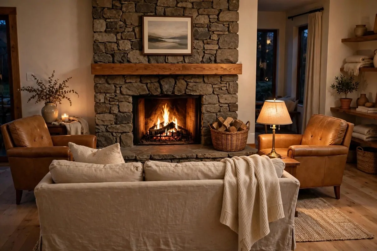
If you have a fireplace, you have a gift. Let it be the boss of the room.
This layout puts every seat facing the fire. The fireplace becomes the focal point, the way a TV is in other rooms. But warmer. Literally.
Arrange a sofa and two armchairs in a loose arc around the hearth. Leave enough space that the heat reaches everyone. The arc shape feels natural and welcoming.
Keep the mantel simple. A mirror or one piece of art above it is enough. The fire is the decoration. You do not need to compete with it.
A basket of firewood or blankets beside the hearth adds charm. It also tells people this fireplace actually gets used. That matters.
Lighting should stay low and warm. Skip bright overhead lights. Table lamps with warm bulbs make the whole room glow like the fire does.
This layout shines in winter. But it works year round too. In summer the fireplace is just a beautiful stone wall. The seating arc still feels cozy.
One tip: do not put the TV above the fireplace if you can avoid it. The neck angle is bad. If you must, keep the mantel low and the screen tilted down.
Rugs are important here. A soft rug under the seating arc makes the area feel like a cocoon. Cold floors and fireplaces do not mix.
I think this is the most romantic layout on the list. Something about facing a fire together makes people talk slower and smile more.
The Reading Corner Arrangement
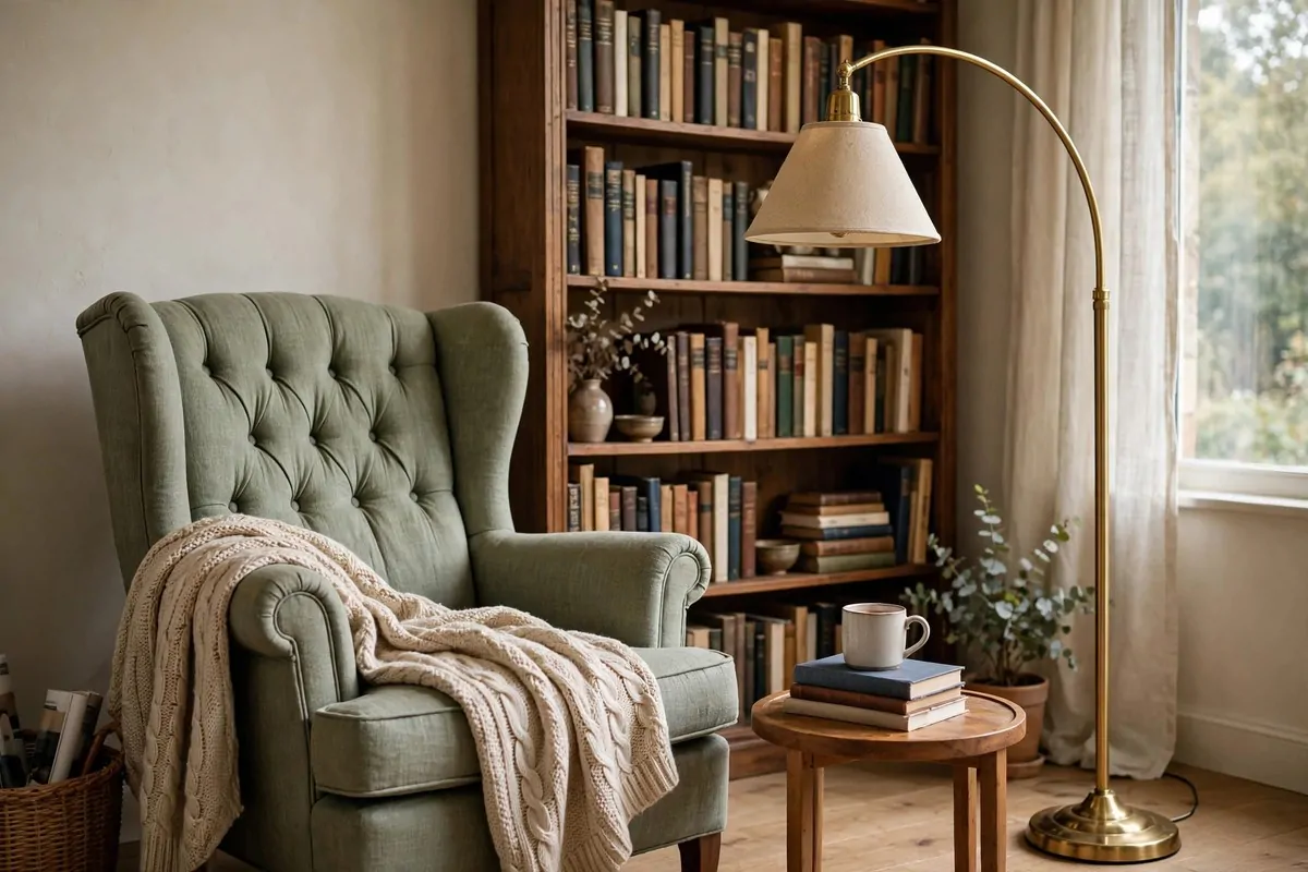
Not every corner of the living room needs to face the TV. One corner can be just for you and a good book.
Pick the corner with the best light. Near a window is ideal. Daylight makes reading easier and the corner feels alive.
The three pieces you need: a comfortable armchair, a good lamp, and a small table. That is it. Everything else is bonus.
The chair is the most important buy. It should be deep enough to curl up in. A wingback or a soft club chair both work. Sit in it before you buy if you can.
The lamp must shine over your shoulder, not into your eyes. An arc lamp or an adjustable floor lamp is perfect. Warm white light, not cold blue.
A small side table holds your tea and your current book. A bookshelf or a stack of books nearby keeps the next read within reach. No getting up.
Add a soft throw blanket. Not just for looks. Reading corners get chilly because you sit still for a long time. The blanket makes it a nest.
This corner does not need to match the rest of the room. A different chair, a different color. It is a little world of its own. That is the charm.
Even in a tiny living room you can steal one corner. One chair. One lamp. Your books. It might become your favorite spot in the whole house.
The Symmetrical Traditional Layout
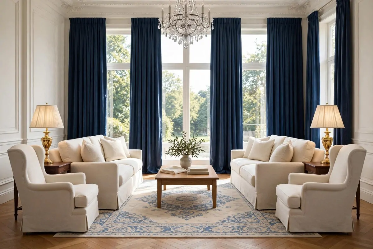
Symmetry is calm. Our brains love balance. When both sides of a room mirror each other, the room feels settled and proper.
This layout is the classic formal living room. Two identical sofas facing each other. A coffee table in the middle. Matching lamps on matching side tables.
Start from the center line of the room. Everything goes in pairs. Two sofas, two chairs, two lamps, two side tables. It sounds rigid, but the result is deeply relaxing.
The coffee table sits exactly in the middle. A rectangular table works best with two facing sofas. It keeps the long axis clean.
This layout is made for conversation. Both sofas face each other across the table. It is also made for rooms that need to look smart. Formal sitting rooms, anyone?
Color helps here. Keep the palette tight. Two or three colors, repeated on both sides. The repetition is what makes symmetry sing.
Art above the fireplace or on the main wall should be centered. One big piece beats a messy cluster in a symmetrical room. Balance needs a calm backdrop.
The downside: it can feel a little stiff. If that bothers you, break symmetry in small ways. Different throw pillows on each sofa. One plant on only one side. Just a touch.
This layout suits traditional homes and anyone who likes order. If messy rooms stress you out, symmetry is your friend.
The Asymmetrical Modern Layout
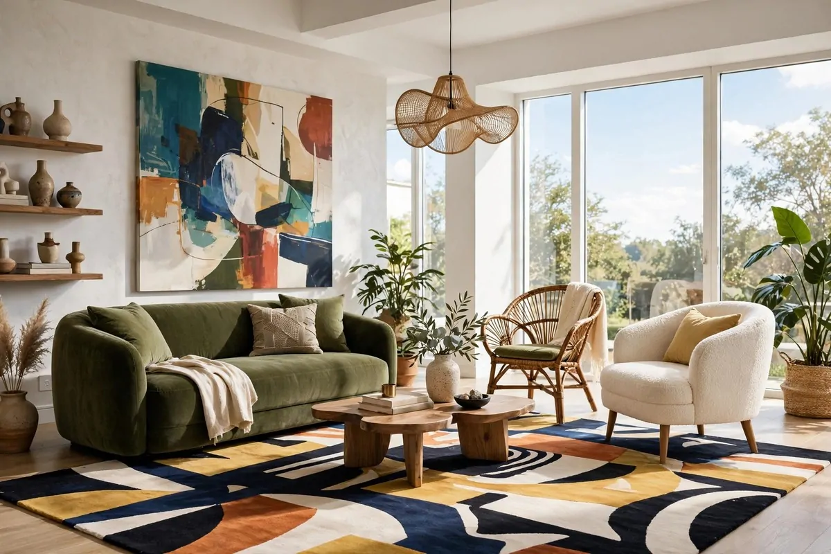
Asymmetry is the cool younger sibling of symmetry. It is relaxed, artsy, and full of personality.
Here the furniture does not match. The sofa sits off center. The chairs are different from each other. It looks casual, but the best versions are carefully planned.
The trick is balance without mirroring. A big sofa on one side needs visual weight on the other side. That can be two small chairs, a bookshelf, or a large plant.
Mix chair styles on purpose. A rattan chair next to a velvet one looks intentional if the colors talk to each other. Pick one color they share and you are safe.
A bold rug anchors the whole thing. In an asymmetrical room the rug is the peacemaker. It holds the different pieces together like a frame holds a collage.
Art placement is freer here. Hang one big piece off center. Or group three small frames in a loose cluster. Perfect alignment would feel wrong in this room.
This layout loves plants. A tall plant in an empty corner fills the gap where a matching chair would go in a symmetrical room. Nature does not do symmetry anyway.
The risk is looking messy instead of artful. The fix: repeat colors and materials. If every piece shares two colors and one texture, the room stays calm.
Here is a quick comparison to help you choose your side:
| Symmetrical | Asymmetrical | |
|---|---|---|
| Feel | Calm, formal, orderly | Relaxed, creative, lively |
| Furniture | Matching pairs | Mixed styles |
| Best for | Traditional homes, formal rooms | Modern homes, creative people |
| Risk | Can feel stiff | Can look messy |
Neither is better. They are just different moods. Pick the one that matches how you want to feel in the room.
The Floating Sofa Layout
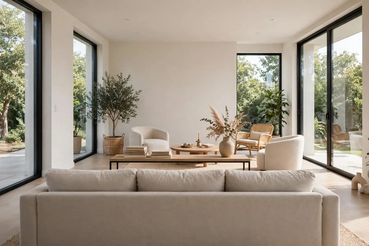
Most people push the sofa against the wall. It feels safe. But floating the sofa in the middle of the room can change everything.
Floating means the sofa sits away from the walls, facing into the room. Its back is visible. That sounds scary, but it creates a room within a room.
This works best in medium to large rooms. You need space to walk behind the sofa. If you can walk around it comfortably, you can float it.
The back of the sofa becomes a design moment. Add a slim console table behind it. Style it with books, a lamp, and a vase. Now the back view is pretty too.
Floating the sofa opens up the walls. You can put a bookshelf, a piano, or a reading nook along the wall where the sofa used to be. The room gains a whole new zone.
Rugs are a must. The rug goes under the sofa and the coffee table. It marks the floating island and keeps it from looking lost.
One common worry: the room will feel smaller. Actually the opposite happens. Seeing floor all around the furniture makes the space feel bigger and airier.
Try it before you judge it. Move your sofa out from the wall for a weekend. Live with it. Most people who try floating never push the sofa back.
The L-Shaped Room Solution
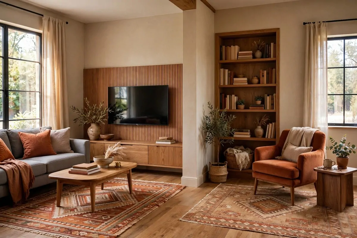
L-shaped rooms look like a problem. They are actually two rooms hiding in one.
The solution: give each wing of the L its own job. One wing becomes the main seating area. The other becomes something else. A reading nook, a play corner, a small office.
Start with the bigger wing. Put the sofa, coffee table, and TV or fireplace there. This is the main living zone. Arrange it like a normal rectangular room.
The smaller wing is your bonus. A comfortable chair, a floor lamp, and a bookshelf turn it into a reading spot. Or put a desk there for a home office corner.
Use a rug in each wing. Two rugs tell the eye that these are two separate places. Different patterns are fine if the colors match.
Keep the walkway between the wings clear. The inner corner of the L is where traffic flows. Do not block it with furniture.
Lighting each wing separately helps a lot. A ceiling light in the main wing, a floor lamp in the small wing. At night each zone glows on its own.
Here are easy job pairs for the two wings:
- Main seating + reading nook
- TV area + kids play corner
- Conversation zone + home office
- Lounge + dining spot
The mistake is trying to make the L feel like one big room. Do not. Celebrate the split. Two cozy zones beat one awkward space every time.
The Long Narrow Room Fix
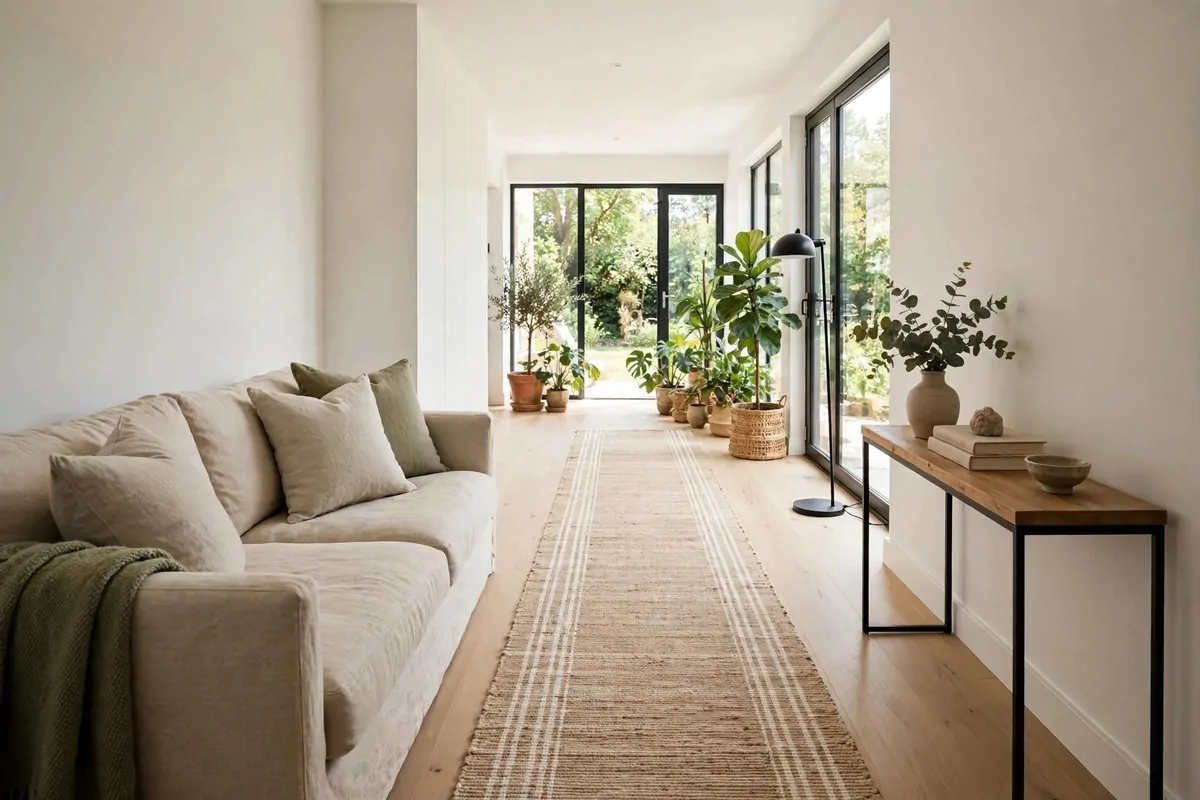
Long narrow rooms feel like hallways. The fix is to break the tunnel feeling with zones across the width.
Put the sofa along one long wall. Face it with two chairs or a loveseat on the opposite wall. Now the room has width. The eye travels side to side, not just end to end.
A runner rug down the middle guides the eye and adds warmth. But do not let the rug run wall to wall. Leave floor showing on both sides so the room breathes.
Use the far end for something special. A reading chair by the window. A small desk. A plant collection. A destination at the end stops the tunnel feeling.
Keep furniture slim. Deep bulky pieces eat the narrow width fast. Look for sofas with a shallow depth and chairs with open legs.
Mirrors on one long wall widen the room visually. One big mirror is better than many small ones. Hang it to reflect a window if you can.
Avoid lining everything up in a single row. That makes the tunnel worse. Stagger pieces. Pull a chair slightly forward. Angle the coffee table a touch.
Here is a quick guide for picking layouts by room shape:
| Room shape | Best layouts from this list |
|---|---|
| Small square | Small Square Plan, Mirror Trick, Minimalist |
| Long narrow | Long Narrow Fix, Floating Sofa |
| L-shaped | L-Shaped Solution, Two-Zone Split |
| Large open | Open-Plan Split, Two-Zone Split, Entertainer |
| Studio | Studio All-in-One, Corner TV |
Long rooms are common in apartments and older houses. Once you zone them across the width, they stop feeling like hallways and start feeling like homes.
The Large Room Two-Zone Split
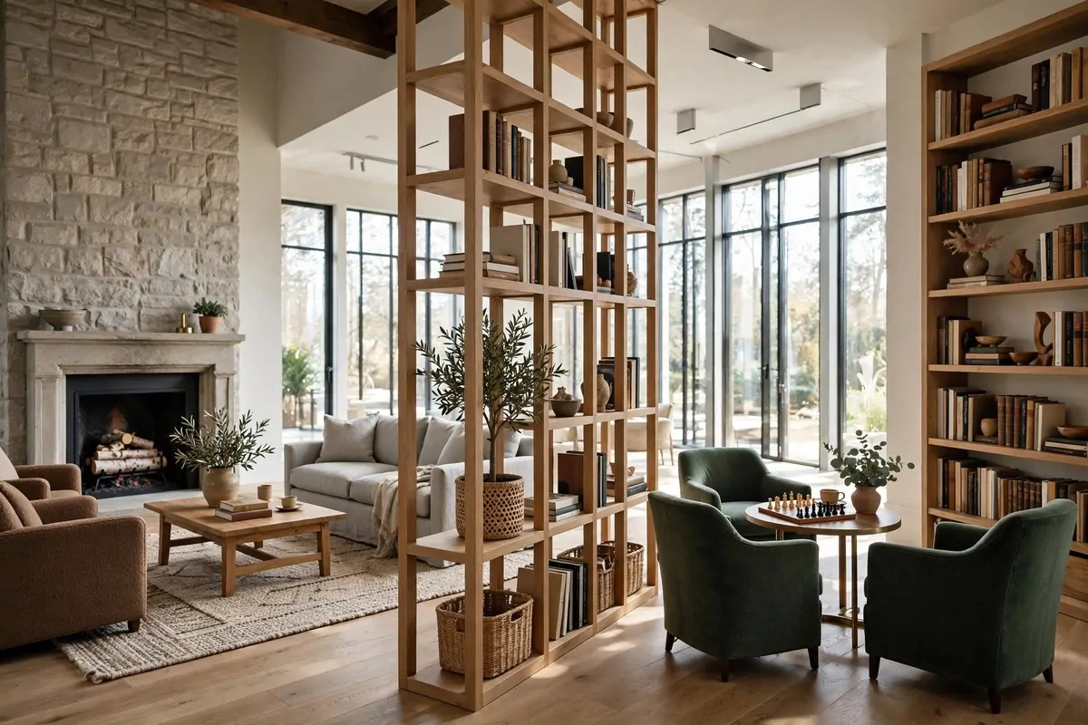
Big living rooms have the opposite problem of small ones. Too much empty space. Furniture huddled in one corner while the rest of the room feels abandoned.
The answer is two zones. Split the big room into two seating areas. Each one feels cozy on its own. Together they fill the space.
Zone one is the main lounge. Sofa, coffee table, TV or fireplace. Arrange it tight and comfortable. This is where daily life happens.
Zone two is the quiet corner. Two armchairs and a small table. Or a game table. Or a reading spot. It is for the times when someone wants a calmer seat.
Divide the zones with something soft. An open bookshelf works beautifully. You can see through it, so the room stays airy. But it clearly marks the line.
Two rugs, one per zone, do the same job. They are the simplest dividers of all. Pick rugs that share a color so the room still feels like one home.
Give each zone its own light. A floor lamp in zone one, a table lamp in zone two. In the evening each area glows separately. It feels magical.
The biggest mistake in large rooms is pushing everything to the walls. That makes the middle a dead desert. Pull furniture toward the center. Fill the middle.
This layout is wonderful for families. Kids can play in one zone while adults talk in the other. Everyone is together but nobody is on top of each other.
The Corner TV Setup
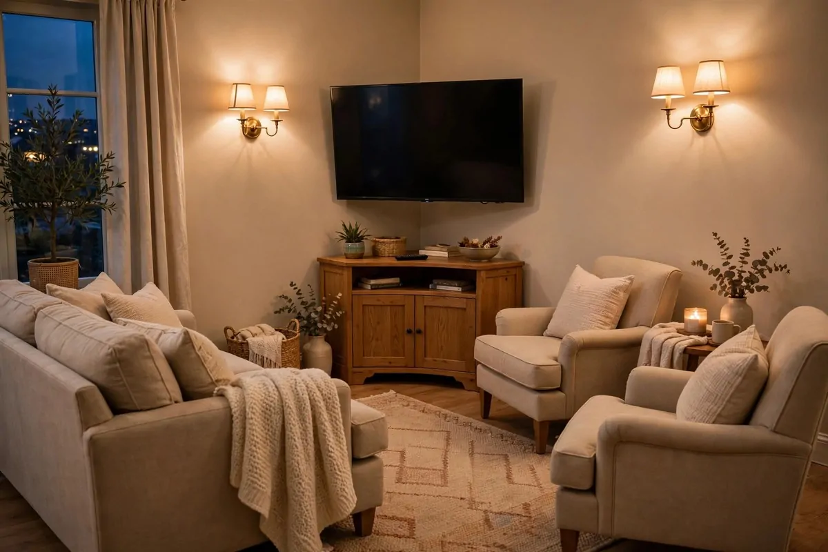
Sometimes the only place for the TV is a corner. That is fine. Corner TVs work great when you angle the seating to match.
Mount the TV diagonally across the corner or place it on a corner stand. The screen should face the main seating directly. No neck turning.
Angle the sofa and chairs toward the corner. A slight angle is enough. You do not need a full circle. Just turn everything a few degrees toward the screen.
A corner media cabinet fills the dead space behind the TV. It also gives you storage. Baskets inside hide remotes and chargers.
This setup frees up the main walls. The long wall can hold a bookshelf or art. The window wall stays open. The room feels less dominated by the screen.
Seating distance matters. Sit about as far from the screen as the screen is wide, times two. Too close and it is overwhelming. Too far and you squint.
Add a floor lamp on one side of the seating arc. It balances the light from the screen. Your eyes will thank you during long shows.
One warning: glare. Corner setups near windows can catch reflections. Try the TV in the corner opposite the windows if you can. Curtains help too.
If your room layout fights a flat wall TV, the corner is your friend. Angle the seats, and it feels completely natural.
The Double Sofa Facing Layout
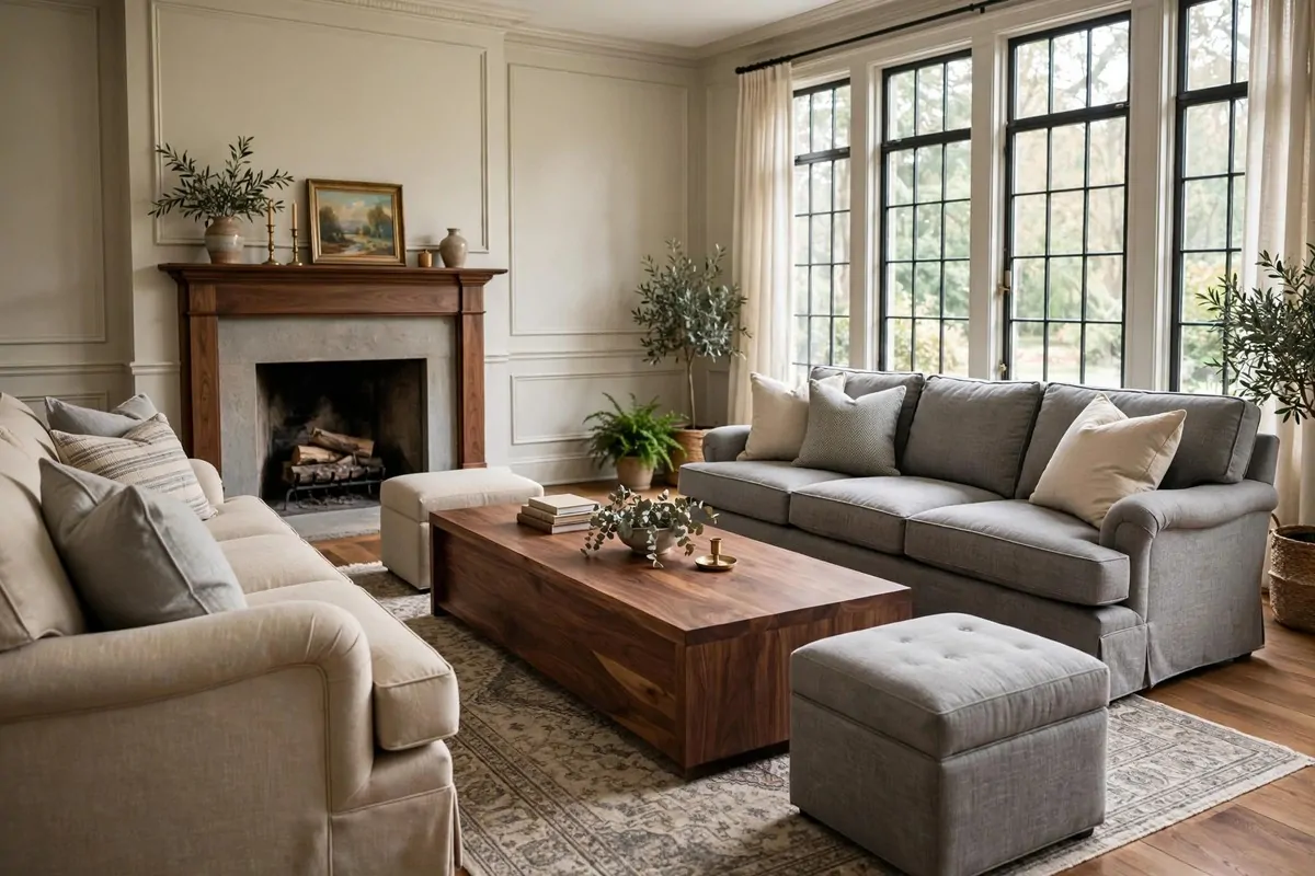
Two sofas facing each other. A long coffee table between them. It is simple, classic, and incredibly sociable.
This layout is built for talking. Everyone faces someone. It is the conversation circle's more formal cousin.
Place the sofas parallel with enough space between them for the coffee table and leg room. You should be able to walk around the table without squeezing.
The coffee table should be long and low. Rectangular works best here. It echoes the shape of the sofas and keeps the middle clean.
Add an armchair at one end if the room is wide enough. It closes the U shape and gives one more seat. If the room is narrow, skip it. The two sofas are enough.
This layout loves a fireplace at one end. The fire becomes the third point of the arrangement. Sofa, sofa, fireplace. A perfect triangle.
Keep the two sofas in the same color family. They do not need to match exactly. But if one is floral and the other is leather, the room will feel split.
Throw blankets draped over both sofa arms soften the formality. It says: yes this looks nice, but please actually sit down.
I like this layout for living rooms that double as guest rooms for conversation. It seats six comfortably. And it photographs beautifully, if that matters to you.
The Fireplace and TV Combo Wall
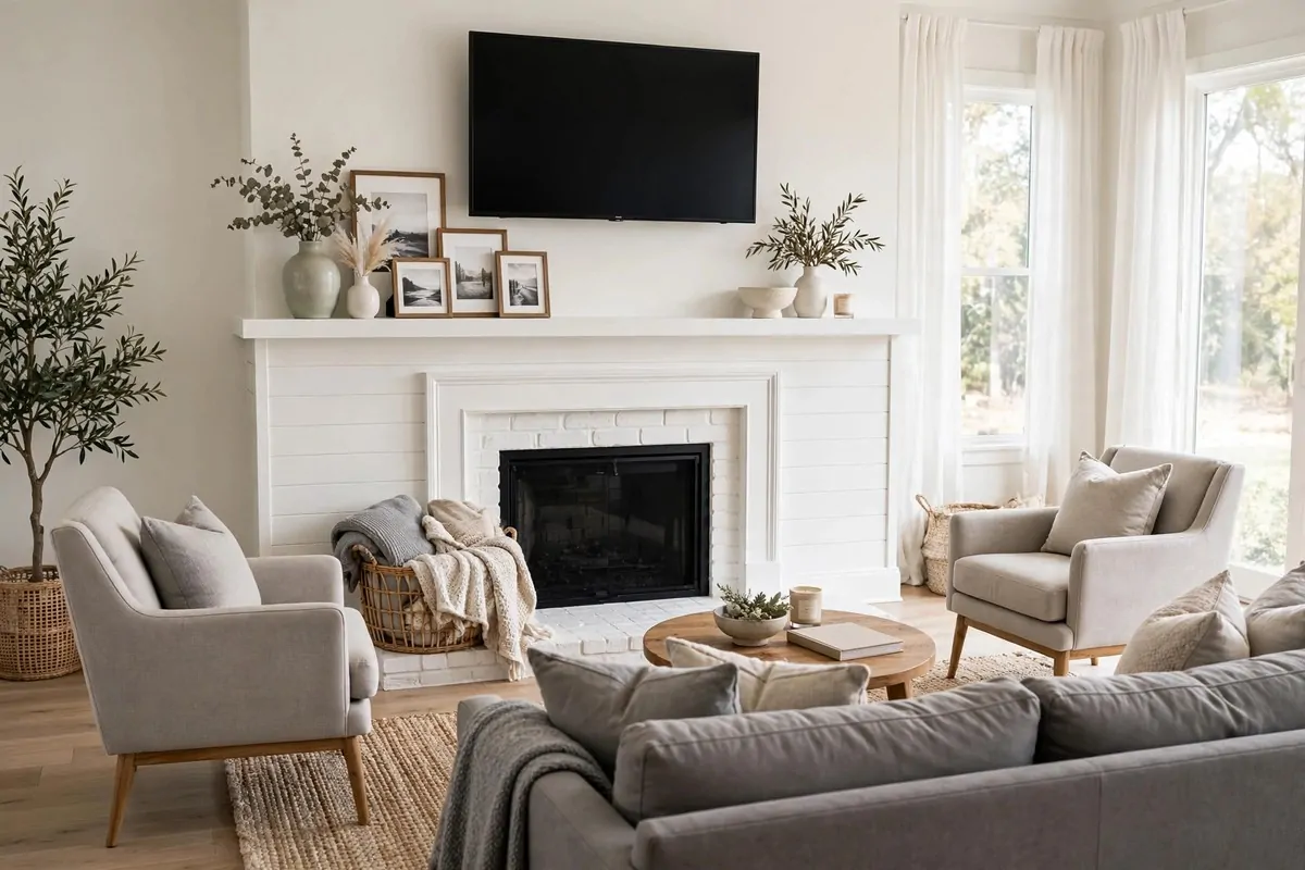
The fireplace wall and the TV wall are the two most wanted spots in a living room. This layout puts them together. One wall does both jobs.
Mount the TV above the mantel. Arrange all seating to face that wall. Every seat gets the fire and the screen. Nobody misses out.
The big question is height. TVs above fireplaces sit high. That can hurt necks. The fix: keep the mantel as low as possible and tilt the TV slightly downward.
A tilting mount is worth every penny here. It angles the screen toward the sofa. Without it, you are looking up all evening.
Style the mantel around the TV. A vase on one side, a stack of books on the other. The TV becomes part of the decor instead of a black box floating alone.
Seating can be simple. One sofa straight on, two chairs angled in. The wall is the star, so the furniture can be calm.
This combo works best with a wide mantel. A narrow mantel with a big TV looks top heavy. If your mantel is small, consider a smaller screen.
In summer, when the fire is off, the art and decor on the mantel carry the wall. The TV just blends in. It is a year round solution.
Not everyone loves TV over the fireplace. Designers argue about it endlessly. But in small rooms where wall space is precious, it is often the smartest answer.
The Window-Lover's Layout
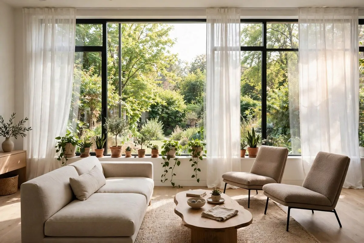
Some rooms have a view worth framing. Big windows, a garden, a skyline. This layout turns the windows into the main event.
Face the seating toward the windows. The sofa looks out. The chairs angle toward the glass. The view becomes your wall art, and it changes every hour.
Keep the window wall uncluttered. No tall bookshelves blocking the glass. No TV competing for attention. Let the light and the view do the work.
Use sheer curtains instead of heavy drapes. They soften the sunlight without hiding the view. You get glow without glare.
Low furniture works best here. A low sofa and low chairs keep sight lines open. Everyone can see out, even from the back seats.
This layout is perfect for morning people. Coffee with the sunrise. Plants love it too. The window ledge becomes a garden shelf.
At night the windows go dark, so plan for that. A floor lamp and a couple of table lamps keep the room warm after sunset. The layout should not depend only on daylight.
One practical note: sun fades fabric. If your windows face the harsh afternoon sun, pick fade resistant fabrics or use blinds during peak hours.
If your room has great windows, do not waste them on a TV wall. Face the view. You will never get tired of it.
The Movie Night Layout
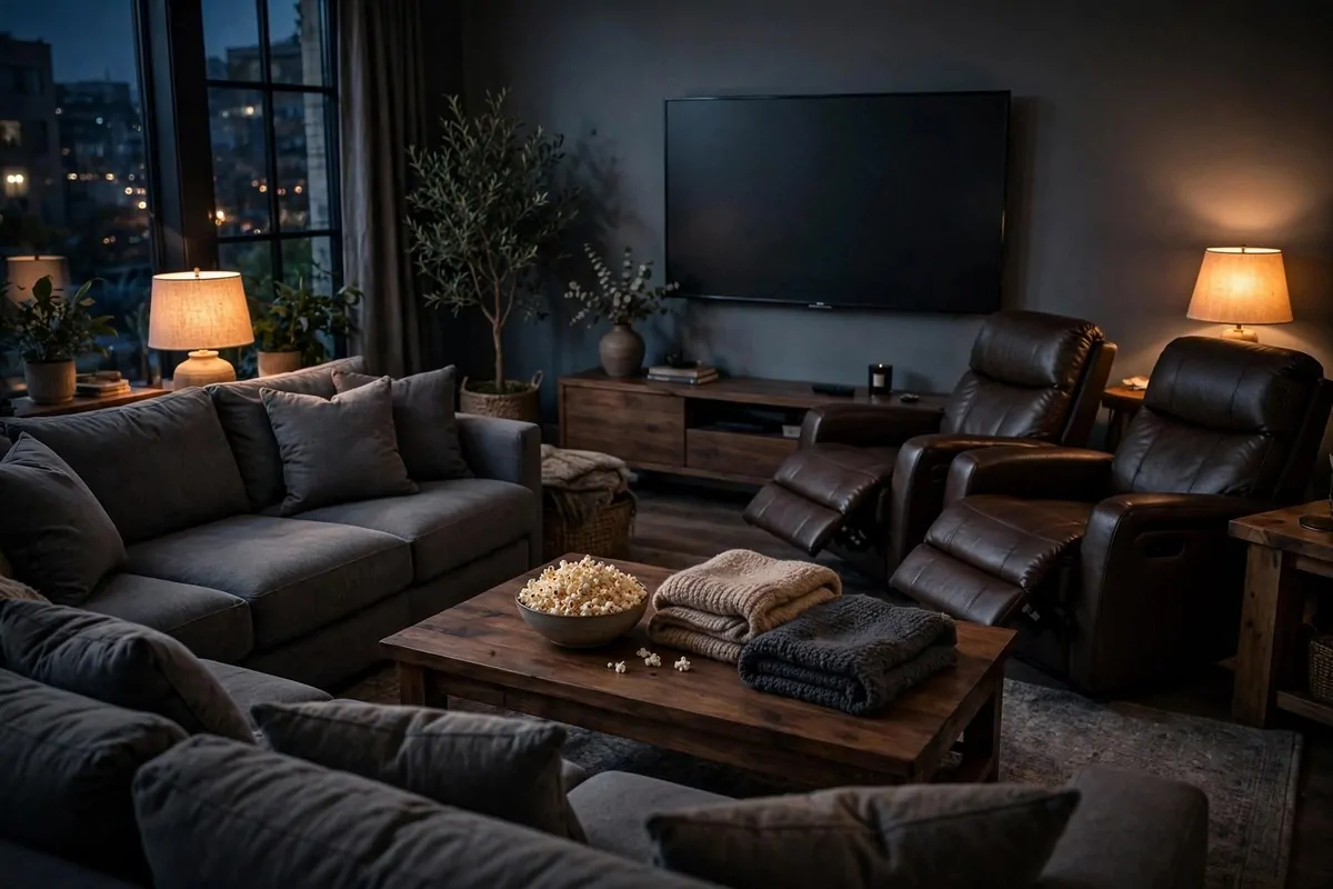
Movie night deserves its own layout. Not just a TV in the corner, but a real little home theater.
Start with the deepest, comfiest seating you can find. A deep sectional is ideal. Recliners are even better. This layout is about sinking in.
Face everything at the screen. No angled chairs, no side conversations. For two hours, the screen is the world.
Keep the lights low and warm. Table lamps with dim bulbs. Maybe a string of small lights. Bright overhead lights kill the cinema mood instantly.
The coffee table becomes the snack station. Popcorn bowls, drinks, blankets folded nearby. Everything within arm's reach. No pausing the movie for snacks.
Dark walls actually help here. Deep green, navy, or charcoal make the screen pop and the room feel like a theater. It is bold, but it works.
Sound matters more than people expect. A small soundbar under the TV makes a huge difference. You do not need a full system. Just better than the TV speakers.
Blankets are mandatory. Drape them over the sofa arms. Movie night without blankets is just watching TV. The blanket makes it an event.
This layout is not for every night. But for Fridays, it is perfect. Your living room becomes the best seat in town.
The Entertainer's Open Flow
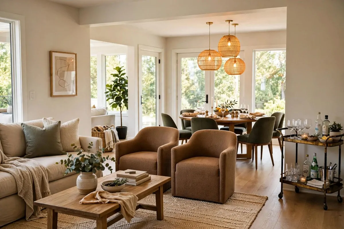
If you host dinner parties, holiday gatherings, or game nights, your living room needs to flow. People move. The layout should let them.
The key word is flow. Furniture arranged so guests can drift from the sofa to the dining table to the drinks without bumping into things.
Keep the path between the living area and the dining area wide and clear. This is the highway of your party. Nothing should block it.
Extra seating is the secret. Poufs, ottomans, and folding chairs tucked nearby. When ten people show up and you have seating for six, extras save the night.
A bar cart in the corner is both useful and pretty. Drinks, glasses, a small plant. It becomes a natural gathering spot. People love standing near the drinks.
The coffee table should be sturdy and big enough for shared snacks. A large tray on top corrals the bowls and makes cleanup fast.
Lighting sets the party mood. Dim the overheads. Turn on every lamp. Warm light makes everyone look good and feel relaxed.
This layout also works for everyday life. The open flow that serves a party also serves a busy family. Kids, dogs, guests. Everyone moves easy.
Think of your living room as a host, not just a room. The entertainer's layout makes people feel welcome the moment they walk in.
The Rug-Layered Cozy Layout
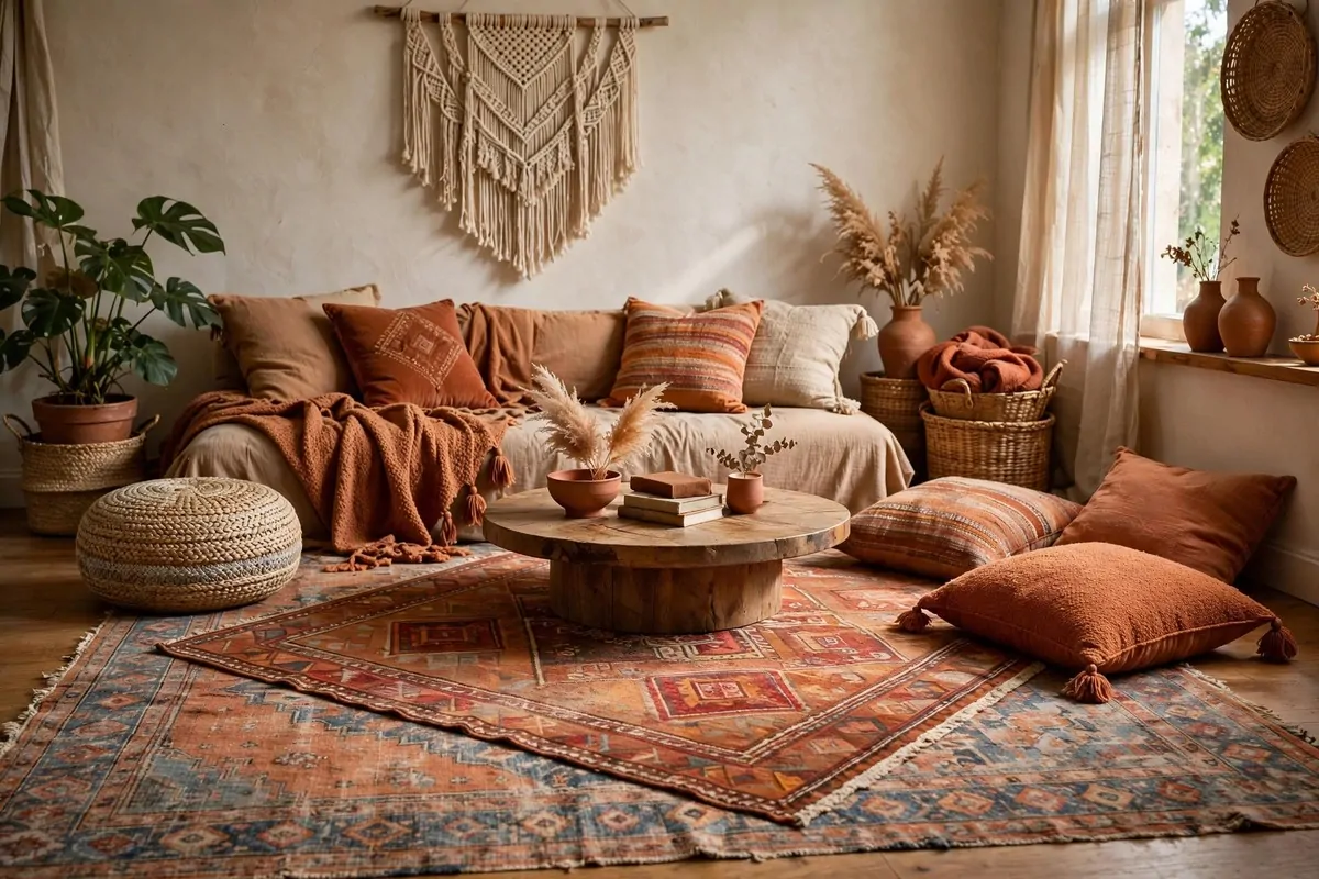
Layering rugs is like layering clothes. It adds warmth, texture, and a collected over time feeling.
Start with a large neutral rug as the base. Jute or sisal works great. It covers the floor and sets the stage.
Add a smaller patterned rug on top, slightly off center. A vintage or vintage style rug with rich colors. The overlap is the whole point. Do not line them up perfectly.
Keep the furniture low. A low sofa, a low coffee table, floor cushions. Low furniture with layered rugs feels grounded and relaxed.
Floor cushions and poufs are essential here. They give extra seats that match the casual vibe. Stack them in a corner when not needed.
This layout loves texture. Knit throws, woven baskets, a macrame hanging. Every surface invites touch. That is what cozy means.
The color palette can be warm and earthy. Terracotta, rust, cream, wood tones. These colors feel like a hug.
One caution: too many patterns can get busy. If the top rug is bold, keep the base rug plain. One star per room.
I love this layout for renters. Rugs are not permanent. You can layer them in any apartment and take them with you. Cozy that travels.
The Game Night Circle
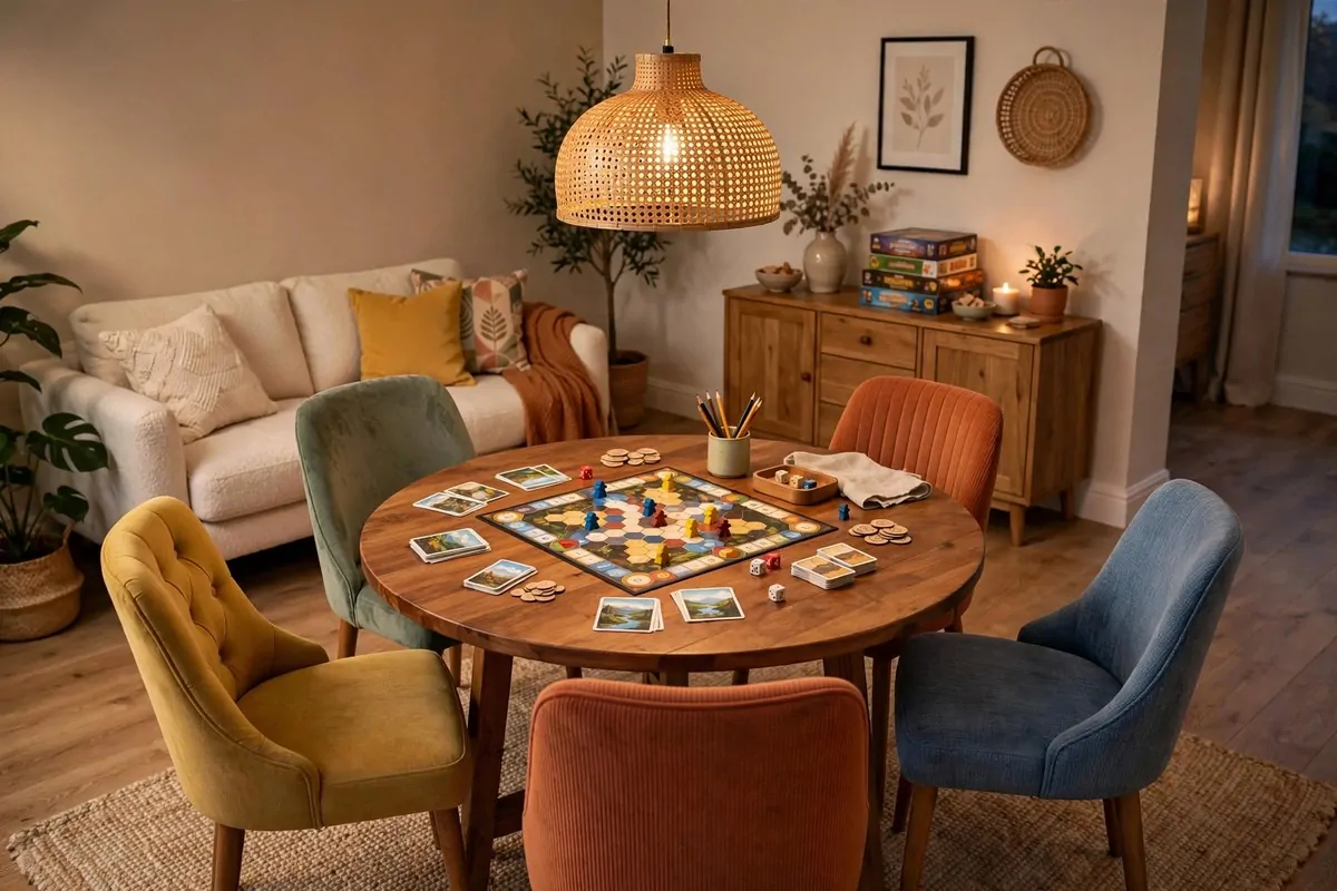
Board games need a table. Card games need chairs close together. This layout puts a game table at the heart of the living room.
A round table is best. Everyone can reach the middle. No corners, no head of the table. Round means equal.
Surround it with four comfortable chairs. Upholstered dining chairs work well. They are comfy for long games but easy to move.
Keep the game table in the center of the room or in a clear zone. Players need elbow room. Nothing kills game night like bumping elbows.
The sofa moves to the side in this layout. It becomes the waiting area. Losers of the first round can watch from the couch. There is always a next round.
Lighting over the table is crucial. A pendant light or a bright floor lamp above. Players need to see the cards. Dim mood lighting does not work here.
Storage nearby keeps the games organized. A sideboard or a shelf with the game boxes. When the games are visible, people actually play them.
This layout tells your family something. Fun matters here. The table in the middle says: sit down, stay a while, let us play.
Even if game night is only once a month, the table earns its place. The rest of the time it works as extra surface. Puzzles, crafts, homework. It is never wasted.
The Minimalist One-Sofa Layout
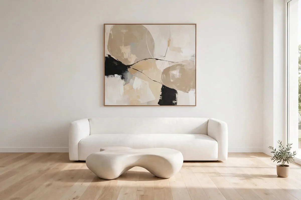
Less, but better. That is the whole idea.
One good sofa. One coffee table. One piece of art. That is the entire layout. And it can feel more luxurious than a room stuffed with furniture.
The sofa must be excellent. When it is the only seat, it carries the room. Pick the best quality you can afford. Simple shape, great fabric.
The coffee table should be sculptural. Interesting shape, beautiful material. With so few pieces, each one gets noticed. Make them worth noticing.
One large art piece on the main wall. It becomes the focal point. In a minimal room, the art does the talking.
Empty space is part of the design. Do not fill every corner. The breathing room is what makes minimalism feel calm instead of empty.
This layout is easy to clean. Fewer pieces, fewer dust traps. If you hate cleaning, minimalism is a gift to yourself.
The risk is feeling cold. Warm it up with texture. A wool rug, a linen throw, a wooden table. Texture adds warmth without adding stuff.
Lighting stays simple too. One floor lamp or one pendant. Soft and warm. Harsh light in a minimal room feels like an office.
Try this layout if clutter stresses you out. It is proof that one sofa, chosen well, is enough.
The Bay Window Nook Layout
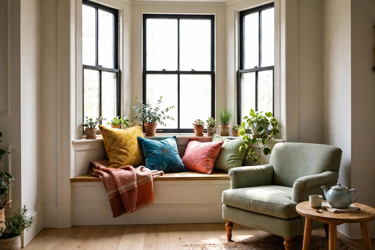
A bay window is a room begging for a nook. This layout answers the call.
Build or buy a window seat for the bay. A deep cushion, some throw pillows, a folded blanket. It becomes the best seat in the house instantly.
Place a comfortable armchair opposite the window seat. Now two people can sit facing each other with the view beside them. A small table between them holds tea.
This nook works for reading, chatting, or just staring out the window. Some days staring out the window is the whole plan.
Keep the window area clear of heavy curtains. Light sheers or simple blinds. The nook is about the light. Do not block it.
Plants love bay windows. Line the sill with small pots. The nook becomes a little indoor garden. Green and light together are unbeatable.
The rest of the living room can be arranged normally. The nook is a bonus zone. It does not need to match the main seating area.
If you do not have a bay window, a regular large window works too. A bench or a deep chair under the window creates the same feeling.
Every home should have one spot made for doing nothing. The bay window nook is that spot. Claim yours.
The Work-From-Home Corner Layout
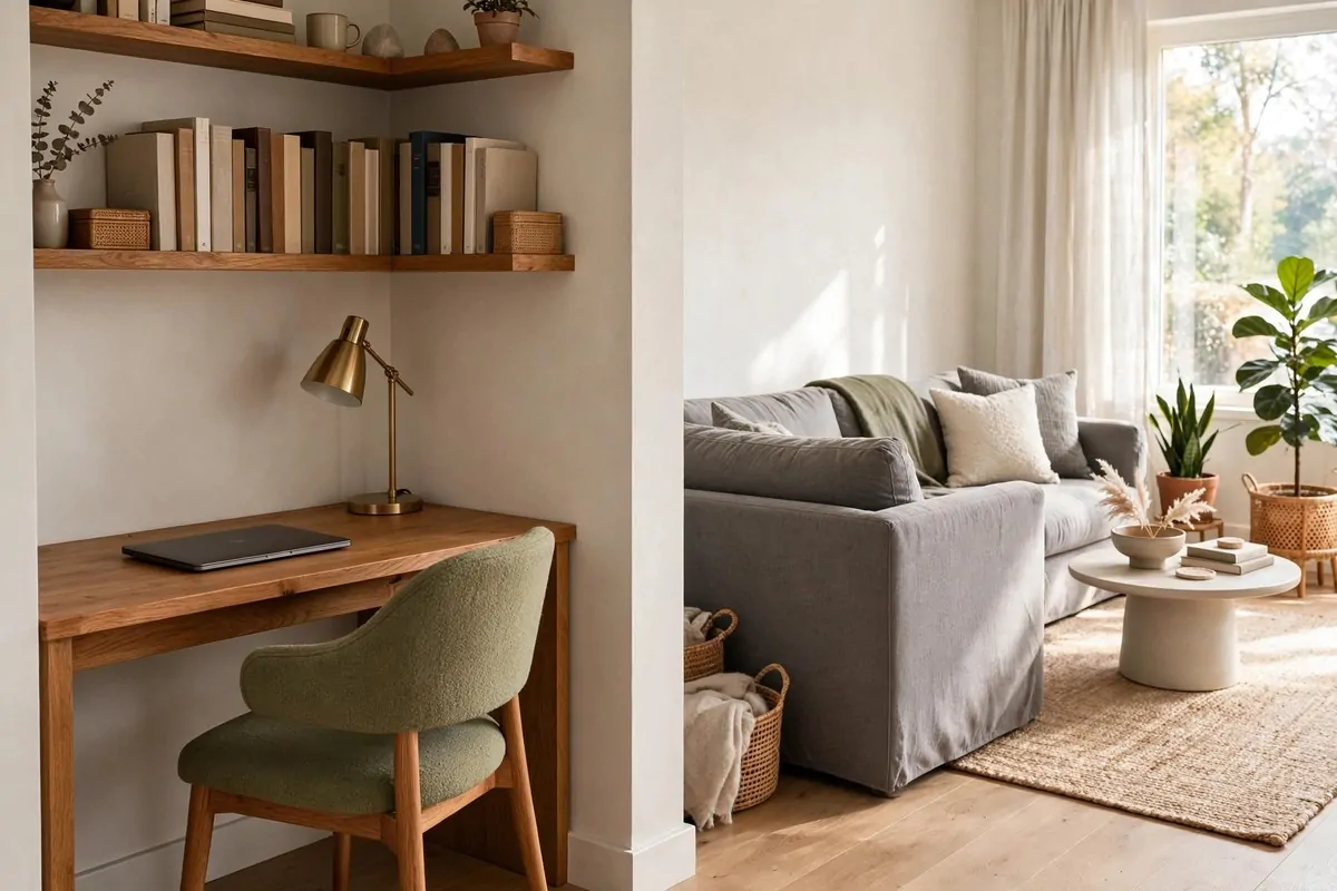
Working from the couch sounds fun until your back gives out. A real desk corner in the living room is the answer.
Pick a quiet corner, away from the TV. Near a window is ideal. Natural light keeps you awake better than any coffee.
The desk can be small. Just big enough for a laptop and a notebook. A wall mounted fold down desk works in the tiniest rooms.
Your chair matters most. Get one with back support. You will sit here for hours. A pretty chair that hurts is not worth it.
Keep work stuff contained. A drawer, a basket, a shelf. When the workday ends, the mess should disappear. The living room must feel like home again.
A small lamp on the desk helps for dark mornings. It also signals work mode. Lamp on means working. Lamp off means done.
Face the desk away from the sofa if you can. Seeing the couch while you work is torture. Seeing the wall or window is better.
This layout respects both lives. The worker and the relaxer share one room. The corner desk keeps the peace between them.
The Gallery Wall Layout
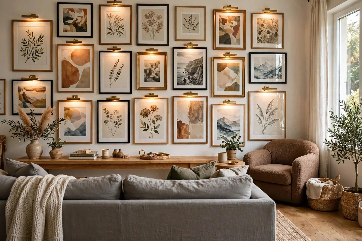
Some people collect art. This layout gives the collection the stage it deserves.
One wall becomes the gallery. Floor to almost ceiling, filled with framed prints, photos, and paintings. It is personal, bold, and completely yours.
Arrange the seating to face the gallery wall. The sofa looks at the art. The art becomes the focal point, like a fireplace or a TV.
Mix frame styles or keep them all the same. Mixed frames feel eclectic and fun. Matching frames feel calm and museum like. Both work.
Plan the arrangement on the floor first. Lay the frames out and move them around. It is much easier than hammering holes and regretting it.
Start hanging from the center outward. The middle piece sets the height. Eye level from the sofa is the sweet spot.
Lighting makes or breaks a gallery wall. Picture lights or small spotlights make the art glow at night. Without light, a gallery wall disappears after dark.
The rest of the room should stay simple. The wall is busy enough. Calm furniture lets the art shine.
This layout is for the collectors, the travelers, the memory keepers. Your walls tell your story. Let them talk.
The Studio Apartment All-in-One
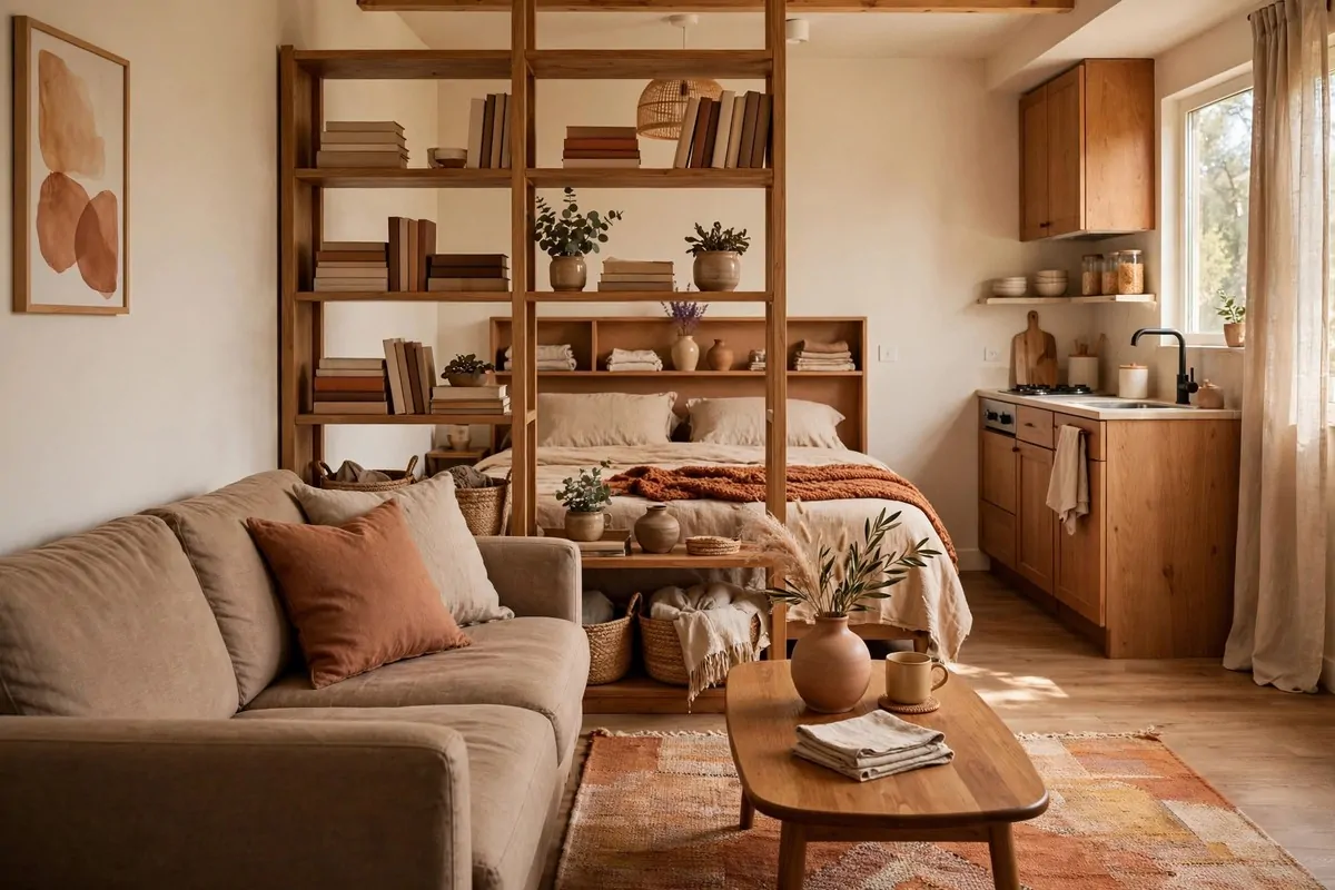
A studio is one room that must do everything. Sleep, work, eat, relax. This layout gives each job its own corner.
The sleeper sofa is the hero. By day it is your living room couch. By night it is your bed. Pick one with a good mattress. You sleep on it every night.
Use a rug to mark the living zone. The rug says: this part is for relaxing. The bed area stays off the rug. Your brain learns the difference.
An open bookshelf makes a great divider. It separates the sleeping area from the living area without blocking light. Both sides get storage too.
Keep the color palette consistent across the whole studio. One set of colors makes one room feel intentional. Mixed colors in a studio feel chaotic.
The kitchenette corner needs a clear edge too. A small rug or a change in lighting marks it. Even a pendant light over the counter helps.
Storage is survival in a studio. Under bed boxes. A coffee table with shelves. Hooks on every wall. Everything needs a home.
This layout proves small can be complete. One room, four jobs, zero excuses. Studio living done right feels clever, not cramped.
The Conversation Pit Revival
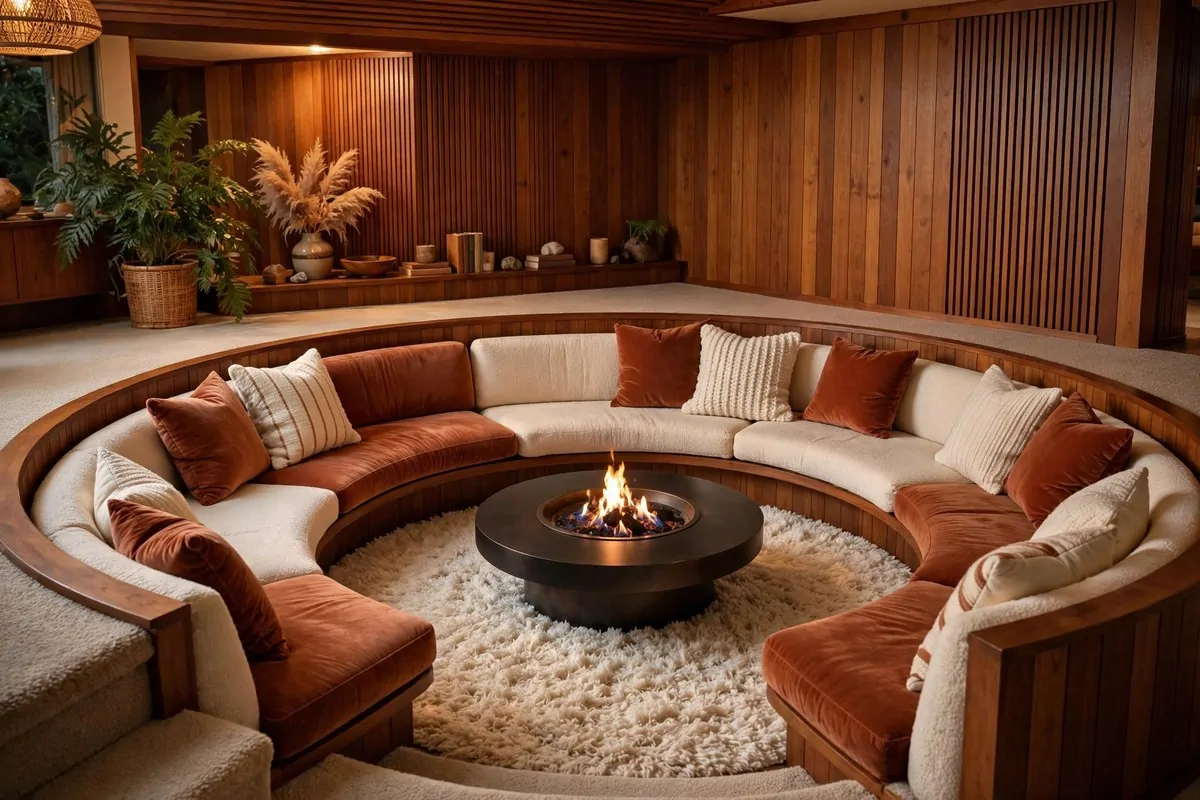
The conversation pit is back. This retro idea from decades ago is having a moment, and honestly it deserves it.
The concept: a sunken seating area, a step or two down from the main floor. Built in benches curve around a central table or fire feature. Everyone sits close, facing in.
Being slightly sunken feels cozy in a way flat floors cannot match. The walls of the pit wrap around you. It is like sitting in a warm hug.
The centerpiece can be a low table or a small fire table. Fire adds drama. A table is more practical. Pick based on how you will actually use it.
Cushions are everything. Deep, plush, in warm colors. Rust, cream, mustard. The pit should look inviting from across the room.
This is a bigger project than moving a sofa. It needs construction. But the result is a true showpiece. Guests will talk about it for years.
If a full sunken pit is too much, fake it. Arrange a curved sectional low to the ground around a round coffee table. Same feeling, no jackhammer.
The pit layout is pure social design. No TV, no distractions. Just people, close together, talking. Sometimes the old ideas are the best ones.
The Patio-Flow Layout
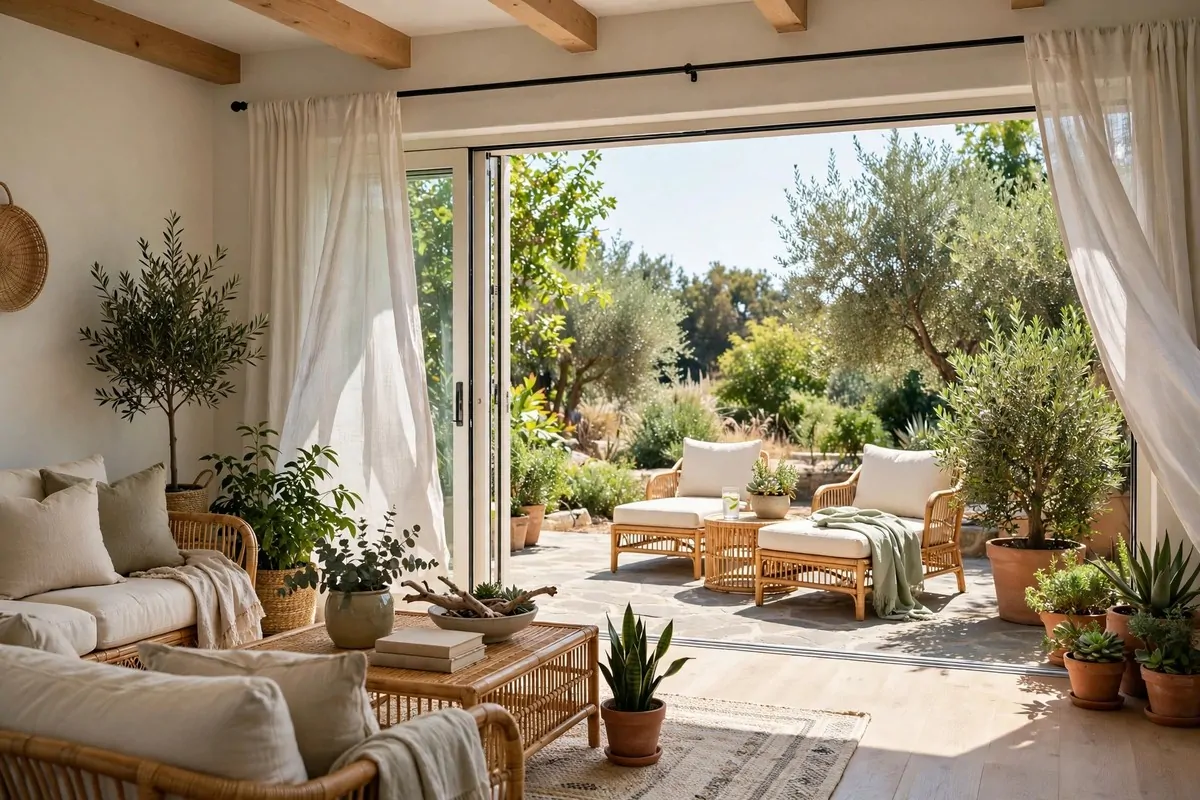
When the weather is good, the living room should not end at the wall. This layout flows straight out to the patio.
Wide sliding or folding doors are the key. Open them fully and the two spaces become one. Indoor rug meets outdoor stone. It feels like double the room.
Match the indoor and outdoor furniture styles. Rattan inside and rattan outside. Similar colors. The eye reads it as one continuous space.
Keep the path to the doors clear. No furniture blocking the way. People should drift outside without thinking about it.
Plants on both sides of the doorway blur the line. A big potted plant inside, matching pots outside. Nature does not care about walls.
This layout shines in spring and summer. Morning coffee outside, evening drinks inside. The living room breathes.
Outdoor lighting extends the flow after dark. String lights or lanterns on the patio. From inside, the glowing patio looks like part of the room.
One practical tip: an outdoor rug near the doors catches dirt. It keeps the indoor floors clean. Small detail, big difference.
If you have a patio and you are not using this layout, you are wasting half your living space for half the year. Open the doors.
The Mirror-Trick Bright Layout
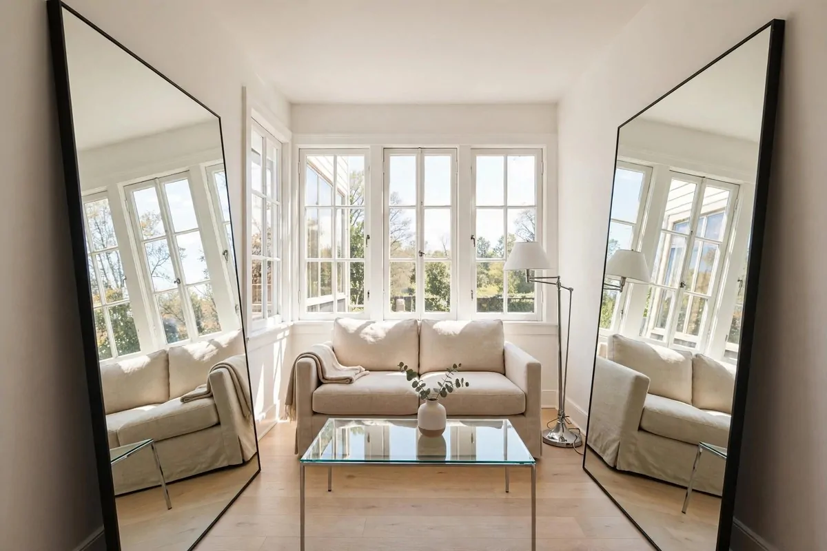
This last layout is less about furniture and more about light. It is for dark or small rooms that need to feel bigger and brighter.
The star is the mirror. Not a small one. A big one. Leaning against the wall or hung large. It doubles the light and the view.
Place the biggest mirror opposite or beside a window. It catches the daylight and throws it across the room. Dark corners disappear.
Two mirrors on opposite walls multiply the effect. The room reflects itself and feels twice the size. It is a simple trick with a dramatic result.
Keep furniture light in color and scale. A pale loveseat, a glass coffee table, a slim lamp. Heavy dark pieces fight the airy feeling.
Glass and chrome are your friends here. A glass table almost disappears. A chrome lamp reflects light. Every reflective surface helps.
Keep decor minimal. The mirrors are the decoration. A crowded room with big mirrors just looks like a crowded room twice.
This layout is perfect for north facing rooms and basement living rooms. Anywhere the sun does not reach easily.
Light changes how a room feels more than any furniture can. The mirror trick layout proves it. Bright is a feeling, and you can build it.
—
Twenty nine layouts. One for every room shape and every way of living. The best Living Room Inspiration is not about copying a photo. It is about finding the layout that fits your room, your people, and your daily life.
Pick the one that made you nod while reading. Move one piece of furniture this weekend and see how it feels. Small changes in layout make the biggest difference of all. Your living room is waiting to become the room you always saved photos of.