24 Home Office Interior Design Tricks Designers Swear By

The best-designed home office I ever sat in had one thing in common with all the others. Nothing in it was shouting.
No wall screamed for attention. No lamp tried to be the star of the room. The desk was tidy, the light was soft, and the whole place felt calm the second I walked in. I wanted to sit down and stay a while, and that is rare for a work room.
Designers do not get that feeling by accident. They use the same small tricks again and again, in room after room. Most of the tricks cost very little. Some cost nothing at all. They are about where things sit, how light falls, and what your eye sees first.
I have watched designers work, and I have tried their tricks in my own office. Some of them changed the room in one afternoon. A rug here. A curtain hung higher there. A lamp moved six inches to the left. Small moves, big feeling.
You do not need a big room or a big budget to use them. You need a desk, a chair, and a little patience. Pick the tricks that fit your space, and leave the rest for later. Your office will thank you for it.
Here are 24 home office interior design tricks designers swear by. Each one is simple, each one is real, and each one makes a work room feel more like a room you love.
1. The Rug That Grounds the Whole Room
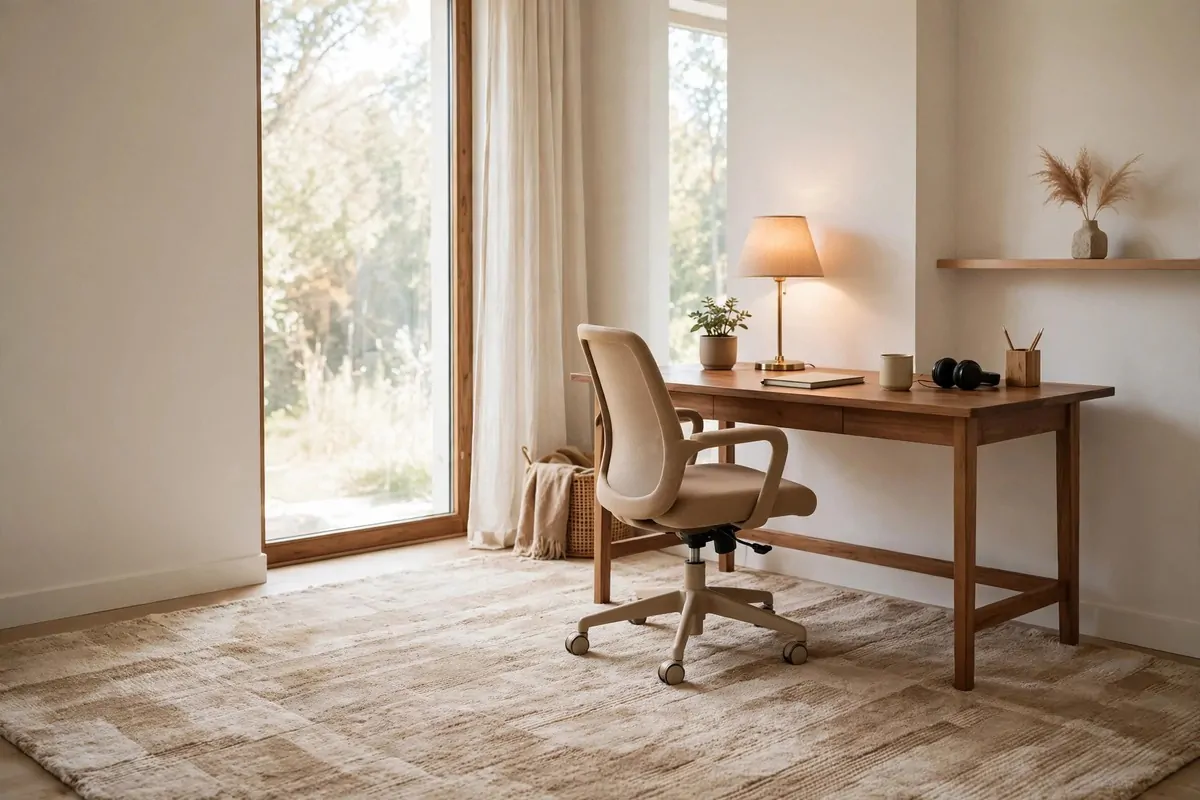
A rug does more work in a home office than almost anything else in the room. It tells your eye where the office starts and where it ends. Without one, the desk just floats in the middle of the floor.
Designers pick a rug that is big enough for the desk and the chair. The chair legs should stay on the rug when you roll back. If the back legs fall off the edge, the rug looks too small, and the whole setup feels wobbly.
Go for a low, flat weave if you use a rolling chair. Thick rugs fight the wheels, and you will spend your day pushing a little harder than you need to. A flat rug lets the chair glide, and it still softens the room.
Color matters more than pattern here. A soft neutral rug calms the whole space. Warm beige, soft gray, or a faded wash of color all work well. Save the loud pattern for a cushion or a piece of art.
I like a rug with a little texture you can feel under your feet. It makes the office feel less like a work station and more like a real room. Your feet notice it first thing in the morning, even if your brain does not.
Put the rug down before you judge anything else in the room. The desk, the chair, and the shelves all look different once the floor has a frame. It is like putting a picture in a frame. The picture was fine before, but now it looks finished.
If your office shares a room with something else, the rug is your border. It marks the work zone without a wall. Step onto the rug, and your brain knows it is work time. Step off it, and the workday feels done.
Do not buy the smallest rug that fits. Buy one size up from what you think you need. A rug that is too big looks generous. A rug that is too small looks like a mistake, and your eye will keep going back to it.
A good rug also hushes the room. Hard floors bounce sound around, and typing and chair wheels get loud fast. One rug under the desk makes calls sound softer, and the room feels quieter all day.
2. The 60-30-10 Color Rule
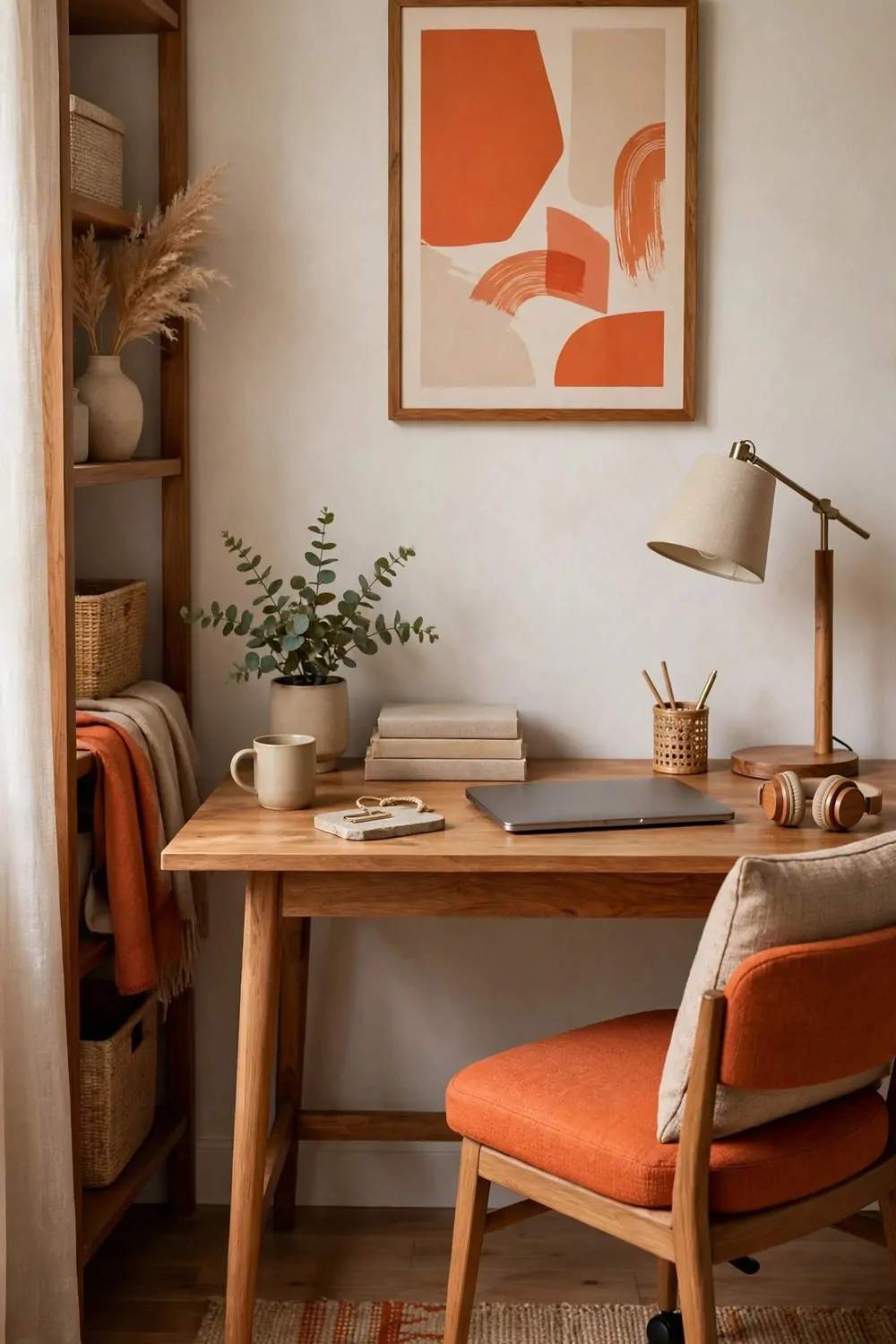
Designers use a simple color rule in almost every room they touch. Sixty percent of the room is one main color. Thirty percent is a second color. Ten percent is an accent that pops.
The main color is usually the walls and the big furniture. It should be calm and easy to live with. Soft white, warm beige, or pale gray are safe picks. You will stare at this color all day, so it needs to be kind to your eyes.
The second color shows up in wood tones, shelves, and bigger textiles. It adds warmth and depth. This is where your desk wood, your curtains, and your rug can do the talking. It should feel different from the main color, but not fight it.
The accent is the fun part. Ten percent is small, so it can be bold. A deep green cushion. A rust colored vase. One strong piece of art. The accent is the color people remember, even though it takes up the least space.
Here is how the rule looks in a real office:
| Share of the room | What it covers | Example in your office |
|---|---|---|
| 60 percent, main color | Walls and large furniture | Warm white walls and a pale desk |
| 30 percent, second color | Wood, shelves and textiles | Walnut shelves, linen curtains and a beige rug |
| 10 percent, accent color | Small pops that catch the eye | Deep green cushions, one vase and a bold print |
When a room feels messy, the color rule is often the problem. Too many colors fight for attention, and none of them win. Pick three colors, and let the rest of the room repeat them. Your eye will relax at once.
You can test the rule with what you already own. Gather the cushions, books, and boxes on your desk. If you count more than three strong colors, put the extras away. The room will look calmer in five minutes.
I keep my accent color in things I can swap fast. A cushion cover, a notebook, a small plant pot. When I get bored, I change the accent, not the whole room. It costs almost nothing, and the office feels new again.
The rule works even if you love color. A bold room still needs a calm base. Paint the walls soft, let the furniture carry the middle tone, and then go wild with the last ten percent. Bold works best when it has quiet around it.
3. The Statement Wall Behind Your Desk
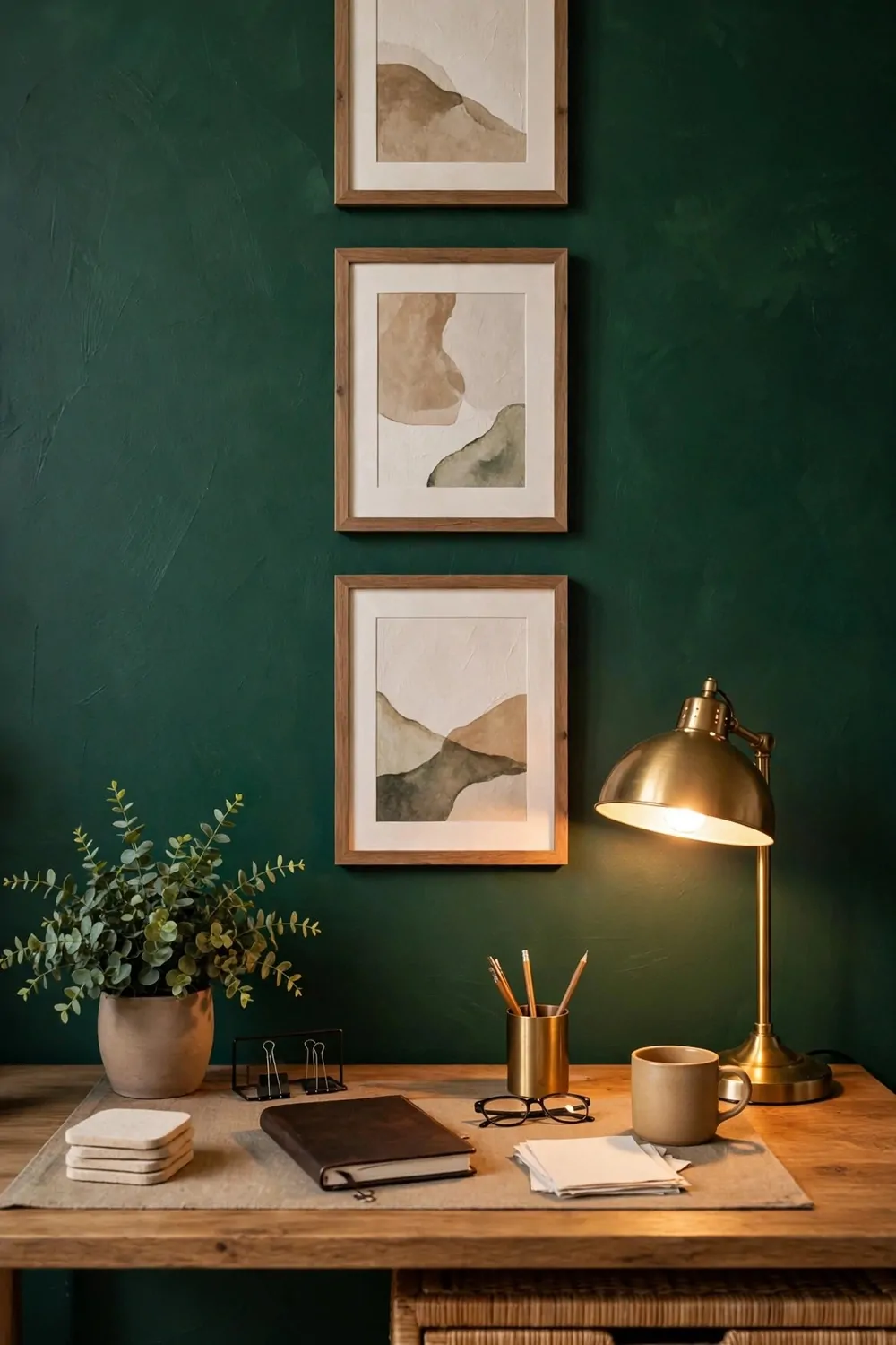
Every home office needs one wall that does the talking. Designers pick the wall behind the desk. It is the wall everyone sees on video calls, and it is the wall you face when you turn around.
A statement wall can be paint, wallpaper, wood panels, or just a deep color. Deep green, navy, and warm charcoal all work well behind a desk. They make the desk look sharp, and they hide cables and shadows better than white does.
Paint only that one wall. The other walls stay light, so the room still feels bright. One dark wall adds depth. Four dark walls can make a small office feel like a cave, and nobody works well in a cave.
If paint feels too bold, try a large piece of art or a wall of shelves instead. The point is the same. One wall holds the interest, and the rest of the room stays quiet. Your eye knows where to look, and the room feels planned.
Keep the desk in front of the statement wall simple. A tidy desk against a bold wall looks like a photo. A messy desk against a bold wall just looks messy, only louder. Clear the surface first, then let the wall shine.
Light matters on a dark wall. A warm lamp or a small picture light keeps the color rich instead of flat. Without light, deep paint can look dull by late afternoon. One warm glow fixes it fast.
I love how a statement wall hides the workday mess in the background of a call. The wall looks smart, the desk looks tidy, and nobody sees the pile of papers just out of frame. It is a small trick, but it works every single day.
Do not rush the color choice. Paint a large test patch and live with it for a few days. Morning light and evening light change the color a lot. A green that looks calm at noon can look almost black at night.
A statement wall also gives you a backdrop for photos and art. Frames pop against deep paint in a way they never do on white. Hang one or two pieces, and leave plenty of empty space around them. The wall needs room to breathe.
4. The Layered Lighting Plan
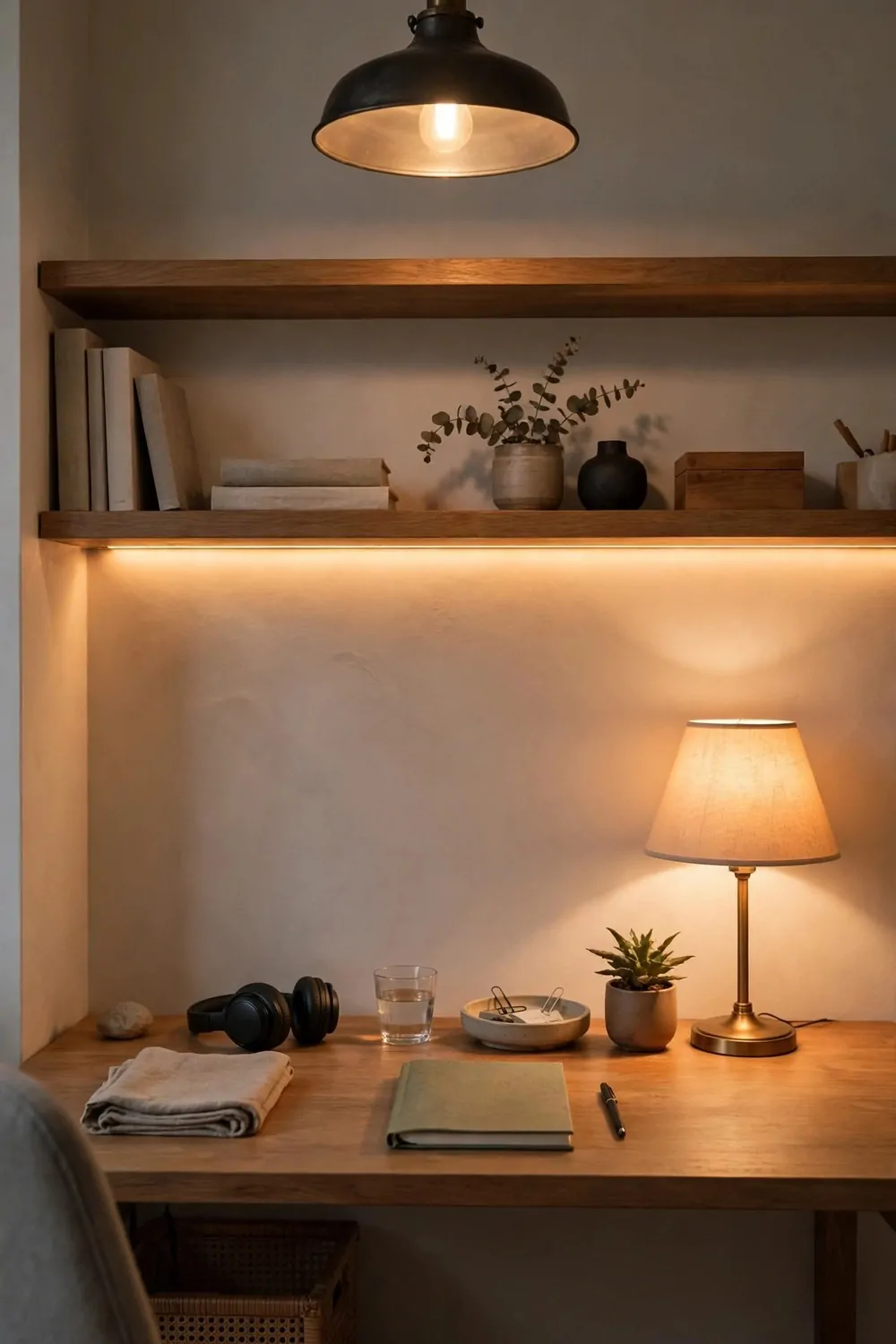
Designers never rely on one light in a room. One ceiling light makes a face look tired and a room look flat. Three layers of light make the same room look warm, deep, and alive.
The first layer is overhead light. It lights the whole room so you can see and move around. Keep it soft and warm, not harsh and white. A dimmer helps a lot here, because you can turn it down once the sun does its job.
The second layer is task light. This is the lamp on your desk that lights your work. It should be bright enough to read by, but it should not shine in your eyes or glare on your screen. Angle it from the side, not straight at you.
The third layer is accent light. This is the soft glow that makes the room feel good. A small lamp on a shelf, a warm strip behind a bookcase, or a candle style light in the corner. It adds depth, and it makes the room feel finished after dark.
Here is a simple way to build the three layers in your office:
- Overhead: one warm ceiling light or pendant, on a dimmer if you can add one.
- Task: one good desk lamp, placed on the opposite side from your writing hand.
- Accent: one small warm lamp on a shelf or in a corner, switched on in the late afternoon.
I switch my layers through the day, and it changes how I feel. Bright task light in the morning helps me focus. Soft accent light in the late afternoon tells my brain the hard part of the day is done. The room follows the same rhythm I do.
Watch out for glare on your screen. If your overhead light reflects in the monitor, move the lamp or tilt the screen a little. A small move fixes a big headache, and your eyes will feel better by lunch.
Warm light is the designer pick for most home offices. Cool white light can feel like a hospital, and it makes wood and skin tones look flat. Warm light makes the same room feel like home, which is the whole point.
Do not forget natural light in the plan. A desk near a window needs less overhead light during the day. Let the sun do the work, and save your lamps for cloudy days and evenings. Your eyes like real daylight best.
A layered plan also helps on video calls. One light from the front, one soft light behind you, and no bright window right behind your head. You will look clear and calm, and the room behind you will look warm instead of dark.
5. The Floating Shelves That Frame the Desk
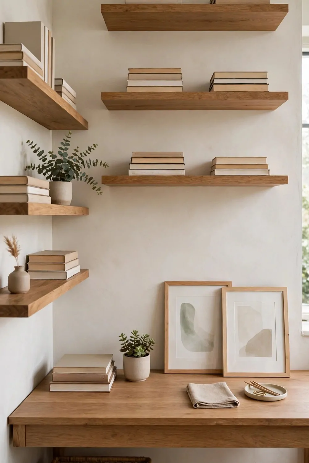
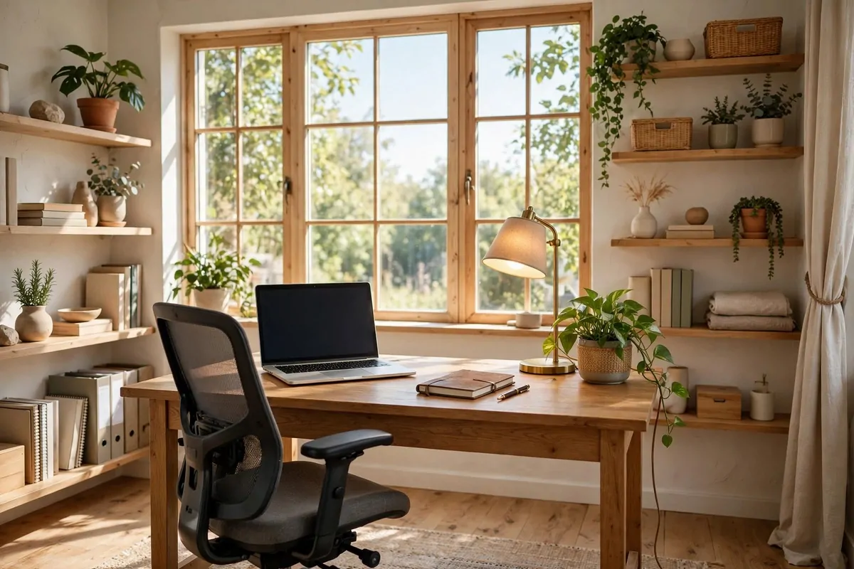
Floating shelves are a designer favorite because they add storage without adding bulk. No legs, no heavy frame, just clean boards on the wall. The desk area stays open, and the wall starts working for you.
Hang them above and beside the desk, not just in one straight line. Two shelves above the desk and one to the side frame the work zone like a picture frame. The desk sits in the middle, and the shelves hold everything around it.
Keep the shelves light. Books, one plant, a few framed prints, and a small box or two are plenty. A shelf packed edge to edge looks like storage, not design. Leave empty space on each shelf so the things you keep can breathe.
Mix what you put on the shelves. Tall books next to a low plant. A framed print leaning against the wall next to a stack of notebooks. The mix keeps the eye moving, and the shelves feel styled instead of stuffed.
Hang the lowest shelf high enough that you do not bump your head or knock things off when you stand up. You need clear space above the desk for your monitor and your arms. Measure twice, and sit at the desk before you drill anything.
I use my shelves for the things I reach for most. Notebooks on the lowest shelf, reference books higher up, and pretty things on the top shelf where I see them but do not need to touch them. It keeps the desk clear, and everything still has a home.
Wood shelves warm up a plain wall fast. Light oak feels fresh and calm. Dark walnut feels rich and grown up. Pick the wood that matches your desk, or go one shade darker for a little contrast. Either way, keep the finish simple.
Do not hang shelves on a wall that gets direct sun all day if you keep books there. Sun fades book spines and art prints faster than you think. A shaded wall, or shelves set back from the window, keeps your things looking good for years.
Floating shelves also give you a place for a small accent light. A tiny warm light under the lowest shelf glows down onto the desk in the evening. It is a small detail, and it makes the whole wall feel like it was built just for you.
6. The Curtains That Make the Ceiling Look Taller
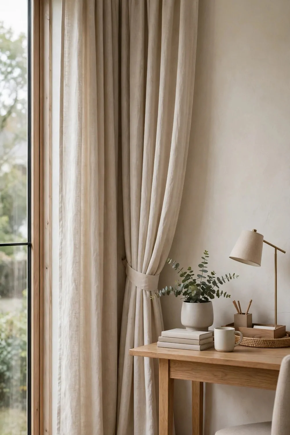
Curtains hung the wrong way can make a room feel short and squat. Curtains hung the designer way can make the same room feel tall and grand. The trick is where you put the rod, not how fancy the fabric is.
Hang the rod close to the ceiling, not right above the window frame. Leave just a small gap at the top. Your eye follows the fabric all the way up, and your brain reads the room as taller than it really is. It is a simple optical trick, and it works every time.
Let the curtains fall all the way to the floor. Curtains that stop halfway down the wall chop the room in half. Floor length fabric makes one long, clean line from ceiling to floor. The room feels finished, and the window looks bigger too.
Pick a light, soft fabric for a home office. Linen and cotton blends let daylight through in a gentle way. Heavy dark curtains can make a work room feel gloomy by mid afternoon. Light fabric keeps the room bright while it softens the glare.
Hang the curtains wide, past the edges of the window. When they are open, the fabric sits on the wall, not over the glass. You get more daylight, and the window looks wider than it is. It is a small move that changes the whole wall.
I keep my curtain color close to my wall color. The match makes the wall and the window read as one calm surface. A strong contrast can work too, but it chops the wall into pieces, and that fights the tall feeling you want.
Iron or steam the curtains before you hang them. Wrinkled fabric pulls the eye down, and it makes even a good room look unfinished. Ten minutes with a steamer gives you clean folds that fall straight, and they stay looking good for weeks.
If you rent and cannot drill, use a tension rod or adhesive hooks rated for the weight. The height trick still works, as long as the rod sits high and the fabric reaches the floor. Renters can have tall looking rooms too, with no holes in the wall.
Curtains also soften sound in a hard room. Bare windows bounce noise around, and calls can sound echoey. Soft fabric on the wall hushes the room a little, and your voice sounds warmer on a call. It is a pretty fix and a practical one.
7. The Oversized Art That Anchors the Wall
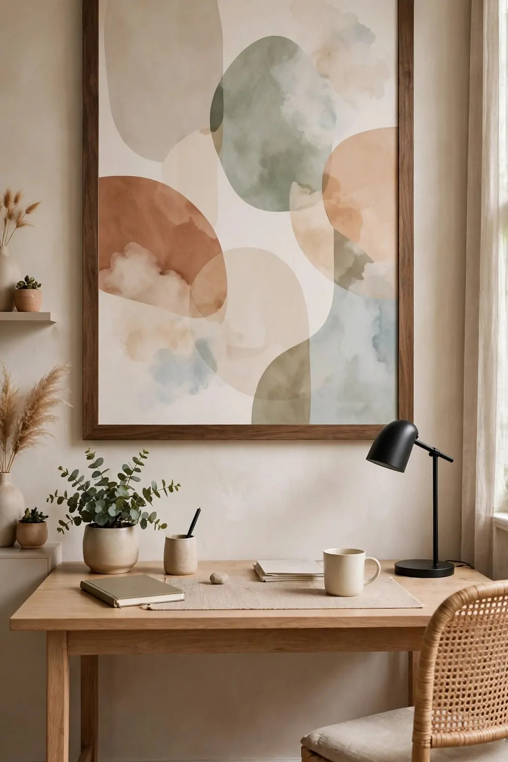
Small art gets lost on a big wall. Designers know this, so they go big. One oversized print above a desk anchors the whole wall better than a cluster of tiny frames ever could.
Pick art that is at least two thirds as wide as your desk. That sounds huge, and it is meant to. A big print fills the space above the desk, and it stops the wall from feeling empty. The desk and the art read as one unit.
Keep the rest of the wall quiet when you go big. One large print needs empty space around it to breathe. If you crowd it with shelves and small frames, the big piece loses its power. Let it have the wall to itself, or give it just one small neighbor.
Hang it low enough to connect with the desk. The bottom of the frame should sit just above your monitor or your shelf line. Art hung too high floats away from the desk, and the wall feels split in two. A small gap ties them together.
Abstract art works well in a home office because it does not demand attention. Soft shapes and calm colors add feeling without telling a story. You can glance at it all day without getting pulled out of your work, and it still makes the room feel styled.
I frame my big prints simply. A thin black frame or a light wood frame lets the art do the work. A fancy heavy frame fights the print for attention, and the wall starts to feel busy. Simple frame, big art, calm room.
Do not be afraid of a large empty space inside the art itself. A print with lots of blank space feels calm and modern. It gives your eyes a place to rest, which is exactly what you want in a room where you stare at a screen all day.
If a real large print feels too costly, print a favorite photo big and frame it well. A good frame makes even a simple print look like art. Size and framing do more work than the price of the picture inside.
Oversized art also hides a plain wall fast. One big piece can rescue a room with no other decor at all. Desk, chair, lamp, and one huge print. That is a whole office look, and it takes one afternoon to do.
8. The Mix of Wood Tones
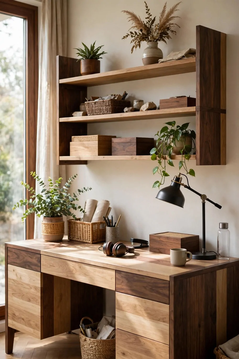
Matching wood used to be the rule. Everything had to be the same oak or the same walnut, or the room looked wrong. Designers broke that rule years ago, and rooms got better for it.
Mixing wood tones adds depth and warmth. Light oak next to dark walnut next to a warm pine shelf feels collected, not bought in one trip. The room looks like it grew over time, and that feels more like home.
The trick is to repeat each tone more than once. One dark piece alone looks like a mistake. Two or three dark pieces spread around the room look like a choice. The same goes for light wood. Repeat it, and the mix reads as planned.
Keep the undertones in the same family. Warm woods mix well with other warm woods. Cool gray woods mix well with other cool woods. Mixing warm and cool at random can make the room feel unsettled, even if you cannot say why.
I start with my desk wood as the anchor. Then I pick shelves one shade darker or lighter, and a small stool or frame in a third tone. Three wood tones are plenty. Four or five start to fight, and the room loses its calm.
Use wood in small doses to test the mix. A wooden lamp base, a picture frame, a tray on the desk. Small pieces let you try a new tone without committing to a big piece of furniture. If it feels wrong, you can move it in seconds.
Finish matters too. Matte wood and matte wood sit well together. A very glossy piece next to a very rough piece can clash, even if the colors match. Keep the sheen close, and the tones can be as mixed as you like.
Do not forget the floor. Your floor wood is the biggest wood tone in the room, and it counts. A warm floor with cool furniture can feel off, so let the floor guide your picks. Warm floor, warm woods. Cool floor, cool woods.
A mixed wood room photographs beautifully on video calls. The tones catch the light in different ways, and the background looks rich instead of flat. It is a quiet kind of luxury, and it costs nothing extra if you shop what you already own.
9. The Sculptural Chair That Steals the Show
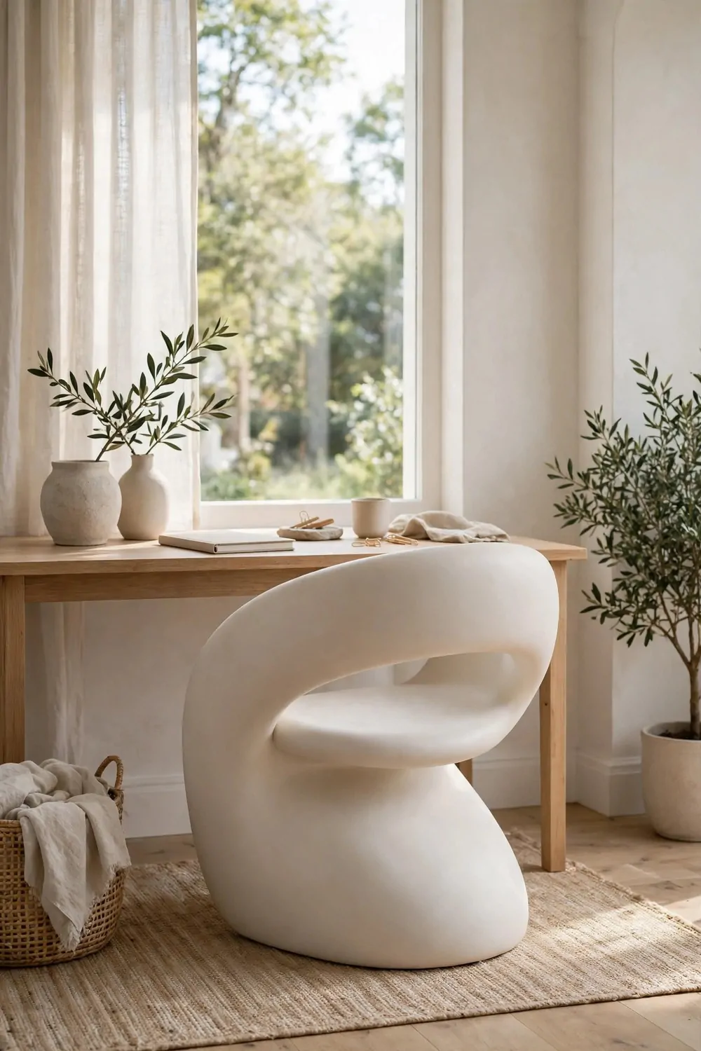
Most office chairs try to disappear. Designers pick one that does the opposite. A sculptural chair with a curved back or an interesting shape becomes the star of the room, and everything else gets calmer around it.
The shape is the point. A rounded back, a curved seat, or a chair with a bold silhouette reads like art. You notice it the second you walk in, and you remember the room because of it. That is what a statement piece is meant to do.
Comfort still comes first. A beautiful chair that hurts your back is a bad chair, no matter how good it looks. Sit in it for at least twenty minutes before you buy it. Your back will tell you the truth faster than any photo will.
Keep the desk simple when the chair is bold. A plain desk lets the chair shine. A fancy desk plus a fancy chair fight each other, and the room feels noisy. One star per room is the designer rule, and the chair is a good star to pick.
Pick a chair color that repeats somewhere else in the room. A boucle cream chair with a cream cushion nearby. A deep green chair with a green plant pot on the shelf. The repeat ties the bold chair into the room, so it looks chosen, not dropped in.
I love a chair with a little texture. Boucle, woven cane, or soft velvet all catch the light in a way flat plastic never does. Texture makes the chair feel warm and touchable, even from across the room on a video call.
Swivel chairs can be sculptural too. Look for one with a curved shell and a simple base. It still rolls and turns for work, but it looks like furniture, not office equipment. The room feels like a home, not a cubicle.
Do not hide a great chair under a desk all day. Pull it out a little when you leave the room. Let the shape show. A sculptural chair earns its keep by being seen, and a room with a beautiful chair feels finished even when the desk is clear.
A statement chair also makes a small office feel special. One bold piece can carry a whole corner. You do not need ten pretty things. You need one great chair, good light, and a tidy desk. The rest is just quiet support.
10. The Symmetry Trick for a Calm Desk
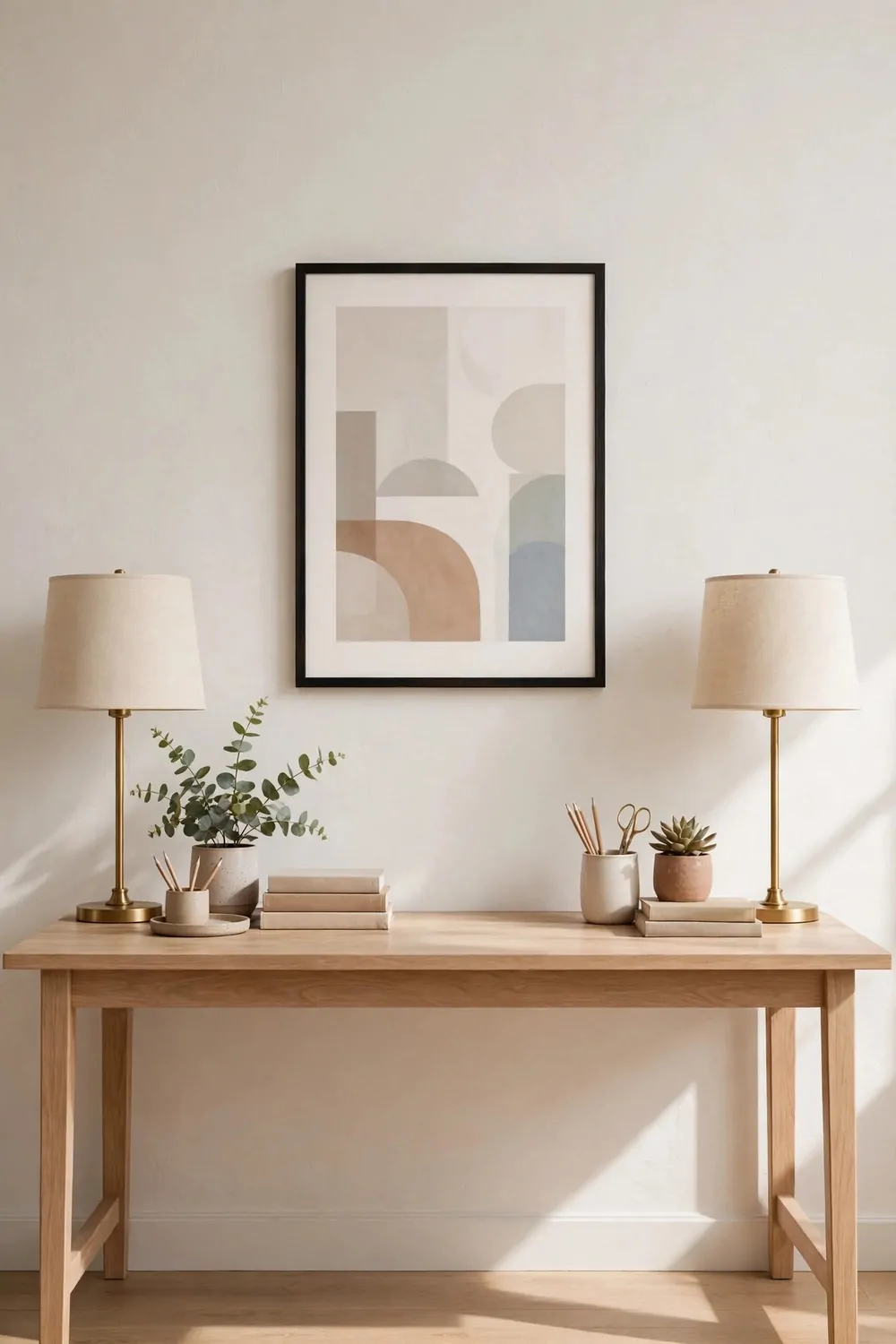
Symmetry calms the brain. When both sides of a desk match, the room feels orderly, even if the drawers inside are a mess. Designers use symmetry to make a work space feel peaceful on sight.
Start with the wall above the desk. One centered print, with matching lamps or matching shelves on each side. The center line runs straight down through the desk, and your eye rests on it. The whole setup feels balanced without trying hard.
Match the lamps first. Two lamps of the same height and shape, one on each side, frame the desk like bookends. They do not need to be costly. They just need to match. Mismatched lamps pull the eye sideways, and the calm feeling breaks.
Keep the desk surface balanced too. A stack of books on the left, a plant of similar height on the right. A notebook on one side, a mug on the other. You do not need perfect mirror images. You need similar weight on both sides.
Here is a quick symmetry check you can run in one minute:
- One centered piece above the desk, like a print or a mirror.
- Two matching lamps, one on each side of the desk.
- Similar height on the left and right, books on one side and a plant on the other.
- Clear space in the middle, so the center line stays open and calm.
I use symmetry most on days when my work feels chaotic. A balanced desk does not fix a hard inbox, but it stops the room from adding to the noise. The calm surface helps my brain settle, and I start work a little easier.
Symmetry works best in a small office. A tiny room with a balanced desk looks tidy and grown up. A tiny room with stuff piled on one side looks lopsided, and the whole corner feels like it is leaning. Balance fixes the lean for free.
Do not force symmetry everywhere. One balanced wall is enough. The rest of the room can be loose and lived in. A reading corner, a plant group, a shelf with odd objects. The calm desk is the anchor, and the rest of the room can relax around it.
If your desk sits against a wall with a door or a window on one side, fake the balance. A tall plant on the open side matches the weight of the door frame on the other side. Your eye reads height and bulk, not perfect pairs, so a plant can balance a doorway just fine.
11. The Textured Throw That Softens a Hard Room
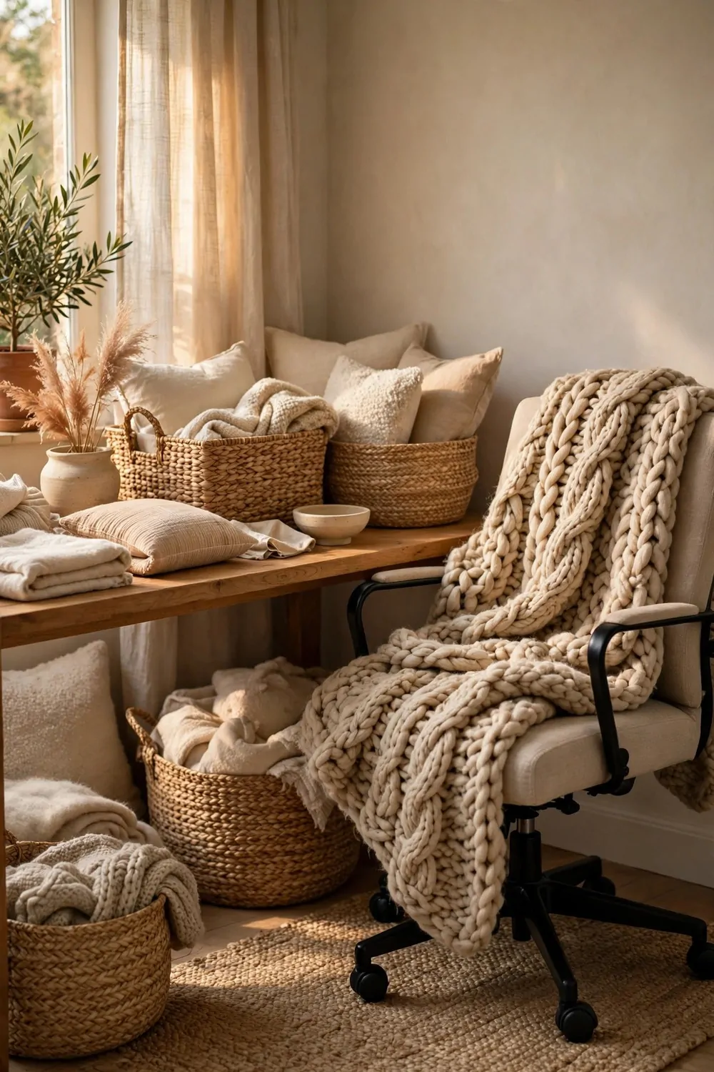
Home offices can feel hard. Hard desk, hard chair, hard floor, hard screen. A textured throw is the fastest softener in the room. One piece of soft fabric changes the whole feeling in seconds.
Drape it over the back of your chair, not folded in a neat square on a shelf. A throw on a chair looks lived in and warm. It invites you to sit down, and it softens the hard lines of the chair back. The room stops feeling like a work station.
Pick a chunky knit or a soft woven texture you want to touch. The eye reads texture before it reads color, so a plain cream throw in a chunky knit looks richer than a patterned throw in flat fabric. Touch is part of design, even if you only look at the room on a call.
Keep the color calm. Cream, soft gray, warm beige, or a muted sage all work. The throw is a supporting player, not the star. A loud throw on a chair fights the art and the rug, and the room gets noisy fast.
I keep my throw where I can reach it on cold afternoons. A chilly office makes you tense up without noticing, and a warm throw fixes it in a minute. It is a design piece and a comfort piece at the same time, and that is the best kind of decor.
A throw also hides a tired chair. An old chair with a worn seat looks new again under a soft throw. You do not need a new chair to refresh the room. You need one good piece of fabric, draped with care, and the chair gets a second life.
Layer it with a cushion in a different texture. Knit throw plus linen cushion. Woven throw plus velvet cushion. The mix of textures feels rich and thoughtful, like the room was styled by someone who loves fabric. Two textures are enough. Three can start to feel busy.
Wash the throw often, and keep it clean. A throw that smells stale or looks dusty does the opposite of softening a room. It makes the office feel neglected. A fresh throw, shaken out each morning, keeps the chair looking inviting all week.
In the warmer months, swap the chunky knit for a light cotton throw. Same trick, lighter fabric. The room still feels soft, but it does not look heavy in summer light. Seasonal swaps keep the office feeling current with almost no cost.
A textured throw is a small thing, but designers reach for it again and again. It softens hard edges, adds warmth, and makes a work chair look like a reading chair. That is a lot of work for one piece of cloth.
12. The Mirror That Doubles the Daylight
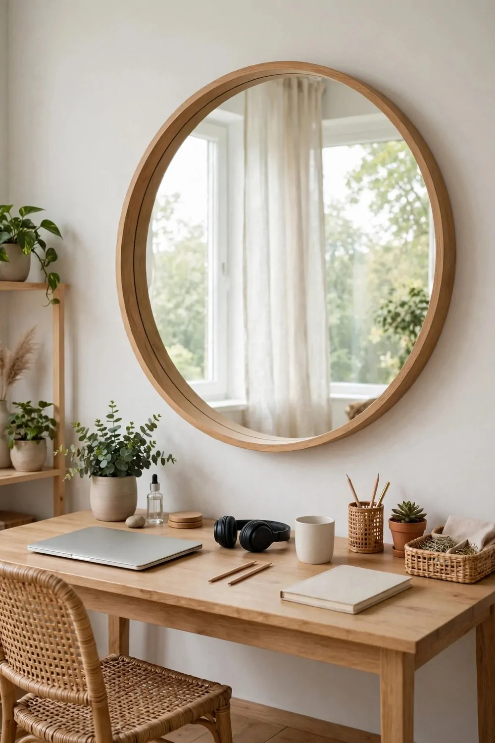
A mirror is the cheapest way to add light to a home office. It does not make light, but it bounces the light you already have around the room. One large mirror can make a dark corner feel bright.
Hang the mirror where it reflects a window, not a blank wall. A mirror facing a window doubles the daylight in the room. A mirror facing a wall just doubles the wall, and that helps nobody. Stand where your desk sits, and check what the mirror will show.
Round mirrors work beautifully in offices. A large round mirror softens all the straight lines of desks, shelves, and screens. It adds a gentle curve to a room full of rectangles, and the eye loves that little break.
Keep the mirror clean. A dusty mirror reflects dull light, and the room feels gray. A quick wipe each week keeps the reflection bright. It takes two minutes, and the difference in daylight is easy to see.
I hang my mirror a little higher than I think I should. The top of the mirror should sit above eye level when you stand. That way it catches the window and the sky, not just the floor and your knees. Sky in a mirror feels like a second window.
A mirror also makes a small office feel bigger. The reflection adds depth, and the wall seems to go further back than it does. In a tiny nook, that extra depth is a gift. The room breathes a little easier with a mirror on the wall.
Do not hang a mirror where it reflects your screen. Glare bouncing off a mirror into your eyes is tiring, and it can double the brightness in a bad way. Angle the mirror a little, or move it to the side wall, until the screen stays glare free.
Frame the mirror simply, like you would frame art. A thin brass frame or a light wood frame adds warmth without stealing attention. A heavy ornate frame can overpower a small office, so keep the frame quiet and let the reflection do the work.
A mirror is also a quick check before a video call. One glance tells you if the room behind you looks tidy and if the light is kind. It is a design trick, a light booster, and a last look in the mirror, all in one piece.
13. The Built-In Look From Flat-Pack Pieces
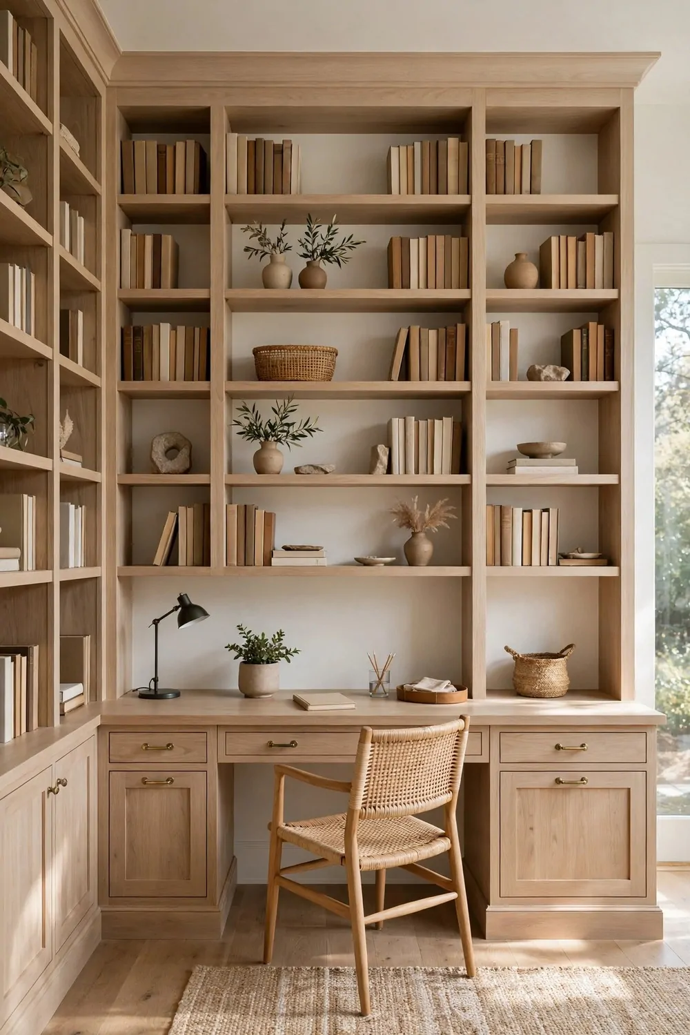
Built-in bookcases look costly and custom. Flat-pack bookcases look cheap and wobbly. Designers know the gap between the two is smaller than you think. A few small moves turn flat-pack pieces into a built-in look.
Start by pushing the bookcases tight together, wall to wall if you can. Gaps between units break the built-in illusion at once. Fill the run from one wall to the other, or center it and add side panels. No gaps, no wobble, no daylight showing through the sides.
Paint the units the same color as the wall. One color from wall to bookcase erases the edges. The shelves read as part of the room, not as furniture standing in front of it. White on white, or deep green on deep green, both work beautifully.
Add trim and a top board. A simple strip of wood along the top, a baseboard at the bottom, and thin trim down the sides hide the flat-pack edges. The trim is the whole secret. It is what makes a box look like it was built into the wall.
Swap the handles and knobs. Cheap plastic handles give flat-pack away in seconds. Simple brass pulls or matte black knobs cost little, and they change the whole feel of the unit. Hardware is jewelry for furniture, and good jewelry lifts the whole outfit.
Here is how the flat-pack look compares with the built-in look:
| Detail | Flat-pack as bought | Built-in look |
|---|---|---|
| Gaps | Spaces between units and walls | Units pushed tight, gaps filled with trim |
| Color | Factory finish, different from the wall | Painted the same color as the wall |
| Top and base | Flat top, small plastic feet | Top board, baseboard and side trim added |
| Hardware | Basic plastic or plain metal handles | Brass pulls or matte black knobs |
| Desk fit | Desk pushed against the units, gaps show | Desk top runs into the units with no gap |
Fit the desk into the run, not against it. A desk top that runs from unit to unit, with no gap at either end, reads as custom. Measure the space, cut the top to fit, and the desk becomes part of the built-in wall. It is the move guests always ask about.
Anchor the units to the wall for safety. Tall bookcases must be fixed to the studs, especially in a room where you pull books out every day. Safety is not a design extra. It is the first step, and it also stops the wobble that gives flat-pack away.
I painted my own flat-pack wall the same soft white as the room, and friends still ask who built it. The paint, the trim, and the tight fit did all the work. The units underneath were the cheapest ones in the store, and nobody can tell.
Leave some shelves partly empty. A built-in wall full of books edge to edge looks like a library, which is fine if that is the goal. A built-in wall with books, art, and empty space looks like a styled room. Mix the two, and the wall feels designed, not just stored.
14. The Odd Numbers Rule for Shelves
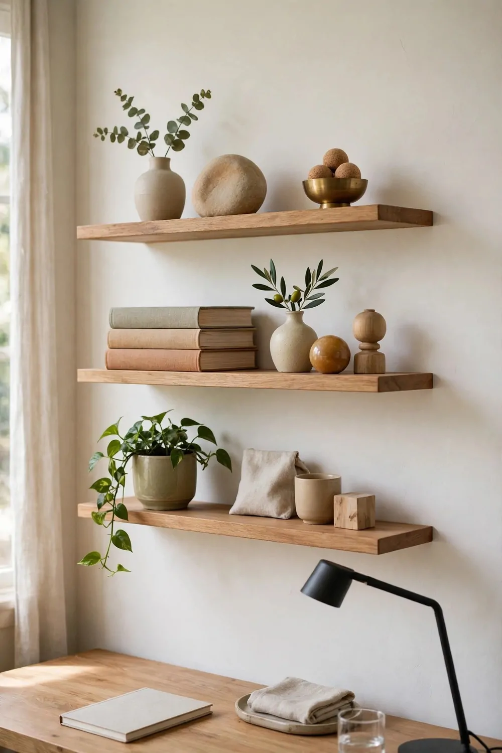
Designers style shelves in odd numbers. Three objects, five books, one vase. Odd groups feel natural and interesting. Even groups feel stiff, like soldiers lined up for inspection.
Three is the magic number for most shelves. A stack of three books, a small vase, and a tiny plant make a complete group. Your eye moves around the three pieces, and the group feels balanced without feeling matched. Two pieces feel like a pair, and four feel like a row.
Vary the heights inside each group. Tall, medium, and short together make a little skyline on the shelf. Three objects of the same height make a flat line, and the shelf looks dull. Height difference is what makes odd groups work.
Group by threes across the whole shelf too. Three groups on one long shelf, with space between them, read better than ten small objects spread evenly. The gaps matter as much as the objects. Empty space lets each group shine.
I start with the biggest object first, then add the medium one, then the smallest. Big at the back, small at the front, if the shelf is deep enough. The layering adds depth, and the shelf looks styled from every angle, not just straight on.
Books count as objects in the rule. A stack of three books is one group, not three separate things. Stack them flat, or stand five upright with a bookend. Both read as one shape on the shelf, and both leave room for a vase or a plant beside them.
Do not count every tiny thing. A shelf with three groups and one small candle tucked in is still an odd group room. The rule is a guide, not a law. If a shelf looks good to your eye, it is good, even if you count four things on it.
Odd numbers also work for art and frames. Three frames in a row above a desk feel lively. Two frames feel like they are waiting for a third. Five small frames in a loose group feel collected and warm. Odd groups tell the eye there is a person behind the styling.
Try the rule on one shelf this weekend. Take everything off, put back three groups of three, and step back. The shelf will look calmer and more interesting at the same time. That is the odd numbers rule doing its quiet work.
15. The Plants at Three Heights
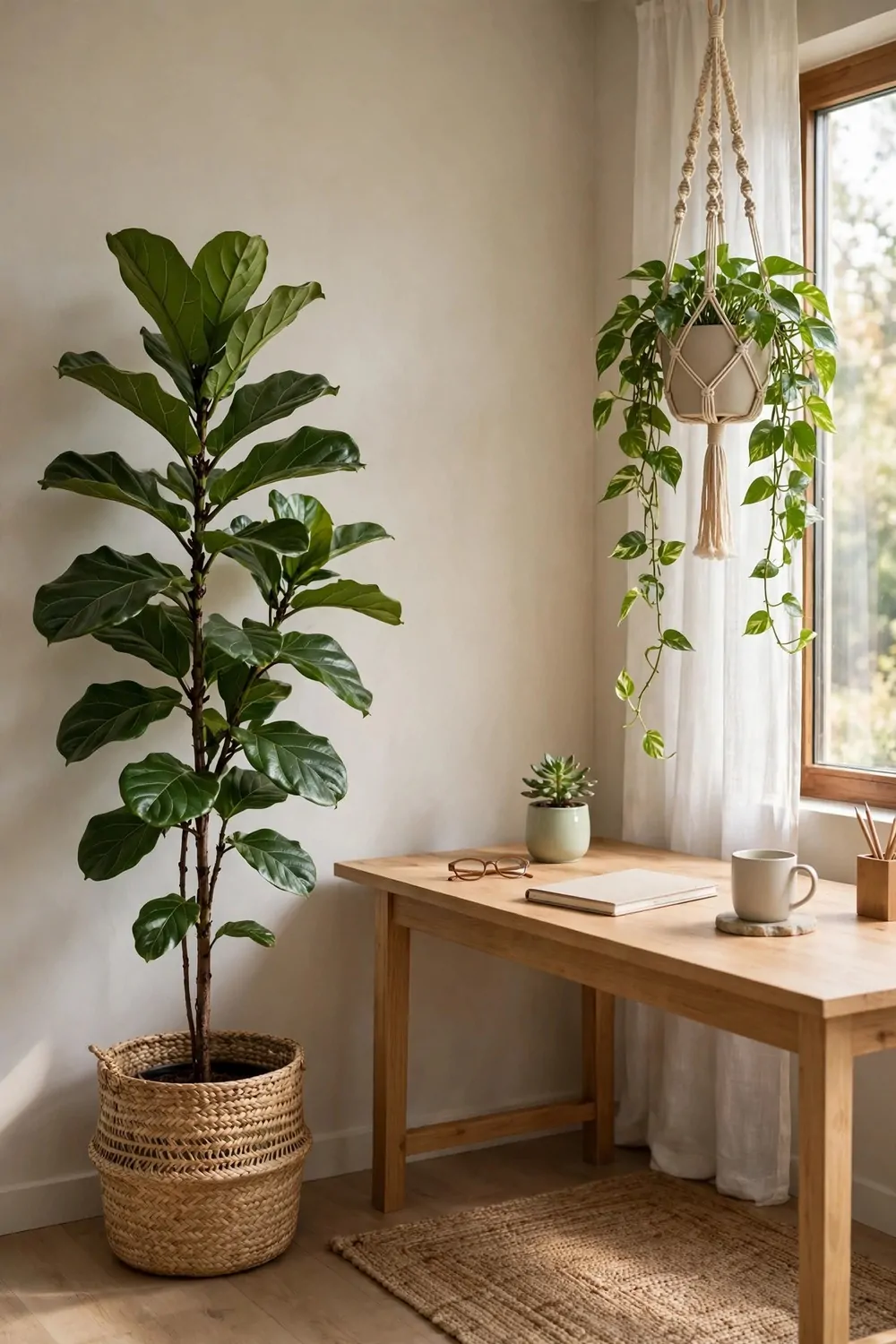
One plant on a desk is nice. Plants at three heights turn a corner into a garden. Designers layer plants high, middle, and low, so the green fills the whole vertical space, not just the desk surface.
The tall plant goes on the floor. A fiddle leaf, a tall snake plant, or a leafy palm in the corner anchors the room. It adds height, and it softens the hard corner where two walls meet. One tall plant can change the whole feeling of a small office.
The middle plant sits on the desk or on a shelf. A small potted plant at eye level keeps green in your sight line all day. It rests your eyes between screen stares, and it makes the desk feel alive. Pick one that likes the light your desk gets.
The low or trailing plant hangs or drapes. A trailing plant on a high shelf, with leaves falling down the wall, adds movement. It softens the shelf edge, and it fills the space between the shelf and the desk. The room feels lush without feeling crowded.
Here is the three height plan in one glance:
- High: one tall floor plant in a corner, reaching toward the ceiling.
- Middle: one small plant on the desk or on a low shelf, at eye level when you sit.
- Low and trailing: one hanging or trailing plant on a high shelf, with leaves draping down.
I water my three plants on the same morning each week, and that little routine keeps them alive. A dead plant does the opposite of what you want. It makes the room feel neglected. Three healthy plants beat ten struggling ones every time.
Match the pots, or keep them in the same family. Terracotta, cream ceramic, and woven baskets all sit well together. Pots in ten different colors fight the calm feeling, even if the plants are beautiful. Let the green be the star, and keep the pots quiet.
Do not block your light with plants. A tall plant right in front of a window steals the daylight your desk needs. Put the tall plant beside the window, not in front of it. The plant still gets light, and your desk keeps its daylight too.
Plants also soften sound a little, and they make the air feel fresher in a small room. I cannot prove the air part with numbers, and I will not try. I just know a room with plants feels better to sit in, and that feeling is enough for me.
Start with one plant at each height, and see how the room feels. You can always add more, but three well placed plants already give you the layered look designers aim for. The corner becomes a little garden, and the office becomes a room you want to stay in.
16. The Task Lamp With a Brass Finish
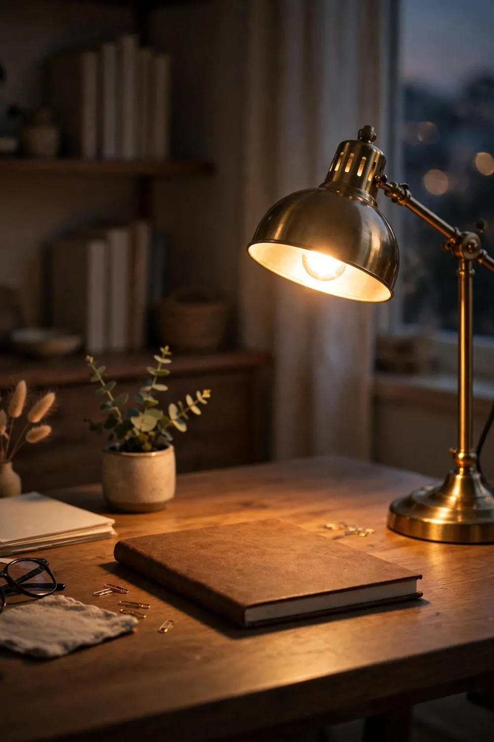
A brass task lamp is a small piece with a big job. It lights your work, and it adds a warm glow that plastic and chrome lamps never give. Designers use brass because it warms up a desk in seconds.
Brass catches the light even when the lamp is off. The warm metal glows softly in daylight, and it makes the desk look richer. A black or white lamp disappears on a desk. A brass lamp earns its place, and it looks good from every angle.
Pick a lamp with an adjustable arm and head. You need to aim the light at your work, not at your face. An adjustable lamp lets you move the glow as the day changes, and it keeps glare off your screen. A fixed lamp looks pretty, but it fights you by four in the afternoon.
Keep the bulb warm. A warm white bulb in a brass lamp gives the loveliest evening light. Cool white in brass looks odd, like a warm coat worn in summer. Match the bulb to the metal, and the whole lamp feels like one thoughtful piece.
I use my brass lamp as my end of day signal. When I switch it on in the late afternoon, my brain knows the overhead light can go off, and the workday is winding down. The warm pool of light makes the last hour feel calm, not rushed.
A brass lamp also repeats well around the room. A brass frame, a brass pot, or brass shelf brackets pick up the same warm tone. One brass piece alone can look random. Two or three brass touches spread around the room look like a plan.
Do not polish the brass to a mirror shine every week. A little patina, that soft dull glow brass gets with age, looks better in a home office than a shiny new finish. Let it age a little. The lamp will look more expensive as it gets older, not less.
Place the lamp on the opposite side from your writing hand, so your hand does not cast a shadow over your work. Right handed, lamp on the left. Left handed, lamp on the right. It is a tiny detail, and it saves a lot of squinting.
A good task lamp is worth spending a little more on. You will touch it every day, adjust it every day, and look at it every day. A cheap lamp wobbles and droops. A solid brass lamp stays put, and it makes the desk feel like a real work place.
17. The Cables You Never See
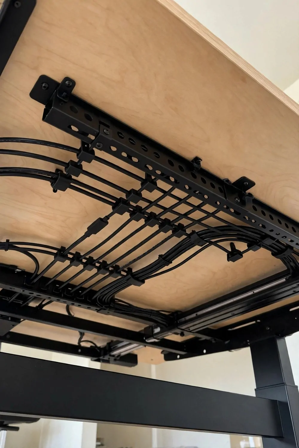
Nothing ruins a beautiful office faster than a tangle of cables. Designers hide cables like they are a secret. A tidy desk with hidden cables looks calm. The same desk with cables hanging down looks messy, even if everything else is perfect.
Start under the desk, where the mess lives. A cable tray mounted under the desk top holds power strips and spare cable length. Everything lifts off the floor, and the tangle disappears from sight. You see a clean floor, and your feet stop catching on wires.
Clip cables along the desk leg. Small adhesive clips hold each cable tight against the leg, from the desk down to the floor. One clip every few inches keeps the cable straight. Loose cables sag and swing, and clipped cables look like they were planned.
Use one power strip for the whole desk, and plug it in once. A single strip in a tray, with short cables to each device, beats five chargers plugged into the wall in five places. Fewer plugs, fewer cables, calmer desk. It is simple math, and it works.
Label the cables you keep. A tiny label on each plug tells you what it powers, so you never unplug the wrong thing in a hurry. It takes ten minutes once, and it saves a lot of crawling under the desk later. I wish I had done mine years sooner.
I run my cables in one neat bundle from the desk to the wall. A fabric sleeve or a spiral wrap holds them together, so five thin cables read as one thick cord. One cord is easy to hide behind a desk leg. Five loose cords are a spider web, and nobody wants that.
Charge devices in a drawer or a box if you can. A charging drawer keeps phones and tablets out of sight while they charge. The desk stays clear, and the cables stay hidden inside the drawer. Close the drawer, and the office looks like nobody owns a charger at all.
Check the back of your desk on video calls. The camera sees what you forget. A clean front and a messy back still show on a call when you turn around. Tidy the back once, and every call looks better from every angle.
Hidden cables also make cleaning easier. A floor with no cable tangle sweeps clean in a minute. A floor full of wires traps dust, and you end up moving everything to clean under the desk. Hide the cables, and the whole room stays cleaner with less work.
18. The Reading Nook in One Corner
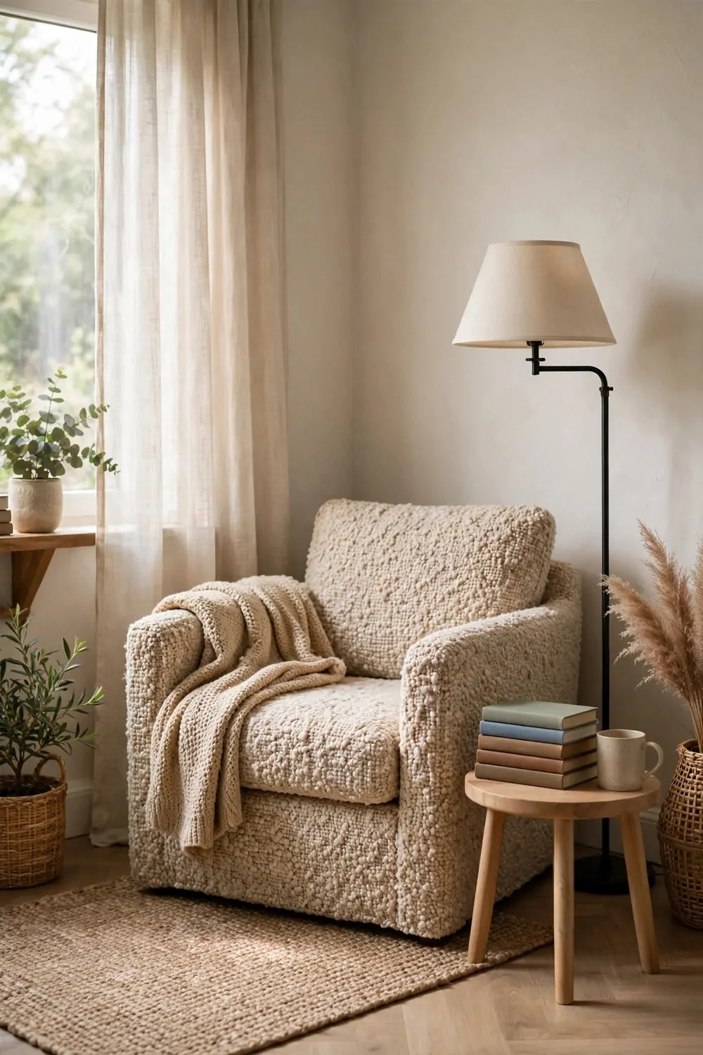
Every home office needs a second seat. A reading nook in one corner gives you a place to think, read, and take a break without leaving the room. It turns a work only space into a room with two moods.
Pick the corner with the best light. A nook beside a window gets soft daylight for reading, and it feels separate from the desk zone. Even a small corner works, as long as the chair fits and your knees do not hit the wall.
One armchair is enough. Pick one you can sit in for an hour without shifting around. A reading chair should hug you a little, with arms you can rest a book on. If the chair is too upright, you will never use it, and the nook becomes a plant stand.
Add a floor lamp beside the chair. Reading light should come from over your shoulder, warm and close. A floor lamp with a shade gives that pool of light without glare. It is the same layered light idea, just moved to the corner.
A small side table holds the book, the mug, and the glasses. The table should be just big enough for those three things, and nothing more. A big table invites clutter, and the nook stops feeling like a restful corner. Small table, calm corner.
I keep a stack of three or four books on my nook table, never more. A tall stack looks like homework, not rest. Three books say you have choices. Ten books say you have a pile. Pick the three you actually want to read next.
A soft throw and one cushion finish the nook. The throw from your office chair can do double duty, or keep a second one folded on the chair arm. The nook should feel softer than the desk zone, so your brain reads it as a break space.
Do not put a screen in the nook. No second monitor, no tablet stand, no work papers. The nook works because it is not a work spot. If work creeps into the corner, the break feeling dies, and you lose the second mood entirely.
A reading nook also gives guests a seat when they visit your office. A friend can sit and chat while you finish a task, without perching on the edge of your desk. The room feels welcoming, not just efficient, and that matters more than it sounds.
19. The Bold Ceiling That Nobody Expects
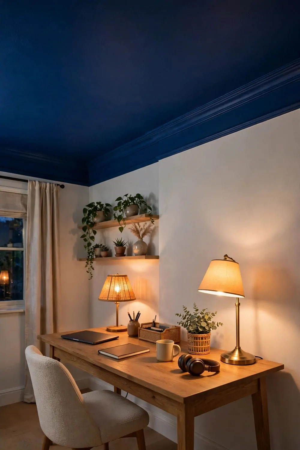
Walls get all the attention in most rooms. Designers know the ceiling is the forgotten surface, and a bold ceiling is the trick nobody expects. Paint it, paper it, or add wood, and the whole room changes.
A deep color on the ceiling makes a room feel cozy and held. Deep blue, warm charcoal, or rich green overhead wraps the room like a lid. The walls feel taller by contrast, and the office feels more like a den than a box.
Paint the ceiling only if the walls stay light. A dark ceiling plus dark walls can feel heavy, especially in a small office. Light walls bounce light around, and the dark ceiling adds drama without stealing the brightness you need to work.
Try wallpaper on the ceiling for pattern without wall clutter. A soft pattern overhead adds interest you notice when you lean back, not when you stare at a screen. It is a treat for the moments you look up, and it never distracts you from work.
I painted my office ceiling a deep blue one winter weekend, and I was nervous the whole time. It looked odd with the paint still wet, and I almost stopped halfway. When it dried and the lamps went on, the room felt rich and calm, like a library at dusk. I have loved it ever since.
Keep the ceiling trim white if you paint the ceiling bold. A crisp white edge frames the color and stops it from bleeding onto the walls. The line between wall and ceiling should be clean and sharp. A wobbly edge ruins the whole effect, so tape it well.
A bold ceiling works best with simple furniture below. Plain desk, calm rug, quiet shelves. The ceiling is the star, so the rest of the room should play support. Too many bold moves at once, and the room feels like it is shouting from every side.
If paint feels too permanent, try removable wallpaper on the ceiling. It peels off when you move, and renters can use it too. The effect is the same, and the risk is much lower. Test a small patch first, and check it holds before you do the whole ceiling.
A bold ceiling also photographs well on video calls. The top edge of the frame shows a hint of color, and the background looks styled without trying. It is a small detail in the corner of the screen, and people notice it more than you would think.
20. The Vintage Find That Tells a Story
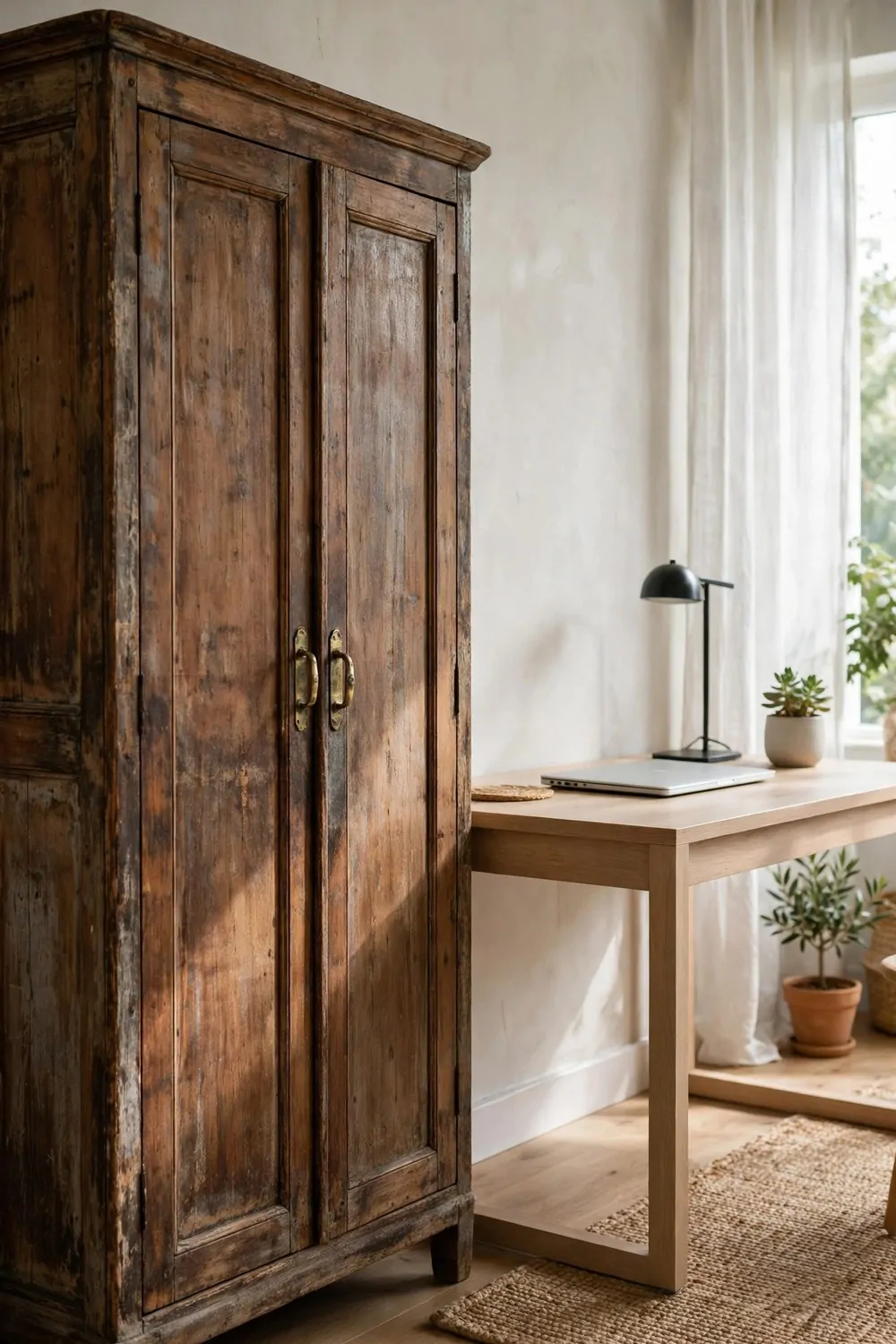
New furniture is clean and safe. Vintage furniture has a story, and a room with a story feels alive. Designers mix one vintage piece into a modern office, and the whole room gains character in one move.
Pick one piece, not a whole vintage room. A worn wooden cabinet, an old brass lamp, or a battered leather chair. One old piece among new things looks collected. Ten old pieces look like a shop, and the office loses its calm work feeling.
Look for patina, not damage. Scratches, worn edges, and faded wood tell a story. Broken drawers, wobbly legs, and bad smells tell a different story, and it is not a good one. A vintage piece should work well, even if it looks well loved.
Give the vintage piece a clear job. A cabinet that holds files, a trunk that hides cables, a side table that holds a lamp. A vintage piece with a job earns its place. A vintage piece with no job just takes up floor space and collects dust.
I found my cabinet at a small second hand shop on a rainy day, and it still has a scratch on one door from its old life. I do not know who owned it before me, and I like not knowing. The scratch makes the room feel real, in a way a new cabinet never could.
Mix the vintage piece with modern clean lines. An old cabinet beside a simple modern desk looks thoughtful. An old cabinet beside ten other old things looks cluttered. The contrast between old and new is what makes the vintage piece shine.
Do not repaint a great vintage piece on the first day. Live with the original finish for a while. The aged wood, the old brass, the worn paint are the whole point. If you paint over them, you erase the story you paid for. Clean it, fix what is broken, and let the age show.
A vintage find also starts conversations on video calls. People ask about the cabinet, the lamp, the old clock. A new desk never starts a chat. A piece with a past does, and it makes your office feel like a room with a person in it, not a catalog page.
Shop slowly for vintage pieces. The right one finds you when you are not in a rush. Check second hand shops, family attics, and local sales. When a piece makes you smile and fits your space, take it home. That feeling is the best buying guide there is.
21. The Zoning Trick for Shared Rooms
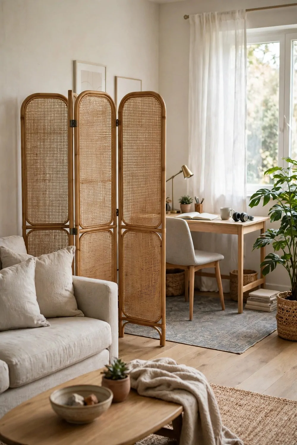
Most home offices share a room with something else. A living room, a bedroom, a dining corner. Designers zone the office area so it reads as its own room, even though no wall divides it.
A rug is the first zone marker. The rug under the desk marks the office floor, and everything on the rug belongs to work. Step off the rug, and you are back in the living room. The border is soft, but your brain respects it.
A folding screen is the second marker. A screen beside the desk hides the work zone from the rest of the room, and it folds away when the workday ends. It is a wall you can move, and it costs far less than building one.
Use furniture as a divider too. A low bookcase with its back to the living room marks the office edge and adds storage at the same time. The desk faces into the office zone, and the bookcase faces out to the room. Both sides get something useful.
Here is a simple zoning kit for a shared room:
- One rug under the desk and chair, big enough to mark the whole work zone.
- One folding screen or low bookcase, placed at the edge of the zone.
- One lamp that belongs only to the office, switched on for work and off after hours.
- One plant at the corner of the zone, marking the edge with green.
I zone my office corner with a rug and a screen, and the trick that matters most is the lamp. When the office lamp is on, I am at work. When it goes off, the corner goes quiet, and the living room takes the space back. Light is a better divider than furniture.
Keep the office zone tidy, because it sits inside a shared room. A messy desk in a closed office is private. A messy desk in a living room is on show all evening. The zone rule keeps the mess contained, and the rest of the room stays calm.
Match the zone to the room around it. The desk, the screen, and the rug should share colors with the living room, so the office feels like part of the home, not a camp set up in the corner. Same color family, different job. That is the balance to aim for.
Do not let the office spread. Cables, papers, and chargers creep past the rug edge if you let them. Check the border once a week, and pull everything back onto the rug. A zone that spreads stops being a zone, and the whole room starts feeling like an office.
A good zone also helps you switch off. Close the screen, step off the rug, switch off the lamp. Three small acts tell your brain the workday is done. Shared rooms need that ritual more than spare rooms do, because the desk never leaves your sight.
22. The Acoustic Panels That Look Like Art
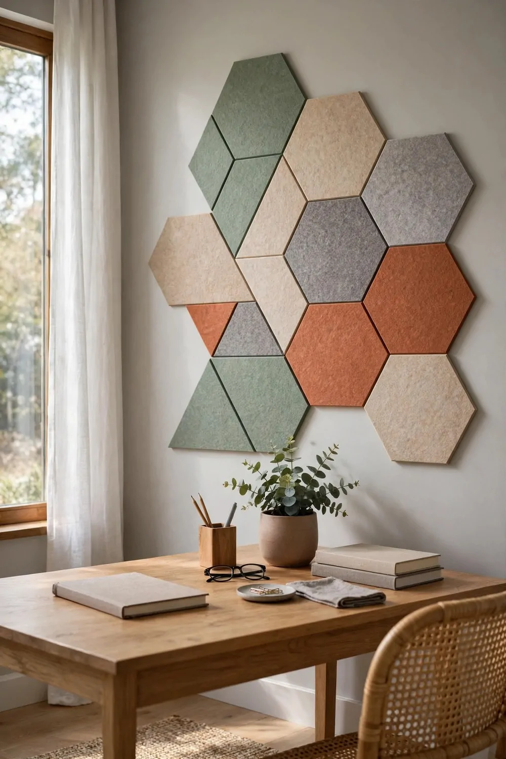
Home offices can sound as hard as they look. Bare walls bounce voices, typing, and video calls around the room. Acoustic panels fix the sound, and designers make them look like art at the same time.
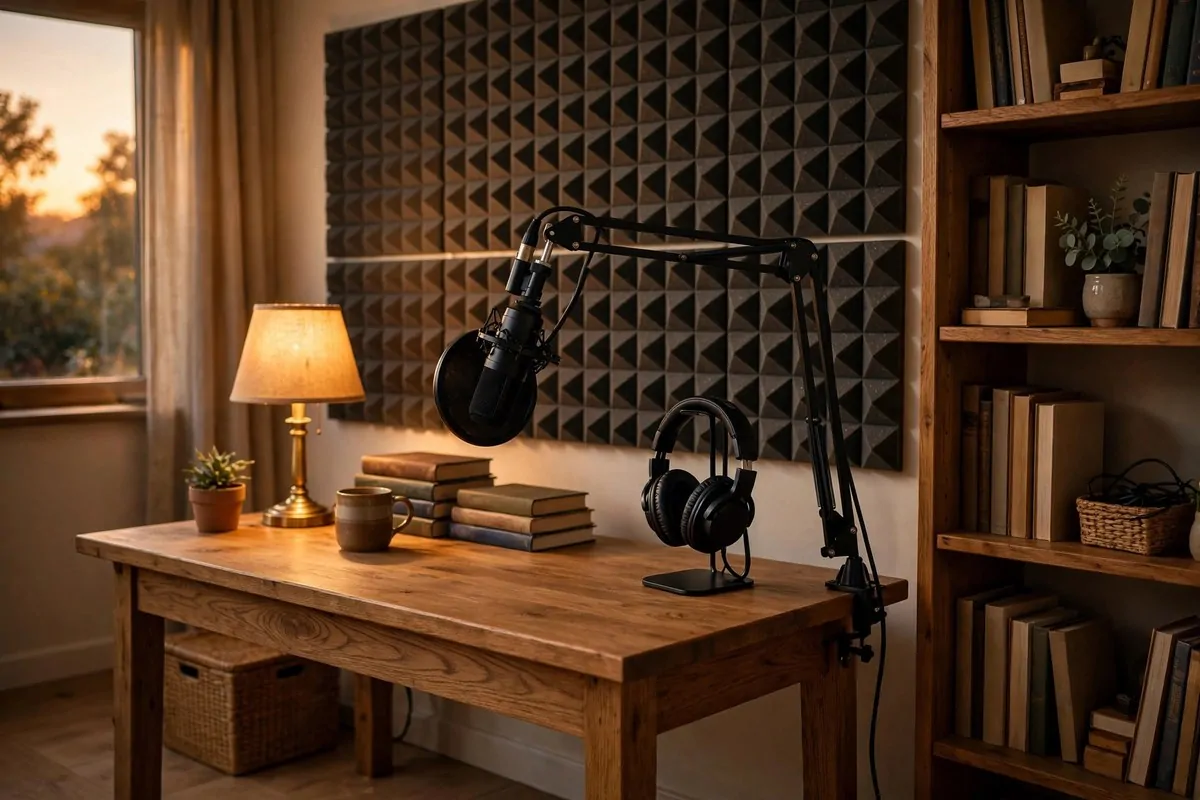
Felt panels are the softest option. They come in muted colors and geometric shapes, and they hang on the wall like a modern art piece. Sound hits the felt and dies instead of bouncing back. Calls sound clearer, and the room feels quieter the same day.
Wood slat panels add warmth and rhythm. Thin wood strips on a felt backing look like a design feature, not a sound fix. They suit a calm, natural office, and they pair well with wood desks and shelves. The slats catch light and shadow, so the wall looks alive.
Fabric wrapped panels are the most invisible option. They look like plain upholstered wall tiles in a soft color, and they hush a room fast. Pick a color close to your wall color, and the panels fade into the background while they do their quiet work.
Here is how the main panel types compare:
| Panel type | Look | Best spot |
|---|---|---|
| Felt geometric panels | Bold shapes in muted colors, like wall art | Wall behind the desk, on video calls |
| Wood slat panels | Warm wood strips with soft shadow lines | Side wall or reading corner |
| Fabric wrapped panels | Soft, plain tiles that blend with the wall | Wall facing the desk, to catch echo |
| Cork panels | Natural, speckled texture, pin friendly | Beside the desk, for notes and soft sound |
Hang panels on the wall you face, or on the wall behind you on calls. Sound bounces between parallel walls, so treating one wall in each pair helps most. You do not need to cover every wall. A few well placed panels change the sound a lot.
Arrange the panels with space between them, like art. A grid with even gaps looks designed. Panels jammed edge to edge look like a padded room. Leave breathing room, and the wall reads as a feature, not a fix.
I added felt panels behind my desk last year, and the first thing I noticed was not the sound. It was how much better the wall looked on calls. The geometric shapes gave the background depth, and the room stopped looking flat on screen. The quieter sound was a happy bonus.
Keep panel colors muted. Soft gray, sage, clay, and navy all work well behind a desk. Bright colors shout on camera, and they fight the calm feeling of the room. Muted panels add texture without adding noise, which is the whole point.
Panels also help in a shared room. A panel wall between the desk and the living room hushes work noise for the rest of the house. Calls stay private, typing stays soft, and the family room stays calm. Good sound design is kind to everyone in the home.
23. The Personal Gallery, Not a Stock Photo Wall
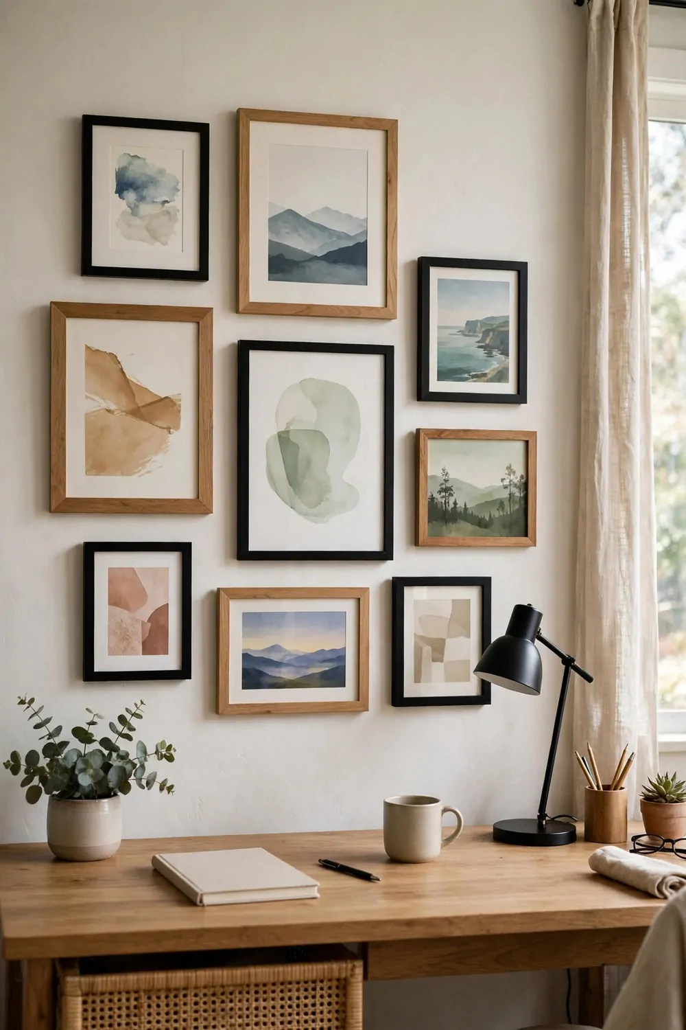
A gallery wall of generic prints looks like a hotel room. A gallery wall of your own photos and small prints looks like a home. Designers pick personal pieces, because a work room should remind you of your life, not a catalog.
Mix photos with small prints, tickets, and little keepsakes. A photo from a trip, a print from a local artist, a postcard a friend sent. The mix tells your story, and no two gallery walls ever look the same. That is the charm of a personal wall.
Use mixed frames, but keep one thing in common. Different frame shapes and sizes look collected and warm. Keep the frame colors in one family, black and wood, or all brass, so the mix feels planned. Too many frame colors at once, and the wall feels scattered.
Hang the gallery where you see it while you work, or where it shows on calls. Above the desk is the classic spot, but a side wall works too. The point is to see the faces and places you love during the day, not to hide them in a hallway.
Start in the middle and work outward. Hang the biggest or most loved piece first, at eye level. Add smaller pieces around it, leaving even gaps. A gallery that grows from the center looks balanced, even when the frames are all different sizes.
I keep one empty spot in my gallery on purpose. It waits for the next photo, the next trip, the next small print I fall in love with. A gallery with room to grow feels alive. A gallery that is finished forever feels like a museum, and museums are not much fun to work beside.
Do not hang anything you do not love, just to fill a gap. A blank patch of wall is better than a print you feel nothing for. Your gallery should make you smile when you glance up. If a piece does not do that, take it down and wait for a better one.
Keep the glass clean and the frames straight. A crooked frame pulls the eye every time you look at the wall, and a dusty print looks tired. A quick straighten each week keeps the gallery looking cared for, which is the whole feeling you want.
A personal gallery also makes a small office feel bigger in spirit. The wall holds memories, not just decor, and the room feels like yours in a deep way. Work feels lighter when the wall reminds you why you work, and who you work for.
24. The One Empty Surface Rule
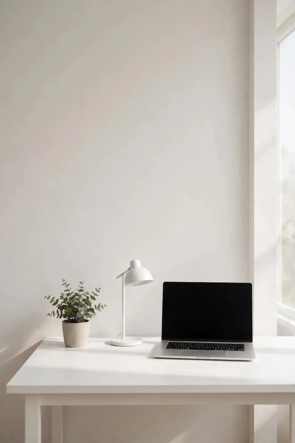
Designers leave one surface empty on purpose. One desk corner, one shelf, one side table with nothing on it. The empty surface is the trick that makes all the styled surfaces look good.
An empty surface gives the eye a place to rest. A room where every inch is filled feels busy, even if everything in it is beautiful. One calm, clear spot lets the rest of the room breathe, and the styled parts stand out more.
Pick the surface you see most. For most of us, that is the desk. Keep one corner of the desk clear, always. No papers, no mug, no charger. Just clean desk top. That one empty corner makes the whole desk look tidy, even on a busy day.
The rule works on shelves too. Leave one shelf with just one object, or leave one shelf fully empty. The empty shelf makes the full shelves look curated instead of crowded. It is the pause between sentences, and every good room needs a pause.
I keep my empty surface empty on purpose, and it is harder than it sounds. Papers creep onto it. Mugs land there. Chargers snake across it. I clear it every evening, and the clear spot greets me fresh each morning. It is a small habit, and it holds the whole room together.
An empty surface is also practical. It is where you set down a new book, spread out a plan, or rest a cup while you think. A room with no empty space has nowhere for new work to land. The empty spot is the landing pad for the next good idea.
Do not fill the empty surface with a plant or a candle just because it looks bare. A plant on the empty surface means it is not empty anymore, and the trick is gone. Let it stay bare. The bare spot is doing its job by being bare.
If guests ask why one spot is empty, smile and tell them it is the most designed part of the room. They will laugh, and then they will look at their own rooms and see the same crowded surfaces. The empty rule spreads fast once people try it.
That is all twenty four tricks, and they share one simple idea. A great home office is not about buying more things. It is about placing the things you have with care, and leaving room for the room to breathe.
You do not need to try all twenty four at once. Pick one trick this week, and live with it for a few days. A rug, a lamp, a higher curtain rod. One small change can shift how the whole room feels, and how you feel sitting in it.
Start with the trick that bothered you most while you read. The messy cables, the bare wall, the dark corner. Fix the thing that nags you first, and the room will feel like yours again. The rest can wait for next weekend, and the weekend after that.
Your office is where you spend so much of your life, and it deserves more than leftover furniture and a bare wall. Give it one good trick, then another, and watch it turn into a room you love to walk into. That feeling is worth every small move.