20 Library Wall Designs That Turn Books Into Art
There was an empty picture frame hanging in my hallway for eight months. I bought it in January, sure I would find the perfect print.
Then life happened, and the frame just hung there. Glass and nothing else.
Last month I finally took it down. I replaced it with a book cover I love, the one with the little house on it, framed simply. Friends ask me about it every time they visit.
That was the moment I learned something simple. Your books do not have to live on shelves. They can live on your walls like art.
And honestly, a Library Wall is the easiest wall in the house to make beautiful, because the art is already yours. The covers, the pages, the stories. They just need a frame and a spot where people can see them.
Here are 20 Library Wall designs that turn books into art. Each one is something I have seen in a real home and thought, yes, I am stealing that.
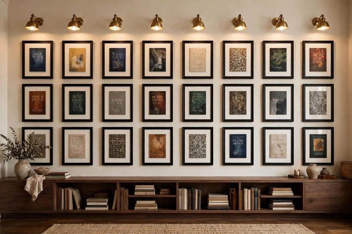
1. Frame Your Favorite Book Covers Like Paintings
You already own the art. It came free with the books.
The prettiest covers on your shelf deserve a frame. Pick three or four covers you love and hang them where everyone can see them. It feels fancy, and it costs almost nothing.
I like frames that match. All black, or all thin wood. When the frames match, the covers can be wild and different, and the whole wall still looks calm.
Hang them in a grid if you like order. I hang mine two inches apart, straight lines. My sister hangs hers in a loose cluster, and it looks good too.
The best part is you can change them whenever you want. New favorite book?
Swap the cover. It is the cheapest gallery wall you will ever make.
Use covers with bold art. A busy photo cover can look messy in a frame. Simple, graphic covers read best from across the room.
Put this wall where guests stop. The hallway, or the wall you face from the reading chair. People always walk closer to read the titles.
Old paperbacks work great. Their covers have that soft worn look you cannot buy new. I framed a beat-up copy of my favorite novel and it gets more comments than anything expensive I own.
Start with one frame if a whole wall feels like a lot. You will know within a week if you want more.
2. Turn One Wall Into a Decoupage of Torn Book Pages
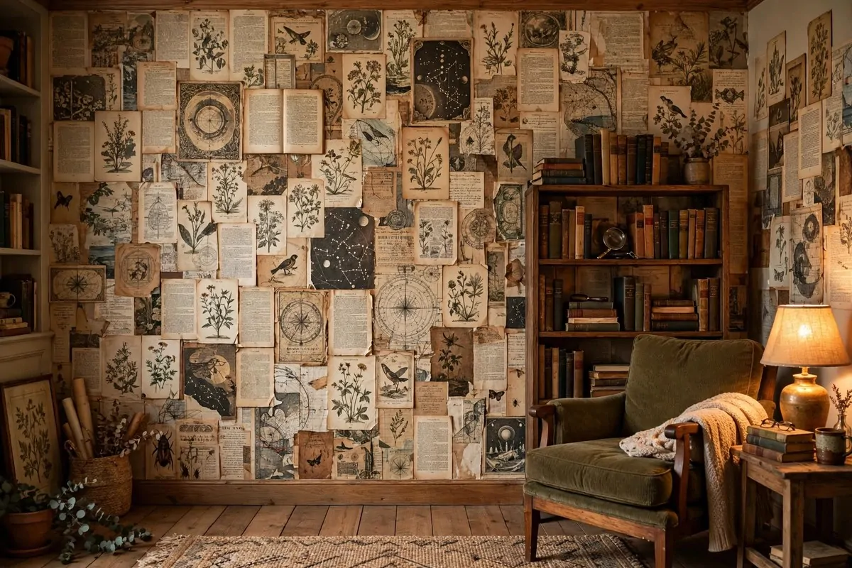
This is the bravest idea on the list. Cover one wall in old book pages.
Decoupage is just paper glued to a wall and sealed. Torn pages from damaged books make the best texture. The torn edges overlap like scales, and the whole wall gets this rich layered look.
Use books that are already broken. Thrift stores sell falling-apart books for almost nothing.
The ones with yellowed pages work best. New white pages look too clean for this.
Tear, do not cut. Torn edges blend into each other.
Cut edges show a hard line. Tear the pages into big pieces, about the size of your hand.
Start from the bottom and work up, like shingles on a roof. Overlap each piece a little. Glue one piece at a time with decoupage glue or plain wallpaper paste.
Seal it when the wall is dry. Two coats of clear matte sealer.
This keeps the pages from peeling and makes the wall wipeable. Do not skip the sealing.
Pages with pictures are gold. Illustrations, old ads, chapter headings with big letters. Mix text pages with picture pages so the wall has rhythm.
One wall is plenty. This texture is strong.
One feature wall with decoupage and three calm walls is the recipe. A whole room would be too much.
This wall tells a story you cannot buy. Every page came from a real book.
Guests will lean in close and read the fragments. It is art and archaeology at once.
3. Hang One Big Old-World Map on the End Wall
Every library needs one map. Just one, but make it big.
The end wall is the one you face from your reading chair. That is where the map goes. You will look at it for hours, between chapters, and it rewards slow looking.
Sepia maps work with everything. The old browned paper tone sits quietly next to dark wood and leather. A bright colorful map shouts too much next to a full shelf of spines.
One big map beats four small ones. Small framed pieces get lost against a wall of books. One large canvas says, I meant this.
Add a small picture light above it if you can. The light makes the map glow at night. It turns the whole corner into something special.
Maps carry stories of their own. Your kids will point at countries.
Your friends will find the places they have been. It is art that starts conversations.
A framed map print costs much less than a real old map. Print shops sell them in big sizes. You get the same look without the auction price.
Hang it so the center sits at your eye level. When you sit in your chair and look up, it should meet your gaze.
Do not crowd it. Give the map a whole wall section to itself. The books can have the other walls.
4. Frame Illustrated Fantasy Maps of Your Favorite Worlds
Fantasy readers, this one is for you.
Remember the map at the front of the book? The one you studied before chapter one? That map belongs on your wall.
Frame the big folding maps that come with special editions. Or print a fan-made illustrated map of the world you love most. In a good frame, nobody can tell the difference.
These maps are packed with detail. Mountains, forests, little seas with sea monsters. You notice something new every time you look.
I hung one in a reading corner painted deep navy. The parchment colors glow against the dark wall like it is backlit. I sit there longer than I plan to.
Match the frame to the room. Dark wood for a classic library.
Simple black for a modern one. The frame is half the look.
One map, one wall, one spotlight of attention. Fantasy maps are busy enough that they do not need company.
If you love more than one world, hang them in the same style of frame. Same frames make different maps feel like a collection.
Your inner kid will thank you. There is no reason grown-up rooms cannot have dragon maps.
5. Create an Author Portrait Gallery in Matching Frames
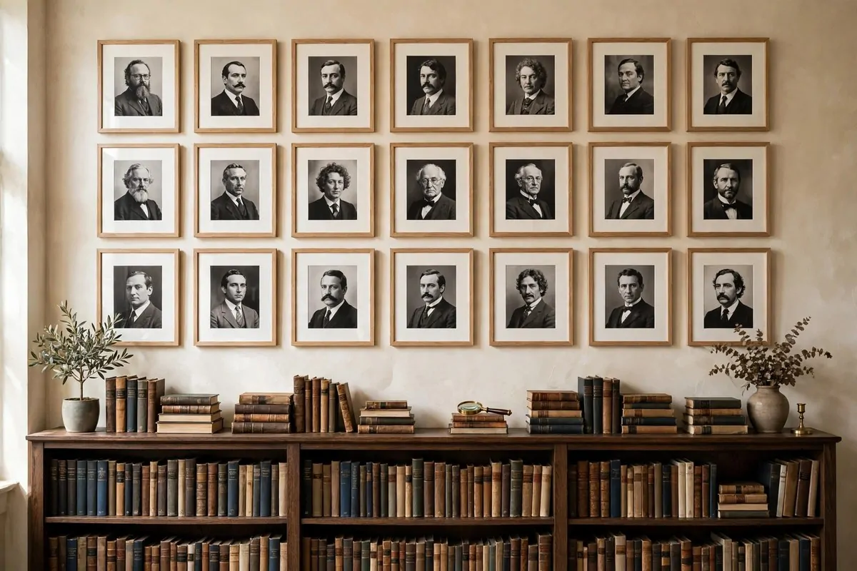
Nothing says library like the faces of the people who wrote the books.
Pick the authors who shaped you. Five or six faces is plenty. The writers whose books live on your shelves, not just names you think sound smart.
Black and white photos are the trick. Color photos of different ages and places can clash. Black and white makes everyone look like they belong together.
Use matching frames. All the same size, all the same style. The sameness is what makes it feel like a real gallery and not a collage.
- Choose authors from different eras so the wall has range.
- Mix writers and poets if you like both.
- Include one author your friends will not know, so they ask.
- Keep the photos the same size for the calm gallery look.
Hang them above a shelf or desk where you write. It feels like company. On a hard writing day, looking up at those faces helps.
Space the frames evenly. Two inches apart is the sweet spot I keep coming back to. A little ruler and a pencil mark save a lot of regret.
Public domain photos are free. The great old authors have portraits anyone can use. A print shop can make them large for very little money.
Tell the story if someone asks. That portrait wall is really a map of your reading life. Everyone’s looks different, and that is the point.
6. Turn Favorite Quotes Into Typography Art
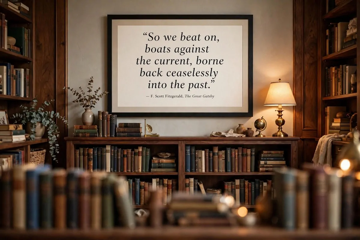
One line from a book can carry a whole room.
Pick a quote that means something to you. Not the most famous one. The one that hit you at the right time and stayed.
Typography art is just words printed beautifully. Big letters, good spacing, a nice font. It looks modern and clean next to all those busy spines.
Go large. A quote printed small looks like a label.
A quote printed big reads as art. Two feet wide is a good starting point.
One quote per wall. Two quotes argue with each other. One quote gets remembered.
I like dark letters on cream paper. It is easy to read and it ages well. White letters on black is moodier and works great in a dark library.
You can make this yourself in an afternoon. Type the quote, print it large at a copy shop, frame it. Done.
Hang it where you see it every morning. Quotes are like vitamins. They only work if you actually see them.
Change the quote when the season of your life changes. My current one is about rest.
Last year’s was about courage. The wall grows with me.
7. Blow Up Vintage Library Card Prints
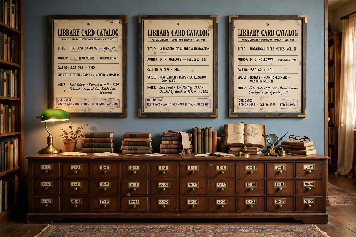
You remember those little cards. The ones with the typed titles and the stamped due dates.
Old library cards have a look that is hard to fake. The typewriter font.
The little lines. The red stamp in the corner that says someone loved this book in 1974.
Blow one up big. A card printed at three feet wide becomes a piece of graphic art. The typewriter letters get chunky and beautiful.
Print a card from your favorite book. Or a card for a book that changed your life. The details on the card, the author, the year, tell a tiny story.
These prints look amazing in groups of two or three. Same size, same frame, hung in a row. It feels like a museum exhibit about your own reading life.
The sepia paper color works with warm wood shelves. It is soft and old without being dusty. I hung mine on a blue wall and the contrast is perfect.
Copy shops can print from a photo. Take a clear photo of an old card, or find printable versions online. Frame them in simple black and you are done.
Guests always read them. Every single one stops and reads the little typed lines. It is interactive art without any batteries.
8. Frame Pages Saved From Damaged Old Books
This idea starts with a sad book. One that is too damaged to read anymore.
I found a falling-apart nature book at a thrift store. The spine was gone.
The pages were loose. But the engravings inside were still beautiful.
I saved the best pages and framed them. Now those hundred-year-old illustrations hang on my wall instead of rotting in a box. The book got a second life.
Old books are full of frameable pages. Botanical drawings.
Old maps. Title pages with gorgeous lettering. Look for books that are already broken, never a good one.
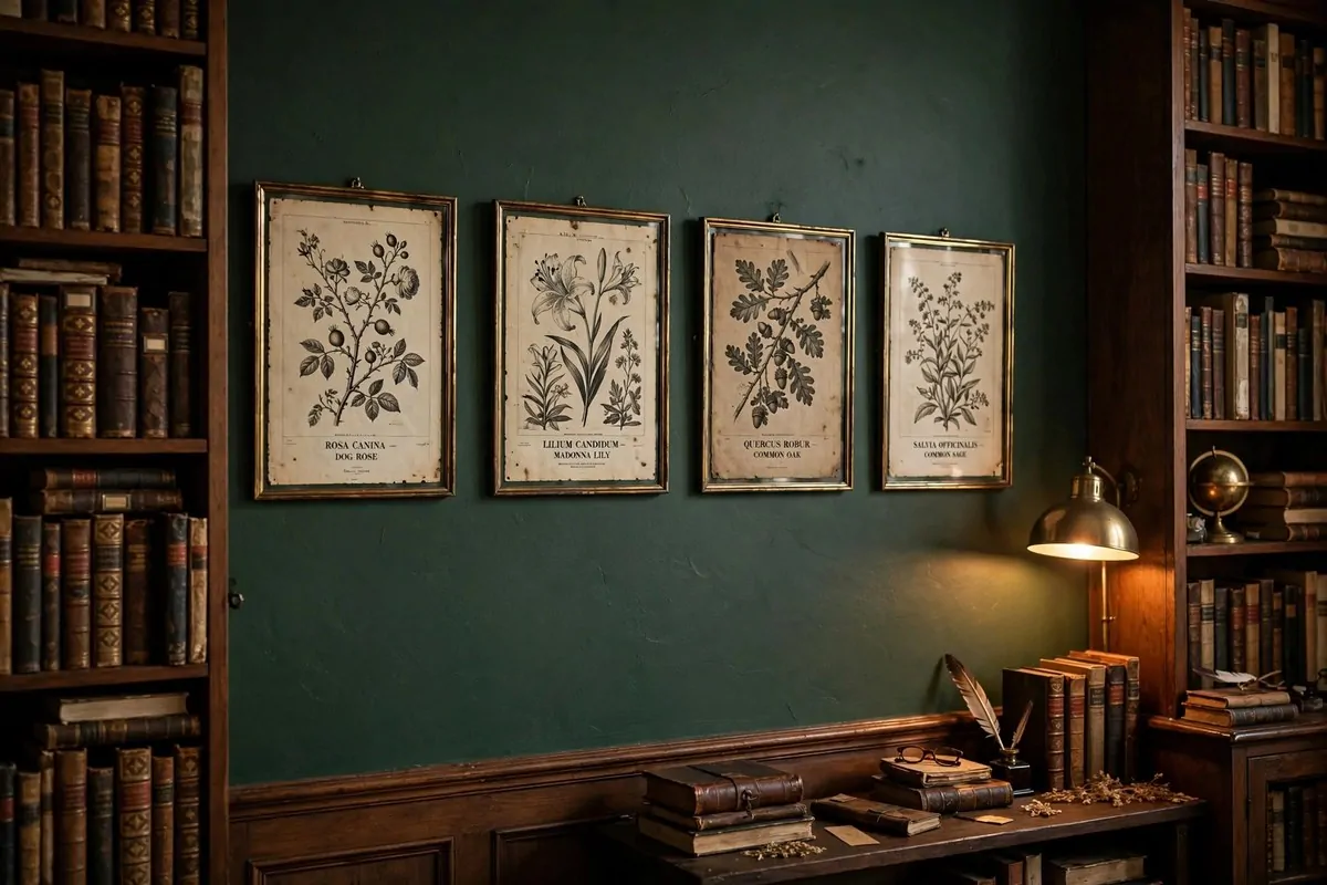
Thin brass frames suit these pages. They keep the antique feeling. White mats make the old paper look crisp and intentional.
Group pages from the same book together. Three botanical prints from one old volume feel like a real collection. Three random pages feel like leftovers.
Hang them where the light is soft. Old paper does not like hard sun. A hallway wall or a spot away from the window is perfect.
This is art with a rescue story. When someone asks about it, you get to tell them about the broken book you saved. That story is half the art.
9. Hang Black-and-White Photography Beside the Shelves
Color is the job of your books. Let your art do something quieter.
Black and white photos never fight with book spines. The spines are a rainbow.
The photos are tone. They sit next to each other like they planned it.
Choose calm subjects. Foggy fields.
Old buildings. A long road. The photo in a library gets looked at slowly, between chapters, so it should reward a slow look.
One wide photo above a low shelf looks great. Or a row of three small ones running along the wall. Keep the frames thin and black so they almost disappear.
I put a big foggy forest print next to my shelves and the whole corner got quieter. That sounds strange, but it is true. The photo slowed the room down.
Match the frames to each other, not to the books. The art wall is its own thing. When the frames match, even different photos feel like one piece.
Print big when you can. A small photo gets swallowed by a tall shelf. A big photo holds its ground.
Family history photos work too. Old black and white pictures of your grandparents look right at home in a library. They are the original readers of your family.
10. Choose a Foggy Dark Academia Landscape Above the Reading Chair
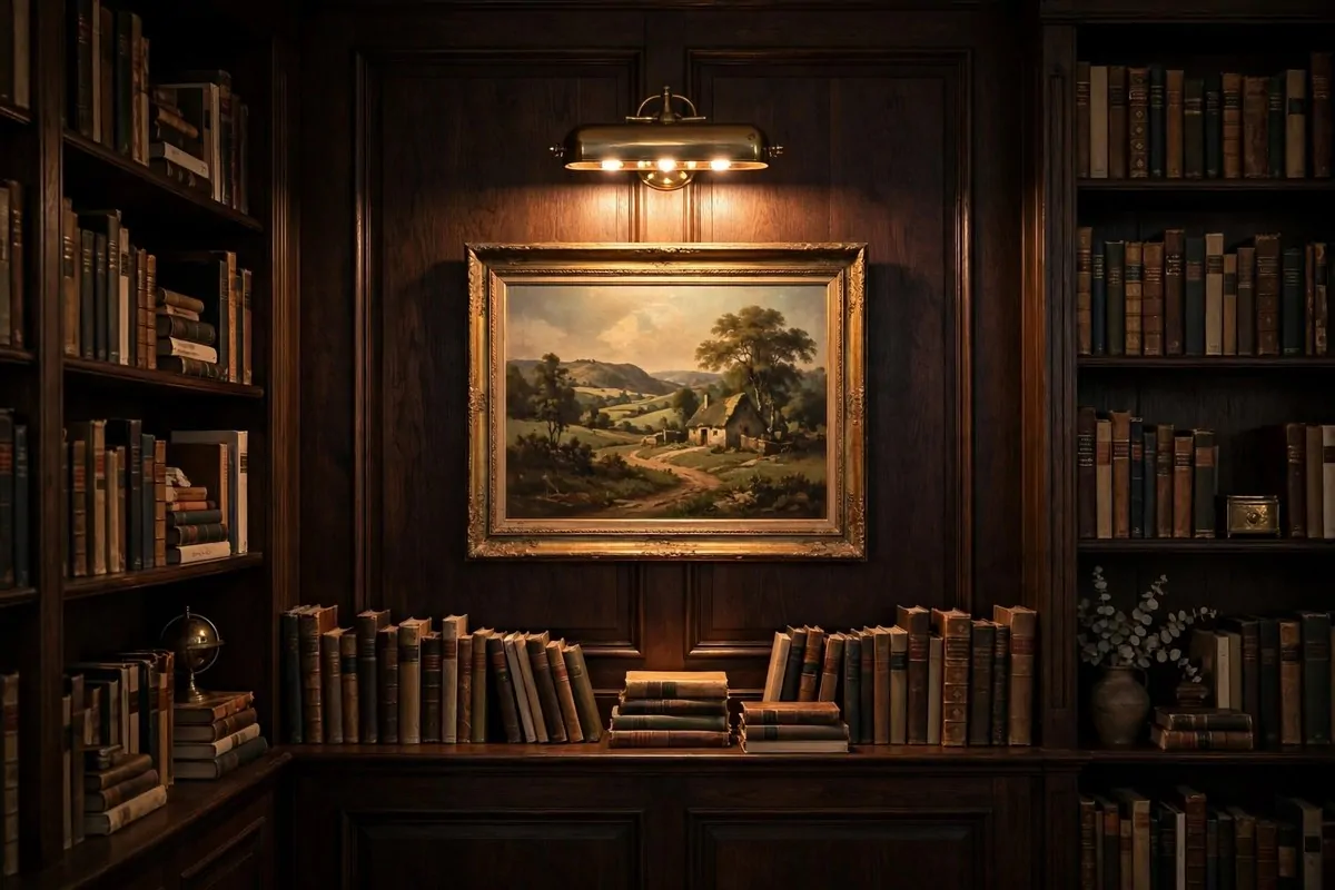
Above the reading chair, hang a painting with weather in it.
A foggy path. A moonlit lake.
Trees disappearing into mist. These moody landscapes fit a library like they were made for it. The room feels scholarly just by association.
This is the one spot where drama is welcome. The painting hangs where your eyes land when you look up from your book. It should feel like another world waiting.
Keep it to one piece. One foggy landscape is atmosphere.
Three is a theme park. Let it breathe.
An oil-style print in a dark frame works perfectly. You do not need a real painting. A good print with a bit of texture fools everyone.
Warm light makes these paintings glow. A small lamp on the side table does the job. At night the painted fog almost moves.
I look at mine during slow chapters. It gives my eyes a place to rest that is still inside the story, somehow. A misty forest and a fantasy novel are old friends.
Dark greens and grays suit dark academia walls. If your library is lighter, pick a painting with soft gray tones. It still reads moody without the goth.
11. Fit Tall Narrow Art Into the Slot Between Cases
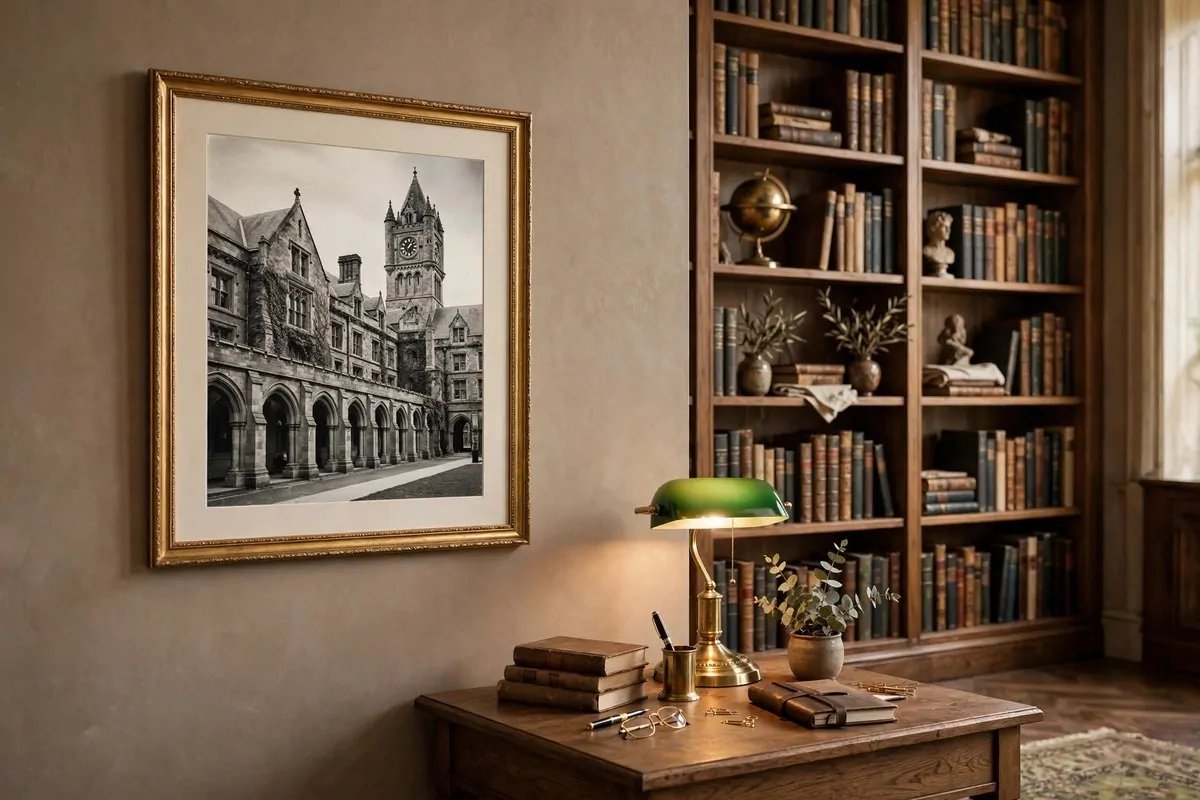
Most bookshelves leave a thin gap. Between two cases, or between a case and the door frame.
That gap is not wasted space. It is a spot for tall narrow art. A vertical print there draws the eye up and makes the whole wall feel taller.
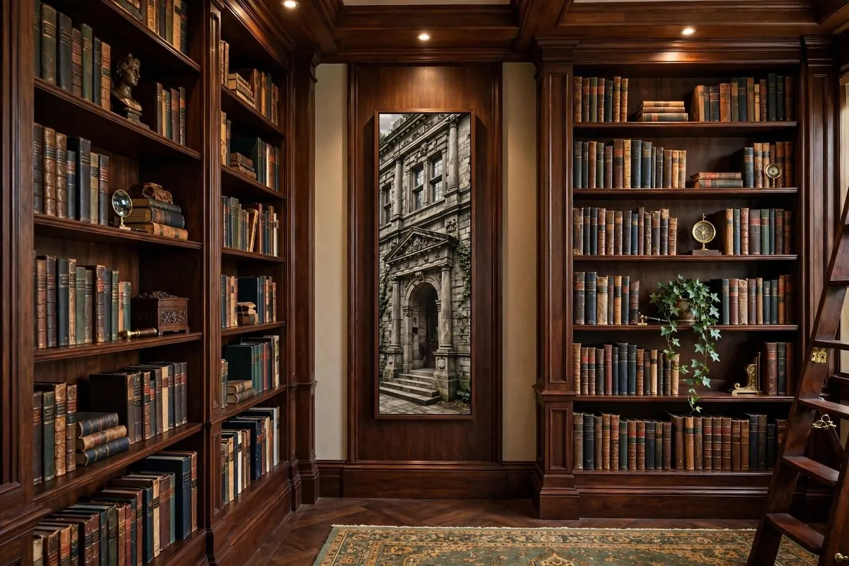
University towers fit perfectly. So do tall trees, narrow city streets, and lighthouse photos. Anything that goes up more than across.
Keep it twelve to sixteen inches wide. Wider and it looks squeezed.
Narrower and it looks lost. The gap decides the size, not you.
One piece per gap. That is the rule. The slot is too small for a gallery and too tall for clutter.
I have a slim print of an old library staircase in my gap. It is my favorite piece in the room and nobody notices it at first. Then they do, and they love it.
Match the frame to your shelves. Same wood, or same color. It makes the print feel like part of the bookcase instead of an afterthought.
This trick costs almost nothing and uses a spot that was doing nothing. Tall narrow is the secret weapon of library walls.
12. Size Every Piece by the Two-Thirds Rule
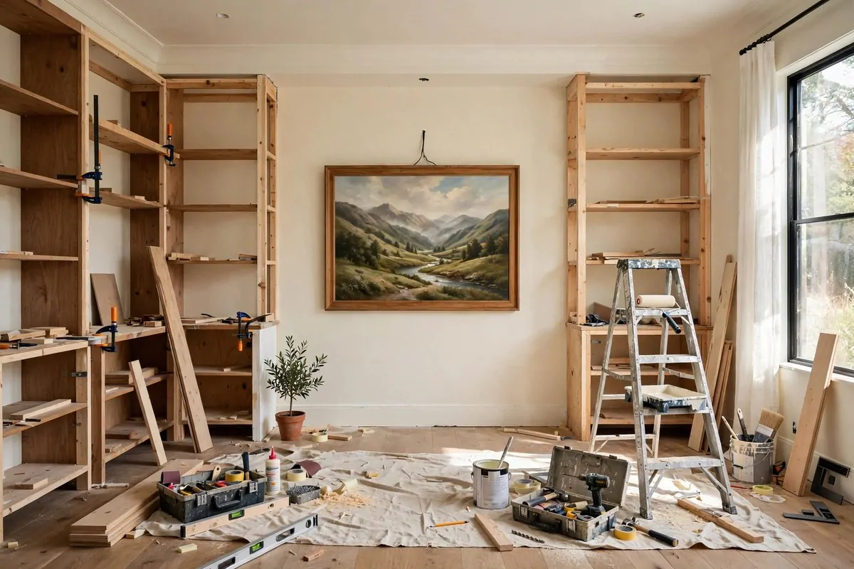
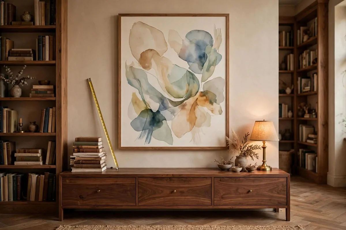
Here is the rule designers use. Art should be about two thirds the width of whatever sits below it.
A piece that is too small looks lost on a big wall. I learned this the hard way with a tiny print that floated sadly above a long shelf. It looked like a postage stamp.
Measure the furniture first. A sixty inch desk wants a forty inch piece.
A seventy two inch shelf run wants something about forty eight inches wide. The wall section counts, not the whole room.
| Furniture width | Ideal art width | Good spot |
|---|---|---|
| 60 inch desk | 36 to 40 inches | Above the desk |
| 72 inch shelf run | 44 to 48 inches | Above low shelves |
| 36 inch gap between cases | 20 to 24 inches | In the slot |
| 48 inch reading nook | 28 to 32 inches | Above the chair |
In a library, the shelves count as furniture. You size the art to the free wall between the cases, not to the whole wall.
Hang the center at fifty seven to sixty inches from the floor. That is standing eye level. If the art hangs where you face it from a chair, drop it two or three inches lower.
Break the rule once on purpose if you want. A tiny piece in a big mat can work. But break it knowing the rule, not by accident.
Tape the size on the wall first. Cut newspaper to the art size and tape it up.
Live with it a day. Your eyes will tell you if it is right.
Good sizing is invisible. Nobody says, nice proportions. They just say, this room feels right.
13. Hang a Wide Panorama Above a Low Run of Shelves
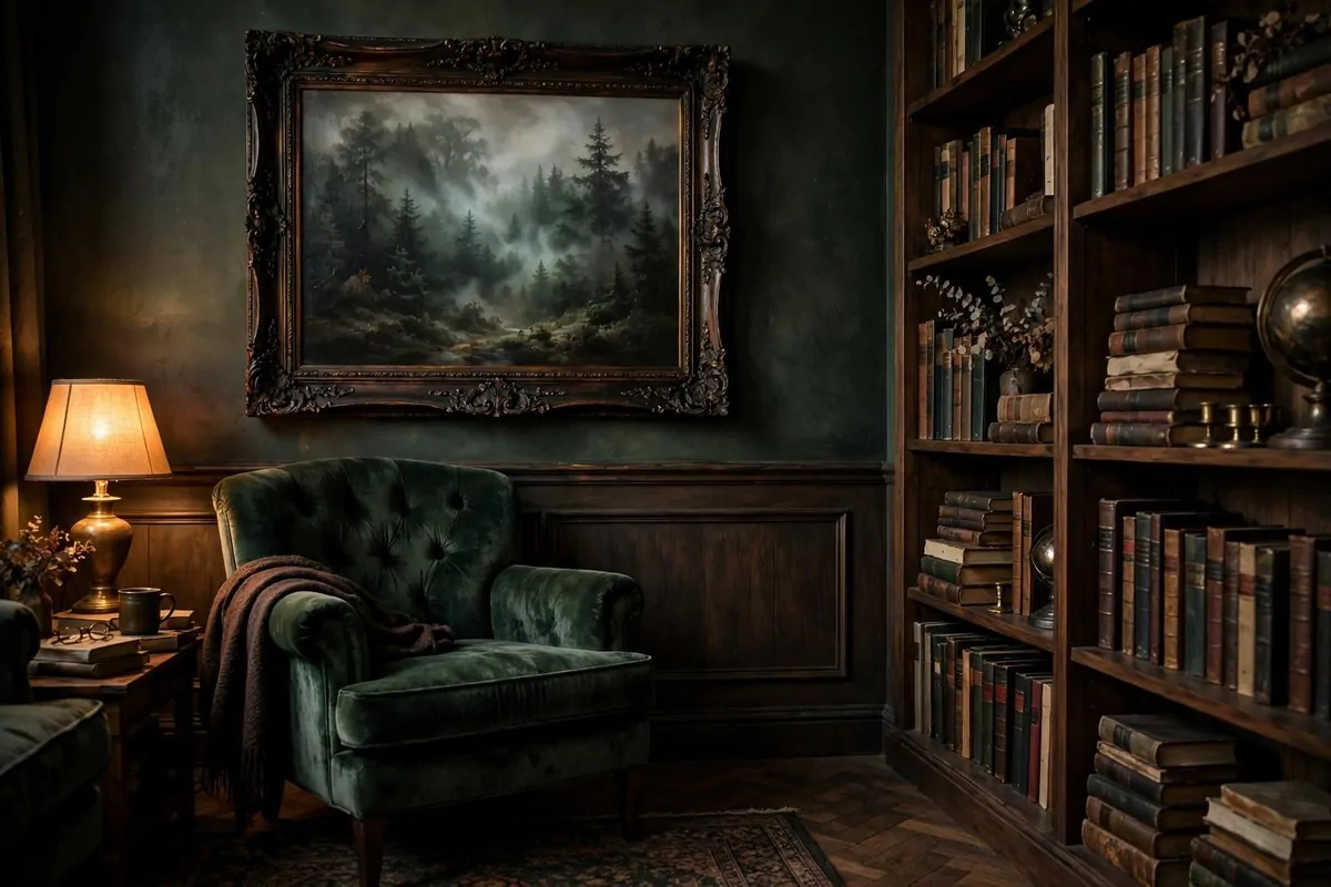
Low shelves are a gift. They leave a whole wall of space above them.
That space wants something wide. A panoramic print, twice as wide as it is tall. It reads like a horizon and stretches the wall sideways.
Panoramic maps are my favorite for this spot. An old coastal chart, long and low.
Or a wide mountain skyline. The horizontal shape matches the horizontal shelves perfectly.
Keep six to eight inches between the shelf top and the frame bottom. Close enough to feel connected. Far enough that tall books on the shelf do not touch the art.
One wide piece beats a row of small ones here. Small frames above long shelves look like crumbs. One wide sweep looks like it was planned.
This is a great spot for a print you already love. That poster rolled up in the closet?
Check if the proportions work. Low shelves are very forgiving.
The wide shape calms a busy shelf. All those vertical spines get a horizontal rest above them. The whole wall feels balanced.
I hung a wide foggy coastline above my low shelves. When I sit across the room, it looks like a window. Best window in the house, and it never needs curtains.
14. Paint a Bold Arch Mural Behind the Reading Chair
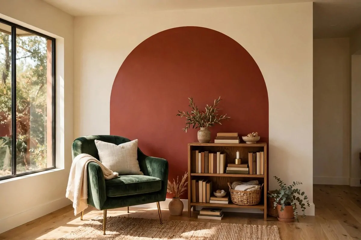
A painted arch is the easiest mural you will ever do. One shape, one color, one afternoon.
The arch frames your reading chair like a doorway into the story. It gives the chair a backdrop, a stage. Suddenly the corner looks designed instead of accidental.
Pick a color with some courage. Terracotta, deep green, warm mustard.
The arch should contrast with the wall around it. A shy color defeats the purpose.
Trace it with a pencil first. A piece of string pinned at the center works as a compass for the curved top.
Two straight lines down the sides. Fill it in with a small roller.
Make the arch wider than the chair. About a foot wider on each side.
It should hug the chair, not squeeze it. Tall enough that the top of your bookshelf can tuck under it too.
This trick works in the tiniest corners. A narrow wall that fits nothing else can hold an arch and a chair. It is a whole reading nook made of paint.
Layer your shelves against it. A low bookcase in front of the arch looks custom, like the arch was painted for the shelf. The two pieces finish each other.
One arch, one chair, one lamp. That is the whole formula.
I painted mine on a rainy Saturday and sat in front of it that same evening. Best ten dollars I ever spent on this room.
When you get tired of the color, paint over it. It is just paint.
That freedom is why this idea is so good. You can be brave because nothing is permanent.
15. Try Bookshelf-Print Wallpaper for an Instant Library Wall
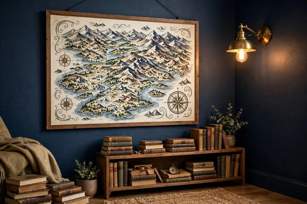
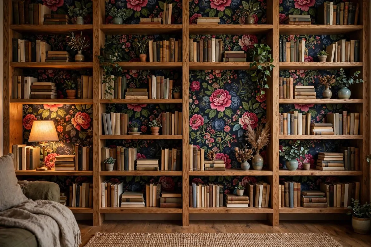
This is the boldest idea on the list. Wallpaper printed to look like a wall of books.
It fools people. From across the room, it reads as a real library.
Up close, you see the trick, and you smile. It is playful in a way libraries rarely are.
This is perfect for a small space. A hallway, a landing, the wall behind a desk. You get the library feeling without losing a single inch to real shelves.
Put a real chair in front of it. The mix of real furniture and printed shelves is what sells the illusion. A lamp and a side table complete the scene.
Quality matters here. Cheap prints look flat and shiny.
Look for wallpaper with good detail and a matte finish. Read the reviews before you order.
You can also do just one wall. One printed wall and three plain walls. That keeps it a fun accent instead of a theme park.
Kids love this one. A bedroom wall of printed books makes reading feel like an adventure. My friend’s son reads in front of his every night.
It pairs well with a few real shelves too. Hang two real shelves on the printed wall. The line between real and printed blurs, and guests do a double take.
16. Paint a Chalkboard Wall for Quotes and Your TBR
Some walls should be allowed to change.
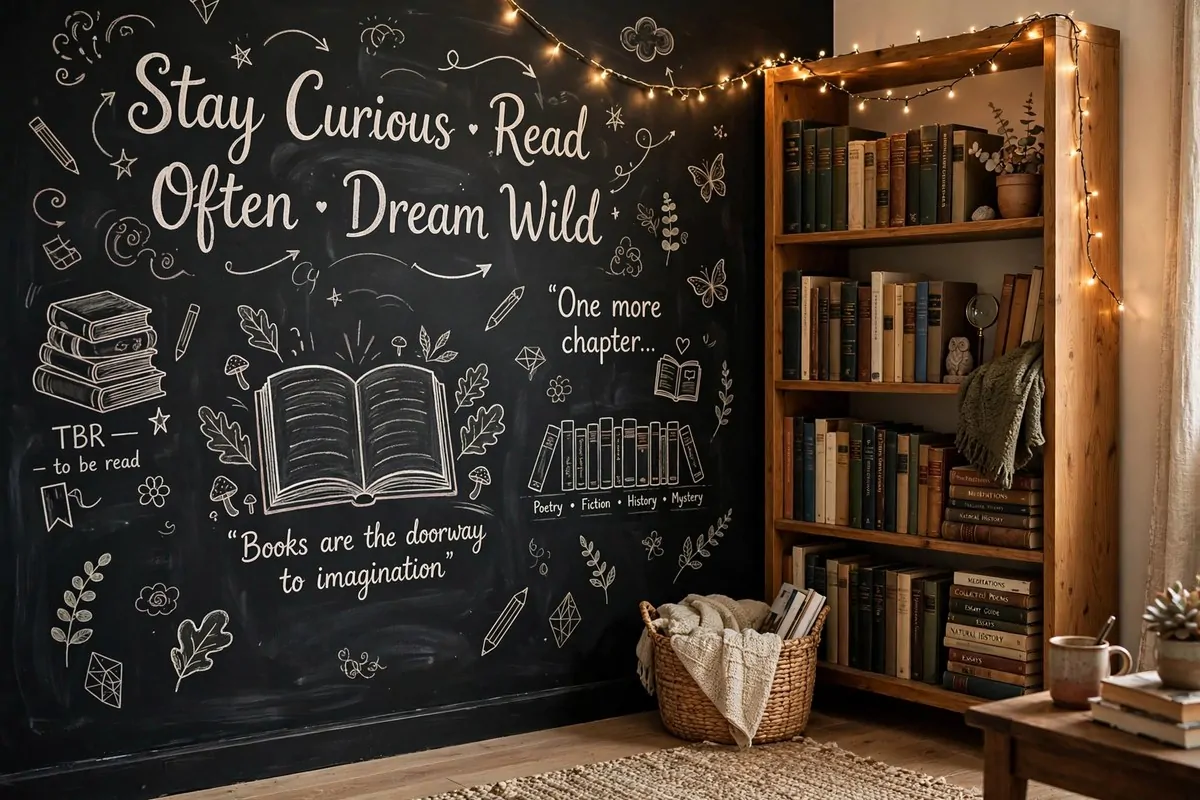
Chalkboard paint turns one wall into a living piece of art. Write your favorite quote big.
Draw a little stack of books. List your to-be-read pile down the side.
The best part is the impermanence. Bored of the quote?
Wipe it off. New favorite book?
Add it to the list. The wall grows with your reading life.
Write big. Small handwriting on a big wall looks timid. Big loopy letters fill the space and look confident, even if your handwriting is not perfect.
Use real chalk, not markers. Chalk has a soft dusty look that fits a library.
Markers look too sharp. Keep a little tray with chalk and an eraser nearby.
Frame the chalkboard area if you want it tidy. A simple wood frame around the painted section makes it look finished instead of messy.
This is a great wall for kids. They can add their own books to the list.
My nephew draws the covers of books he finishes. The wall is his trophy shelf.
One wall is enough. A whole room of chalkboard feels like a classroom. One wall feels like a secret.
Start with one quote you love. Stand back and look.
Then add from there, slowly, over weeks. The best chalkboard walls grow like journals.
17. Hang One Picture Light Over Your Library Art
A picture light is a small lamp that mounts above a frame. It washes the art in warm light.
This one little light changes everything at night. The art glows while the rest of the room goes dim. Your library feels like a museum after hours.
Battery picture lights are the easy route. No wiring, no electrician.
You stick them up with screws or even strong magnets. Charge them once a month.
Brass suits a classic library. Black suits a modern one. The light itself becomes part of the look, so pick a finish you like seeing in daylight too.
One light per piece. Two lights on one frame looks fussy. If you have a gallery wall, light the middle piece or the biggest one.
Warm light, always. Cool white light makes art look like an office. Warm light makes it look like a painting in an old house.
The light also helps you see. Reading rooms get dim in the corners. A picture light over the art adds a second layer of glow without a new lamp.
I added one over my map and my husband thought I bought new art. Same map, new light. That is how much difference it makes.
Do not light everything. One glowing piece is special. Five glowing pieces is a hardware store.
18. Keep the Walls Calm With Just One Statement Piece
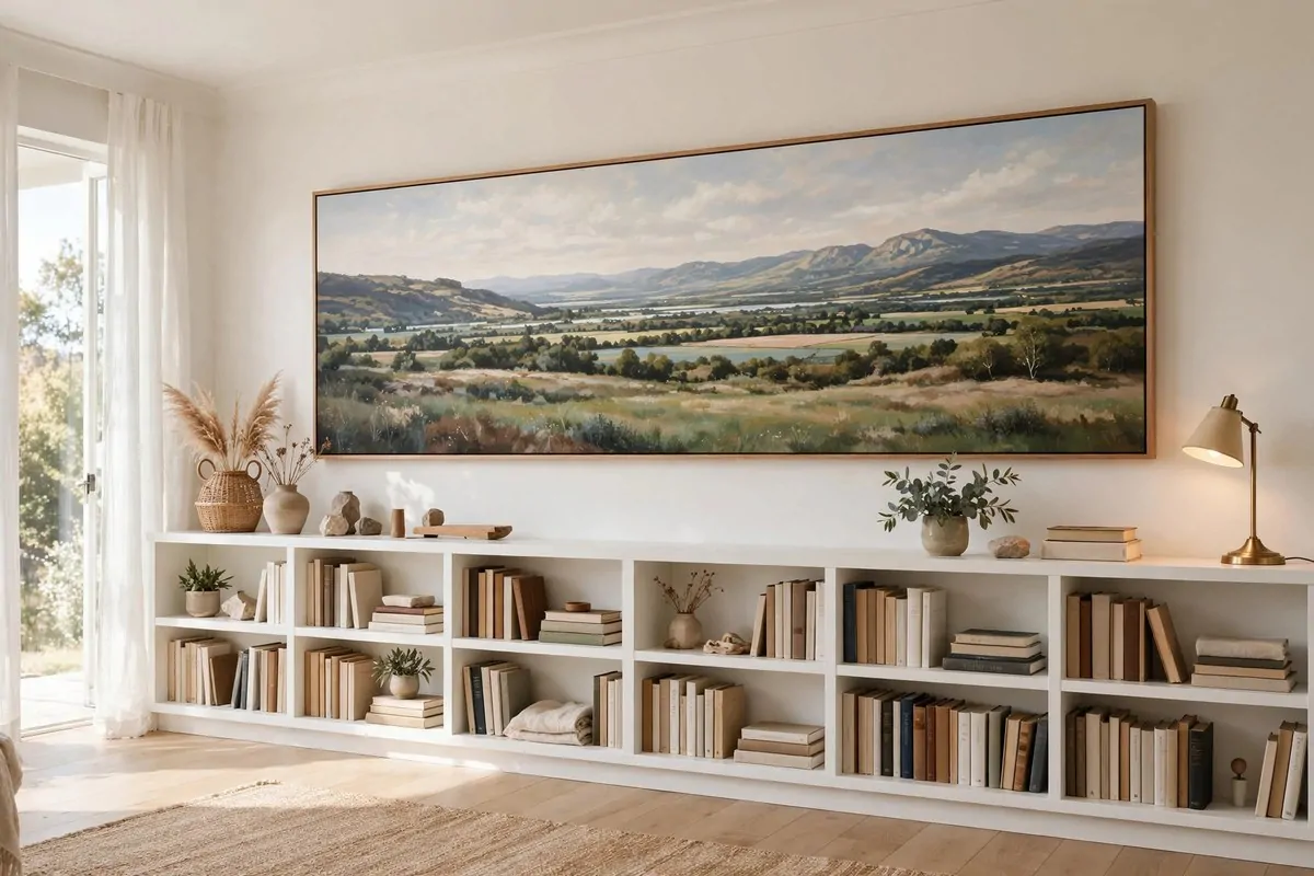
Here is a brave idea. Hang one piece and stop.
A library with one picture reads as a library. A library with six pictures reads as a gallery.
The books are already a lot of visual noise. They need a calm wall.
Pick the wall you face from your reading chair. That wall gets the one piece. Everywhere else, let the shelves do the talking.
The piece should be big. Small and alone looks like you forgot to finish. Big and alone looks like a choice.
This works beautifully in small rooms. One statement piece gives a tiny corner a focal point without crowding it. Less really is more here.
Choose something you never get tired of. You will look at this piece every day. Pick the painting that feels like a deep breath.
Leave the rest of the wall empty on purpose. Empty wall is not unfinished wall. It is the frame around your one piece.
My reading corner has exactly one painting. Friends always comment on how calm it feels. The calm is the empty wall doing its job.
Restraint is a design skill. Anyone can fill a wall. It takes confidence to hang one piece and walk away.
19. Hang University and Library Facade Prints
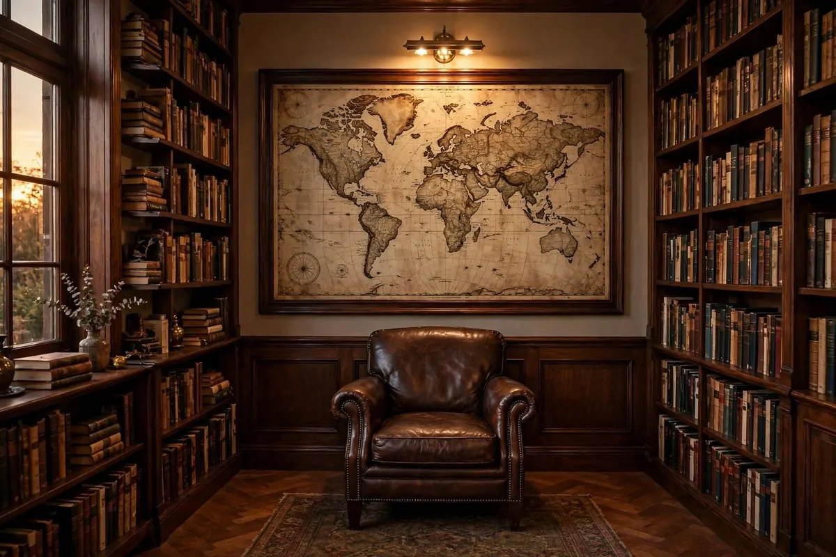
Some buildings are made of books, spiritually speaking.
Old universities, grand libraries, stone facades with clock towers. These buildings hold the books we love. Their pictures bring that history into your home.
These prints suit the narrow spots. Beside a desk.
In the slot between two cases. They are often tall and vertical, which fits library walls perfectly.
Sepia and stone tones blend with wood shelves. The gray stone and brown wood are old friends. A black frame keeps it crisp.
One facade print above a writing desk is a classic study look. It says, this is a serious reading spot. Even if you mostly read novels in your pajamas.
Pair it with a brass lamp if you have one. The warm metal and the stone building look like they belong to the same century.
These prints are easy to find. Old architecture photos are everywhere, and they print beautifully in large sizes.
Hang it where you see it when you sit down to read. It is a little window into the great libraries of the world, right above your own small one.
20. Pick the Free Wall First, Build the Shelves Around It
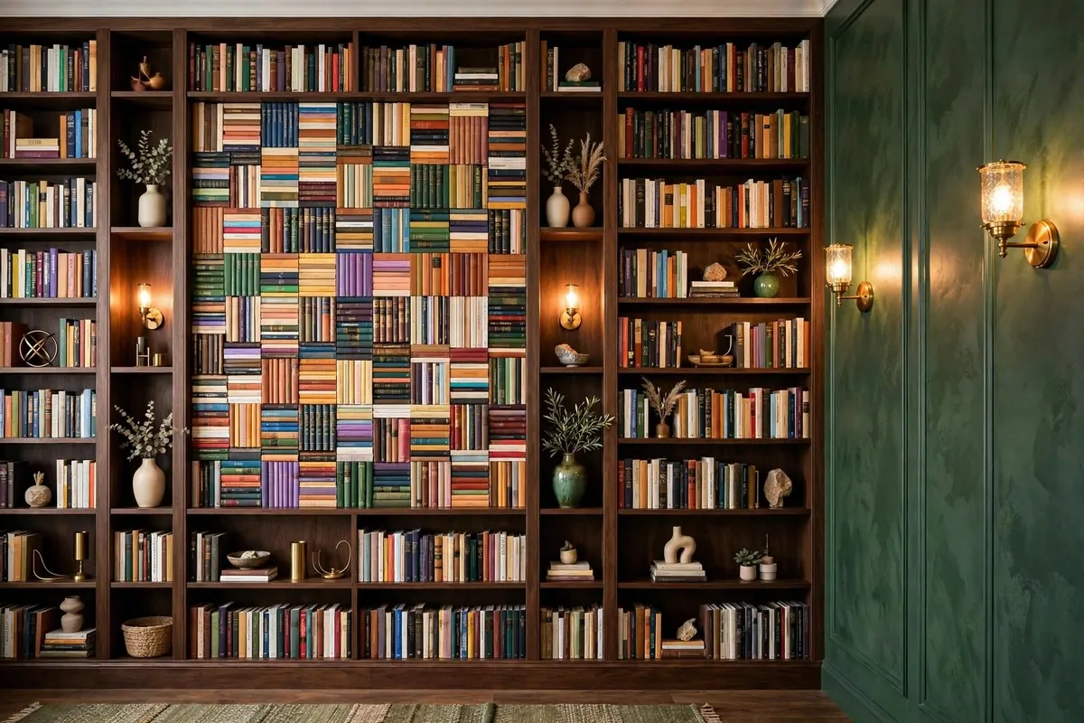
Most people build the shelves first. Then they stare at the leftover wall and wonder what to do with it.
Flip the order. Decide your art wall first.
Pick the piece, pick the spot, hang it. Then build the shelves around it.
This sounds backwards, but it works. The art gets the best wall in the room.
The shelves fill in around it like a frame. Nothing ends up stranded.
Start with an empty room if you can. Stand in it.
Find the wall your eyes go to naturally. That is the art wall. Mark it before a single shelf goes up.
Your shelves become the frame for your art. Two tall cases on either side of a big painting look intentional and grand. The painting looks like it was always meant to be there.
This also stops the small-print problem. When art comes last, it is always too small for the leftover space. When art comes first, it is sized right from the start.
Plan the lighting for the art wall early. A picture light needs a spot.
A reading lamp needs an outlet. Easier to plan wires before the shelves block everything.
I wish someone had told me this before my first library corner. I built shelves, then spent a year with a sad little print floating on the leftover wall.
Art first. Shelves second. Your future self will thank you every time she sits down to read.
Keep Reading
If your shelves are hungry for more ideas, these posts will feed them. 30 Library Ideas That Make Every Book Lover Swoon is my full plan for building a home library from scratch. 24 Home Library Aesthetic Looks You’ll Want to Save covers the moods, from dark academia to light and airy. For a dreamy bedroom corner, 23 Bedroom Library Ideas for a Dreamy Reading Retreat is full of cozy setups. And 16 Office Reading Room Ideas Cozy Enough to Linger In blends books and work in the prettiest way.