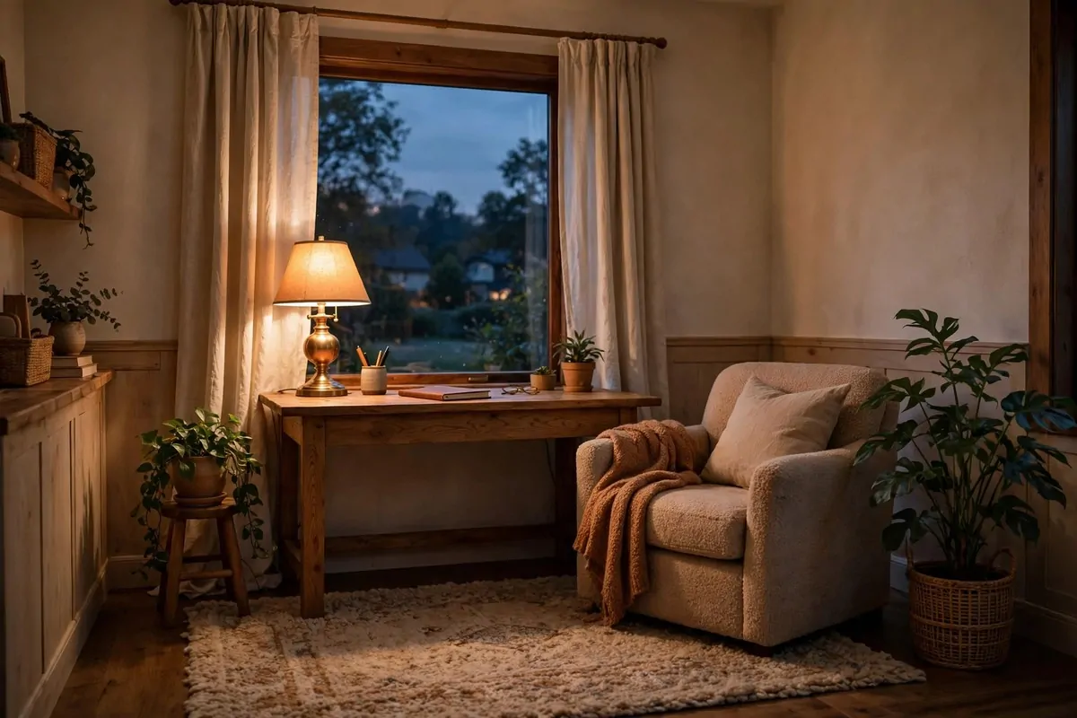
23 Home Office Room Design Ideas Pros Always Use

Last Tuesday at half past five, my manager’s camera clicked on and I got my first real look at her home office.
It was not big. It was not fancy. But it looked finished. The desk sat under a window. The lamp glowed warm. The shelf behind her held books and one small plant, and nothing, not one thing, looked out of place.
My own office, right that second, had a cable hanging off the desk like a vine and a pile of papers I kept meaning to file. I stayed quiet on the call and took notes instead. Not meeting notes. Room notes.
I wanted to know what made her room look so calm when mine looked so loud. It turns out the answer is not money. It is a short list of design moves that pros use in almost every home office they build.
I asked around, I read what working designers actually do, and I collected 23 of their best Home Office Room Design ideas here. Steal them. They are meant to be copied.
1. Zone the Room: Give Every Corner a Job
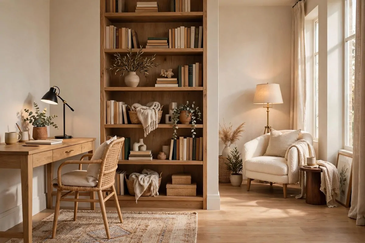
Pros never treat a room as one big blob. They split it into zones, and each zone gets one job.
My office has three zones now. A work zone with the desk. A reading zone with a chair and a lamp. A storage zone with the shelves.
Each zone feels like its own little room. I move between them and my brain switches tasks with me.
- A rug marks the work zone. When I am on the rug, I am working.
- The reading chair faces away from the desk. Out of sight, out of mind.
- Shelves sit between zones like a soft wall. They divide without closing the room.
- Each zone gets its own light. The desk gets the bright lamp, the chair gets the warm one.
This works in rooms of any size. My zones are small, but they are real.
The trick is keeping the zones honest. If papers pile up in the reading chair, the zones collapse. I tidy the chair every evening.
Designers call this zoning. You can call it giving your room a map.
Start with two zones if three feels like too much. Desk zone and everything else. That alone changes how the room feels.
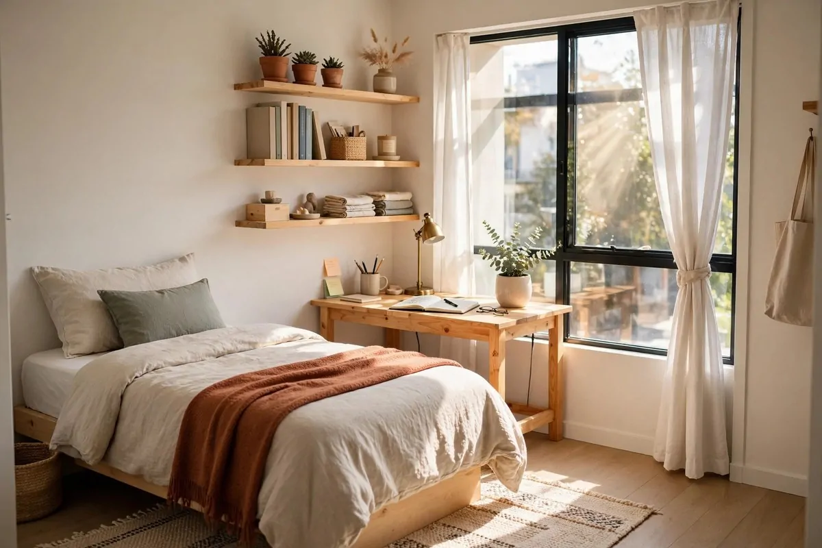
2. Put the Desk Where the Light Lives
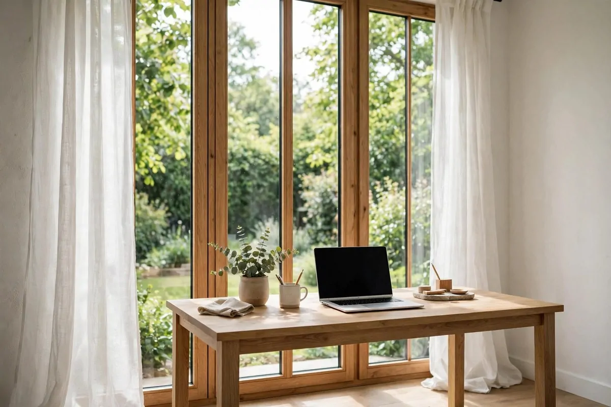
Ask any designer where the desk goes and most will point at the window. Light is the best free design tool.
I moved my desk to face the window last year. My afternoon slump got smaller. My eyes stopped burning by four.
Natural light also makes video calls look better. Your face glows instead of looking like a shadow.
- Face the window if you can. Side light works too, but facing it is best.
- Keep the screen perpendicular to the window if glare hits. A small turn fixes most glare.
- Sheer curtains soften harsh sun. They cost little and look soft on camera.
- If you have no window, a daylight lamp is the next best thing. Pros use them in windowless rooms.
My window faces a garden wall. Not a great view. Still, the light matters more than the view.
One warning. Direct sun on your back makes you a silhouette on calls. Face the light or sit beside it, never with your back to it.
Designers plan rooms around windows first and furniture second. Do the same. The desk follows the light.
This one move costs nothing and changes the whole feel of the room.
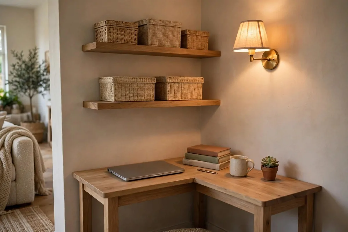
3. The L-Shaped Desk Pros Swear By
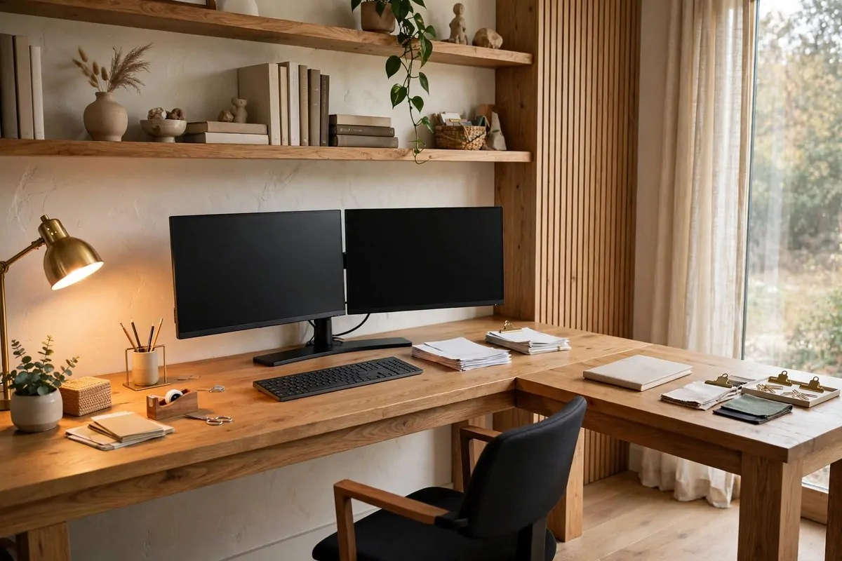
Watch any office designer work and you will see the L-shaped desk appear again and again. It is their favorite for a reason.
An L gives you two work surfaces in one corner. Computer on one side, papers or crafts on the other. You swivel, not walk.
I use one arm for my monitor and one for my notebook. The corner between them holds my lamp and my plant.
- The L fits corners, which are the most wasted space in any room.
- Get one at least 55 inches on the long side. Shorter ones feel cramped fast.
- Put the return on your dominant hand side. Right handed people want the return on the right.
- Anchor the corner against the wall. It feels solid and hides the cables.
My old straight desk always had stuff sliding off the back edge. The L holds everything because the corner catches it all.
Designers love it for dual monitor setups. Two screens fit on the long arm without crowding.
If your room is too small for an L, a straight desk with a small side table makes a mini L. Same idea, smaller footprint.
This is the desk shape I recommend to everyone who asks. It just works.
4. Shelves That Run Floor to Ceiling
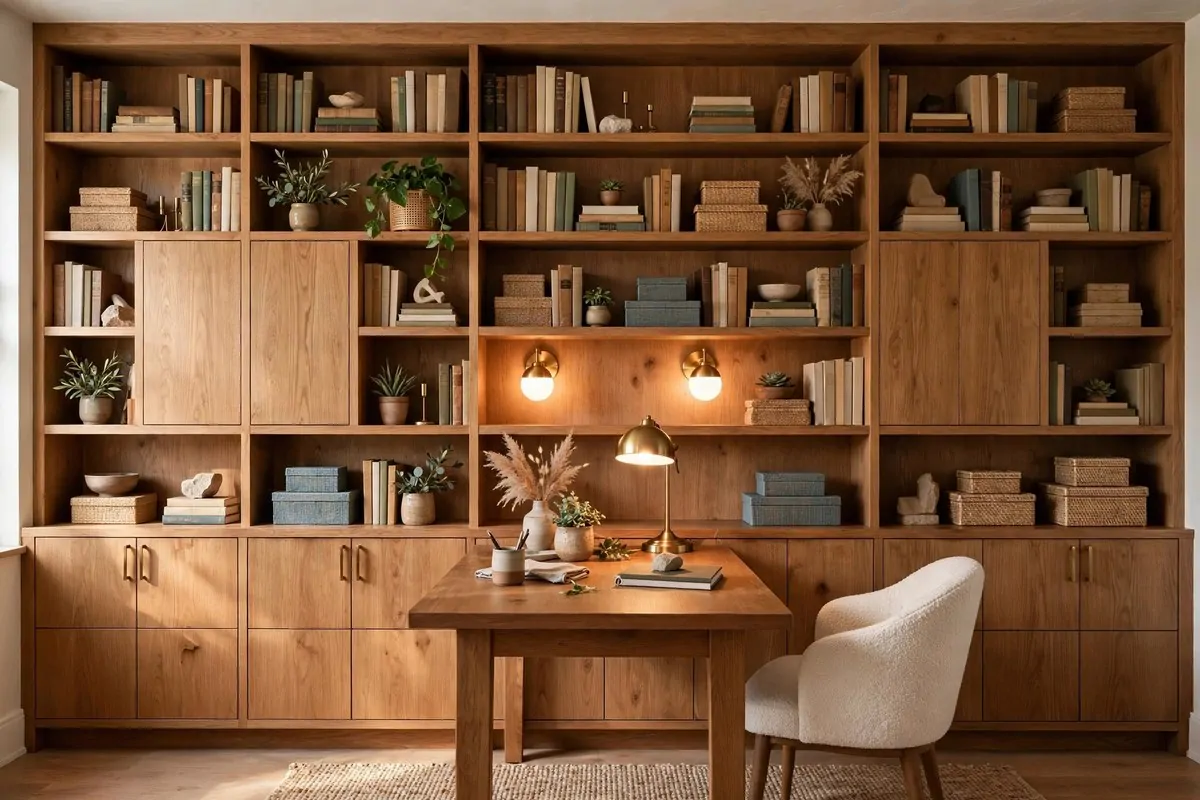
Short shelves make a room look chopped up. Tall shelves make it look grand. Pros always go tall.
My shelf wall runs from the floor to the ceiling. It holds books, boxes, plants, and a few pretty things. It is the backbone of the whole room.
Tall shelves draw your eye up. The ceiling feels higher. The room feels bigger. It is pure visual trickery and it works.
- Anchor tall shelves to the wall. This is not optional. Falling shelves are dangerous.
- Mix open and closed storage. Closed boxes hide the ugly stuff, open shelves show the pretty stuff.
- Put daily items at arm level. Top shelves are for things you touch twice a year.
- Leave some empty space. A shelf packed edge to edge looks stressed.
I style mine in thirds. One third books, one third boxes, one third decor. It looks planned without looking stiff.
The top shelf holds things I love but rarely need. Old cameras, a globe, a framed photo of my grandmother.
Designers use tall shelves as the room’s anchor wall. Everything else in the room points back to it.
One wall of tall shelves can replace a whole closet of storage. And it looks a hundred times better.
5. Floating Cabinets That Keep the Floor Clear
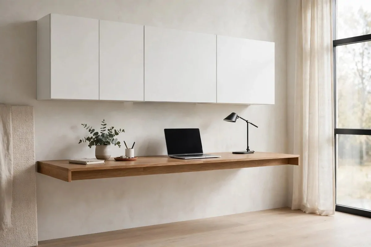
Pros hate visual clutter at floor level. Floating cabinets fix it. They hang on the wall and the floor stays open underneath.
My floating cabinet sits above my desk. It holds printer paper, spare notebooks, and all the boring stuff.
Because it floats, I can sweep and mop right under it. The room feels lighter and cleaner.
- Hang them at eye level above the desk. You should reach them without standing.
- Keep them shallow, 12 inches deep is plenty. Deep floating cabinets look heavy.
- Use push to open doors for a clean look. No handles means no visual noise.
- Match them to your wall color. They blend in and the room feels calmer.
The floating look is modern and tidy. Guests always ask where I got them. They were flat pack and took an afternoon.
I keep one cabinet door for current projects and one for archives. When a project ends, it moves down a shelf. Simple system.
If your walls are weak, use a rail system. It spreads the weight and you can move the cabinets later.
Floor space is the most precious thing in a small room. Stop giving it to boxes and cabinets. Hang them up.
6. A Built-In Desk That Looks Made for the Room
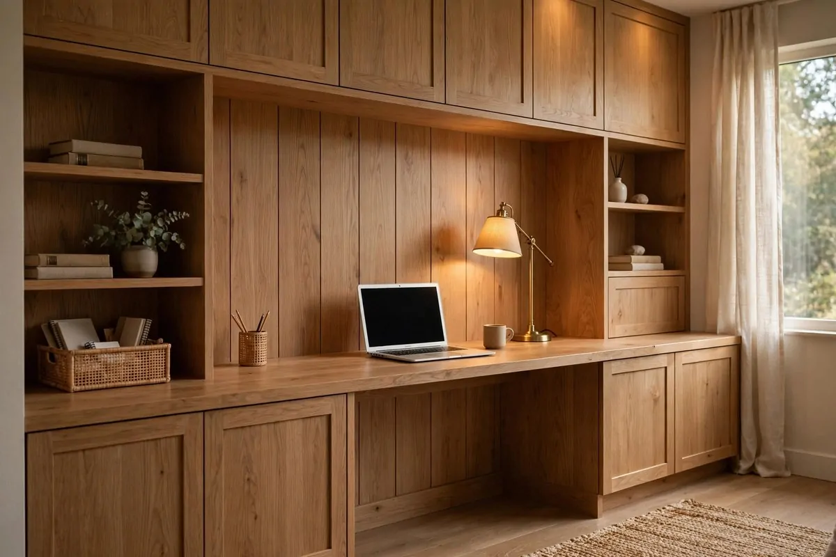
A desk that touches both walls looks custom. A desk that floats in the middle looks temporary.
Pros build desks wall to wall whenever they can. It reads as furniture made for the room, not furniture that happened to fit.
Mine runs the full width of my office nook. No gaps on the sides. No wobble. It looks like a carpenter built it.
- Measure wall to wall, then subtract a quarter inch. Walls are never perfectly straight.
- Use a solid wood or butcher block top. It spans wider without sagging.
- Add a modesty panel or drawers underneath. It hides cables and knees.
- Paint or stain it to match the room. Matching makes it look built in.
I added side shelves at the same height. The whole wall became one unit. It looks expensive. It was not.
The best part is no dust behind the desk. There is no behind. The desk meets the wall on all sides.
If you rent, use a tension fit. Cut the top tight and wedge it in. No screws, no damage, same look.
This is the single biggest visual upgrade in my office. One board, cut to fit, changed the whole room.
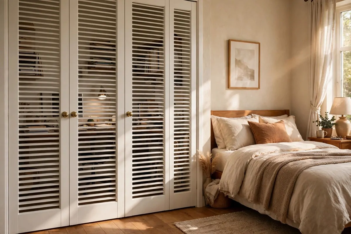
7. Hidden Cabinets for a Calm Camera Background
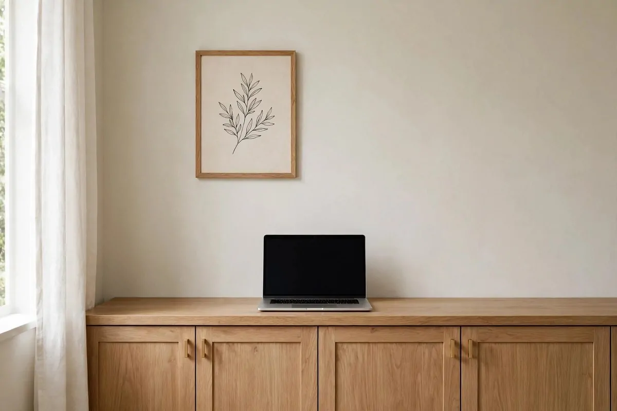
Your video call background is your office’s public face. Pros design it on purpose.
Mine is simple. Closed cabinets, one framed print, a small plant. Nothing moves, nothing distracts.
The secret is closed storage. Open shelves look great in person but messy on a small video square. Closed doors look calm at any size.
- Keep the background wall simple. One or two items is enough.
- Closed cabinets hide the chaos. Open shelves show it.
- Test it on camera before a big call. What looks fine in person can look busy on screen.
- A plant softens the background. One is enough. Three looks like a jungle.
I learned this after a client asked about the pile of boxes behind me. Now the boxes live in the cabinets.
The rest of my office can be a happy mess. The camera wall stays clean. That is the deal I made with myself.
If you share the room, a folding screen works as a portable background. Set it up for calls, fold it away after.
Designers now ask clients where the camera sits before they plan the room. The background wall gets designed first.
Your background is your first impression. Make it boring in the best way.
8. One Accent Wall Behind the Desk
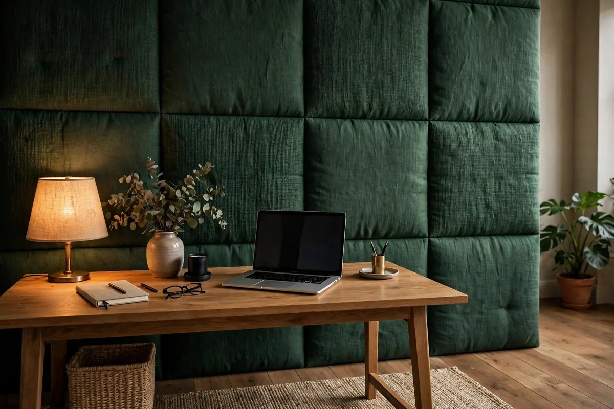
One bold wall beats four boring walls. Pros use accent walls to give a room a focal point.
Mine is deep green with a linen texture. It sits right behind my desk. It is the first thing you see on a video call and the last thing I see at night.
The texture matters as much as the color. Flat paint is fine. Textured panels are better. They catch light and add depth.
- Pick the wall behind the desk. It frames your workspace and your camera background.
- Go bold but not bright. Deep green, navy, warm terracotta. Colors that feel like evening.
- Test a big swatch first. Paint looks different on a whole wall than on a tiny card.
- If paint scares you, try peel and stick panels. They come off clean when you move.
My green wall makes the white desk pop. The contrast is the whole design.
The other three walls stay light. That balance keeps the room from feeling dark or small.
A friend did hers in navy with brass shelves. It looks like a library. Mine looks like a garden room. Same trick, different mood.
One wall. One color. One afternoon of work. The room will feel designed instead of decorated.
9. Warm Wood Tones That Ground the Room
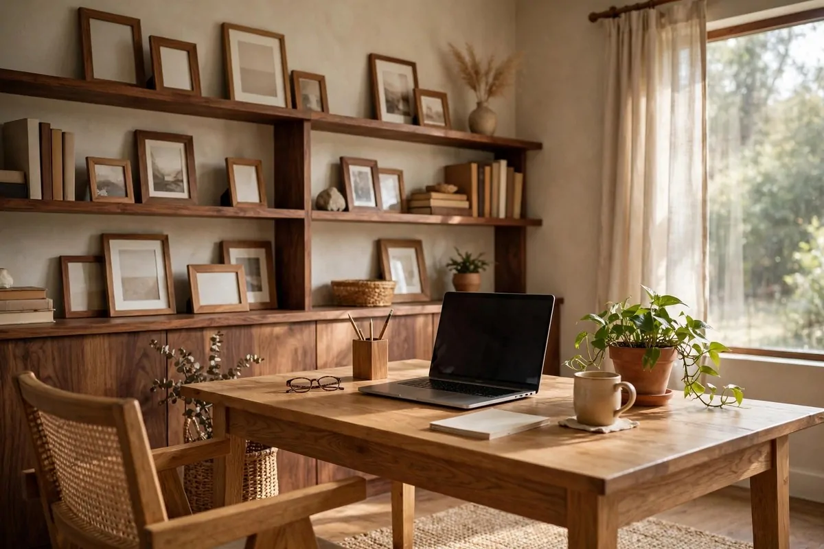
White and gray offices look clean in photos. In real life they can feel cold. Pros warm them up with wood.
My office mixes oak and walnut. The desk is oak, the shelves are walnut, the frames are a little of both.
Wood adds warmth that no paint can fake. It makes a room feel human and lived in.
- Mix two wood tones, not five. Two looks rich. Five looks confused.
- Keep the undertones matched. Warm woods together, cool woods together.
- A little wood goes a long way. A desk and one shelf is enough to warm a white room.
- Oil or wax real wood yearly. It keeps the color deep and the surface smooth.
I worried mixing woods would clash. It does not. Different grains in the same warmth family look natural together.
The wood also photographs well. My video background has that warm glow that white rooms lack.
If your furniture is all white, add wood in small doses. A wooden tray, a frame, a small stool. The warmth builds up.
Designers call wood the grounding element. It is the thing that keeps a modern room from feeling like a showroom.
Touch your desk. If it feels warm and real, the room feels warm and real too.
10. Three Layers of Light, Not One
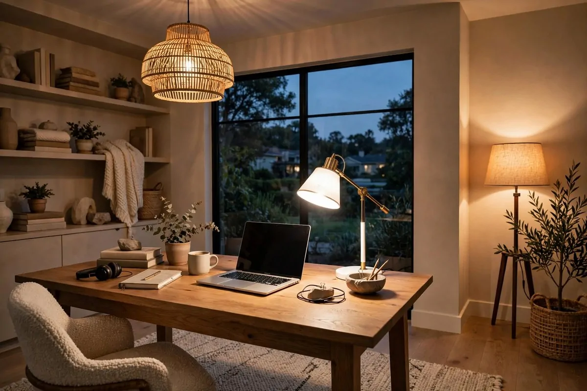
One overhead light makes every room feel like an interrogation. Pros use three layers.
Ambient light fills the room. That is the ceiling light or the window. Task light hits the work. That is the desk lamp. Accent light adds mood. That is the floor lamp or the shelf glow.
My office has all three. The ceiling pendant for general light, the desk lamp for work, and a small floor lamp in the corner for evenings.
- The desk lamp should be the brightest. Your work matters most.
- Use warm bulbs everywhere, 2700K. Mixed color temperatures look wrong.
- Put lights on separate switches or smart plugs. You want one layer at a time.
- The accent light goes in the darkest corner. It kills the cave feeling.
In the evening I turn off the ceiling light and keep the desk and floor lamps. The room glows. It feels like a different place.
This is the lighting plan in every designer office I have seen. Three layers, warm bulbs, separate controls.
It costs less than you think. A good desk lamp and a floor lamp cover two of the three layers.
Light is not one thing. It is three things. Get all three and the room will feel finished.
11. A Big Rug That Anchors Everything
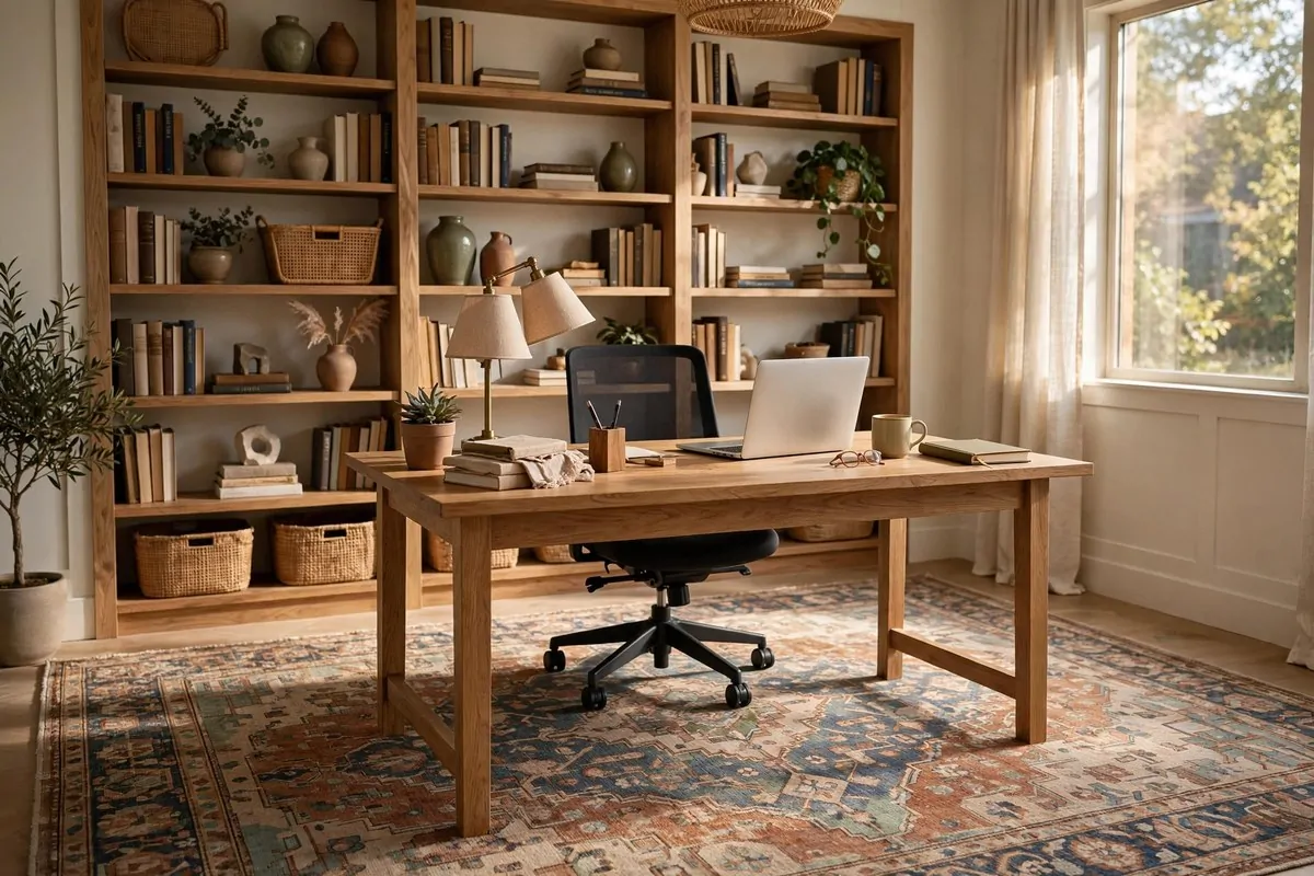
A floating desk in a bare room looks lost. A rug anchors it. Pros size the rug to the zone, not the furniture.
My rug sits under the desk and the chair, with room to roll. It defines the work zone the way a frame defines a picture.
The rug also softens sound. Hard floors bounce noise around. A rug soaks it up. My calls sound better since I got it.
- The rug should fit the desk plus the chair’s rolling space. Measure both.
- Low pile for office chairs. High pile eats wheels.
- Pick a pattern that hides crumbs. Solid light rugs show everything.
- The rug can carry the room’s accent color. Mine has the same green as my accent wall.
I chose a flat weave with a subtle pattern. It looks calm and it cleans easy.
The rug also protects the floor. Chair wheels are brutal on wood. A rug takes the beating instead.
If your room is carpeted, use a chair mat instead. Same anchoring job, less bulk.
Designers call the rug the foundation of the room. Everything else sits on it, literally and visually.
One big rug beats three small ones. Go big or skip it.
12. The Chair Pros Actually Spend Money On
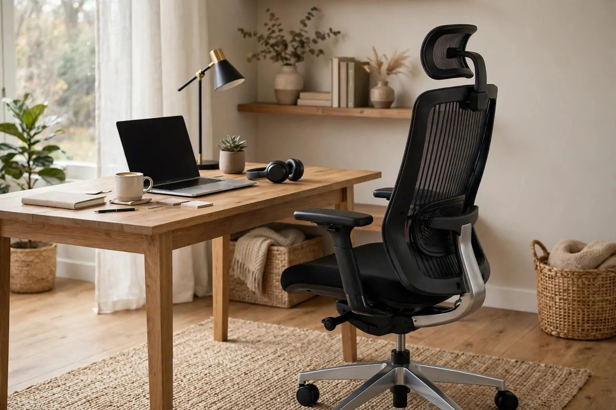
Ask a designer where to spend and where to save. They will say spend on the chair.
You sit in it eight hours a day. A bad chair costs you in back pain, bad posture, and short workdays.
Mine has lumbar support, adjustable arms, and a seat that tilts. It was the most expensive thing in my office. Worth every penny.
- Lumbar support is non negotiable. Your lower back needs it by hour three.
- Adjustable armrests save your shoulders. Fixed arms fit nobody perfectly.
- Try before you buy if you can. Chairs are personal.
- A good chair lasts a decade. Divide the price by ten years. It is cheap per day.
I used a dining chair for a year. My back ached every evening. The new chair fixed it in a week.
The chair also sets the room’s tone. A good looking chair makes the whole office look professional.
Save on the desk lamp. Save on the decor. Do not save on the chair.
This is the one piece of advice every designer repeats. Your body is the most important tool in the room. Support it.
13. Hide Every Single Cable
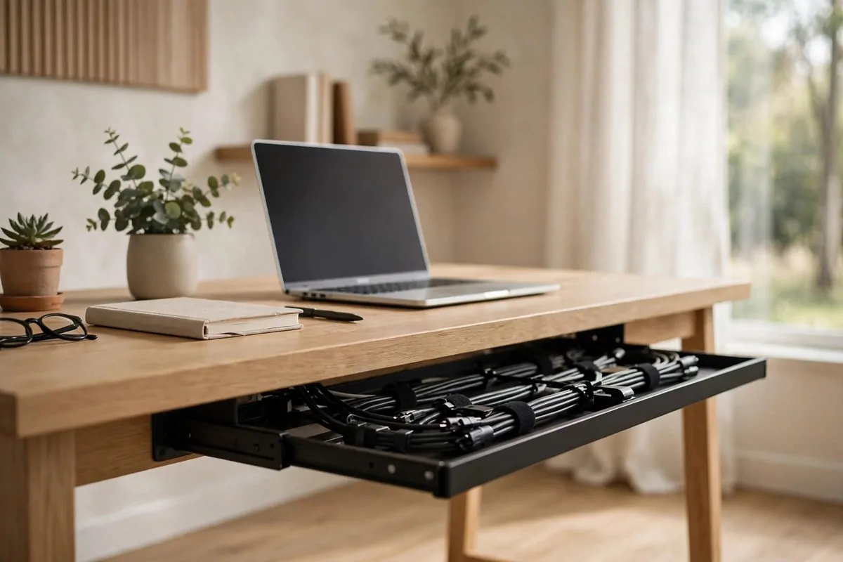
Nothing ruins a designed room faster than cables. Pros treat cable management as part of the design, not an afterthought.
My desk has one visible cable. One. It runs from the laptop to the wall in a neat line. Everything else hides in a tray under the desk.
The tray was the best twenty dollars I spent on this room.
- A cable tray under the desk holds the power strip and all the bricks.
- Velcro ties beat zip ties. You can redo them when you add a device.
- Run cables along the desk leg with clips. They disappear against the leg.
- Label both ends of every cable. Future you will be grateful.
I did this on a Sunday afternoon. It took an hour and the room looked instantly calmer.
The floor under my desk is empty now. I can stretch my feet without kicking a tangle.
Wireless helps too. I switched to a wireless mouse and keyboard. Two fewer cables, just like that.
On video calls, nobody sees a cable jungle behind me. The background stays clean.
Cables are the weeds of the office garden. Pull them, hide them, and the room blooms.
14. Acoustic Panels That Kill the Echo
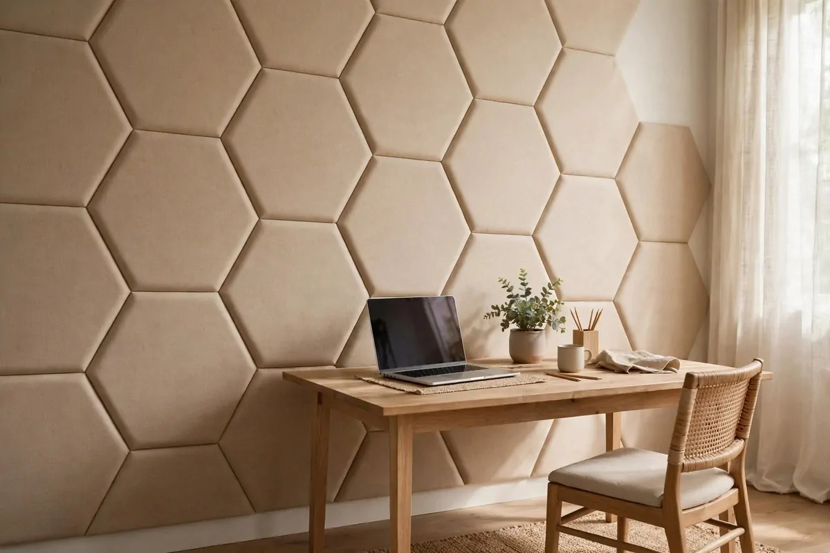
Hard walls bounce sound. Bounced sound makes calls echoey and the room feel harsh. Pros fix it with soft surfaces.
My wall has fabric acoustic panels in a soft geometric pattern. They look like art. They work like sponges for sound.
The difference on calls is huge. My voice sounds clear and close now, not like I am shouting in a bathroom.
- Put panels on the wall behind you first. That is where the mic picks up echo.
- Fabric panels beat foam. They look like decor, not like a recording studio.
- A bookshelf full of books works too. Books are natural sound absorbers.
- Rugs and curtains help. Soft things everywhere means calm sound.
I chose beige panels that match my wall. They blend in and just look like texture.
The panels also cut the hum of the street outside. My room is quieter in every way.
If panels feel like too much, hang a thick tapestry or a quilt. Same idea, softer look.
Sound is invisible design. You cannot see it, but you feel it on every call. Fix the echo and the room feels twice as professional.
15. A Zoom-Ready Background Wall
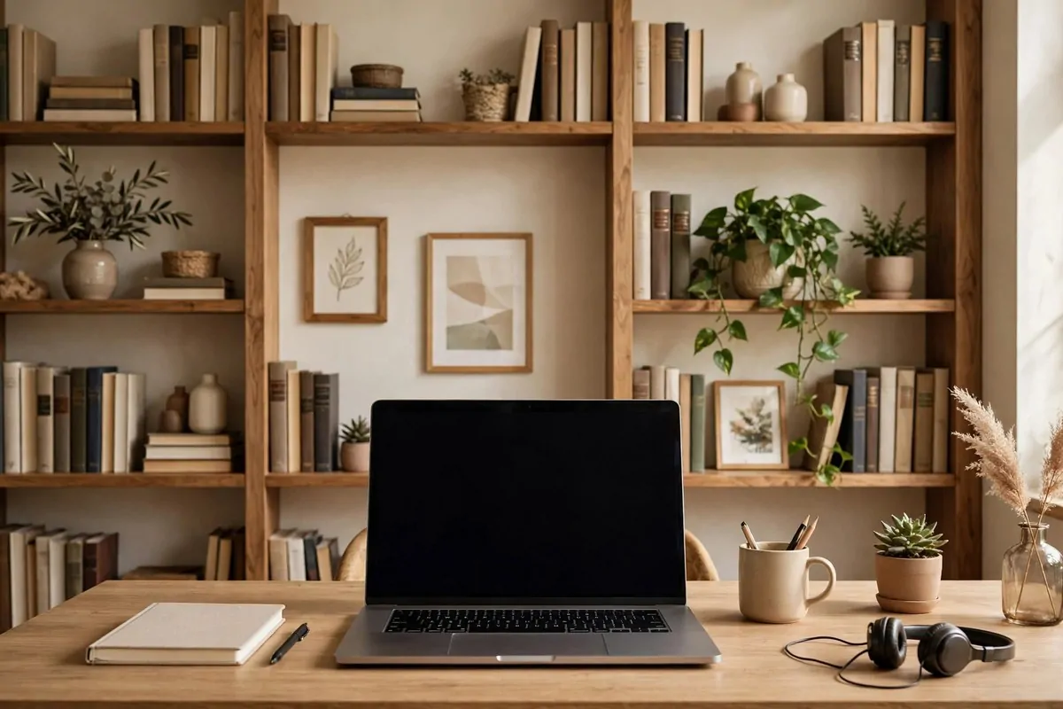
Your background wall is the most seen part of your office. Design it like a set, because it is one.
Mine has a bookshelf with books, one framed print, and a small plant. It took me an hour to style and it looks good on every call.
The rule is simple. A few real things, neatly arranged, with space between them.
- Odd numbers look best. Three books, one plant, one frame.
- Keep it shallow. Deep shelves look cluttered on camera.
- One personal item is enough. A photo or a souvenir. Two starts to look like a museum.
- Check it on camera, not in person. The camera crops and flattens everything.
I move things around every few months. A fresh background keeps calls feeling fresh too.
The books are real books I have read. People ask about them. It starts conversations.
Lighting matters here too. My background gets soft light from the side. No harsh shadows, no dark corners.
Designers now style this wall before anything else in the room. It is the wall the world sees.
Your background tells your story in three seconds. Make it a good story.
16. A Glass Partition That Borrows Light
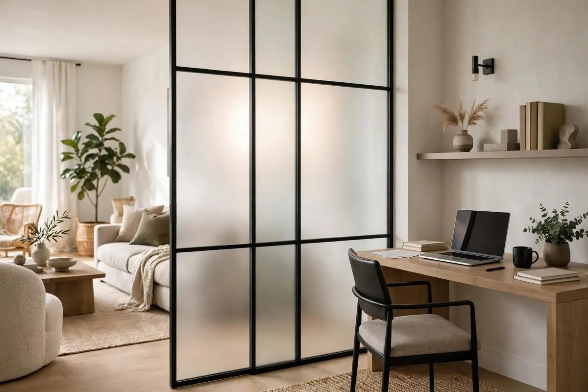
A solid wall blocks light. A glass partition divides the room and lets light flow through.
I have seen this in city apartments where the office sits inside the living room. The glass keeps it separate without making it dark.
Frosted glass is the pro choice. It glows with light but hides the mess. Clear glass looks sharp but shows everything.
- Frosted film on existing glass is cheap. You do not need new glass.
- A glass partition needs a frame. Black frames look modern, wood frames look warm.
- It does not block sound much. Plan for that with soft furnishings.
- Keep the glass clean. Smudges show fast on a partition.
This is a bigger project than most on this list. But in open plan homes, it is the only way to get a real office feel.
The light borrowing is the magic. My friend’s glass walled office gets sun from the living room windows all afternoon.
If a full partition is too much, a glass door does half the job. Light flows, the door closes, the noise drops a little.
Pros use glass when the room has light to share. Do not wall off your only window. Share it instead.
17. The Fold-Down Desk for Rooms With Two Jobs
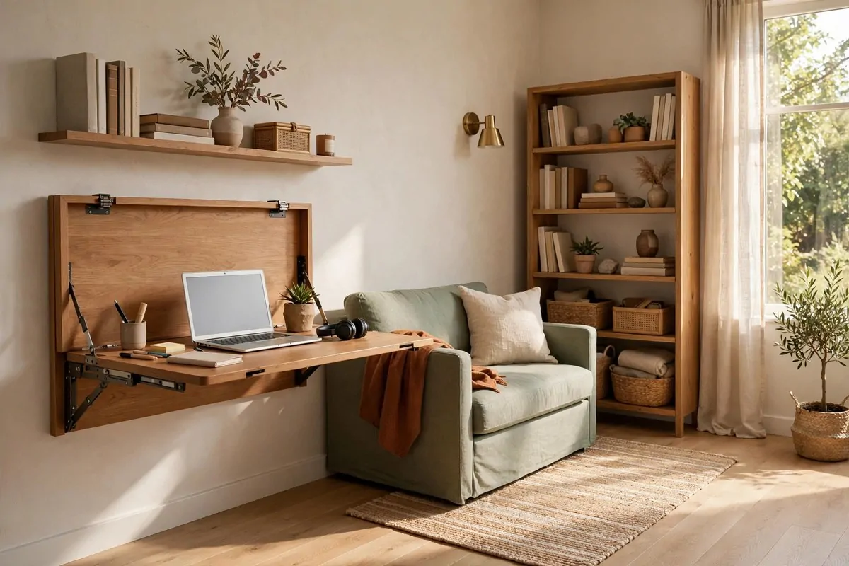
Some rooms work two shifts. Office by day, living room by night. Pros design for both.
A fold-down desk is the hero here. Open it in the morning, close it at six, and the room changes jobs.
My sister’s office is also her guest room. Her desk folds flat against the wall when visitors come. The room looks like a pure guest room.
- Wall mounted desks need solid brackets. This is not the place to skimp.
- Keep the desktop clear of heavy items. You fold it up daily.
- A folding chair tucks beside it. The whole office fits in four inches of wall.
- Add a small shelf above for the things that stay out. Lamp, plant, a book.
The daily fold is a ritual. Open means work. Closed means rest. Your brain learns the signal fast.
| Room combo | Desk solution | Why it works |
|---|---|---|
| Office plus guest room | Fold-down wall desk | Vanishes when guests arrive |
| Office plus living room | Console that opens to desk | Looks like furniture, works like a desk |
| Office plus bedroom | Desk as nightstand | One piece, two jobs, no extra floor |
Designers love convertible pieces because clients love flexible rooms. One room, two lives.
If your room has two jobs, the furniture should too. Anything single purpose is wasting space.
The fold takes ten seconds. The freedom lasts all evening.
18. Real Plants in the Corners
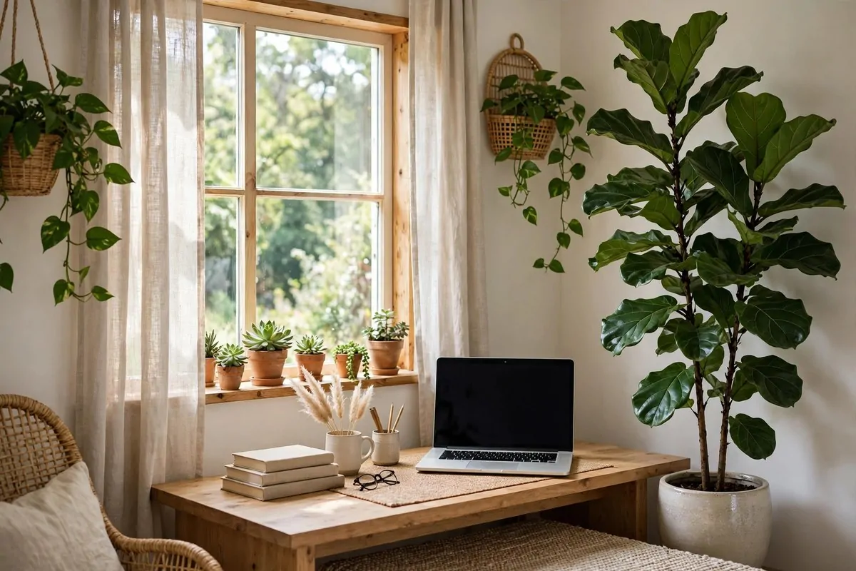
Every designer office has plants. Not one sad succulent. Real green things in real pots.
My office has three. A tall one in the corner, a trailing one on the shelf, and a tiny one on the desk.
They soften the hard edges. Desks and shelves are all straight lines. Plants are all curves. The room needs both.
- Tall plants fill dead corners. A fiddle leaf fig or a bird of paradise owns a corner.
- Trailing plants soften shelves. Pothos drapes over the edge beautifully.
- Match the plant to your light. Dark corner plants die and that is sad for everyone.
- Real beats fake. Fake plants collect dust and fool nobody up close.
I water on Sundays. It is part of my weekly reset. The plants and I start the week fresh together.
The air feels different with plants around. Fresher, calmer, less like a sealed box.
My tall plant is the first thing people notice on calls. Everyone asks about it. It is a better icebreaker than any art I own.
| Spot | Plant pick | Care level |
|---|---|---|
| Dark corner | Snake plant | Nearly none |
| Bright corner | Fiddle leaf fig | Medium |
| On the desk | Small pothos | Easy |
| On a shelf | Trailing philodendron | Easy |
Pros call plants the finishing layer. They go in last and they make everything else look better.
Start with one. You will want more. Everyone does.
19. A Gallery Wall That Feels Like You
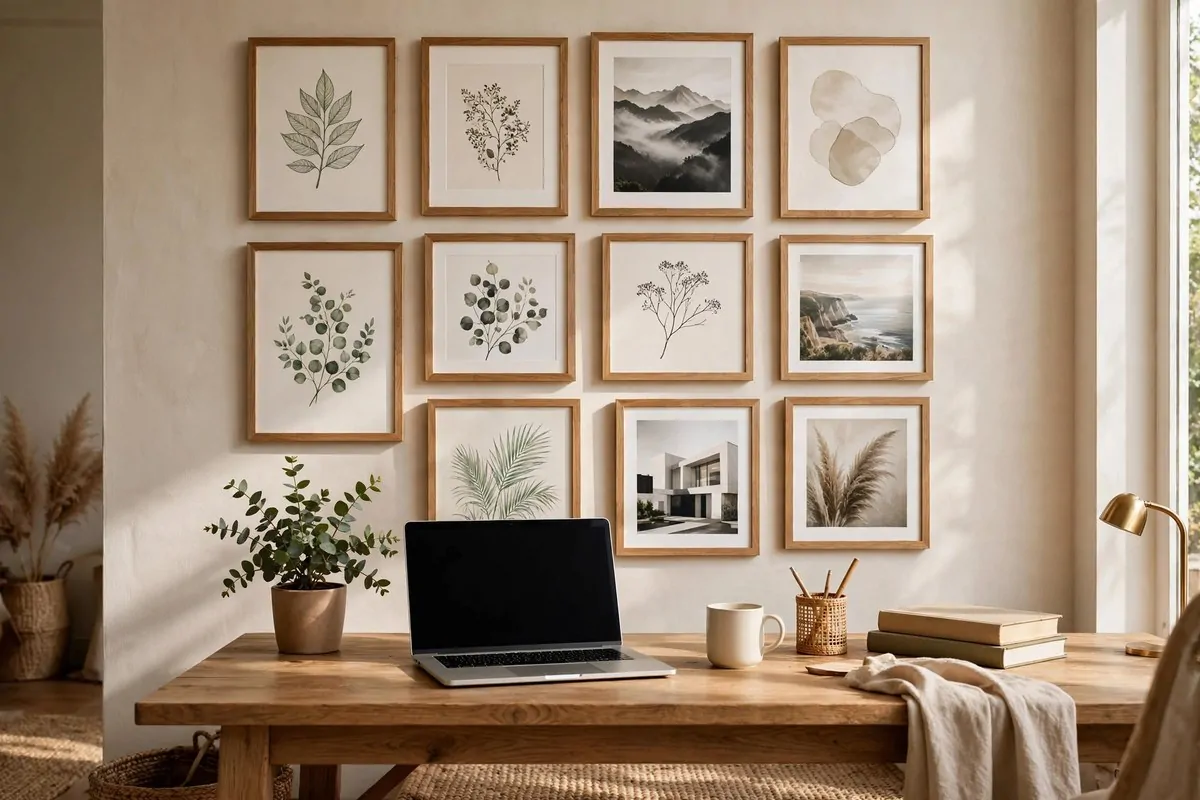
A gallery wall is a cluster of framed art. Pros use them to make a room feel personal without cluttering surfaces.
Mine hangs on the wall beside my desk. Six frames in matching wood. Prints I love, a photo from a trip, a quote that keeps me going.
It is the most me part of my office. Clients see it on calls and ask about the pieces.
- Matching frames unify different art. Six random frames look messy. Six matching frames look designed.
- Lay it out on the floor first. Tape the shapes to the wall before you hammer.
- Start with the biggest piece in the middle. Build outward from there.
- Leave two inches between frames. Tight enough to read as one wall, loose enough to breathe.
I add one new piece a year. The wall grows with me. It is a slow project and I like that.
Keep the gallery off the camera background wall. It is busy by design. Let it live on a side wall where it shines in person.
The frames were cheap and the prints were cheaper. The effect looks like a designer did it.
Your office should have one wall that is purely you. Not productive. Not professional. Just yours.
20. Blinds That Kill the Glare
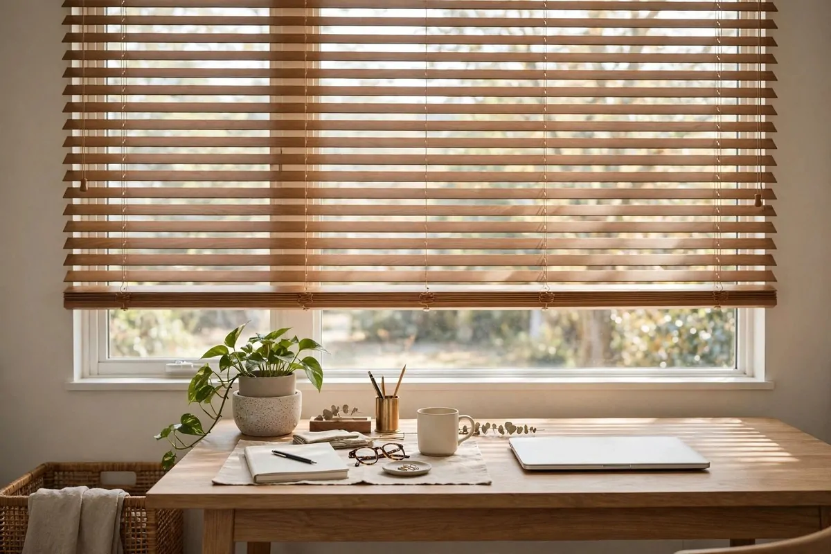
Window light is wonderful until it hits your screen. Then it is the enemy. Pros control it with good blinds.
My wooden blinds tilt. Morning sun gets filtered soft. Afternoon glare gets blocked fully. I adjust them twice a day.
It takes five seconds and my screen stays readable all day.
- Tilt blinds beat roller blinds for offices. You control the angle, not just open or shut.
- Light filtering is the goal. You want glow, not glare and not darkness.
- Match the blind color to your trim. It looks built in instead of added on.
- Top down bottom up blinds are the fancy option. Light from the top, privacy at the bottom.
I used to squint every afternoon at three. The blinds fixed it in one day.
They also help on video calls. No more bright window blowing out the camera behind me.
Curtains work too, but blinds give finer control. A small tilt changes the light a lot.
This is a small boring upgrade with a big daily payoff. Your eyes will thank you by Friday.
21. One Calm Base Color Plus One Bold Accent
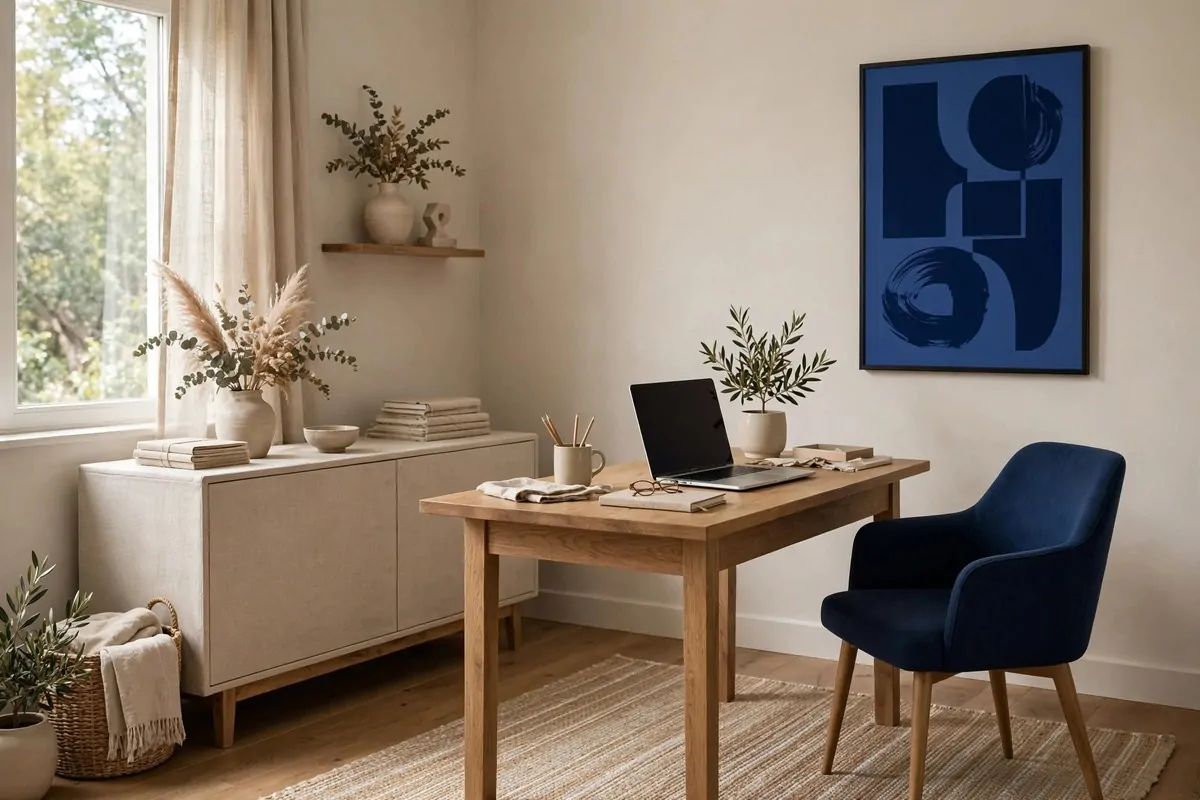
Pros build rooms on a simple formula. A calm base everywhere, one bold accent in a few spots.
My base is warm beige. Walls, rug, curtains. All calm. My accent is deep navy. The chair, one art print, a small vase.
The base keeps the room peaceful. The accent keeps it interesting. Together they look designed.
- Pick the base first. Warm whites, soft grays, light beiges. Colors that disappear.
- Pick one accent, not three. One bold color has power. Three bold colors fight.
- Repeat the accent three times. Chair, art, and a small object. Three repeats look intentional.
- The accent can change with seasons. Swap the vase and the throw pillow. New room, same base.
I changed my accent from green to navy last year. Same room, same furniture, totally new feeling. It cost almost nothing.
The 60-30-10 rule helps. Sixty percent base, thirty percent secondary, ten percent accent. Pros use it everywhere.
My secondary is wood tones. Beige walls, wood furniture, navy accents. It just works.
If choosing colors scares you, steal a palette from a photo you love. Designers do this all the time.
One calm, one bold. That is the whole recipe.
22. Under-Desk Drawers That Swallow the Mess
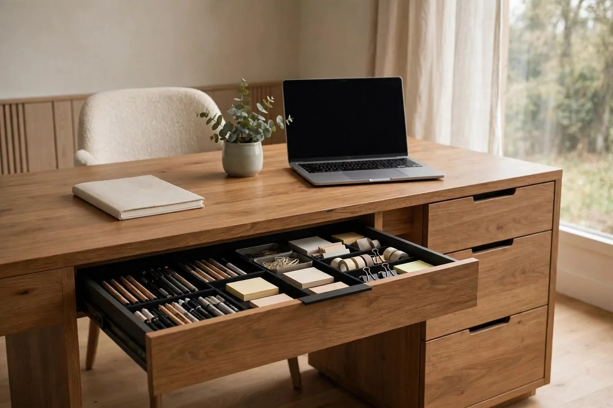
A clear desktop is a pro signature. The mess has to go somewhere. Under-desk drawers are that somewhere.
My drawer unit hangs under the desk on the right side. It holds pens, notebooks, chargers, and the daily clutter.
The desktop stays clear because everything has a drawer to dive into.
- A three drawer unit fits under most desks. Measure your knee space first.
- The top drawer is for daily tools. Pens, sticky notes, the good scissors.
- The middle drawer is for current projects. One project per folder.
- The bottom drawer is for archives. Things you keep but rarely touch.
I empty the top drawer every Friday. Old notes get filed or tossed. Monday starts clean.
Rolling drawer units are flexible. Fixed hanging ones look cleaner. Pick your style.
The drawers also hide the ugly stuff on calls. Nobody sees the mess. They see a clear desk and a calm person.
This is the least glamorous idea on this list. It is also one of the most used. I open these drawers twenty times a day.
Clear desk, full drawers, calm mind. That is the pro equation.
23. The Pro Rule: A Clear Desktop Every Night
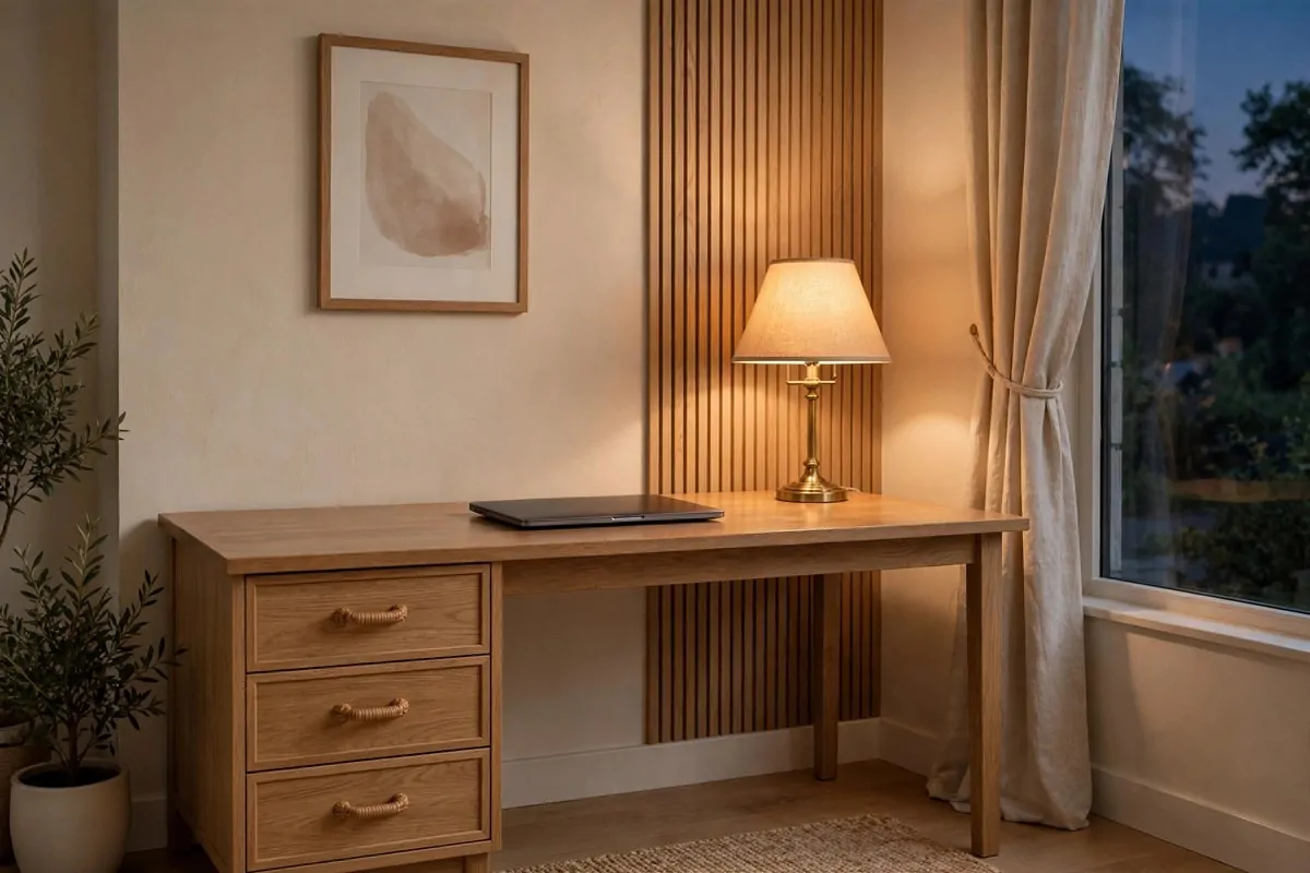
This last one is not furniture or paint. It is the rule every designer gives their clients.
Clear the desk every night. Everything in a drawer, on a shelf, or in the bin.
I do it at six. Laptop closed. Papers filed. Mug to the kitchen. It takes four minutes.
The morning me walks into a fresh room. No yesterday staring back. The day starts clean.
- Set a shutdown alarm. When it rings, work is over and the reset begins.
- Keep a catch all tray for the day’s loose items. Sort the tray, not the whole desk.
- Wipe the desk while you are at it. Thirty seconds, huge difference.
- End with the lamp on and the chair pushed in. The room looks ready for tomorrow.
Pros say a room is never finished, only maintained. The nightly reset is the maintenance.
My evenings feel longer since I started this. The office stops being the office. The home gets the room back.
Twenty three ideas, and this free one might be the most powerful. A designed room stays designed because someone resets it daily.
Pick three ideas from this list and try them this weekend. Your home office will look like a pro designed it. Because now, in a way, one did. You.