19 Mens Home Office Inspiration Setups With Bold Style

You can learn a lot about a man from his desk.
The tidy planner has a place for every pen. Every cable is tucked away. His notebook sits at a perfect angle, and honestly, it makes me a little jealous.
Then there is the creative chaos guy. Papers everywhere. Sticky notes on the monitor. A coffee mug that has seen things. But ask him for one file and he finds it in five seconds flat.
And the minimalist. One screen. One lamp. Nothing extra. He looks at his empty desk the way other people look at a clean windshield. Happy.
Whichever type you know, they all have one thing in common. They spend hours at that desk. So the desk should look good. Real good. Bold style turns a home office into a room he actually wants to spend the day in, not just a corner he is stuck with. These 19 Mens Home Office Inspiration setups show you exactly how to do it, one strong idea at a time.
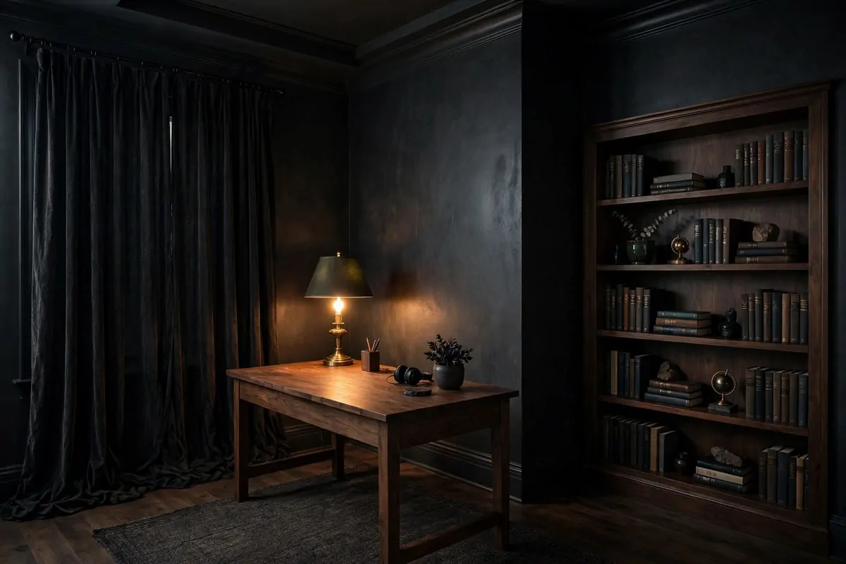
1. The Charcoal Accent Wall
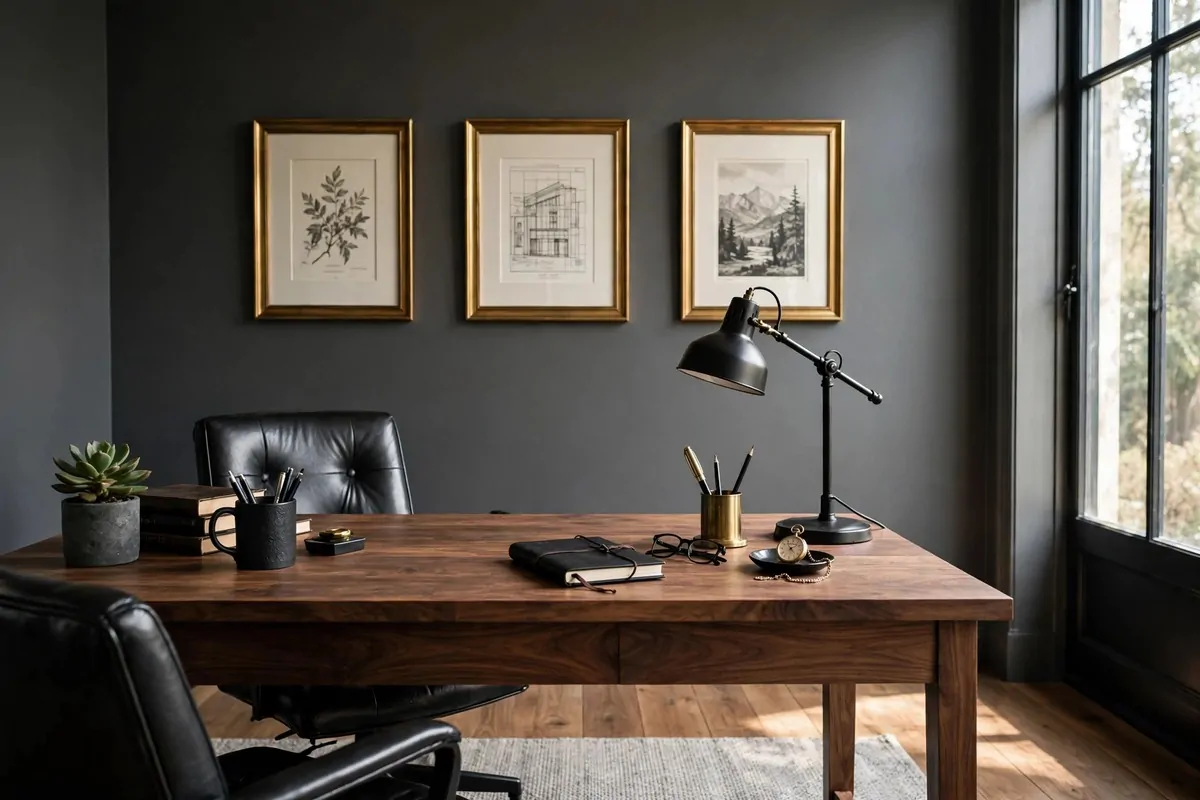
Charcoal is the boldest easy move you can make in a home office.
One wall. That is all it takes. The whole room feels deeper the second the paint dries. I have seen tiny offices look twice as serious with one dark wall behind the desk.
Keep the other walls light so the room does not close in on you. White or warm gray works fine. The dark wall becomes the stage and everything in front of it looks important.
Put your desk against the charcoal wall. Light wood or medium walnut looks amazing against it. The contrast does all the decorating for you, honestly.
Art pops on charcoal too. Black frames almost disappear into it, so try wood or brass frames instead. They will glow against the dark paint.
Here is what to get before you start:
- One gallon of charcoal or soft-black paint (matte finish hides wall flaws)
- A roller, tray, and painter’s tape
- Wood or brass picture frames for the dark wall
- A light rug to keep the floor from going dark too
Paint in the morning so it dries by evening. Two coats are enough for most walls. Matte paint is your friend here because it drinks the light instead of bouncing it.
Lighting matters more on a dark wall. A desk lamp with a warm bulb keeps things cozy. Overhead light can make charcoal look flat, so mix your light sources.
One warning from me. Do not paint the ceiling dark too. That is the line between bold and cave. Walls are the limit.
If painting feels scary, try one wall for a weekend and live with it. You can always paint it back. But I have never seen anyone paint it back.
2. The Leather Chesterfield Corner
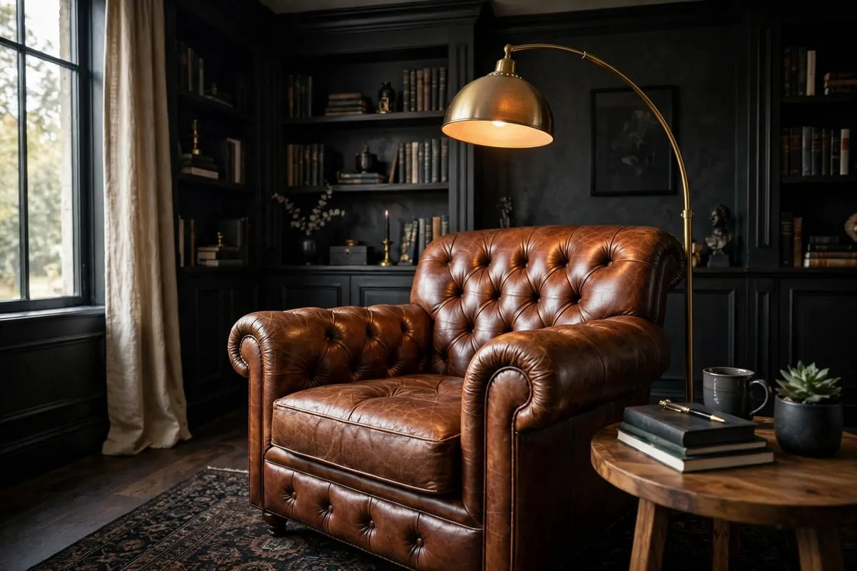
Every great home office needs a chair that is not the work chair.
A Chesterfield chair is that chair. Deep buttons. Rolled arms. Leather that looks better every year. It says this office belongs to a grown man, and I love that.
Put it in a corner near a window if you can. Add a small side table. That is your reading spot, your thinking spot, your phone-call spot. You will use it more than you expect.
Real leather costs more but ages like a dream. Faux leather is fine on a budget. Just pick one with a matte finish, because shiny fake leather fools nobody.
Color choice matters. Cognac brown is warm and classic. Dark chocolate feels rich. Black is the most serious of the three. I would pick cognac if the room has dark walls already.
A floor lamp behind the chair makes the corner feel planned, not leftover. Brass or black metal both work. Warm light only, never the blue-white stuff.
Throw one cushion on it if you want. Just one. A dark wool cushion looks manly and costs almost nothing. Skip the frilly ones. This is not that kind of chair.
The Chesterfield also breaks up the desk-desk-desk feeling of an office. It gives your eyes a soft place to land. Rooms need soft places.
Clean the leather twice a year with a damp cloth and leather cream. Five minutes of care and the chair will outlive your desk. It will outlive most of your furniture, honestly.
3. The Walnut Executive Desk
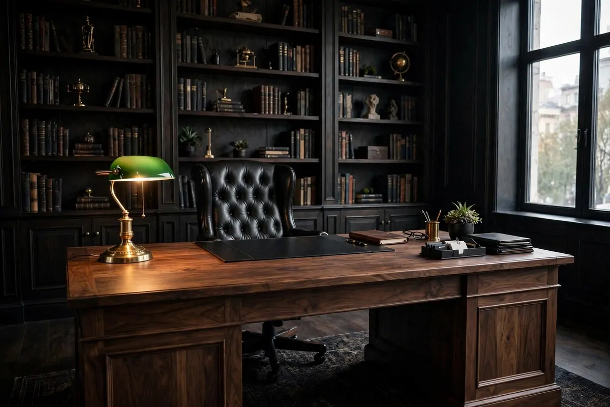
Some desks are furniture. A walnut executive desk is a statement.
Walnut is dark, rich, and full of grain. It looks expensive even when it is not. A solid slab of it in the middle of your office tells everyone who sits there means business.
Size matters here. Go big if the room allows. A wide desk with real drawers on both sides has presence. Small desks are for dorm rooms.
Top it with a leather desk pad. Black or dark green leather both look sharp on walnut. The pad protects the wood and gives your arms a soft place to rest.
Keep the surface mostly clear. A lamp on one side. A tray for papers on the other. Maybe one plant or one framed photo. The wood is the decoration, so let it breathe.
Pair it with a chair that can hold its own. A leather executive chair or a solid wood armchair works. A flimsy plastic chair next to a walnut desk looks like a joke.
Budget tip: real walnut veneer over solid wood looks just as good as solid walnut. Most people cannot tell the difference. Your wallet definitely can.
Walnut loves oil. A wipe of wood oil once or twice a year keeps it glowing. It is a two-minute job that makes the desk look brand new every time.
Position the desk so you face the door if you can. Old school, I know. But sitting with your back to the door feels wrong in a serious office. Face the room.
4. Industrial Pipe Shelving
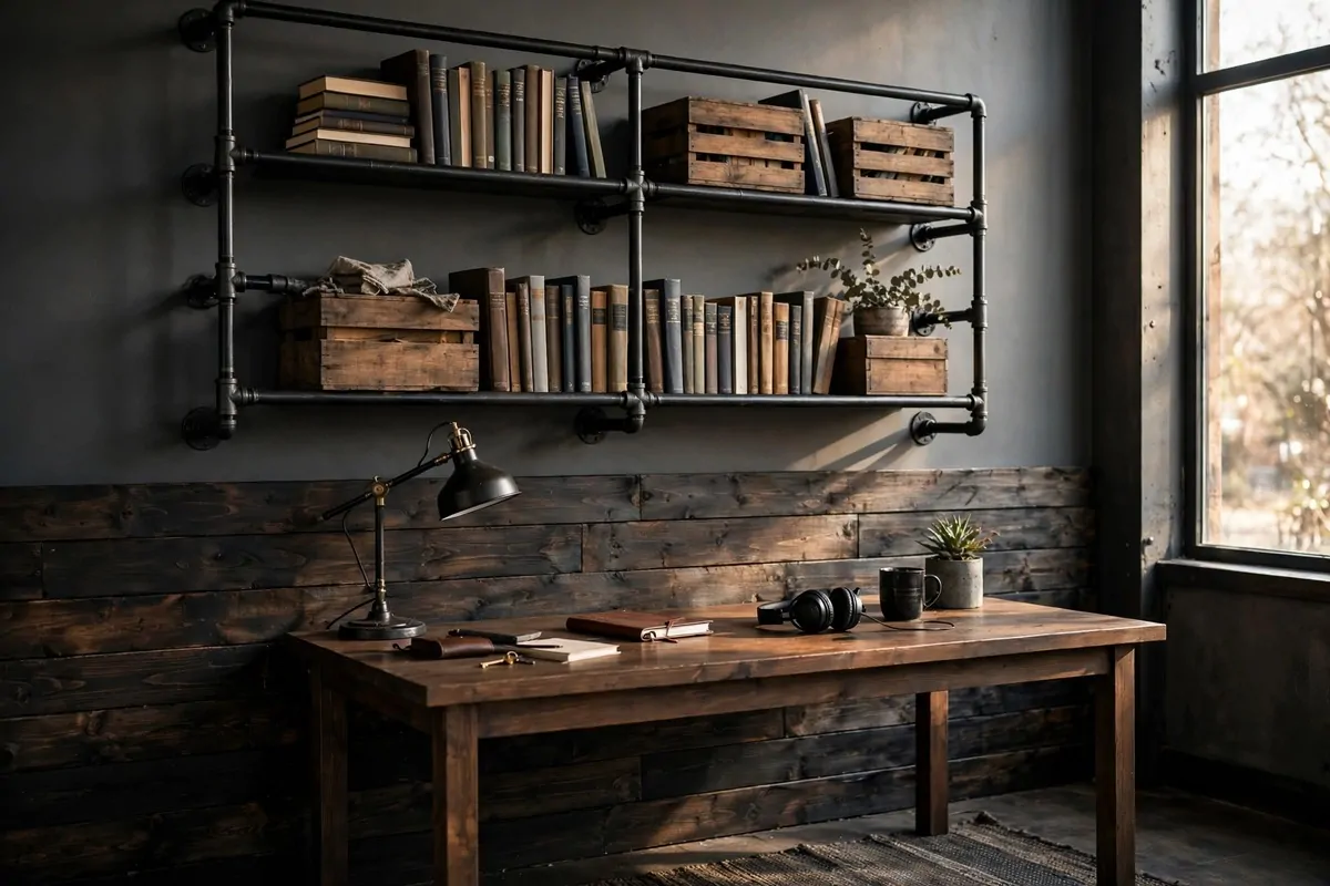
Pipe shelving is the easiest way to make a plain wall look like a workshop loft.
Black iron pipes and wood boards. That is the whole recipe. It looks industrial, it holds real weight, and it costs way less than a fancy bookcase.
You can buy the kits online or build them yourself with pipes from a hardware store. Flanges hold the pipes to the wall, elbows make the corners. It is honestly simple plumbing.
Stain the wood boards dark for a masculine look. Walnut stain on pine boards fools almost everyone. Sand them smooth first or your books will catch splinters.
What goes on the shelves matters as much as the shelves. Mix books, boxes, and a few objects you like. A row of only books looks like a library. A row of only decor looks like a store.
Leave some breathing room between items. Industrial style is about strength, not clutter. If a shelf looks stuffed, take three things off. It will look better instantly.
Hang the shelves above your desk or on a side wall. Above the desk keeps supplies within reach. A side wall makes them a feature you see from the door.
Check your wall type before you drill. Drywall needs anchors. Studs are better. These shelves carry real weight, so mount them like you mean it.
One more idea. Add a pipe bracket lamp under the bottom shelf. It lights your desk and makes the whole setup glow at night. Very cool look for almost no money.
5. The Exposed Brick Backdrop
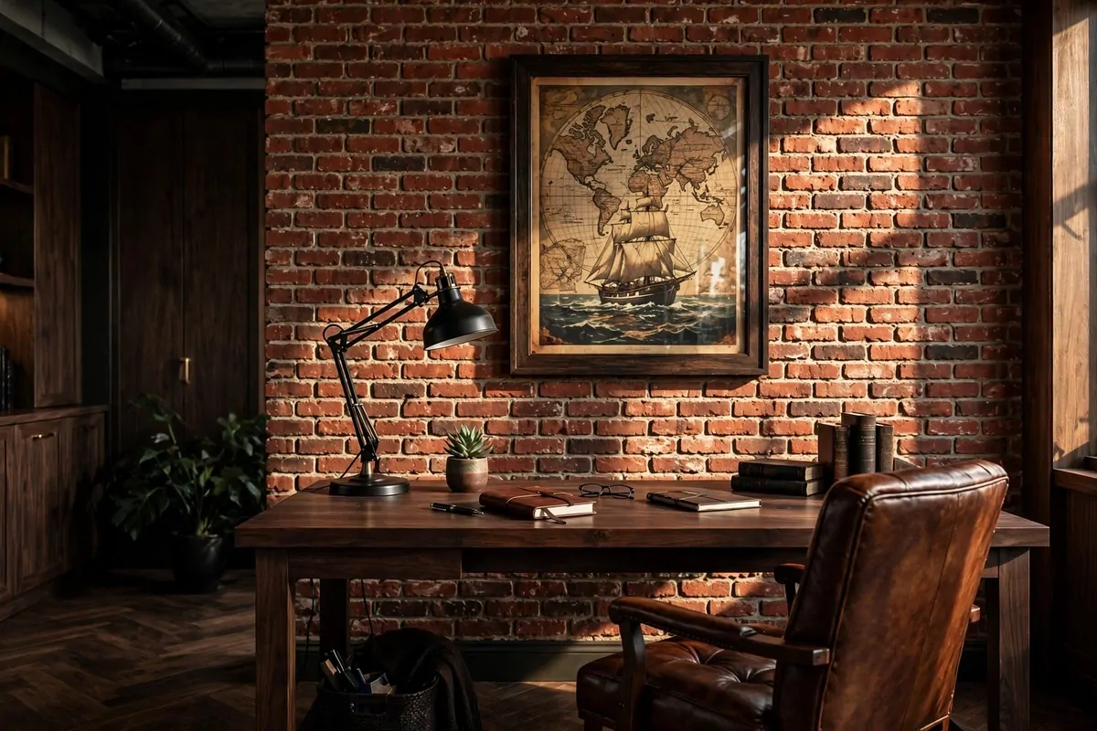
Nothing says bold like a wall of real brick behind your desk.
Exposed brick brings texture, warmth, and history into a room. It is rough in a good way. A home office with brick feels like it has a story, even if the story is just that you peeled off old drywall.
If you have real brick hiding behind drywall, finding it is the best home surprise there is. Pull a small section first to check. Sometimes it is beautiful. Sometimes it is a mess. Check before you commit.
No real brick? Faux brick panels look shockingly good now. The new ones have real depth, not the flat printed kind from years ago. Paint stores carry them, and they go up in a weekend.
Brick loves dark furniture. A black or walnut desk in front of brick looks made for it. Metal lamps with warm bulbs complete the warehouse feel.
Do not hang too much on the brick. One big piece of art or a clock is enough. The brick is already the decoration. Covering it up misses the point.
Seal real brick with a matte masonry sealer. It keeps the dust down and stops the mortar from crumbling on your desk. One coat, and you are done for years.
Lighting on brick is everything. A picture light or a wall washer aimed at the texture makes the bricks glow at night. Flat overhead light flattens it out, so angle your lamps.
Brick also eats sound a little, which is a nice bonus. Video calls sound warmer. The room feels quieter. Small win, but you will notice it.
6. Black-Framed Black and White Art
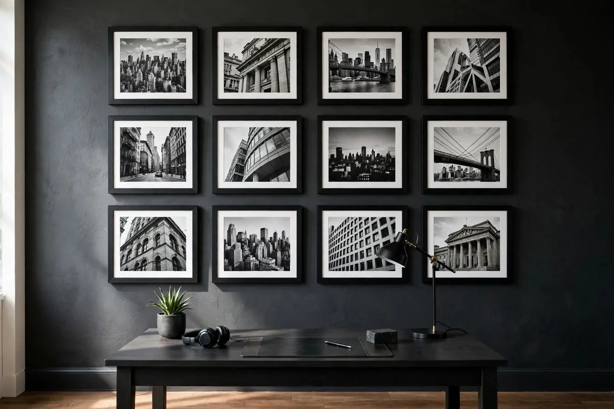
Black and white photography is the safest bold choice in the world.
It cannot clash with anything. It looks expensive. And a wall of it in matching black frames turns any office into something that feels curated, even if you bought the prints last week.
Pick a theme or it looks random. City skylines. Classic cars. Mountain ranges. Architecture shots. One subject, many views. That is what makes it feel like a collection instead of a pile of posters.
Uniform frames are the secret. Same black frame, same mat width, same size. When everything matches, even cheap prints look like gallery pieces. Mismatched frames are what make art walls look messy.
Hang them in a grid for a strong masculine look. Rows and columns, even spacing. Gallery walls with mixed sizes feel creative. Grids feel powerful. For a mens office, go grid.
Above the desk is the natural spot. But a grid on the wall you see when you walk in hits harder. First impressions, you know.
You do not need to buy art. Print your own photos in black and white. Phone photos of buildings or bridges look amazing stripped of color. A print shop will do big sizes for little money.
Measure before you hang. Lay the frames on the floor first and tape the outline on the wall. Eyeballing grids is how you end up with a crooked mess and six extra holes.
Glass glare is the one real problem. If your desk faces a window, use non-glare acrylic instead of glass. Costs a little more. Saves you from seeing your own reflection instead of the art.
7. The Bar Cart Corner
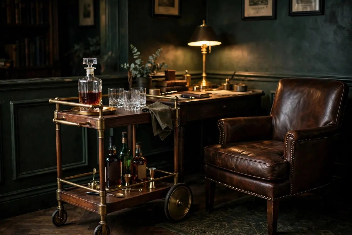
A bar cart in the office is the ultimate power move.
It says the work gets done and the evening is respected. A small cart with a decanter, a few glasses, and maybe a bottle of something good turns a corner into a whole mood.
You do not need to drink to enjoy it. Stock it with good coffee, fancy sodas, or just beautiful glassware. The point is the ritual, not the alcohol.
Wood and brass carts fit a masculine office best. Chrome looks cold. Wood looks warm. Two tiers give you room for bottles below and a tray on top.
Style it like this: decanter and glasses on top, bottles below, one small plant or one framed photo. That is it. A crowded bar cart looks like a storage shelf.
Here is a quick styling formula that always works:
- Top shelf: decanter, two to four glasses, one small tray
- Bottom shelf: three to five bottles, grouped by height
- One green thing: a small plant or a sprig in a vase
Roll it near the seating corner, not the desk. The bar cart belongs to the relax zone. Desk is for work. Cart is for the five o’clock version of you.
A decanter makes even cheap bottles look classy. Glass decanters cost very little and change the whole feel. Nobody needs to know what is inside.
Keep it dusted. Glass shows dust fast, and a dusty bar cart looks sad instead of classy. One wipe a week. Ten seconds.
8. The Vintage World Map Wall
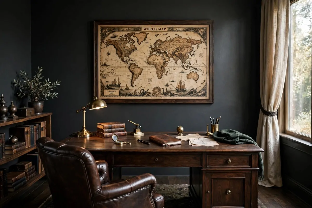
A big vintage map is a whole personality in a frame.
It says you think beyond your zip code. It adds color without being loud. And it fills a big wall better than almost anything else you can hang.
Go for an old-style map with warm tones. Creams, browns, faded greens. The aged look pairs perfectly with dark walls and wood furniture. Modern bright maps feel wrong in a masculine office.
Size it big. A map should cover most of the wall behind your desk. Small maps look like an afterthought. Big maps look like a decision.
Frame it in dark wood or black. No glass if you can avoid it, because big glass glares. Canvas prints of maps need no frame at all and look great stretched over a frame.
Pin your travels if you want a personal touch. Small brass pins on the places you have been. It starts conversations on video calls. People always ask.
Where to find one: thrift stores, flea markets, and print shops all have them. Old atlases get taken apart and framed too. A real vintage page in a good frame beats a new print every time.
Hang it centered behind your desk. It becomes your video call background, so make it straight. Tilted maps on camera look like you do not care. You care.
Pair it with warm light. A brass lamp or warm picture light above the map makes the old colors glow. Cool white light makes vintage maps look washed out and sad.
9. Framed Sports Prints
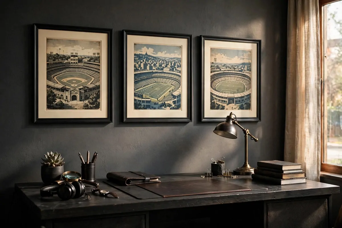
Your office should show what you love. If you love sports, show it.
Framed sports prints are classic mens office decor for a reason. They are personal, they start conversations, and they look great when they are done right.
Done right means framed. Posters taped to the wall belong in a dorm. A print in a real frame belongs in an office. That one change makes all the difference.
Vintage styles work best. Old stadium illustrations, classic team posters, retro ticket art. They have color and history. Modern glossy prints can look cheap next to wood and leather.
Pick one sport or one team and commit. A wall of mixed random sports looks like a fan shop. A wall built around one passion looks like a collection.
Three prints in a row above the desk is the sweet spot. Same size, same frames. Or one huge statement piece if you have a big empty wall. Both work. Mixed sizes rarely do.
Black frames keep it sharp. Wood frames keep it warm. Either way, use mats. A white or cream mat around the print is what separates framed art from a framed poster.
Hang them at eye level when you are sitting. Offices are for sitting, so measure from your chair, not from standing height. Most people hang art too high. Do not be most people.
Rotate them with the seasons if you are a real fan. Football season, baseball season. It keeps the office feeling alive. Just keep the frames and swap the prints.
10. The Vinyl Record Corner
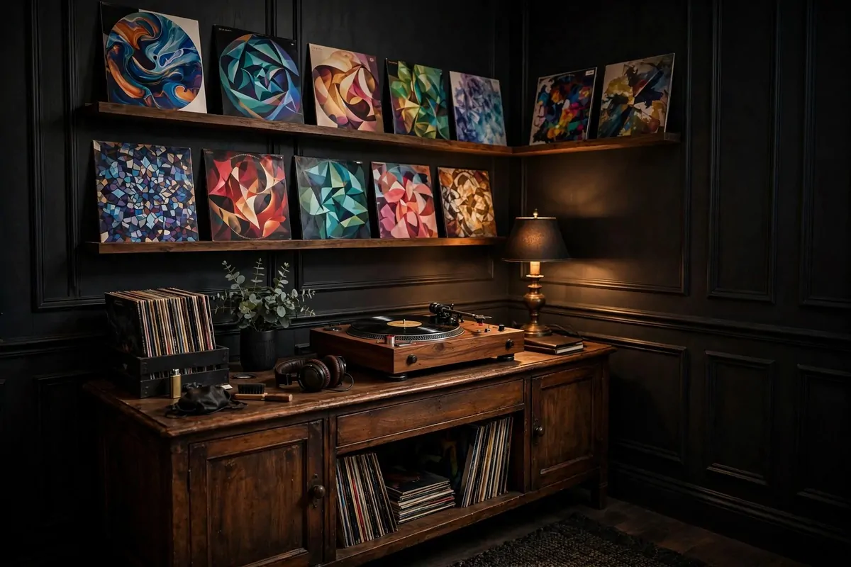
A record player in the office is a lifestyle choice, and a good one.
Vinyl slows you down in the best way. You pick a record, you drop the needle, you actually listen. No skipping every thirty seconds. It changes how the workday feels.
You do not need an expensive setup. A simple turntable, a small speaker, and a shelf for records is enough to start. The hobby grows on its own after that. Trust me on this one.
Give the records a home that shows them off. Album covers are art. A wall-mounted display shelf that holds records face-out turns your collection into decoration. Flip them like a gallery.
| Piece | What to look for |
|---|---|
| Turntable | Belt drive, adjustable tonearm, wood or black finish |
| Speaker | One good bookshelf speaker beats two cheap ones |
| Storage | Cube shelf or face-out wall ledges, stored upright |
| Care | Inner sleeves, a brush, and keep them out of sun |
Place the setup away from your desk speakers and foot traffic. Vibrations are the enemy of good sound. A sturdy sideboard or a dedicated stand works best.
Warm light suits a vinyl corner. A small lamp with a dim bulb, maybe. Listening to records under bright office lights feels wrong. Dim it down when the music starts.
Start with ten records you truly love. Not the cool ones. The ones you play. A small collection you love beats a big collection you bought to look cool.
Records are also a great break ritual. Stuck on a problem? Flip the record. Stand up. Stretch. Come back fresh. The music gives your brain a reset button.
11. Forest-Green Walls With a Brass Lamp
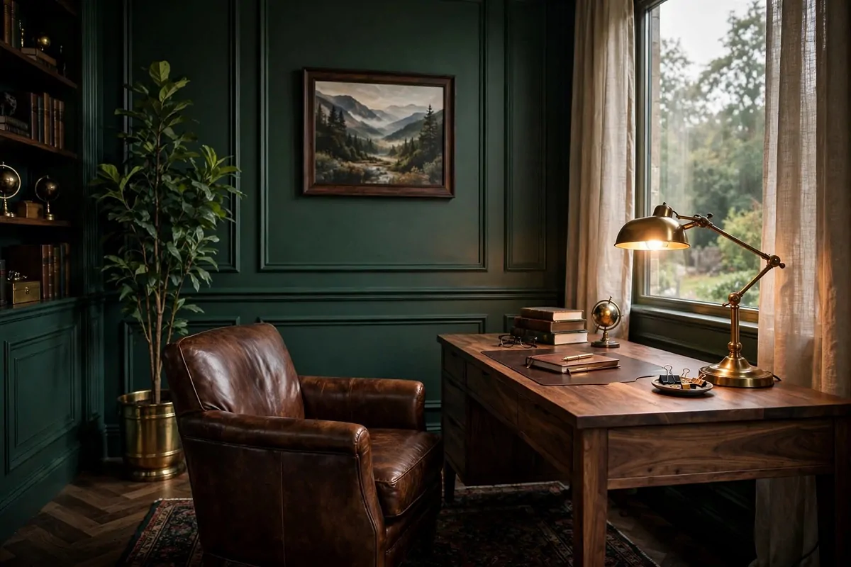
Forest green is the color of old libraries and good decisions.
It is dark without being black. Rich without being loud. A forest-green office feels like a private club, and you are the only member. Who would not want that.
Paint all four walls if the room gets decent light. Green wraps around you in a way charcoal cannot. It feels alive. One accent wall works too, but full green is the bold move.
Brass is green’s best friend. A brass desk lamp, brass picture frames, brass handles on the drawers. The warm metal glows against the deep green like candlelight.
Wood tones matter here. Walnut and dark oak love green walls. Light pine fights with them. If your desk is light wood, stain it or swap it. This combo needs depth.
Leather seating completes the look. Brown leather against green walls is one of the great color pairings in all of decorating. It never fails. Never.
Plants look amazing on green walls. The greens blend, and the leaves almost glow. A tall plant in a brass pot is the perfect finishing touch. Easy and cheap.
Keep your art warm-toned. Landscapes, old maps, sepia photos. Cool blue art on green walls looks muddy. Warm art looks like it was made for the room.
At night, this room is magic. Turn off the overhead light. Turn on the brass lamp. The walls go deep and dark and the desk glows. You will never want to leave.
12. The Concrete-Top Desk
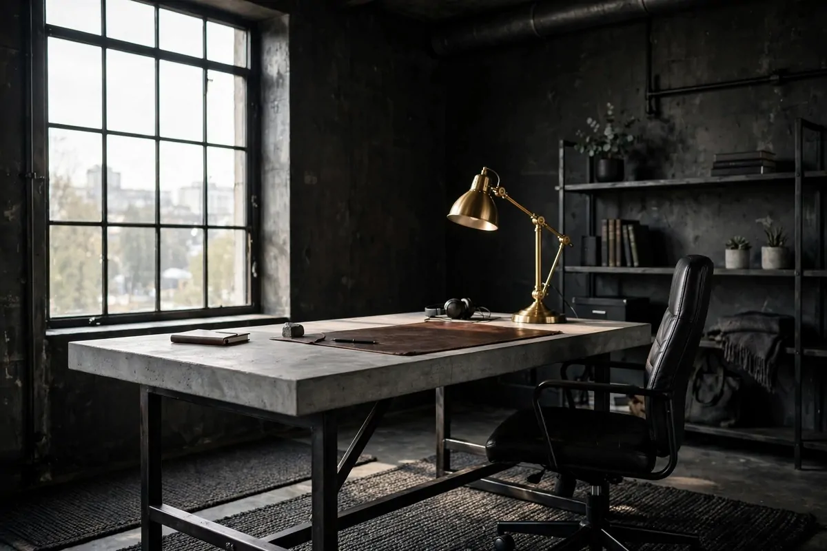
A concrete desk top is not what most people expect in a home office. That is exactly why it works.
Concrete is cool, solid, and a little raw. It feels like a workshop and a design studio at the same time. If wood desks feel too traditional for you, this is your answer.
You can buy concrete-top desks or make one. A poured slab on black metal legs is the classic build. It is heavy, so build it where it will live. Moving it later is a workout.
Seal it properly. Raw concrete stains from coffee rings and ink. A good concrete sealer keeps it looking clean and makes it wipeable. Do this step or regret it later.
Pair it with black metal legs or a black steel frame. The industrial combo is concrete and steel, always. Wood legs soften it, but steel keeps it bold.
Soften the top with a leather desk pad and warm accessories. Concrete can feel cold. Wood trays, a brass lamp, a green plant. Warm things on a cool desk. Balance.
Keep the styling simple. Concrete already has texture and character. A few strong objects beat a dozen small ones on this surface. Let the desk speak.
Gray goes with everything. That is the hidden superpower of a concrete desk. Dark walls, light walls, brick, green. It works with all of them.
It is also nearly indestructible. Hot mugs, dropped tools, years of use. Concrete takes it all and looks better for it. A desk that ages well is a desk worth owning.
13. The Matte Black Pegboard Wall
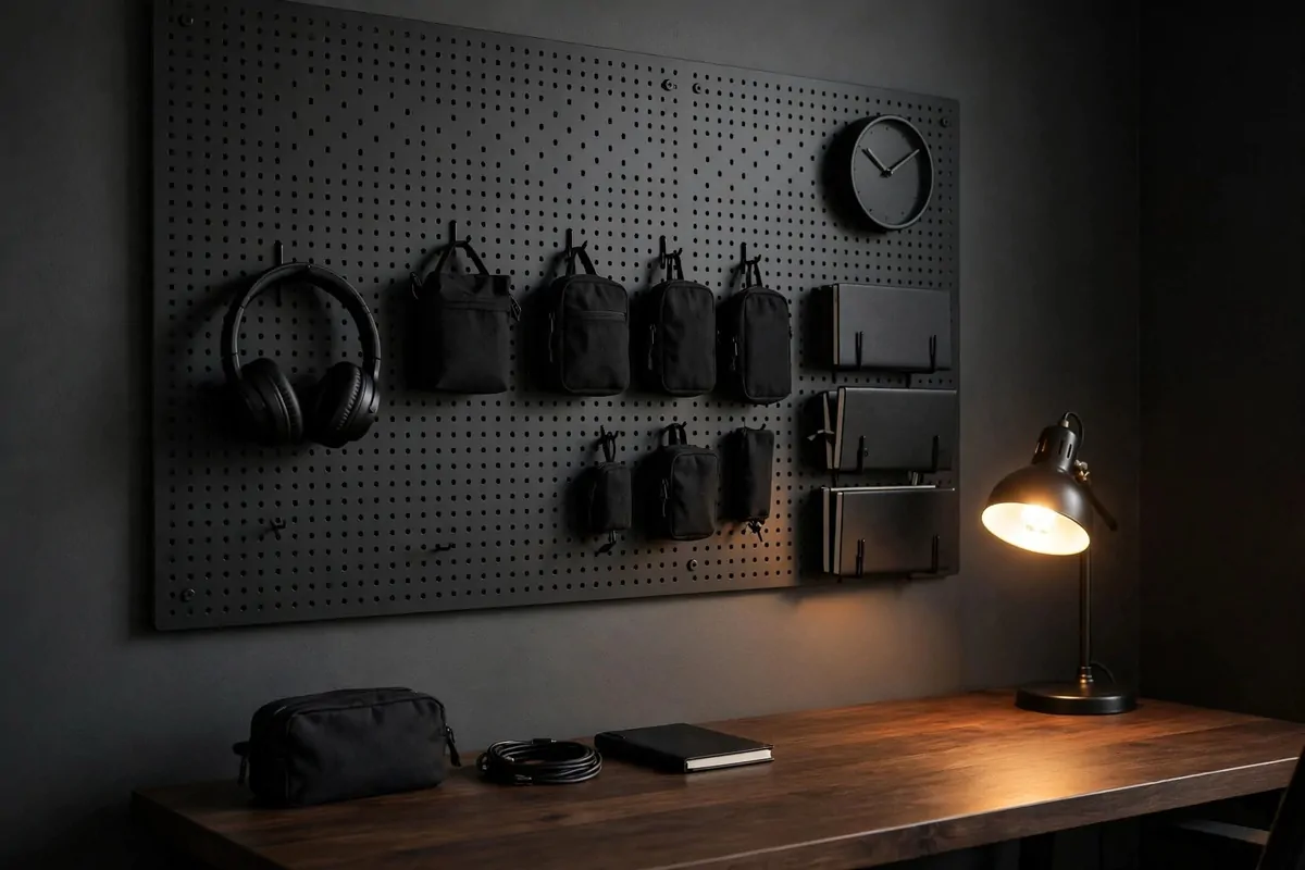
Pegboards got a bad reputation from messy garages. A matte black one is a different animal.
Painted black, pegboard looks sharp and modern. It turns a blank wall into organized storage that actually looks good. Tools, headphones, cables, notebooks. All on display, all in their place.
Mount it above your desk or on the wall beside it. Above the desk keeps your daily tools within arm’s reach. A full side wall makes it a real feature.
The all-black finish is what makes it bold. Natural pegboard looks crafty. Black pegboard looks like it belongs in a design magazine. Same board, different paint, different planet.
Use black hooks and black accessories to match. Mixed silver hooks break the look. Black on black is sleek. It reads as texture instead of clutter.
Organize by zone. Writing tools in one area. Tech in another. Paper and notebooks in a third. Zones keep it from turning into a junk wall. Every hook earns its spot.
Here is what actually belongs on an office pegboard:
- Headphones on a wide hook (saves desk space)
- Cable wraps and chargers in small pouches
- A wall clock or a small calendar
- One shelf for the notebook and pens you use daily
Leave empty space on purpose. A pegboard that is only two-thirds full looks intentional. A pegboard stuffed to the edges looks stressed. Empty hooks are fine.
Light it if you can. A small picture light or LED strip above the pegboard makes it glow at night and keeps it useful after dark. Shadows are the enemy of finding things.
14. The Dark Gaming-Work Hybrid
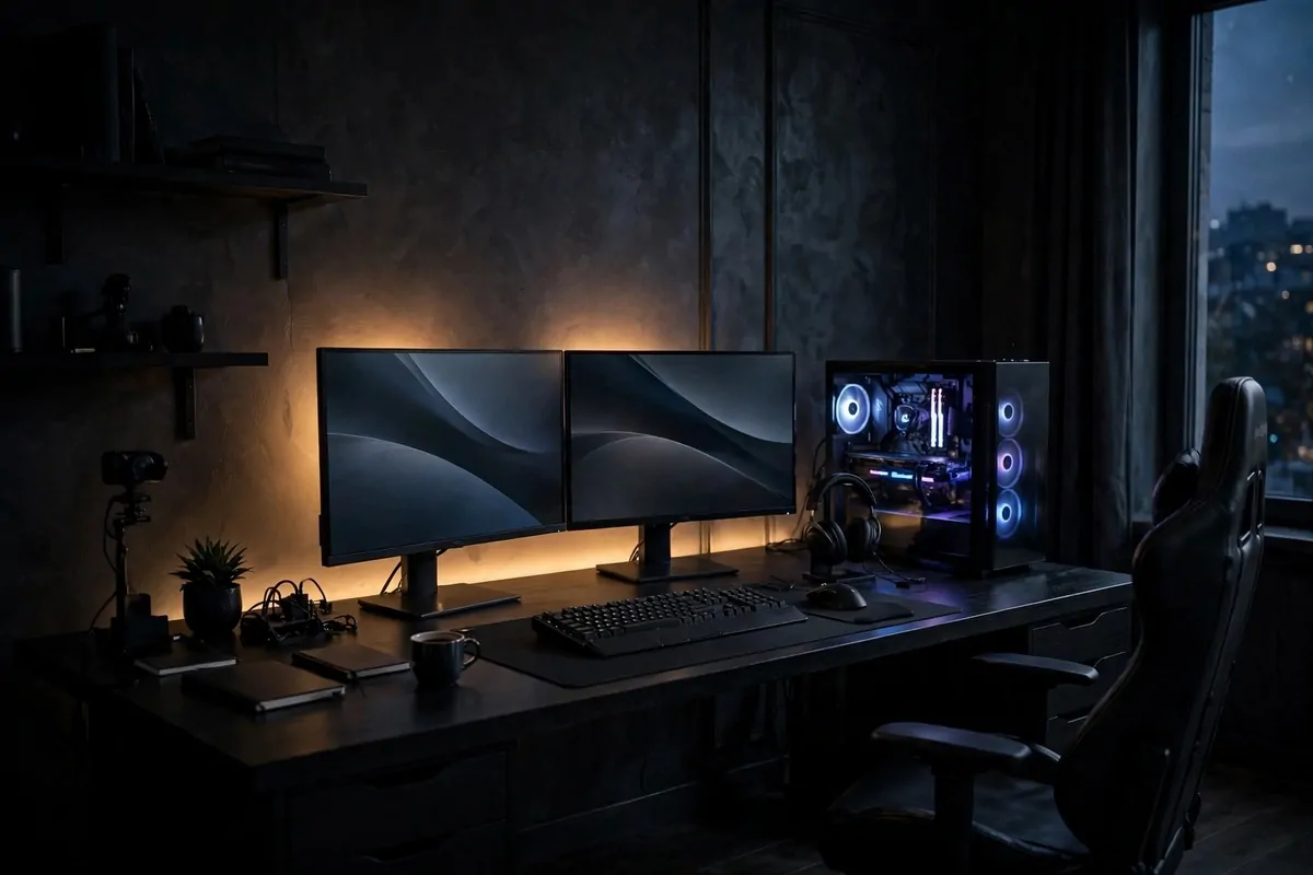
Work by day, play by night. One desk can do both.
A gaming-work hybrid setup is the most honest office for a lot of men. The same machine runs the spreadsheets and the games. So build one setup that handles both with style.
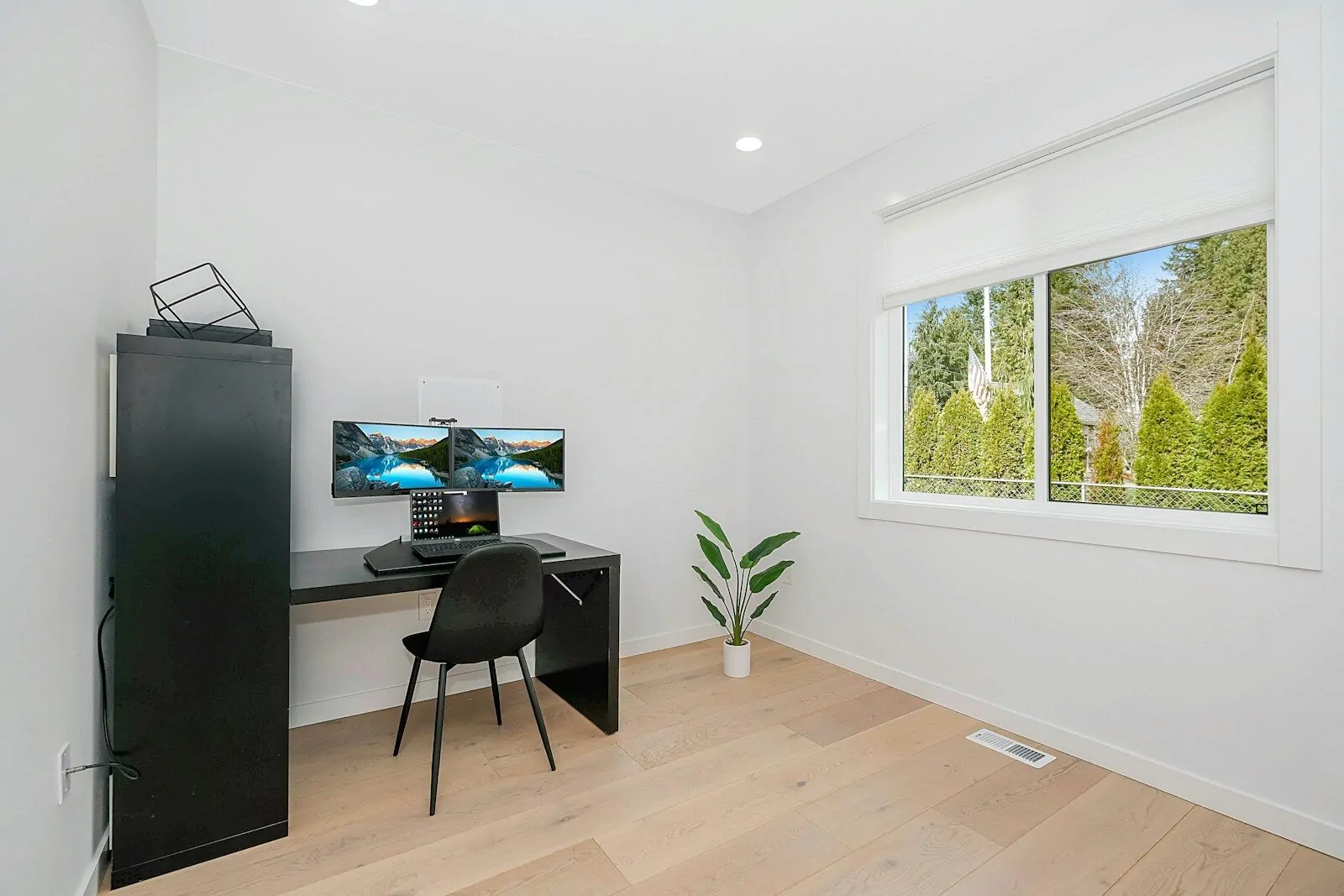
Start with a big, deep desk. You need room for a keyboard, a mouse with space to move, and your work stuff. Shallow desks make gaming miserable. Go deep.
Two monitors or one wide one. For work, more screen is more productive. For games, wide is immersive. A monitor arm keeps them floating and frees the whole desk surface.
Keep the color scheme dark. Black desk, black monitors, dark walls. Screens glow brighter against dark surroundings, and the whole setup looks like a command center.
Cable management is not optional here. Nothing ruins a hybrid setup faster than a nest of wires. Cable trays under the desk, one power strip, velcro ties. Do it once and forget it.
A good chair matters double for this setup. You sit here for work AND for fun. That is a lot of hours. Get the best chair you can afford. Your back will thank you for years.
Add bias lighting behind the monitors. A soft glow behind the screens cuts eye strain and looks incredible in a dark room. It is the cheapest upgrade with the biggest wow factor.
When work ends, change the scene. Dim the room lights. The same desk becomes a different place. That little ritual tells your brain the workday is over.
15. The Motorcycle Art Print
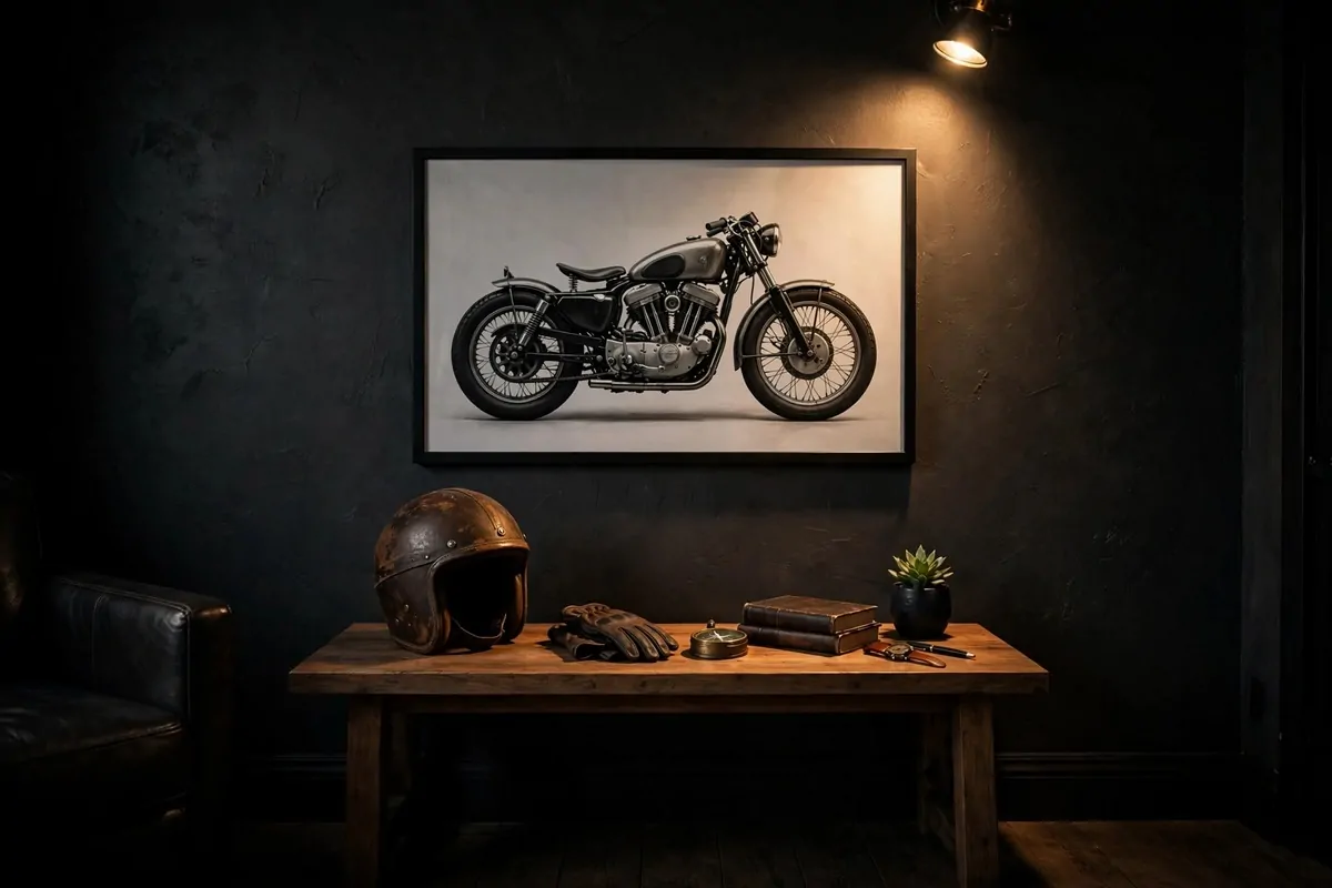
One great motorcycle print can carry a whole wall.
It does not matter if you ride. A vintage bike illustration or a moody photo of a classic motorcycle has shape, chrome, and attitude. It is art with an engine.
Go big with this one. A large print in a simple frame makes a stronger statement than three small ones. Motorcycles have presence. Give them room.
Black and white bike photography is timeless. Sepia vintage ads are full of character. Color shots of red or black bikes pop against dark walls. Pick the mood that fits your room.
Hang it where you see it from your chair. Above the desk, on the side wall, wherever your eyes rest. This is your inspiration piece. It should be in your sightline.
Frame it well. A thin black frame with a wide mat looks gallery-sharp. A chunky wood frame looks garage-cool. Both work. Cheap plastic frames do not.
Do not overdo the theme. One motorcycle print is taste. Five plus a helmet shelf plus a jacket hook is a shrine. Unless that is what you want, let the one piece breathe.
Pair it with one related object, max. A small model bike on the shelf. A vintage helmet on a stand. One echo of the theme ties the room together without going overboard.
This is also the perfect gift-art. If someone asks what to get you for the office, a motorcycle print is an easy yes. Beautiful, personal, and almost impossible to get wrong.
16. The Library Wall With a Ladder
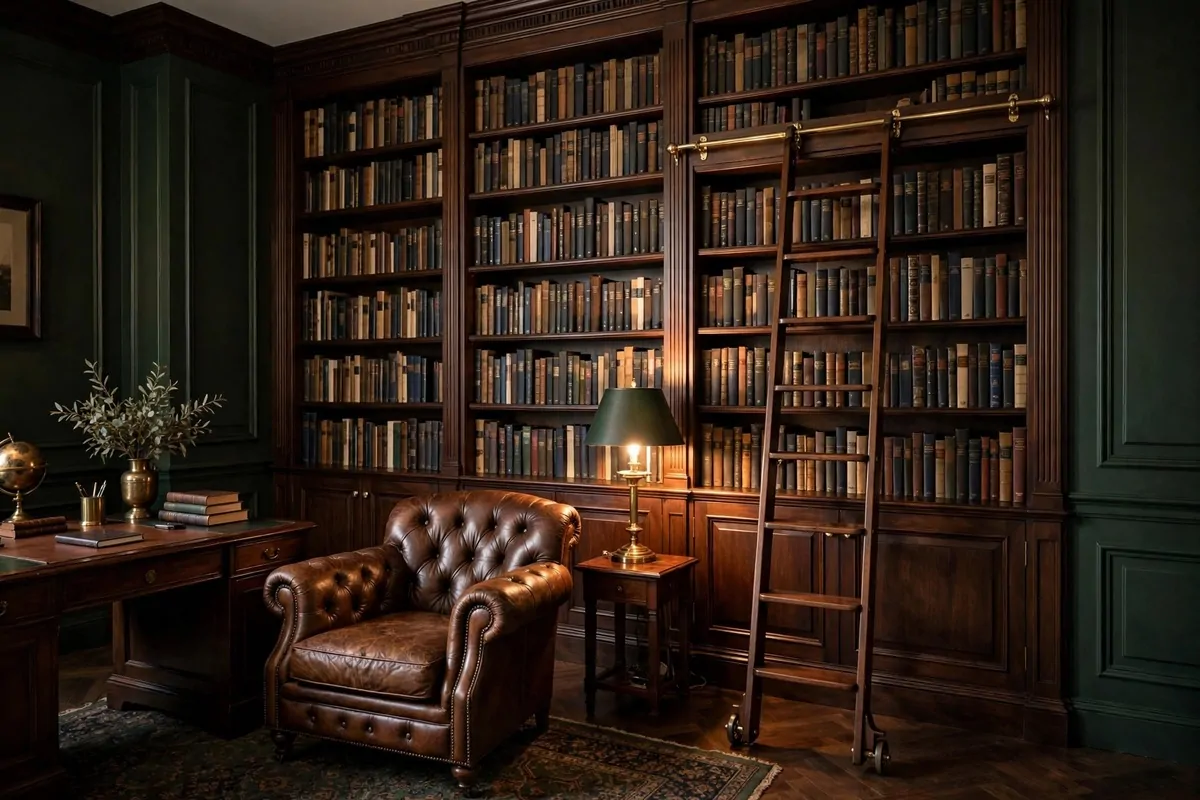
A wall of books with a rolling ladder is the dream. Let us be honest.
It is the most classic bold office move there is. Floor-to-ceiling shelves, dark wood, and a ladder that actually rolls. It makes every video call look like you run a publishing house.
You do not need a mansion for this. One full wall of a small office works perfectly. Measure the wall, buy tall bookcases, and bolt them together and to the wall. Safety first, always.
Dark wood or painted black shelves look the most masculine. Light wood library walls feel like a school. Dark ones feel like a private collection. Paint is cheaper than new shelves.
The ladder is the star. A rolling library ladder on a brass rail is the real deal. A leaning wooden ladder is the budget version and still looks great. Either way, it must be sturdy.
Fill the shelves with real books you have read or will read. Mixed with a few objects: a globe, a clock, framed photos. Books only looks like a bookstore. Objects break it up.
Organize however you like, but make it look full. Gaps look sad on a library wall. Stack some books horizontally to fill odd spaces. Horizontal stacks are a designer’s trick.
Add library lighting if you can. Small brass picture lights on the shelves or a warm floor lamp nearby. Books look best in warm light. Cold light makes them look like an archive.
Dust it twice a year. A feather duster, top to bottom, done in twenty minutes. A dusty library wall loses its magic fast. A clean one glows.
17. The Matte Black Standing Desk
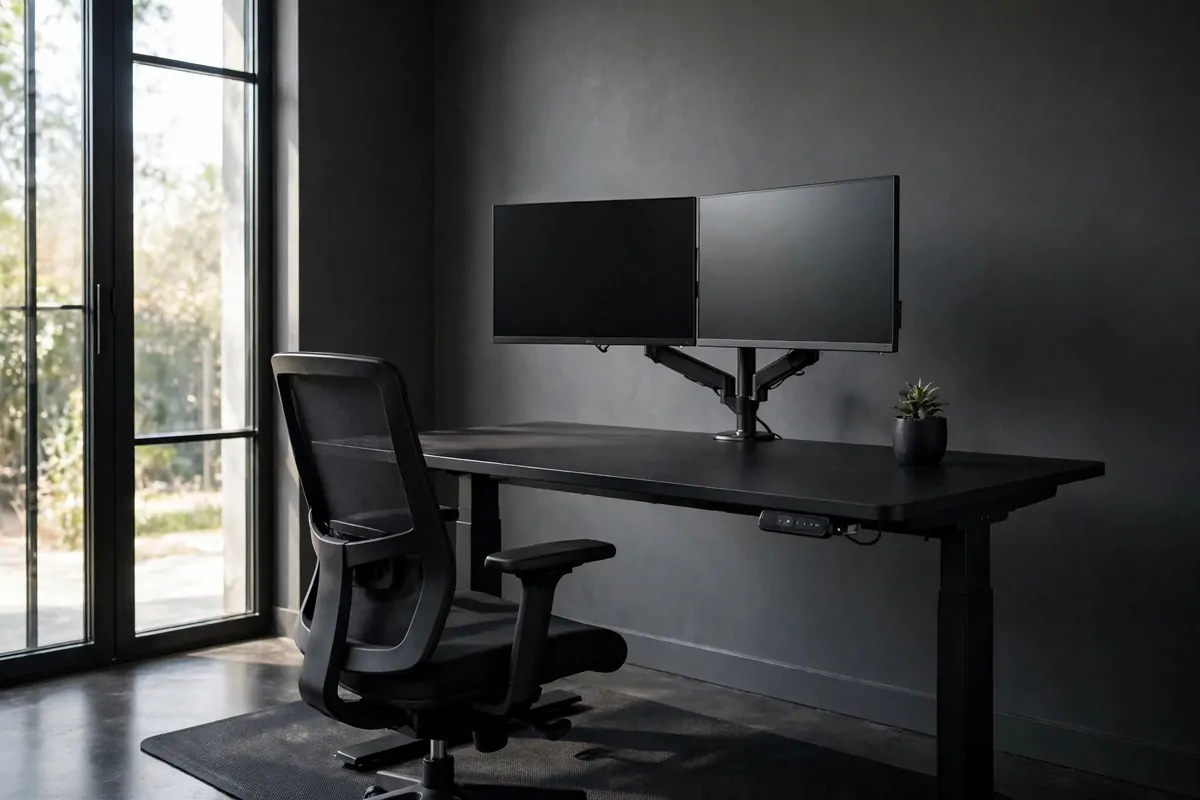
Standing desks are practical. A matte black one is practical with style.
Most standing desks look like office equipment. Matte black changes that. It looks like furniture. It fits a bold home office instead of fighting with it.
The matte finish matters. Glossy black shows every fingerprint and scratch. Matte hides them. It also photographs better for video calls, with no shiny reflections.
Go electric, not manual. Crank handles get old in a week. A smooth electric lift with memory buttons means you actually use the standing feature. Manual desks become permanent sitting desks.
Size it for your real setup. Measure your monitors, your keyboard, your papers. A desk that is too small makes you stack things, and stacking kills the clean look.
| Feature | Why it matters |
|---|---|
| Memory presets | One tap to your sit and stand heights |
| Cable tray | Wires move with the desk, no pulling |
| Anti-collision | Stops before crushing anything below |
| Sturdy frame | No wobble at full standing height |
Add an anti-fatigue mat. Standing on a hard floor gets old fast. A dark mat under the desk looks intentional and saves your feet and knees.
Keep cables in a tray under the desk that moves with it. Fixed cables will yank when the desk rises. This is the number one standing desk mistake. Plan for the movement.
Start with short standing sessions. Thirty minutes, then sit. Build up over weeks. Your legs need time to adjust. Nobody stands all day on day one.
Style the desk like a regular desk, not a gym. Leather pad, brass lamp, one plant. A standing desk should look like it belongs in the room, not like equipment parked in it.
18. The Trophy and Display Shelf
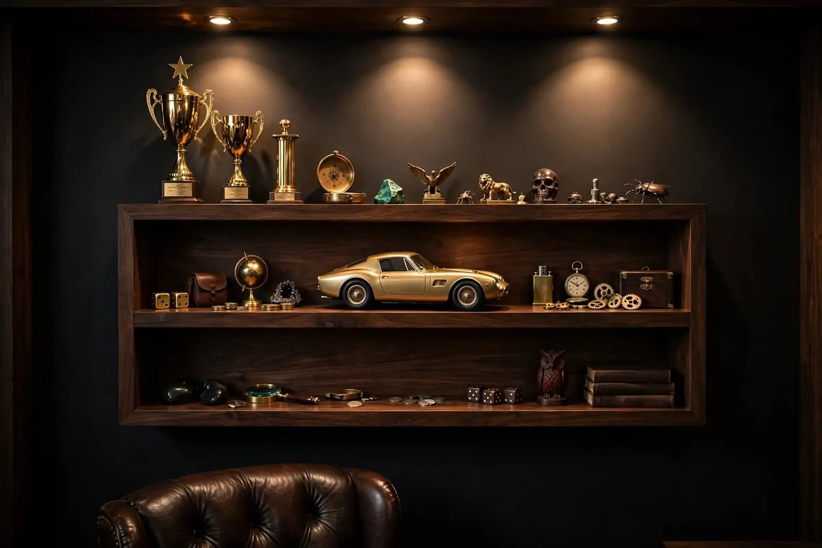
Your wins deserve a shelf, not a box in the closet.
Trophies, medals, model cars, signed balls, awards from work. These things tell your story. A display shelf puts that story on the wall where you see it every day.
Use one dedicated shelf or cabinet. Not scattered around the room. One strong display beats ten random objects on ten surfaces. Grouping gives them power.
Dark wood shelves or black metal look best for this. Glass shelves disappear and let the objects float. A lit cabinet is the premium version and worth it if you have the budget.
Give each item space. Crowded shelves look like a thrift store. Spaced-out objects look like a museum. If you have too many, rotate them. The shelf stays fresh that way.
Light it. A small spotlight or LED strip inside the shelf changes everything. Lit objects look important. Unlit objects look stored. Light is what makes it a display.
Mix heights for a good look. Tall trophy in back, small medal in front. Vary the levels. A flat row of same-size objects looks boring. Stagger them like a skyline.
Include one or two non-trophy items. A photo from the big day. A ticket stub in a frame. The story around the win is what makes people stop and look.
Dust it monthly. Display shelves collect dust fast, and dusty trophies look forgotten. A quick wipe keeps your wins looking like wins.
19. The Masculine Gallery Wall
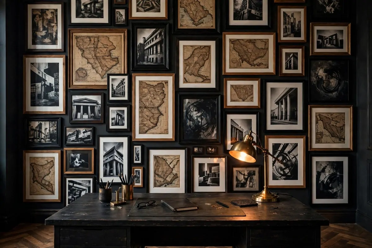
A gallery wall is the grand finale of office decor. Do it right and it steals the show.
Masculine gallery walls are about strong subjects and tight editing. Maps, architecture, abstract art in dark tones, vintage ads. Not cute quotes. Not watercolor flowers. Strong stuff.
Mix frame styles but keep a common thread. All black frames with different sizes. Or mixed wood and black with the same mat color. One thing ties them together, everything else can vary.
Plan it on the floor first. Lay every frame out, move them around, take a photo. Then hang from the photo. Walls with gallery-wall regret are full of extra nail holes.
Start with one anchor piece in the middle. The biggest or boldest frame. Build outward from it. Anchors keep gallery walls from looking scattered.
Keep spacing tight and even. Two to three inches between frames. Wide gaps make it look accidental. Tight spacing makes it look like one big piece of art.
Go up high and down low. Gallery walls that only live at eye level look timid. Fill the wall from near the desk to near the ceiling. Bold means committed.
Here is a simple mix that always works:
- Two large anchor pieces (map, big photo)
- Three to four medium frames (prints, illustrations)
- Two to three small frames (tickets, small photos, objects)
Step back often while hanging. Walk to the door and look. Gallery walls are judged from across the room, not from two feet away. The door view is the real test.
Live with it for a week before you call it done. You will notice one frame that bugs you. Move it. Gallery walls are never finished. They grow with you.