15 Eket Ikea Office Ideas That Maximize Wall Storage

First, let us say it out loud. EKET. Eh-ket. Rolls off the tongue once you try it, right?
EKET is IKEA’s little wall cabinet system. Small square boxes that hang on your wall on a metal rail. You can mix open ones with closed ones, add doors or glass fronts, and build them into almost any shape you can dream up.
I love them for offices because walls are free real estate. Most of us use maybe the bottom half of our office wall. The rest just holds paint. EKET turns that empty space into storage without eating a single inch of your floor space.
I dug through the best real-life setups people use right now. IKEA’s own wall ideas. Clever builds shared by home office owners online. These are not fake showroom rooms. They are practical layouts that actually hold real stuff.
Here are 15 Eket Ikea office ideas that maximize wall storage. Pick the one that fits your wall, and your desk clutter will finally have somewhere to go.
1. A Full EKET Wall Above Your Desk
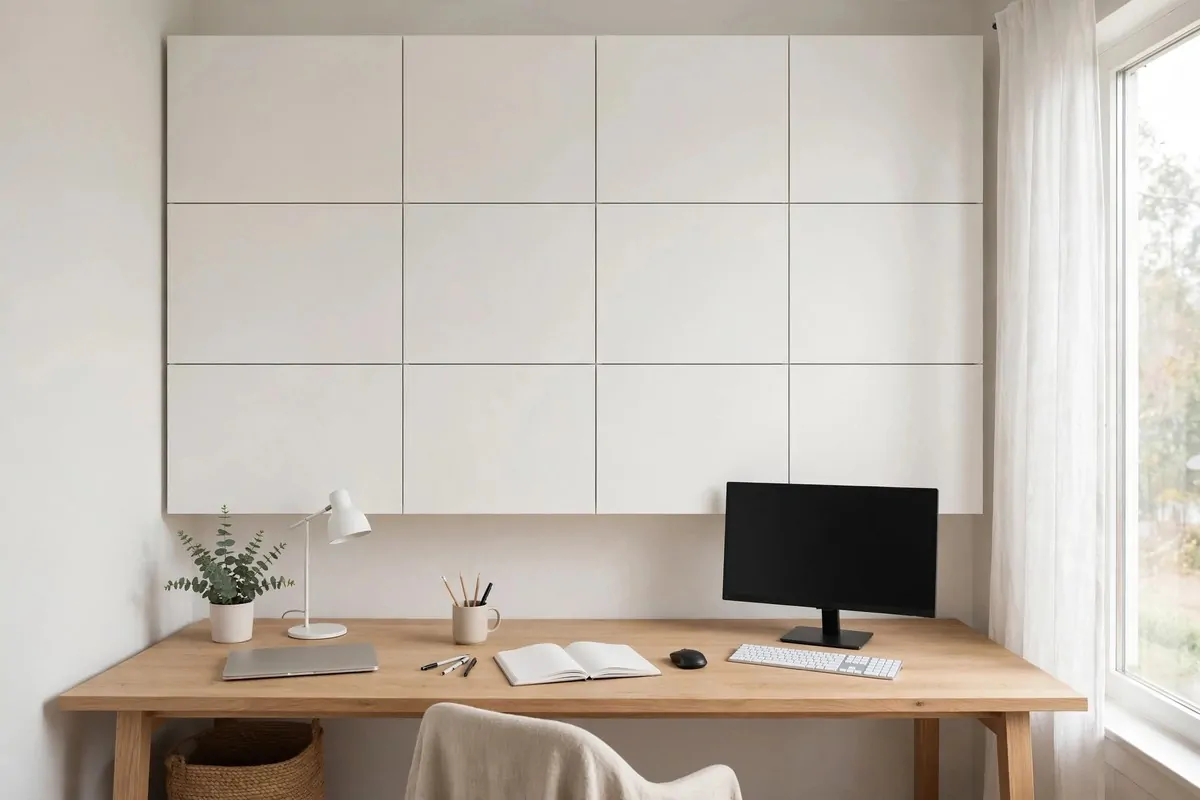
This is the big one. The whole wall above your desk, filled with EKET boxes from one side to the other.
It sounds like a lot. But once it is up, it looks calm, not busy. Because everything is behind closed doors, your eye sees one clean grid. The mess is still there. It is just hidden.
Here is why it works so well. Your desk zone is where you need things the most. Having the storage right above you means you can reach almost anything without standing up. Pens. Notebooks. Printer paper. All of it, one reach away.
Measure your wall before you buy. Write down the width. EKET cabinets come in a few sizes, and you want the row to end cleanly on both sides. A wall that ends mid-cabinet looks unfinished.
Most people use the standard 35 cm deep cabinets for this wall. They are deep enough to hold files and office supplies. The shallower 25 cm ones can look a bit thin for a full wall. But they work in tight rooms.
Start the bottom row just above your monitor. Leave enough space so you do not hit your head when you stand. About 55 to 65 cm above the desk is the sweet spot for most people.
Mounting is the part you should not rush. EKET hangs on a metal suspension rail. You screw the rail into wall studs. Then the cabinets hook on. It is a simple system, but it only holds if the rail is solid.
Here is a quick way to think about what goes where in your EKET wall:
| Row | Best for | Why |
|---|---|---|
| Bottom row | Daily items | Easiest to reach |
| Middle row | Papers and files | Eye level, fast to find |
| Top row | Rarely used stuff | Out of sight, safe and sound |
Use doors with the push-open feature. They open with a light tap. No handles needed. That keeps the whole wall looking smooth and modern.
If your wall is wide, do not fill every single gap. Leave one or two open boxes in the grid. Put a small plant or a framed photo there. It breaks up the boxiness and makes the wall feel alive.
One last tip. Put a label inside each door. A sticky note works fine. Future you will thank past you when you stop opening three doors to find the stapler.
2. Open EKET Cubes for Books and Bits
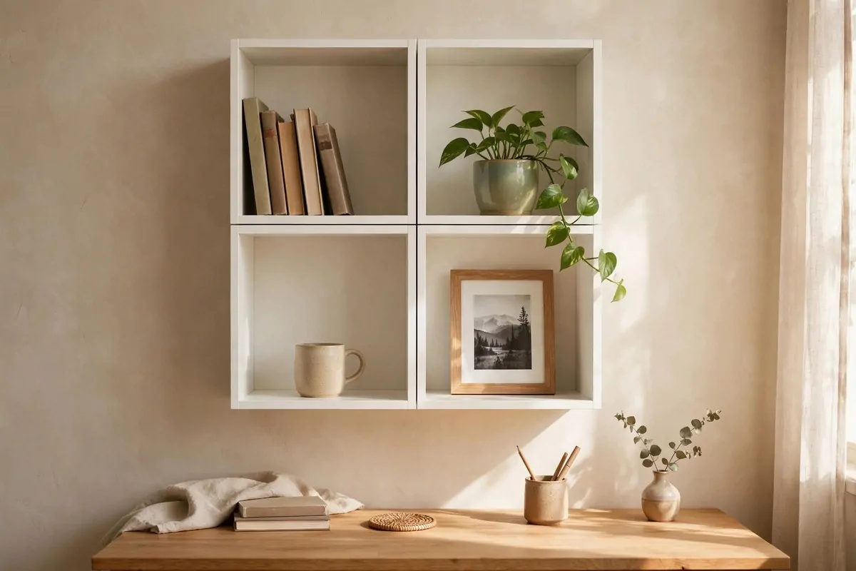
Closed doors hide the mess. But open cubes do something else. They make the room feel personal.
Books look good on a shelf. So do small boxes, a tiny plant, and that weird souvenir you refuse to throw away. Open EKET cubes give these things a home. The wall starts to feel like yours.
The trick is to not cram them full. Leave some air around your things. A shelf that is packed tight looks like storage. A shelf with breathing room looks like design.
Put the open cubes at eye level if you can. That is where your eyes land when you look up from the screen. It is nice to see things you like in that little break.
Use small matching boxes inside the open cubes for the boring stuff. Cords. Spare batteries. Random screws. The boxes keep it tidy while the shelf still looks open and pretty.
Books stack well in EKET. The cubes fit most paperbacks upright. Big art books fit too if you lay them flat. I keep my work journals stacked flat in mine. They are easy to grab that way.
A small plant in one cube changes everything. It adds life to a wall of boxes. Pick something tough like a pothos. It will forgive you when you forget to water it.
Do not put open cubes right above a desk where coffee lives. Spills and dust are real. One row higher, out of the splash zone, is better for display shelves.
If the cubes start looking messy, do the one-minute rule. Once a week, stand in front of them for one minute and put three things back where they belong. That is all it takes.
This idea pairs well with closed cabinets below. Pretty things up high. Ugly necessities down low. Everyone wins.
3. The Mix: Closed Bottom, Open Top
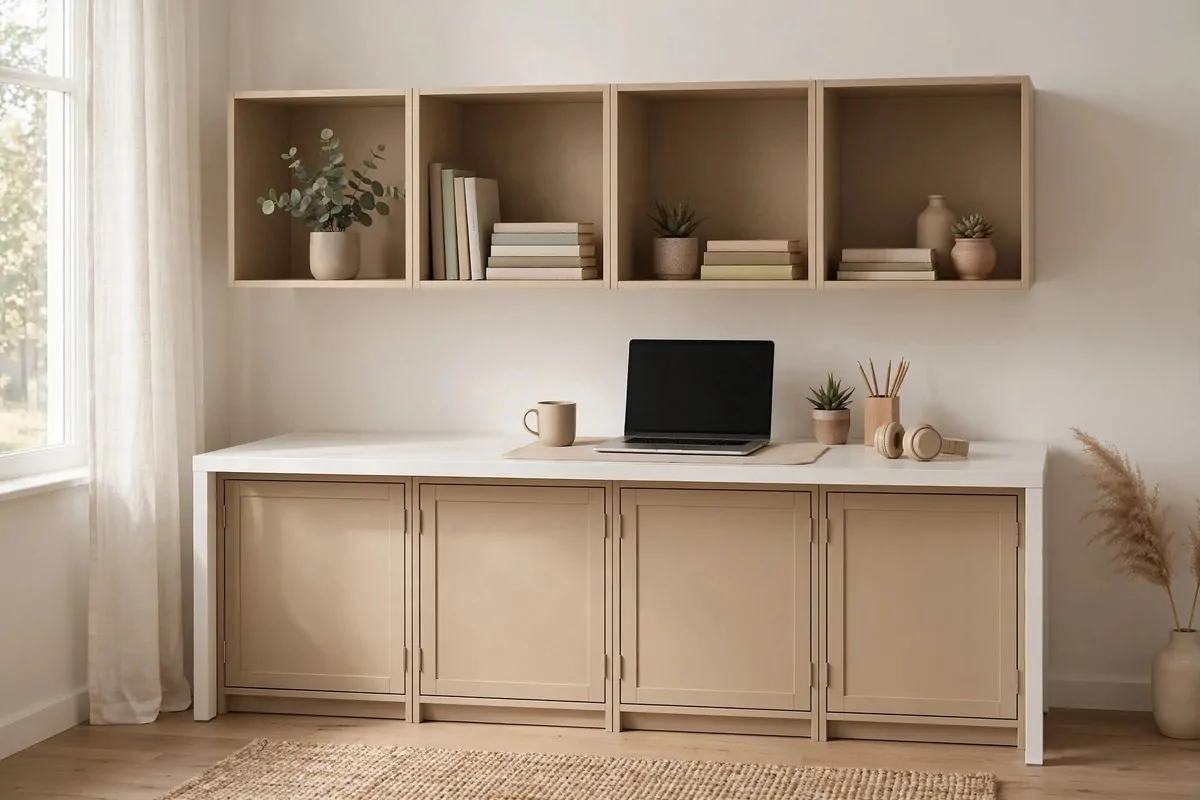
This is the layout I recommend to almost everyone. Closed cabinets on the bottom. Open cubes on the top. It gives you the best of both worlds.
The closed bottom hides the chaos. Old files. Tech boxes. That drawer of mystery cables. Nobody sees any of it. The wall looks neat even on your worst day.
The open top shows off the nice stuff. Your books. A small frame. Maybe a plant or two. Your eyes rest on pretty things instead of clutter.
This split works because of how we look at walls. We notice the middle and lower parts most. That is where clean looks clean. Up high, we are more forgiving. Open shelves up there look airy, not messy.
Keep the bottom row within easy reach. That is your workhorse zone. Files, supplies, and things you touch daily live there. The doors make it all disappear in one smooth look.
Up top, style the open cubes in odd numbers. Three cubes with things in them looks better than four. I do not know why. It just does. Trust your eye on this.
Leave one open cube empty. On purpose. It gives the whole arrangement room to breathe. It also gives you a landing spot for the next book you buy.
Colour matters here too. You can keep the whole thing one colour for calm. Or make the open cubes a different colour from the closed ones. White below and wood-look on top is a combo that never fails.
This layout is also the easiest to start with. Buy the bottom cabinets first. Live with them for a month. Then add the open cubes when you are ready.
One more thing. The push-open doors on the bottom row are great, but open them fully when you load the cabinets. It is easier than squeezing things through a half-open door.
4. The Asymmetrical Mountain Climb
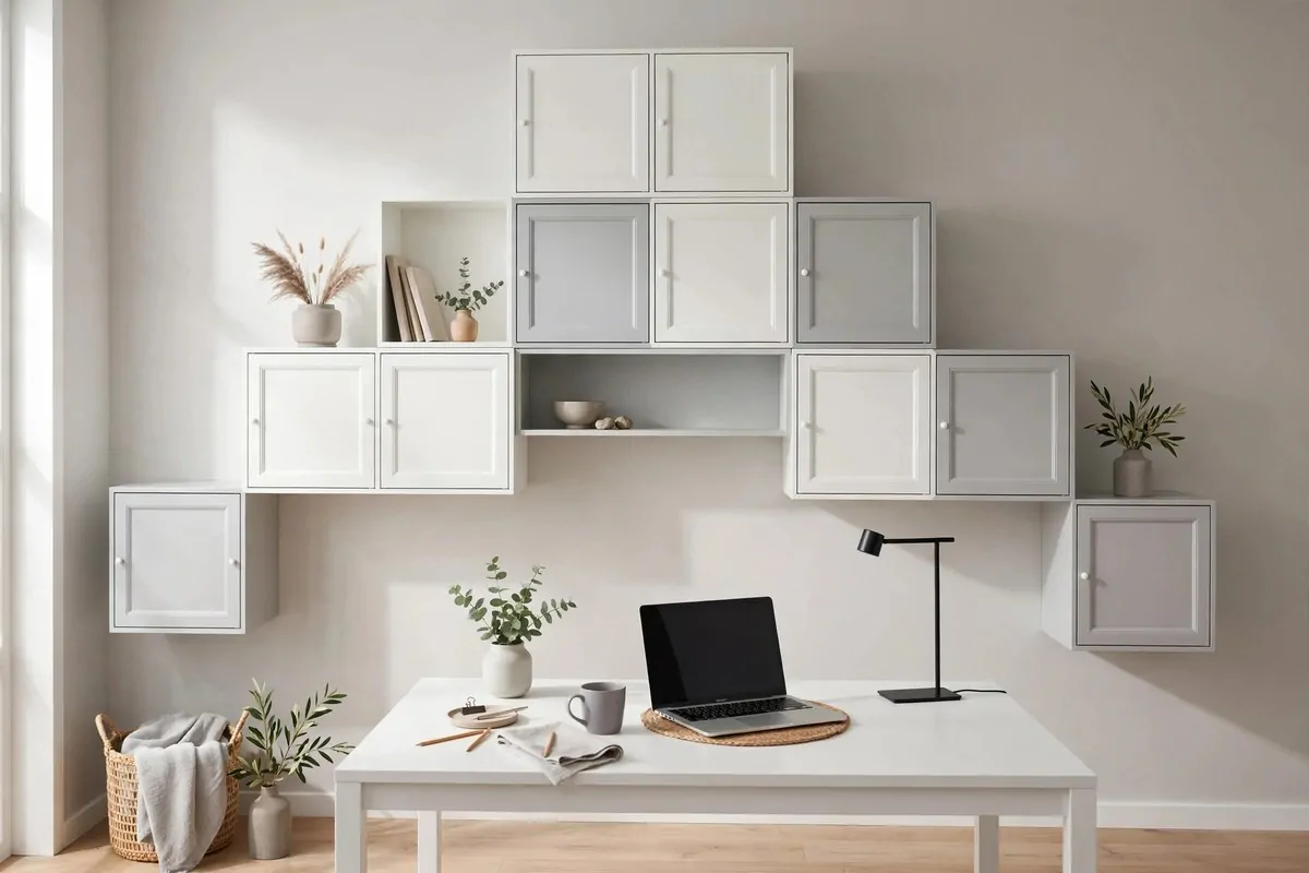
IKEA itself suggests this one, and it is brilliant. Instead of a flat rectangle, you build the cabinets up in a mountain shape. Low on the sides, taller in the middle.
It looks like art. A mountain of boxes on your wall. Visitors notice it the second they walk in. It turns plain storage into a feature wall.
The middle peak is the tallest part. That is where your biggest storage lives. Binders. Boxes of files. The stuff you need but do not touch daily.
The lower sides are perfect for open cubes. Style them with books and a plant. They sit at a height where you can actually see and enjoy them.
This layout is friendly to small rooms. It does not cover the whole wall. The empty space around the mountain makes the room feel bigger. You get lots of storage without a wall of boxes pressing in.
You will need two depths to pull this off. Use the deeper 35 cm cabinets at the bottom for strength and real storage. Use the shallower 25 cm ones higher up. It keeps the wall feeling light.
Draw the shape on paper first. Mark the wall with light pencil dots where each cabinet goes. It is much easier to move a pencil dot than a mounted cabinet.
Secure every cabinet to the wall. Even the bottom row. This is IKEA’s own advice and it matters. A full cabinet of books is heavy. The rail and wall fixings carry that weight only if you do it right.
Mix colours in the mountain for a playful look. Two or three colours max. White, grey and one wood tone works well. More than three starts to look like a toy box.
Keep the peak a little below the ceiling. A small gap at the top stops dust from settling where you cannot reach. It also makes the shape look finished, not crammed in.
This one is my pick if you want storage that people actually compliment. It is practical and pretty at the same time.
5. A Low EKET Credenza Under the Window
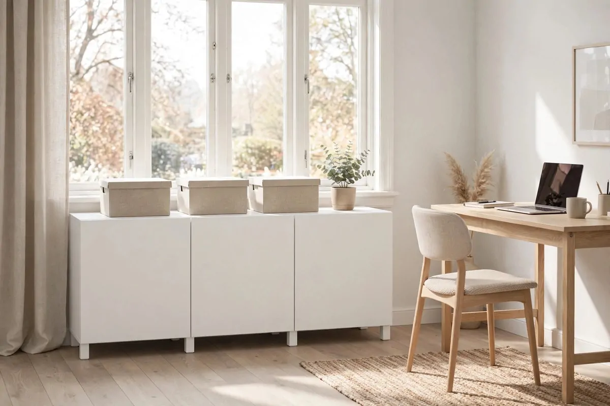
Not every wall is for hanging. The wall under your window is dead space. A low row of EKET cabinets turns it into a credenza.
This is storage you can sit next to. It holds the big, heavy things. Printer paper. Box files. That stack of magazines you swear you will read.
Keep it low enough that the window still gets light in. The tops of the cabinets sit below the sill. Your desk gets all the daylight. The storage stays out of the way.
The top of the credenza is a free shelf. Put a row of matching boxes up there. Or a plant that loves the light. Window light makes everything on it look good.
You can sit EKET on the floor with feet or a plinth. Or mount it floating just above the floor. Floating looks modern. Floor-standing is sturdier and easier. Pick what suits your home.
Use doors on this low row. Under a window, things collect dust fast. Doors keep it all clean. They also hide the boring stuff you only touch once a month.
Inside, use one cabinet per category. One for paper. One for tech extras. One for the kids’ school papers if you have them. When everything has its own box, you stop piling.
This credenza can double as extra seating in a pinch. The frames are strong. Throw a cushion on top and guests have a place to perch. Just do not jump on it.
If your office is also a spare bedroom, this low unit is perfect. It is not too tall. It does not scream office. Guests see a neat bench with boxes. You see your filing system.
Measure your window first. Leave a hand’s width of space on each side. The cabinets should look like they were made to fit, not squeezed in.
One more idea. Line the inside of a cabinet with fabric. It softens the look and stops boxes from sliding. A cheap offcut does the job.
6. One Bold Cube as a Pop of Colour
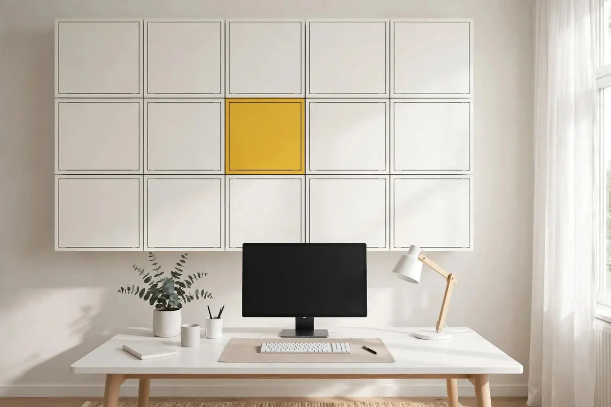
Here is IKEA’s own trick and it is so good. Build a calm grid of white or grey cabinets. Then swap one for a bold colour.
That one cube becomes the star. Your eye goes straight to it. The whole wall feels designed, not just stored.
Pick a colour you actually love. Mustard yellow. Pale lilac. Dark green. EKET comes in fun shades that change often. Choose one that makes you smile when you look up.
Put the bold cube in the middle of the grid. Or slightly off centre. Off centre feels more modern. Middle feels more classic. Both work.
Use the bold cube for something pretty. Your favourite books. A small plant. The nice stationery you save for good days. Give the star something worthy to hold.
Keep the rest of the wall calm. White or light grey. The contrast is what makes the pop work. A bold cube in a loud wall just gets lost.
You can change the pop colour later. That is the beauty of EKET. Doors and fronts swap easily. Tired of the yellow? Try the dark green next year. New look, same wall.
This works in tiny offices too. Even a grid of four cubes gets the trick. Three white, one bold. Small wall, big personality.
Do not overdo it. One pop cube is a statement. Three pop cubes is a pattern. Both are fine, but know which one you want before you buy.
If you are shy about colour, try the pale lilac or the soft sage shades. They add interest without shouting. You still get the pop, just in a whisper.
Visitors will point at it. They always do. And you get to say it was one cabinet. That is the whole trick.
7. The Printer and Paper Wall
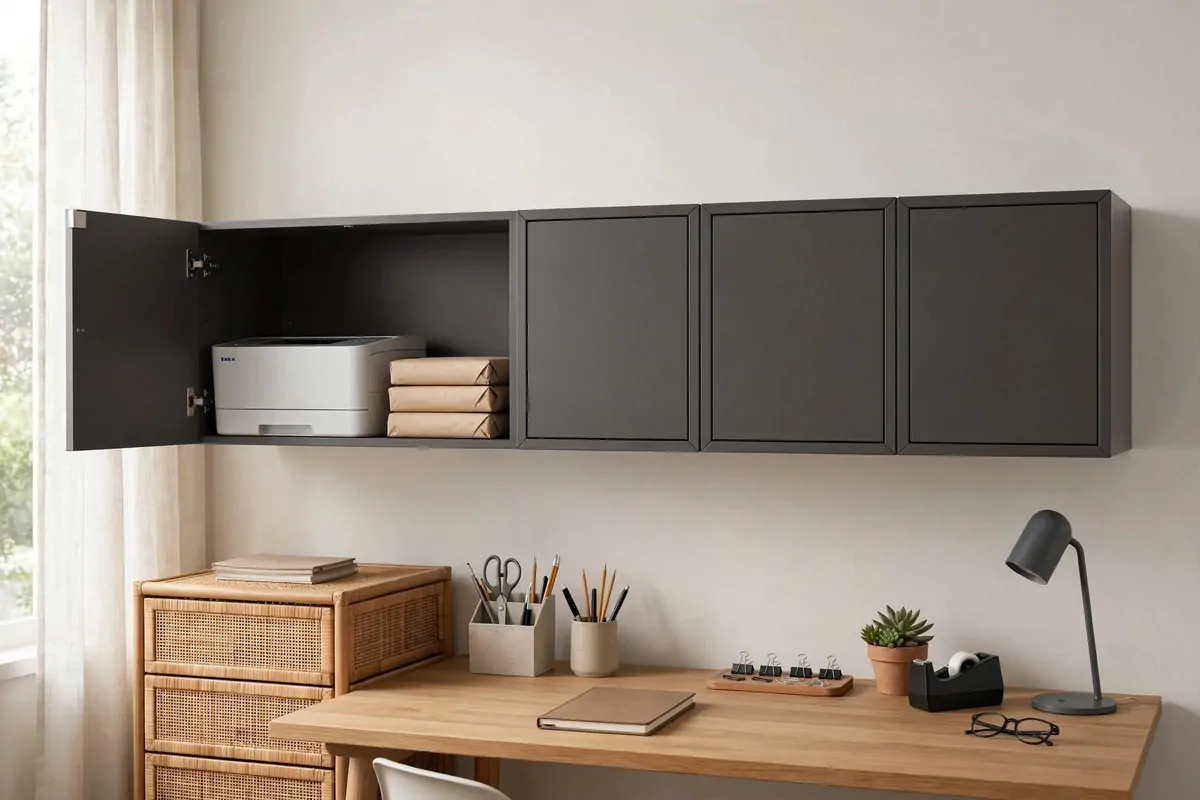
Every office has an ugly corner. The printer. The paper stack. The ink boxes. This idea gives them a proper home.
Build a small EKET wall for your office machines and the supplies that feed them. Everything printer related lives in one place. Nothing wanders onto your desk.
Put the printer inside a deep open cabinet. The 35 cm deep boxes fit most home printers. Leave the front open so you can reach the paper tray. Airflow matters. Printers get warm.
Keep paper in the cabinet right next to the printer. Reams. Envelopes. Labels. When the printer runs out mid-job, the refill is one step away. No more hunting through the house.
Use closed doors for ink and toner. They are ugly and they leak sometimes. Behind a door, they are invisible and safe. Out of sight, out of worry.
Dark grey EKET is perfect for this wall. It hides scuffs. It looks serious. It also hides dust better than white. Printers make dust. This is just true.
Leave one open shelf for the things in use. The current project folder. The notebook you print from. The mail that needs scanning. A little staging zone keeps the flow smooth.
Mount this wall close to a power outlet. Printers need power and sometimes a cable to the computer. Plan the cord before you mount the cabinets. Running cords after is a pain.
Put a small basket in one cabinet for printer waste. Test prints. Misprints. Paper with one side used. Empty it once a month. It keeps the whole wall from filling with paper ghosts.
Label the cabinets. PAPER. INK. SCAN. It sounds silly. It saves you from opening three doors every time. Sticky notes work. So does a label maker if you are fancy.
This wall turns a chore zone into a tidy station. Printing stops being a mess you avoid. It becomes a quick task you finish and forget.
8. The Corner Climber
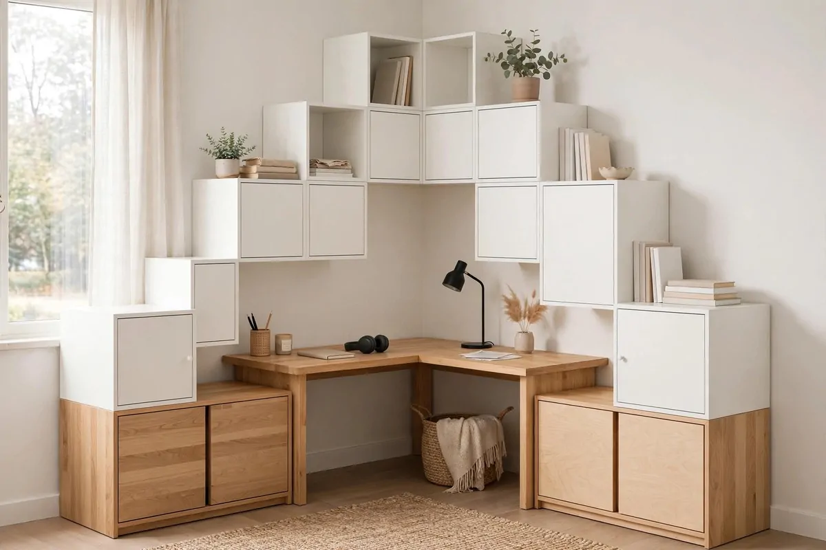
Corners are the most wasted space in every office. This idea takes them back. You build EKET up both sides of a corner, climbing like steps.
Start at the bottom with deep cabinets. These hold the heavy stuff. Big binders. Box files. Things you do not want falling from a height.
Work your way up, but do not go straight. Step the shape. Leave some surfaces clear as you climb. Those clear tops are perfect for plants and bigger display pieces.
The corner itself can hold a tall stack. It looks amazing. A column of boxes rising in the corner uses space that was doing nothing. It also makes the room feel anchored.
Break up the boxiness with an uneven top. One side taller than the other. Or a gap in the middle. Symmetry is nice, but a little wild looks more interesting.
This setup is great for L-shaped desks. Your desk wraps the corner. Your storage wraps the walls. Everything you need is within arm’s reach from your chair.
Secure every single cabinet to the wall. The bottom row too. Corners feel safe, but a full cabinet is heavy no matter where it sits. IKEA says this in their own guide. Listen to them.
Use the clear surfaces for things you love. A framed photo. A small clock. A plant that trails down. The corner becomes a happy spot, not a dark one.
Light the corner if it is dark. A small lamp on one of the cabinet tops works. Corners are often dim. A little light makes the whole climb feel intentional.
Keep the very top of the climb low enough to reach with a step stool. Storage you cannot reach is just decoration. Be honest about your height and your ladder habits.
This corner will hold more than you think. Boxes on the wall. Clear tops for display. It is one of the hardest working ideas on this list.
9. Deep Below, Shallow Above
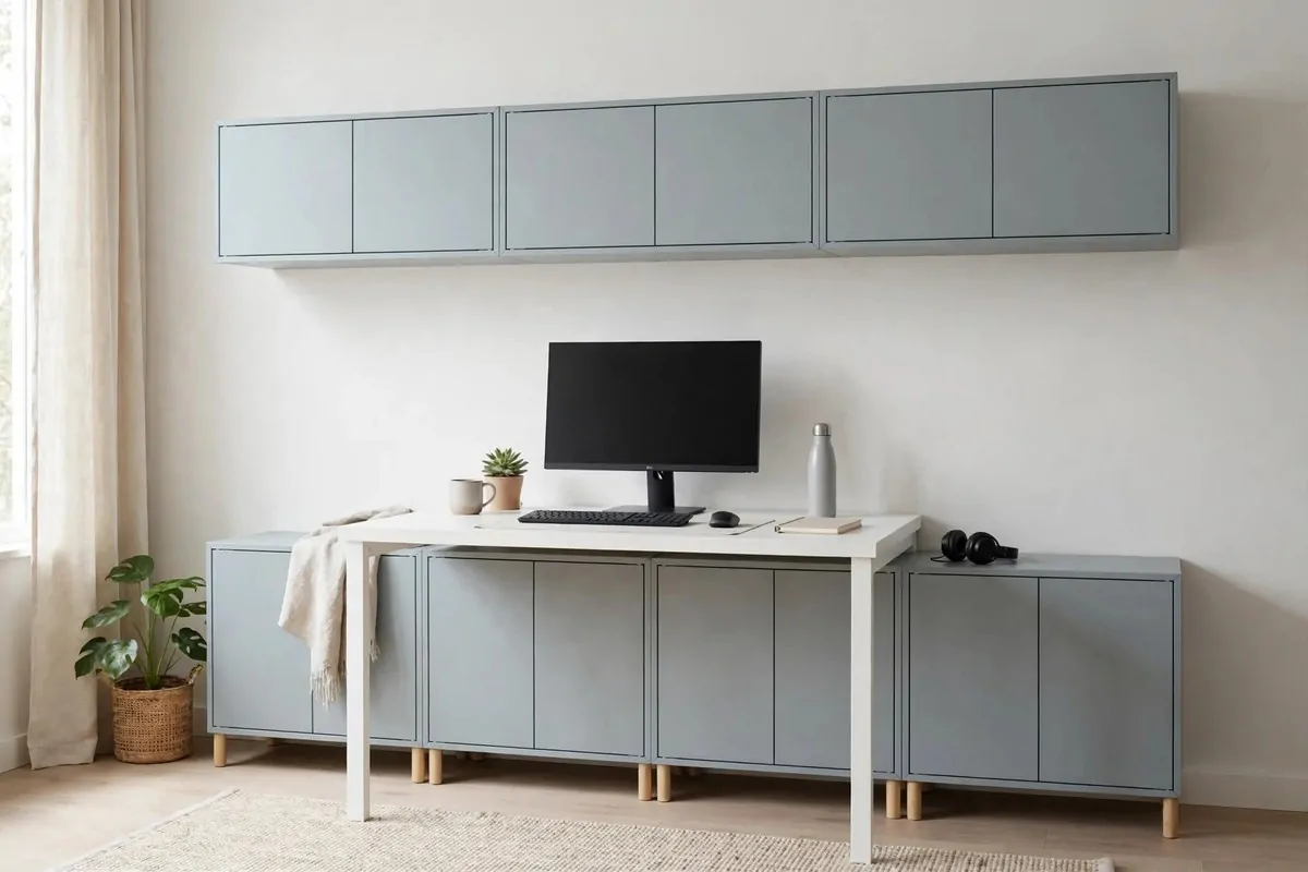
EKET comes in two main depths. Deep ones at 35 cm. Shallow ones at 25 cm. This idea uses both on purpose.
Deep cabinets go at the bottom. They hold the big stuff. Files. Storage boxes. The printer accessories. The weight sits low, which is safer and easier to reach.
Shallow cabinets go on top. They hold lighter things. Notebooks. Pens. Small boxes. Up high, you do not want deep cabinets. They stick out too far and feel heavy over your head.
The mix looks slim and neat. The wall steps back as it goes up. Your desk area feels open, not crowded. It is a small trick with a big effect.
Here is a simple guide for what lives at each depth:
| Cabinet depth | Put here | Keep out |
|---|---|---|
| 35 cm deep | Files, boxes, heavy items | Tiny items that get lost |
| 25 cm shallow | Books, pens, small trays | Anything big or heavy |
This depth split also saves money. Shallow cabinets cost less. Using them up top cuts the total bill. You get the same wall of storage for less.
Think about how you reach. Bottom deep cabinets are for crouch-and-grab items. You bend for them rarely. Top shallow cabinets are for quick peeks. Everything stays easy.
The shallow top row is also the perfect spot for a display gap. Leave one box open. Put a plant there. The shallow depth keeps it from looking cluttered.
If your office is narrow, this idea is a gift. Deep cabinets everywhere would make the room feel tight. The shallow top row pulls the visual weight back.
Match the colours across both depths. Same colour, different depths, one clean look. The eye reads it as one system, not a patchwork.
Check your wall before mixing depths. The rail handles both fine. Just plan the layout on paper first so the rows line up nicely.
This is the thinking person’s EKET wall. Not just more boxes. The right boxes in the right places.
10. Glass Doors for the Pretty Stuff
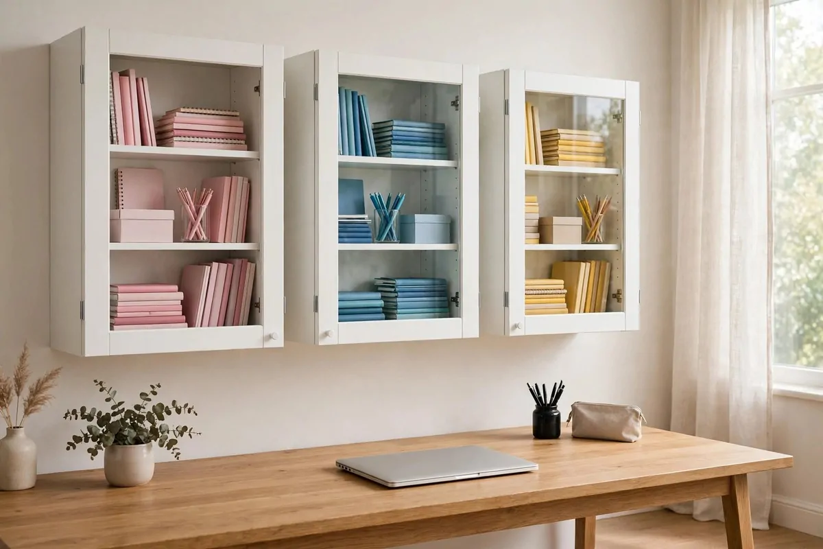
Glass doors are the middle ground. Not hidden like solid doors. Not exposed like open cubes. Just a little peek.
They work best for things that already look nice. Colourful notebooks. Neat pen jars. Pretty boxes. If it looks good, show it through glass.
The glass keeps dust off. This is the real win. Open shelves get dusty in an office. Behind glass, your pretty things stay clean. You still get the display effect.
Keep what is inside tidy. Glass is honest. It shows mess. So this idea comes with a small rule. If it goes behind glass, it has to look nice.
Group by colour inside. All the blue notebooks together. All the kraft paper boxes together. Colour grouping is the easiest styling trick there is. It always looks neat.
Use the glass-front cabinets in the middle row of your wall. Eye level. That is where the display does its work. Solid doors can go above and below.
Do not overfill. Leave space between groups. Glass fronts look best when things have room. A packed glass cabinet just looks like a shop shelf.
Wipe the glass once a month. A quick swipe with a damp cloth. Office dust is sneaky. Clean glass makes the whole wall sparkle.
This idea is perfect for craft supplies too. Washi tape. Nice paper. Ribbon rolls. They look gorgeous behind glass. And you can see what you have without opening doors.
Kids love the glass fronts. They can see the fun supplies without touching. If your office shares space with homework time, this matters.
One warning. Glass shows fingerprints. If little hands are around, wipe more often. Or put the glass row higher up. Problem solved.
11. EKET With Warm Light Underneath
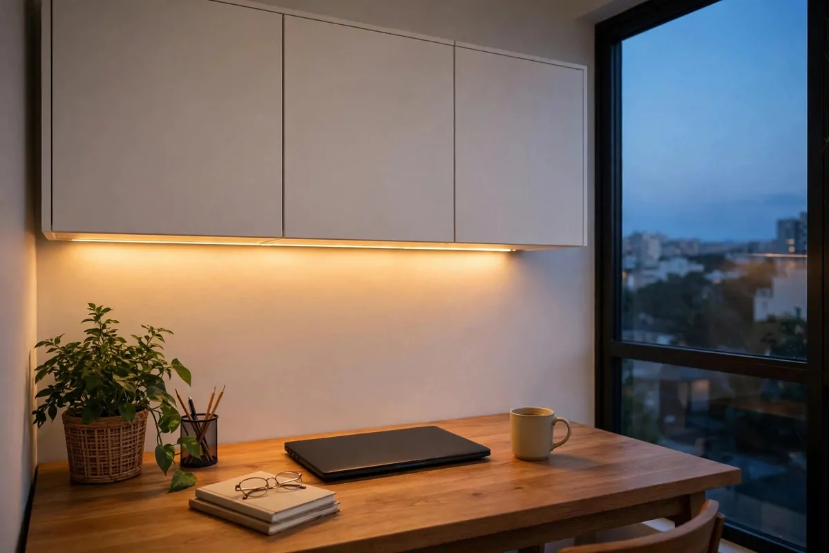
This idea adds one thing under your EKET cabinets. Light. And it changes everything.
Stick LED strip lights under the bottom row of cabinets. They shine down on your desk. Suddenly your workspace feels warm and focused. Like a cosy corner, not a cubicle.
Warm white light is the key. Not cool blue. Warm light around 2700K feels like evening sun. It is kind to your eyes after a long screen day.
The light also makes the wall look expensive. It is a trick from fancy kitchens. Under-cabinet lighting adds depth. Shadows soften. The whole setup looks richer.
You can see your desk better too. The strips light your keyboard and papers. No more harsh overhead light bouncing off your screen. Your eyes will thank you.
Battery strips are the easy option. Stick them on. Done. No wires. No electrician. Change the batteries every few months. Simple.
Wired strips are brighter and last longer. If you are handy, run a thin cable down the side of the cabinets to an outlet. Most people can do this in an afternoon.
Put the light switch somewhere easy. A remote works. Some strips have motion sensors. Wave your hand and the desk lights up. It feels a little bit magic.
Light the display cubes too. A small strip inside an open cube makes your books and plant glow. It is a tiny detail that looks incredible in the evening.
Turn the strips on at dusk. Work a little. Read a little. The warm glow makes the office the nicest room in the house at night. I am not kidding. Try it once.
This is one of the cheapest upgrades on this list. A strip of lights costs little. The feeling it gives is worth ten times more.
12. The Slim Tower Next to Your Desk
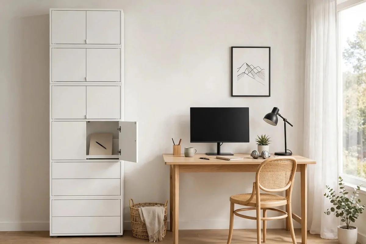
Not every office has a big empty wall. Some of us have one thin strip of wall next to the desk. This idea is for that strip.
Stack EKET cabinets tall and narrow. One column. Floor to almost ceiling. It is a tower of storage in the space of a coat rack.
This tower holds the daily essentials. Top box for pens and small things. Middle for notebooks and folders. Bottom for the heavy stuff you rarely move.
Mount it on the wall with the rail. Even floor-standing towers should be fixed to the wall. Tall and narrow can tip. The fixing takes five minutes. Do not skip it.
A tower like this is perfect beside a desk that faces the wall. Swivel your chair. Grab what you need. Swivel back. Your workflow never breaks.
Use a mix of doors and open boxes in the tower. Doors at the bottom for ugly stuff. One open box in the middle for the notebook you use daily. It becomes your grab-and-go spot.
Put the tallest things at the bottom. Heavy books. Box files. The low centre of gravity keeps the tower stable. Light things go up high. This is just good physics.
If the tower is near a door, keep the swing clear. Measure twice. A tower that blocks a door is a daily annoyance. A hand’s width of clearance is enough.
Style the top of the tower. It is at eye level when you stand. A small plant. A clock. Something nice. The top box is free decor space.
Two towers can frame a desk. One on each side. Like bookends. It looks built-in and serious. It also doubles your storage without touching the wall above.
Small wall, big win. That is the whole point of this one.
13. A Low EKET Reading Bench in the Corner
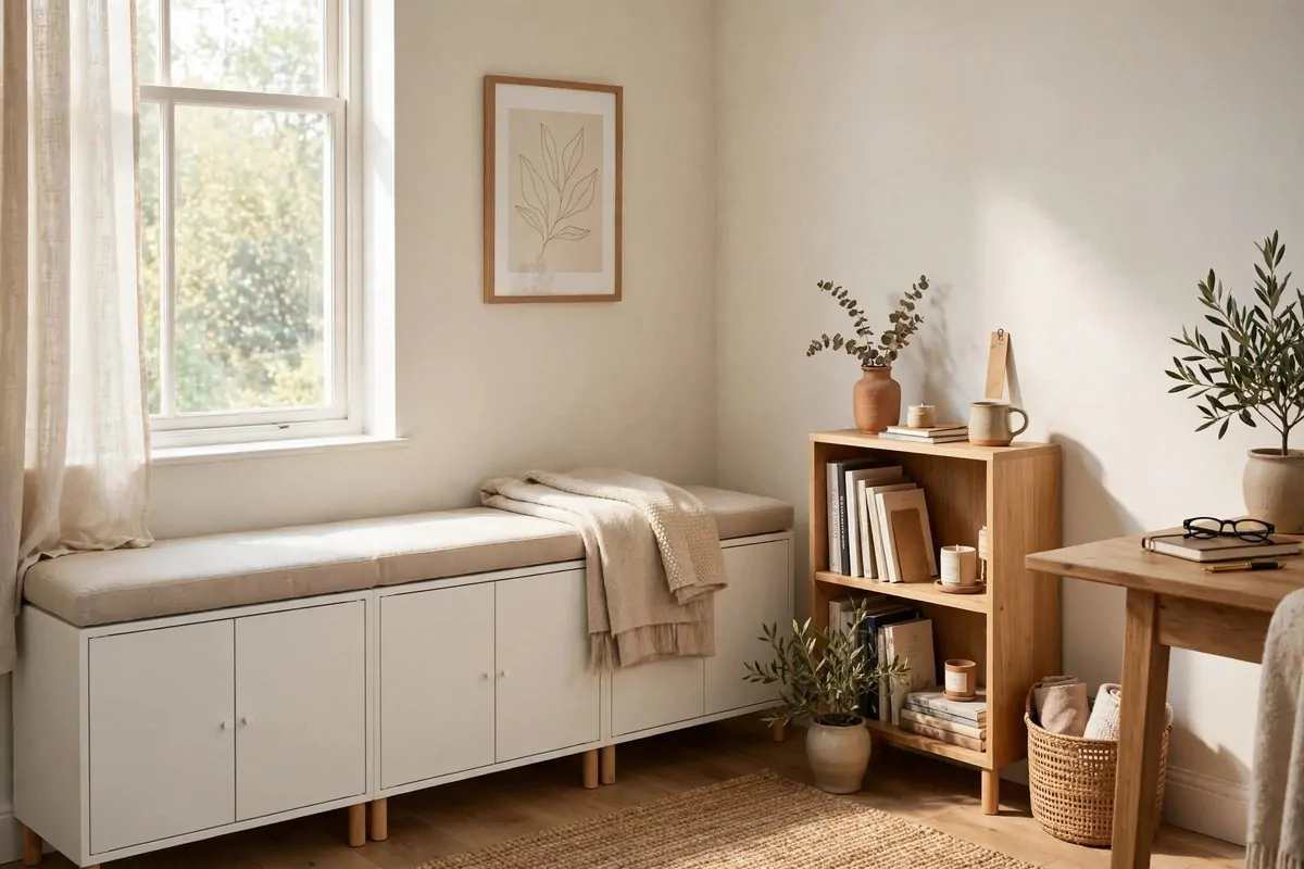
Offices need a spot that is not the desk. A place to read. To think. To drink coffee without a screen in front of you.
A low row of EKET cabinets makes a perfect bench. Strong enough to sit on. Full of storage underneath. Two jobs, one piece of furniture.
Put a cushion on top. A flat seat pad works. So does a folded blanket. Suddenly the corner has a purpose. It is your thinking spot.
The cabinets under the seat hold the slow stuff. Old project files. Reference books. The things you need sometimes but not daily. They live there quietly.
This corner works best near a window. Natural light for reading. A view for daydreaming. If your office corner has a window, claim it for this bench.
Keep the bench low. Two rows of cabinets max. You want to sit down and stand up easily. A bench that is too tall feels wrong. Knee height is about right.
Use doors on the bench cabinets. When you sit, your legs are near them. Doors keep everything hidden and smooth. No stubbed toes on open boxes.
Style the wall above the bench. A small shelf. A framed print. The bench becomes a nook. A nook feels cosy in a way a corner never does.
This is also a great spot for kids during homework time. They sit on the bench with a book. You work at the desk. Same room, different zones, no fights.
Add a small basket on the bench for current reads. The book you are halfway through. The magazine from last week. It keeps the top clear and the reads close.
Your office just gained a second room. A desk for work. A bench for rest. All from a few low cabinets.
14. A Colourful Wall for a Kids Study Zone
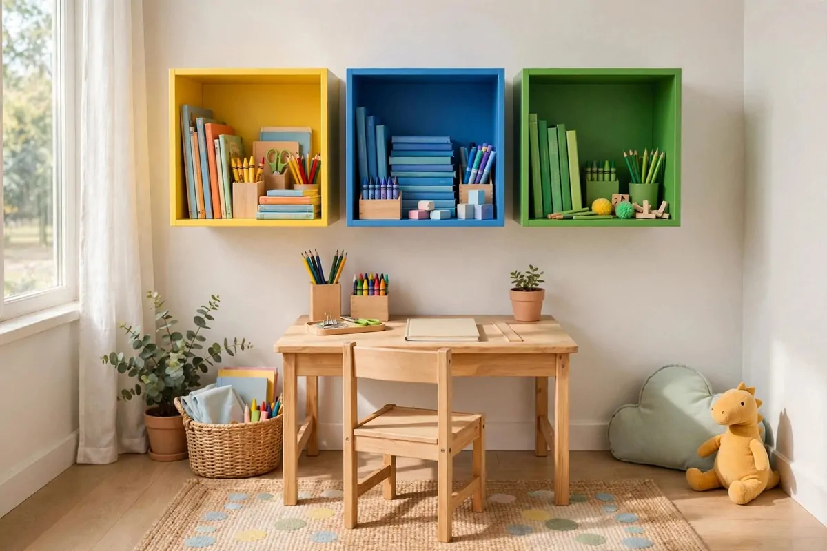
If your office shares space with a kids homework zone, this one is for you. EKET in happy colours turns a study corner into a place kids actually like.
Mix the fun shades. The multicolour combos IKEA sells are made for this. Bright doors. Playful fronts. The wall looks like it belongs to a kid, not an office.
Give each child their own column. One stack per kid. Their books. Their supplies. Their art. When everything has a named spot, the morning hunt for the missing pencil case stops.
Keep the kids cabinets low. They need to reach their own stuff. Bottom rows for little hands. Top rows for your office things. One wall, two users, no conflict.
Use the open cubes for display. Kids love showing their work. A drawing in a frame. A good grade pinned up. The wall celebrates them. That matters more than you think.
Doors with the push-open feature are kid friendly. No handles to catch on. A light push and it opens. Little fingers manage it fine.
Inside, use small boxes. One for crayons. One for homework folders. One for the stuff they swear is important. Boxes make tidying a game. Sort and drop.
Let them pick their door colour. It is their zone. A kid who chose the yellow door will keep the yellow cabinet tidy. Ownership works better than rules.
Put a clock on the wall above. Homework time. Reading time. Break time. The EKET wall becomes the study headquarters. Everything in one spot.
This idea grows with them. Swap the bright doors for calm ones when they are older. Same cabinets. New look. EKET is flexible like that.
A shared office can still feel fun. This wall proves it.
15. The Desk Command Wall
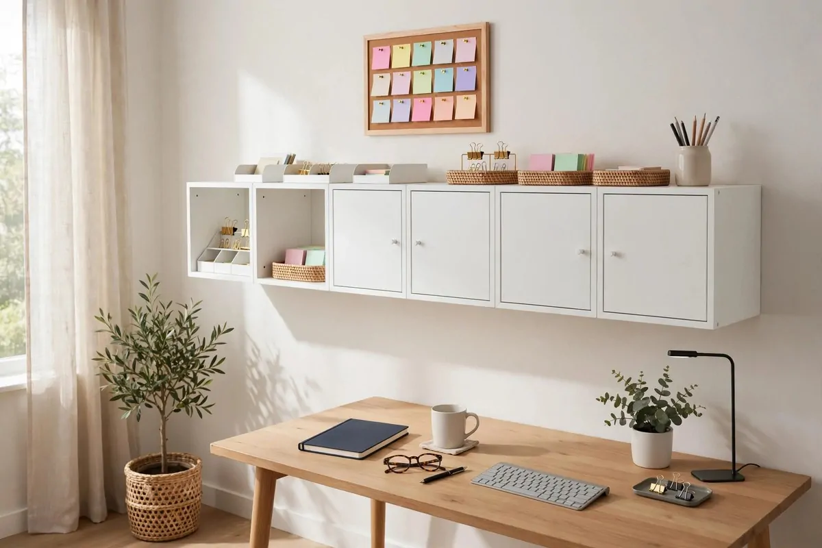
The last idea is my favourite. Turn your EKET wall into command central. Storage below. Organisation on top.
The tops of the bottom cabinets are a free shelf. Put small trays there. Incoming mail. Today’s to-do list. The pen you actually use. A landing strip for daily life.
Mount a pinboard or a small whiteboard above the cabinets. Notes. Reminders. The kids school dates. It lives at eye level, where you will actually see it.
Use one open cube as the charging station. Phones. Headphones. The tablet. Cords run behind the cabinet. The front looks clean. Everything charges in one spot.
Keep a small clock on the command wall. Time flies when you work. A clock at eye level keeps the day honest. No more surprise it is six already moments.
This is the wall that runs your day. Every morning, you glance at it and know the plan. Every evening, you clear the trays and reset. It is a tiny ritual that keeps chaos away.
The system is simple. Here is how to set it up:
- Tray one: things to do today. Nothing else goes here.
- Tray two: things waiting on someone else. Check it weekly.
- Pinboard: dates and reminders. If it is not pinned, it does not exist.
- One open cube: the notebook and pen you reach for daily.
- Closed cabinets: everything else. Filed, hidden, calm.
Reset it every Friday. Clear the trays. File the papers. Wipe the tops. Monday morning starts clean. This habit takes ten minutes. It saves hours of hunting.
The beauty of this wall is that it grows. Add a cabinet when life gets busier. Remove one when it calms down. The command centre scales with you.
Fifteen ideas. One wall system. Your office will never be the same.