25 Home Design Ideas Designers Swear By

Designers have a short list of moves they repeat in almost every home. I know because I started paying attention. The same tricks, the same little fixes, in home after home.
These are not the things they talk about on TV shows. The TV shows love the big reveals and the expensive sofas. The real playbook is quieter, and most of it costs almost nothing.
That is why I am sharing it here. No gatekeeping, no fancy words, just the actual home design ideas designers swear by when they walk into a room and make it look amazing.
Most of these tricks take one afternoon. Some take ten minutes. None of them need a renovation or a big budget, and that is the whole point.
So grab a coffee and walk through this list with me. By the end, you will know the playbook too, and your home is going to thank you.
1. Hang Curtains High and Wide
This is the first thing designers do in almost every room, and it might be the biggest bang-for-your-buck trick on this whole list. It costs nothing extra if you already own curtains.
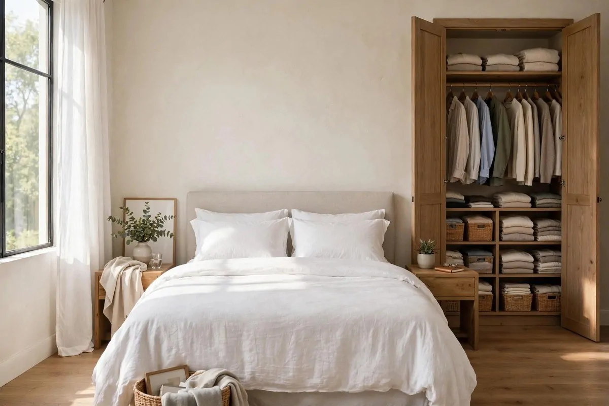
Most people hang their curtain rod just above the window frame. That is the mistake. It chops the window short and makes the whole wall feel low.
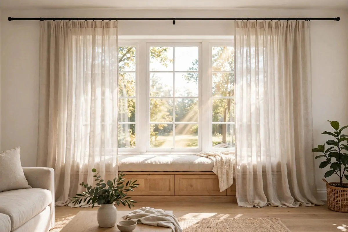
Designers mount the rod close to the ceiling instead, usually just a few inches below it. Then the curtains fall all the way to the floor. Your eye follows that long line upward, and your brain decides the ceiling must be higher than it is.
It is a simple optical trick, and it works in every single room. Bedrooms, living rooms, even tiny apartments all feel taller this way.
Going wide matters just as much as going high. Extend the rod a good bit past the window frame on both sides.
That way the curtains sit on the wall when they are open, not over the glass. You get more light during the day, and the window itself looks much bigger than it really is.
Try it on one window this weekend and you will see the difference instantly.
One more tip: curtains that just kiss the floor or puddle slightly look expensive. Curtains that float halfway down the wall look unfinished. Let them go long.
If you are renting and you cannot drill holes, try tension rods inside the frame or command-style hooks. You can still go as high as possible.
2. Paint the Ceiling Flat White
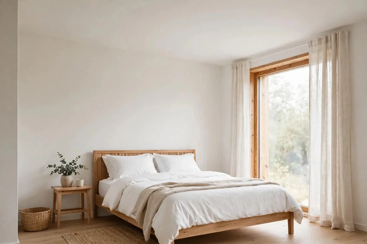
Ceilings are the forgotten surface in most homes. We paint walls, we fuss over floors, and we completely ignore the big flat thing above our heads.
It is the cheapest room upgrade you can buy.
Designers never ignore it. A fresh coat of flat white paint on the ceiling is one of their favorite quiet tricks.
Flat paint does not reflect light the way satin or gloss does. That sounds like a bad thing, but for ceilings it is perfect.
Shiny ceilings bounce light in weird ways and show every flaw. Flat paint hides bumps and seams, and it tricks your eye into thinking the ceiling floats a little higher.
If pure white feels too cold for you, pick a soft warm white. It still reads as white, but it feels cozier and kinder to your walls.
This trick is especially good in rooms with low ceilings. A bright flat ceiling pulls the eye up without drawing attention to itself.
A ceiling job is also one of the easiest paint projects there is. No cutting around windows or doors, just big rolling strokes.
One afternoon, one can of paint, and your whole room feels taller. Designers do this so often that many of them do not even think of it as a trick anymore. It is just how a room gets finished.
3. Style Shelves in Odd Numbers
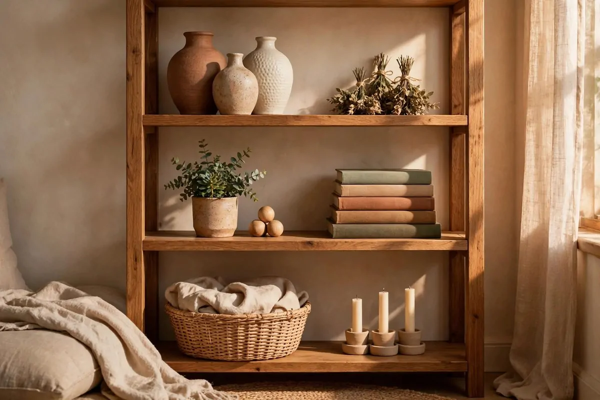
Here is a secret that sounds almost silly until you try it. Designers group objects in odd numbers. Threes and fives, mostly.
Three is magic, and five is even better.
Two objects side by side feel stiff, like a pair of bookends waiting for someone to use them. Three objects feel alive. Your eye moves around the group instead of stopping dead.
This is called the rule of odds, and designers use it on shelves, mantels, coffee tables, and nightstands. Everywhere.
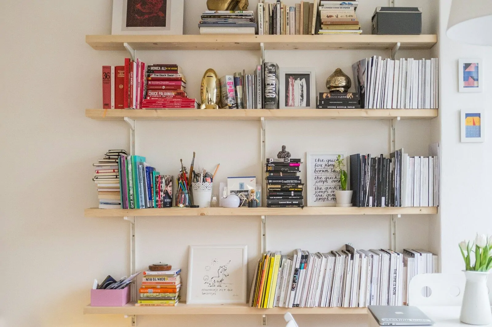
Look at any styled shelf in a magazine and count. You will find three candlesticks, five books, or a single vase next to two small frames. It is never four and four.
The trick works because our brains like a little puzzle. Odd groupings give the eye something to do, and that movement reads as interesting and natural.
Try it yourself right now. Take a shelf and arrange three things together: one tall, one medium, one short.
- Tall: a vase with stems, a candlestick, or a framed print leaning on the wall
- Medium: a stack of two books, a small plant, or a decorative box
- Short: a candle, a tiny bowl, or a small figurine
Step back and look. Then try the same items in groups of two or four. You will feel the difference instantly.
Once you get the hang of odd numbers, you will start using them without thinking. It becomes a habit, like seasoning food.
4. Add Greenery Everywhere
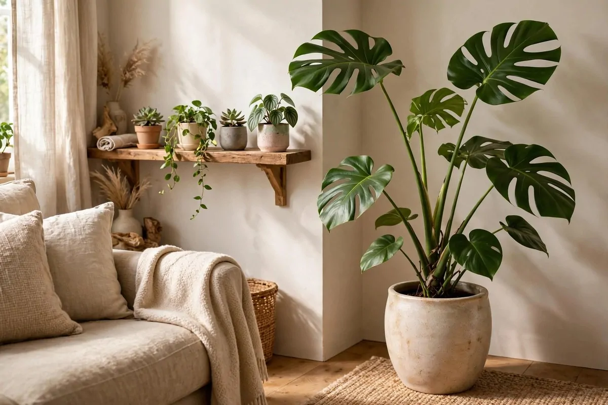
Ask a designer for one item that works in every style of home and most of them will say the same thing. A plant.
Greenery does something no throw pillow can do. It brings life into a room, literally. A leafy plant softens hard edges and makes even the most modern space feel warm and human.
The best part is that plants fit any budget. A small cutting from a friend grows into a full plant if you give it a little time and light.
Start with easy ones if you do not have a green thumb. Snake plants, pothos, and ZZ plants are almost impossible to kill, and they look great in simple pots.
Dried branches count too. A vase of dried eucalyptus or pampas grass on a shelf adds height and texture with zero watering involved.
Place plants where they break up boring lines. An empty corner, the top of a bookshelf, or beside a floor lamp are all perfect spots.
Even a good fake plant beats an empty corner, so fake it proudly.
Mix sizes for the best effect. One tall plant on the floor, one medium one on a table, and one small trailing plant on a shelf makes a room feel layered.
If real plants stress you out, good fake ones exist now that fool almost everyone. Just keep them dusted, because dusty fake leaves are the one thing that gives the game away.
5. Sneak in Hidden Storage
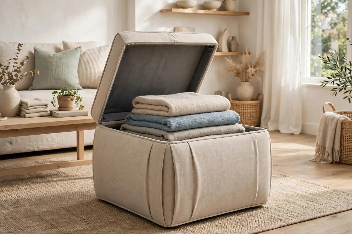
Designer homes do not look clutter-free by accident. They look clutter-free because the clutter has somewhere secret to go.
Every professional designer I have watched does this. They build storage into the prettiest pieces in the room.
Ottomans with lift-up lids hold blankets and remote controls. Coffee tables with drawers swallow magazines and chargers. Beds with storage underneath hide out-of-season clothes.
Your clutter is not the problem, your lack of hiding spots is.
The magic is that none of it looks like storage. Your guests see a beautiful ottoman. You see a hiding place for the kids' toys.
Start with the pieces that already do double duty. An entryway bench that opens up can hold shoes, scarves, and bags in one tidy spot.
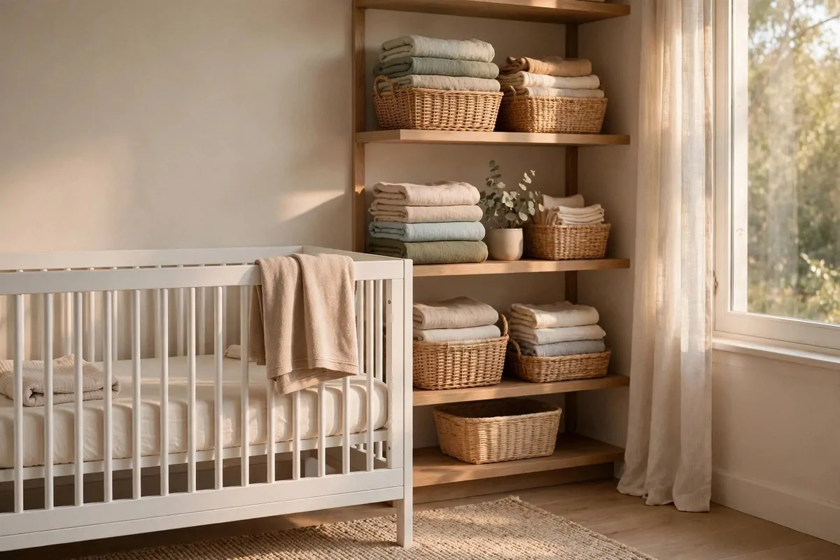
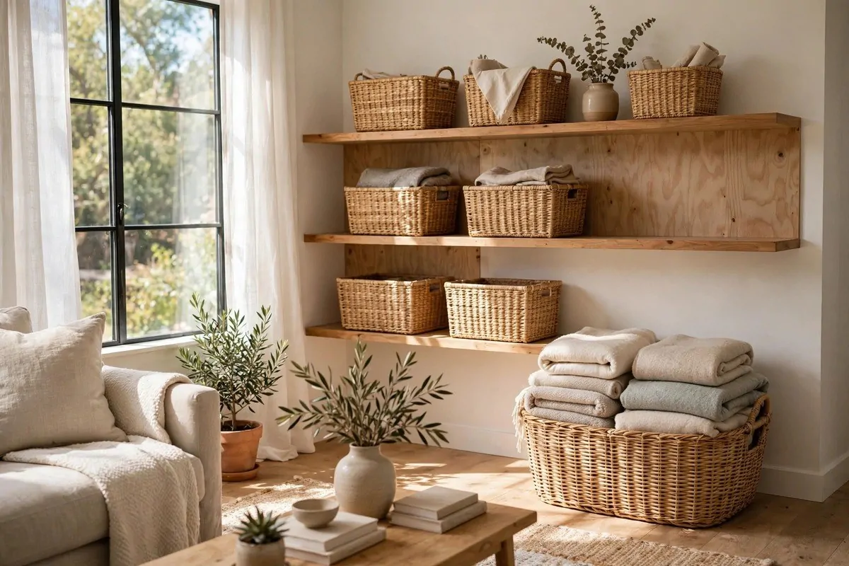
Baskets are the designer's other storage weapon. A big woven basket next to the sofa holds throw blankets and looks completely intentional.
When everything has a hidden home, the room stays calm without you spending your life tidying. That is the real secret. Designers are not better at cleaning than you are. They just designed the mess out of sight.
Start with just one piece this month. A storage ottoman or a lidded basket is enough to feel the difference.
6. Mix Vintage Finds with New Pieces
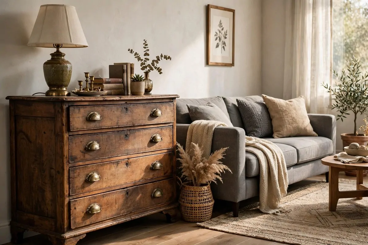
Here is the difference between a room that feels like a showroom and a room that feels like a home. The showroom bought everything in one afternoon.
Designers almost never buy a whole room at once. They mix old and new, expensive and cheap, inherited and thrifted.
Old wood and new fabric are best friends.
A vintage dresser next to a brand new sofa creates a little spark. The two pieces talk to each other across time, and the room suddenly has a story.
This mix also saves a lot of money. Thrifted and antique pieces often cost less than new ones, and they are usually built better too.
You do not need to go full antique shop. Even one or two older pieces change the whole feel of a room.
Try a vintage mirror over a modern console table. Or an old wooden stool beside a sleek armchair. Small doses work just as well.
The old pieces bring character and the new pieces keep everything feeling fresh. Together they make a room that looks collected, not decorated.
That collected look is exactly what people mean when they say a home feels "designer." It is really just patience and a mix of eras.
7. Follow the 60-30-10 Color Rule
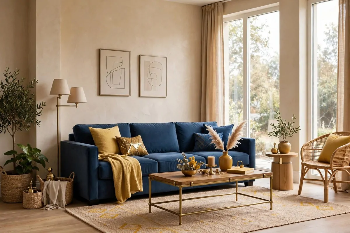
Designers make picking room colors look easy, but most of them follow one quiet rule behind the scenes. It is called the 60-30-10 rule.
The idea is simple. Sixty percent of your room is one dominant color. Thirty percent is a secondary color. Ten percent is a bold accent.
It works in bedrooms, kitchens and tiny bathrooms alike.
Most rooms end up with the walls as the sixty percent, big furniture as the thirty, and small decor as the ten. It is not a strict formula, just a helpful guide.
This rule keeps you from two common problems. Too many colors makes a room feel messy and loud. Too few makes it feel flat and boring.
| Room share | What it usually is | Example |
|---|---|---|
| 60% dominant | Walls, large rug | Warm beige or soft gray |
| 30% secondary | Sofa, curtains, bedding | Deep blue or olive green |
| 10% accent | Pillows, art, small decor | Brass, rust, or mustard |
Pick your accent color first, because it is the fun part. Then build the rest of the room in calmer tones around it.
The accent is where your personality shows. Throw pillows, a small vase, a piece of art, and one lamp in the same shade tie everything together.
One of my favorite home design ideas is to test this rule before you buy anything. Take a photo of your room and check the balance. If one color is shouting, the rule tells you exactly what to soften.
Keep this rule in your back pocket for every room you decorate from now on. It never steers you wrong.
8. Place a Mirror Across from a Window
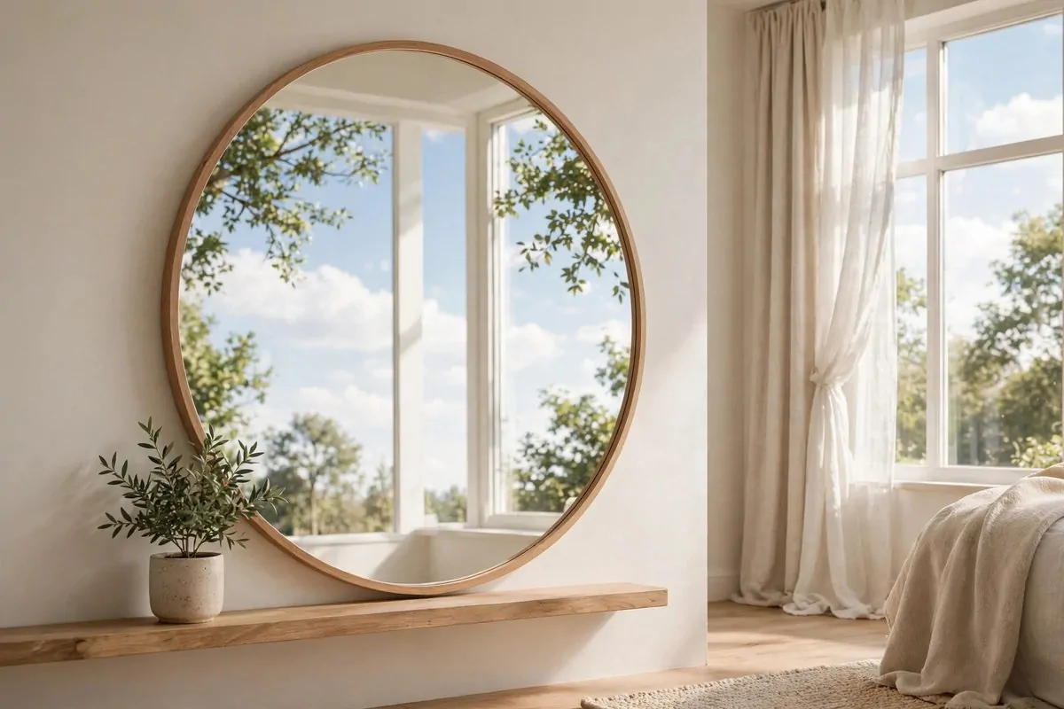
Every designer has a mirror trick, and this is the one they all use. Hang a mirror where it can catch the daylight.
When a mirror sits across from a window, it doubles the light in the room. You get a second glowing "window" without cutting any new holes.
Double the light, half the effort.
It also doubles the view. Instead of one pretty window, your room now has two. The whole space feels bigger and brighter.
This trick works best in dark rooms and narrow hallways. A hallway mirror opposite a door with glass, or near a window at the end, can completely change how the space feels.
Size matters here. A tiny mirror makes a tiny difference. Go as big as your wall and your budget allow.
Lean-to floor mirrors are a designer favorite for this. They reflect tons of light and they look expensive even when they are not.
Also pay attention to what the mirror reflects. A mirror that faces a pretty window is magic. A mirror that faces a blank wall or a messy corner is just doubling your problems.
Hang it, stand back, and check the reflection from your favorite seat. If you see sky and light, you nailed it.
9. Layer Your Lighting
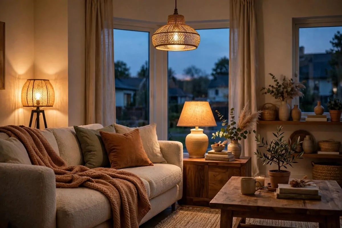
If a room feels flat and sad at night, the problem is almost never the furniture. It is the lighting.
Designers never rely on one ceiling light to do everything. They layer three kinds of light in every room.
Ambient light is the general glow, like ceiling fixtures or recessed lights. Task light is the focused beam for reading or cooking, like desk lamps or under-cabinet lights. Accent light is the pretty stuff, like picture lights or a glowing vase.
Each layer on its own is fine. Together they make a room feel deep, warm, and expensive.
The easiest layer to add is a floor lamp in a dark corner. Suddenly that dead corner has a job and the whole room feels more balanced.
Next add a table lamp or two. They bring light down to eye level, which is where you actually live most of the time.
| Lighting layer | Example | What it does |
|---|---|---|
| Ambient | Ceiling fixture, recessed lights | Fills the room with base light |
| Task | Reading lamp, pendant over counter | Lights up specific activities |
| Accent | Picture light, candle, LED strip | Adds warmth and depth |
One lonely overhead light is a room's worst enemy.
Once you have layers, put them on separate switches or use plug-in dimmers. Then you can tune the mood in seconds, bright for cleaning, soft for movie night.
Your evenings will thank you. Layered light is the fastest way to make a plain room feel special after dark.
10. Switch Every Bulb to Warm White
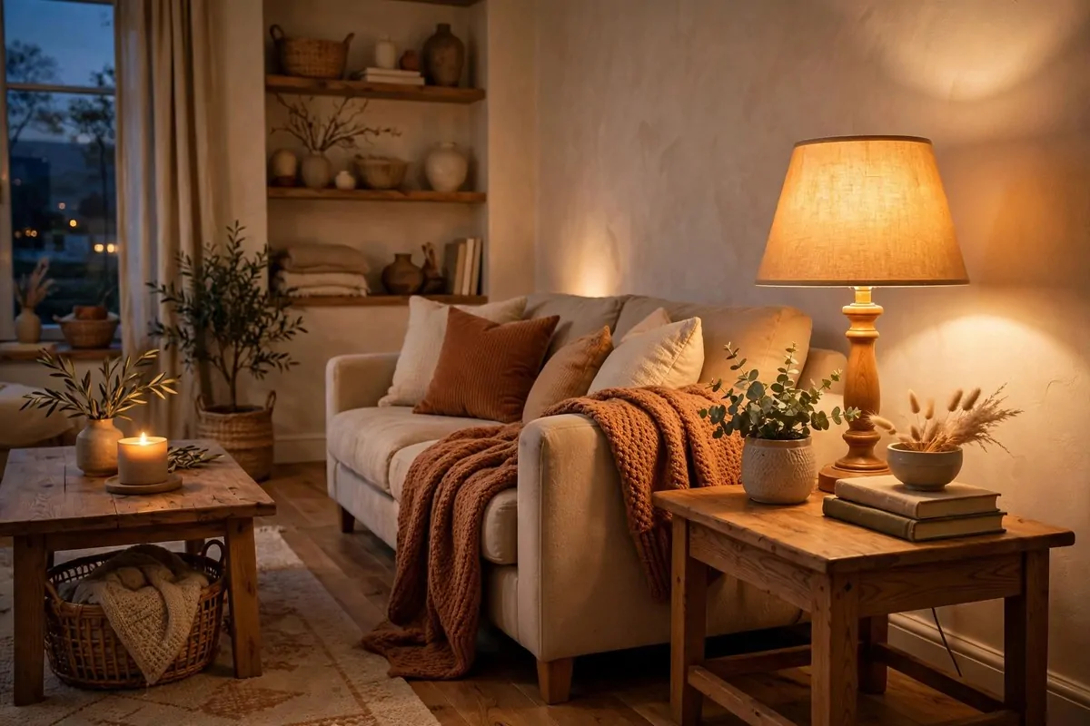
This trick costs a few dollars and changes your whole home in an afternoon. Swap your bulbs to warm white.
Cozy lives at 2700 kelvin.
Designers almost always choose warm bulbs around 2700K. That is the soft golden glow that feels like candlelight, not the blue-white glare of an office.
Cool white bulbs make everything look a little harsh. Skin looks washed out, food looks less appetizing, and cozy rooms feel like waiting rooms.
Warm light does the opposite. It flatters people, makes wood tones glow, and tells your brain it is time to relax.
Check the packaging when you shop. Look for the words "warm white" and the number 2700K, or something close to it.
This one fix is so powerful that designers call it the cheapest upgrade in the book. No new lamp needed, no rewiring, just a twist of the bulb.
Do it in every room for the biggest effect. A mix of warm and cool bulbs in the same space feels off, even if you cannot quite say why.
Stand in your living room tonight and look around. If the light feels cold and a little lonely, you already know what to do tomorrow.
11. Let Furniture Front Legs Kiss the Rug
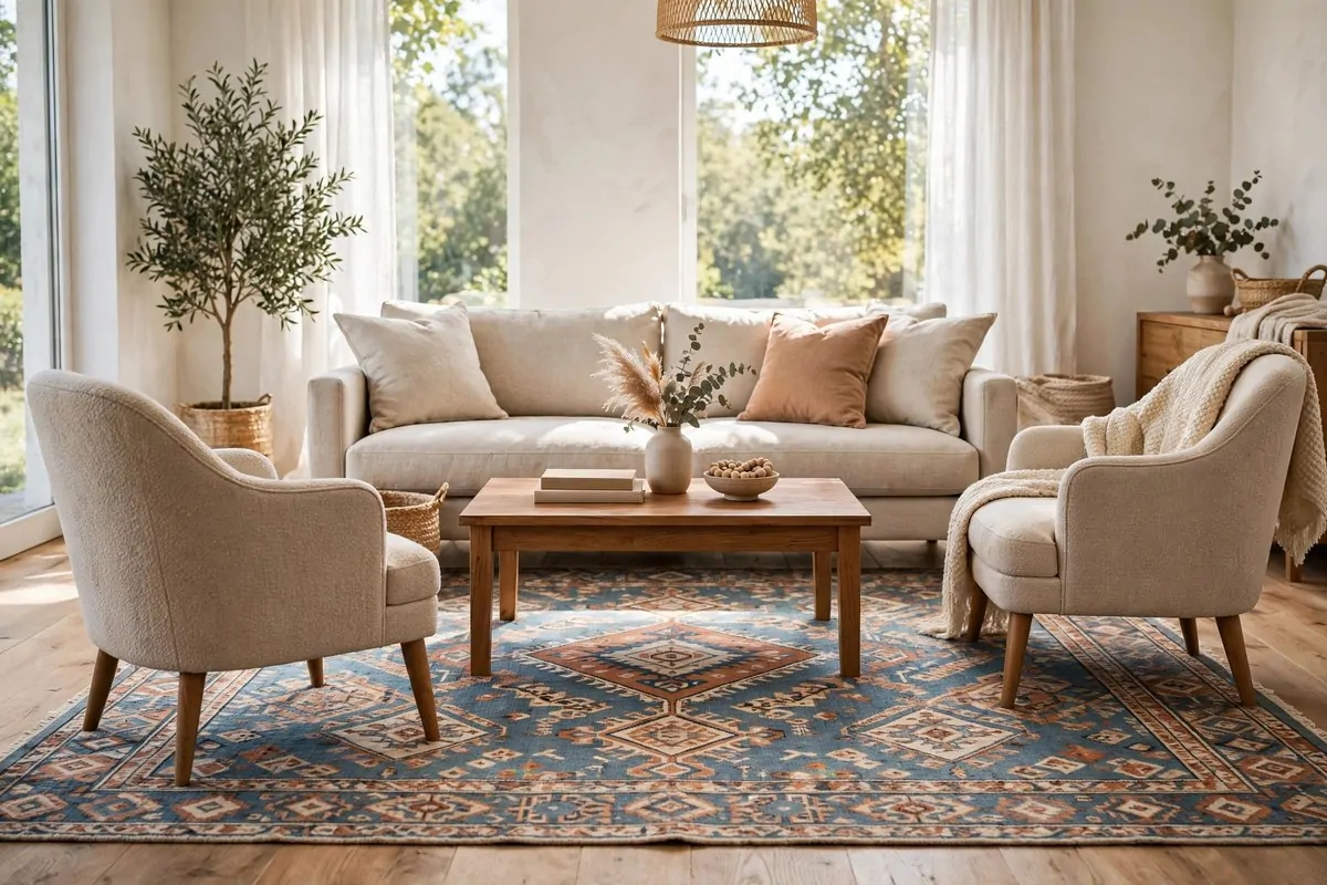
Rugs go wrong more than almost anything else in a home, and the mistake is almost always the same. The rug is too small.
Designers follow one rule that fixes this instantly. At least the front legs of every big piece of furniture should sit on the rug.
When the sofa, chairs, and coffee table all touch the same rug, the room clicks together. The rug becomes an island, and everything on it belongs to one group.
A floating rug in the middle of the floor does the opposite. It makes the furniture look scattered and the room look smaller than it is.
This usually means buying a bigger rug than you think you need. In a living room, that often means a rug large enough to hold the front legs of the sofa and both chairs.
If a huge rug does not fit your budget, layer two smaller ones. A big flat jute rug underneath with a smaller patterned rug on top gives the same anchored feeling.
It is a small detail with a huge payoff.
The rug also protects your floors and softens noise, which makes the room feel calmer. Two wins for one purchase.
Next time you walk into a room that feels "off," check the rug first. More often than not, it is too small and everything is floating.
12. Pull Furniture Away from the Walls
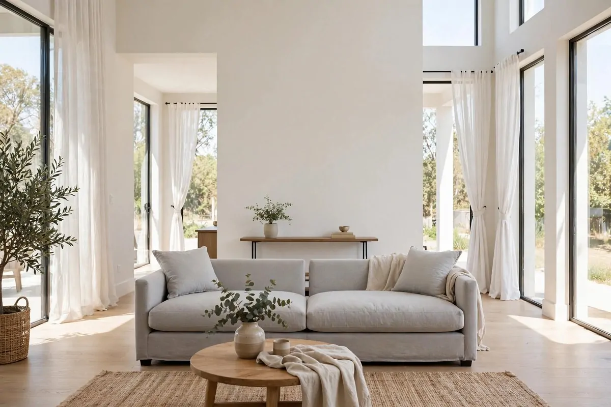
Most of us do the same thing in every room. We push all the furniture against the walls, like the room is a waiting room.
Designers do the opposite. They pull pieces in and float them, leaving a little breathing space behind the sofa or chairs.
It sounds backwards, but furniture floating in the middle of a room actually makes the room feel bigger. The gap behind the sofa creates depth, and depth reads as space.
Even a small gap makes a difference. A few inches of air between the sofa and the wall is enough to stop the room from looking cramped.
This trick also gives you permission to create real conversation areas. Chairs angled toward each other invite talking. Chairs lined up against a wall invite staring at nothing.
In an open plan space, floating furniture defines zones without any walls. A sofa facing away from the dining area quietly says "this is the living room."
- Pull the sofa 3 to 6 inches off the wall as a first step
- Angle at least one chair toward the sofa for conversation
- Leave clear walking paths around the grouping so it feels open
Floating furniture makes a room feel twice as big.
Try it in one room this weekend. Push everything back, then pull the main pieces forward a little. The room will feel bigger, and you will wonder why you waited.
It is free, it takes ten minutes, and it changes how the whole room breathes.
13. Hang Art at True Eye Level
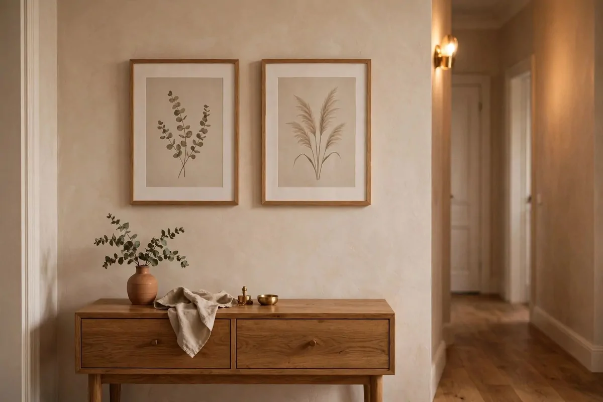
Almost everyone hangs art too high. I know because I did it for years, and every designer I have read says the same thing about their clients.
The designer standard is simple. The center of the artwork should sit about 57 to 60 inches from the floor. That is roughly average eye level.
A cheap print hung at the right height looks thoughtful and expensive. A pricey piece hung near the ceiling looks like an accident.
When art sits too high, it disconnects from the furniture below it. The wall feels empty in the middle, and the whole room feels off balance.
This rule is especially important over furniture. Art above a sofa or console should hang close to the piece, not floating halfway up the wall. A hand's width of space is usually plenty.
Galleries figured this out centuries ago.
For a gallery wall, treat the whole arrangement as one piece. Find the center of the entire group and put that at eye level.
Ask someone to hold the frame while you stand back and check. Your eyes will tell you when it feels right, because suddenly the art and the room feel like one thing.
This is one of those home design ideas that takes five minutes and a nail, but guests will think you hired a professional.
14. Size Pillow Inserts Up
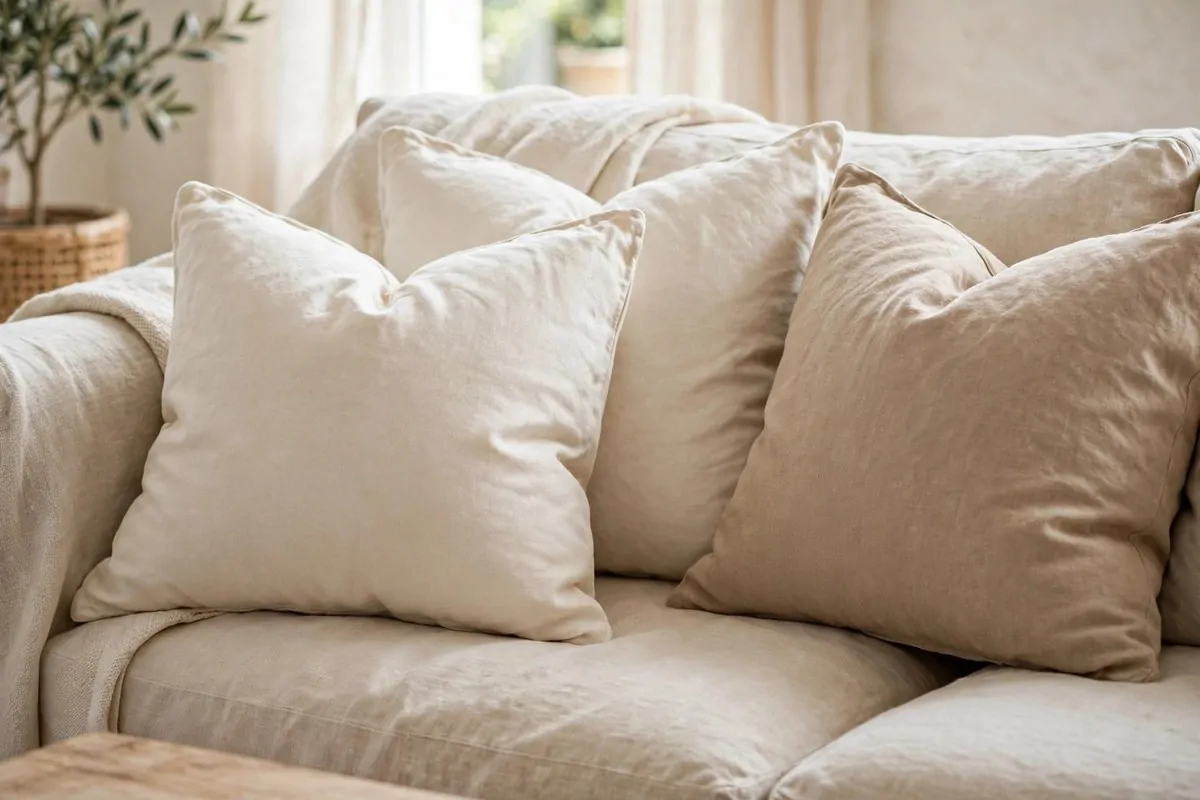
Here is a weird little secret. Those gorgeous plump pillows in designer photos are not special pillows. They are just bigger inside.
Flat pillows are a crime against sofas.
Designers buy pillow inserts two inches larger than the cover. A 20 inch cover gets a 22 inch insert.
The bigger insert fills every corner of the cover. No saggy edges, no flat sad pillows, no fabric wrinkling at the seams.
This tiny detail is the difference between pillows that look custom made and pillows that look like they came from a bargain bin. And it costs almost nothing extra.
The trick works best with down or down-alternative inserts. They squish into the cover and then puff right back out.
For the best look, buy a couple more pillows than you think you need. Odd numbers again, by the way. Three or five on a sofa beats two.
Mix sizes for that styled look. Big squares in the back, medium ones in front, and one small lumbar pillow up front.
Then do the famous karate chop on top of each pillow. A light press in the middle makes them look soft and inviting, like someone actually lives there.
15. Stick to One Metal Finish
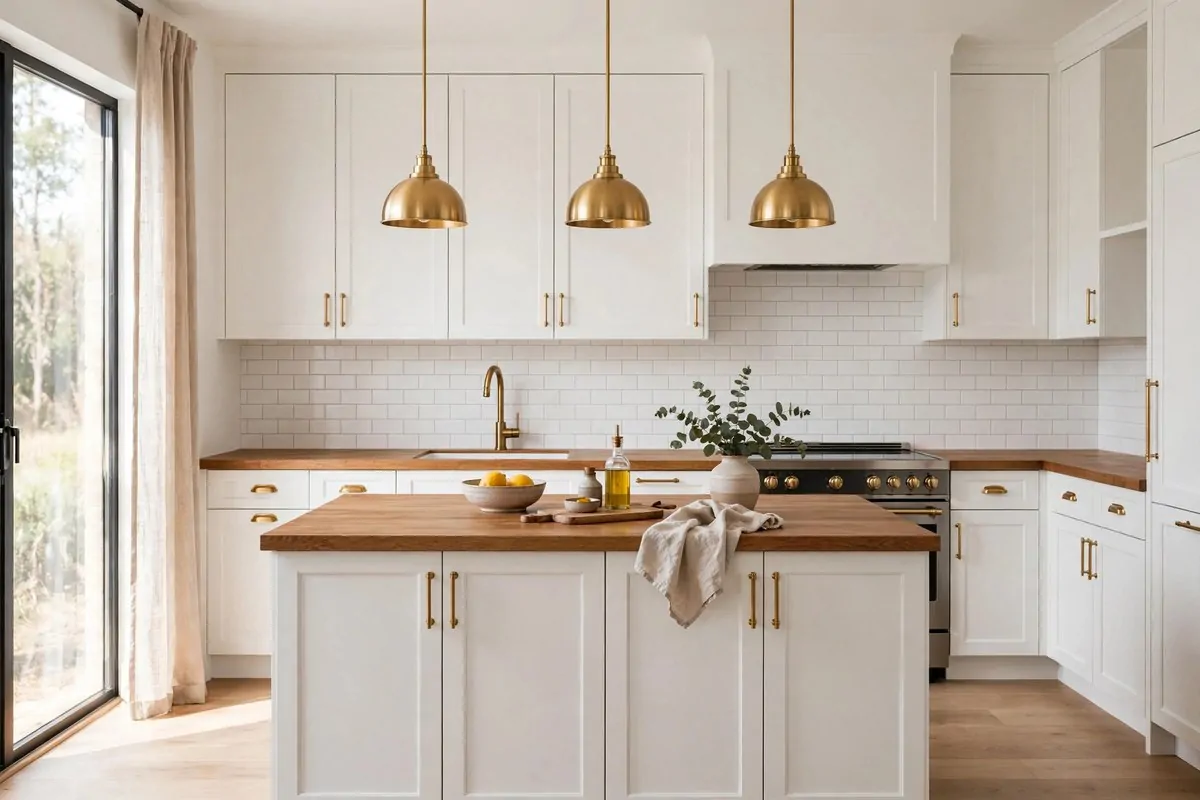
This is one of the quietest designer rules, and breaking it is one of the fastest ways to make a room feel random. Commit to one metal finish per room.
Brass drawer pulls, a brass faucet, and a brass lamp look planned and calm together. Brass mixed with chrome, nickel, and black in the same room looks like five different decisions.
Pick your metal and repeat it. Cabinet hardware, light fixtures, curtain rods, and even the frame on your mirror can all match.
The finish you choose sets the mood. Warm brass and gold feel cozy and classic. Matte black feels modern and bold. Brushed nickel feels clean and simple.
You do not have to be perfect about it. One small exception in a room is fine, and sometimes a little mixed metal looks artistic on purpose.
- Kitchen: match faucet, cabinet pulls, and pendant lights
- Bathroom: match faucet, towel bars, and the mirror frame
- Living room: match curtain rod, lamp bases, and picture frames
Chrome and brass in the same room just argue with each other.
The trick is intention. If the metals match on purpose, the room feels designed. If they clash by accident, the room feels thrown together.
Swapping hardware is cheap and renter friendly. New cabinet pulls and a new faucet can update a whole kitchen without touching a single cabinet.
It is a small detail with an outsized payoff, which is exactly the kind of trick designers love most.
16. Color Drench One Room
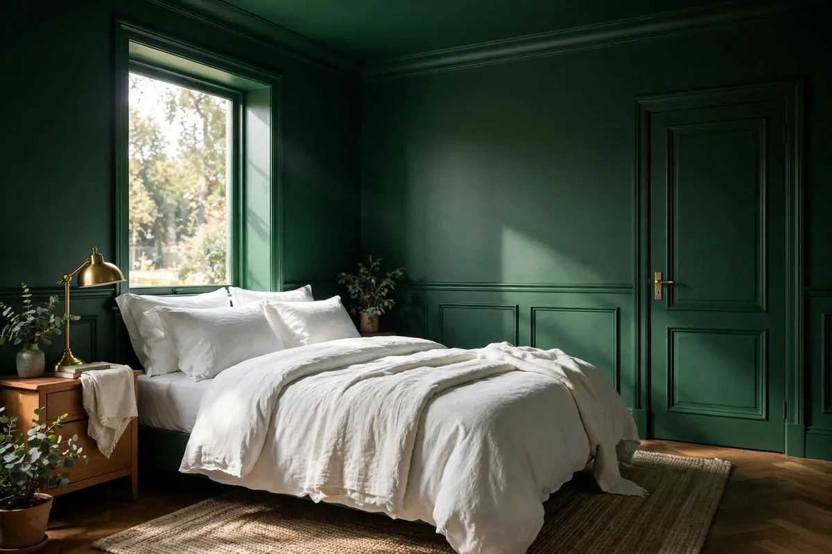
This one sounds scary until you see it done. Color drenching means painting the walls, trim, ceiling, and doors all the same color.
Designers love it because it erases all the visual breaks in a room. No white trim cutting across the wall, no ceiling line chopping the space. Just one calm, continuous color.
The result feels bold and cozy at the same time. Small rooms feel bigger because the edges blur together. Big rooms feel more intimate and dramatic.
Pick a color with some depth for the best effect. Deep green, rich navy, warm terracotta, or a moody charcoal all work beautifully.
Brave walls make the best rooms.
The secret to making it work is playing with sheens. Matte on the walls, satin on the trim, and flat on the ceiling. Same color, different finishes, and the light dances across the room.
Start with a small room if you are nervous. A powder room or a home office is the perfect test, because one color in a small space feels like a jewel box.
Then layer in contrast with furniture and art. Light bedding against dark walls, or a pale rug on a dark floor, keeps the room from feeling heavy.
This is one of the boldest home design ideas on this list, but it uses nothing but paint. And paint is the cheapest transformation there is.
17. Paint Interior Doors a Rich Color
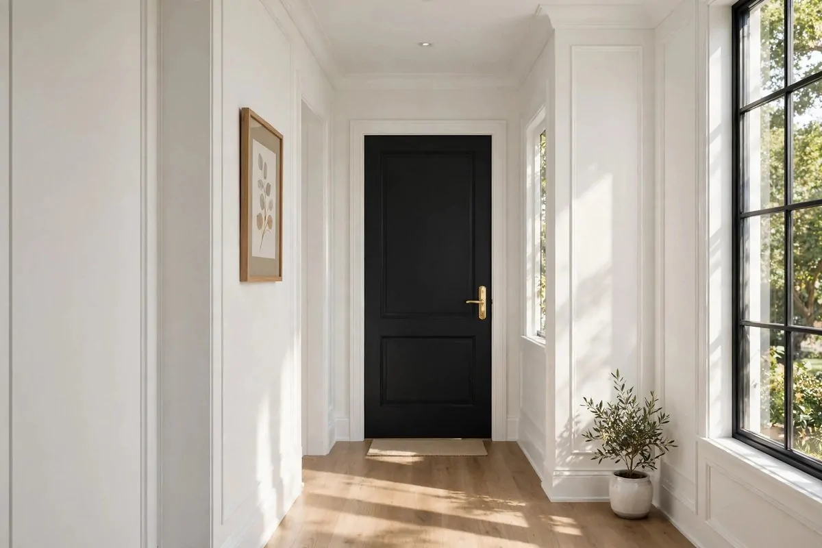
If painting a whole room feels like too much, here is the mini version of the same trick. Paint your interior doors.
A door is a canvas you walk past every day.
Designers call doors the jewelry of a room. A bold charcoal, deep green, or soft black door against plain white walls adds instant character.
It is a small surface, so it takes very little paint and very little time. Most doors need just one afternoon, including the drying time between coats.
The effect is way bigger than the effort. Suddenly the room has a focal point, and the whole space feels more custom and thought through.
Dark doors are a favorite because they ground a room. They add weight at just the right places, like punctuation marks between rooms.
But light bold colors work too. A dusty blue or a sage green door in a neutral hallway feels fresh and welcoming.
Do not forget the hardware while you are at it. A painted door with new brass or black handles looks completely new.
If you rent, try this on just one door you can repaint later, like a bedroom or pantry door. Or skip the paint and hang a bold wreath or hook set instead.
18. Repeat Your Accent Color Three Times
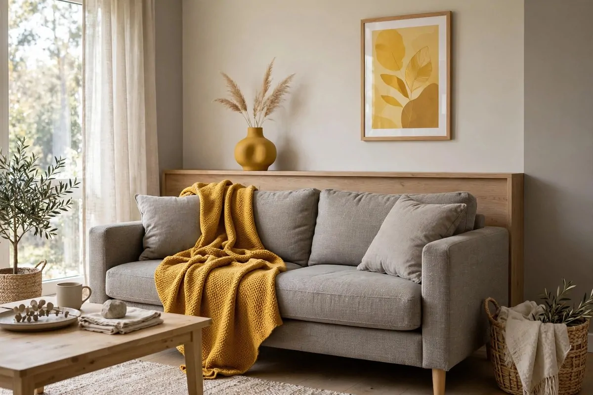
Designers have a simple rule for making a color look intentional instead of random. Use it at least three times in the room.
Three touches turn a color into a theme.
One blue pillow on a gray sofa looks like a leftover. Three blue touches, a pillow, a vase, and a piece of art, look like a plan.
The magic number is three because your eye starts connecting the dots. It travels from one blue thing to the next, and that journey makes the room feel pulled together.
The touches do not have to match exactly. They just need to be in the same color family. A mustard throw, a rust vase, and a golden art print all read as one warm story.
Spread the color around the room too. Two items side by side count as one visual moment. Three items across the room create balance.
- First touch: something soft, like a throw pillow or blanket
- Second touch: something at eye level, like art or a lamp shade
- Third touch: something small, like a candle, a vase, or a tray
This rule is the easiest way to test a new color. Buy three small things in the shade first, live with them for a week, and see if you love it.
Once you see the pattern working, you will start spotting the rule of three in every designer room you walk into. It is everywhere.
Three touches, spread around the room, and suddenly your color choice looks like it was always meant to be there.
19. Mix Textures, Not Just Colors
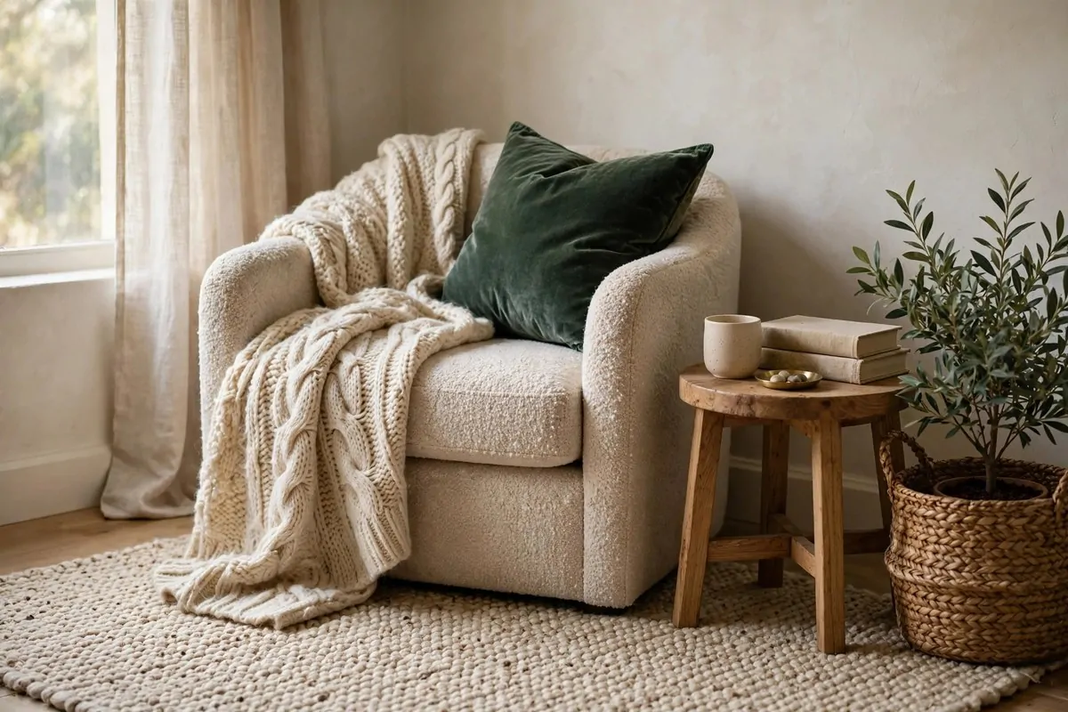
A room can have perfect colors and still feel flat. The missing ingredient is almost always texture.
Your hands notice what your eyes miss.
Designers mix materials the way cooks mix flavors. Smooth next to rough, shiny next to matte, soft next to hard.
Think of a leather chair with a chunky knit throw. Or a glass coffee table on a nubby jute rug. The contrast between the two surfaces is what makes each one interesting.
Texture also makes neutral rooms sing. An all-beige room with velvet, linen, wood, and woven baskets feels rich and layered. The same beige room with all-smooth surfaces feels dull.
You probably own more texture than you think. Throw blankets, baskets, wooden bowls, stone coasters, and woven placemats all count.
Touch is the real test here. Run your hand over a surface and ask if it feels different from everything around it. If every surface feels the same, add something new.
Start with what is easy to swap. Pillow covers in velvet or bouclé, a woven tray on the coffee table, or a chunky throw on the sofa arm.
Rooms with great texture invite you to sit down and stay awhile. That is the feeling designers are really after, and it costs far less than new furniture.
20. Vary Heights in Every Grouping
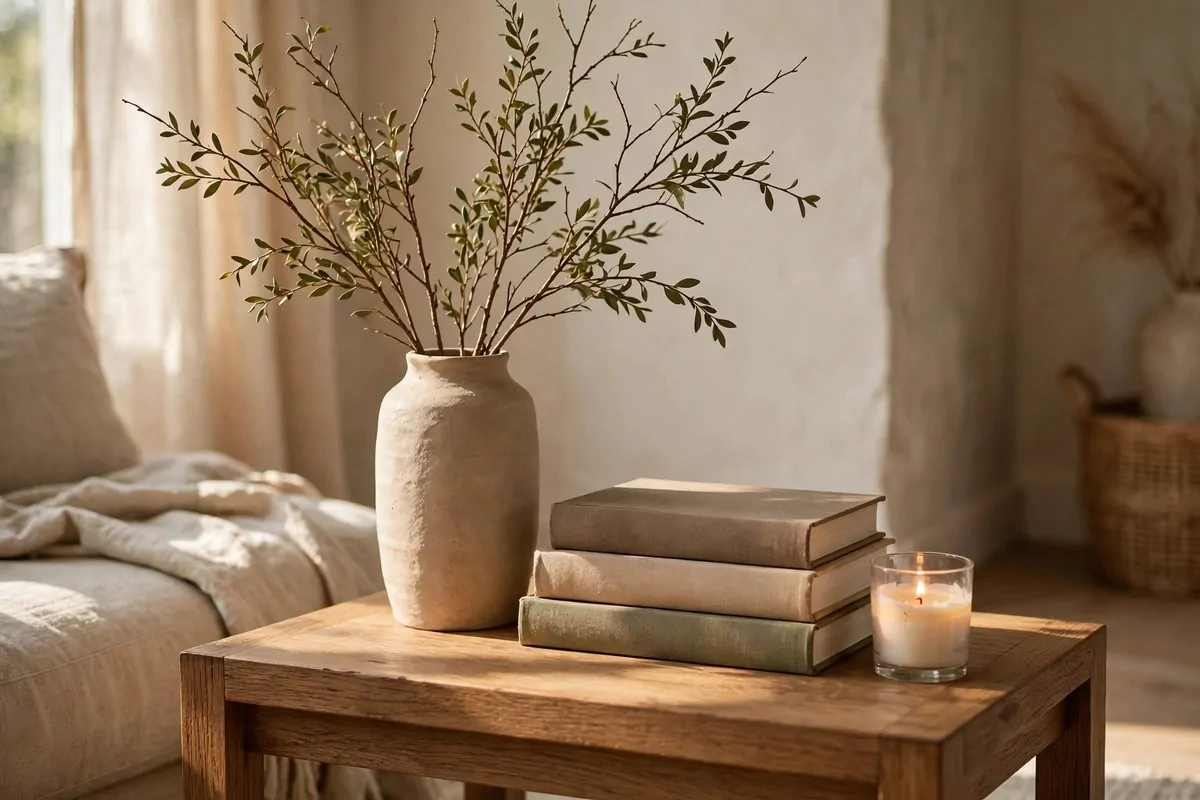
Look at any styled surface and you will see the same pattern. Tall, medium, and low. Never three things the same height in a row.
Designers call this playing with height, and it is what keeps a shelf or table from looking like a police lineup.
Flat styling is boring styling.
A tall vase, a medium stack of books, and a low candle make a little skyline. Your eye bounces between the levels, and the whole arrangement feels alive.
When everything sits at one height, the surface feels stiff and boring. It is like a sentence with no punctuation.
This trick works everywhere. On a mantel, try tall candlesticks on one end and a low bowl on the other. On a nightstand, pair a tall lamp with a low stack of books.
Books are the designer's secret weapon for height. Stack two or three under a small object to lift it into the medium zone.
Plants help too. A trailing plant on a high shelf brings height down, and a tall plant on the floor fills a gap that nothing else can.
Step back after you style and squint. If the top line of your arrangement goes up and down like gentle hills, you got it right.
21. Corral Clutter with Trays
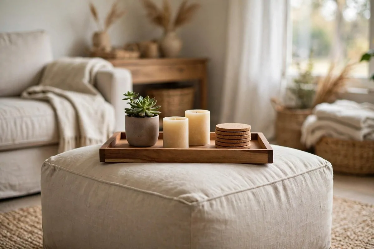
A tray is the laziest styling trick designers know, and they use it constantly. Put loose stuff on a tray and it instantly looks intentional.
Remote controls scattered on a coffee table look like clutter. The same remotes on a pretty tray look like a display.
A tray turns a mess into a display.
Trays create boundaries. They tell your eye where one group ends and the rest of the room begins, which makes everything feel more organized.
Use them everywhere. A tray on the ottoman holds candles and a small plant. A tray on the bathroom counter groups your everyday bottles. A tray on the dresser catches keys and sunglasses.
The tray itself adds texture and style. Wood feels warm, mirrored trays bounce light, and woven trays add a natural touch.
Size it right. The tray should be big enough to hold your items with a little breathing room, but small enough that the group feels tight and tidy.
This trick also makes cleaning faster. Lift the tray, wipe the table, set the tray back down. Done in ten seconds.
One tray per surface is plenty. The goal is a styled group, not a tray collection. Let the tray do its quiet job and move on.
22. Create Little Vignettes
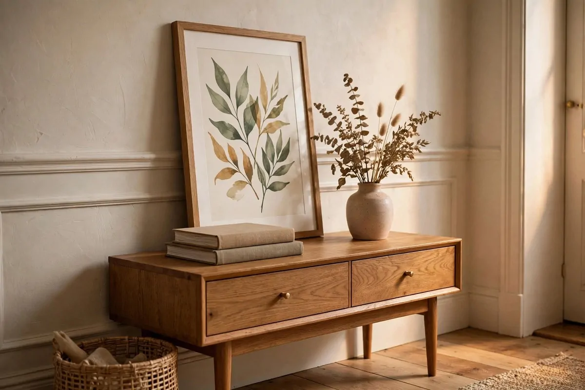
Designers have a fancy word for a pretty little arrangement. They call it a vignette, and every styled room is full of them.
A vignette is just a small group of things that looks good together. A stack of books with a vase on top. A candle next to a framed photo. A bowl beside a small plant.
The formula is simple. Combine something tall with something flat, then add one sculptural thing with an interesting shape.
Try it on your console table. Lean a framed print against the wall, lay two coffee table books in front of it, and set a small vase on top of the books. That is a vignette.
Entryways are perfect for these moments. Guests notice them first, and a good vignette says "someone who cares lives here" before you say a word.
Every flat surface wants a tiny story.
Change them with the seasons if you like. Swap in fresh flowers in spring, a small pumpkin in fall, or pine branches in winter. The bones stay the same.
Do not overthink it. Start with three items, step back, and adjust. Move things around until it feels right, because your eye knows more than you think.
A home full of little vignettes feels warm and personal. It is the opposite of a furniture store, and it is exactly what makes a house feel like yours.
23. Leave Some Negative Space
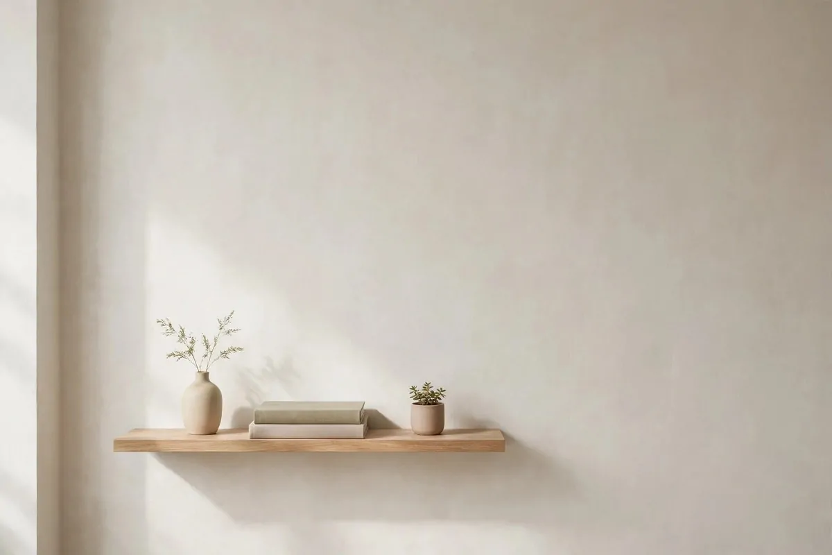
The hardest designer trick is also the simplest one. Leave some space empty on purpose.
Most of us fill every shelf and every surface. It feels wrong to leave a spot bare, like we are wasting it.
But designers know that empty space is what makes the full spaces shine. A shelf that is half empty looks calm and expensive. A shelf stuffed to the edges looks like a storage unit.
Negative space gives your eye a place to rest. Without it, everything blurs together and nothing gets noticed.
Try this in one spot. Take everything off a shelf, then put back only your three favorite things. Leave the rest of the shelf bare.
- Keep one empty surface in every room, like a clear nightstand or a bare side table
- Leave the top third of tall bookshelves mostly open
- Resist filling corners just because they are empty
Empty space is a design choice too.
It will feel strange for about a day. Then you will notice that the three things you kept suddenly look like art.
This trick also makes your home easier to clean and cheaper to decorate. Fewer things to buy, fewer things to dust, more calm to enjoy.
Empty space is not wasted space. It is the frame that lets the beautiful things in your home actually get seen.
24. Go Vertical with Tall Storage
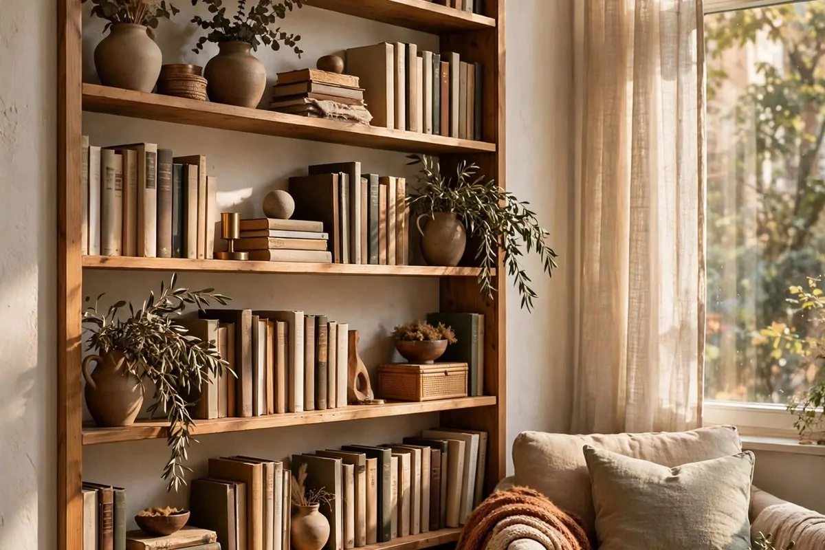
When floor space is tight, designers look up. Tall bookcases, floating shelves, and floor-to-ceiling storage draw the eye upward and make a room feel bigger.
Your walls are storage you are not using yet.
Low furniture everywhere makes a room feel squat and closed in. One tall piece changes the whole geometry of the space.
A tall bookcase in a corner fills an awkward gap and gives you tons of storage without eating floor space. It is one of the best moves for small apartments.
Floating shelves do the same job in kitchens and bathrooms. They lift everyday items off the counter and turn them into decor at the same time.
Stack your styling high. Put the tallest items on the top shelves so the eye travels all the way up.
This trick pairs beautifully with the curtain trick from earlier. Tall curtains and tall shelves together make even a small room feel grand.
Watch the proportions though. One or two tall pieces anchor a room. Five tall pieces in a small room feel like a forest. Balance them with lower furniture.
Look at your walls right now. All that empty space above your furniture is free decorating real estate. Use it.
25. Try an Accent Wallpaper Wall
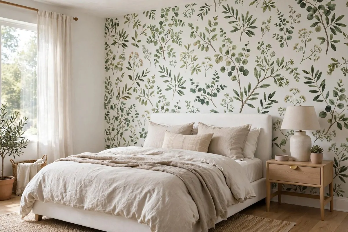
Wallpaper used to scare people, but designers have brought it back in a big way. The modern trick is to use it on just one wall.
One accent wall of wallpaper adds pattern, color, and personality without overwhelming the room. It becomes the art, so you do not need much else on that wall.
Behind the bed is the classic spot. A bold botanical or geometric print behind a simple white bed looks like a hotel suite.
Powder rooms are another designer favorite. A small space with big wallpaper feels like a jewel box, and guests always remember it.
If you rent or you are nervous about commitment, peel-and-stick wallpaper exists now and it actually works. It goes up in an afternoon and comes down without damage.
Pick a pattern with a color you already use in the room. That way the wallpaper feels connected instead of random.
Keep the other three walls simple. Let the wallpaper be the star and everything else play a supporting role.
This is one of those home design ideas that delivers a huge visual punch for very little money. One wall, one afternoon, one totally new room.
You made it to the end, and here is the truth I promised at the start. None of these 25 home design ideas need a big budget or a renovation crew.
One bold wall beats four boring ones.
Designers are not doing magic. They are just doing simple things on purpose, and doing them in almost every home they touch.
Pick three tricks from this list and try them this weekend. Hang your curtains higher, warm up your bulbs, and style one shelf in odd numbers.
Small moves, done with intention, are what separate a house that looks "fine" from a home that feels designed. And now you know the playbook.