35 Two-Tone Kitchen Ideas That Make Cabinets Look Custom

I was stirring a pot of soup last Tuesday night when I caught my own reflection in the cabinet doors and realised they looked tired and plain. I stood there for a minute and just looked at them.
My kitchen is not big. It is not fancy. But I spend a lot of time in it, and I wanted it to feel like mine.
I started to look at two tone kitchens online. You know what I mean. One colour on top and a different colour down low. It looked fresh and calm and fun all at once.
I tried small things first. I painted a few doors. I changed the knobs. I moved things around until the room felt right.
You do not need a full redo to get this look. You do not need a big budget either. A little paint and a clear plan can change the whole room.
In this post I share my favourite pairs. I tell you what works, what feels soft, what feels bold, and what I would pick again.
All 35 ideas are in this one post, so you can scroll through them all here and pick the one that feels right for your kitchen.
1. White Uppers with Navy Lowers
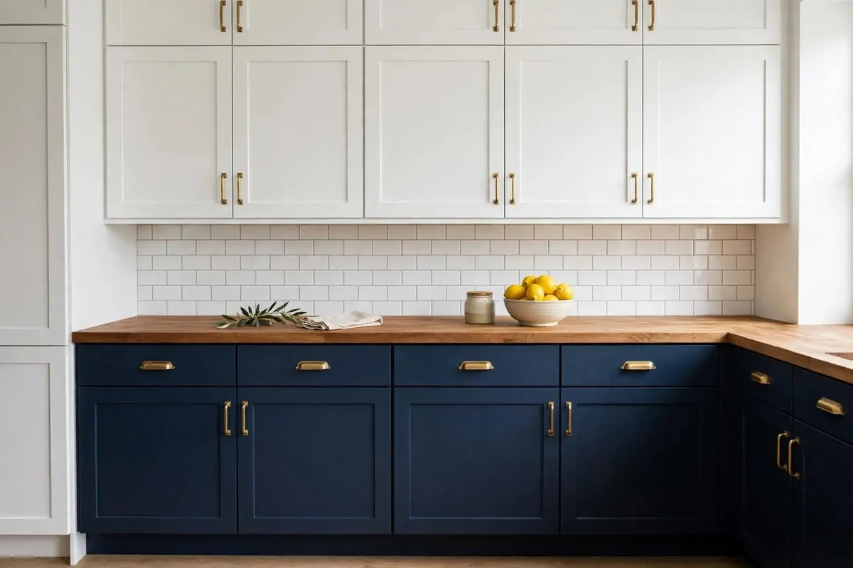
I love this pair more than any other pair in my kitchen list. White on top keeps the room bright. Navy down low gives it a strong base.
When I walk in, my eyes go up first. The white doors feel light and clean. Then I look down and the navy feels calm and steady.
This works so well in a small kitchen. The white uppers do not close the room in. The dark lowers hide small marks from daily cooking.
I would pick a soft white, not a sharp white. A soft white feels warm next to navy. It does not feel cold at all.
Gold knobs look lovely here. I tried brass pulls on my own lowers and they made the navy pop. Silver knobs work too if you like a cooler look.
Keep your worktop light. A pale wood top or a white top keeps the balance right. A dark top can make the room feel too heavy.
If your floor is dark, this pair still works. Just add a light rug near the sink. It breaks up the dark and adds a soft spot for your feet.
I cook a lot, so I need doors I can wipe fast. Navy paint in a satin finish wipes clean with a damp cloth. White uppers need a quick wipe too, but it takes only a minute.
Try this pair if you want a kitchen that feels classic and fresh at the same time. It never feels old to me. It feels like home.
2. Cream Uppers with Sage Green Lowers
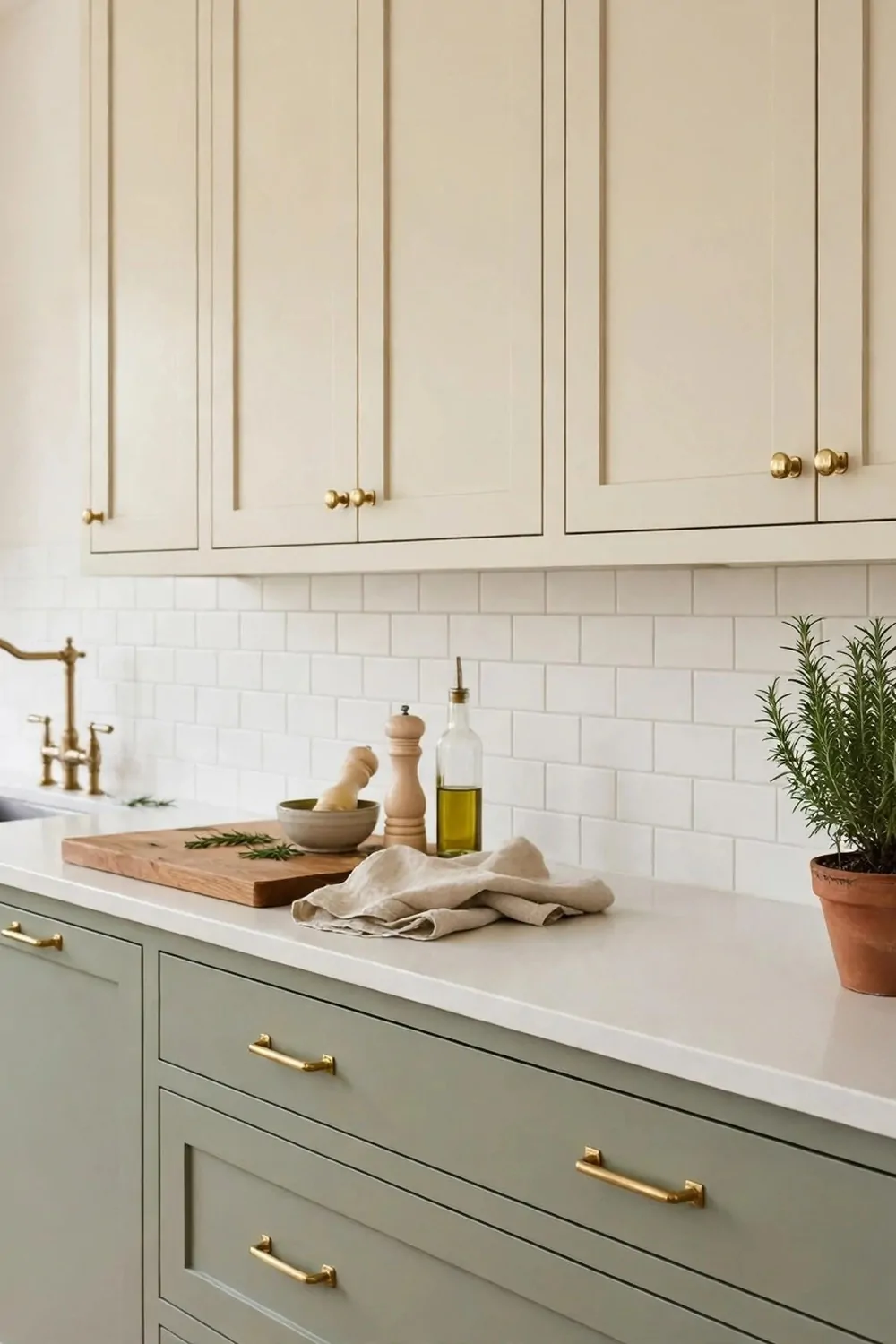
Cream and sage green feel like a soft morning in the kitchen. The cream is warm. The sage is gentle and green, like fresh leaves.
I like this pair when I want calm. It does not shout. It just sits there and makes tea time feel slow and nice.
Sage green is not too dark and not too light. It hides small splashes well. Cream uppers keep the top of the room bright and open.
I would pair this with wood knobs or soft black pulls. Wood knobs add warmth. Black pulls add a small sharp touch.
A white worktop works best here. It keeps the sage from looking dull. A light wood top works too, and it adds a farm feel.
Plants look so good in this kitchen. I keep a small herb pot on my sill. The green leaves match the lowers in a sweet way.
If you have a lot of light, sage looks fresh all day. If your kitchen is dark, add a warm light under the uppers. It will lift the cream.
This pair suits a country style kitchen. It also suits a plain modern kitchen. You can dress it up or keep it simple.
I would pick this if you want a kitchen that feels soft, kind, and easy to live in. It makes me want to bake bread and stay a while.
3. Soft Grey Uppers with Charcoal Lowers
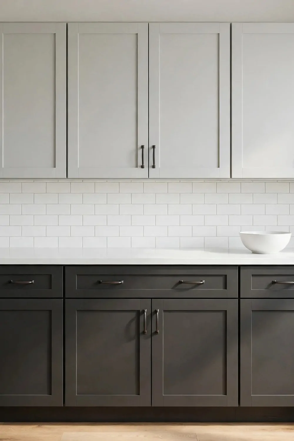
Soft grey on top and charcoal down low gives a kitchen a neat, tidy feel. It looks smart without trying too hard.
I like how the grey uppers feel light. They do not weigh the room down. The charcoal lowers ground the space and make it feel solid.
This pair is great if you like a modern look. It pairs well with steel taps and plain handles. Nothing fussy is needed.
I would keep the walls pale. A very light grey wall or a white wall helps the uppers stand out. It also keeps the room from feeling grey all over.
Black handles look sharp here. I tried matte black pulls and they felt just right. Silver handles work too, and they feel a bit softer.
A white or light grey worktop keeps the look clean. I like a plain worktop here, with no big pattern. It lets the two greys do the talking.
Charcoal is good at hiding marks. If you have kids or you cook every day, that helps a lot. A quick wipe and it looks new again.
Add a warm touch so the room does not feel cold. A wood chopping board on the side does it. A small wood shelf does it too.
Pick this pair if you want a kitchen that feels calm, clean, and a little bit smart. It is easy to live with day after day.
4. White Uppers with a Bold Island
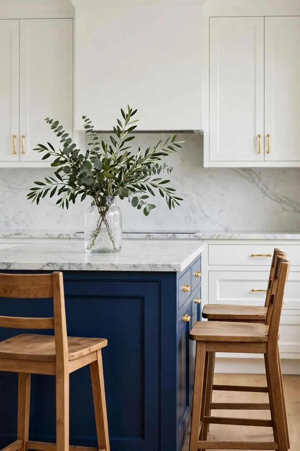
A bold island can change a whole kitchen. The white cabinets around it stay calm. The island does all the fun work.
I love this idea because you do not need to paint every door. You paint one big piece in the middle. That saves time and paint.
Pick a bold colour you truly like. Navy, teal, deep green, or even a rich red can work. It should make you smile when you walk in.
White uppers keep the room light. They stop the bold island from taking over. The balance feels just right to me.
Think about cost before you start. A bold island is often the cheapest way to get a two tone look, because you paint less. Here is a simple guide to what each pair can cost for paint.
| Colour pair | Feel | Typical cost |
|---|---|---|
| White + Navy | Classic and calm | $40 to $120 for paint per cabinet set |
| Cream + Sage Green | Soft and fresh | $40 to $120 for paint per cabinet set |
| Grey + Charcoal | Smart and tidy | $40 to $120 for paint per cabinet set |
Those costs are just for paint, not for new doors or a full refit. Most pairs in this guide sit in that same $40 to $120 range for paint per cabinet set. If you hire help, the cost will be more.
Use the island as your work spot. I chop, mix, and pack lunch boxes on mine. A bold colour makes that daily work feel less dull.
Add two stools that match the island colour. Or pick wood stools for warmth. Either way, the island becomes the heart of the room.
Try this if you want a big change with a small job. Paint the island, keep the rest white, and watch your kitchen wake up.
5. Pale Blue Uppers with White Lowers
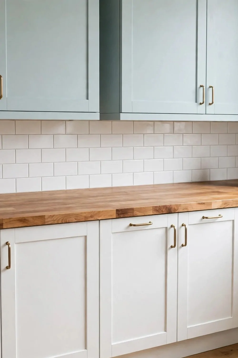
Pale blue uppers feel like a clear sky in the morning. White lowers keep the bottom of the kitchen bright and clean.
I like this pair in a kitchen with a window. The blue picks up the daylight. It makes the whole room feel airy.
This is a soft look, not a loud one. The blue is gentle. It does not fight with your plates or your worktop.
I would use silver or white knobs here. They blend in and keep the look soft. Gold can work too, but keep it light.
A pale wood worktop adds warmth next to the blue. A white worktop keeps it crisp. Both look good, so pick what you have.
This pair suits a small kitchen so well. The light colours open the room up. It feels bigger than it is.
I keep my blue uppers plain, with no heavy trim. Simple doors look best. They let the colour shine on its own.
If you worry blue will feel cold, add a warm rug or a wood board. One warm touch is all it takes. The room will feel cosy again.
Pick this if you want a fresh, light kitchen that feels like spring all year. It makes me smile every time I open a door.
6. Warm Wood Lowers with White Uppers
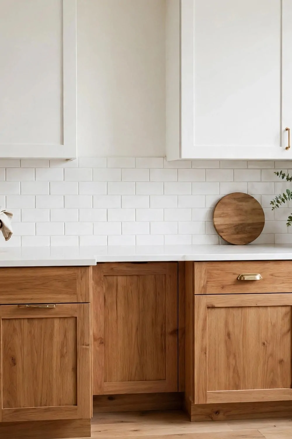
Warm wood lowers with white uppers feel like a hug. The wood is rich and warm. The white on top keeps it light.
I love the grain in wood. Every door looks a little bit different. That makes the kitchen feel real and handmade.
This pair works in old homes and new homes. Wood adds soul to a plain room. White adds a clean, fresh top.
I would pick a medium wood tone, not too dark. Oak or a light walnut looks best. Very dark wood can make the lowers feel heavy.
Black handles look great on wood lowers. They stand out just enough. Wood knobs blend in more, if you like a soft look.
A white worktop keeps the balance right. A wood worktop can work too, but pick a lighter wood so it does not match the lowers too much.
Wood lowers hide small marks well. They also age well. A few small marks over time just add to the charm.
I like to add a wood shelf to match the lowers. It ties the room together. It also gives me a spot for jars and cups.
Try this pair if you want a kitchen that feels warm, natural, and lived in. It is my pick for a family kitchen.
7. Black Lowers with White Uppers
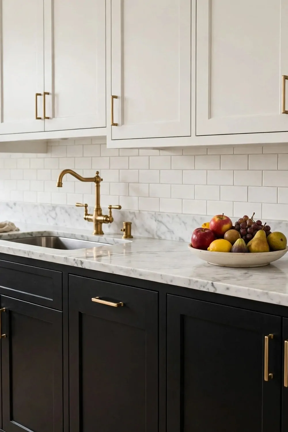
Black lowers with white uppers make a bold, clean statement. It is sharp. It is simple. It works.
I was scared of black at first. I thought it would make my kitchen dark. But with white on top, it feels just right.
The white uppers bounce light around the room. The black lowers anchor the space. Your eye moves up and down in a nice way.
I would use a matte black paint, not a shiny one. Matte feels soft and modern. Shiny black can show every mark.
Gold or brass handles look stunning on black. They add a warm sparkle. Silver handles give a cooler, neater look.
Keep your worktop light here. White or pale stone works best. A dark worktop with black lowers is too much dark in one place.
Black is great at hiding spills and marks. If you cook a lot, you will love that. A quick wipe keeps it looking sharp.
Add a light rug or a pale blind to soften the look. One light touch stops the black from feeling hard. It keeps the room friendly.
Pick this pair if you want a kitchen that feels bold and smart. It is not for shy tastes, and that is why I love it.
8. Dusty Pink Uppers with Cream Lowers
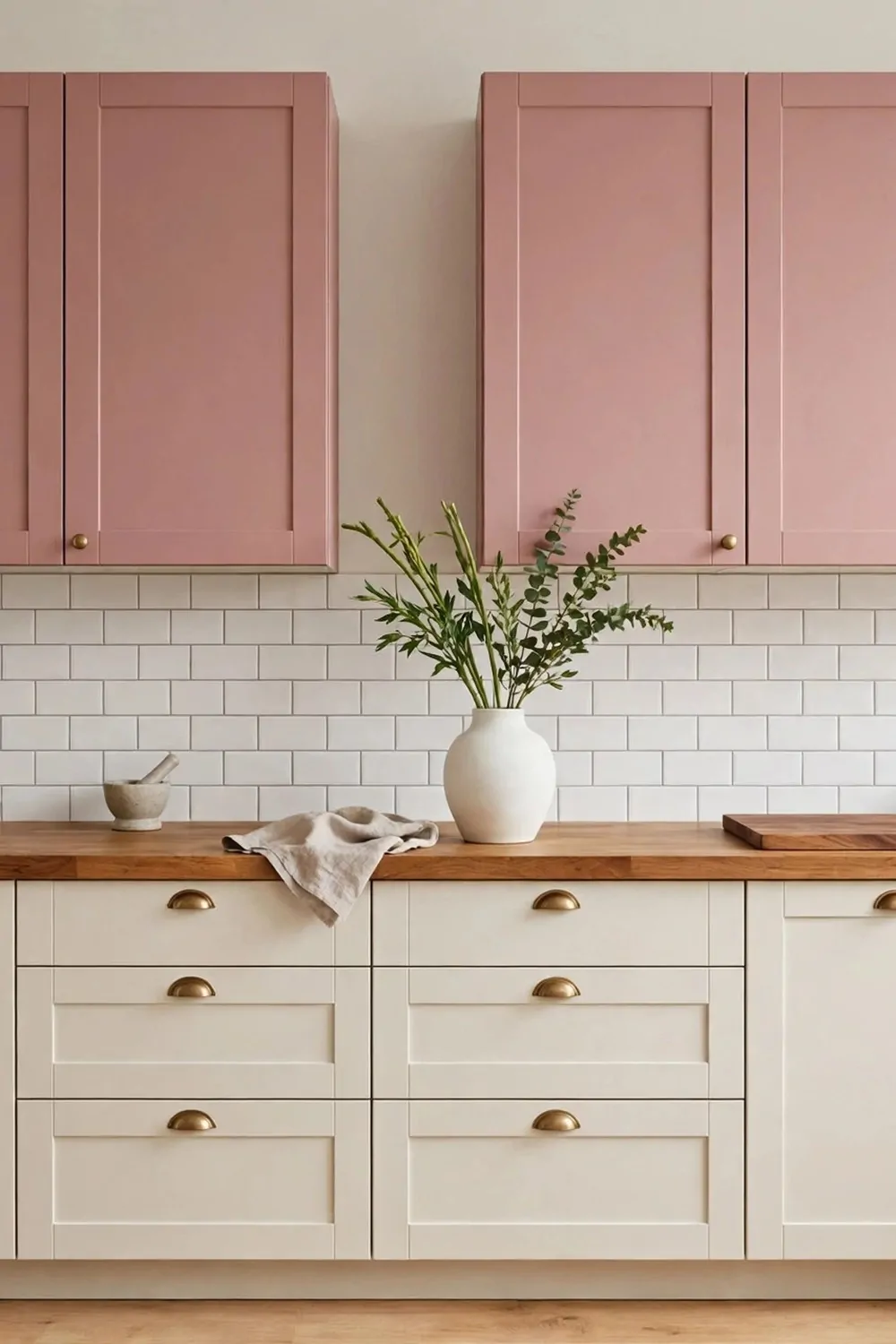
Dusty pink uppers with cream lowers feel soft and sweet. The pink is not bright. It is muted, like a faded rose.
I like this pair because it feels gentle. It makes the kitchen feel like a calm place to start the day. Tea tastes better here, I think.
Cream lowers keep the bottom warm and light. They stop the pink from feeling too much. Together they feel balanced.
I would pick soft gold knobs for this pair. They add a warm glow. White knobs work too, and they keep the look very soft.
A white worktop is my first pick here. It keeps the pink fresh. A light wood top adds warmth and a homely feel.
This pair suits a kitchen with soft light. If you have a sunny window, the pink glows in the morning. It is such a pretty sight.
Keep the rest of the room simple. Plain walls and plain floors let the pink shine. Too many colours will fight with it.
I would add a small vase with fresh flowers on the side. The flowers pick up the pink in a sweet way. It feels like a treat.
Try this if you want a kitchen that feels soft, pretty, and a little bit romantic. It is gentle, and it makes me happy.
9. Forest Green Lowers with Cream Uppers
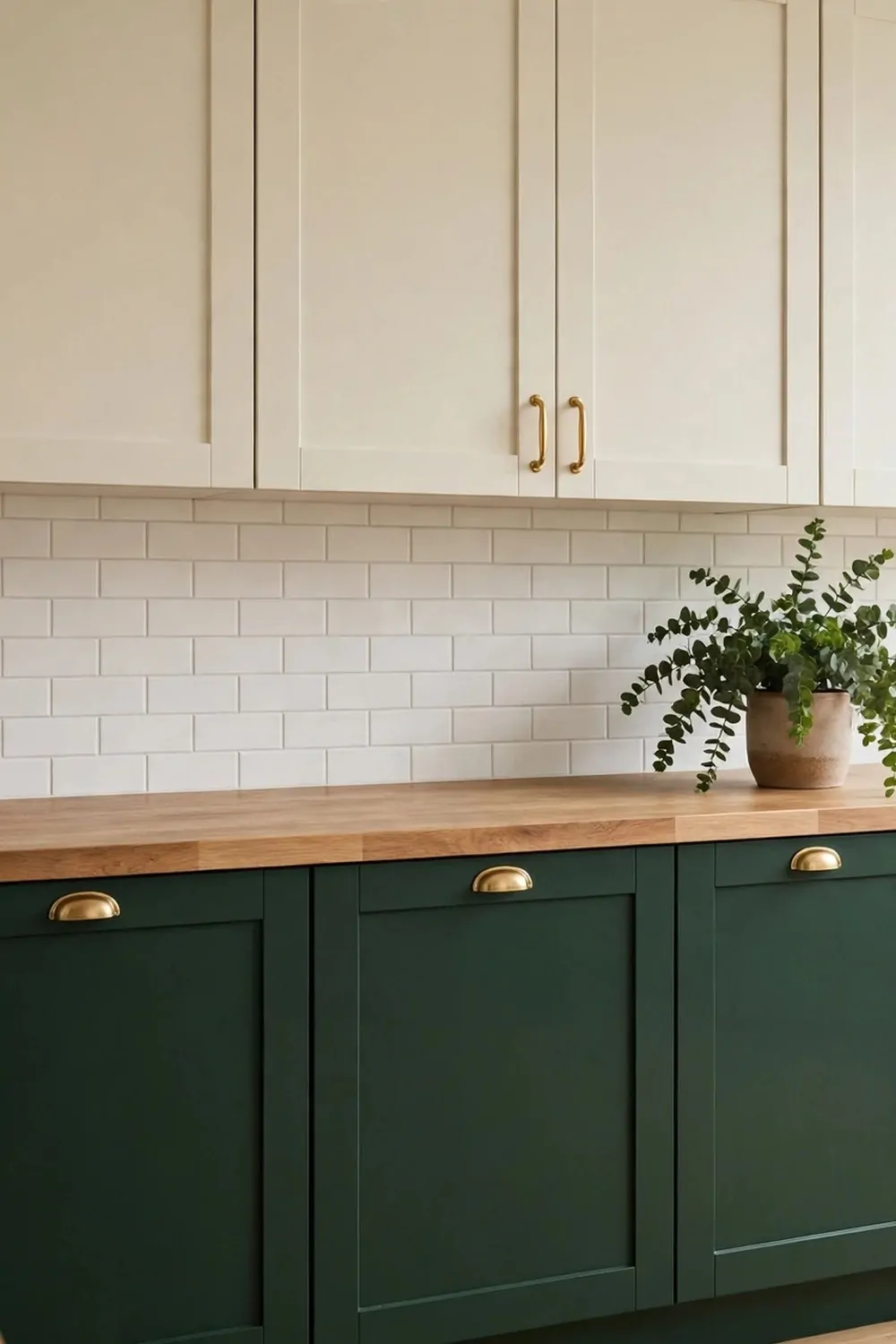
Forest green lowers with cream uppers feel rich and calm. The green is deep, like trees after rain. The cream on top is warm and light.
I love this pair in the evening. When the lights come on, the green looks deep and cosy. The cream keeps it from feeling dark.
This is a great pair for a kitchen with wood floors. The green and the wood work so well together. They feel natural side by side.
I would use brass or gold handles here. They glow against the deep green. Black handles work too, for a sharper look.
A white or cream worktop keeps the room bright. I like a plain worktop here. It lets the green be the star.
Forest green hides marks well, which I love. Cooking splashes wipe off fast. The doors still look rich after a busy week.
Add a plant or two to match the green. A small pot on the sill ties it all together. It makes the room feel alive.
This pair suits a classic kitchen and a modern kitchen. It feels timeless to me. It will not look old next year.
Pick this if you want a kitchen that feels deep, warm, and a little bit grand. It is my pick for long winter evenings at home.
10. Two-Tone Cabinets with a Matching Backsplash
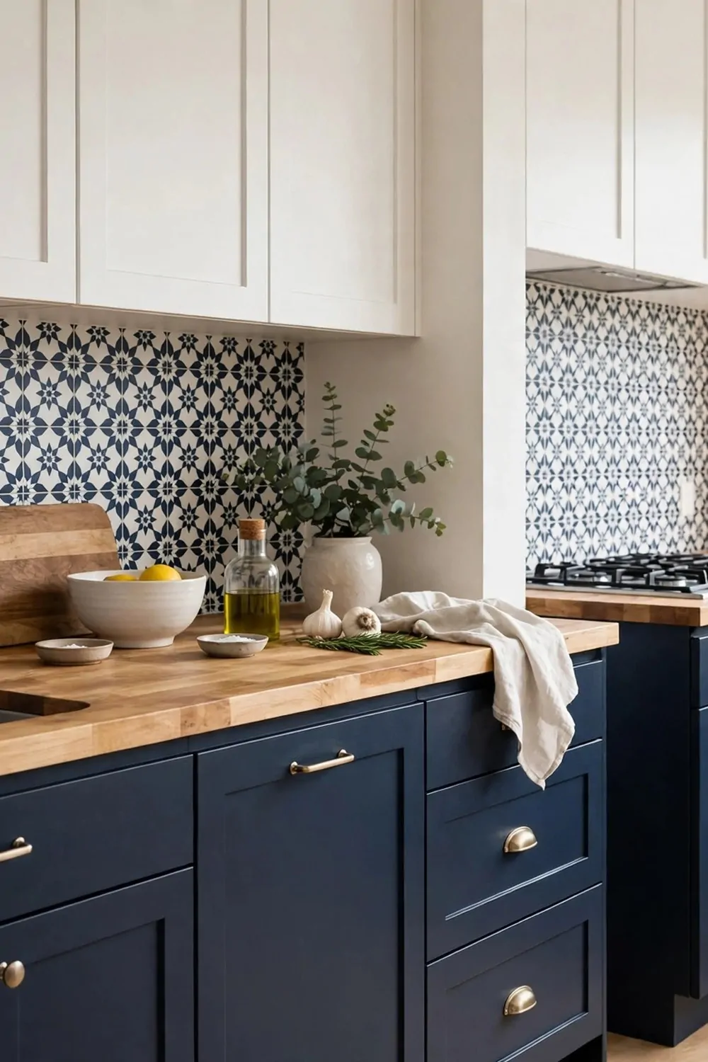
A matching backsplash can pull two cabinet colours together. It is the bridge between the top and the bottom. It makes the pair feel planned.
I like to pick one colour from the cabinets for the backsplash. Or I pick a tile that has both colours in it. Either way, it ties the room up.
White tiles are a safe pick. They work with almost any pair. They keep the wall bright and they are easy to wipe clean.
If your lowers are bold, pick a soft backsplash. A pale tile will calm the bold colour down. It keeps the room from feeling busy.
If your cabinets are soft, you can go bolder on the wall. A patterned tile adds fun. Just keep the pattern small so it does not take over.
I love subway tiles for this job. They are simple and classic. They suit white uppers and dark lowers so well.
Think about the grout too. White grout feels clean. Grey grout hides marks better. I pick grey grout in a busy kitchen.
A backsplash also guards your wall. It stops splashes from cooking and washing up. It is pretty and useful at the same time.
Try this idea if your two colours feel a bit apart. A good backsplash will join them up and make the whole kitchen feel like one room.
11. Navy Island with White Cabinets All Around
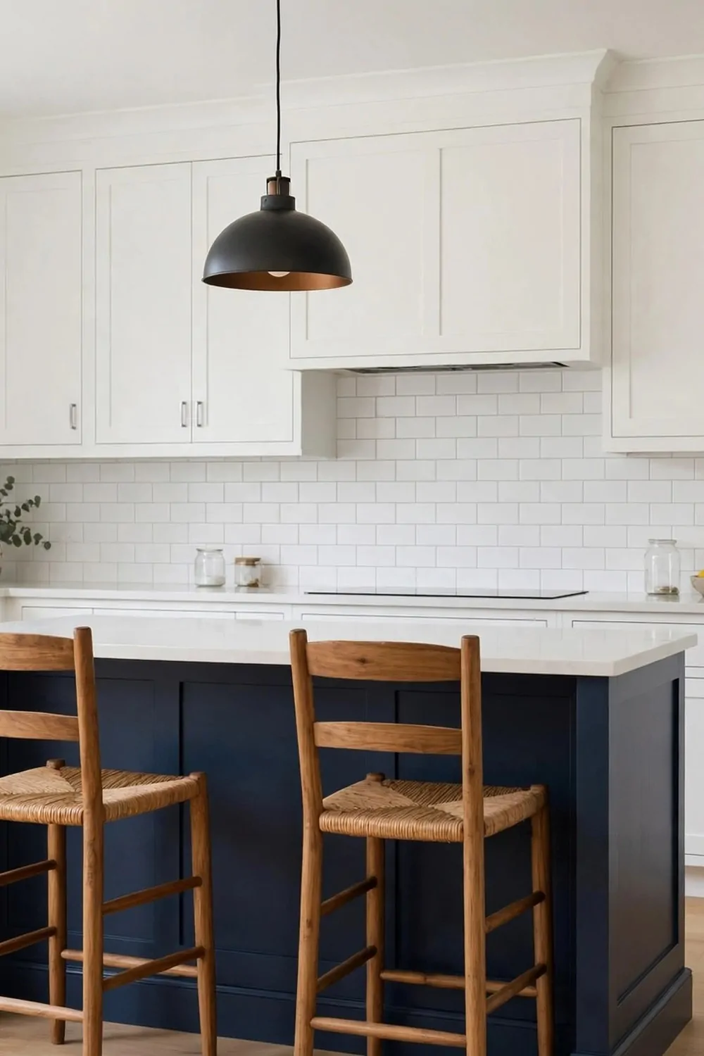
A navy island with white cabinets all around is a classic for a reason. It is clean, bold, and easy to love.
I like how the white cabinets frame the island. The island stands out in the middle. It feels like the star of the room.
Navy is deep but not harsh. It feels calm in the day and rich at night. It suits a big kitchen and a small one.
I would add brass pulls to the island. They shine against the navy. White knobs on the wall cabinets keep the rest soft.
A white worktop on the island looks crisp. It also makes the navy pop. A wood top on the island adds warmth if you like that.
Use the island for meals as well as cooking. I eat breakfast at mine most days. Two stools and a cup of tea, and I am set.
Keep the floor light if you can. A light floor lifts the navy island. A dark floor can make the island blend in too much.
This look is easy to change later. If you tire of navy, you can repaint just the island. The white cabinets stay the same.
Pick this if you want a bold centre piece with a calm frame. It is simple, it is smart, and it always looks good in photos.
12. Sage Green Island with Cream Cabinets
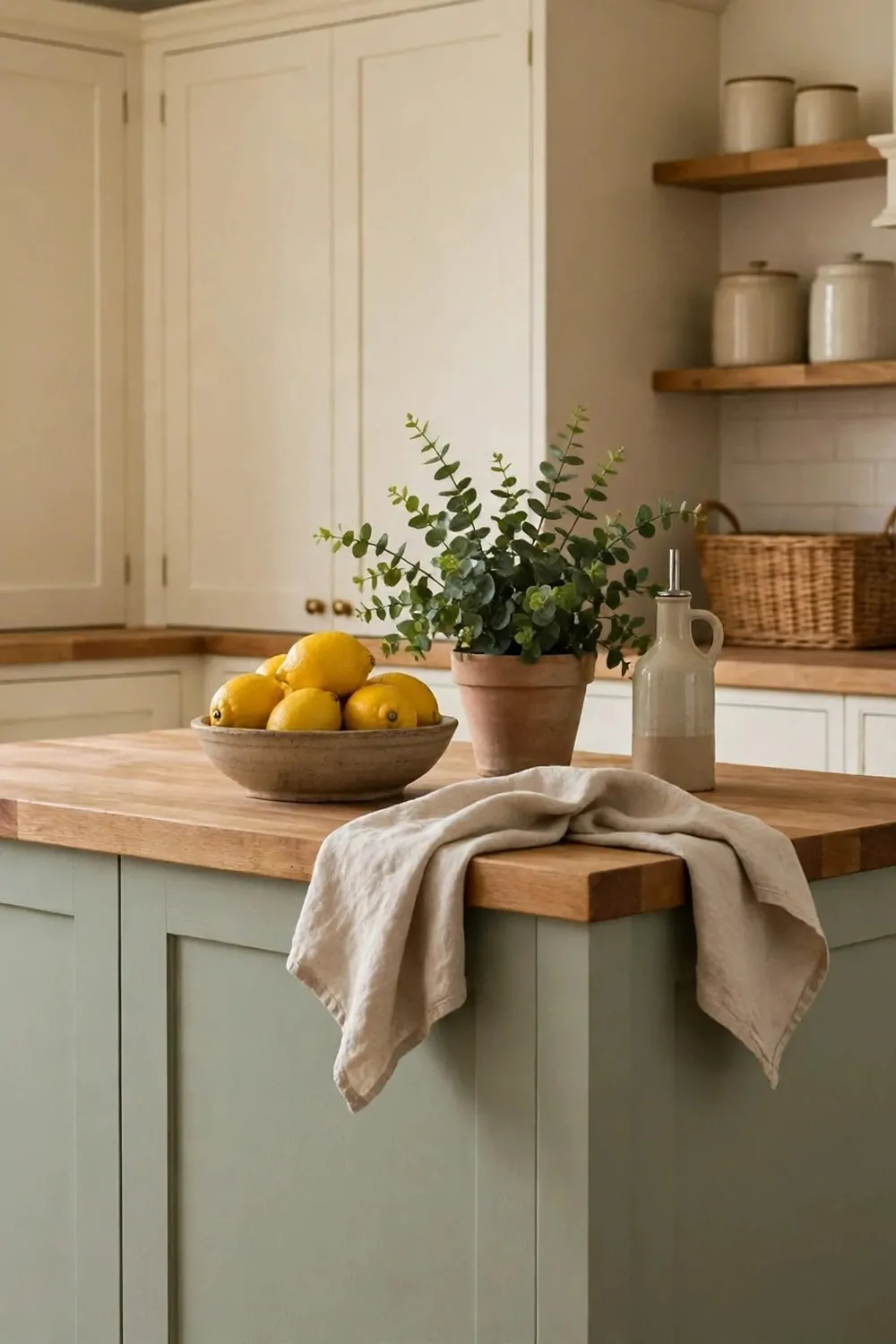
A sage green island with cream cabinets feels soft and fresh. The cream all around is warm. The sage in the middle is gentle and green.
I love this pair because it feels like a garden kitchen. It is calm. It makes me want to cook slow meals and sit down to eat them.
Cream cabinets keep the room light. They do not feel stark like pure white can. They feel warm, like fresh cream.
Sage green is a soft colour for an island. It does not shout. It just sits there and looks pretty all day.
I would use wood knobs on the cream cabinets. They add warmth. On the island, soft black pulls add a neat touch.
A white worktop on the island keeps it bright. A light wood top adds a farm feel. Both work, so pick the one you like best.
Add stools in a natural wood tone. They match the soft feel of the room. They also make the island a place to sit and chat.
This pair suits a kitchen with lots of light. The sage looks fresh in sun. In a dark kitchen, add warm lights over the island.
Try this if you want a kitchen that feels gentle, warm, and full of calm. It is a soft centre piece that never feels too much.
13. Light Wood Island with Painted Cabinets
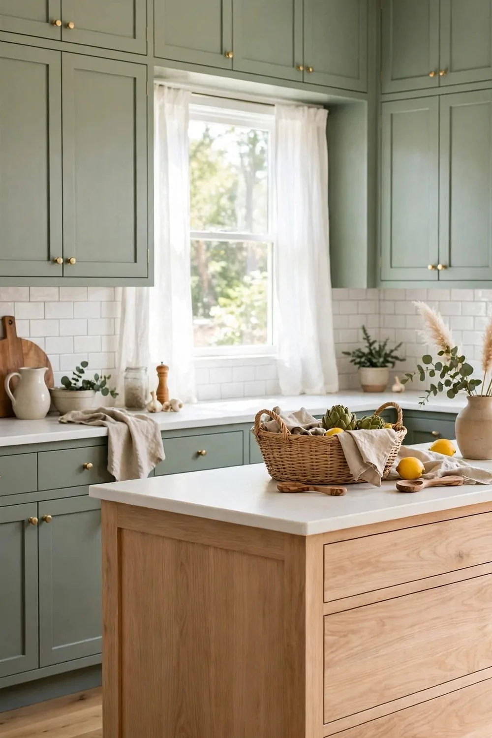
I love how a light wood island warms up a painted kitchen. It feels soft and calm. It also feels like a real home.
The wood brings a natural feel to the room. You can see the grain. It makes the space feel less flat.
Painted cabinets around it keep the look clean. White or soft grey works well. The wood stands out just enough.
I think of the island as the heart of the kitchen. You chop food there. You sit there with a cup of tea.
Light wood works with many paint colours. It suits sage green. It suits navy too.
Keep the wood tone pale and even. A honey tone is nice. A pale oak tone is nice too.
You can match the wood to your floor. Or you can let it stand on its own. Both ways look good.
Add simple stools at the island. Pick ones you can wipe clean. You will use them every day.
This mix feels fresh and warm at the same time. It is not too busy. It is just right for a family kitchen.
14. Paint Finishes That Make Two Tones Work
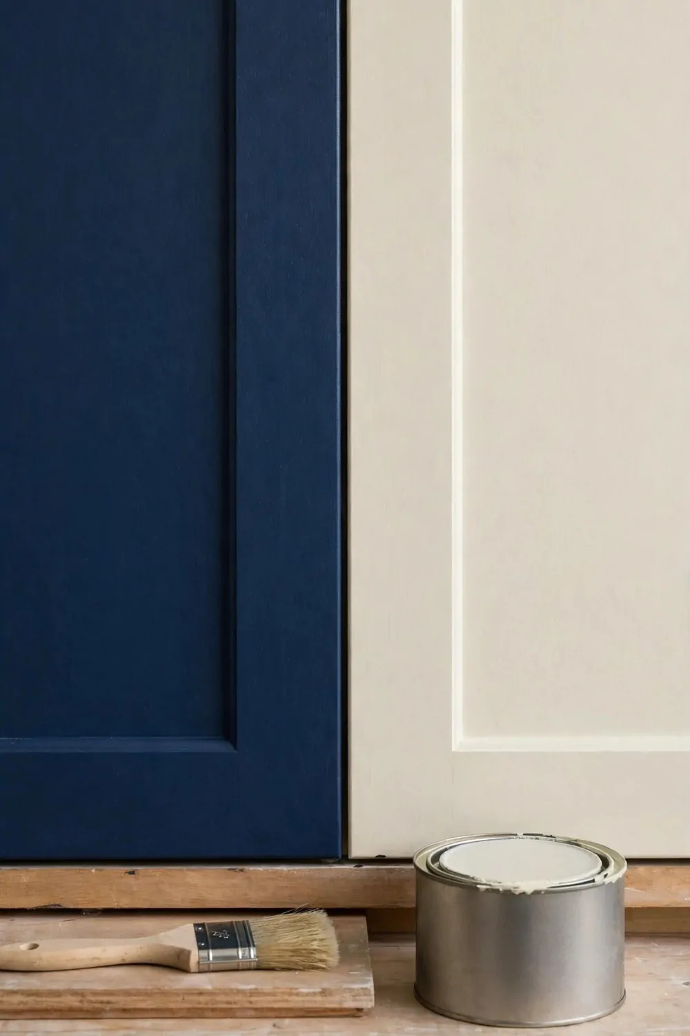
The paint finish can change how your two tones look. It is a small choice. It makes a big change.
Matt paint looks soft and flat. It hides small bumps on the doors. It gives a calm, modern feel.
Satin paint has a soft shine. It is easy to wipe clean. I like it for busy kitchens.
Gloss paint shines a lot. It makes colours look deep and rich. It can show marks more, so you need to wipe it often.
Cost is simple to plan. Matt paint is often $30 to $55 per gallon. Satin paint is often $35 to $60 per gallon. Gloss paint is often $40 to $65 per gallon.
| Paint finish | Look | Typical cost |
|---|---|---|
| Matt | Soft and flat, hides small marks | $30 to $55 per gallon |
| Satin | Soft shine, easy to clean | $35 to $60 per gallon |
| Gloss | Strong shine, deep colour | $40 to $65 per gallon |
You can mix finishes in one kitchen. Try matt on the uppers. Try satin on the lowers.
That mix helps the two tones feel planned. The uppers look soft. The lowers stay easy to clean.
Test a small patch first. Paint one door and live with it for a few days. You will know if you like it.
Pick a finish that fits how you cook. If you cook a lot, satin is a safe pick. If you want a soft look, matt is a good pick.
15. Two-Tone Cabinets in a Small Kitchen
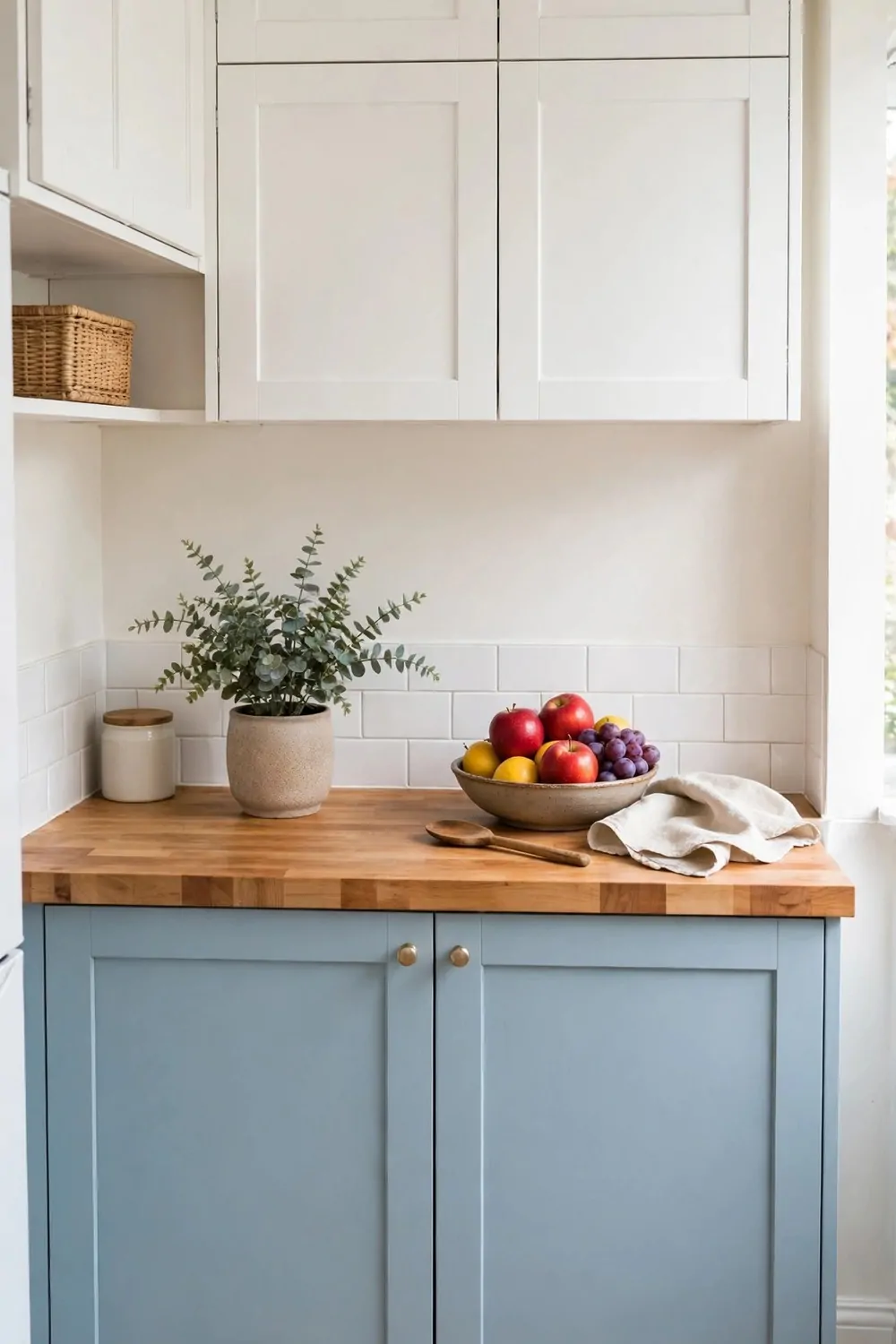
A small kitchen can still have two tones. You just need to keep it light. Light colours open the room up.
I like white uppers in a small space. They feel clean and bright. They make the wall feel taller.
Pair them with a soft lower colour. Try pale blue or pale green. It adds charm without making the room dark.
Keep the two colours close in tone. A big jump can feel heavy. A soft jump feels calm.
Use the same handles on both tones. It ties the room together. It keeps the look neat.
Leave some wall space clear. Do not fill every spot. A little space helps a small room breathe.
Pick a light worktop too. A pale worktop bounces light around. It makes the room feel bigger.
You can add colour with small things. A plant on the sill is nice. A soft tea towel is nice too.
Two tones in a small kitchen should feel easy. Not busy. Not loud. Just fresh and simple.
16. Two-Tone Cabinets in a Galley Kitchen
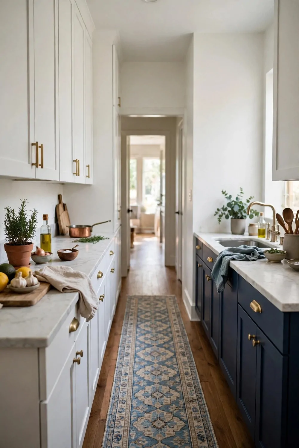
A galley kitchen is long and narrow. Two tones can help it feel balanced. You need a clear plan.
I like light uppers on both sides. They keep the long walls bright. They stop the room from feeling like a tunnel.
Use a deeper tone on the lowers. Navy or deep green works well. It grounds the room.
Keep the floor light if you can. A pale floor adds light. It helps the narrow space feel wider.
Do not use too many colours here. Two tones are enough. A third colour can make it feel crowded.
Match the two sides of the galley. The same tones on both sides look calm. It feels like one room, not two.
Add light under the top cabinets. It lights the worktop. It makes cooking much easier.
Keep the worktops clear. A clear run of worktop feels long and useful. It also shows off your two tones.
A galley kitchen can feel smart and cosy. The two tones give it shape. The light keeps it open.
17. Dark Lowers to Hide Marks and Mess
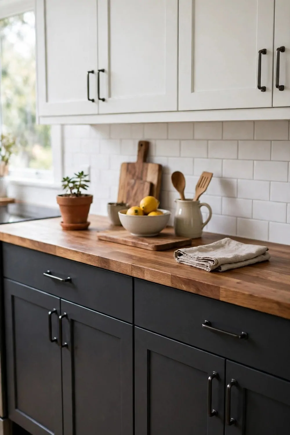
Dark lowers are a smart pick for a busy kitchen. They hide small marks. They hide splashes too.
I know how messy cooking can get. Flour dust. Sauce spots. Little hand prints near the floor.
A dark lower cabinet hides all of that. You do not need to wipe it every hour. That saves you time.
Navy is a good dark pick. Deep green is good too. Charcoal grey also works well.
Pair dark lowers with light uppers. The top stays bright. The bottom stays practical.
Use a finish you can wipe clean. Satin is a good choice here. It wipes well and still looks soft.
Dark lowers also make the room feel grounded. The eye rests low. The room feels steady.
Keep the handles simple. Black or brass both work. Pick one and use it all through.
If you have kids at home, dark lowers are a gift. They hide the daily mess. Your kitchen still looks tidy.
18. Light Uppers to Keep the Room Bright
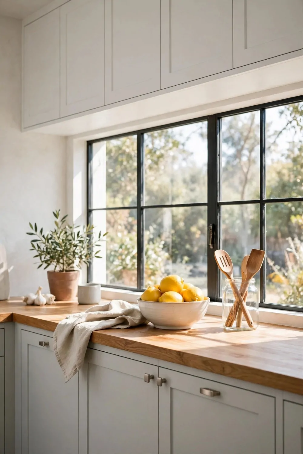
Light uppers make a kitchen feel bright. They catch the light. They lift the whole room.
White is the classic pick. Cream is warm and soft. Pale grey is calm and clean.
I like light uppers with a darker base. The mix feels balanced. The top feels airy.
Light uppers also help in a room with one small window. They bounce what light you have. The room feels less dark.
Keep the uppers plain and simple. No fussy detail. Clean doors look best up high.
You can paint the uppers the same as the ceiling. That trick makes the room feel taller. It is simple and it works.
Add glass in one or two upper doors if you like. It breaks up the wall. It shows off your pretty plates.
Wipe the uppers now and then. Dust can show on light paint. A quick wipe keeps them fresh.
Light uppers are a safe, happy choice. They suit most homes. They make mornings feel brighter.
19. Two-Tone Cabinets with Brass Handles
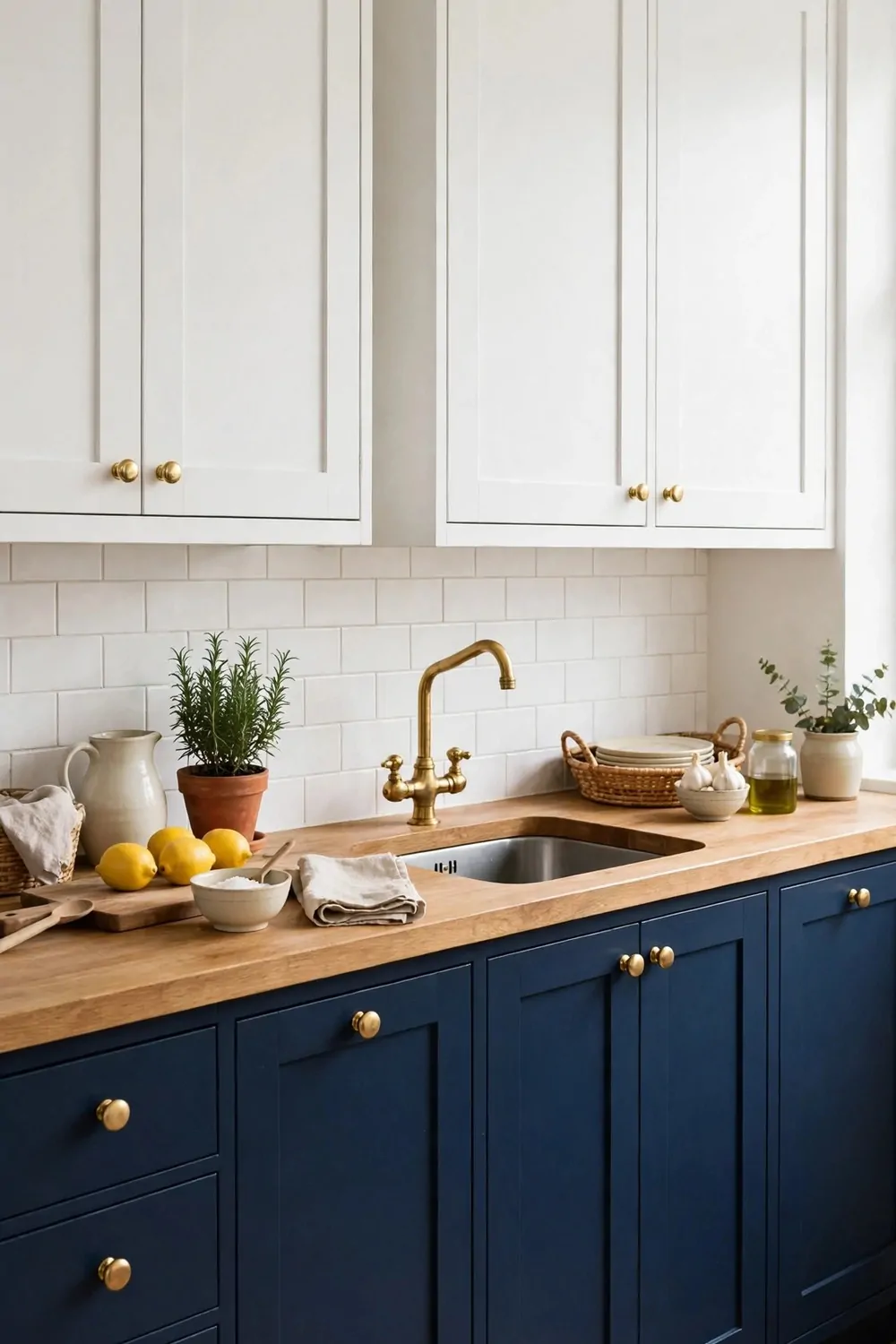
Brass handles add warmth to two-tone cabinets. They shine in a soft way. They feel a bit fancy.
I love brass with navy lowers. The gold tone pops against the dark paint. It looks rich but not loud.
Brass also works with white uppers. It adds a warm spot. It stops the white from feeling cold.
Pick one brass tone and stick to it. Mixed gold tones can clash. One tone looks planned.
Try long bar handles on drawers. They are easy to grab. They look neat in a row.
Use small knobs on the doors. Keep the same style all through. That keeps the look calm.
Brass needs a quick wipe now and then. Finger marks can show. A soft cloth is all you need.
You can match brass to your tap. That small match ties the room together. It feels like a real plan.
Brass handles are a small change with a big feel. They warm up two tones. They make the kitchen feel loved.
20. Two-Tone Cabinets with Black Handles
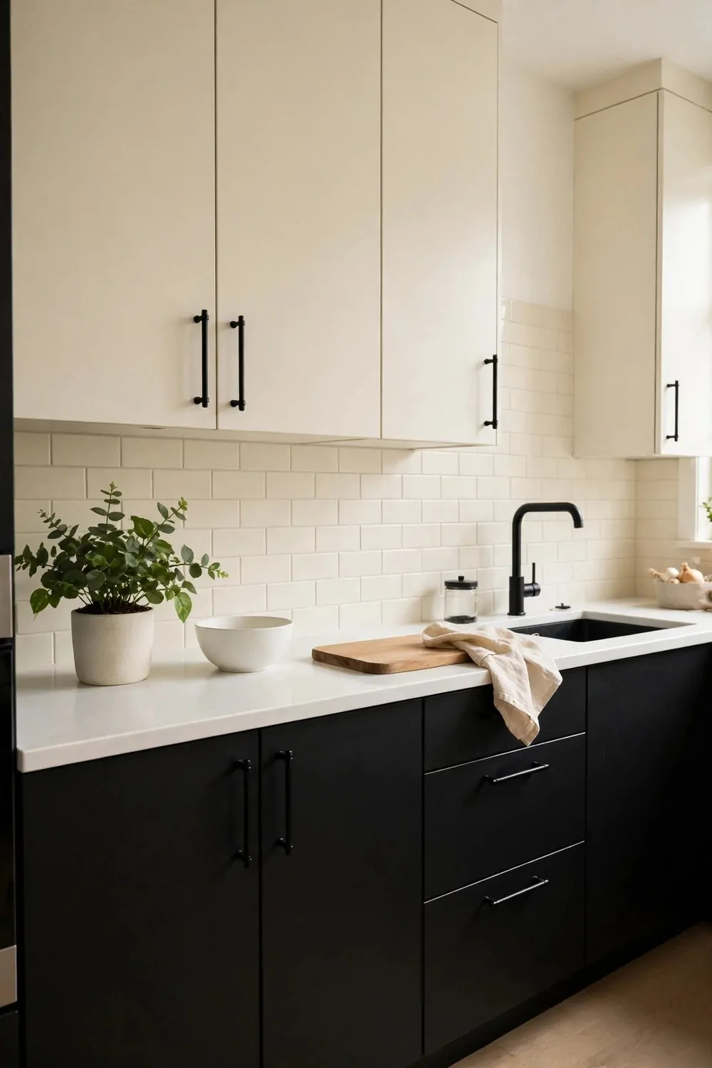
Black handles give two-tone cabinets a clean edge. They look sharp. They feel modern.
I like black handles with white uppers. The dark line stands out. It frames each door.
Black also works well with wood tones. It adds a firm touch. It keeps the wood from feeling too soft.
Pick matt black if you can. It looks soft, not shiny. It suits most kitchens.
Use the same black handle on both tones. It links the two colours. It makes the mix feel like one design.
Long black pulls suit wide drawers. Small black knobs suit small doors. Mix the sizes, not the colour.
Black handles hide marks well. You do not see every touch. That is handy in a busy kitchen.
Match them to a black tap if you like. Or match them to black light fittings. One small link is enough.
Black handles are simple and strong. They suit two tones well. They will not date fast.
21. A Bold Colour on Just the Island
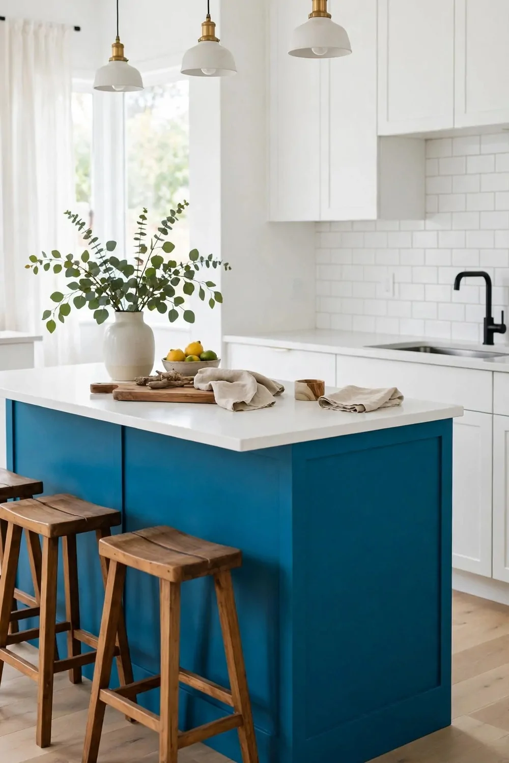
A bold island is a fun way to try colour. You keep the rest calm. The island does all the talking.
I love a deep teal island. Or a rich red island. It becomes the star of the room.
Keep the wall cabinets white or cream. That calm base lets the bold island shine. It does not fight it.
Pick a colour you truly love. You will see it every day. It should make you smile.
Test the colour in your light first. Paint a board and lean it by the island. Check it in the morning and at night.
Add simple stools that do not clash. Wood or black stools work well. Let the island be the colour star.
You can echo the bold colour in small things. A tea towel. A vase. Just a hint is enough.
A bold island also hides marks well. Dark and rich tones are kind that way. It stays looking good.
This is a brave but safe idea. One bold spot is easy to live with. It gives your kitchen real charm.
22. Soft Pastel Two-Tone for a Calm Kitchen
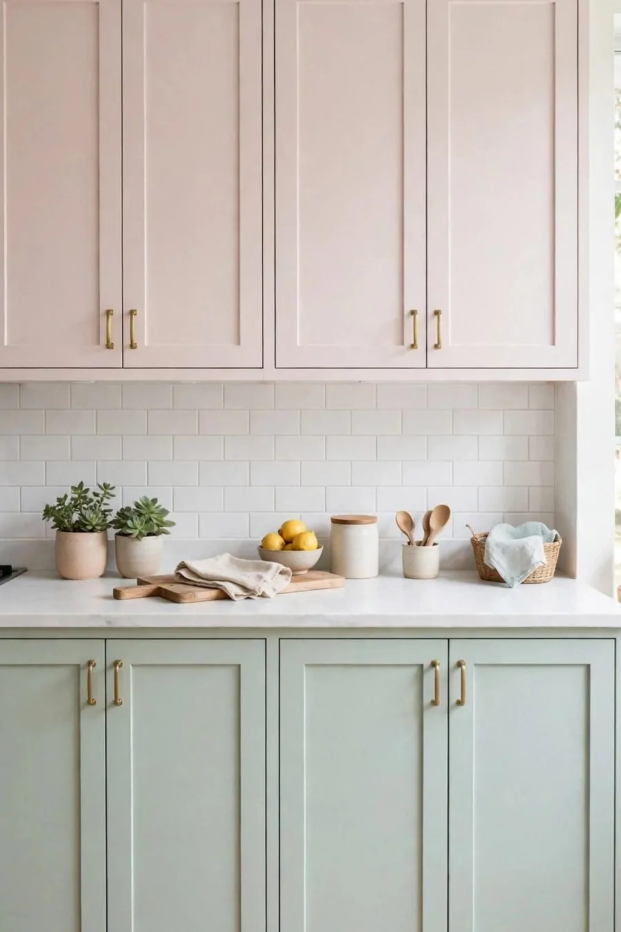
Pastel two-tone feels soft and calm. It is gentle on the eyes. It makes the kitchen feel peaceful.
I like pale pink with white. It feels sweet and light. It suits a small, bright room.
Pale blue with cream is calm too. It feels like a fresh morning. It never feels loud.
Mint green is another soft pick. Pair it with white uppers. The mix feels clean and fresh.
Keep both tones pale. If one gets too strong, the calm feel goes. Soft is the whole point.
Use light wood with pastels. It adds warmth. It stops the room from feeling too pale.
Pick simple handles in white or wood. Fancy handles can fight the soft look. Simple is best here.
Pastels suit a kitchen you use to relax in. A slow breakfast. A quiet cup of tea. It all fits.
A pastel kitchen feels kind and easy. It is not trying too hard. It just feels good to be in.
23. Grey and White Two-Tone That Never Dates
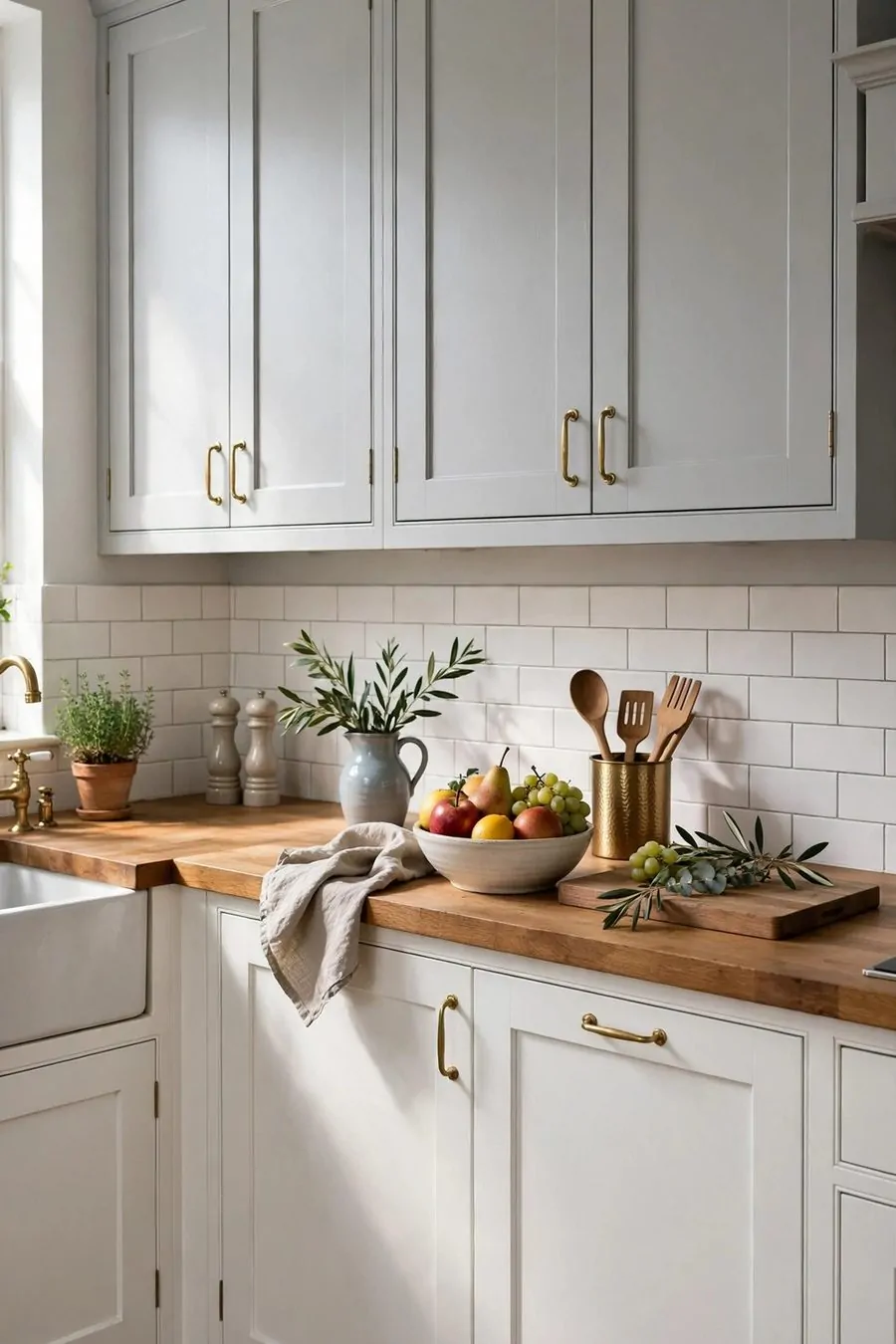
Grey and white is a classic mix. It has been loved for years. It still looks fresh today.
I like white uppers with soft grey lowers. The top stays bright. The bottom feels calm and steady.
Pick a warm grey, not a cold one. Warm grey feels homely. Cold grey can feel a bit stark.
This mix suits almost any home. Old homes. New homes. Big kitchens and small ones.
Grey hides marks better than white. That helps on the lowers. You wipe less often.
Add wood to warm it up. A wood worktop is lovely. Wood stools are lovely too.
Keep the handles simple. Silver, black or brass all work. Pick one and use it through the room.
You can change the look with small things. New tea towels. A new plant. The grey and white base stays the same.
This is a safe mix that still has charm. It will not date fast. You will love it for years.
24. Cabinet Finishes: Matt, Satin or Gloss
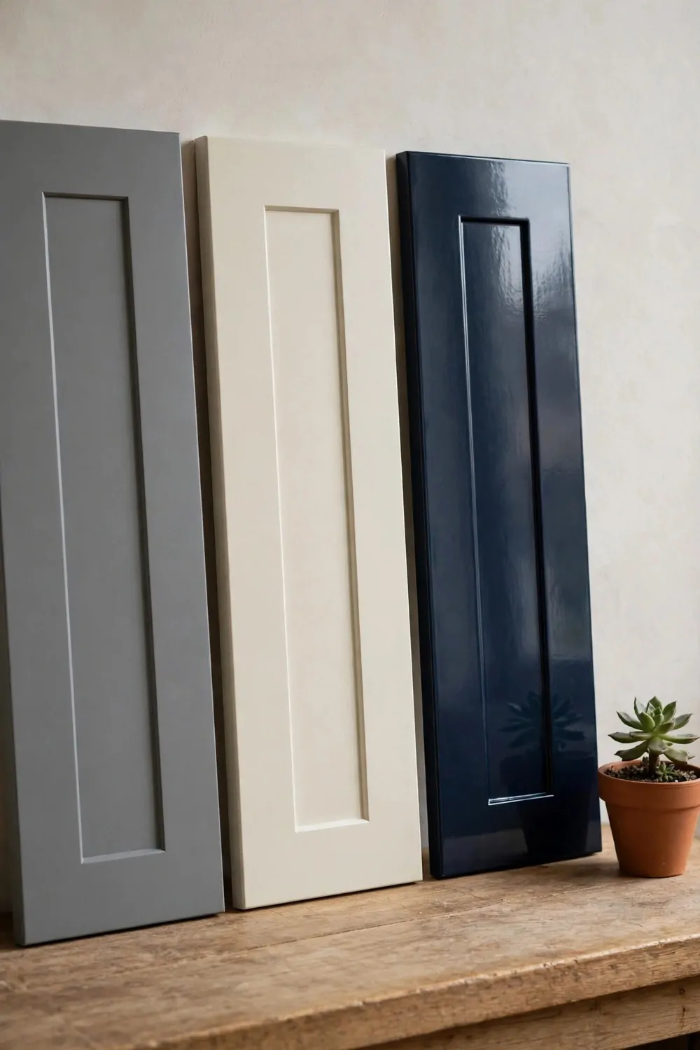
The finish you pick changes how your cabinets feel. It is not just about shine. It is about how you live.
Matt is soft and flat. It looks calm and modern. It hides small dents well.
Satin has a soft glow. It is the middle choice. It looks neat and it cleans well.
Gloss is bright and shiny. It makes colour look bold. It can show finger marks, so it needs more wiping.
Costs are easy to compare. Matt is often $30 to $55 per gallon. Satin is often $35 to $60 per gallon. Gloss is often $40 to $65 per gallon.
| Finish | Best for | Typical cost |
|---|---|---|
| Matt | Calm rooms, hiding small marks | $30 to $55 per gallon |
| Satin | Busy kitchens, easy cleaning | $35 to $60 per gallon |
| Gloss | Bold colour, bright light | $40 to $65 per gallon |
Think about your daily life first. If you cook a lot, satin is a kind pick. If you want a soft look, matt is a kind pick.
You can use one finish all through. Or you can mix matt uppers with satin lowers. Both ways work.
Ask for a small sample pot. Paint a door and touch it for a few days. You will feel which finish suits you.
The right finish makes your two tones look their best. It is a small choice. It lasts for years.
25. Two-Tone Cabinets with Open Shelving
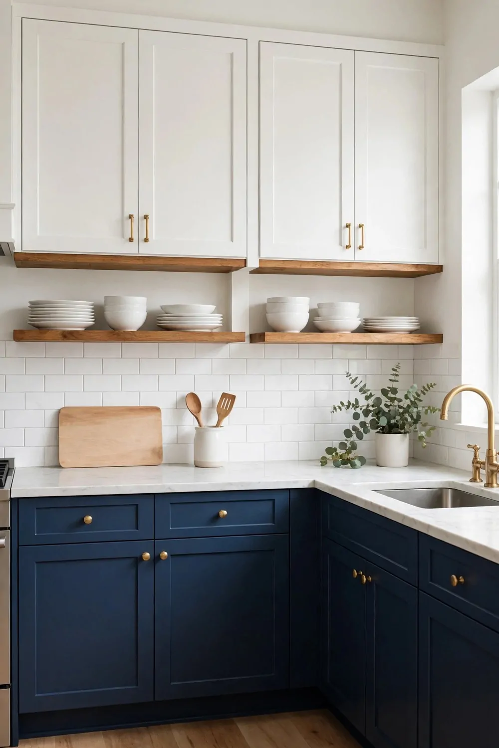
I love open shelves with two-tone cabinets. They make the room feel light and airy.
Paint the lower cabinets a deep color. Keep the uppers soft and pale.
Then leave a few open shelves where the top cabinets would be. You get a nice break in the color.
I use my open shelves for the plates I grab every day. They sit right where I need them.
Wood shelves look warm next to painted cabinets. White shelves look clean and fresh.
Do not fill every shelf to the edge. Leave a little space so the eye can rest.
Try three or four items on each shelf. A small plant, a stack of bowls, and a mug or two is plenty.
If the shelves start to look messy, I take half the stuff off. Simple looks better than full.
Two-tone cabinets and open shelves work so well together. You get color, charm, and a kitchen that feels open.
26. Two-Tone Cabinets with Glass-Front Uppers
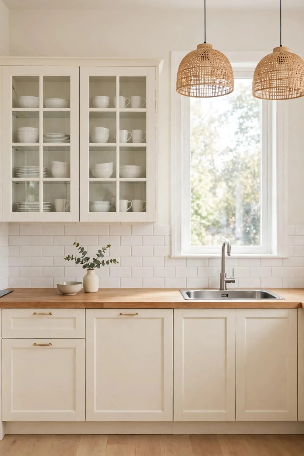
Glass-front uppers make a two-tone kitchen feel special. You can see the pretty things inside.
I like dark lowers with light glass-front uppers. The glass keeps the top half from feeling heavy.
Pick glass that fits your style. Clear glass shows everything, and frosted glass hides a bit more.
Put your nicest dishes behind the glass. White plates and clear glasses always look good there.
Keep the inside neat because you will see it every day. I line my bowls up in a row and it looks calm.
If you have kids, keep the glass shelves for things that are safe to reach. I keep the mugs low and the fancy stuff up high.
Glass fronts also bounce light around the room. My kitchen looks brighter since I added them.
You do not need glass on every upper cabinet. Two or three glass doors can be enough.
Try it and see how it feels. Glass uppers give your two-tone cabinets a custom look without a big change.
27. Warm Terracotta Lowers with Cream Uppers
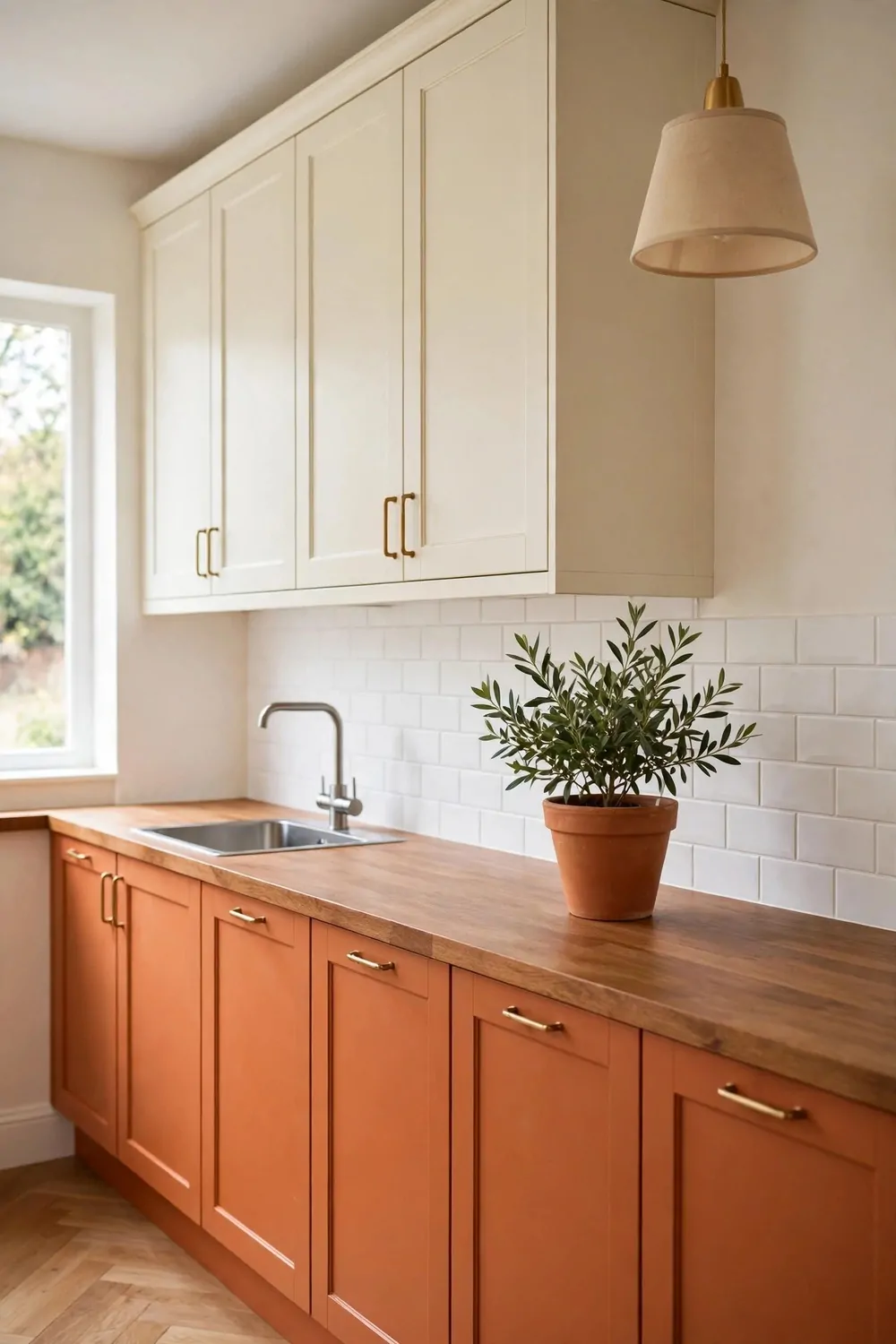
Terracotta lowers with cream uppers feel warm and cozy. It is like a hug for your kitchen.
Terracotta is a soft orange-brown color. It reminds me of clay pots and warm sun.
Cream uppers keep the room from feeling dark. They balance the rich color below.
I think this pair works best with wood touches. A wood cutting board or a wood stool fits right in.
Try brass handles with terracotta. The warm metal matches the warm color so well.
If terracotta feels bold to you, test it on one small cabinet first. Live with it for a week and see.
Keep your worktop light with this pair. A pale stone or light wood top lets the terracotta shine.
Add a few green plants and the room feels alive. Green and terracotta are good friends.
This is a brave choice and a warm one. Your kitchen will feel sunny even on a grey day.
28. Teal Lowers with White Uppers
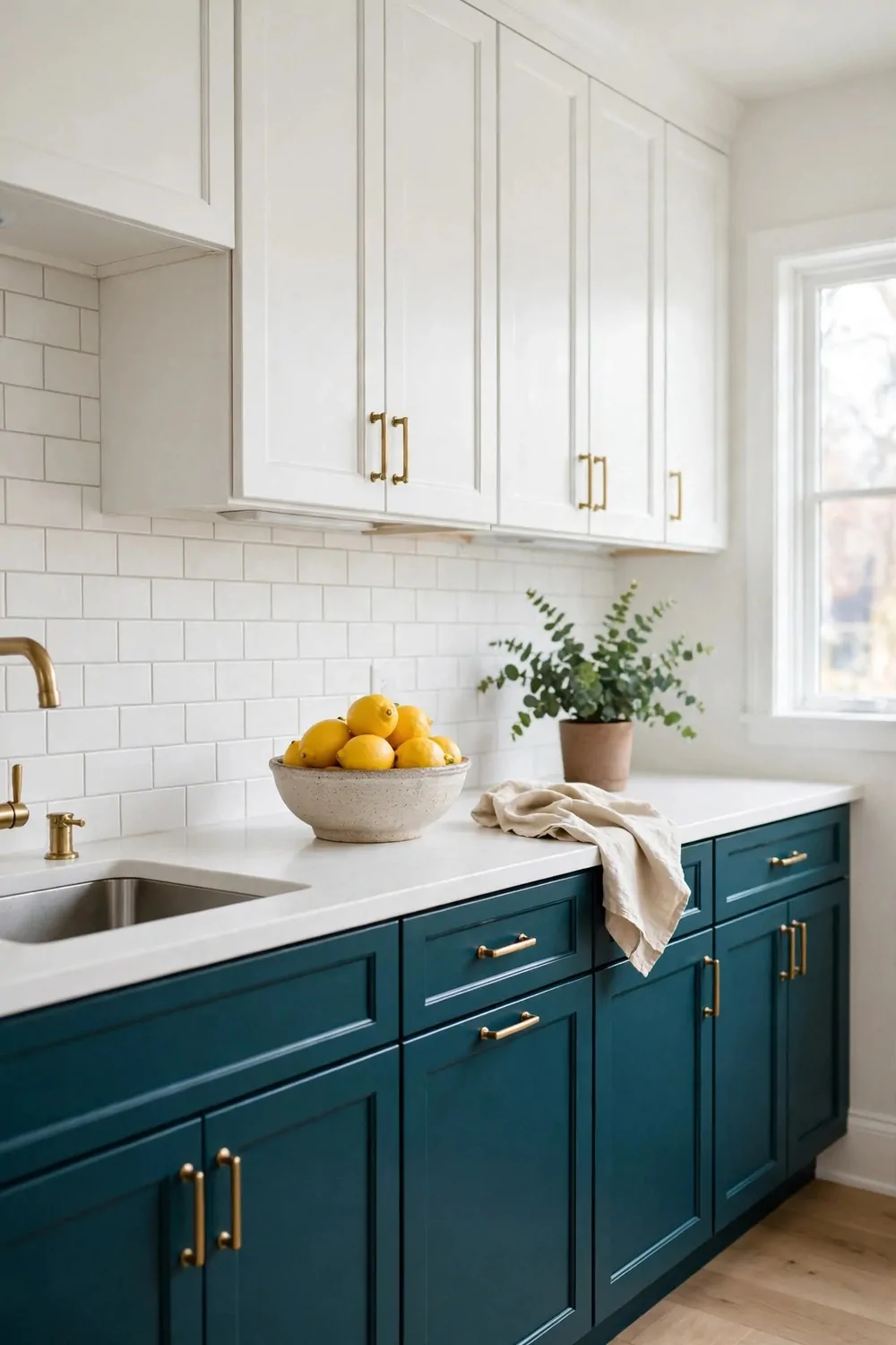
Teal lowers with white uppers feel fresh and calm. It is a bold look that still feels easy.
Teal sits between blue and green. It brings a bit of the sea into your kitchen.
White uppers keep the teal from taking over. The top half stays light and bright.
I love this pair with a white worktop. It keeps everything crisp and clean.
Silver or chrome handles look great with teal. They add a cool shine to the warm room.
If you worry teal is too strong, try a soft teal. A lighter shade is gentle and still full of charm.
Keep the walls pale so the cabinets can be the star. I painted my walls a soft white and it works.
Add a wood tray or a wood bowl to warm the room up. Wood softens the cool teal nicely.
Teal and white is a fun pair. It makes the kitchen feel happy and fresh every morning.
29. Two-Tone Cabinets on a Tight Budget
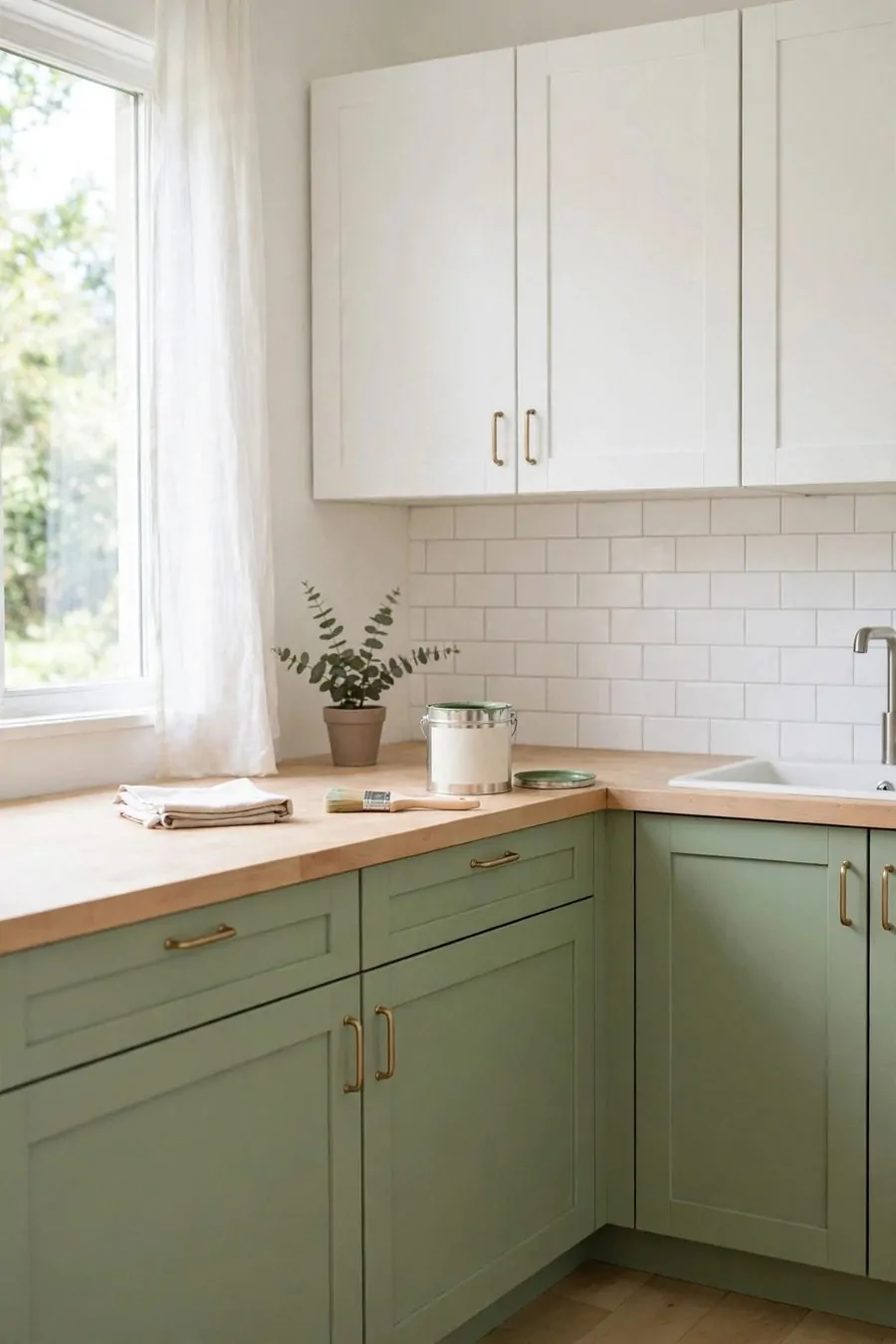
You do not need a big budget for two-tone cabinets. A little paint can change the whole room.
Paint just the lowers and leave the uppers as they are. That one change gives you the two-tone look.
I painted my own lowers on a weekend. It took time, but it saved a lot of money.
Clean the cabinets well before you paint. Grease stops paint from sticking, so wash them twice.
Use a good primer first. It helps the color stay smooth and last longer.
Pick one paint color you truly love. You will see it every day, so choose with care.
Swap the handles instead of the whole cabinets. New knobs cost little and look brand new.
Shop for handles on sale or in a pack. I found mine for half price and they look lovely.
A tight budget does not mean a plain kitchen. With paint and new handles, your cabinets can look custom.
30. Hardware Finishes That Tie Two Tones Together
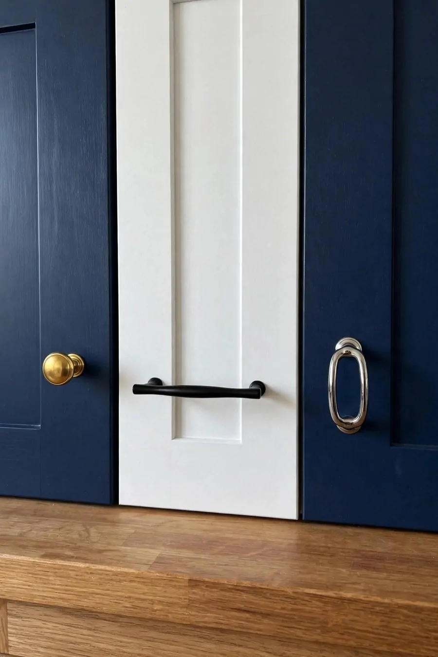
Hardware is the small detail that ties two cabinet colors together. The right finish makes both tones feel like one plan.
I think of handles like jewelry for the kitchen. They are small, but you notice them all the time.
Pick one finish and use it on all the cabinets. Mixing too many metals can look messy.
Brass feels warm and classic. It looks lovely with cream, green, and navy cabinets.
Black hardware feels bold and modern. It stands out on light cabinets and looks sharp on dark ones.
| Hardware finish | Look | Typical cost |
|---|---|---|
| Brass | Warm and classic | About $5 to $15 each |
| Black | Bold and modern | About $3 to $10 each |
| Chrome | Bright and clean | About $3 to $12 each |
Chrome feels bright and clean. It suits white uppers and cool tones like teal and grey.
Brass costs about $5 to $15 each, black costs about $3 to $10 each, and chrome costs about $3 to $12 each. Prices change by shop, so check a few stores first.
Try holding a handle against both cabinet colors before you buy. You will see at once if it works with both.
One finish, used all through the kitchen, pulls the two tones together. It is a small change with a big payoff.
31. Two-Tone Cabinets with a Wooden Worktop
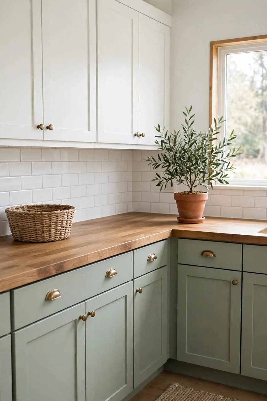
A wooden worktop makes two-tone cabinets feel warm and homey. It softens the paint and adds a natural touch.
I love a light wood top with dark lowers. The contrast is soft and easy on the eyes.
Wood also works with pale cabinets. A warm wood top keeps a white kitchen from feeling cold.
Oil your wood worktop often to keep it safe from water. I oil mine once a month and it stays lovely.
Wipe up spills right away. Wood does not like to sit wet for long.
Use a cutting board for chopping. It saves the wood from cuts and marks.
Wood tops show small marks over time. I think those little marks add charm and tell a story.
Match your wood tone to your floor if you can. When they are close, the room feels calm and put together.
A wooden worktop is warm, useful, and full of charm. It makes two-tone cabinets feel like home.
32. Two-Tone Cabinets with a Stone Worktop
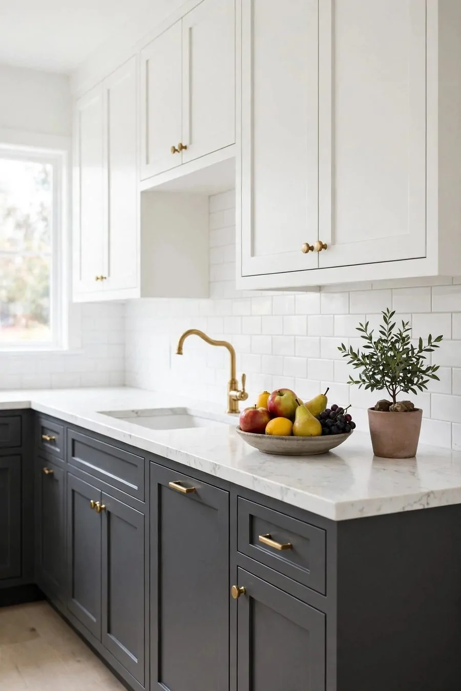
A stone worktop makes two-tone cabinets feel smart and strong. It is hard, smooth, and easy to clean.
White stone looks fresh with almost any cabinet color. I like it with navy lowers and white uppers.
Grey stone is calm and hides small marks well. It suits a busy family kitchen.
Stone can be cool to the touch. That cool feel is nice when you are baking on a warm day.
Seal your stone top as the maker says. A sealed top resists stains much better.
Wipe it with a soft cloth and mild soap. Harsh cleaners can dull the shine.
Stone is heavy, so make sure your cabinets are strong enough. Your fitter can check this for you.
A stone top lasts for years if you care for it. It is a solid choice for a kitchen you use every day.
Stone and paint are a great team. The stone adds polish and the two tones add warmth.
33. Two-Tone Cabinets in a Farmhouse Kitchen
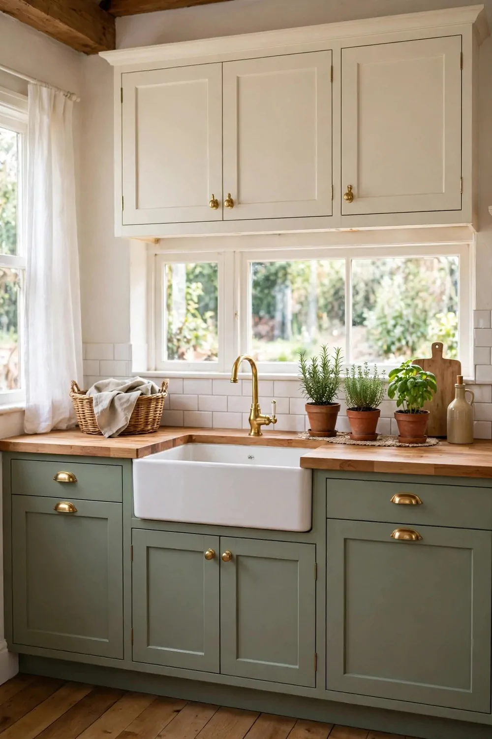
A farmhouse kitchen with two-tone cabinets feels cozy and lived in. It is warm, simple, and welcoming.
I like cream uppers with a soft sage or dusty blue below. The colors feel gentle and old fashioned in a good way.
Wood beams and wood shelves fit this style so well. They add warmth next to the painted cabinets.
Try a farmhouse sink if you can. The deep sink looks classic and holds big pots with ease.
Keep the decor simple. A vase of fresh flowers and a wood tray is all you need.
Black handles suit the farmhouse look. They add a little contrast without feeling fancy.
Use open shelves for jars and plates. Glass jars with dry food look pretty and useful.
A farmhouse kitchen should feel easy to live in. Nothing too perfect, nothing too stiff.
Two tones give the farmhouse style a fresh twist. Your kitchen will feel old in charm and new in style.
34. Two-Tone Cabinets in a Modern Kitchen
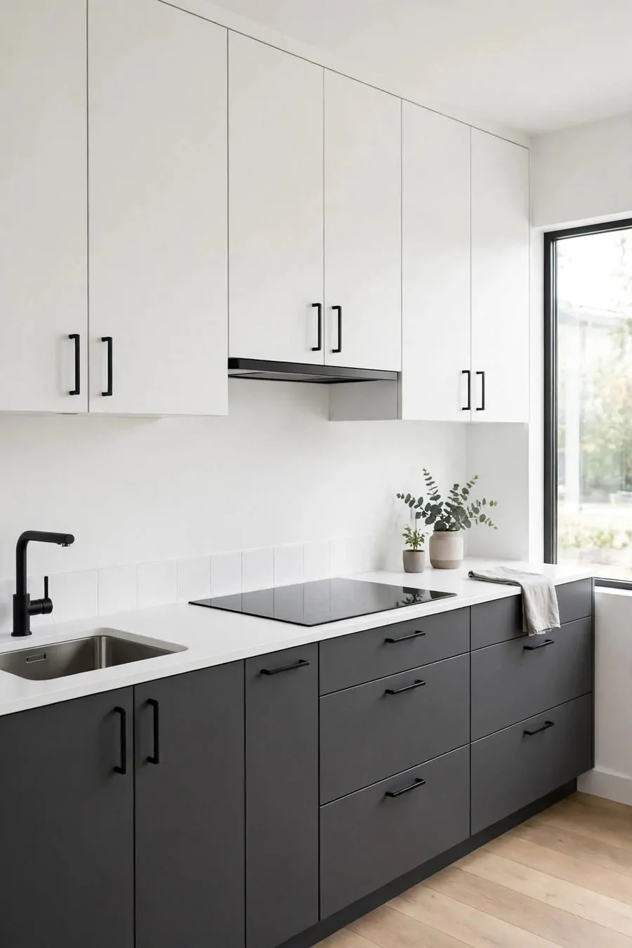
A modern kitchen with two-tone cabinets feels sleek and clean. The lines are straight and the colors are sharp.
I like white uppers with dark grey or black lowers. The mix looks smart and up to date.
Flat cabinet doors suit the modern style best. They have no fuss and no extra trim.
Keep the handles simple or hide them. Long slim pulls or push-to-open doors look very modern.
A plain worktop works well here. White or light grey stone keeps the look calm.
Leave the worktops mostly clear. One or two items is enough in a modern kitchen.
Good light matters a lot in this style. Under-cabinet lights make the two tones glow at night.
Keep the colors to two or three in the whole room. Too many colors can break the clean feel.
Modern does not have to feel cold. The right two tones make it feel fresh, calm, and yours.
35. A Simple Weekly Care Routine for Painted Cabinets
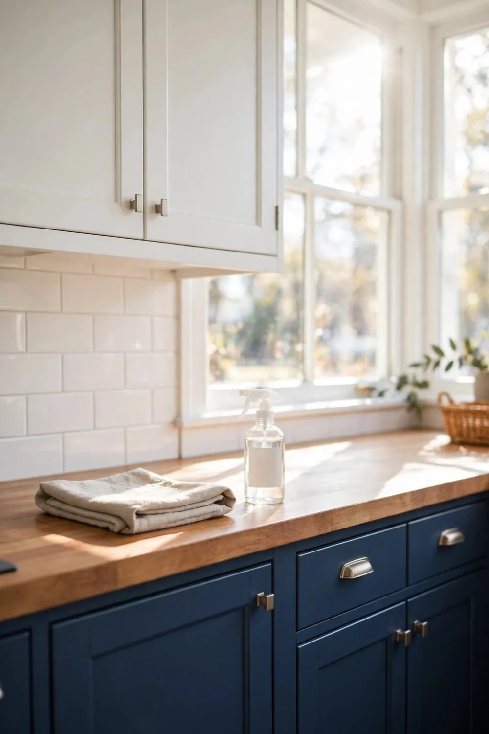
Painted cabinets stay lovely with a little care each week. A short routine keeps them clean and fresh.
I wipe the doors near the cooker first. That is where grease lands most.
Use a soft damp cloth and a drop of mild soap. Harsh scrubbers can scratch the paint.
Wipe the handles too. Hands leave marks there every day.
Check the lower cabinets for scuffs from shoes and chairs. A quick wipe now stops marks from setting in.
Dry the doors with a soft towel after you wipe them. Water left on paint can leave spots.
Once a month, look for small chips in the paint. Touch them up early with a small brush.
Keep a little pot of your cabinet paint in a cupboard. It makes touch-ups fast and easy.
A few minutes each week is all it takes. Your two-tone cabinets will look custom for years.
Keep Reading
- 29 Kitchen Rug Ideas That Add Warmth Without the Mess
- 21 Kitchen Window Ideas That Bring in Light and Style
- 32 Budget Kitchen Makeover Ideas That Look Like a Remodel
- 24 Open Kitchen Shelving Ideas That Look Beautiful and Work
- 37 Kitchen Countertop Decor Ideas That Stay Practical
- 25 Tiny Home Ideas to Maximize Space and Style
Pick one two-tone idea you loved today and try it in your kitchen. Paint one set of cabinets, swap the handles, and watch how custom and warm your room feels. I think you will love the change the moment you step in.