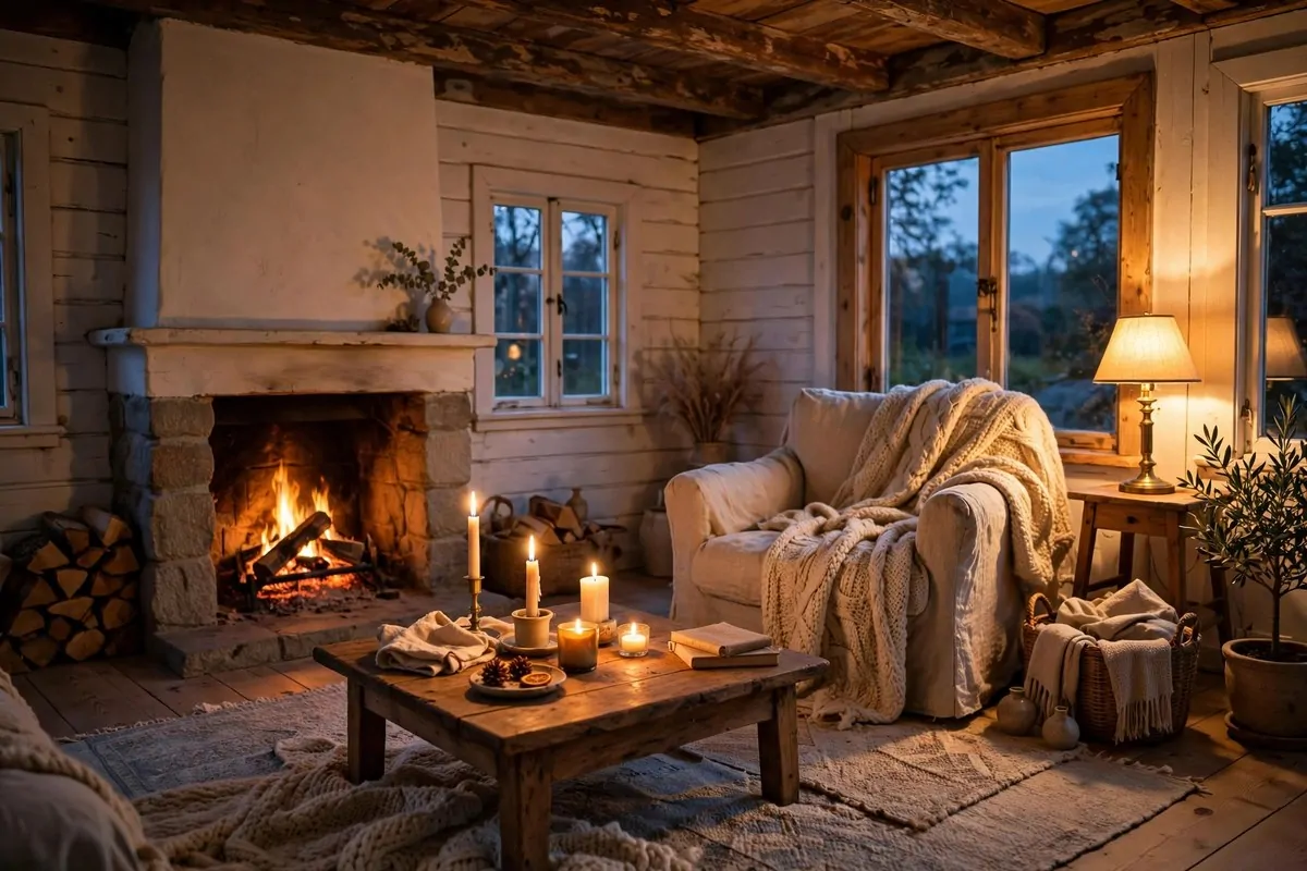
28 Apartment Inspiration Ideas That Look Designer-Made

Same building. Same floor plan. Same plain white walls. One apartment looks like a waiting room. The other looks like it came straight from a magazine spread.
The difference between those two apartments is almost never money. It is a short list of small moves. Moves that change how light falls, how walls feel, and how the whole place reads the second you walk in.
These are the 28 ideas I would try first. Every one of them works in a rented apartment. None of them need a big budget or a drill you are afraid to use.
Hang Your Curtains High and Wide
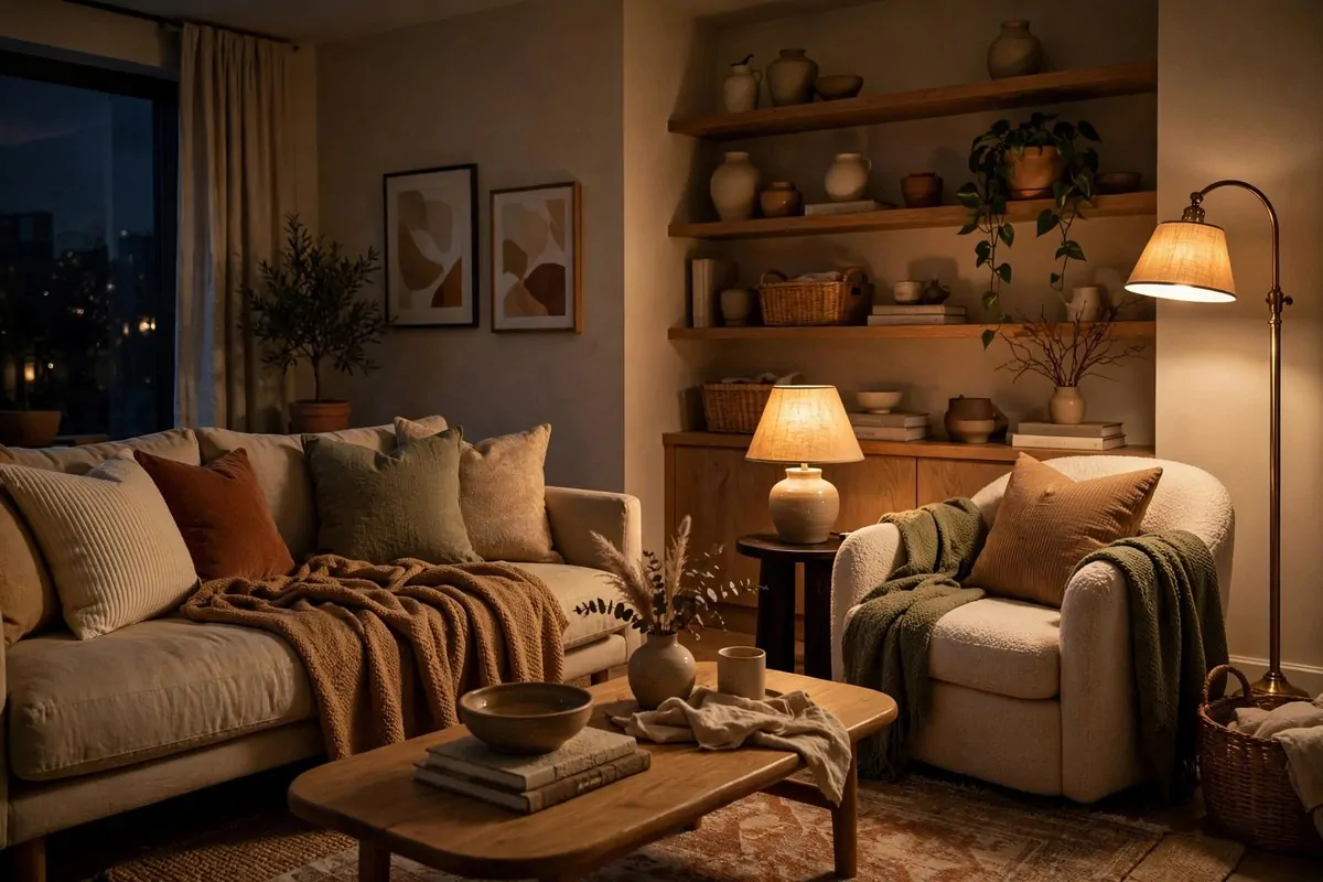
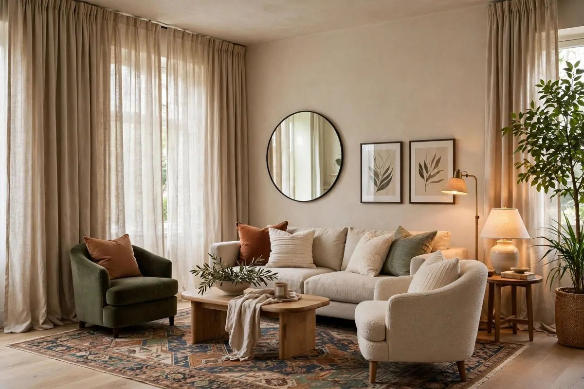
I hung my first set of curtains the way most people do. Right on the window frame. Tight and short. My living room looked small and a little bit sad.
Then I moved the rod up. Almost to the ceiling. And I made it wider than the window by a good bit on each side. The room changed overnight. It really did.
Your eye reads the curtain, not the window. That is the whole trick. When the fabric starts near the ceiling, your brain thinks the window is taller. When it spreads wide, your brain thinks the window is wider.
You do not need expensive curtains for this. Linen-look panels work fine. Even simple cotton ones look good when they hang from high up.
Measure from about four inches below the ceiling. That is your rod height. Then go eight to twelve inches past the window on each side.
Here is the mistake I made first. I bought curtains that just kissed the floor. They looked cut off. They looked cheap. Let your panels graze the floor or puddle a little bit.
- Hang the rod 4 inches below the ceiling
- Extend 8 to 12 inches past each side of the window
- Choose panels long enough to touch the floor
- Pick linen or cotton in a light neutral tone
Width matters more than you think. If your curtains are too narrow, they look stretched. You want them to look full even when they are pulled open.
Two panels per window is the safe choice. Three looks fuller if the window is wide. I always buy the wider panel when I am unsure.
This one change makes your ceilings look taller without touching the ceiling. It is the cheapest height trick in the whole decorating world.
Try it on just one window first. You will see what I mean. Then you will want to do every window in the apartment.
Lean a Big Mirror Across From the Window
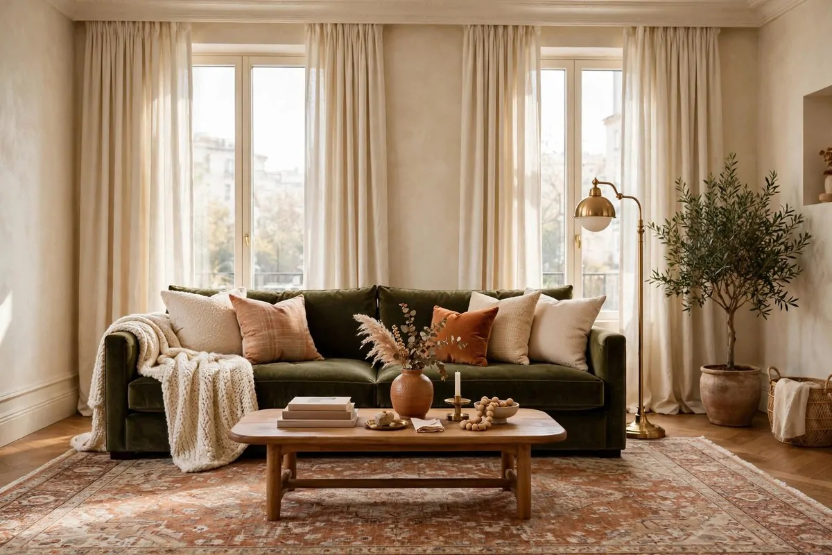
My old apartment had one good window. The rest of the place felt like a cave by three in the afternoon. One mirror fixed more of that than I expected.
A big mirror across from a window bounces the light deep into the room. It is like getting a second window for free. Designers use this trick in almost every dark apartment.
You do not need to hang it. That is the best part for renters. A large mirror can just lean against the wall. It looks casual and it looks done at the same time.
Pick the biggest mirror you can fit. Small mirrors in a dark room do almost nothing. A tall one changes the whole feel of the corner it sits in.
I like arched mirrors for this. The curve softens the room. But a simple rectangle works too. Keep the frame thin so the reflection is the star.
Place it exactly across from the window if you can. Not next to it. Not at an angle. Straight across gives you the most light back.
One more thing to check. Stand where the mirror will go and look at what it will reflect. If it reflects a blank wall, move it. You want it to catch the window or something pretty.
- Size: as tall as you can manage, at least 60 inches
- Placement: directly across from the biggest window
- Frame: thin brass, black, or natural wood
- No hanging needed: leaning is renter-safe
Dust the glass every week or so. A dirty mirror eats the light you are trying to gain. A quick wipe keeps it bright.
This is the kind of apartment inspiration that costs once and pays off every single day. Morning light. Evening light. All of it, doubled.
Trade the Overhead Light for Warm Lamps
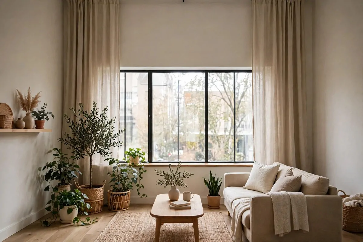
The overhead light in most apartments is harsh. It makes everything look flat. It makes you look tired. Nobody looks designer-made under a ceiling panel.
I stopped using mine completely. I have three lamps in my living room now. One on each side table and one floor lamp in the corner. The room feels like a different place at night.
Warm light is the whole secret. Look for bulbs marked warm white. They give that soft glow you see in pretty home photos. Cool white bulbs kill the mood fast.
Layer your light at different heights. A table lamp, a floor lamp, and maybe a small one on a shelf. Three heights of light feel rich. One ceiling light feels like an office.
- Living room: 2 to 3 lamps at different heights
- Bedroom: one lamp on each nightstand
- Bulbs: warm white, around 2700K
- Shades: fabric shades soften the light best
Thrift stores are full of good lamps with ugly shades. Buy the lamp for its base. Swap the shade for a plain drum one. It will look new.
I keep my overhead off all evening now. My electric bill barely changed. My apartment feels like a little hotel every night.
If you only try one idea from this whole list, make it this one. Light decides everything. Everything else just helps.
Here is a small habit that helps. Turn your lamps on an hour before sunset. Your eyes adjust slowly. By dark, the room glows.
Add a Plug-In Wall Sconce by the Bed
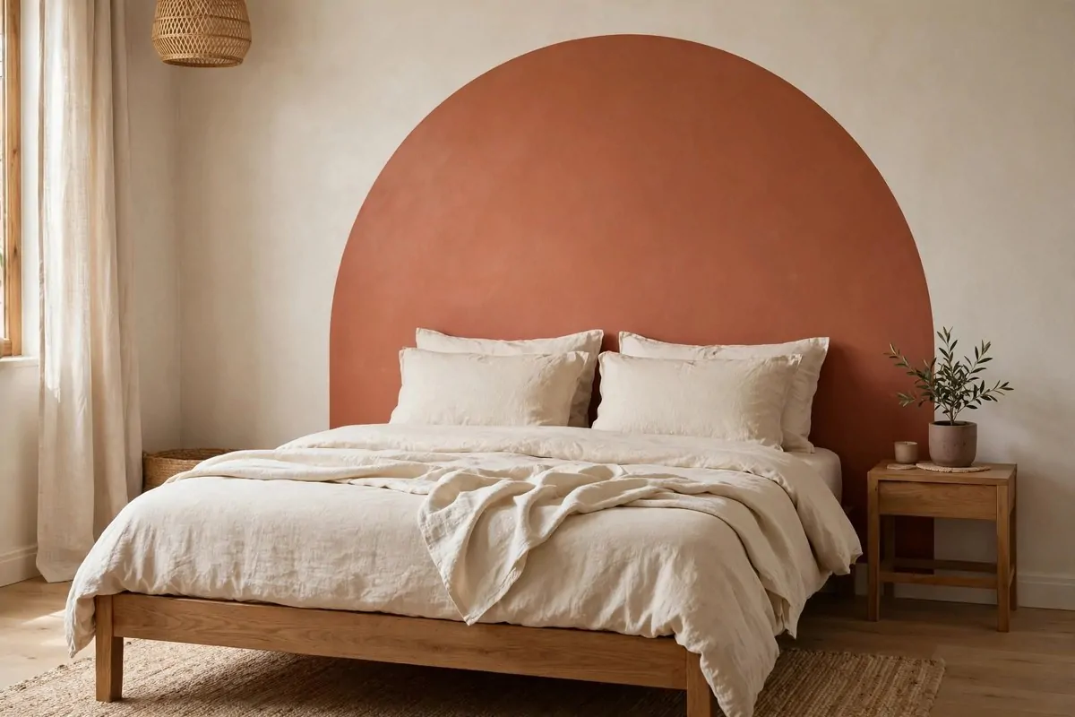
I wanted bedside lighting without a bulky lamp taking up my whole nightstand. My nightstand is tiny. It fits a glass of water and my phone. That is it.
A plug-in sconce solved it. It mounts to the wall. The cord drops down to the outlet. No wiring. No electrician. No angry landlord.
The look is so grown-up. It is the kind of detail you see in boutique hotels. And the whole thing cost less than a dinner out.
Most plug-in sconces come with a cord cover. It is a thin strip that hides the cord against the wall. Paint it the wall color and it almost disappears.
Mount it about shoulder height when you sit up in bed. That is the sweet spot for reading light. Too high and it lights the ceiling. Too low and it glares in your eyes.
I picked brass for mine. It warms up the whole corner. Black works great too if your room leans modern. Matte finishes look richer than shiny ones.
You can hang two of them, one on each side of the bed. That looks very designer. But even one, on one side, lifts the whole room.
- Hang at seated shoulder height beside the bed
- Choose a warm bulb to match your other lamps
- Use the cord cover and paint it to match the wall
- Brass or matte black look best in small rooms
Installation took me twenty minutes. The hardest part was picking the spot. Mark it with tape first. Live with the tape for a day. Then drill or stick.
Renters can use the strong adhesive mounts that come with many sconces. Test one in a hidden spot first. Some wall paint is more delicate than others.
Nightstand space is precious in an apartment. This idea gives you light without giving up your water glass. Small win. Big feel.
Try a Peel-and-Stick Backsplash in the Kitchen
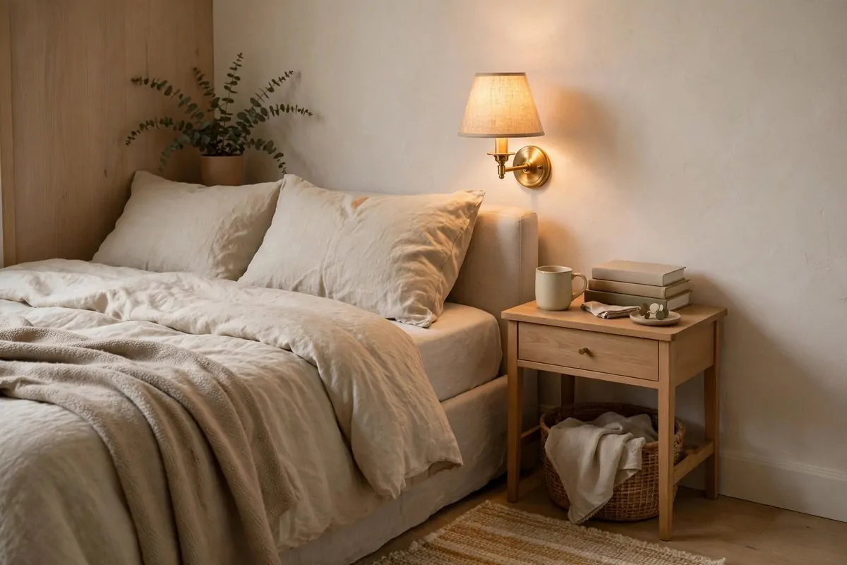
My kitchen backsplash used to be plain beige paint. Grease spots. A little sad. It made the whole kitchen feel tired even when the counters were clean.
Peel-and-stick tile changed it in one afternoon. I picked a white subway pattern. It went up right over the old wall. When it was done, my kitchen looked renovated.
Nobody believes it is a sticker. Guests touch it. They always ask who did my tile work. That is how good the new ones look.
Clean the wall first. Wipe off all the grease. The tiles stick much better to a clean surface. A quick pass with dish soap and water does the job.
Start from the middle and work out. Line up your first tile carefully. Everything else follows it. A small gap at the end is fine. You can trim tiles with scissors or a craft knife.
| Area | What to use | Cost idea |
|---|---|---|
| Behind the stove | Heat-safe peel-and-stick tile | Keep a small gap from the flame |
| Behind the sink | Glossy subway pattern | Wipes clean with a cloth |
| Full wall | Herringbone pattern | Looks very high-end |
Pick a good brand. The cheap ones curl at the edges in steam. Read the reviews about bathrooms and kitchens specifically. Heat and steam are the test.
My tiles have been up for over a year. No peeling. When I move out, they come off with a hairdryer and a slow pull. That is the renter promise.
This is one of those apartment inspiration ideas that looks like a remodel in photos. But it costs less than a grocery run and takes one afternoon.
Swap Your Cabinet Knobs for Something Pretty
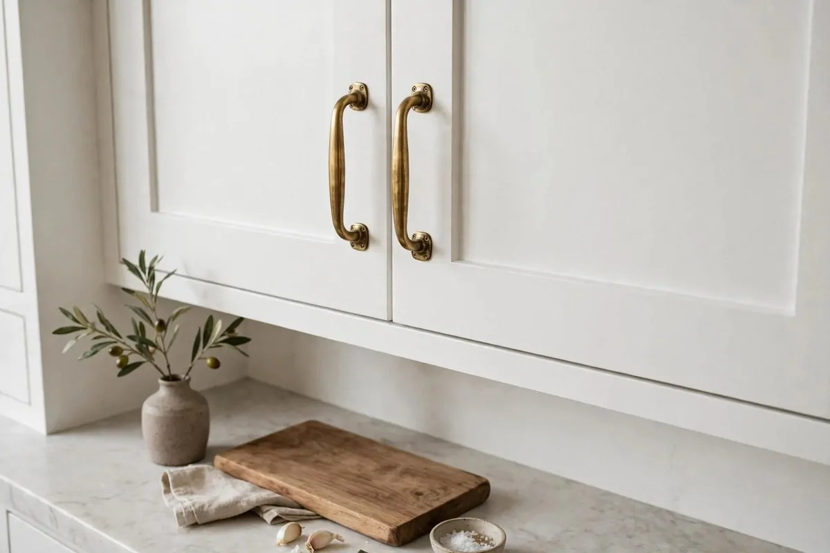
Builders put the cheapest knobs in apartments. Little plastic or chrome things. They make even nice cabinets look basic. I swapped mine and could not stop smiling.
This is a ten minute job. Unscrew the old knob. Screw in the new one. That is the whole project. It is the easiest upgrade on this entire list.
Keep the old knobs in a bag. Label the bag. Put it in a drawer you never open. When you move out, swap them back. Your landlord will never know.
Brass knobs warm up a white kitchen. Matte black handles make plain cabinets look modern. Ceramic knobs add charm to a boring bathroom vanity too.
Measure the distance between screw holes before you buy pulls. Knobs are one hole, easy. Bar pulls have two holes and need to match. Bring one old pull to the store.
- Single knobs: fit any door, no measuring stress
- Brass: best for warmth in white or gray kitchens
- Matte black: best for a modern look
- Ceramic: best for bathrooms and cute detail
I did my whole kitchen for the price of a pizza night. Eight knobs. Ten minutes. It looks like I hired someone.
Count your doors and drawers before you order. I always order two extra. One always rolls under the fridge. Always.
Small hardware is jewelry for your kitchen. Do not skip this one. It is too cheap and too fast to leave undone.
Paint an Arch on the Wall Behind Your Bed
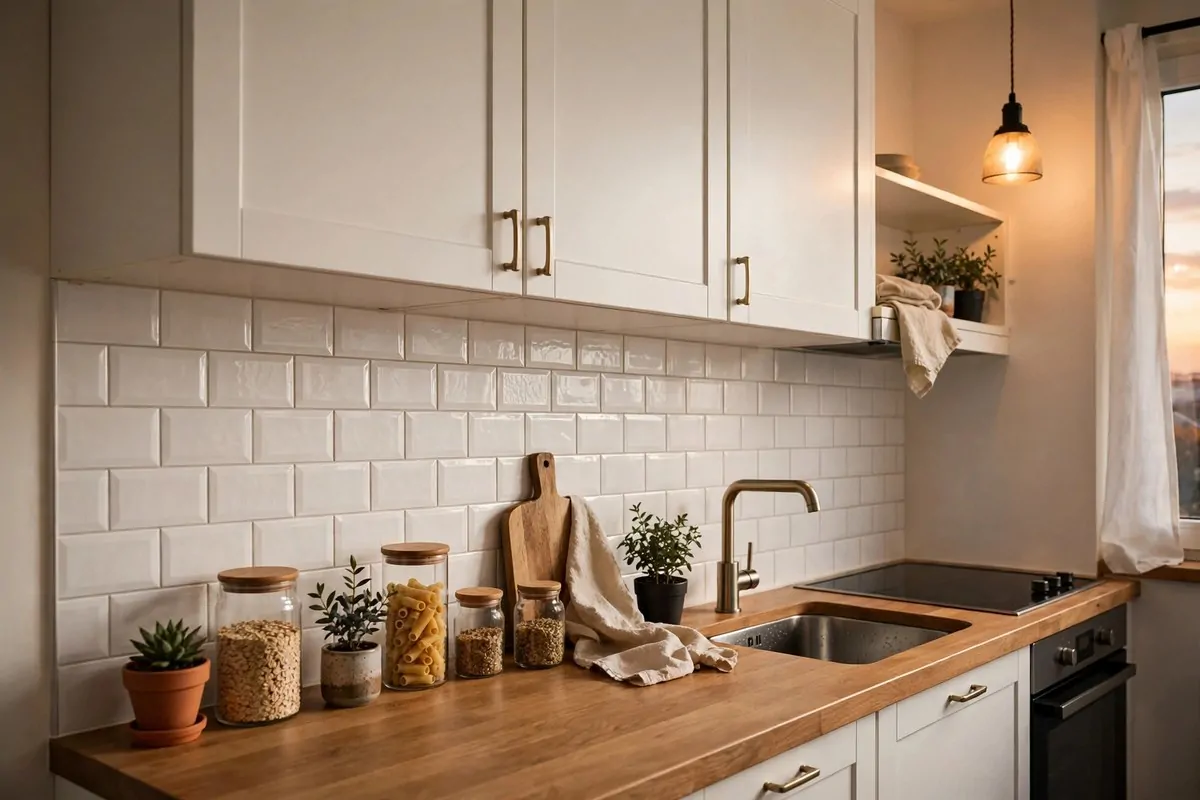
This is the viral one. And it earns the hype. A painted arch behind your bed looks like a custom headboard. It costs one small pot of paint.
You draw a half circle on the wall. You paint inside it. That is it. The bed sits in front of it. Suddenly your bedroom has a focal point.
I used a terracotta color in my guest corner. Warm. Soft. It made the whole wall feel designed. A deep green or a dusty blue works too.
Here is how you draw it clean. Push a pin where the center will be. Tie a string to a pencil. Hold the string at the pin. Swing the pencil in a half circle.
Tape the edges with painter's tape. Roll the paint on in two thin coats. Peel the tape while the paint is still a little wet. The line comes out crisp.
- Sample-size paint pot is enough for one arch
- String, pencil, and tape are your only tools
- Two thin coats beat one thick coat
- Peel tape before the paint fully dries
Check your lease first. Some landlords hate wall paint. If yours does, paint over it before you move out. One coat of white and it is gone.
The arch does what a big headboard does. It frames the bed. It gives the room a shape. And it costs almost nothing.
I stare at mine every morning. It still makes me happy. Few projects give you that much joy for that little money.
Lay One Big Rug Over the Whole Room
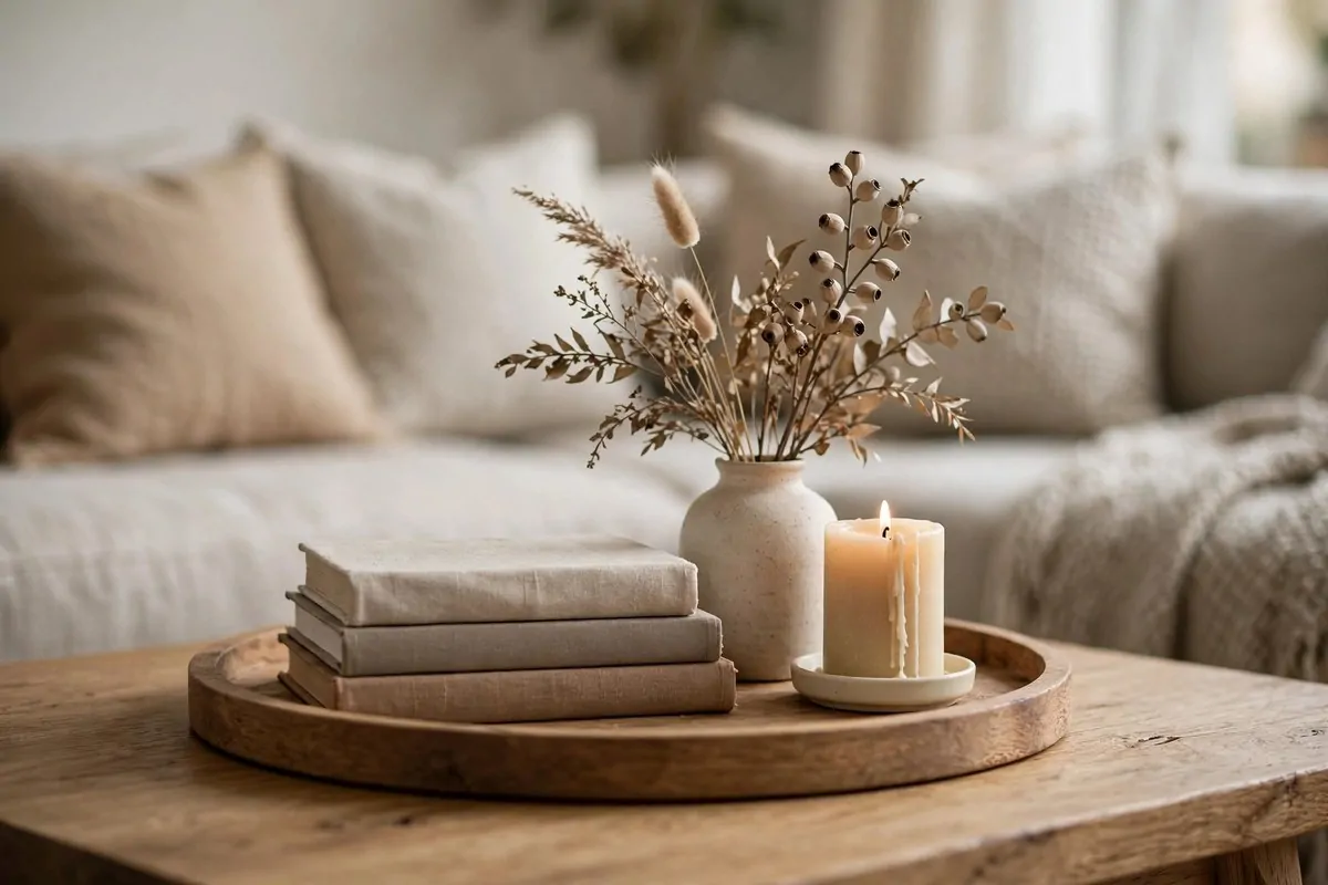
Small rugs chop up a room. I learned this from a photo of my own living room. I had a rug that floated in the middle like an island. The room looked smaller because of it.
One big rug fixes everything. It should reach under the front legs of your sofa and your chairs. When the furniture sits on the rug together, the room feels connected.
Measure your room before you shop. Then buy the biggest rug that fits with a few inches of floor showing at the edges. Bigger is almost always better here.
Low-pile rugs work best in apartments. They are easier to clean. Chairs slide on them better. And they do not trap as much dust.
Pattern hides a lot. If your floor is ugly, a busy pattern pulls the eye up to the rug. Solid rugs show every crumb. I speak from experience.
- Living room: rug should catch the front legs of the sofa
- Bedroom: rug should extend past both sides of the bed
- Low pile: easier to clean and move chairs on
- Pattern: hides stains and ugly floors
I found my big rug secondhand. A quick steam clean and it looked brand new. Rugs are one of the best things to buy used.
This single purchase did more for my living room than three small decorations combined. It is the foundation. Everything else sits on it.
If you remember one rug rule, make it this one. Too big beats too small every single time. Every time.
Update the Floor With Peel-and-Stick Tiles
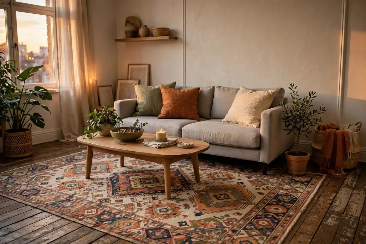
My entryway floor was the ugliest part of my apartment. Old vinyl. Weird beige. I hated walking on it. Peel-and-stick tiles covered it in a Saturday.
The checkerboard pattern is the classic choice. Black and white. It looks like a fancy old building. Every visitor asks about my "new tile."
Measure the room first. Buy ten percent more tiles than you need. You will trim pieces for the edges. Running out mid-project is the worst feeling.
Start in the center of the room. Work toward the walls. This keeps the pattern even. If you start at one wall, the last row can look weirdly thin.
Clean the floor really well before you stick. Mop it. Let it dry fully. Dust is the enemy of sticky tiles. A hairdryer helps them bond on cold days.
| Room | Pattern idea | Why it works |
|---|---|---|
| Entryway | Black and white checkerboard | Feels expensive |
| Kitchen | Herringbone or wood-look | Warms up the space |
Press each tile down hard. Walk on it after. The pressure sets the glue. Do not mop for the first day or two.
When I moved from my last place, the tiles came up clean. A little heat from a hairdryer. A slow peel. The floor underneath was untouched.
Ugly floors make the whole apartment feel cheap. This is the fastest way to fix them without asking your landlord for anything.
Build a Gallery Wall With Mismatched Frames
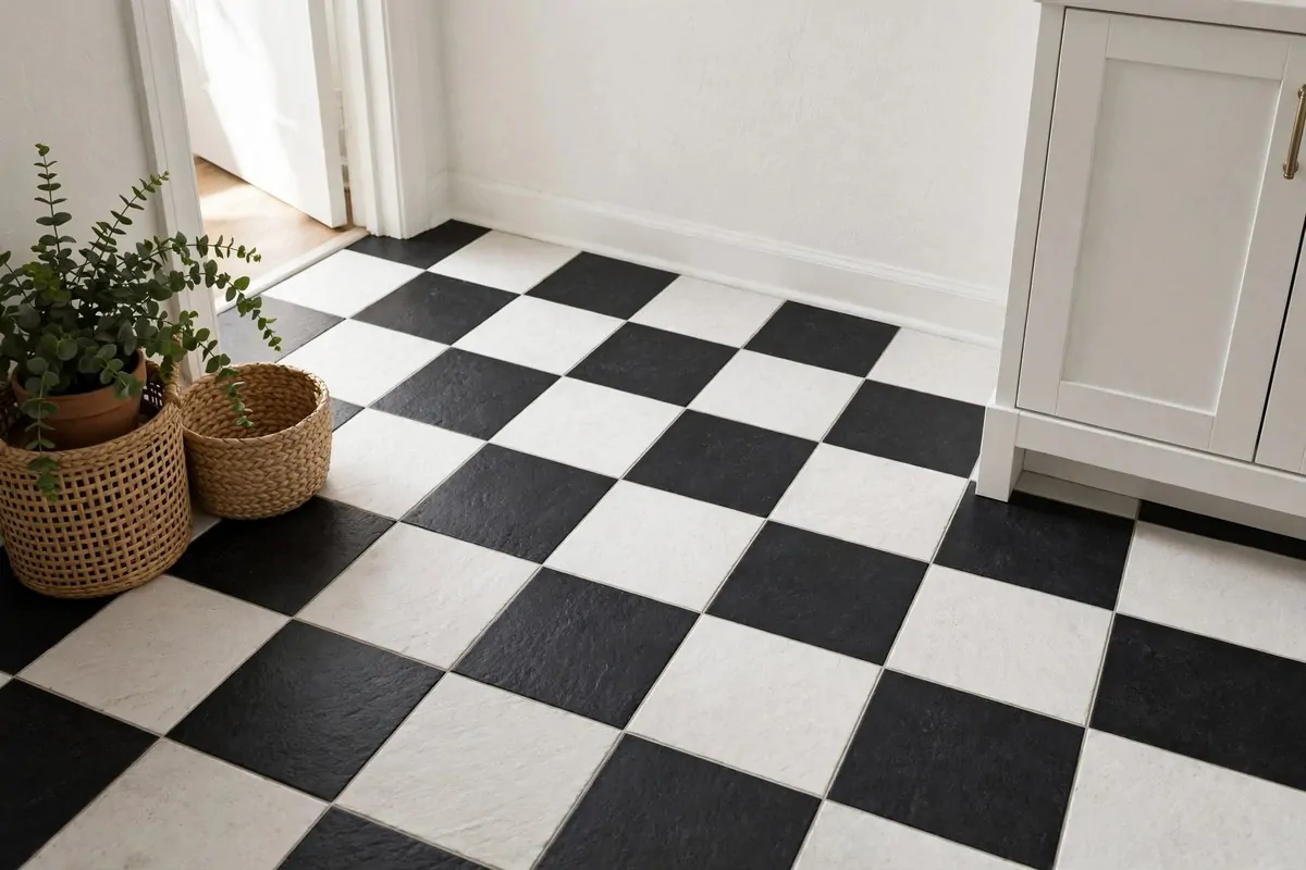
Blank walls are the number one reason apartments look unfinished. A gallery wall is the fastest cure I know. It fills a big empty wall with personality.
You do not need matching frames. Mixed frames look better. Black, brass, wood, even a painted one. Different frames make it look collected over time.
Lay it all out on the floor first. This is the most important step. Move pieces around until the shape feels right. Take a photo. Then copy the photo on the wall.
Start with the biggest piece in the middle. Build out from there. Keep the gaps between frames about the same. Two to three inches feels natural.
Command strips are your renter friend here. No holes. No patching. Just follow the weight limit on the package. Heavy frames still need a real nail.
- Start with the largest piece in the center
- Mix frame colors: black, brass, wood
- Keep gaps even, about 2 to 3 inches
- Use adhesive strips to stay renter-safe
I mix art prints with real photos. A little of both feels personal. All prints can feel like a store. All photos can feel like a hallway.
Do not overthink it. My wall is a little crooked in one corner. Nobody notices. The overall effect is what people see.
A gallery wall tells your story without a single word. It is the fastest way I know to make an apartment feel like a home.
Style a Tray Moment on the Coffee Table
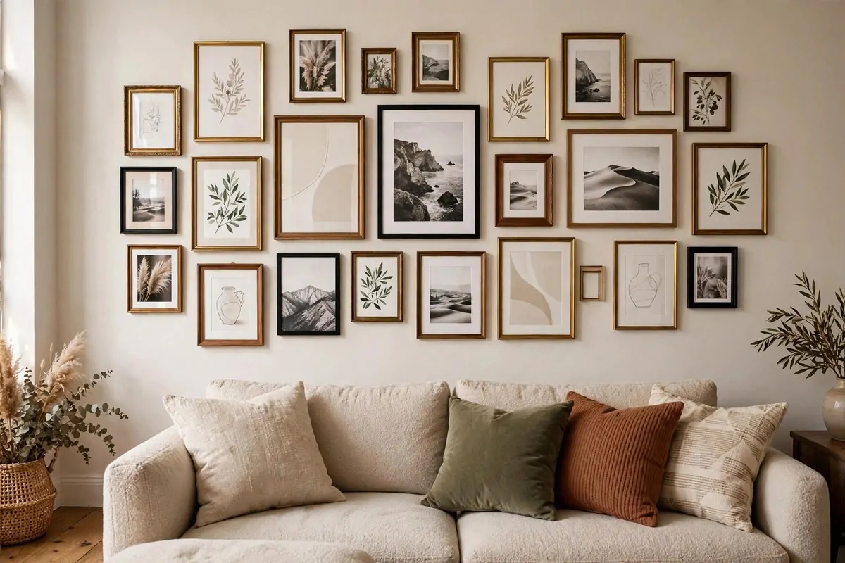
A messy coffee table makes the whole living room look messy. I learned this when a friend took a photo of my place. My eyes went straight to the cluttered table.
A tray fixes it in one move. Put your remote, your candle, and your little objects on the tray. The tray holds the mess. The table looks styled.
Designers call this a tray moment. It is just a small group of things that look good together. Books. A candle. A little plant. Done.
Odd numbers look best. Three things on a tray. Or five. Even numbers can look stiff. I do not know why this works. It just does.
Keep one thing tall, one thing low. A vase with stems and a short candle. Different heights make the group interesting. Same height looks flat.
- Tray: round wood or rattan works with everything
- Books: stack two, they add height and color
- Candle: one, unscented looks best in photos
- Greenery: one small stem in a bud vase
Round trays soften a square table. Square trays organize a round table. Match the shape opposite to your table for the best look.
My tray also saves my table from rings. Coasters live on it. Glasses go on it. The wood stays clean.
This is a five minute project. Grab a tray. Grab three things you like. Arrange them. Step back. You will feel like you hired help.
Use a Bookcase as a Room Divider
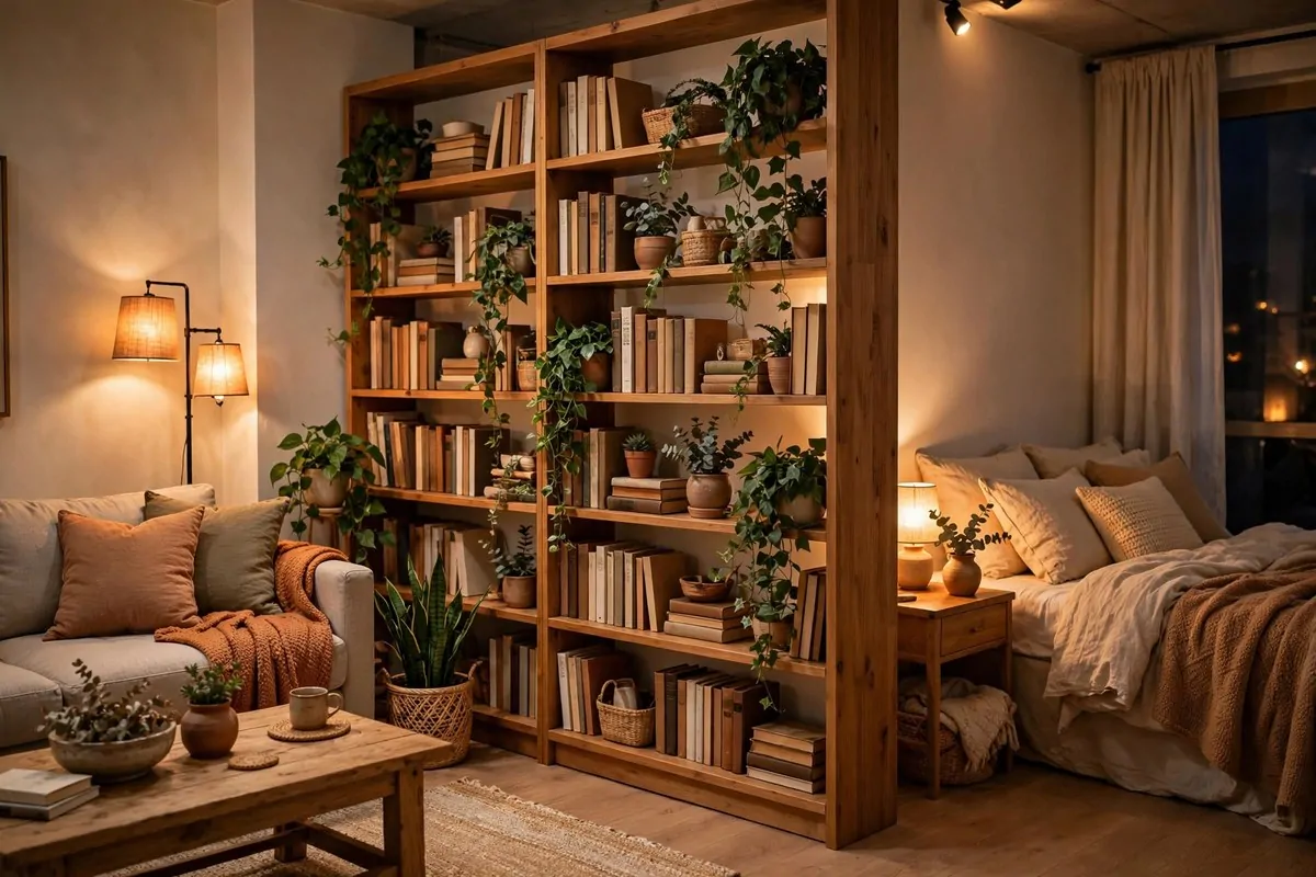
Studio living means one big room does everything. Sleep, work, eat, relax. It can feel like a dorm. A bookcase divider changes that fast.
Put a tall bookcase across the room. Behind it, your bed. In front of it, your living space. You just built a wall without building anything.
Style the shelves from both sides. Books facing the bed. Books facing the sofa. Plants on top where both sides can see them. It works double duty.
Keep it stable. This matters. Anchor the top to the wall if you can. If your lease says no, fill the bottom shelves with heavy books. A wobbly divider is a bad divider.
Leave a gap at the top if the room is dark. Light needs to travel over it. A bookcase that blocks all light makes both sides gloomy.
- Choose a bookcase at least 60 inches tall
- Fill bottom shelves with heavy books for stability
- Style both faces so it looks good from each side
- Keep the top low enough for light to pass over
I did this in my first studio. My "bedroom" finally felt like a bedroom. My living room finally felt like a room for guests.
It also doubles your storage. Books, baskets, folded throws. A divider that holds your stuff is the best kind of divider.
One piece of furniture. Two rooms. Zero construction. That is studio magic.
Divide the Room With See-Through Shelving
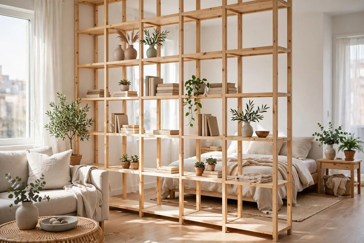
A solid bookcase can feel heavy in a small apartment. It can block the light you worked so hard to get. Open shelving solves that problem.
See-through shelves divide the space without closing it off. You get zones. You keep the light. You keep the airy feeling. Best of both worlds.
Light wood or rattan keeps it fresh. Dark heavy shelves defeat the purpose. You want this divider to feel like it floats.
Style it lightly. A few books. A vase. A trailing plant. Do not pack every shelf full. Open space is what lets the light through.
I keep my plants on the top shelf of mine. The leaves hang down a little. It looks alive. It looks like something from a design blog.
- Material: light wood or rattan, never dark and chunky
- Styling: leave half the shelves half empty
- Top: trailing plants soften the whole unit
- Height: tall enough to mark the zone, low enough for light
This works in living rooms too. Divide a work corner from the sofa. Divide a dining spot from the entry. Any open plan benefits.
My friend did this between her desk and her bed. She says she sleeps better now. Her brain finally knows when work is over.
Light plus division. That is the dream combo for small apartments. This shelf gives you both.
Keep One Pretty Vignette on Each Shelf
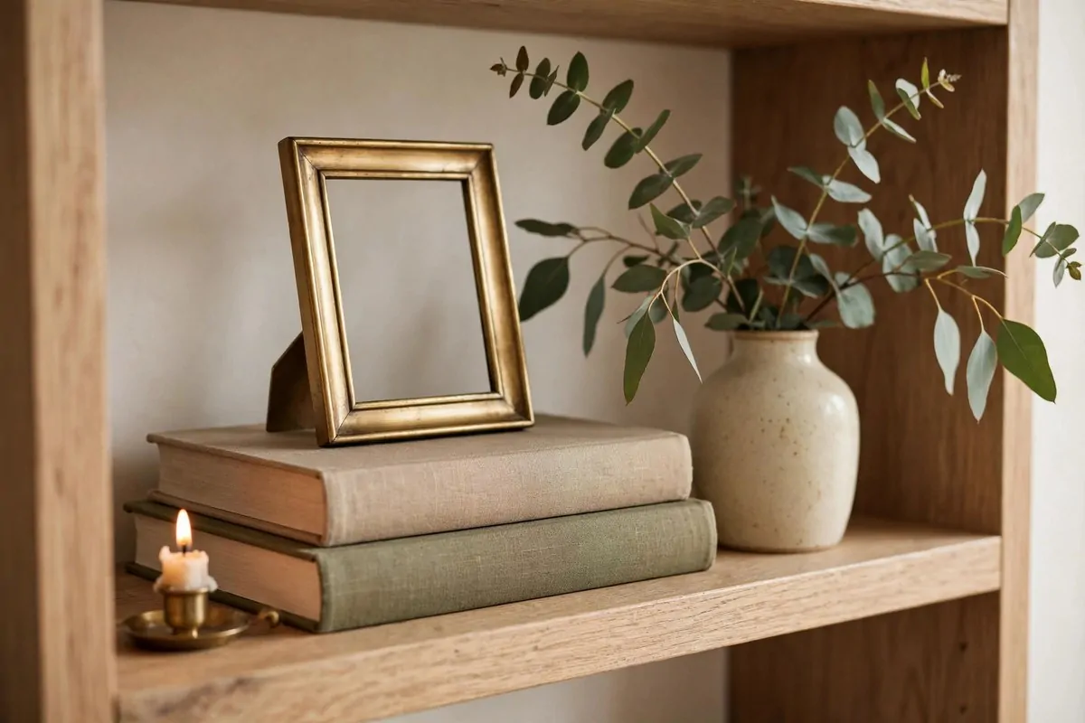
Shelves full of random stuff look cluttered. Shelves with one small scene each look designed. The difference is just editing.
A vignette is a tiny group of pretty things. Three items. A stack of books. Something tall. Something small. That is the whole formula.
Leave breathing room around each group. Empty space is not wasted space. It is what makes the pretty things look pretty.
I go through my shelves twice a year. I take everything off. I only put back what I love. The rest goes in a box for the donate pile.
Group by color first. Things that share a color family look calm together. Random colors read as clutter, even when each piece is nice alone.
- One vignette per shelf, no more
- Three items per group is the sweet spot
- Leave empty space around each group
- Group pieces by similar colors
Height variation matters. A tall vase, a medium frame, a tiny candle. Stair-step heights feel natural. All the same height feels like a lineup.
My shelves looked busy for years. I kept adding things. Taking things away was what finally made them look good. Less really is more here.
Edit one shelf today. You will be amazed. It takes ten minutes and it looks like you hired a stylist.
Give One Big Plant a Beautiful Pot
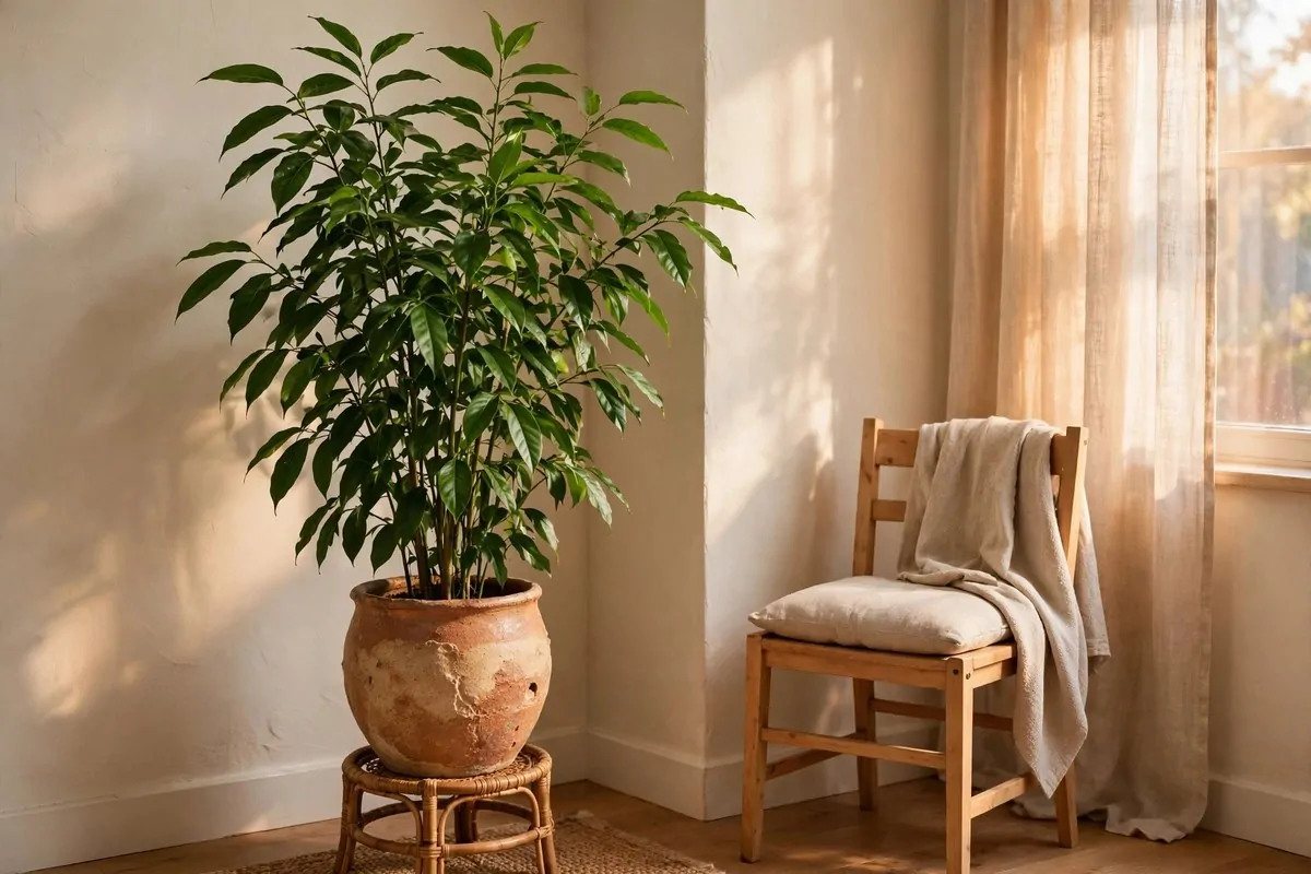
Plants make apartments feel alive. But the sad plastic pot they come in from the store? That kills the vibe. The pot is the outfit. The plant is just the model.
One big plant in a beautiful pot does more than five small plants in ugly pots. Go big once. It becomes a piece of furniture.
Pick a plant you can actually keep alive. A snake plant if you forget to water. A pothos if you want trailing leaves. Honest plant choices beat dead fancy ones.
The pot should be bigger than you think. Plants like room. And a big pot anchors the corner better. Small pot, small impact.
Put it on a little stand. A few inches of lift makes it look intentional. It also protects your floor from water rings.
- Plant: pick one you can keep alive, honestly
- Pot: ceramic or textured, bigger than the nursery pot
- Stand: a few inches of lift looks intentional
- Placement: empty corners and beside the sofa
I water mine every Sunday. Same day. Same routine. It is the only plant rule that ever worked for me.
A tall plant also fills vertical space. Apartments have a lot of empty air up high. Plants claim some of it.
This is living decor. It grows. It changes. It makes the room feel cared for. All for the price of one pot.
Layer Two Rugs on Top of Each Other
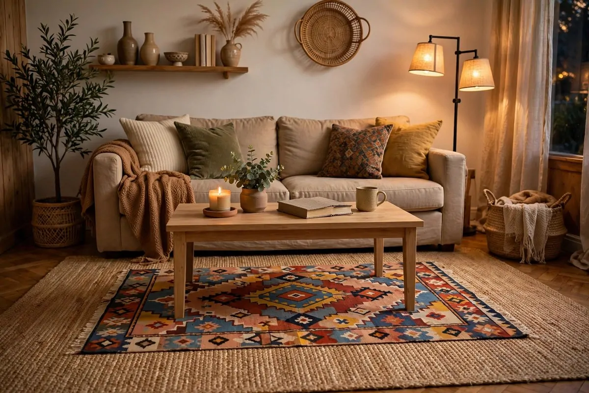
Layering rugs sounds wrong. Rugs go on floors, not on rugs. But designers do it all the time. And it looks so good.
Start with a big natural rug. Jute or sisal. Something flat and neutral. Then lay a smaller patterned rug on top of it. The combo looks rich and collected.
This trick is perfect for ugly floors. The bottom rug covers the floor. The top rug adds the pretty. Double coverage.
It also adds softness. Two rugs feel amazing under bare feet. My living room went from cold floor to cozy in one afternoon.
Keep the top rug about half the size of the bottom one. You want to see the border of the bottom rug all around. That frame is what makes it look layered.
- Bottom rug: large, flat, natural fiber like jute
- Top rug: smaller, patterned, with colors you love
- Ratio: top rug about half the size of the bottom
- Both low pile so doors and chairs still work
I use a rug pad under the bottom one. It stops slipping. It adds a little cushion too. Worth the small cost.
My layered rugs get more compliments than anything else in my living room. People ask where I got "that rug." It is two rugs. They never guess.
Try it. Even in a small space. It adds warmth and texture that one rug alone cannot give.
Mix Throw Pillows in Odd Numbers
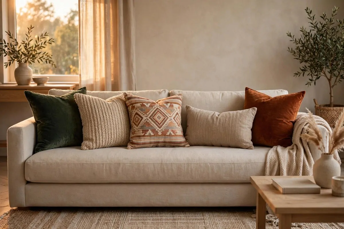
My sofa used to have two matching pillows. Just two. It looked like it came with the couch. Because it did.
Then I learned the odd number trick. Three pillows. Five pillows. Odd counts look styled. Even counts look like a set.
Start with two the same at the ends. Add one different in the middle. That is three. Want five? Add a small lumbar and one more texture. Done.
Mix textures, not just colors. Velvet, linen, knit. Touch matters as much as color. A sofa you want to touch looks expensive.
Pick a color story first. Three colors max. Pull one from your rug. Pull one from your art. The third can be a fun wild card.
- Count: 3 or 5 pillows, never 2 or 4
- Ends: two matching pillows anchor the sofa
- Middle: one different pillow, the star of the show
- Textures: mix velvet, linen, and knit
Big pillows go in back. Small ones in front. Like a little staircase. Nobody wants to lean on a tiny pillow hiding behind a big one.
I buy pillow covers, not whole pillows. Covers are cheap. I swap them when I want a new look. The inserts stay the same.
Chop the tops of your pillows. Karate chop, right in the middle. It makes them look plump and styled. It is a silly trick. It works.
Your sofa is the biggest thing in the room. Dress it right and the whole room follows.
Drape a Chunky Knit Throw Over the Sofa
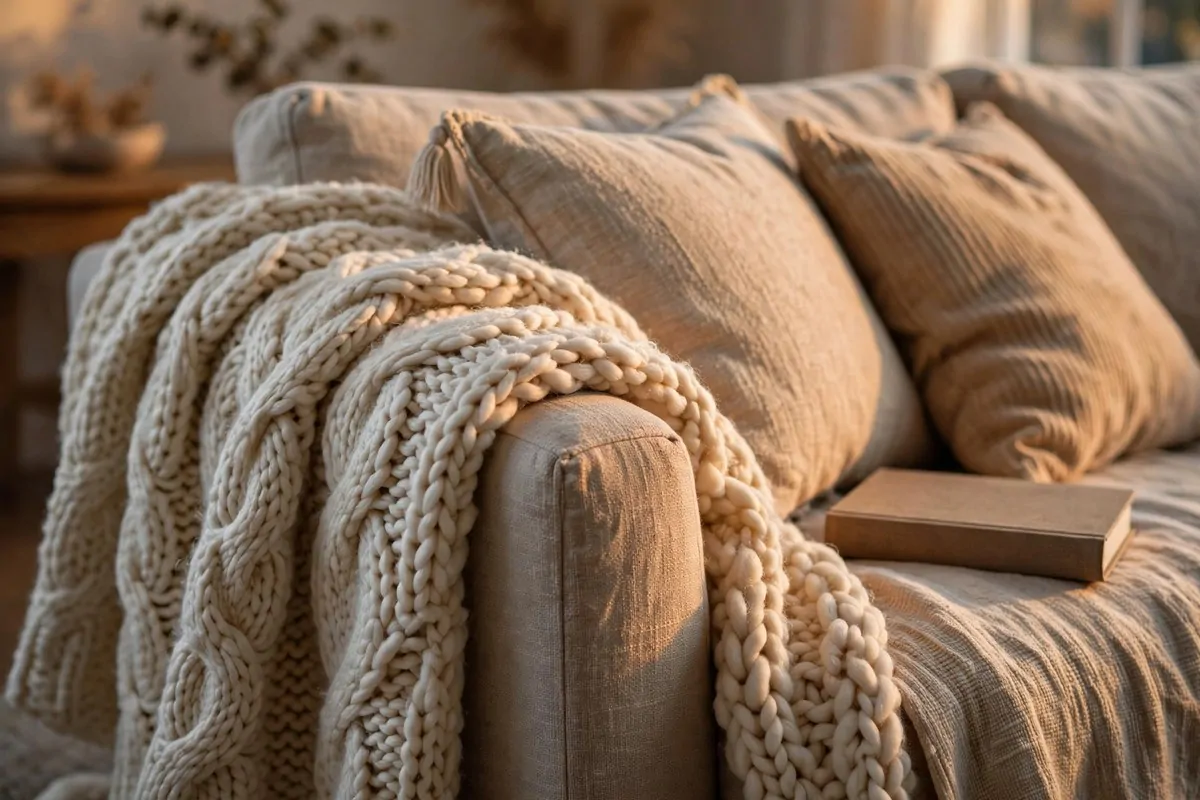
A sofa without a throw looks a little naked. Like a bed without a blanket. A chunky knit throw fixes that in two seconds.
Drape it, do not fold it perfectly. A little mess looks cozy. A perfect fold looks like a store display. You want cozy.
I keep mine on the arm of the sofa. Easy to grab. Always in reach for movie nights. It is decor that actually gets used.
Chunky knits photograph beautifully. All that texture catches the light. Your sofa will look softer and more inviting in every photo.
Pick a color that contrasts a little. Cream throw on a gray sofa. Mustard throw on a cream sofa. Contrast is what makes it pop.
- Drape over the arm or one corner, never folded flat
- Cream, mustard, or rust work with most sofas
- Chunky knit texture catches light beautifully
- Washable matters: you will actually use this
Size matters less than you think. A throw does not need to cover the whole sofa. It just needs to soften one corner.
I wash mine once a month. Throws collect dust and snack crumbs. A clean throw smells good and looks fluffy.
This is the coziest five dollars to fifty dollars you can spend. Whatever your budget, there is a throw for it.
One throw. One drape. Instant warmth. Your sofa will thank you.
Divide the Sleeping Corner With a Curtain
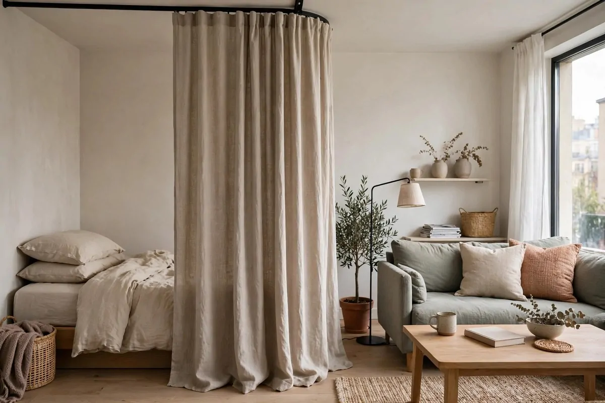
Sleeping where you eat and work messes with your rest. Your brain never fully switches off. A curtain divider gives your bed its own little world.
Hang a curtain from the ceiling on a simple track. Linen or cotton in a natural tone. It pulls closed at night and opens in the morning.
It is softer than a bookcase divider. It takes zero floor space. And it adds fabric to the room, which makes everything feel warmer.
I pull mine closed every night. It is my signal to my brain. Work is over. The day is done. It sounds small. It changed my sleep.
Choose a fabric you can see a little light through. Total blackout can feel like a cave. A soft glow through linen feels calm.
- Track: simple ceiling track, no drilling with adhesive options
- Fabric: linen or cotton in a natural tone
- Length: floor-grazing looks best
- Habit: close it nightly to signal bedtime
You can also use a tension rod between two walls if the layout allows. No ceiling work at all. Apartments love tension rods.
Wash the curtain twice a year. Fabric collects dust. A fresh curtain smells like a fresh start.
A curtain bedroom feels private. It feels intentional. It feels like you planned your studio instead of just surviving it.
Privacy is a luxury. This is the cheapest way to buy some.
Add Under-Cabinet Lights in the Kitchen
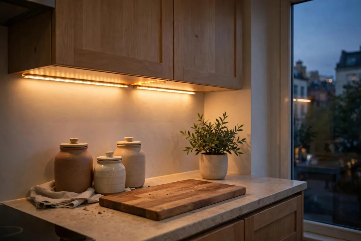
Kitchens have the worst lighting in most apartments. One bright ceiling light. Shadows everywhere. You cannot see what you are chopping.
Under-cabinet lights fix the exact spot where you work. They light the counter. They light your food. Cooking feels safer and nicer.
The adhesive ones need no wiring. Peel, stick, done. They run on batteries or recharge with a cable. Renters can use them freely.
Warm light again. Always warm. Cool white under cabinets makes food look sad. Warm light makes your kitchen glow like a restaurant.
I put a strip under each upper cabinet. My kitchen looks different at night now. It has depth. It has mood. All from tiny lights.
| Spot | Light type | Why |
|---|---|---|
| Under each cabinet | LED strip, warm | Lights the whole counter |
| Inside a dark pantry | Small puck light | Find things without a flashlight |
| Above the sink | One puck light | Dishes look better already |
Stick them toward the front edge of the cabinet. The light then washes down the backsplash. Toward the back edge leaves a dark strip.
Rechargeable ones save money over time. Batteries add up. I recharge mine once a month. Takes an hour.
This is the kind of apartment inspiration nobody sees in daylight. Then evening comes and your kitchen glows. Guests always notice.
Upgrade Switch Plates and Doorknobs
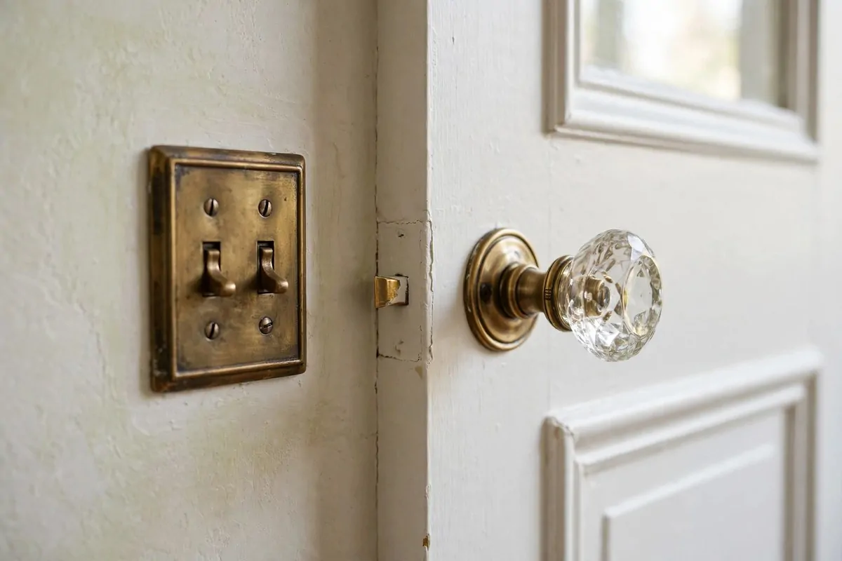
Nobody looks at switch plates. That is exactly why changing them works. They are the detail people feel but never name.
Builder switch plates are thin white plastic. They yellow with age. A brass or matte black plate in the same spot looks custom.
Doorknobs are the same story. The standard ones are boring. A vintage-style glass knob or a brass lever changes how the whole door feels.
Keep the originals in a bag. Every single one. Landlords check these things at move-out. Swap back day takes twenty minutes.
This is a screwdriver job. One screw for a switch plate. Two for a knob. If you can use a screwdriver, you can do this.
- Switch plates: brass or matte black, one screw each
- Doorknobs: vintage glass or brass levers
- Bag and label every original for move-out
- Start with the rooms guests see most
I did my living room and hallway first. The rooms I touch every day. The doors feel different in my hand now. It is a tiny daily pleasure.
Thrift stores have the best vintage plates. A dollar each. A little polish and they look like antiques.
Small details, big feeling. That is the whole game of making a rental look expensive.
Do not skip the bathroom. A pretty plate next to the mirror gets seen every single day.
Make Air-Dry Clay Vases and Trays
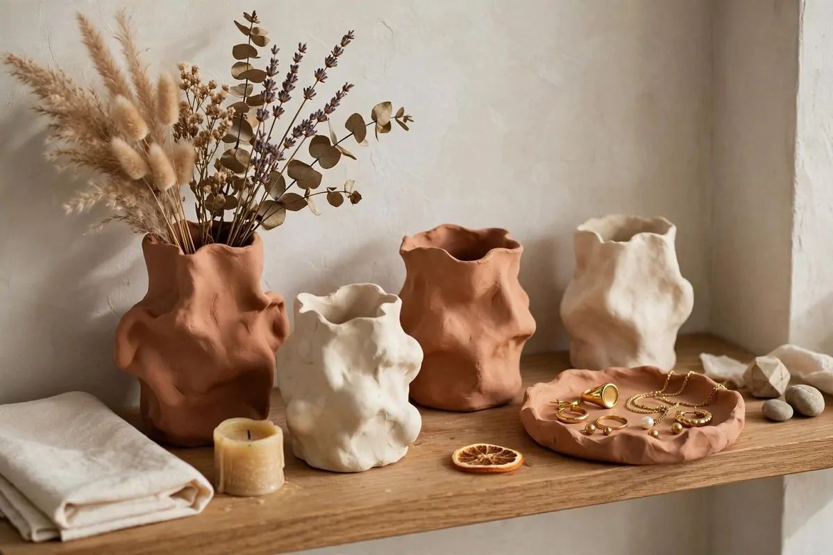
Air-dry clay is having a moment. And it deserves it. You can make decor that looks handmade and artsy for the price of a coffee.
No kiln needed. No special tools. Roll it, shape it, let it dry for two days. Paint it if you want. Seal it. Done.
The wonky look is the point. Perfect shapes look store-bought. A little wobble looks like art. Embrace the wobble.
I made a pinch pot for my rings. A chunky vase for my rings. A chunky vase for dried stems. A little tray for my keys. Three pieces from one bag of clay.
Seal everything with a clear spray. Raw clay stains easily. Sealed clay wipes clean. This step matters if you actually use the pieces.
- Clay: one bag makes 3 to 4 pieces
- Dry time: 24 to 48 hours, be patient
- Paint: acrylic in cream or terracotta looks best
- Seal: clear spray so pieces wipe clean
Dried flowers are perfect for clay vases. No water needed. No leaks. No dead stems to throw away.
My clay tray sits by my front door. Keys, sunglasses, lip balm. It is the prettiest junk drawer I own.
This is decor with a story. You made it. Guests ask about it. And it cost almost nothing.
Style a Bar Cart in a Dead Corner
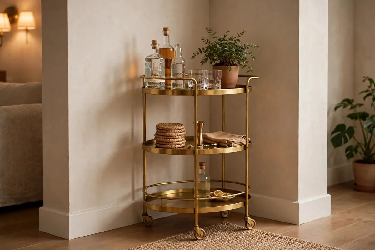
Every apartment has a dead corner. Too small for furniture. Too big to ignore. It just sits there looking empty and awkward.
A bar cart fills it perfectly. It is narrow. It rolls. It holds drinks, glasses, a plant, and a candle. Suddenly the dead corner is the fun corner.
You do not need to drink alcohol for this. Style it with pretty bottles of juice, sparkling water, and fancy glasses. It is about the look.
Keep it to two levels of styling. Bottom level: bottles and extra glasses. Top level: one plant, two glasses, a small tray. Not crowded.
Brass carts look warm and classic. Black carts look modern. Pick the metal that matches your other hardware for a pulled-together feel.
- Bottom shelf: bottles grouped together, tallest in back
- Top shelf: one plant, two glasses, small tray
- Add a candle for evening glow
- Roll it to the dining spot when guests come
I roll mine next to the sofa on movie nights. Drinks within reach. No trips to the kitchen. It earns its corner.
Dust it weekly. Bar carts collect dust on every level. A quick wipe keeps the glass sparkling.
Dead corners make apartments feel unfinished. One cart. One afternoon. Problem solved.
Build a Cozy Reading Nook
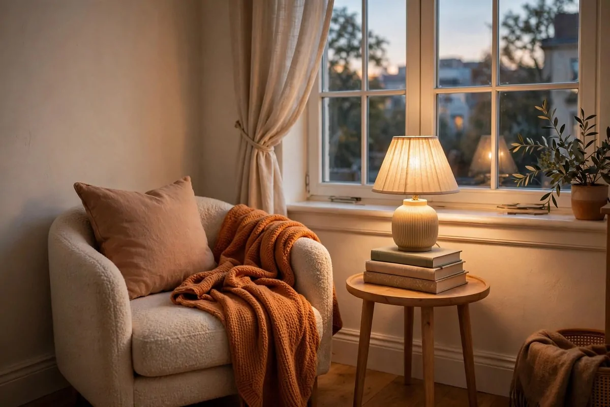
You do not need a library. You need a chair, a light, and a spot for your book. That is a reading nook. Every apartment has room for one.
Find a corner near a window. Daylight for afternoon reading. A lamp for the evening. The corner becomes a destination.
The chair matters most. It should be the comfiest seat you own. If your best chair is in the living room, steal it. The nook deserves it.
Add a small table for your tea. A basket for your current books. A throw for your legs. Three small things make it feel complete.
- Chair: the comfiest one you own goes here
- Light: a floor lamp or table lamp with warm bulb
- Table: tiny side table for tea and your book
- Extras: a throw and a small basket of books
I read more since I built mine. Having the spot ready removes the friction. I just sit down. The book is already there.
Keep your phone out of the nook. That is my one rule. The nook is for pages, not screens. It feels like a little escape.
Apartments are small. But a nook makes yours feel like it has rooms. Rooms with purposes. That is what designer homes feel like.
One corner. One chair. One lamp. You will use it every single day.
Pick a Floor Lamp That Looks Like Sculpture
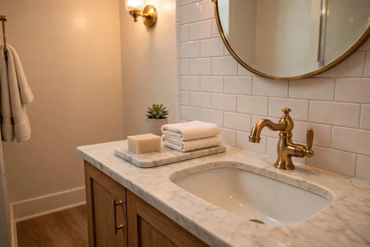
A boring floor lamp just lights the room. But a sculptural one does that and looks like art. It becomes a focal point, not just a tool.
Arched lamps are my favorite. The arm curves over a chair like a question mark. It looks dramatic. It looks expensive. It photographs beautifully.
Globe lamps are another good pick. A simple ball of light on a thin stand. Very modern. Very clean. They work in almost any room.
Place it where it frames something. Over a reading chair. Beside the sofa. In an empty corner that needs a moment. The lamp should have a job and a spot.
- Arched: dramatic curve over a chair, big impact
- Globe: simple modern ball of light, very clean
- Tripod: warm wood legs, cozy and casual
- Always pair with a warm bulb
I replaced a plain lamp with an arched one. It is now where I take all my photos.
Check the height before you buy. The light should fall over your shoulder when you sit. Too tall and it lights the ceiling. Too short and it blinds you.
One statement lamp beats three plain ones. Save your lamp budget for the one that looks like art.
Light is decor. Never forget that. The lamp you see all day matters as much as the light it gives at night.
Give the Entryway a Small Console Table
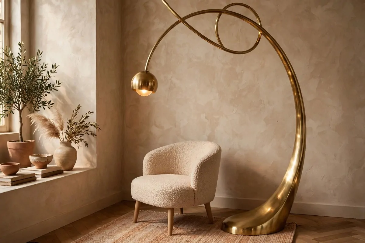
The entryway is the first thing guests see. Most apartments give it nothing. Keys on the floor. Shoes everywhere. No welcome at all.
A slim console table changes the whole arrival. It does not need to be big. Just wide enough for a bowl, a plant, and a candle.
Hang a mirror above it. Guests check themselves before they come in. The mirror also bounces light into what is usually a dark hallway.
The bowl is the workhorse. Keys, sunglasses, mail. Everything lands in the bowl. No more hunting for keys on the way out.
- Table: slim, just deep enough for a bowl and a plant
- Mirror: round, hung at eye level above the table
- Bowl: one catchall for keys and small things
- Plant: one small green thing for life
I added a little tray under my bowl. Mail goes on the tray. It keeps the paper pile from spreading across the whole table.
Keep it minimal. An entryway table is not a storage shelf. If it gets crowded, edit it back to the basics.
First impressions happen in seconds. Yours happen at this table. Make those seconds count.
A ten minute tidy of this spot before guests come makes your whole apartment feel cleaner. True story.
Style the Bathroom With Brass and Marble Touches
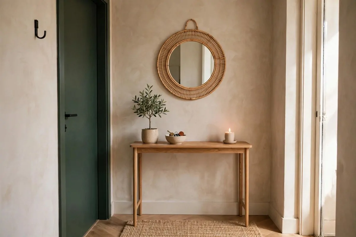
Apartment bathrooms are usually the saddest room. White tile. Harsh light. Nothing personal. But small touches can make them feel brand new.
A marble tray on the counter holds your soap and lotion. It turns random bottles into a display. Everything looks intentional on a tray.
Brass details warm up all that white tile. A brass soap dispenser. A brass hook for your towel. Warm metal against white tile looks rich.
Fold your towels nicely. Rolled or stacked in thirds. It takes one minute. It looks like a hotel. Hotels know what they are doing.
- Tray: small marble or stone tray for the counter
- Dispenser: one brass soap dispenser, decant your soap
- Towels: white, folded in thirds, stacked neatly
- Plant: one tiny plant that loves humidity
Decant your products. Pour shampoo into matching bottles. Five different plastic bottles look messy. Three matching ones look designed.
A small stool or basket holds extra towels. It fills the empty corner. It adds wood warmth to a cold room.
My bathroom went from embarrassing to proud in one weekend. Guests use it now without me apologizing first.
Small room. Small budget. Big change. Bathrooms deserve the designer treatment too.
Group Candles in Three Heights
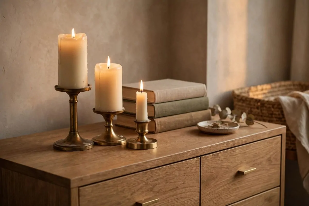
Candles are the cheapest mood on earth. But one lonely candle looks a little sad. Three candles at three heights look like a stylist did it.
The rule is simple. Tall, medium, short. Group them close together. Light them all at once. The glow multiplies.
Brass holders warm up the look. Glass holders feel modern. Wood holders feel cozy. Pick the material that matches your room.
Put the group on something. A tray. A stack of books. A small dish. The base grounds the group and catches the wax.
- Heights: tall, medium, short in one tight group
- Holders: brass for warmth, glass for modern
- Base: a tray or book stack to catch drips
- Safety: never leave them burning unattended
I keep a group on my dresser and one on my coffee table. Evening comes. I light them. The apartment feels calm in about two minutes.
Unscented candles are safest for groups. Too many scents mixed together can give you a headache. One scent or no scent.
Battery candles work too. The new ones flicker like real flames. Use them on high shelves or around curious pets.
Three heights. One match. That is all it takes. Your evenings will feel different from tonight.
The secret behind all 28 of these apartment inspiration ideas is the same. Small moves, done with care, beat big money every time. Pick three ideas from this list. Try them this weekend. Your apartment will start to feel like the second apartment in this story. The magazine one.