15 Bookshelf Styling Ideas That Make Your Home Look Expensive

Some products shown here are affiliate links. Clicking them won’t cost you anything extra. For full details, see our Affiliate Disclosure.
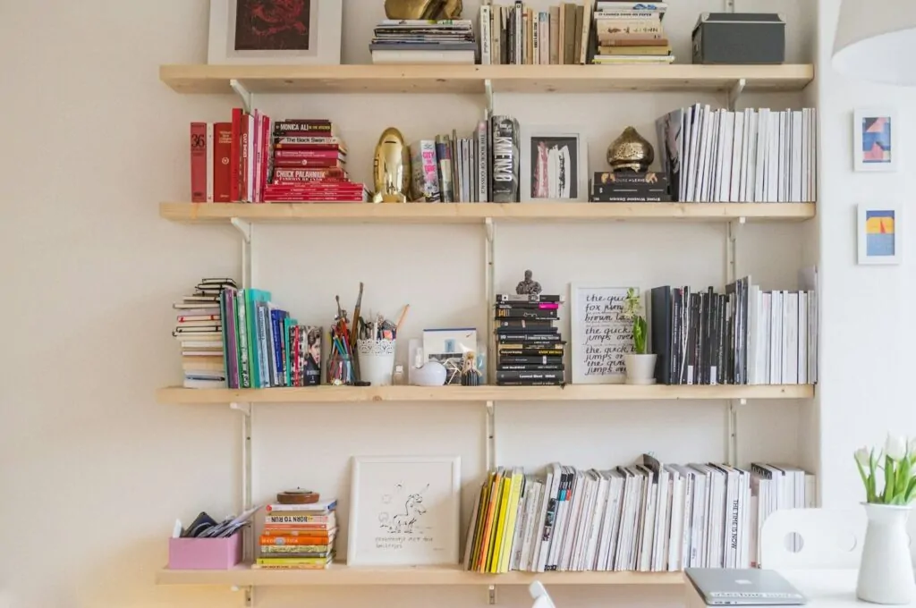
There is a kind of room that stops you. You walk in and feel it before you see it. Something about the way the light falls, the way objects sit near each other, the way a bookshelf just looks like it belongs to someone with taste. You look around and think, how did they do that? The shelf has books. Some vases. A plant maybe. But it does not look like your shelf. Not even close.
Most of us have shelves that look like storage. Books pushed in from both ends, a few random objects from past vacations, maybe a candle or a photo frame bought on sale. Nobody taught us how to style a shelf. We just filled it and moved on.
The truth is, what makes a bookshelf look expensive is not the price of the items on it. It is the way those items are placed, the space between them, the colors that connect them, the height differences that make your eye move naturally from one shelf to the next. Designers know this. They have for years. And once you know it too, your whole space can shift without spending much at all.
1. Start With a Neutral Color Base

Walk into any high-end home showroom and look at the shelves. You will almost never see a mix of bright reds, bold blues, and clashing greens. What you will see is a calm, controlled palette where the colors feel related to each other. Warm whites, soft creams, dusty grays, aged woods. Colors that feel like they chose each other.
The reason neutral color palettes work so well on shelves is simple. They give the eye a place to rest. When everything on a shelf is a different loud color, the brain works hard to make sense of it. When the tones feel close together, the whole thing reads as one thoughtful composition.
Here is how to do this without buying everything new:
- Pull books with similar spine colors together and group them by tone
- Cover books with plain paper bags or kraft wrap for an instant uniform look
- Swap out any bright colored vases or objects for white, cream, or natural versions
- Add a single muted accent, dusty green, blush, soft terracotta, to give the shelf life without noise
Pro Tip: You do not need everything to match. You need everything to relate. Think of it like an outfit. The pieces do not have to be the same color, but they need to feel like they belong to the same wardrobe.
A white ceramic vase next to a linen-colored storage box next to a pale wood frame looks calm and considered. That is the effect. Calm and considered reads as expensive every single time.
2. Stack Books Both Ways, Not Just One

Almost every styled shelf you see in a magazine or on a design blog does this one thing that most people skip. Some books stand upright, and some are flat in a stack. It sounds small. It changes everything.
When all books stand the same way, the shelf looks like a library. Libraries are wonderful but they do not look expensive. They look like storage. The moment you pull three or four books out and lay them flat in a stack, the shelf starts to feel designed.
A few things happen when you stack books horizontally:
- You create a natural riser for other objects. A small vase or plant on top of a stack looks intentional and elevated.
- You break up the visual rhythm, which stops the eye from glazing over
- You signal that the shelf is curated, not just filled
Important Note: Coffee table books are perfect for horizontal stacking because of their size. Look for ones with solid, clean covers in muted tones. They also double as decor on their own.
The mix of upright and flat books also lets you control height. A stack of three books can raise a small object to the exact height needed to balance the shelf. That is not an accident in professional styling. It is a tool used on purpose.
3. Odd Numbers Rule Everything
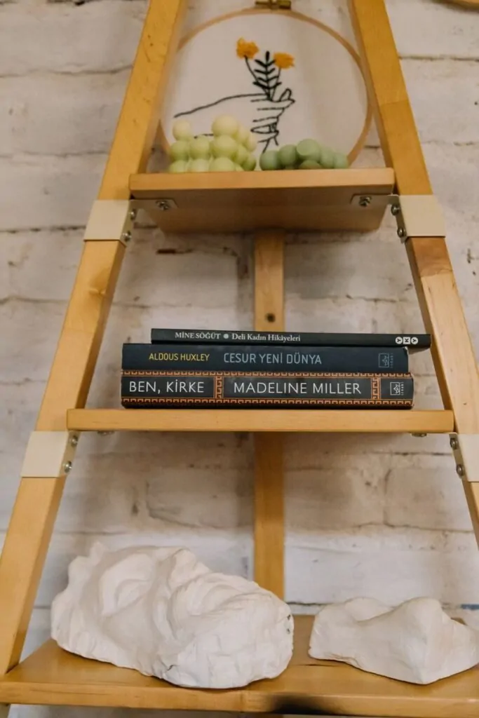
This is one of those design rules that sounds like made-up advice until you test it. Place two objects near each other on a shelf. Then add a third. Look at the difference. The group of three creates a visual triangle that the eye reads as complete. The group of two feels like it is waiting for something.
Designers call this the Rule of Three, but it works with any odd number: three, five, seven. The odd count creates a natural center point and gives the arrangement a kind of tension that is pleasant to look at.
Here is a simple way to use this on your shelf:
- Group a tall vase, a medium candle, and a small object like a stone or figurine together
- Make sure each item is a different height so the group has a peak, a middle, and a low point
- Leave some space around the group so it reads as a collection, not a pile
What makes this feel expensive is the breathing room. Objects need space around them to feel like they were chosen. Objects pressed together look like they were stored.
Checklist: Quick Odd Number Test
- Pick any shelf and count the decorative groups on it
- If you see pairs everywhere, pull one item from each pair and rearrange into threes
- Step back and compare — the difference will be clear within seconds
4. Bring in Natural Materials
| Material | Why It Works | Easy Examples |
|---|---|---|
| Wood | Adds warmth and organic texture | Wooden bowl, carved figurine, a raw-edge board |
| Stone or marble | Reads as luxury, adds visual weight | Marble bookends, a small stone dish |
| Rattan or cane | Adds softness and pattern | Woven basket, rattan tray |
| Linen or cotton | Brings in warmth through fabric tone | Linen storage boxes, cloth-covered books |
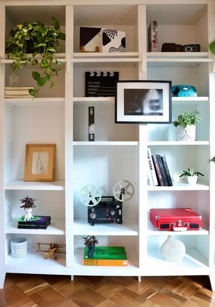
Natural materials do something synthetic ones cannot. They catch light differently at different times of day. A marble bookend looks different in morning light than it does in the evening. That shift, that small bit of life in an object, is part of what makes styled shelves feel warm rather than cold.
When you mix natural materials, the shelf gains depth. A smooth ceramic vase next to a rough woven basket next to a polished marble object creates a texture journey that is interesting without being chaotic.
Most people style their shelves with objects from one category: all ceramics, all frames, all plants. The shelves that look expensive almost always mix at least three different types of materials.
- Start with one wood element, one stone or ceramic element, and one woven or fabric element per shelf zone
- Do not worry if they are from different stores or different eras
- What matters is how they sit next to each other, not where they came from
5. Add Greenery, Even the Fake Kind
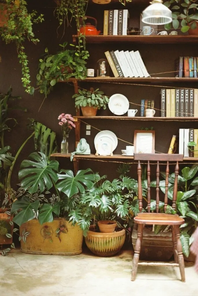
Plants change a shelf in a way that no other object can. They add life. Not metaphorically. Literally. A living thing among the books and objects reminds you that the space is inhabited, cared for, chosen. Even a small trailing plant or a eucalyptus sprig in a thin vase shifts the whole energy of the shelf.
Here is the honest truth about fake plants: good ones work just as well. A high-quality faux plant in a ceramic pot looks real from three feet away. It does not need water. It does not drop leaves. And it holds its shape and color exactly where you place it.
Warning Box: What to Avoid Cheap plastic plants in bright, saturated greens can ruin an otherwise well-styled shelf. If the fake plant looks shiny and plastic under light, it will pull attention for the wrong reason. Spend a little more on quality faux greenery with matte leaves and natural stem variation.
The best plants for shelves are ones with soft shapes and calm colors. Eucalyptus works well. A small faux olive branch in a simple pot. A trailing pothos or string of pearls placed at the edge of a shelf so it cascades down slightly. These shapes soften the hard edges of shelves and books and frames.
Think of greenery as the punctuation in a sentence. It tells the eye where to pause.
6. Leave Empty Space on Purpose
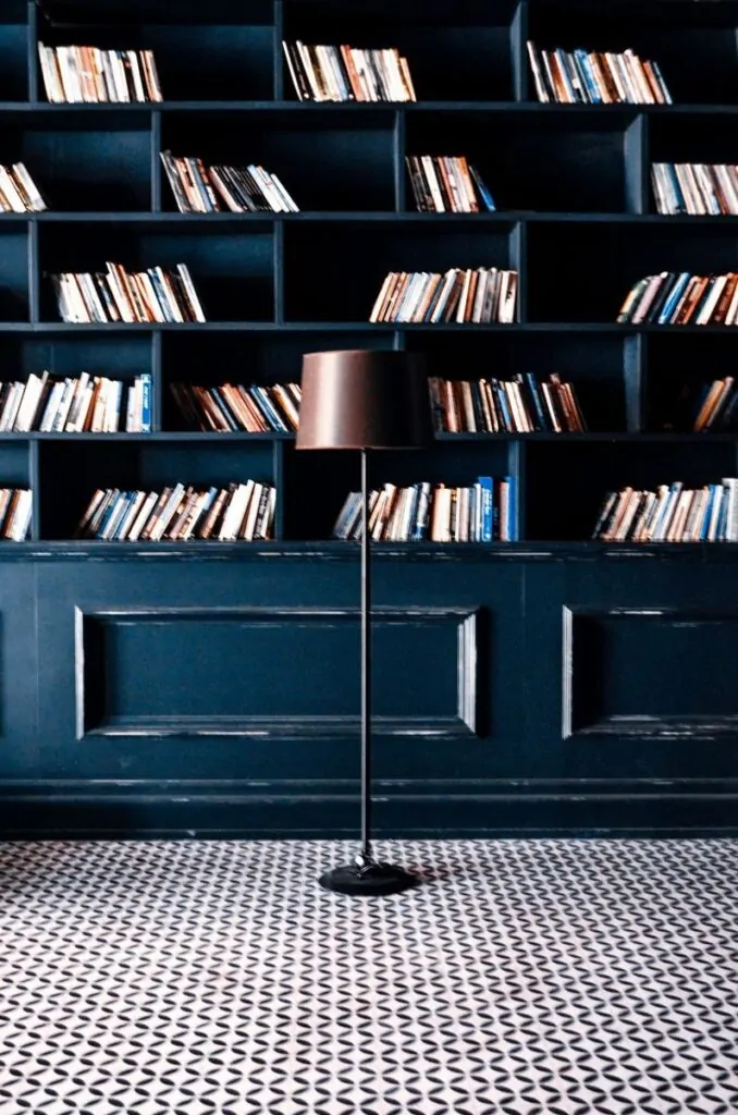
This one feels wrong at first. Shelves are for putting things on. Why would you leave parts of them empty?
Because empty space is not wasted space. In design, it is called negative space, and it does the same job silence does in music. It gives the notes meaning. A shelf packed from edge to edge looks anxious. A shelf with breathing room looks intentional.
Here is the difference between a cluttered shelf and a luxury shelf, in one sentence: the luxury shelf has less on it.
Expensive-looking rooms are rarely full. They are edited. Someone chose what stays and what goes. That act of choosing is visible. You can feel it in the space between objects.
Pro Tip: Try pulling half the items off one of your shelves. Just one. Then step back and look. Notice how the remaining items suddenly look more important, more chosen. That is what curation feels like.
Use empty space the same way you use objects. Place it intentionally. One third of a shelf can be empty. Two shelves can be bare while the others are styled. This variation in density is what gives the eye something to discover as it moves across the unit.
7. Layer Art Behind Your Decor
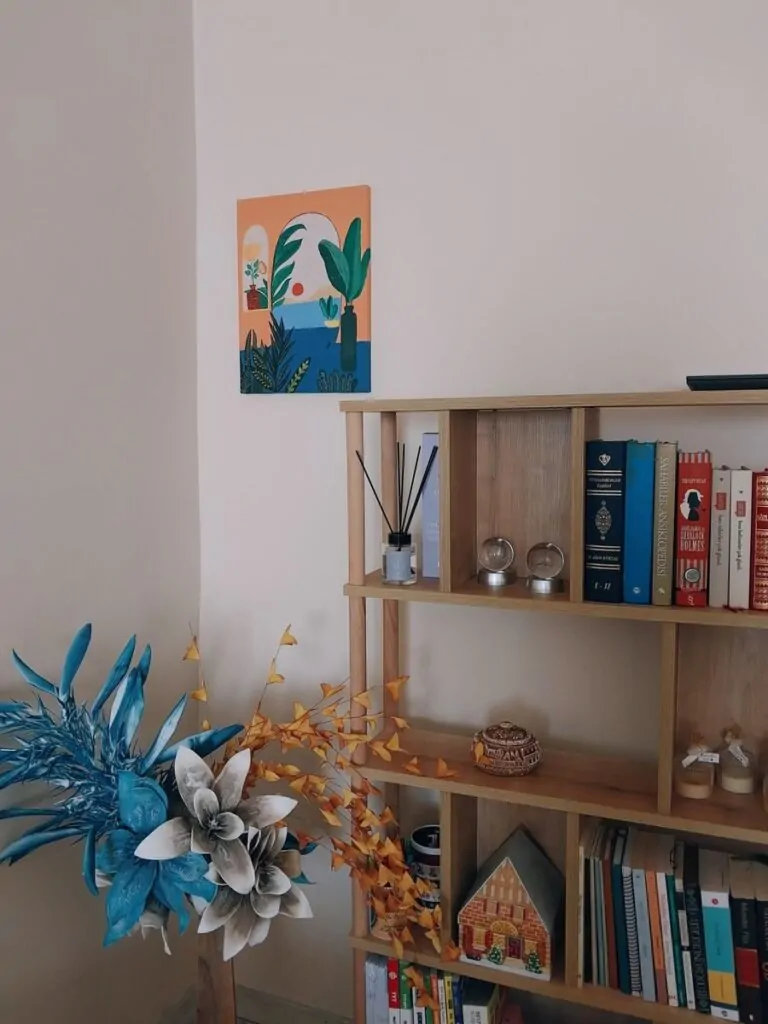
Most people think art goes on walls. That is true. But a small framed print leaning against the back wall of a shelf, half-hidden behind a vase or a stack of books, does something that wall art cannot. It creates depth. It makes the shelf feel like a small room of its own.
Leaning frames instead of hanging them is one of the simplest tricks that reads as expensive. It looks casual but considered. Like someone placed it there while rearranging and decided it looked good that way.
A few things to keep in mind when layering art on shelves:
- The frame should be slightly taller than the objects in front of it so both are visible
- Choose frames in warm metals, natural wood, or simple black and white for a clean look
- Abstract prints, botanical prints, and simple line drawings work best because they do not compete with the objects in front of them
Common Styling Mistake: Using frames that are the same height as the objects in front of them. When everything is the same height, the depth disappears and the shelf looks flat.
Vary the sizes. A tall narrow frame leaning behind a short ceramic pot, with a medium book stack to one side. That layering, that sense of things existing at different distances from the eye, is what makes a shelf feel three-dimensional.
8. Add Warm Lighting to Transform the Mood
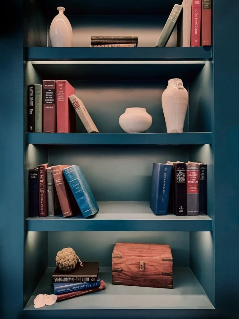
Lighting is the most underused tool in shelf styling. Most people light the whole room and call it done. But a small focused light on a shelf changes it completely. It creates shadow, depth, and warmth that overhead lighting simply cannot produce.
There are a few easy ways to add shelf lighting:
- Small rechargeable picture lights that clip or mount above a shelf section
- LED strip lights tucked behind objects so the light glows rather than shines directly
- A tiny battery-operated table lamp placed at the end of a shelf
The goal is warm light, not bright white light. Warm light, the kind that sits around 2700K on the color temperature scale, makes every object on the shelf look richer and more considered. It is the difference between a showroom and a home.
| Light Type | Best For | Cost Level |
|---|---|---|
| Picture clip light | Accent and focal shelves | Low to medium |
| LED strip (warm tone) | Long shelf units, back-lighting | Low |
| Mini table lamp | Corner shelves, cozy feel | Low to medium |
| Battery puck lights | Rental-friendly, no wires | Very low |
Good lighting is invisible. You should notice the glow, not the source. When shelf lighting works, you feel the warmth of the shelf without quite knowing why.
9. Use Bookends That Do Double Duty
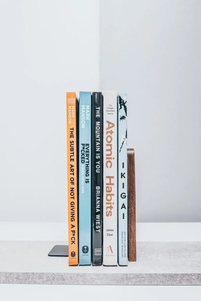
Bookends are easy to overlook. They hold books upright, and that feels like enough. But a good set of bookends does two things at once. They organize the books and they add a design moment to the shelf.
Marble bookends are one of the most cost-effective ways to add a luxury look to any shelf. They are heavy enough to work, they come in warm neutral tones, and they look far more expensive than they are. The same goes for geometric brass or gold bookends.
The key is choosing bookends that feel like objects first and functional items second. When a bookend looks like a sculpture that also happens to hold books, the shelf looks styled. When it looks like a generic metal clamp, it just looks practical.
- Marble: best for neutral, organic, high-end feel
- Brass or gold: best for warm, rich, traditional or eclectic styles
- Acrylic or lucite: best for modern, minimal, clean looks
- Ceramic: best for soft, artful, handmade aesthetics
Pro Tip: If your current bookends look purely functional, swap them first before changing anything else on the shelf. It is one of the fastest, cheapest upgrades with the most visible result.
10. Display Personal Items With Intention
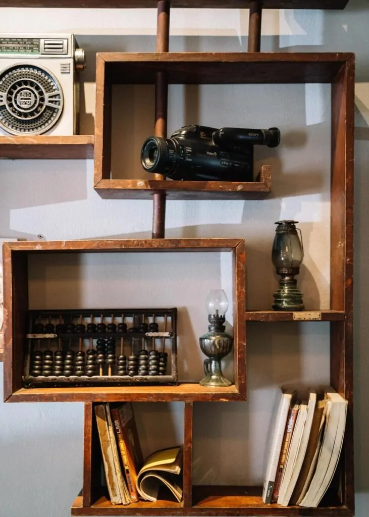
Here is where many design guides go wrong. They tell you to remove all personal items and replace them with store-bought decor to get a luxury look. That advice misses something important. What makes a space feel rich is not just how it looks. It is how it feels. Personal items, when placed thoughtfully, add a layer of authenticity that no vase from a store can replicate.
A small photo in a clean frame. A souvenir from a trip you remember well. A handmade object from someone you love. These things, when placed with the same intention as any other decorative object, add warmth that styled shelves often lack.
The difference is not what the item is. It is how it is treated. A vacation photo in a beautiful frame, leaning against the back of a shelf next to a small plant, looks curated. The same photo in a cheap frame crammed between too many objects looks like clutter.
- Choose one or two personal items per shelf zone, not ten
- Frame or display them as you would any other decorative object
- Give them space, good light, and things nearby that complement rather than compete
A shelf that has no personal items looks like a showroom. A shelf that has too many looks like storage. The point is the balance.
11. Play With Height Differences
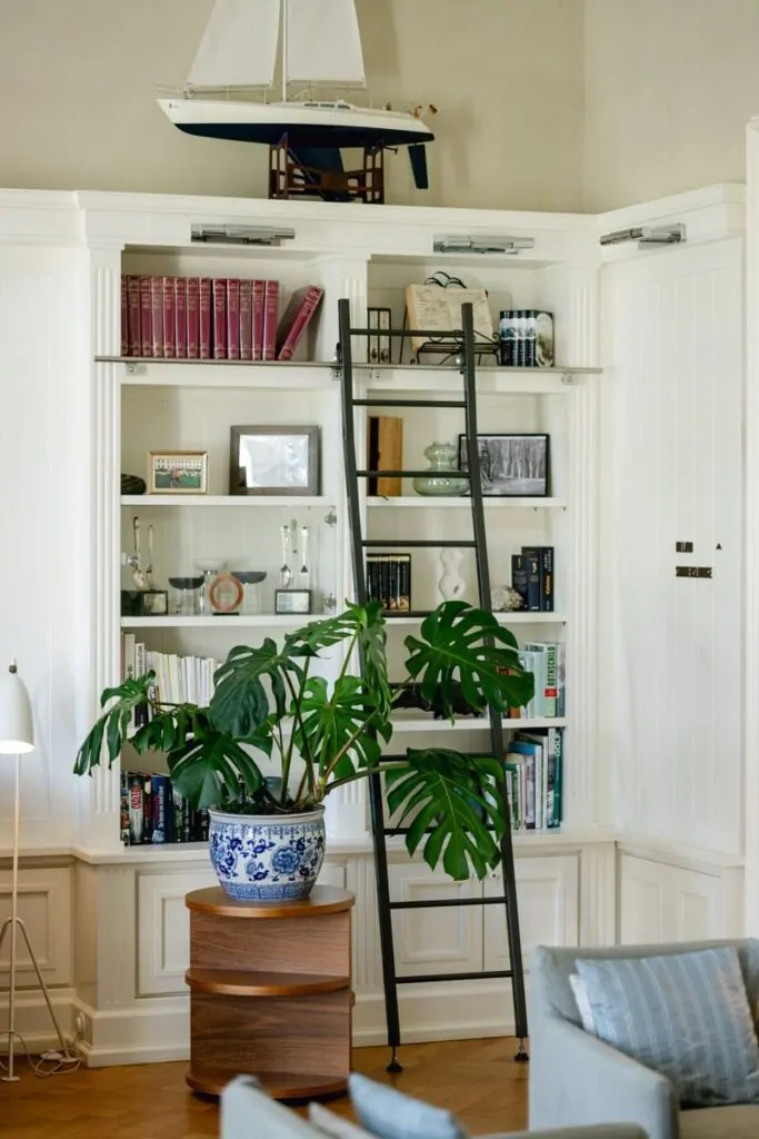
One of the fastest ways to make a shelf look flat and uninteresting is to fill it with objects that are all the same height. When everything sits at the same level, the eye has no reason to move. It scans once and moves on.
Professional stylists build what they call a skyline. Just like a real skyline, a shelf needs peaks and valleys. Tall objects, medium objects, low stacks, and empty zones create a visual rhythm that draws the eye from one end to the other.
Here is a simple way to build your shelf skyline:
- Place one tall item (a vase, a tall book, a plant) as the anchor
- Add one medium item next to it (a framed photo, a candle)
- Add one low item (a small bowl, a short stack of books) on the other side
- Leave a small gap before starting the next grouping
The result is a shelf that has movement. The eye travels up to the tall piece, across to the medium, down to the low, pauses in the gap, then starts again. That journey is what makes a styled shelf interesting.
Important Note: The tallest point on a shelf should not touch the shelf above it. Give it breathing room. If the tall item is too close to the ceiling of the shelf opening, it looks stuck, not styled.
12. Add Texture Everywhere
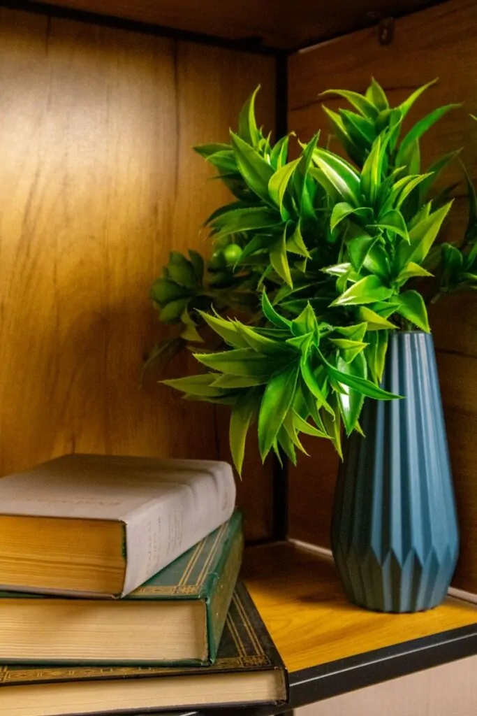
Color gets most of the attention in design conversations. Texture does the quiet work. When all the objects on a shelf have similar surfaces, the shelf looks one-dimensional even if the colors are good. Add texture and the shelf gains depth.
Texture is why a rough woven basket next to a smooth ceramic vase next to a matte linen box works so well. Each surface catches light differently. The contrast between them is what creates visual richness.
Here are some easy ways to add texture without buying many new items:
- Wrap a few books in brown kraft paper or linen fabric for an instant textured look
- Add a small woven basket or rattan tray as a container for smaller objects
- Use a rough stone object or geode as a low anchor piece
- Place a piece of driftwood or a natural wood slice as a neutral textural element
Texture does not need to be expensive. It needs to be varied. The goal is that if someone ran their hand across the shelf (not that they would), they would feel at least three different types of surface. That variety is what the eye is reading when it says, this shelf looks rich.
13. Style by Season Without Starting Over
| Season | Simple Swap Ideas | Colors That Work |
|---|---|---|
| Spring | Small bud vase with fresh stems, light linen | Soft pink, sage, pale yellow |
| Summer | Woven items, shells, bright but small accents | Warm white, navy, sand |
| Fall | Mini pumpkins, dried leaves, warm candles | Rust, amber, deep green |
| Winter | Small ornaments, pinecones, soft garland | Deep red, gold, evergreen |
Seasonal styling does not mean changing everything. It means swapping two or three items per shelf to shift the mood. A dried leaf wreath leaning against the back of one shelf in autumn. A small bowl of ornaments in winter. Fresh tulips in a simple vase in spring. These small changes keep the shelf feeling alive and connected to the time of year.
The mistake most people make is going too far. Every object on the shelf becomes seasonal and the whole thing looks like a holiday shop display. The goal is a hint of the season, not a full transformation.
Pick one anchor piece per season, something that is clearly seasonal, and let everything else on the shelf stay as it is. The contrast between the permanent curated items and the one seasonal piece actually makes the seasonal item feel more special.
14. Use the Rule of Three on Every Shelf
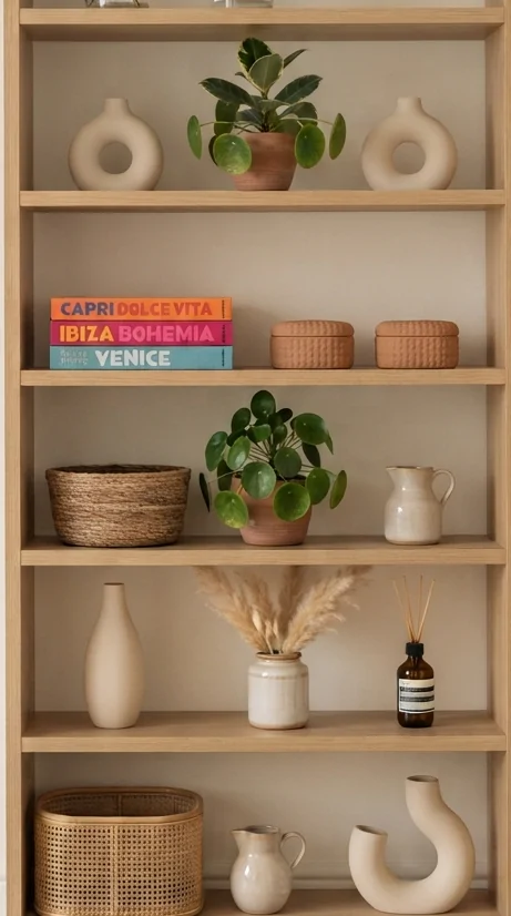
The Rule of Three deserves its own section because it is that useful. It is the single most reliable tool in shelf styling, and it works on every shelf in every room in every style of home.
Here is the full breakdown of how to apply it:
Step 1: Divide your shelf into three zones: left, center, right.
Step 2: In each zone, place a group of three objects at different heights.
Step 3: Make sure the groups relate to each other through color, material, or tone, but are not identical.
Step 4: Leave some empty space between or around the groups.
The result is a shelf that has structure without looking rigid. The groupings feel related but each zone has its own personality. This is exactly what makes shelves in design magazines look so considered.
A quick example: On the left, a tall green plant, a medium stack of muted books, and a small white ceramic bowl. In the center, a framed print leaning against the back, a candle in front of it, and a marble bookend to one side. On the right, a short vase with dried stems, a small sculpture, and an empty space that lets the arrangement breathe.
That is the Rule of Three in action. It feels designed because it is.
15. End With One Statement Piece
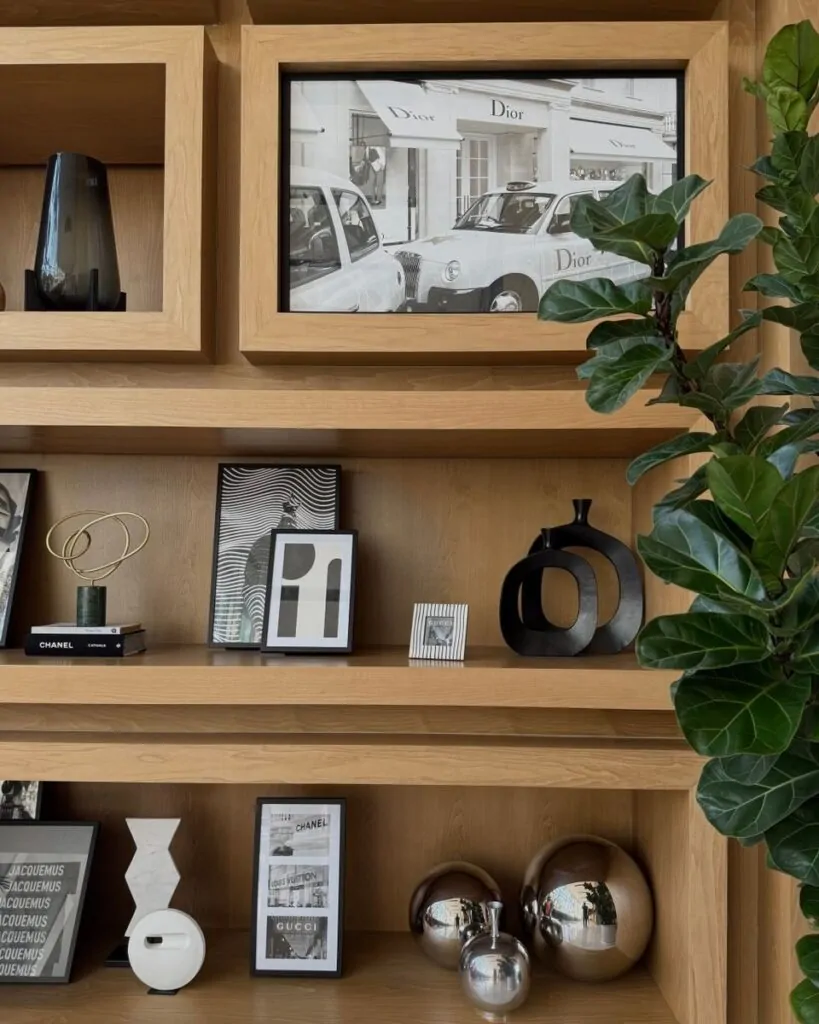
Every well-styled shelf has something you cannot miss. One object that is larger, bolder, or more interesting than everything around it. Not loud. Not cheap-looking. Just distinctly itself.
A statement piece anchors the entire shelf unit. It gives the eye a place to land. It creates a focal point that the rest of the styling supports rather than competes with.
What makes a good statement piece:
- It is larger than most of the other objects on the shelf
- It has a quality that reads as intentional, whether that is material, shape, or age
- It does not look like it could be bought at any basic store
- It holds its own without needing something next to it to explain it
An oversized ceramic vase in a muted glaze. A large art book standing upright on its own on one shelf. A sculptural object in an interesting form. A cluster of tall dried stems in a heavy floor vase placed at the base of the unit.
The statement piece is not necessarily the most expensive item you own. It is the most considered one. The one that says, someone who cares lives here.
Common Bookshelf Styling Mistakes
Most shelves do not look bad because of the objects on them. They look bad because of patterns that quietly work against the whole look. Here are the ones that show up most often:
Too many objects: When every inch of the shelf is filled, nothing stands out. The eye cannot find a resting place and the shelf reads as storage.
Same height, top to bottom: Without height variation, the shelf looks flat. Vary the heights within each shelf and across the unit as a whole.
No color story: Objects that have no color relationship look like they were gathered from different rooms. Even a loose relationship, warm tones only, or neutrals with one accent, makes a big difference.
No greenery anywhere: A shelf without any plant life, even a small faux branch, tends to look sterile. One plant changes everything.
Ignoring the back wall: The back of the shelf unit is an opportunity. Paint it a contrasting color. Line it with simple wallpaper. Even a clean, deep white makes objects in front of it pop more clearly.
No lighting: A dark shelf looks like a storage unit even if everything on it is beautiful. Even one small light source changes the mood completely.
Warning Box: The #1 Mistake That Undoes Everything Buying a lot of new decor without editing first. Adding more objects to a cluttered shelf makes it more cluttered. Before you buy anything, take half of what is on the shelf off. Then decide what needs to be added. Editing comes before decorating.
Amazon Favorites for Bookshelf Styling
Here is a quick reference guide for the types of products worth looking for:
| Category | What to Look For | Why It Helps |
|---|---|---|
| Decorative books | Muted spine colors, coffee table size | Color control, horizontal stacking |
| Faux plants | Matte leaves, natural stem variation | Life and softness without maintenance |
| Ceramic vases | White, cream, or warm neutrals | Versatile anchor pieces |
| Marble bookends | Natural veining, heavyweight | Luxury look at low cost |
| Storage baskets | Rattan or woven, neutral tones | Texture and organization |
| Pillar candles | Unscented, muted colors | Height variation, warm glow |
| Picture frames | Simple metals or natural wood | Personal touch, art layering |
| Small sculptures | Abstract or organic shapes | Focal points, conversation pieces |
| LED shelf lights | Warm tone, dimmable | Mood and shadow |
| Large coffee table books | Clean cover design, oversized | Stacking bases, design anchors |
Frequently Asked Questions
How do professionals style bookshelves?
Professionals start by clearing everything off the shelf and starting from scratch. They build in zones, use a limited color palette, mix heights and materials, and leave intentional empty space. They also step back often and look at the whole unit rather than focusing on one shelf at a time.
What should go on a bookshelf besides books?
Vases, plants (real or faux), framed photos or art, candles, small sculptures, woven baskets, natural objects like stones or wood pieces, and decorative boxes all work well. The key is mixing these with books rather than filling the whole shelf with one type of item.
How do you make a bookshelf look luxurious without spending much?
Edit first. Remove more than you think you need to. Then group what remains by color and height. Add one or two neutral accent pieces, a plant, and one source of warm light. The editing alone will do more than any new purchase.
How many decorative items should go on each shelf?
A good starting point is three groupings per shelf with two to three objects in each group and some empty space between them. So six to nine objects per shelf, spread across three zones. This varies by shelf size, but it is a solid baseline.
What colors work best for bookshelf styling?
Neutral bases, white, cream, warm gray, natural wood, work best because they let other elements stand out without fighting each other. Add one or two soft accent colors at most. Deep greens from plants, a single dusty terracotta vase, or warm blush all work well as accents in a neutral palette.
Should every shelf look the same?
No. Variation between shelves makes a unit more interesting. Some shelves can be more styled and dense, others almost empty, others focused on books. The variation itself is part of the design.
How do you style built-in bookshelves?
Built-ins work best when treated as one composition rather than shelf by shelf. Use the whole wall as a canvas. Place your largest statement piece near eye level at the center. Let the surrounding shelves support that focal point with lighter styling. Built-ins also benefit from a painted back wall in a complementary color.
How do you decorate a bookshelf on a very low budget?
Start with what you already have. Rearrange books by color. Wrap a few in brown paper. Move objects from other rooms onto the shelf and see how they look. Bring in one plant from the garden or a branch from outside. Good styling is mostly about arrangement, not about buying things.
Key Takeaways
- A shelf that looks expensive is almost always a shelf that has less on it, not more
- The most common styling mistake is filling every inch, which turns a shelf into storage
- Warm light changes the mood of a shelf more than any object on it
- The Rule of Three works because odd numbers create natural focal points
- Natural materials add richness that synthetic items cannot replicate at any price
- Editing is the first step, and most people skip it entirely
Conclusion
There is a moment, when a shelf finally looks right, that is quiet and satisfying. Not exciting. Not dramatic. Just right. You step back, look at what you have arranged, and feel a small sense of calm that was not there before. That is the real point of all of this.
Styling a bookshelf is not about impressing people who visit. It is about living in a space that feels considered. That reflects that someone lives here who pays attention. Who edits. Who chooses.
You do not need a large budget for that. You need patience. You need the willingness to take half the things off the shelf before putting any back. You need to trust that empty space is doing something, even when it feels wrong.
As the designer William Morris put it: have nothing in your house that you do not know to be useful or believe to be beautiful. A styled shelf is simply that principle made visible, one object at a time.